
Andy Gavin's Blog, page 178
December 26, 2011
11 reasons you should buy The Darkening Dream
 1. It's a great book.
2. It's only $2.99 — but the price might go up soon.
3. You loved Crash Bandicoot.
4. You loved Jak & Daxter.
5. I was a great boss, friend, or co-worker.
6. My vampires don't sparkle.
7. There are several beheadings.
8. Decrepit ancient Egyptian gods are cool.
9. The girl on the cover is really cute.
10. I handed you a glass of $100 wine at some point.
11. The book includes a "cesarian by vampire scene."
And 4 refutations to your protests:
1. I'm poor – but it's only $2.99.
2. I don't have a Kindle – you can read Kindle books on a smartphone, iPad, or the web.
3. I'm too lazy to click twice – bad excuse.
4. I don't read – do you really want to admit that?
Buy it now!
Then after you do, retweet, share, like, or otherwise spam this post or a link to the book on all of your social media! 


December 25, 2011
The Darkening Dream for Christmas!
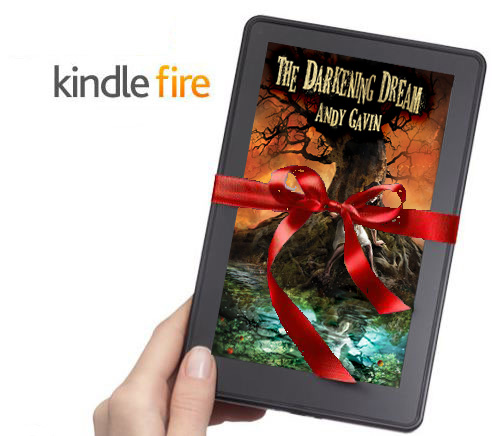 As a surprise move, I'm stealth launching The Darkening Dream — right now! — although only the Kindle edition.
If your stocking has been stuffed with a brand new Kindle, or you already have one, or you read on the Kindle app anywhere (iPad, Android, etc.)…
Buy it now!
Stealthy introductory price of $2.99. Which is certainly a bargain given that it took me two busy years to write and a lot of work to produce the layout, cover, etc.
So, you might ask (after you have purchased your copy — hint hint), what is a stealth launch?
Well, firstly, while the book is totally done and the E-Book version is all typeset, I've only put up the Kindle version. In the next week or so I'll try and get all the other E-Book variants up (B&N, iTunes, etc.). Also, I'm still finishing up the paper editions. These will look great but they take a bit longer because I have to wait for physical proofs (5 days), make changes, then wait again, etc.
But also, I'm bucking the marketing machine that over the last thirty years has moved more and more to "big launch and then go away" mentality. Pretty much all big products: movies, albums, books etc. are marketed this way now. The marketeers build everything up for a big launch, hope for the best, then turn elsewhere a few scant weeks later. Truth is, this serves the marketeers more than it does the customer. Novels don't age very fast. I enjoyed The Maltese Falcon as much as any book I read this year and it's 81 years old. And the potential reader who happens to stumble upon my book doesn't really care if it was published today — or last year. And it will take me time to collect reviews, get the other editions out, build up more web linkages etc. Later, when I have more of that in place I'll begin the bigger marketing push.
So try it out and see what you think. Afterward, please review the book on Amazon. Reviews matter!
If you're still not convinced:
Find out more about the book here
or read the sample chapters
or even check out a bit about the characters.
December 24, 2011
The Look – al-Nasir
In the process of developing the interior look of my book, The Darkening Dream, I wanted to create glyphs to represent each point of view character. In general, despite my big library of occult titles, I find a lot of references on the web (Google for the win!). Ultimately, I'm trying to produce original works, but reference art is very useful in communicating with your artists.
Let's start with one of the easiest: al-Nasir, my 900 year-old vampire villain.

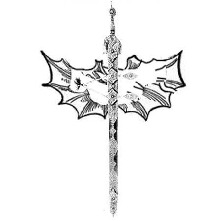
In life, al-Nasir, was a Moorish warrior who ruled over the Caliphate of Cordoba. If this floats your boat, check out his detail page on the blog. He's a violent warrior, so a sword was a natural. The above weapon is a photograph of an actual Nasrid sword from the eleventh century. Contrary to popular imagination, Moorish swords were not curved, at least in this period.

As the style I'm going for is an illustrated, "old school engraving" style, I showed the artists this image, which is a similar kind of sword, but as an drawing was useful in demonstrating how to convert the photographic image into a more illustrated form.

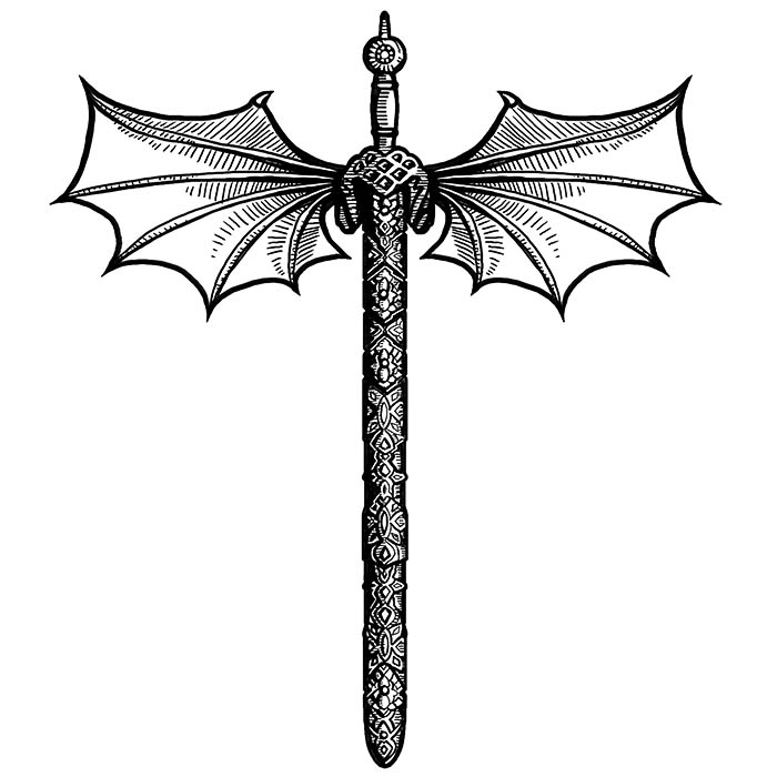
But al-Nasir isn't just any old medieval Moor, no he's a vampire, and one who specializes in the flying bat form. So I found this odd sixteenth or seventeen century engraving. The bat wings are really cool and in just the kind of naive wood block style I'm going for.
I rotated the sword, then used Photoshop to snip out the bat wings and build a composite to show the artists exactly what I had in mind. I call this "ghetto art" and it might be ugly but it's invaluable in communicating visually. Below is the resulting final image, which they got pretty much dead on (haha) with the first try.
For more about my novel, The Darkening Dream.
To find out more about developing a style for the interior art, see here.
For more information on al-Nasir, the badass 900 year-old Moorish vampire.
December 23, 2011
Naughty Dog – 25 Years!
www.vg247.com has written a very nice piece on Naughty Dog's 25th anniversary.
There's been a few anniversaries in the gaming world this past year: Ubisoft's 25th, Blizzard's 20th. But it seems there may have been one that slipped under the radar, which is a big surprise considering this studio is now perhaps one of the most widely-recognised on the triple-A scene.
Naughty Dog is 25 years old this year.
But all things have an origin.
Jamming, man
In 1986, high school students Andy Gavin and Jason Rubin joined forces to found what was then known as Jam Software. The pair had been experimenting with computer programming, tooling around with C++, before combining their talents.
But it was in 1989 that the first seeds of the company as we know it today were sown. Making a new beginning, Jam Software was renamed Naughty Dog, with EA-published RPG Keel The Thief for Apple IIGS, Amiga and PC the first release under the new moniker. Its next effort, Rings of Power for the Genesis or Mega Drive, arrived in 1991 – another RPG published by EA.
And in 1994, Naughty Dog developed a 3DO fighting title for the now defunct Universal Interactive Studios (better known in recent years as Vivendi Games) called Way of the Warrior, with both single-play and multiplayer.
Based on Way of the Warrior's success, Mark Cerny, then head of Universal Interactive Studios, agreed to back the company's next games. What came afterwards signaled the beginning of Naughty Dog's true success.
"Whoa!"
In 1996, with a distribution deal secured, Naughty Dog released a unique platformer called Crash Bandicoot. It was published by the fresh-faced Sony Computer Entertainment, which had released its debut console, the PlayStation, over 1994 and 1995.
Despite a few errors (our first game was actually published in 1985) this is a nice article with lots of good stuff and some fun videos from the different eras. Check out the full text here.
December 22, 2011
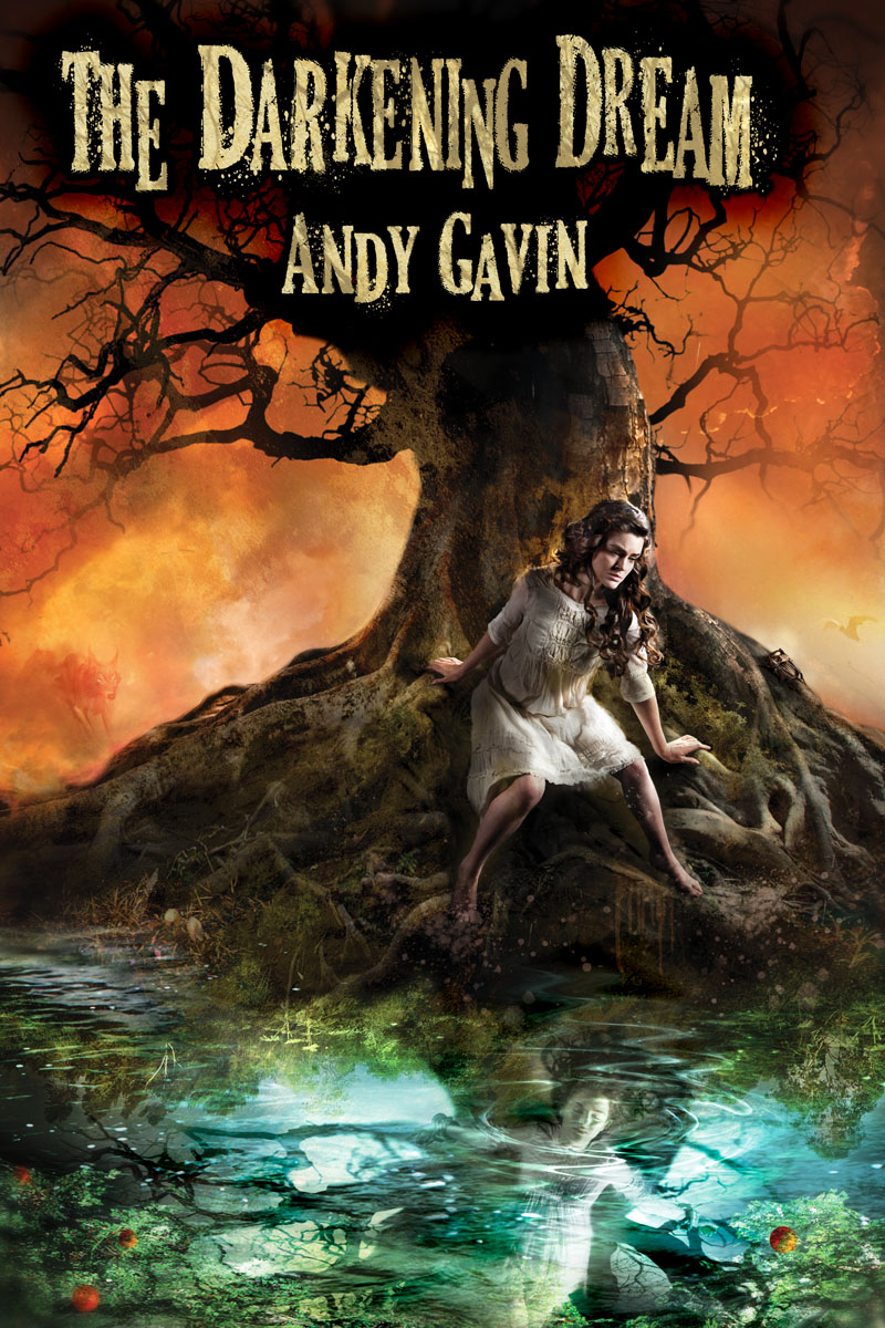
New Cover Art is here!
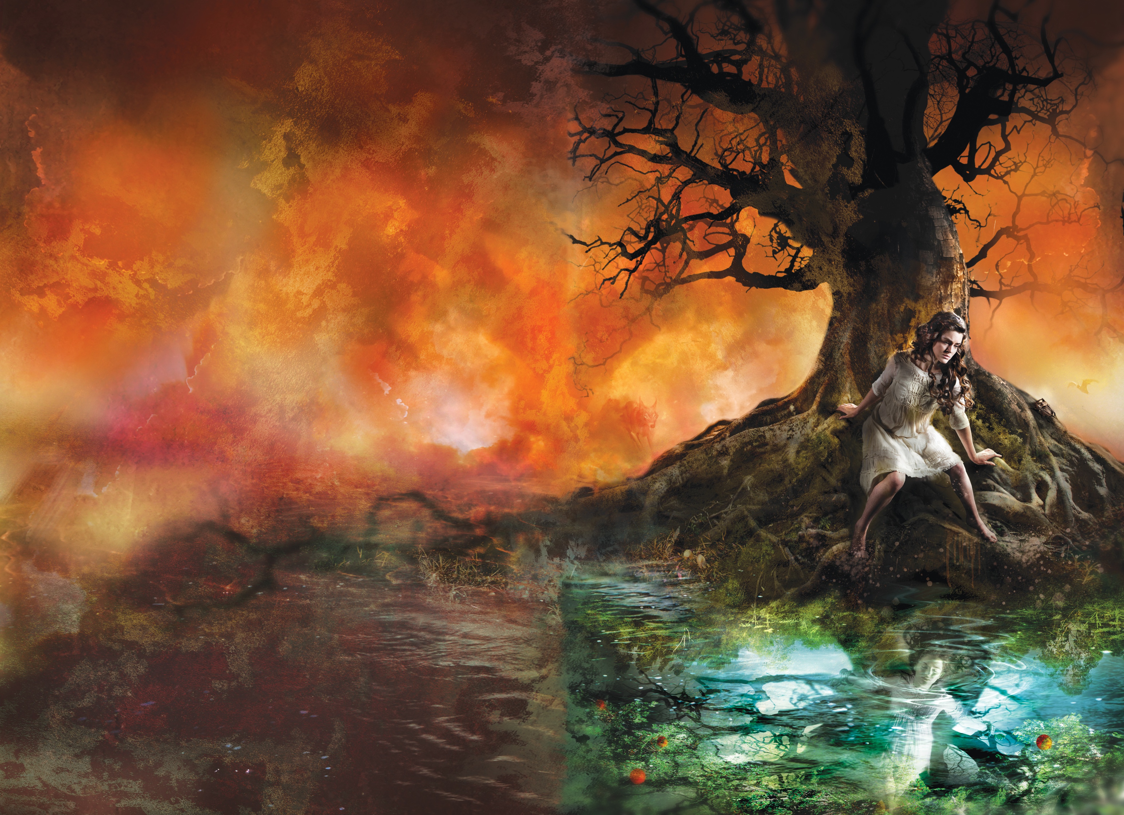
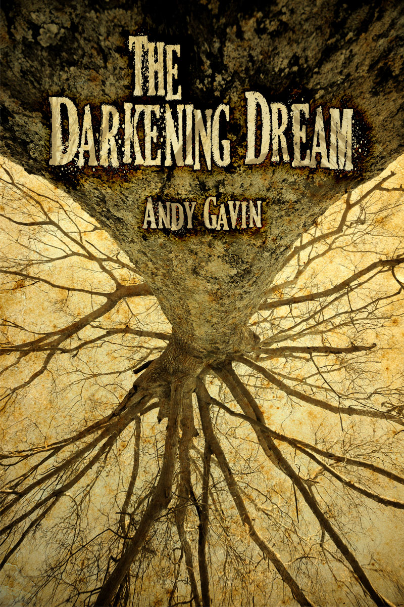
The new cover for The Darkening Dream is almost done! To the left is the current mockup (click the double spread below if you want to see a large version). It still needs a few tweaks and real titles (those are NOT final titles), but it's real close.
As I've discussed before, I commissioned a new cover a couple weeks ago from artist Cliff Nielsen, worked through a whole batch of ideas and sketches, shot the model in the studio, and voila!
I've basically got the E-Book interiors done too, having learned over the last two days how to generate MOBI and EPUB files from my base HTML. I even caught and reproed a bug in Calibre which a super responsive programmer fixed in an hour. These files took a lot of work but they look really awesome with all the little interior illustrations and very nice, clean, formatting.
My last thing is to get real titles done and then I'm ready to go with the E-Book version by around the New Year! Although, titles and Amazon approval might drag that out by a couple days.
Please write in the comments what you think of the cover.
The old cover -- made by yours truly
To see photos from the cover shoot, click here.
For more info on the new cover artist, click here.
For more information on The Darkening Dream.
For more posts on writing, click here.
December 21, 2011
The Hobbit Trailer
Nerdgasm update. What more is there to say about this:
The feeling of the prequel going second is interesting. It looks great, but it also feels slightly anticlimactic (for those of us who know the stories in detail) following on Return of the King. But still, it might actually be a more fun film(s) — the book is a little better paced than the masterpiece — which brilliant as it is, is a bit odd in the structural department. Don't get me wrong though, I have read them half a dozen times. Even the Silmarillion, which is actually one of my favorites. Although I can't say I've read all of those extra lost tales whatever books Christopher Tolkien pushed on us (a few though).


Din Tai Fung Dumpling House
Restaurant: Din Tai Fung
Location: 1108 S. Baldwin Ave., Arcadia,California 91007. (626)574-7068
Date: December 8, 2011
Cuisine: Chinese Dumpling House
Rating: Amazing Taipei spinoff
_
I love dimsum so much I was willing to drive 45 minutes out into the wilds of Arcadia to try this place. And it was well worth the journey. The "juicy pork dumplings" alone were worth the price of admission.

Classical Arcadia was a place of legendary beauty, filled with bucolic green hills, lazy shepherds, and nubile nymphs. Arcadia Ca features strip malls.

The chefs hard at work in their little glass tank.

Din Tai Fung is so popular we had to wait 30 minutes on a random thursday at 1pm. But they are nothing if not organized. The staff all wear secret service ear pieces and our order was taken before we even sat.

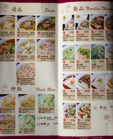
The huge menu. And it has pictures!

Some stuff appears to be take out friendly.

The setup of chopsticks, tea cup, and ginger.

Marinated cucumber in a sort of garlic ponzu type sauce. Nice and crunchy, but I was saving room.

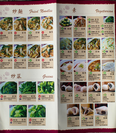
"Juicy pork dumplings." These are sometimes called Shanghai style "soup" dumplings. I've had lots of them but these were easily the best ever. These succulent little mouthfuls were superbly balanced.

"Pork sticky rice."

This sticky log of rice contained bonus roast pork. Yum yum. You'll notice the DTF food is heavy on both the carbs AND the pork.

"Noodle with mince pork sauce." This was yummy too, although I have had better of this dish — in Xian China.

"Noode with spicy sauce." This was actually tastier than the pork ones as the sauce had this nice spicy vinegar tang.

"Braised beef soup." You can't see them, but the soup is filled with more of the spaghetti-like noodles. The beef tasted like short rib.

"Vegetarian dumplings." These were some of the better veggie dumplings I've had. Still, they don't hold a candle to the meaty ones.

"Pork and Shrimp Shu-mai." Not only did these look great, but they tasted fantastic. These were my second favorite after the straight pork ones.

"Shanghai rice cake with chicken." This tasted fine (like soy sauce, in a good way). The rice cake has a weird chewy texture, not unlike jellyfish. It was actually kind of fun.

"Pork buns."
Unlike the typical BBQ pork buns, these just had the slightly spiced (buy yummy) pork balls inside, not the sweet red BBQ pork. Still good.

"Juicy Pork & Crab dumplings." Like the pork ones, but with a slightly weird crab aftertaste. We all preferred the plain pork ones, but I still happily kicked back about 5 of these.

"Sautéed mustard cabbage with garlic." Fine for what it was. Boring!

Yum yum, drown that baby!

"Fish dumplings." I haven't had a lot of fish dumplings, but these were superb! Almost as good as the pork. Well not quite, but they were really good.

Now the dessert buns. First the "black sesame."

This were really good, with a sweet nutty taste. The bun itself is identical to the pork bun.

Then two other experimental types: "sweet taro" and "red bean." All were pleasant, but the taro was like a bun stuffed with whipped sweet mash potato and the red bean — well like red bean.
Overall, Din Tai Fun was awesome. I'm so hungry just writing up this post and I want to go back right away. I don't want to drive the better part of an hour just this second, but I want the "juicy pork dumplings." It's also a good deal. Four of us completely polished off the above. And yeah we pigged out. And it cost like $65!
December 20, 2011
The Game of Thrones Set – Belfast
Yet more Game of Thrones goodies. This one details the effort of capturing the look from the Belfast set (Northern Ireland for the geographically challenged).

Check out my own Fantasy novel, The Darkening Dream.
December 19, 2011
Making of a Cover
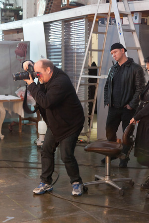
On Sunday we shot the live model for my new cover for The Darkening Dream.

The artist, the amazing Cliff Nielsen, works out of a 1903 former power station! This was totally awesome given the 1913 setting of The Darkening Dream.
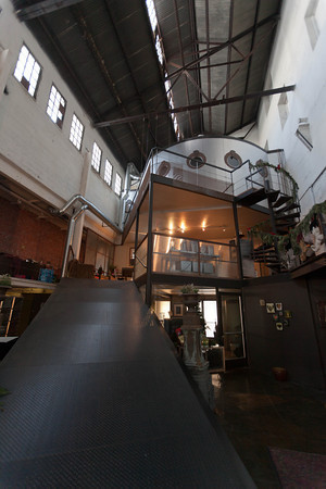
The interior is even crazier!

And our studio location where Cliff has set up his stage area and lighting.
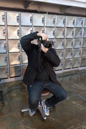
The artist behind his camera. Turns out he's a Canon 5D Mark II shooter as well!

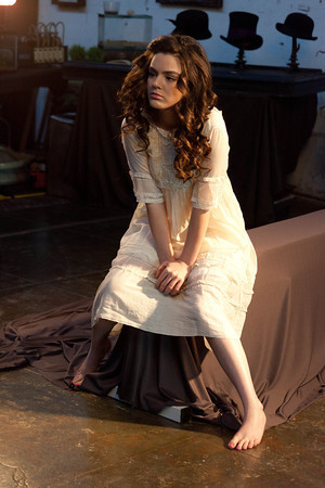
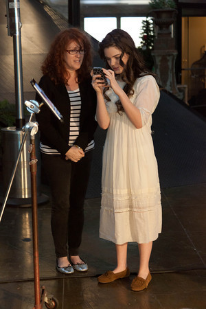
Enter our lovely young protagonist, Sarah Engelmann, played by the talented .
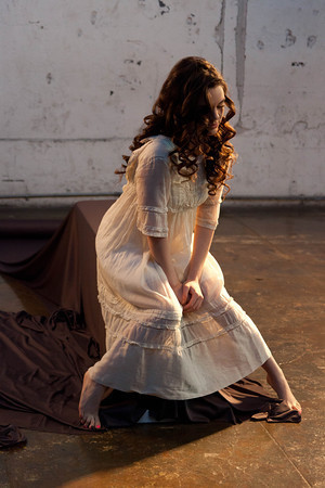
It just takes a bit of costume and some hair styling to take her back a hundred years! This cover is a bit allegorical. In the book, Sarah is plagued by dreams of violent super natural deaths, and entangled with more than a bit of the violent supernatural during her waking moments.
So for the cover we are trying to capture a bit of a nighttime Sarah caught in the junction between these waking (natural) and sleeping (supernatural) worlds. Just a note for total verisimilitude, Cliff will have to Photoshop off the nail polish (like 2 minutes work) because Western women didn't wear nail polish between late antiquity and the 1930s! (Although the Chinese did)
Cliff earning his keep.

He shot using the 24-70 2.8L which is a great lens for studio work.
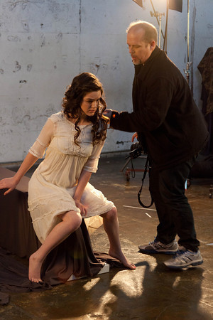
Hair fix.
I thought this shot during break an amusing contrast of period and modern.

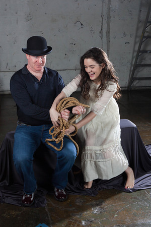
Dana was a fantastic sport and even put up with a second — and creepy – crucifixion pose. In the context of The Darkening Dream this isn't really Jesus type crucifixion, but more Conan on the Tree of Woe or Odin sacrificed and hung from the world tree Yggdrasil. Rest assured, it has certain magical/occult significance in the story.
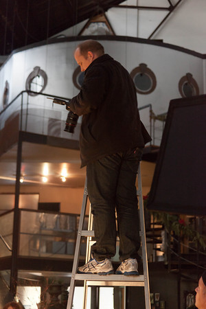
Cliff had to shoot from high up on a ladder.

During this part of the shoot it was suggested that I draw in a small dark mustache and cultivate a sinister silent movie villain laugh.
Or perhaps it's the reverse.
All in all, it was a fantastic shoot and we got great images. I can't wait to see the finished cover in a couple of days.
Read more about The Darkening Dream here.
Or check out the cover design here.
Or read the first two chapters for free.
December 18, 2011
Sample Chapters!
 With my novel The Darkening Dream steaming along toward release, it's high time that I offer a taste of the book itself. So to that effect, I've put up the first two chapters as a sample.
Check them out here!
I even used my CSS mastery to format them in fairly close approximation of the real book. Although I used times, which is a good looking screen font, instead of Arno Pro like the printed book. But I did include the appropriate interior art that I've been developing. This includes chapter heading illustrations and custom separators. Each different point of view has a separate icon, in the case of these two chapters the horn for Sarah (our protagonist) and the tree for Charles. Why, is fairly clear even in these brief chapters.
Please share your opinions on the opening either here or below the sample itself.
Also for those who care about the geekdom, I upgraded the little red buttons I use on various places on the site to support roll over highlighting. This was easy, but figuring out how to flow the pair of them underneath the sidebar book cover took longer than all the other tasks today, including the styling of the sample. HTML/CSS is like that. At first I forgot about display:block and then, for some slightly mysterious reason, I had to use float:left to get them to sit side by side. Go figure.


