Judith Deborah's Blog, page 2
January 26, 2012
News Flash: Gorgeous Woman Reads A Falling Knife In Thailand!
Behold my stunning friend Laura McHale, globetrotter, charmer and all-around good egg, on vacation in Thailand with A Falling Knife:

Is that a sight for sore eyes or what? This photo has made my month!


January 18, 2012
Meet My Fabulous Cover Designer!
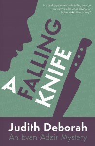 When I decided to self-publish A Falling Knife, one of the elements I looked forward to most was the design of the cover. I knew I wanted something beautiful and original, but also knew I had neither the graphic arts skill nor the technical ability to do it myself. I needed a designer.
I saw a recommendation for Andrew Brown of Design for Writers and got in touch. I liked not only his work, but also his professional demeanor — quick to respond, thoughtful, a good listener, but with real integrity about his own approach and ideas. I engaged him immediately, and he did both the cover of A Falling Knife and this website. I look forward to our working together on other projects.
When I went into the cover collaboration, I was possessed of a number of vague certainties. The book is set in the modern day, but its structure is that of a classical mystery. I wanted to find a visual way of communicating that duality — of expressing both elements somehow through shape, color, and font. Andrew knew what I was talking about when I said woolly things like that, and came up (amazingly quickly) with ideas that conveyed what I had intended but had been unable to express visually.
The color choices, for example, subtly evoke the era of the Golden Age mysteries in their heyday, but the striking modern font updates and balances them. (And isn't that just the most gorgeous font ever?) The greeny background suggests a blackboard (and indeed there are faint mathematical formulas written across it, visible only on close scrutiny). The knife suggests the genre, as does the face silhouette — an image that creates a question in the viewer's mind (always a good thing when the book's a mystery). Is that the detective? Is it the killer?
I could go on and on. Suffice it to say I couldn't be happier with the result. Enough with the introducing, though. Let's chat with Andrew directly. (The cover images you'll see below are examples of his work.)
What is your personal background?
I am married to the lovely Rebecca (you can follow her on Twitter @rebeccaebrown) and we have two lovely children: Daniel aged four and a half (he insists on mentioning that all important half!) and Emily, who will be two in April. I am based in the currently very cold and frosty north of England.
What is your academic/professional background?
Most of my career has been spent working in the third sector as a professional fundraiser for charities such as the Red Cross and Hospice care and most recently as Communications Manager for a very large church. My roles largely involved marketing, event management and of course design.
 How much experience do you have?
Designing is basically what I do. I can't remember not doing it and created my first magazine (all laid out and typeset by myself of course) as a one-man show when I was in Primary School. It is only in the past year that I was finally able to take the step I always planned – into self-employment as a designer.
Would you say you have a particular style as a designer?
Absolutely. My designs are generally very clean and fuss-free. I am not an illustrator but a layout designer and I work best with type, layout, colour and space. Space is often the most overlooked but for me perhaps the most important element of design – it is about what's going on where there is no content which really allows the content itself to breathe and speak. That all sounds very pompous, but it's true nonetheless. Great typography and excellent artwork can be ruined by a poor comprehension of space.
Did you always intend to design for writers? If not, what were your original intentions, and what led you toward designing for writers?
Two things first: I love books and I'm a frustrated writer myself. On that first point, I actually love the books themselves as much (if not more than) the content. I love being in a bookstore and holding a well designed book, looking at the cover and thinking through the process that the designer may have gone through. Design is often overlooked in books — and when it is at its best, apparent design will often disappear entirely anyway — but it's the most important thing for me. On the second point, I'd love to be a writer. In future I plan some non-fiction eBook guides of my own, but there's a story I'd love to write about a mining disaster in my home town over one hundred years ago. It always feels like something undone for me.
Importantly though, I don't only design for writers. Approximately half of my workload comes from the Design for Writers business, but I am currently developing my general design and print brand which should launch in the coming weeks offering web and print design.
What do you consider to be the most important visual elements of a book cover? Color scheme? Font? Image? Something else?
I'm going to cheat and say two things: space and a succinct message. The importance of both of these can often be difficult to communicate to clients, who are naturally very close to their manuscript and aware of a thousand tiny details. But if you overwhelm a cover design with detail — too many messages, words, inappropriately complex images, etc — then you are going to lose people. A good cover designer will take your brief and focus on a small number of very important aspects which need to be communicated to potential buyers. The ever-expanding eBook market only adds to the importance of these elements — people need to know in a second that your book sits in a genre that interests them and they need to be given confidence that they are not going to spend a considerable few hours reading something awful. If you have confidence in your manuscript therefore (which hopefully you do) please don't throw away all that work with a poor cover which is going to sow doubts in people's minds.
 What's your favorite part of the cover design process?
Without doubt it's the moment where the client has that "Yes!" moment; when they see a cover which captures those vital aspects of their book. There are still often tweaks to be made, but the sweet spot has been found and the client is happy. I love that feeling and it never fails to make me smile broadly.
What are the biggest challenges?
The biggest challenge is probably ensuring that a strong brief is obtained right at the beginning of the process. My process usually begins with a consultation in which I have certain questions I need answering so that I can be properly briefed going into the process. A bad brief only ever leads to misunderstandings and this will generally come to light when the client receives the proposed design and it is completely wrong for them. If this happens (and it has happened to me a few times) then the actual brief will usually become clear very quickly as people often find it easier to explain why they don't want something. But it is far easier (and less costly) to work together on a great brief from the outset. Everyone should read this blog post from Kindle publishing authority Steven Lewis — who I have worked with on numerous projects — about the importance of a great brief.
Walk us through a cover design, from the writer's initial contact through the finished product.
This is a tough one to distill into a paragraph, but my standard approach is to respond to an enquiry with some basic questions (timescale, genre, formats required, etc) so that I can quote as accurately as possible. When a client accepts a quote and the job is booked in, a thirty minute online consultation is arranged. The results of this will inform the brief and a suggested design draft will be created. On acceptance this will be tweaked (I usually offer three rounds of alterations to the design as standard) until it is ready to go at which point the client will sign off on the design, make payment and receive their final set of files.
How much do you guide the writer in designing the cover?
Hopefully a lot. I don't think people pay a designer to move pixels around as directed. You are paying for someone to guide and advise you to the correct cover and anything short of that I consider as short-changing the client. I will always offer advice at every stage and, if I disagree with a client's decision, I will make that clear. Ultimately of course the client has the final say, but they deserve to have all of the relevant information at hand when making a decision.
How are the interactions between you conducted?
All communications happen electronically, mainly by email. I have been trialling Basecamp for project management with some clients and it has been a big success. I'll be introducing this for all projects in the coming weeks and months. It simply means that there is a hub for all interaction between the client and the designer, where all communication is recorded. This makes access to information much easier and, particularly for the client, presents everything about their project in one space in a transparent way. We will also soon be launching a Knowledge Base and Support Desk (in the first quarter of the year) which will give even better support to clients at every step of the process.
If the writer has ideas you think are ill-advised, do you object?
Yes. I will give reasons every time, but as I said above I feel that a client deserves more than (and is paying for more than) someone who will simply lay out pixels on the page. Most clients are not designers and have sought out someone to do a professional job for them. I hope my clients trust me, and for me to deserve that trust I need them to know that I am being honest at every stage. Ultimately the client has to make the call, but it will always be with my honest thoughts available to them.
What has surprised you about cover design, and/or working with writers?
It pains me to say this, but the generally low standard of cover design (away from the mainstream writers, whose publishers rightly invest heavily in beautiful cover design) never fails to surprise me. Books are absolutely judged by their covers most of the time. Of course when someone has read a book, the judgement will generally be based on the text, but you need to make sure that people get that far by presenting them with a cover that doesn't make them run for the hills or (perhaps worse) yawn. The manuscript has been loved and worked on for months (often years), tears have often been spilled over individual chapters or sentences. Yet all too often you can look at a book and wonder whether the author forgot until the very last minute that a cover was even required at all. You know that you're going to be needing a cover, so please talk to your designer (whoever that may be) as early in the process as possible. If you fob your potential readers off with something half-hearted on the cover, why will they trust you with their time? Make them fall in love!
Do you believe in branding a writer's titles individually or creating a consistent look across covers?
I don't think there's a single answer to this one. It will vary on a case-to case basis as to what is right for a client. The answer will become obvious in the brief, however.
 Do you plan to branch out with other offerings for writers, or to branch out beyond books to something entirely new?
As I say I already offer design services for non-writing projects and that business will be fully branded and public soon. I will be spending most of the first quarter concentrating on that and on building ever stronger customer support offerings, which are more important than anything to me. Beyond that there are some other things up my sleeve…and that's where they're staying for the time being!
You also do website design for writers. How does that process work?
Website design is actually the main line of work. These projects are generally bigger and require far more planning simply because of all the various aspects which need to be pulled together for a site to launch and work as desired. Websites are the shop windows for most of the world's organizations and of course for writers these days. A well developed and designed site can work wonders almost as much as a really poor site can be disastrous for a brand.
What do you feel are your particular competitive advantages and professional strengths? Why should a writer choose you over another designer?
A very honest, personal service with great support. I aim to be there for the client and to offer my advice to them in spades. I hope you felt this way with my offerings as we worked together [Very much so! - JD] and I hope everyone does. I always work on support first, sales last and I never see that changing. In fact, Design for Writers is investing heavily this year on making all of this even better than it has been. Every design is loved and nurtured through the process.
January 17, 2012

January 14, 2012
Got a Kindle? A Falling Knife Is Free for One Day
 Gang, I'm experimenting with KDP Select — the Amazon program that allows self-publishers to put their Kindle titles on sale for free every once in a while. I'm trying this as well as several other marketing strategies and will report back. For all of January 14 (PST), A Falling Knife will be available for free download.
January 8, 2012
I Cannot Watch This Enough
Need some joy juice? Here is an incredibly talented little kid with a gift for the ukelele and some truly great facial expressions. This makes me smile every time I see it. Hope it does the same for you.
January 5, 2012
My Favorite Joke
 Two cows are standing around in a field, chatting.
First cow says, "You know, I'm really worried about this mad cow thing."
Second cow says, "I'm not."
First cow says, "Why not?"
Second cow says, "'Cause I'm a duck."
January 3, 2012
Live a Little. Use an Adverb Today.
Forgive me for going all Atticus Finch on you, but I'm getting just a little tired of writers who recoil in horror at the sight of an adverb. Somebody's got to step up with the case for the defense.
True, the adverb is not a part of speech to be tossed around with abandon. Like truffle oil, it should be deployed with caution. But it's become axiomatic that adverbs are inherently bad, that they define bad writing. That's some pretty boneheaded stuff right there.
 What's the beef against adverbs? Well, they're said to be responsible for overwriting, since they result in additional words on the page. (This is held to be awful by definition.) They're also supposed to be Delilahs to verbs. A solitary verb is a fine, strong, noble thing, but slap an adverb by its side and it morphs into a spindly, chinless, pasty wretch. Couldn't get your message across without an adverb, you sorry little part of speech? What's wrong with you?
In the case of the first, the cure is often worse than the disease; it can take many words to accomplish what a well-chosen adverb can do with one. In the case of the second, it is — as is true of so many of life's riskier endeavors — all in the execution.
Writing well isn't so much about adhering to rules as it is knowing what the options are, having a clear sense of the effect each option will have on the reader, and choosing accordingly. Adverbs not only modify verbs, often in clever and satisfying ways, but they affect the rhythm of sentences, and that is everything. They can flabbify a sentence, yes, but they can also add just that essential beat that makes a sentence sing. It's ridiculous to tell a writer learning the craft that he's allowed to use every arrow in his quiver except this one. That's not good advice; it's lazy teaching.
The ban-the-adverb trope is analogous to the eternally fraught question of the passive voice, another valid technique that gets no respect. Using the passive voice conceals the agency in a sentence, which might be exactly what a writer wants to do at a given moment. And like the adverb, the passive voice alters the rhythm in ways that might be desirable. In both instances, as long as the writer is using the tool consciously and for a good reason, pipe down and get out of the way.
Here are some examples of adverb-dotted sentences that are damn near perfect, if you ask me. Read and savor.
To my surprise, instead of clicking the tongue and waggling the head gravely to indicate that he saw the stickiness of the dilemma, he chuckled fatly, as if having spotted an amusing side to the thing which had escaped me. Having done this, he blessed his soul, which was his way of saying 'Gorblimey'.
- P.G. Wodehouse, Jeeves in the Offing
It was when curiosity about Gatsby was at its highest that the lights in his house failed to go on one Saturday night — and, as obscurely as it had begun, his career as Trimalchio was over. Only gradually did I become aware that the automobiles which turned expectantly into his drive stayed for just a minute and then drove sulkily away.
- F. Scott Fitzgerald, The Great Gatsby
When Thorne came back from his conference, the axe, which had been poised so delicately over the back of my neck, fell.
- Laurie Colwin, The Achieve of, the Mastery of the Thing (in The Lone Pilgrim)
It was this cloistral hush which gave our laughter its resonance, and carried it still, joyously, over the intervening clamour. Here, discordantly, in Eights Week, came a rabble of womankind.
- Evelyn Waugh, Brideshead Revisited
A Faulkner Story I Really Hope Is True
 I heard this story while studying Faulkner as an undergraduate. I've never seen any confirmation of it, but I've decided it's too delicious not to be true.
You already know that Faulkner was the author of towering works of fiction like Absalom, Absalom!, Light in August and The Sound and the Fury. You may not know that he also wrote for the movies. In the 1940s, he worked as a screenwriter in Hollywood for Howard Hawks, and had a hand in the scripts for The Big Sleep and To Have and Have Not.
One weekend, Faulkner was invited to spend the day out fishing with some Hollywood bigwigs, one of whom was Clark Gable. During the trip, conversation turned to literature. Gable asked Faulkner, "Who would you say are the best American writers living today?"
Faulkner considered for a moment, then said, "John Dos Passos, Ernest Hemingway, and myself."
"Oh!" Gable said. "You're a writer?"
"Yes," Faulkner said. "What do you do?"
Seven Beloved Things I Don't Get At All
I want to love whisky. It's a beautiful color. It has a long and storied history. It's a staple element of an extremely sexy male visual ensemble. It also smells and tastes like industrial-strength cough medicine. (Come on. You know it's true.)
2. Black, unsweetened coffee
God invented cream and sugar for a reason, people.
3. Celery
So devoid of taste it might as well be made of plaster of Paris. What little flavor there is is unpleasantly bitter. Nice crunch, but that's no more an argument for eating celery than it is for eating twigs. Give me a carrot any day.
4. Watching soccer
Men in knee socks zigzagging around a field in all directions for hours, resulting in a score like 1-0 or possibly no score at all. This is a sport?
5. Desserts that do not involve chocolate
Pies are nice, compotes are nice, but if you want something that tastes like fruit, eat fruit. You want dessert, eat chocolate.
6. Scooby-Doo
On the shortlist of all-time most unbearable kids' programming (right behind Bob the Builder, which is in a class by itself). I would rather memorize actuarial tables than watch Scooby-Doo.
7. Tiny, yappy dogs
Twee little dogs that bark a commanding, respectable bark are fine. Twee little dogs that bark a piercing, kvetching yap are not. (Although if they are yapping to protest having been forced to wear a sweater, I support them in their cause.)
A Falling Knife Now Available
I'm pleased to announce that my mystery novel, A Falling Knife, is now available for purchase on Amazon in paperback and as an ebook for the Kindle. The print edition is also available from Barnes & Noble.
 (That was a bit decorous. What I'm actually feeling right now is HALLELUJAH! CRACK OPEN THE CHAMPAGNE! BREAK OUT THE CHOCOLATE TRUFFLES! CRANK UP THE MUSIC! THE BOOK IS OUT!)
If you'd like more information about A Falling Knife, including background on how I came to write it, please have a look at the Book page on this site.
A Falling Knife had a four-year gestation, and I'm experiencing a combination of incredible relief and hopeful trepidation not unlike that which accompanies childbirth. The predominant emotion is pure delight, and I'm happier than I can say to be able to share it with you. Thank you for giving A Falling Knife a look — and please visit here often.