Tosh McIntosh's Blog, page 3
December 8, 2017
Tosh’s Book Cover Gallery Update 2
If the title of this page is black, and/or you see the fighter-pilot header, click on the title to view the featured-image header.
At the end of a previous post subtitled as “Tosh’s Book Cover Gallery,” I noted the titles of three novels currently in work with my interior and cover designs. In Update 1 to the Gallery, I shared 3D versions of the front and back covers of the print edition for one of the three, and another of those novels has just been published in digital format on preorder with Amazon. Availability of the print edition will be timed to coincide with launch of the eBook when is is automatically delivered to preorder customers.
I’ve had the privilege of participating in the Novel-In-Progress—Austin writers’ group with Lara Reznik for over a decade, and her latest novel titled Bagels & Salsa is the third interior I’ve designed for her, but it’s the fourth cover, because Lara published her debut novel the girl from Long Guyland with two different covers. That’s a story worthy of its own post.
Here are 3D versions of the front and back covers of the paperback edition of:
Bagels & Salsa by Lara Reznik


November 22, 2017
Tosh’s Book Cover Gallery Update 1
If the title of this page is black, and/or you see the fighter-pilot header, click on the title to view the featured-image header.
At the end of a previous post subtitled as “Tosh’s Book Cover Gallery,” I noted the titles of three novels currently in work with my interior and cover designs. One of those is within a few days of publication on Amazon in paperback and digital formats.
I’ve had the privilege of participating in the Novel-In-Progress—Austin writers’ group with Sharon Scarborough since 2005, and we have supported each other through multiple revisions on multiple manuscripts. When Sharon asked me to assist with production of her debut novel, I gladly agreed, and we’ve been dealing with all the individual tasks required since late July of this year. Sharon moved from Austin to Murray, KY before we got very far into production, so most of our collaboration has been handled through emails and Skype sessions. I hate to think of how much more labor intensive it would have been using a telephone and snail mail.
But we made it, and I’ve often said that holding in my hands for the first time the print edition of someone else’s novel that I’ve helped produce is almost as thrilling as if the book were mine. The explanation, of course, might well be that in a sense, it is.
Here are 3D versions of the front and back covers of the paperback edition of:
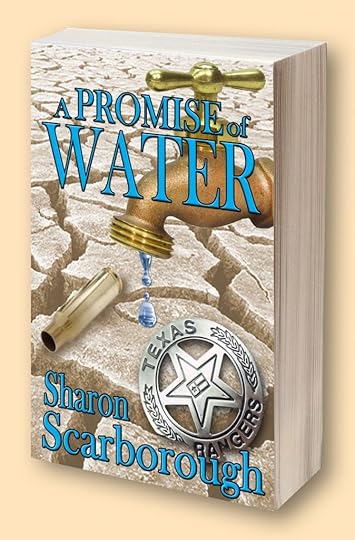
A PROMISE OF WATER by Sharon Scarborough

Tosh’s Book Cover Gallery Version 2
If the title of this page is black, and/or you see the fighter-pilot header, click on the title to view the featured-image header.
At the end of the previous post subtitled as “Tosh’s Book Cover Gallery Version 1,” I noted the titles of four novels currently in work with my interior and cover designs. One of those is within a few days of publication on Amazon in paperback and digital formats.
I’ve had the privilege of participating in the Novel-In-Progress—Austin writers’ group with Sharon Scarborough since 2005, and we have supported each other through multiple revisions on multiple manuscripts. When Sharon asked me to assist with production of her debut novel, I gladly agreed, and we’ve been dealing with all the individual tasks required since late July of this year. Sharon moved from Austin to Murray, KY before we got very far into production, so most of our collaboration has been handled through emails and Skype sessions. I hate to think of how much more labor intensive it would have been using a telephone and snail mail.
But we made it, and I’ve often said that holding in my hands for the first time the print edition of someone else’s novel that I’ve helped produce is almost as thrilling as if the book were mine. The explanation, of course, might well be that in a sense, it is.
Here are 3D versions of the front and back covers of the paperback edition of:
A PROMISE OF WATER by Sharon Scarborough
August 3, 2017
Tosh’s Bookmark Gallery
If the title of this post is black and/or you see the fighter-pilot header, click on the title to view the featured-image header.
I published my debut novel Pilot Error in 2011 and had Red Line in work when a group of us indie authors attended the 2012 Texas Book Festival and displayed our books in a booth, hoping (in vain) to sell out before the two-day event closed down.
Having customized bookmarkers to place in each book after signing it seemed like a good marketing tool, so I downloaded a 2″ x 6″ template and designed a two-sided bookmark with the covers of both novels and the first books of my two non-fiction series on aviating and writing.
One of my fellow writers and friends had bookmarks made for the event. She recently asked if I would redo them, which led to designing a bookmark two days ago for another writer and friend who is in the process of launching her debut novel.
And so, dear website visitors, the purpose of this post is to share with you the following bookmark designs, and I’ll add new designs to the post as necessary.
Without further adieu, here they are, and for this update, we begin with the newest addition to the gallery:
For A Promise of Water by Sharon Scarborough

My first bookmark (side #1)

My first bookmark (side #2)

For the girl from Long G uyland by Lara Reznik

For The M&M Boys by Lara Reznik
 For Compromise with Sin
by Leanna Englert
For Compromise with Sin
by Leanna Englert

Special Note: I’d love to claim cover-design credit for Leanna’s novel, but the kudos go to Kristin Bryant of 99designs. My contribution involved resizing the original paperback cover to accommodate the spine width required by the final page count, adding the jacket blurb on the back cover (with a really nice drop cap embellishment), including an excerpt from a Readers’ Choice Five-Star review, and inserting an author photo.
Standby for the next addition to Tosh’s Bookmark Gallery . . .
Tosh’s Bookmark Gallery Version 2
If the title of this post is black and/or you see the fighter-pilot header, click on the title to view the featured-image header.
I published my debut novel Pilot Error in 2011 and had Red Line in work when a group of us indie authors attended the 2012 Texas Book Festival and displayed our books in a booth, hoping (in vain) to sell out before the two-day event closed down.
Having customized bookmarkers to place in each book after signing it seemed like a good marketing tool, so I downloaded a 2″ x 6″ template and designed a two-sided bookmark with the covers of both novels and the first books of my two non-fiction series on aviating and writing.
One of my fellow writers and friends had bookmarks made for the event. She recently asked if I would redo them, which led to designing a bookmark two days ago for another writer and friend who is in the process of launching her debut novel.
And so, dear website visitors, the purpose of this post is to share with you the following bookmark designs, and I’ll add new designs to the post as necessary.
Without further adieu, here they are, and for this update, we begin with the newest addition to the gallery:
For A Promise of Water by Sharon Scarborough
My first bookmark (side #1)
My first bookmark (side #2)
For the girl from Long G uyland by Lara Reznik
For The M&M Boys by Lara Reznik
For Compromise with Sin
by Leanna Englert
Special Note: I’d love to claim cover-design credit for Leanna’s novel, but the kudos go to Kristin Bryant of 99designs. My contribution involved resizing the original paperback cover to accommodate the spine width required by the final page count, adding the jacket blurb on the back cover (with a really nice drop cap embellishment), including an excerpt from a Readers’ Choice Five-Star review, and inserting an author photo.
Standby for the next addition to Tosh’s Bookmark Gallery . . .
Tosh’s Bookmark Gallery Version 1
If the title of this post is black and/or you see the fighter-pilot header, click on the title to view the featured-image header.
I published my debut novel Pilot Error in 2011 and had Red Line in work when a group of us indie authors attended the 2012 Texas Book Festival and displayed our books in a booth, hoping (in vain) to sell out before the two-day event closed down.
Having customized bookmarks to place in each book after signing it seemed like a good marketing tool, so I downloaded a 2″ x 6″ template and designed a two-sided bookmark with the covers of both novels and the first books of my two non-fiction series on aviating and writing.
One of my fellow writers and friends had bookmarks made for the event. She recently asked if I would redo them, which led to designing a bookmark two days ago for another writer and friend who is in the process of launching her debut novel.
And so, dear website visitors, the purpose of this post is to share with you the following bookmark designs, and I’ll add new designs to the post as necessary.
Without further adieu, here they are:
My first bookmark (side #1)
My first bookmark (side #2)
For the girl from long guyland by Lara Reznik
For The M&M Boys by Lara Reznik
For Compromise with Sin by Leanna Englert

Special Note: I’d love to claim cover-design credit for Leanna’s novel, but the kudos go to Kristin Bryant of 99designs. My contribution involved resizing the original paperback cover to accommodate the spine width required by the final page count, adding the jacket blurb on the back cover (with a really nice drop cap embellishment), including an excerpt from a Readers’ Choice Five-Star review, and inserting an author photo.
Standby for the next addition to Tosh’s Bookmark Gallery . . .
May 3, 2017
It’s Been Over a Year? (also known as Tosh’s Book Cover Gallery)
If the title of this page is black, and/or you see the fighter-pilot header, click on the title to view the featured-image header.
I received a comment recently noting that nothing had been added to this website in over a year and asking where I was. I hate to admit it, but I had no idea it had been that long. Reasons abound, all of which can be summarized with the simple fact that there’s never enough time in the day to focus my intention on everything I’ve committed to doing. This post, therefore, will serve to illustrate only one of the reasons why these pages have been sitting idle for so long.
As always, I can’t resist the compelling urge to begin with backstory, which in this particular case rewinds to the spring of 2011 and my decision to abandon all attempts to get an agent and legacy-publish my debut novel Pilot Error. Being frugal by nature, and with more time on my hands than spare cash, I decided not to pay someone to perform all the tasks necessary to indie-publish my books.
For the next six months, I immersed myself in the maze of details about book production, and through a lot more error than trial I created the covers and formatted the interiors for eBook and print editions of the novel. Following that, I did the same for two short non-fiction books, both intended to be the initial entries in a series.
But in a moment that can be described by the proverbial “Something happened on the way to . . .,” I discovered an intense interest in the concept described by Dean Wesley Smith in offering advice to indie authors, that you have to Think Like a Publisher. And while I intended to do it all, learning about marketing and promotion remains an elusive goal as I’ve become more involved in book production. Along with the second novel in the Pilot Error series, I’ve designed the covers and formatted the interiors for five novels and currently have four others in various stages of production.
Cover design sits at the top of the production task list primarily because it’s the single most important factor in a three-step sequence leading to a reader buying a book. As the saying goes, you can’t tell a book by its cover, but you will have a hard time attracting potential buyers if you don’t have a good one.
As author/blogger Barry Eisler describes in his two-part posting on book packaging, title and cover design have to work together to grab a shopper’s attention. He uses an example from his own stable of books by pointing out how poorly his US publisher (at the time) accomplished that with his debut novel compared to the Japanese edition. The comparison is stunning.
In a brick-and-mortar or online bookstore, covers are like billboards. They have to create a “call to action” moment in the viewer, which in this case means, Read the back cover copy/description. If those relatively few words do their job, reading the first page or two of the novel has the opportunity to seal the deal with a sale.
I make no claim to being a professionally trained graphic designer, and I’m more than positive that anyone who is can find fault with the covers I’ve done. But with all due respect, to do its only job, a cover doesn’t have to impress someone with detailed knowledge of the principles of graphic design.
Would I be proud to receive kudos from a professional? Of course. But in the final analysis, it matters not so long as my covers don’t stand in the way of a potential book buyer reaching out with the thought, “What’s this book about?”
But you can judge for yourself as to the effectiveness of my amateur efforts by taking a look at the following examples:
My First Cover

My Second Cover

My Third Cover

My Fourth Cover

The first version of the girl from Long Guyland by Lara Reznik

The second version of the girl from Long Guyland

The M&M Boys by Lara Reznik

Hijacked Hitman by Ron Robertson

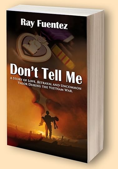
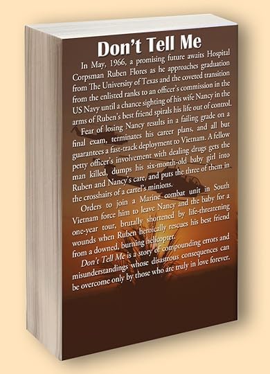
Note: The original cover for the eBook edition of Don’t Tell Me was designed by a friend of the author’s daughter. I had to make some changes to it and incorporate the new version into a wraparound cover for the paperback edition. Both front and back covers are shown below.
Don’t Tell Me by Ray Fuentez
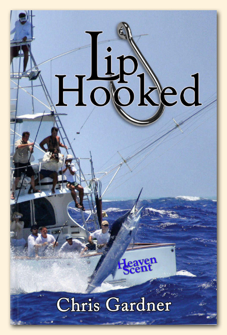
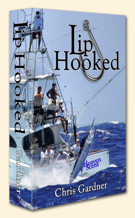
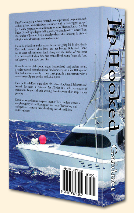
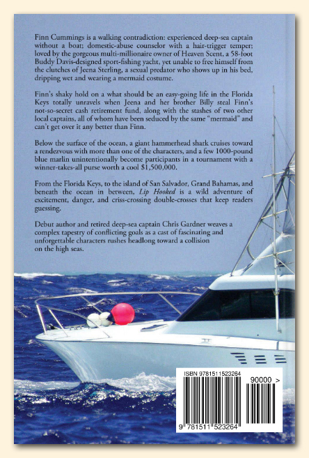
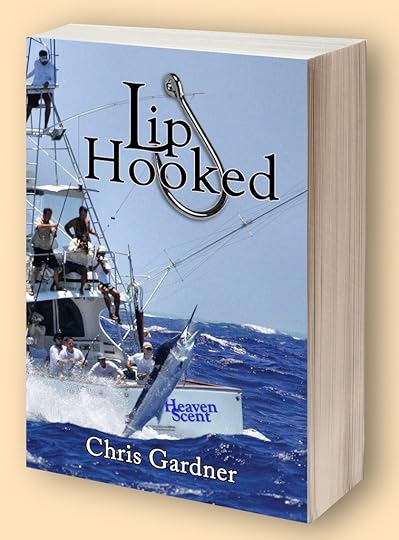
Lip Hooked by Chris Gardner (RIP)
Note: The original cover for the eBook edition of Raptor was designed by Carol Terry. The author provided me with a JPG version, which I used to rebuild the front cover in Photoshop and design the wraparound cover for the paperback edition. Both front and back covers are shown below.
Raptor by B.A. Bostick


Compromise with Sin by Leanna Englert
Special Note: I’d love to claim cover-design credit for Leanna’s novel, but the kudos go to Kristin Bryant of 99designs. My contribution involved resizing the original paperback cover to accommodate the spine width required by the final page count, adding the jacket blurb on the back cover (with a really nice drop cap embellishment), including an excerpt from a Readers’ Choice Five-Star review, and inserting an author photo. Both front and back covers are shown below.


Standby for publication of the following novels with my cover and interior designs:
Bagels and Salsa by Lara Reznik
Geronimo’s Bones by Darrell Bryant
A Promise of Water by Sharon Scarborough
None of the above excuses my prolonged absence from this website. It only provides one of the reasons, and thanks to a comment by a visitor named Mamie, I hope to redirect my attention to an effort too long ignored.
It’s Been Over a Year?
I received a comment recently noting that nothing had been added to this website in over a year and asking where I was. I hate to admit it, but I had no idea it had been that long. Reasons abound, all of which can be summarized with the simple fact that there’s never enough time in the day to focus my intention on everything I’ve committed to doing. This post, therefore, will serve to illustrate only one of the reasons why these pages have been sitting idle for so long.
As always, I can’t resist the compelling urge to begin with backstory, which in this particular case rewinds to the spring of 2011 and my decision to abandon all attempts to get an agent and legacy-publish my debut novel Pilot Error. Being frugal by nature, and with more time on my hands than spare cash, I decided not to pay someone to perform all the tasks necessary to indie-publish my books.
For the next six months, I immersed myself in the maze of details about book production, and through a lot more error than trial I created the covers and formatted the interiors for eBook and print editions of the novel. Following that, I did the same for two short non-fiction books, both intended to be the initial entries in a series.
But in a moment that can be described by the proverbial “Something happened on the way to . . .,” I discovered an intense interest in the concept described by Dean Wesley Smith in offering advice to indie authors, that you have to Think Like a Publisher. And while I intended to do it all, learning about marketing and promotion remains an elusive goal as I’ve become more involved in book production. Along with the second novel in the Pilot Error series, I’ve designed the covers and formatted the interiors for five novels and currently have four others in various stages of production.
Cover design sits at the top of the production task list primarily because it’s the single most important factor in a three-step sequence leading to a reader buying a book. As the saying goes, you can’t tell a book by its cover, but you will have a hard time attracting potential buyers if you don’t have a good one.
As author/blogger Barry Eisler describes in his two-part posting on book packaging, title and cover design have to work together to grab a shopper’s attention. He uses an example from his own stable of books by pointing out how poorly his US publisher (at the time) accomplished that with his debut novel compared to the Japanese edition. The comparison is stunning.
In a brick-and-mortar or online bookstore, covers are like billboards. They have to create a “call to action” moment in the viewer, which in this case means, Read the back cover copy/description. If those relatively few words do their job, reading the first page or two of the novel has the opportunity to seal the deal with a sale.
I make no claim to being a professionally trained graphic designer, and I’m more than positive that anyone who is can find fault with the covers I’ve done. But with all due respect, to do its only job, a cover doesn’t have to impress someone with detailed knowledge of the principles of graphic design.
Would I be proud to receive kudos from a professional? Of course. But in the final analysis, it matters not so long as my covers don’t stand in the way of a potential book buyer reaching out with the thought, “What’s this book about?”
But you can judge for yourself as to the effectiveness of my amateur efforts by taking a look at the following examples:
Note: The original cover for the eBook edition of Don’t Tell Me was designed by a friend of the author’s daughter. I had to make some changes to it and incorporate the new version into a wraparound cover for the paperback edition. Both front and back covers are shown below.
The first version of the girl from Long Guyland by Lara Reznik
The second version of the girl from Long Guyland
The M&M Boys by Lara Reznik
Hijacked Hitman by Ron Robertson
Don’t Tell Me by Ray Fuentez (front)
Don’t Tell Me by Ray Fuentez (rear)
Lip Hooked by Chris Gardner (RIP)
Standby for publication of the following novels with my cover and interior designs:
Compromise with Sin by Leanna Englert
Bagels and Salsa by Lara Reznik
Geronimo’s Bones by Darrell Bryant
A Promise of Water by Sharon Scarborough
None of the above excuses my prolonged absence from this website. It only provides one of the reasons, and thanks to a comment by a visitor named Mamie, I hope to redirect my attention to an effort too long ignored.
April 27, 2016
America’s Most Honored WWII Flight
If the title of this post is black or it displays the fighter-pilot header, click on the title to view the featured-image header.
My friend and fellow pilot “Mugs” Morgan frequently forwards emails that address topics of interest to our mutual pasts as military aviators and combat veterans. This one is worth passing on in the form of a post in the “Visitor Stories” Logbook, which I’ve modified from its original purpose to include stories written by others who have never visited my website and never will. I especially like doing this to honor those of the greatest generation who stood up to be counted as warriors in the battle against the abomination of the Axis Powers. This one more than qualifies.
Doesn’t look like much, does it? But, depending upon your definition, this photograph, a team effort by 9 men, is the most honored picture in U. S. History. If you want to find out about it, read on. It’s an interesting tale about how people sometimes rise beyond all expectations. It takes place in the early days of World War II, in the South Pacific, and if you’re a World War II history buff, you may already know about it. [I am, and I didn’t.]
THE SCREWED-UP PILOT
First, let’s get this out of the way. Jay Zeamer wasn’t a photographer by trade. He was mostly a wanna-be pilot. He looked good on paper, having graduated with a degree in civil engineering from MIT, joining the Army Air Corps, and receiving his wings in March, 1941. He was a B-26 bomber co-pilot when World War II started.
His classmates all rapidly became lead pilots and squadron leaders, but not Jay. He couldn’t pass the pilot check tests despite trying numerous times. He was a good pilot, but just couldn’t seem to land the B-26. Landing, from what I’ve read, was considered one of the more important qualifications for a pilot. Stuck as a co-pilot while his classmates and then those from the classes behind him were promoted, he got bored and lost all motivation.
Things came to a head when co-pilot Zeamer fell asleep while his plane was in flight. Not just in flight, but in flight through heavy anti-aircraft fire during a bombing run. He only woke when the pilot beat him on the chest because he needed help.
His squadron commander had him transferred to a B-17 squadron in Port Moresby, Papua New Guinea where he was allowed to fly as a fill-in navigator and occasionally as a co-pilot. He was well liked and popular — on the ground. But no one wanted to fly with him.
Zeamer finally managed to get into the pilot’s seat by volunteering for a photo reconnaissance mission when the scheduled pilot became ill. The mission, an extremely dangerous one over the Japanese stronghold at Rabual, won Zeamer a Silver Star – despite the fact that he still hadn’t qualified to pilot a B-17.
THE EAGER BEAVERS
Zeamer become the Operations Officer (a ground position) at the 43rd Air Group. Despite his lack of qualification, he still managed to fly as a B-17 fill-in pilot fairly often. He had discovered and found that he loved to fly B-17s on photo reconnaissance missions, and he wanted to do it full-time. There were only three things standing in his way: he didn’t have a crew, he didn’t have an airplane, and oh, yeah, he still wasn’t a qualified pilot.
He solved the first problem by gravitating to every misfit and ne’er-do-well in the 43rd Air Group. As another pilot, Walt Krell, recalled, “He recruited a crew of renegades and screw offs. They were the worst — men nobody else wanted. But they gravitated toward one another and made a hell of a team.”
The plane came later. An old, beat-up B-17, serial number 41-2666, that had seen better days was flown into their field to be scavenged for spare parts. Captain Zeamer had other ideas. He and his crew decided to rebuild the plane in their spare time since they weren’t going to get to fly any other way. Exactly how they managed to accomplish their task is the subject of some debate. Remember, there were so few spare parts available that their ‘plane’ was actually brought in originally to be a parts donor.
But rebuild it they did. Once it was in flying shape the base commander congratulated them and said he’d find a new crew to fly it. Not surprisingly, Zeamer and his crew took exception to this idea, and according to Walt Krell the crew slept in their airplane, having loudly announced that the 50 caliber machine guns were kept loaded in case anyone came around to ‘borrow’ it. There was a severe shortage of planes, so the base commander ignored the mutiny and let the crew fly – but generally expected them to take on missions that no one else wanted.
The misfit crew thrived on it. They hung around the base operations center, volunteering for every mission no one else wanted. That earned them the nickname The Eager Beavers, and their patched up B-17 was called Old 666.
 Once they started flying their plane on difficult photo reconnaissance missions, they made some modifications. Even among the men of a combat air station, the Eager Beavers became known as gun nuts. They replaced all of the light 30 caliber machine guns in the plane with heavier 50 caliber weapons. Then the 50 caliber machine guns were replaced with double 50 caliber guns. Zeamer had another pair of machine guns mounted to the front of the plane so he could remotely fire them like a fighter pilot. And the crew kept extra machine guns stored in the plane, just in case one of their other guns jammed or malfunctioned.
As odd as all this sounds, the South Pacific theatre in the early days of World War II was a chaotic area scattered over thousands of miles with very little equipment. Having a plane with an apparently nutty crew who volunteered for every awful mission not surprisingly made the commanding officers look the other way.
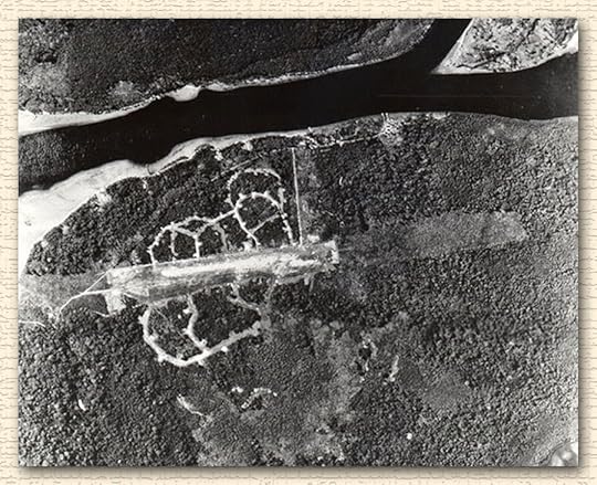
BUKA
In June, 1943, the U. S. had secured Guadalcanal in the southern Solomon Islands. They knew the Japanese had a huge base at Rabual, but were certain there were other airfields being built in the Northern Solomon Islands. They asked for a volunteer crew to take photographs of Bougainville Island to plan for an eventual invasion, and of Buka airfield on the north side of the island to assess for increased activity there. It was considered a near-suicide mission — flying hundreds of miles over enemy airspace in a single, slow bomber. Not to mention photo reconnaissance meant staying in level flight and taking no evasive action even if they were attacked.
 Credit: World Factbook
The only crew that volunteered, of course, was Jay Zeamer and the Eager Beavers. One of the crew, bombardier Joseph Sarnovski, had absolutely no reason to volunteer. He’d already been in combat for 18 months and was scheduled to go home in 3 days. Being a photo mission, there was no need for a bombardier. But if his friends were going, he wanted to go, and one of the bombardier’s battle stations was to man the forward machine guns. They might need him, so he went.
They suspected the airstrip at Buka had been expanded and reinforced, but weren’t sure until they got close. As soon as the airfield came in sight, they saw numerous fighters taking off and heading their way. The logical thing to do would have been to turn right and head for home. They would be able to tell the intelligence officers about the increased number of planes at Buka even if they didn’t get photos.
But Zeamer and photographer William Kendrick knew that photos would be invaluable for subsequent planes attacking the base, and for Marines who were planning to invade the island later. Zeamer held the plane level (tilting the wings even one degree at that altitude could put the photograph half a mile off target) and Kendrick took his photos, which gave plenty of time for over 20 enemy fighters to get up to the altitude Old 666 was flying at.
The fighter group, commanded by Chief Petty Officer Yoshio Ooki, was experienced and professional. They carefully set up their attack, forming a semi-circle all around the B-17 and then attacking from all directions at once. Ooki didn’t know about the extra weapons the Eager Beavers had mounted to their plane, but it wouldn’t matter if he had; there was no way for a single B-17 to survive those odds.
During the first fighter pass the plane was hit by hundreds of machine gun bullets and cannon shells. Five crewman of the B-17 were wounded and the plane badly damaged. All of the wounded men stayed at their stations and were still firing when the fighters came in for a second pass, which caused just as much damage as the first pass. Hydraulic cables were cut, holes the size of footballs appeared in the wings, and the front plexiglass canopy of the plane was shattered.
Zeamer was wounded during the second fighter pass, but kept the plane flying level and took no evasive action until Kendrick called over the intercom that the photography was completed. Only then did he begin to move the plane from side-to-side allowing his gunners better shots, just as the fighters came in for a third wave of attacks. The third pass blew out the oxygen system of the plane, which was flying at 28,000 feet. Despite the obvious structural damage Zeamer put the plane in an emergency dive to get down to a level where there was enough oxygen for the men to survive.
During the dive, a 20mm cannon shell exploded in the navigator’s compartment. Sarnoski, who was already wounded, was blown out of his compartment and beneath the cockpit. Another crewman reached him and saw there was a huge wound in his side. Despite his obviously mortal wound, Sarnoski said, “Don’t worry about me, I’m all right” and crawled back to his gun which was now exposed to 300 mile an hour winds since the plexiglass front of the plane was now gone. He shot down one more fighter before he died a minute or two later.
The battle continued for over 40 minutes. The Eager Beavers shot down several fighters and heavily damaged several others. The B-17 was so heavily damaged, however, that they didn’t expect to make the several hundred miles long flight back home. Sarnoski had already died from his wounds. Zeamer had continued piloting the plane despite multiple wounds. Five other men were seriously wounded.
Flight Officer Ooki’s squadron returned to Buka out of ammunition and fuel. They understandably reported the B-17 was destroyed and about to crash in the ocean when they last saw it.
The B-17 didn’t quite crash, though. Zeamer had lost consciousness from loss of blood, but regained it when he was removed from the pilot seat and lay on the floor of the plane. The copilot, Lt. Britton, was the most qualified to care for the wounded and was needed in the back of the plane. One of the gunners, Sergeant Able, had liked to sit in the cockpit behind the pilots and watch them fly. That made him the most qualified of the crewman, so he flew the plane with Zeamer advising him from the floor while Britton cared for the wounded.
The plane made it back to base. (Britton did return to the cockpit for the landing.) After the landing, the medical triage team had Zeamer removed from the plane last, because they considered his wounds mortal. Amazingly, the one thing on the plane not damaged were the cameras and the photos in them were considered invaluable in planning the invasion of Bougainville.
EPILOGUE
All of the wounded men recovered, although it was a close thing for Captain Zeamer. In fact, a death notification was sent to his parents somewhat prematurely. He spent the next year in hospitals recovering from his wounds, but lived a long and happy life, passing away at age 88.
Both Zeamer and Sarnovski were awarded the Congressional Medal of Honor for the mission, the only time in World War II that two men from one plane ever received America’s highest medal for valor in combat. The other members of the crew were awarded the Distinguished Service Cross, second only to the Medal of Honor as an award for bravery.
So, somewhat surprisingly, the most decorated combat flight in U. S. history didn’t take place in a major battle. It was a photo reconnaissance: The flight of ‘Old 666’ in June of 1943.
“Competition is a by-product of productive work, not its goal. A creative man is motivated by the desire to achieve, not by the desire to beat others.” — Ayn Rand
“There are men running the government who shouldn’t be playing with matches.” — Will Rogers
“When an old man dies, a library burns to the ground.” — unknown
October 13, 2015
The Novel Lip Hooked — Endgame
If the title of this post is black or you are viewing the fighter-pilot header, click on the title to view the featured-image header and continue reading.
This post is the first in a series devoted to documenting my personal experience with a project begun in August, 2014 and nearing the endgame in mid-October, 2015.
I’ve elected to introduce the series with what might be described as the Epilogue for a number of reasons, not the least of which is that to tell the whole story now would require more time than I have at the moment, and even if I did, it might be too soon in terms of obtaining some distance and perspective on the months of effort required to reach this point.
On November 6, 2015, which would be Chris Gardner’s 70th birthday had he not lost a long and courageous battle with cancer in the early morning hours of April 24, 2015, a book launch event is scheduled in Florida for his novel Lip Hooked.
I am truly honored to have participated in the extraordinary efforts of a number of people to place a copy of Chris’s novel in his hands the week before he passed, and soon to finally publish it as an eBook and paperback.
If you’d like to get a preview of this remarkable action/adventure debut novel, stop by Booth #506 at the Texas Book Festival, where my friend, fellow writer, and small publisher Lara Reznik will be more than happy to take your pre-order.
![]()
For this introduction I offer the following screenshots of the 3-D presentation of the Lip Hooked paperback cover: