Marcu Taylor's Blog, page 9
August 19, 2019
11 Secrets of Designing Emails That Convert (with Examples)
According to data from HubSpot, 99% of consumers check their email every day while 80% of business professionals believe email marketing increases customer retention.
This shouldn’t come as a surprise.
Email is one of the only channels that gives you a direct line to leads and customers individually. Crucially, it’s also the only channel, aside from your website, that you own 100%, meaning you’re not at the mercy of third-party tech giants.
Impressive stats and benefits aside, though, you can’t unlock the magic of this marketing channel unless you’re able to design emails that get results. So, in this article, we’re looking at 11 secrets of designing emails that convert.
What makes a great email design?
Before we get into the secrets that make high-converting emails, let’s take a moment to clarify what a great email looks like. There are a number of key aspects you need to focus on throughout the design process; the factors that decide whether a user is going to read your emails and buy into your message.
Here they are.
Compelling messages
As with most types of content, it’s not so much the visual design that people buy into but the message it delivers. From the subject lines in your email to the header text they see in message previews and the main content in the body of your emails, this is the most important factor in everything you send out.

Weak messaging will get every campaign off to a false start – so this is going to be a key area of focus for us in this article.
There are visual and informational design factors to consider in this, too: information architecture, layout, text size, font styles and the use of images. We’ll be looking at all of these elements, too.
Strong layouts
A good email layout helps people navigate, read, digest and remember your messages more effectively. You can also create layouts to direct the user’s eye to key elements of the page and make sure the most important parts of your message stand out.
Contrast and whitespace are crucially important when it comes to designing and weighting layouts so we’ll be having a good look at these two design factors in this article.
High-converting CTAs
While it’s the main messaging in your emails that have to do the majority of convincing, when it comes down to taking action, it’s your CTAs that need to step up and seal the deal.
This is one of the most talked-about subjects in every post about lead gen marketing strategies so I’m not going to repeat what’s already been said. I’ll quickly list the key essentials in some bullet points and then add some insights you don’t often hear elsewhere.
Deliverability
It doesn’t matter how great your email designs are if people never get to see them. You have fake email addresses, spam filters, unsubscribers and all kinds of hurdles potentially getting in the way of your emails reaching their intended destination.
Poor deliverability rates mean poor email marketing results so we’ll be talking about how to maximise deliverability throughout this article as well.
The right design and email marketing tools
To run a mature email marketing strategy that guides each target audience along the customer journey, you need the right mix of tools. First off, you need a solid set of email templates and design tools to build your fleet of campaigns. Then, you want the right piece of email marketing software to manage those campaigns and minimise the manual workload.

You also want to think about web forms because these are what sign people up to your email lists and, ultimately, convert leads after they click your CTA buttons. Finally, you’ll need to A/B test email variations to help maximise performance and we’ll be looking at these kinds of tools throughout this article.
That gives you a good idea of what we’ll be covering in this article and, by the time you’ve finished reading, you’ll have everything you need to design high-performing email campaigns.
So now let’s delve into our 11 secrets of designing emails that convert.
#1: Get the right email builder/templates
Before you can start creating emails, you need to the design tools and there are two key things you want: email templates and a solid email builder. Templates give you a starting point to work with and its really the layouts you want to be looking out for when you browse templates.
What I will say is, you should create the content for your emails before you choose any templates because you don’t want to be squeezing text into boxes. Layouts should enhance your messages, not compress the life out of them.

More important than templates is having a good email builder on your side. This allows you to create layouts and emails from scratch, create your own templates and fully customise everything in your designs.
You don’t need coding any coding skills to create emails in this day and age. There are plenty of drag-and-drop email builders that allow you to put just about any design together in minimal time.
Here at Venture Harbour, we use ActiveCampaign which comes with an excellent email builder (above) packed into a wider piece of email marketing software. I can safely say this is one of the best email builders on the market right now but there are plenty of other great options. It was other features that secured ActiveCampaign as our primary email marketing platform and I’ll explain more about these later.
Note: Deliverability is really important when you’re choosing any email marketing software. Make sure you go with reputable names that will be trusted by ISPs, otherwise your emails could get snagged in spam folders.
#2: Design for segmented campaigns
The whole point of email marketing is to establish that personalised channel with users on an individual basis.
You’re letting this go to waste if you send generic emails to everyone on your list.
Great email campaigns target the individual needs/expectations of each recipient and this is why segmentation is so important.
Segmented campaigns allow you to send highly relevant messages to recipients based on their data and previous actions.

Source: Adidas, Campaign Monitor
Why is this important for email design?
Because you need to get into the mindset of designing emails for segmented campaigns. More than anything, this means you need to pinpoint the unique needs of individual audiences and create highly-focused messages that entice them to take action.
Generic emails are not invited to the party.
Once again, you’re going to need the right tools to manage segmented email campaigns.

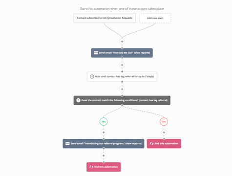
We use Leadformly to segment email signups as they fill out our forms and we send this data to ActiveCampaign, which places them on our segmented lists.
ActiveCampaign takes the lead from here, automatically sending out emails to users on each list and it moves them onto other lists, based on how they interact with our emails and website.
This allows us to target users with highly-targeted messages at every stage of our sale funnel and guide them towards the next conversion.
#3: Start with your subject lines
As mentioned earlier, a good email has a focused message and segmenting campaigns give you the ability to really hone in on specific user interests/needs – so make the most of it.
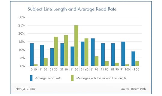
A study from Return Path suggests email subject lines between 61-70 characters long are most effective.
To make sure the messaging in your emails is focused enough, I recommend you start with your subject line. You don’t need to come up with the perfect subject line right now but getting a concise message into 61-70 characters is really going to force you to narrow down on your key selling point.
Next, start working on your preheader text – this is what shows in message previews in inboxes and notifications. Again, you don’t need to get the perfect preheader text right away (you can rework this later) but it’s a good exercise for clarifying the key message you want to get across.
#4: Clean, responsive email layouts
With your email content sorted, it’s time to think about layouts. The goal here is to present your content in the most compelling way. Geneally speaking, you want to stick to single column layouts and stack divs on top of each other with centre-aligned text.

Source: Charity Water
Visually, your emails are going to look a lot like landing pages with a hero section and your content divided into vertically stacked divs.
This means your emails will pretty much look the same on mobile and desktop.

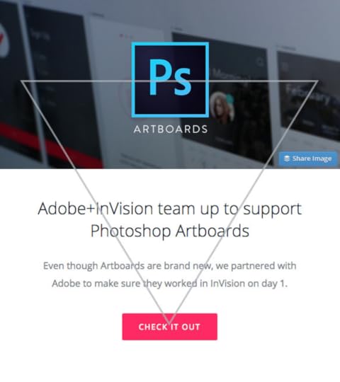
Source: InVision
Use plenty of contrast to make text and buttons stand out. A good rule of thumb is to choose a background colour that works with white text and then invert this with divs containing black text on white backgrounds, as shown above.
You can then use the same background colour for your CTA buttons with white text, which adds balance to the high-contrast design.
Also, make sure you use plenty of white space to break up sections of text and vary font styles, sizes and weights to help group and differentiate pieces of information.
#5: The inverted pyramid
This is one of the most fundamental design principles for emails, landing pages and CTAs in general.
The inverted pyramid vertically stacks content that continuously decreases in width, essentially pointing towards a CTA button – or another key element you want to highlight.
Source: InVision, Campaign Monitor
This design approach is effective because it guides users’ eyes to the most important elements on the page and it makes your content easier to scan.
You need to get across the key benefit of your message in a bold, concise headline. You can expand on this with smaller text placed below your heading and wrap things up with a compelling CTA.
This inverted pyramid template is a good starting pint for every email, landing page and CTA elsewhere on your website.
#6: Images that immerse users in the customer experience
It’s easy to sit here and talk about the importance of compelling images on your landing pages – but what does that actually mean?
Well, the best landing page visuals (images and/or videos) immerse users in the experience of using your products or services.

It’s not your product people are buying into, it’s the idea of what it’s like to use it and the lifestyle they associate around it.
Luxury bath products don’t make you any cleaner than cheaper alternatives and, in many cases, the only difference is in the packaging.
Likewise, mobile phones have barely progressed in terms of technology but people continue to buy flagship devices because luxury products hint of a luxury lifestyle – and this perception is what your images need to capture.

Services and software products are a little more challenging but the same principle applies.
Clear provides biometric security products for airports, stadiums and other venues – and it knows its selling points.
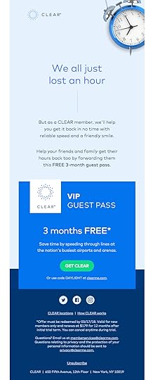
Source: Really Good Emails
Security is clearly a priority but so are convenience, productivity and time efficiency. All of which you’ll find featured in its email campaigns, complete with simple but compelling images.
#7: Knowing what really matters with CTAs
Earlier, we looked at the inverted pyramid design principle and I recommend applying this to all of your email CTAs as a starting point. By all means, test variations and try to find something that works better but the inverted pyramid approach will take some beating.

If your conversion rates are lower than expected, chances are your problems lie elsewhere. Here’s a quick run through some CTA best practices to make sure you’re on the right track:
Width – Place your CTAs in a full-width div with centered text to make them unmissable as users scroll down.
Copy – Make your CTA copy actionable and compelling.
Contrast – Use plenty of contrast so your text and CTA button stands out.
Size – Make sure your text and buttons are large enough to read and your buttons large enough to tap in touchscreens.
Secondary CTA – Have a secondary CTA further down your email for users who don’t convert with your first one.
When it comes to A/B testing CTAs, I suggest focusing most of your efforts on improving the copy in your CTAs and confirming where the best placement is.
The best CTAs pinpoint a truly compelling message that encourages people to click and this is far more important than aspects like background colours, fonts and button shapes.
I’m not saying those factors don’t matter but you have to make the biggest impact with your optimisation efforts. For more tips on CTAs, check out our articles on 15 best practices that’ll increase conversions and CTA psychology: what makes people click.
#8: Getting personal (but not too personal)
Email personalisation can increase transaction rates by 600% but there are two common mistakes marketers make with email personalisation:
Not using email personalisation at all.
Going too far with email personalisation.
You want to use personalisation to increase email open rates, engagement and conversion rates.
You don’t want to creep users out by getting too personal.
Address people by name in your main content, send them special gifts on their birthday and reward them for being loyal customers.
Avoid using people’s names in your subject lines, though. It screams “spam”.
Beyond those basics, I don’t recommend using personal details too much. Focus the rest of your personalisation efforts on user actions: previous product purchases, software usage data, content engaged with, resources downloaded, etc.
Send email content, based on these actions, that improves the experience for users – for example, reports showing how they can get more from your software platform or related products that are currently on sale.
Personalising content via customer data is far more important than reminding them that you know where they live.
#9: Ramp up the incentive
As with anything designed to convert users, your primary goal is to create incentive. This starts with identifying bg what your target audiences want and then delivering messages that prove you can deliver.
To enhance your messages even further, there are a number of tactics you can use.

Scarcity: Make it clear there’s a limited supply of something and people are going to fear they’ll miss out by not converting now.
Urgency: Likewise, putting a deadline on special deals will encourage people to convert now or risk missing out.
Freebies: Throw in freebies, 2-for-1s and other incentives to make people feel like they’re getting a great deal.
Money-back guarantees: Show people they’ve got nothing to lose.
Free trials: Give customers a free taste and show them what you can really do.
Exclusivity: Create VIP memberships or special incentives for higher price tags.
Incentive is the most important aspect of high-converting emails – or high-converting anything, for that matter.
Make this a priority in your copy and A/B testing.
#10: Knowing what to A/B test
You’ll often hear marketers in articles like this one spout this lazy cliche: that you should test everything in your emails, landing pages, etc. What a load of rubbish. Conversion optimisation needs to be profitable and that’s never going to happen if you’re constantly running tests on every minute detail of your email and pages.
No.
Profitable conversion optimisation starts with knowing what to test.
Much like the converted pyramid design principle we looked at earlier, you want to start testing the biggest and most important aspects of your email and then narrow down to the finer details, once you’ve got the key essentials sorted.
Here’s my recommended approach:
Email subject lines: Start by testing different email subject lines and measure the impact on deliverability and open rates.
Email copy: Test entirely different messages, key selling points and styles, not small wording changes.
Sender info: Test variations of your sender info and measure the impact on deliverability and open rates.
Images & visuals: Test different images to see how these impact engagement and conversions.
Calls to action: Now it’s time to test those CTAs: conversion goal, copy, placement, number of CTAs, etc.
Above all, you need to make sure people are opening your emails before you start optimising their contents. And, once people open your emails, it’s the copy inside that has most influence over whether they take action or not. So don’t get caught up in changes images or CTA buttons until you know the copy in your emails is compelling people to take action.
By the time you come to optimising your CTAs, you should be confident that nothing else is getting in the way of conversions.
#11: It takes more than one email
With everything we’ve covered in this article, the final step is to apply these design approaches across an entire email marketing strategy – not only individually emails.
The goal with email marketing is to guide prospects along the buying process, keep them engaged as customers and turn them into repeat buyers. To pull this off, you need to determine which messages users are going to respond to at each stage of the sales funnel and have a system in place to deliver them.
Drip campaigns allow you to send email messages to users within defined time frames (eg: a week after the first purchase with recommended products, a month after for customer reviews, etc.) but you’re limited to what you can do with these campaigns.
To take that next step, you want to create campaigns based on user actions (pages visits, content downloads, product purchases, email engagement, etc.) and deliver messages encouraging users to take the next action towards a more profitable conversion.
This is where email automation becomes so important, allowing you to preset your strategy and know the relevant emails are going to be sent out as users take each action along the buying process.
Take your email marketing efforts to the next level
With these 11 secrets to designing emails that convert, you should be able to design and deliver emails that generate higher open rates and inspire more users to take action. As mentioned in the final point, this isn’t something you should only apply to individual emails, but your entire email marketing strategy.
If you want to know more about the best email design and marketing tools available right now, take a look at our article on the Best Email Marketing Software & Email Automation Tools of 2019.
The post 11 Secrets of Designing Emails That Convert (with Examples) appeared first on Venture Harbour.


August 8, 2019
30+ Marketing & Sales Tasks You Need to Automate
Marketing automation is one of the biggest topics in the industry right now with brands of all sizes looking to maximise results. Interest in marketing automation has tripled over the past five years and this has been helped by new advances in technologies like machine learning – not to mention significantly more competitive prices.

Over the past few years, a more advanced breed of automation tools has hit the market and prices have drastically dropped. This means even the smallest of marketing and sales teams can achieve far more within their budgets than ever before.
We’re now at a point where automated growth is accessible to businesses of every size.
With so many tools available now, the biggest challenge is often choosing which marketing and sales tasks to automate, especially for businesses looking to integrate automation for the first time.
So, in this article, we’re looking at 30+ marketing and sales tasks every brand should look at automating. Hopefully, this will get you off to the best possible start or even spark a few new ideas for your automated growth strategy.
What are we looking at in this article?
As this is going to be a relatively long article, here’s a quick preview of what’s coming up – and you can click on the bullet point items below to jump to each section.
What kind of tasks to automate: A look at what kind of marketing and sales tasks you should/shouldn’t automate.
Inbound marketing tasks to automate: A number of automated tasks and strategies to increase inbound traffic and generate more leads.
Automate lead segmentation: These will help you increase the quality of your leads and target them with more convincing messages.
Automate lead nurturing: Workflows to guide leads across the sales funnel and turn them into customers.
Automating customer service: Keep customers happy, solve issues faster and turn more customers into repeat buyers.
Automating reports & optimisation: Take the time and hassle out of reports and optimisation by automating these tasks.
First, I’m going to start by explaining what kind of marketing and sales tasks should be automated. Getting your head around this will help you asses the unique aspects of your business and find new opportunities to increase profits, productivity, efficiency and other key performance aspects via automation.
After that, I’m going to suggest a number of marketing and sales tasks in each of the categories above that you should look at automating. These are tasks pretty much every modern brand is already doing or could benefit from doing – from keyword research to handling customer service.
Automate all of the tasks in this article and you’ll have most of the marketing and sales essentials covered. This will have a major impact on your business and the process of automating these tasks will give you the experience you need to jump into more advanced automations.
What kind of marketing & sales tasks should be automated
This is one of the hardest concepts to get your head around when you first delve into automation. This isn’t only true for marketing and sales tasks, either; this applies to every business process taking place in your organisation.
As a general rule, it’s the repetitive and/or time-consuming tasks that should be automated first. For example, resizing images for social media posts, sending order confirmations to customers, running link audit reports on your website and testing ad variations are all tasks that can be automated.
Instead of manually hitting the same buttons in a piece of software like Google Analytics, you can define parameters to trigger the same function as often as you need to.
It’s this repetition that even basic automation software is capable of doing faster and more accurately than humans.
What automation isn’t so good at is the creative decision making required to create content, ad copy, landing page designs, take compelling images or shoot epic videos. Automation is getting better at helping humans complete these tasks and today’s algorithms are capable of making decisions based on existing data (eg: this ad should outperform this ad) but there’s still a lot of progress to be made on this front.
The list of tasks automation isn’t capable of handling is getting smaller every year. That said, in a practical business sense, the technology is still best applied to relatively simple, repetitive tasks.
If you’ve still got any doubts about which kind of tasks should be automated, keep on reading. Some things are better explained with examples and we’ve got 30+ everyday marketing and sales tasks you should be looking to automate.
Inbound marketing tasks to automate
First up, let’s take a look at some of the most common inbound marketing tasks that can be automated.
#1: Social media posts

The first marketing task any brands wants to automate is social media posting. With tools like Hootsuite, you can schedule posts and automate them to repost at specific times. This means you can automate 60% of your social media activity be a constant presence without a dedicated team.
You also want your blog posts to automatically go out as social posts as soon as you hit the publish button. Not only that, but you want to be able to schedule them as reposts to keep promoting your posts and maximise reach.

If you’re using WordPress, all of this is easily done with an auto-publishing plugin like Microblog Poster (there are plenty of other options, too).
#2: Keyword research
Keyword research is another time-consuming task every business can automate. New keyword opportunities arise all the time as search trends shift and the likes of Google roll out new features and algorithm updates.
You can use tools like SEMrush and Searchmetrics to automate a whole bunch of keyword research tasks and reports. Better yet, you can use their APIs to build these reports into your own custom interface and compile all the reports you need into a single workflow.
#3: PPC bids
Automating PPC bids is more challenging than social media posts of keyword reports. Google Ads has a bunch of automated bidding strategies you can use but these hand over too much control to the search giant.

Instead, use a PPC management tool like Adzooma that includes bid automation features you can control. Alternatively, you can use Google Ads scripts to automate bids or even build your own machine learning algorithm to constantly optimise bids on the parameters that matter most to you.
#4: Dynamic content
Dynamic content is a form of personalisation that changes the messaging in your ads, emails and web pages to match user intent. For example, Google Ads has a feature called Dynamic Search Ads that changes the text in your ads, based on the keywords users type in and the content on your landing pages.

Landing page software Unbounce also has a feature called Dynamic Text Replacement, which changes the content on your landing page to match the keywords users typed into search engines to see your ad.
The great thing about these features is they’re very easy to use without any expensive software or complex algorithms. But, if you’re looking for a more advanced set of personalisation features, take a look at Adobe Target or Optimizely.
#5: Newsletter signups
Instead of generic newsletter signup forms, you can automate a more advanced strategy to get people signing up. First, you’re going to create lead gen content for each category on your blog page – things like webinars, in-depth guides, free downloads and whatever you think will get people signing up.

A CTA asking users to sign up for our lead generation webinar in the middle of a blog post on the exact same topic.
Next, you’re going to place dynamic CTAs on your blog posts so each piece of lead gen content features on posts of the same category. For example, your blog posts on social marketing will prompt people to download a guide to social advertising and your email marketing posts will offer free email automation workflows.
The point is, people who are reading your blog posts are clearly interested in these topics and you should use this interest to generate leads by targeting them with relevant offers.
Dynamic CTAs are a simple but effective automated strategy that’ll do this for you.
#6: Webinar marketing

When 91% of B2B professionals say webinars are their favourite type of content to engage with, you better pay attention. The problem with webinar marketing is it’s time-consuming and expensive to hold regular live events, but here’s the thing: you don’t need to hold regular events.
Instead, you can create a single webinar, a few or as many as you decide necessary and automate them to play at regular intervals. This has been one of our most successful inbound marketing strategies here at Venture Harbour and you can fund out how to do it in our guide to automated evergreen webinars.
#7: Quotes & proposals
Creating quotes and proposals manually is a major drag on resources, especially when you the majority of them probably aren’t going to lead to sales. It really hurts when you spend time on creating quotes or proposals for deals that never come through and in many cases you’ll never even hear from the prospective customers/client again.
That’s not good for any business.
Luckily, you can automate these, too, using tools like Bidsketch and Quoteroller to save huge amounts of time.

The great thing about this automation strategy is it doesn’t really matter whether you get the customer or not because you haven’t invested any time in creating the quote or proposal in the first place. This is especially true if you’ve automated your lead generation strategies so you’re bringing in potential customers and sending out quotes/proposals without any manual work.
Your sales team only gets involved with leads with a strong potential to become paying customers and you don’t waste any resources on the rest.
Find out more about this strategy in our guide on how to automate quotes and proposals.
Automate lead segmentation
Some leads are simply worth more than others and lead segmentation allows you to prioritise the leads that are most valuable. Advanced lead segmentation can be complex, though. Automation not only simplifies things but turns lead segmentations into one of the most powerful aspects of your marketing strategy.
#8: On-page lead segmentation
Waiting until users convert to start segmenting leads is often too late. Relevant messages deliver. We’ve found that relevant messages result in 89% sales uplift & 58% increase in average order value and the sooner you segment leads, the better.

With Leadformly, you can segment leads as they fill out your web forms by using a technology known as conditional logic. This asks relevant questions to users based on the info they provide, allowing us to use this data to send more relevant messages from the very first email.
#9: Lead qualifying
Some leads simply aren’t worth chasing up and lead qualification allows you to filter out the leads that don’t hold enough value. This is how you make sure your sales team aren’t wasting valuable resources on leads that don’t meet your requirements.
Most importantly, you want to filter out leads that don’t look likely to become customers. However, certain marketing campaigns might be targeting a very specific type of customer or customers with a certain lifetime value.
With lead qualification, you can essentially throw away leads that don’t have enough value or place prospects that don’t meet the criteria for one marketing campaign on a segmented list for a different campaign.

We use Leadformly to get the information we need from leads to decide whether they’re worth pursuing or meet our criteria for specific campaigns. This happens automatically, as users sign up to one of our offers, and this data is fed through to ActiveCampaign, which places each lead on the relevant marketing list.
100% lead qualification that means we’re only dealing with the highest quality of leads with every marketing campaign.
#10: Lead scoring
The next step on from lead qualification is lead scoring and this is where you assign a numerical value to each lead. While lead qualification essentially gives a “pass” or “fail” status to each prospect, lead scoring allows you to prioritise leads that pass by ranking them with numerical values.
With lead scoring, you can make sure the majority of your sales and marketing efforts are being spent on the leads that have most value to your brand. This might be the leads that are most likely to become customers, leads interested in the highest value products/services or prospects with the highest likely customer lifetime value – whatever your priorities may be.

ActiveCampaign comes with built-in lead scoring, which is fully automated based on user actions and you can then automate your follow-up messages to each lead, in response to their scores.
#11: Remarketing lists
Remarketing lists are a PPC feature that allows you to target your website visitors with visual ads as they continue to browse the web. Google Ads pioneered this advertising strategy but you can also make use of remarketing on Facebook, Instagram, LinkedIn and most of the major paid advertising platforms.

The trick with remarketing lists is you can assign leads to different lists based on their interests, pages visited, products viewed and actions – all of which allows you to target them with more relevant and compelling messages.
Best fo all, assigning leads to remarketing lists can be entirely automated using cookies.
#12: Behavioral targeting
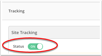
While targeting users based on the pages they visit is technically a form of behavioural targeting, it has its limitations. We can go much further than this by using event tracking in Google Analytics or site tracking in ActiveCampaign.
This allows you to place users on segmented lists based on the buttons they click, forms they interact with and other actions they take on specific pages. For example, you can create an email campaign for people who abandoned their shopping cart or users who started singing up to your software platform but didn’t complete the process.
Taking things even further, you can create segmented lists for every stage of the sales funnel and assign leads to each list based on actions that define where they are along the buying process. This allows you to target them with messages encouraging them to take the next step and they’ll automatically be placed on the next list once they complete the requires action.
This carries on until you’ve guided prospects along the entire sales funnel, all the way to the purchase.
Automate lead nurturing
Speaking of guiding users along the buying process, it’s time to look at some crucial lead nurturing tasks you can automate to increase the percentage of leads who become paying customers.
#13: Assigning leads to sales reps

Assigning leads to sales reps is one of the first tasks you want to automate and this is an essential feature in any good customer relationship management (CRM) platform.
We use ActiveCampaign here at Venture Harbour and this gives us two different options for automatically assigning new leads to members of our sales team. You can either assign leads evenly between team members in terms of quantity or you can distribute them evenly based on value.
#14: Email follow-ups

Email marketing has benefited the most from current automation technology and this is where you’ll generally make the biggest impact with the least amount of difficulty.
First off, you’re going to want to automate your email follow-ups to key users actions: email signups, enquiries, cart abandonments, purchases, customer service queries, etc.
Every automated email strategy starts with this crucial step, allowing you to respond to any number of leads instantly (or with a delay of your choice) and send targeted messages to users based on the actions they take.
#15: Drip campaigns

Drip marketing is a tried and tested strategy that sends leads/customers a defined set of messages over time. Drip campaigns are static, meaning you create a set of messages for specific target audiences and they’re sent out in a specific order at intervals of your choosing.
Let’s imagine someone signs up to a 14-day free trial of a software platform. The provider might send out a welcome message as soon as people sign up and then send out a series of tips and tricks emails to help them get the best out of the platform during the free trial.
In the final days of the trial, the provider might send out emails asking for feedback, highlighting the benefits of the full version and offering a special deal for signing up for a paid account.
A drip campaign automatically sends out these emails at each interval.
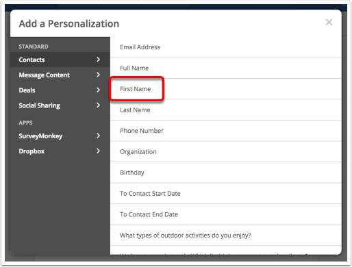
#16: Personalised email campaigns
74% of marketers say personalisation increases customer engagement (CampaignMonitor, eConsultancy). With the right CRM and email marketing software on your side, you can do this at scale and automate the entire process.
The important thing is to use personalisation to create more compelling messages for individual leads, not creep them out by showing how much you know about them. Sure, address people by their name but focus on personalising the key messages in your emails based on what you know about each prospect (interests, industry, position at their company, etc.).
#17: Upselling / cross-selling

Upselling and cross-selling are fundamental strategies for maximising customer retention and value – nothing new in that regard. However, automation means you can apply these strategies to every customer without any manual work whatsoever.
Better yet, the latest advances in machine learning allow you to create more effective upselling and cross-selling strategies. This is most evident in product recommendation algorithms, most famously used by Amazon to recommend products of interest based on users’ previous purchases and items viewed.

However, this technology isn’t limited to eCommerce brands. We mentioned lead scoring earlier and you can use machine learning to predict the likelihood of prospects cross-buying, up-buying or repeat buying and factor this into your automated email strategy.
#18: Customer lifecycle messages

Source: Smart Insights’ RACE planning framework for maximising customer lifetime value.
The interests of your leads and customer change over time. Businesses grow, devices age, technologies advance and all kinds of other factors contribute to how buying decisions change, even after the initial sale.
To maximise customer value, you need to identify how these interests change and deliver relevant messages along the way. To identify these interests, you’ll have to nail your audience research although this is another area where machine learning is making a real impact.
However, automation is going to deliver these messages for you as your customer interests evolve.
#19: Customer re-engagement
Sometimes leads and customers simply lose interest. It could be people using your software less often, online shoppers abanding their cart or a prospect not responding after you send over a quote – there are all kinds of scenarios where user engagement drops.
When this happens, you don’t just let users slip away.
You have a system in place to detect drops in engagement and automated email workflows designed to re-engage users.

The example above shows an email from Grammarly for users who haven’t used its software tool recently. Other commons examples are shopping cart recovery emails and special offers for repeat customers who haven’t made a purchase recently.
#20: Advanced behavioural campaigns

Most of the marketing and sales tasks we’re looking at in this article revolve around user actions to some extent – completing a web form, visiting a specific page or making a purchase, for example.
Those are all important actions to create automated workflows for but you can get so much more granular with your behavioural targeting – and we touched on this earlier when I mentioned event tracking in Google Analytics and site tracking in ActiveCampaign.
These technologies allow you to create campaigns for highly specific actions. For example, you could create a campaign for users who start filling out a web form but don’t complete it. Or you might want to target users who clicked to watch a product explainer video rather than simply targeting users who visited that page.
Automating customer service
If you’re going to turn new customers into repeat buyers, the quality of the service you provide along the way is a major factor. The problem is, the more customers you have, the more difficult it becomes to provide the same standard of service to all of them – unless you automate these key customer service processes.
#21: Customer profiles

Relevance matters when it comes to customer service, too. Your sales team need to know the status of every customer, any ongoing issues and what the next steps should be. This requires complete profiles for every customer, filled with all the relevant info related to their purchase history.
These profiles should be filled out automatically wherever possible.
For example, we feed the data users complete via our web forms into ActiveCampaign, creating profiles for new leads and updating any new info provided for existing leads.
#22: Customer service replies

When a customer gets in touch with a technical issue or some kind of problem, the speed and usefulness of your response are both imperative. Luckily, you never need to keep people waiting for a response when you have automated email workflows in place.
The key thing is to make sure your response email points them to information that might solve their problem and clarify that someone will be in touch with them asap – and you need to make sure someone really is in contact with them within a reasonable time frame.
Make the most of personalisation in these automated responses to address customers by their name, establish a friendly relationship and send more relevant content where possible.
#23: Chatbots

The problem with automated email responses is they inevitably tell users to wait until one of your team members can get in touch. Chatbots, on the other hand, can provide an instant response and they may even be able to solve some basic user problems by asking the right questions and directing customers to helpful pieces of information.
Even if this is the same information you’re linking to in your emails, chatbots create an engaging response and a sense that you’re actively doing something about each customers issue, even if you’re not.
Chatbots also mean your customer support team is only dealing with issues that really need their attention.
#24: Customer feedback & reviews

Customer feedback and reviews tell you what you’re doing wrong and right as a brand. It helps you make informed business decisions, increases engagement with customers and shows the people most important to your brand that you value their opinion.
Automating customer reviews/feedback is relatively simple with the right tools and Hotjar has a great set of features for this. Aside from customer surveys, you can ask for feedback from users as they interact with your website. You can even ask why they’re not converting and use this to improve your on-page messages.
#25: Customer referrals
Another customer service task you want to automate is referrals. This is the whole recommend a friend for some kind of reward strategy and ActiveCampaign has a really handy automation workflow that you can add to your account to handle this for you.
Automating reports & optimisation
Reports and optimisation are crucial but incredibly time-consuming and you’re going to need all the help you can get from automation to reduce your workload on these two marketing fundamentals.
#26: Reports

The problem with having so much data available these days is that you need to be able to process it all. This is difficult when you’ve got reports from dozens of different platforms that all need to be compiled and compared.
Luckily, there are platforms like Supermetrics that pull in all of your data into a single dashboard. This allows you to create custom reports and dashboards with all the data you need (and none of the stuff you don’t).
#27: Predictive analytics

One of the biggest breakthroughs in machine learning technology over the past five years has been predictive analytics. The concept itself isn’t anything new but it’s only recently that we’ve seen genuinely useful predictive analytics platforms hit the market at affordable prices.
The likes of IBM, Adobe Analytics and MicroStrategy (above) are at the forefront of this technology and the predictive power of these algorithms is only going to improve further with time.
#28: Customer lifetime value calculations

A key part of predictive analytics is calculating the lifetime customer value of prospects. You can find out more about how this work by reading this Google Cloud documentation page, which explains how models are trained to achieve such calculations.
You’ll also find this feature on platforms like Adobe Analytics and MicroStrategy, mentioned in the previous point.
By accurately calculating the lifetime customer value of prospects, you can determine which leads and customers really hold the most value to your brand and adapt your marketing and sales strategies accordingly.
#29: Website audits

Website audits are entirely necessary but a real drag. Or, they used to be, until automation tools made it possible to run audits periodically without any manual input and then raise the red flag when any action needs to be taken.
SEMrush offers a pretty comprehensive site audit tool that scans your website for 130+ technical and SEO issues. There are plenty of other tools offering similar features and you can even create your own with some API integrations.
#30: A/B testing

This is an area where automation is going to advance rapidly over the coming years. We’re already seeing predictive A/B testing systems hit the market, which take that next step onwards from predictive analytics to actually putting fixes in place.
For now, there’s a limit to how much of this process you’ll want to automate, as this particular niche of automation technology still has some growing up to do.
However, there are plenty of tools you can use to automate parts of your A/B testing processes, such as ad variations in Google Ads, which essentially split tests different versions of ads for the same campaign.
Likewise, you can automate the application of test winners across every relevant page of your site, so that improvements are made as soon as the best variation is determined.
What are you going to automate first?
You don’t need to jump in at the deep end with automation – you can start with small, basic tasks and gradually create workflows for additional tasks at a rate that suits you. So, the only question left at this stage is: what are you going to automate first?
The post 30+ Marketing & Sales Tasks You Need to Automate appeared first on Venture Harbour.
11 Places Your Website Is Losing Conversions – and How to Fix Them
According to insights from Unbounce, the average conversion rate for landing pages is 4.02% although this does vary from one industry to another. Either way, the vast majority of visitors who land on your site are going to leave without completing any valuable action and increasing conversion rates is an ongoing priority.

An effective conversion optimisation strategy starts with knowing which parts of your website to optimise. You need to identify where your site is killing conversions and put suitable fixes in place. This will require some digging around on your part, provided you have access to the right data.
However, there are some guaranteed areas where your website is going to losing conversions, which means you can start optimising these while you compile the necessary data for other issues. Here are 11 places your website is losing conversions – and how to fix them.
#1: Slow loading times
This is the worst way to lose potential conversions because you don’t even get the chance to put your message across if people quit the session before your page even loads.
According to Google’s latest research, it takes a whopping seven seconds for the average landing page to load on mobile, which is way too long. The craziest part of that stat is that average loading times have halved since Google released its previous insights on mobile loading times – the average was roughly 14 seconds a couple of years back.

Clearly, loading times a problem for users and conversion rates alike so make sure you’ve got these in check before you start anything more ambitious with your conversion optimisation efforts.
How to fix this conversion killer
Start by making sure the code used to build your website is clean and up-to-date. You don’t want some sluggish WordPress theme or rogue JavaScript code bringing your loading times to a standstill.

Google PageSpeed Insights can help you with the basics of optimising pages for speed.
Next, you need to think seriously about server requests and the number of resources your pages are going to load. Every code file, image, web font, API and other resource increases the number of server requests and the total amount of information that needs to be downloaded.
Minimise these as much as you can.
Next, make sure your images, code files and other resources are compressed (or minimised) to reduce download times.
#2: Targeting broad audiences
When it comes to turning traffic into conversions, leads, customers and all the other good stuff, relevance is key. This means you need to be bringing in the right kind of visitors in the first place. If you’re targeting broad audiences, you’re making it difficult for yourself to create compelling messages, as their individual interests will vary.
How to fix this conversion killer
You’re going to start by identifying your key target audiences and how their interests in your brand differ. For example, a productivity software provider might want to target freelancers, small business owner and management teams at brands with multiple business locations across the country – all of which will have different interests from the exact same product.

Audience targeting for display ads on Google Ads.
You want to create marketing campaigns for each of your target audiences with these unique interests at the heart of every message you deliver. Target long-tail keywords for your organic SEO and paid search campaigns, make full use of the targeting options available of your PPC platforms to pinpoint these audiences and create ad groups appealing to their unique interests.
By targeting narrower audiences, you should be bringing in a higher quality of traffic that has a stringer purchase intent than board audiences with a general interest in what you’re selling
#3: Irrelevant messages on your landing pages
The thing with targeting more specific audiences through inbound marketing is you need to be just as relevant with the messages on your landing pages. If you pitch a key selling point to users in one of your ads/posts but your landing page doesn’t match the same point of interest that convinced users to click through, you’re going to end up with some nasty bounce rates.
With paid advertising, it’s also worth remembering that platforms like Google and Facebook also look at the relevance of your landing pages and consider this when scoring the quality of your campaigns. The lower your scores, the worse your overall PPC performance will become and the more you’ll need to spend to keep your ads being seen.
A definite lose-lose scenario.
How to fix this conversion killer
The first step to creating relevant landing pages is to create unique landing pages for every advertising campaign. You’re crafting unique ads for these campaigns and you need to match these up with their own landing pages with the same highly-relevant messages for each target audience.

Use a landing page builder like Unbounce and you’ll have no problem creating new landing pages for every advertising campaign. Make sure the key selling point in your ads, posts and inbound content features boldly at the top of each landing page because this is why individual users click through to begin with.
You’re already targeting more specific target audiences with each campaign, which has increased the quality of the traffic landing on your site. Now, you’re also increasing the quality of the pages they land on and delivering compelling messages to each type of visitor – all of which is good news for conversion rates.
#4: Distracting content on your landing pages
Now, we’re getting into the specific design elements of your pages and this is a common trap many brands fall into. You may have followed all the best practices with your landing page design and featured all the key elements that are designed to increase conversions: great images, videos, social proof, etc.
So why haven’t your conversion rates hit the roof?
Well, there could be any number of reasons but the first things you’ll want to check is that none of your on-page elements are distracting user attention away from the parts of the page that really matter.
For example, you don’t want those expensive images taking attention away from your CTAs or visitors using up all their click power on playing your video when there are CTA buttons and web forms to complete.
How to fix this conversion killer
To fix this issue, you need to know which page elements users are seeing and interacting with. This is where tools like Hotjar come into play, allowing you to see how users scroll down your page and which elements they click or tap.

This allows you to determine whether users actually see your calls to action or scroll right past them. CTAs aren’t the only element worth paying attention to either. You can check whether visitors are spending enough time with the key pieces of content on your page to absorb the message you’re trying to get across.
If they’re not, you need to rethink the balance of your page and test new ways to get people engaging with the parts of your pages that matter most.
#5: Your navigation is sending users off-course
Navigation is a tricky thing at the best of times and the more pages your website has, the bigger your challenge is going to be. In terms of SEO, you want to have pages for everything you’re aiming to rank for but you don’t want this site structure to make navigating your website too complex.
If you’re a business selling a wide range of services or a highly complex product, this can be a problem. If you’re in the eCommerce game, things can be even worse.
In terms of conversion rates, the biggest danger with complex navigation is you can end up sending users off-course. For example, when someone lands on your homepage, you’re trying to communicate the value of your entire business and this normally involves links to various different parts of your website (service pages, product pages, case studies, etc.).
All of these have the potential to send users off-track and away from your CTAs.
How to fix this conversion killer
If we’re talking about landing pages, the best thing you can do is remove the navigation menu altogether. If you’ve followed the steps I mentioned earlier about targeting specific audiences and creating relevant landing pages, they shouldn’t need any navigation.

Zoho used to feature complex navigation menus on its landing pages.
This is the page they want; you’ve made sure of that already – so don’t give them a navigation menu provides a path elsewhere.
This doesn’t mean you can’t link to other parts of your site in the main body of the landing page. Of course, you can. The point is, you control which parts of your site users can navigate to and they’re pages that keep them on the path towards conversions.

Zoho has ditched the nav menus in recent landing pages to keep users locked into the conversion process.
If you can’t stand the idea of giving users no navigation menu, try testing one out in the footer of your landing pages and see how this compares to not having one at all. Thanks to the magic of A/B testing, getting answers to the crucial questions is relatively straightforward these days.
#6: Unconvincing calls to action
Of course, there has to be a section in this article about calls to action but I’m not going tell you how changing one word in your CTA button is going to increase conversions by 3,000% and save the rainforests.
No, let’s focus on the core fundamentals here: convincing calls to action.
The simple fact is, if you’re CTAs aren’t convincing, you’re literally not going to get the conversion. Unfortunately, “convincing” is an objective term and there’s no fixed blueprint for a CTA that really makes people click.
How to fix this conversion killer
The good news is, you’re already off to a good start by targeting niche audiences with your inbound marketing campaigns and creating unique, relevant landing pages for each one.
This naturally creates CTAs that a more relevant to user interests and this is definitely going to help in the convincing department.
Reiterate that key selling point used in your ad and the top of your landing page – this is what convinced people to click through, keep scrolling through your page and this is what will ultimately get the conversion.

Next, you need to make sure your CTAs are grabbing user attention. It doesn’t matter how convincing your CTAs are if people can’t see or notice them. So, before you start testing minute details like buttons colours and font styles, make sure you’ve got the basics covered.
Your CTA should be visible, bold and use plenty of contrast to jump out of the page. Surround your CTAs with plenty of white space to make them even more prominent and don’t forget about those poor mobile users trying to look at your page outside with daylight blaring down on their displays.
With all that covered, understand that the text surrounding your CTA button and the content that comes before your CTA has far more of an impact on conversion rates the button itself. So don’t go crazy over optimising buttons when you should be focusing on the text in your CTA, the content around it and where you place your CTAs on the page.
#7: Hitting users with the CTAs too early
Apparently, one section on calls to action isn’t enough for this article and we’re back with a second CTA conversion killer. This one deserves a section of its own, though, because it might change the way you think about CTAs and landing pages in general.
Once upon a time, CTAs were put above the fold on landing pages but the dawn of mobile internet forced them further down the page. Then, the world realised that calls to action can actually be better off placed further down landing pages, giving you more space to add compelling content before hitting them with the buy-or-get-lost ultimatum.
How to fix this conversion killer
Sometimes, a call to action in the hero section is going to do the trick. However, there are plenty of situations where telling users to pay up right away is going to put them off.
We’re now seeing a growing trend in landing page designs where conversions aren’t the primary goal. A lot of brands are now creating “click-through” landing pages that are designed to engage users, increase their interest in what’s available and direct users to relevant offers through selective navigation options.

This landing page from doesn’t ask users to convert at all. Instead, it prompts them to get started on a personalised experience, regardless of whether it ends in a sale.
The aim here is to engage users and guide them through a content journey that demonstrates the value of Stitch Fix’s service. There aren’t even any product listings on this site because the company isn’t looking to sell a few t-shirts. It’s aiming to create an ongoing experience with customers that’s valuable to both parties.
I’m not saying the hero section “buy now” CTA is dead but there are other (sometimes better) options worth exploring.
#8: Poor form UX
Web forms stand between users and every conversion, which is why it pains me so much to see how poor the average form experience still is. All of the progress we’ve made over the past 10 years or so and trying to complete most web forms still sucks the life out of you.
No wonder conversion rates are generally so low.
Web forms don’t get the same kind of attention as calls to action when it comes to conversion optimisation, even though they’re equally (if not more) important. And, when talk turns to form optimisation, the same “best practice” keeps on cropping up: make your forms shorter.
This is really bad advice.

Yes, some forms should be a short as possible but the idea that shorter forms automatically increase conversions is dangerous. Think about it: would you trust an insurance company that only asked for your email address and credit card details? No. You expect to fill out a lengthy form when you’re applying for insurance and anything less would raise alarm bells.
There are plenty of scenarios where longer forms increase conversions rates – let’s get that part out of the way.
However, poor form UX (regardless of length) is always going to hurt conversions.
How to fix this conversion killer
One of the biggest breakthroughs we’ve made here at Venture Harbour was exploring why longer forms sometimes outperform shorter versions. There are many reasons why this can be the case:
Longer forms can increase engagement
They can also compel users to complete the form after investing time in filling part of it out
Longer forms can filter out lower quality leads
They allow you to collect more relevant information
Sometimes users want to provide more information
The more tests we ran, the clearer it became to us that longer forms were often converting more users but, crucially, they were increasing the quality of those conversions. However, the intimidating look of long forms remained an issue and this forced us to completely rethink form design.
This is how we landed on multi-step form designs, which remove all of the friction from traditional forms. By only showing and asking one question at a time, users are never bombarded with a page full of form fields. Instead, they get a highly engaging experience with visual questions and image buttons, sliders and other formats.
This reduces the need to type and allows mobile users to complete forms with a number of touches.
We took this principle even further when we developed Leadformly, a multistep form builder, by integrating conditional logic. This means users are only asked the questions relevant to them based on the information they submit as they fill out your forms. So a form of 10 fields can become a form of five by filtering out the questions that aren’t relevant to individual users.
Poor form UX is no longer a problem.
#9: Slow email responses
When a user converts, you need to follow up quickly or that lead will turn colder than you think. As we’ve said before, Harvard research shows leads can lose most of their value of you fail to respond within 24 hours.
all that work you’ve put into generating traffic, creating compelling messages and optimising for conversions goes to waste if you’re not fast enough to respond to new leads.
How to fix this conversion killer
Luckily, this is the easiest conversion killer in this list to fix and all you need is a decent email marketing automation tool to send out responses to new leads instantly – on time, every time.

We use ActiveCampaign as our all-in-one email marketing, marketing automation and CRM platform. Email auto responders are a standard feature, meaning you can respond to every new lead while they’re still hot – either instantly or after a set delay
#10: Generic email responses
Auto responders are great for keeping leads engaged after the initial conversion but sending generic responses to every lead is always going to get limited results. When you’re creating multiple landing pages for the same product, you want your email responses to match the individual interests of each audience in the same way.
Fail to do this and you’re not going to get the post-conversion engagement you need to keep these leads on board with your business.
How to fix this conversion killer
Again, this conversion killer is relatively easy to fix with email automation. What you need is a platform that offers solid list segmentation features, so you can target users on each list with relevant emails.
This is a standard feature with most email marketing tools these days but you also want a platform that allows you to feed data from your web forms.
With Leadformly, we can send our form data to ActiveCampaign and place users on segmented lists, based on the information they provide us. This means we can send relevant email responses to each target audience from the very first email and we can also prioritise which kinds of leads are most important to us.

Combine this with ActiveCampaign’s Site Tracking and we can create highly targeted list segments with email messages that really capture the interests of any audience we consider valuable.
#11: You’re letting users leave your website
No matter how much you optimise your pages, the majority of users are still going to leave without converting. Going back to Unbounce’s landing page conversion rate report, the highest conversion rate it saw from more than 74 million user sessions was 27.4%.

Let’s be clear, 27.4% is a very good conversion rate by anyone’s standards but you would still be looking at more than 70% of visitors failing to convert.
Whatever you’re current conversion rates may be, there’s always more than can be done to increase conversion and/or increase the quality of conversions.
How to fix this conversion killer
To maximise conversion rates, you need to get into the mentality that you’re not going to simply sit back and let users leave your site without completing some kind of profitable action.
There are two key strategies for turning outgoing traffic into potential conversions.
First, you’re going to want to use remarketing on your paid advertising platforms. Google Ads has a particularly effective remarketing infrastructure that you can use to bring back previous visitors to your site and target them with unique messages.
You can also create remarketing lists to segment leads, based on the actions they’ve taken on your website. Link Google Ads with Google Analytics and you can target users based on the elements they click on your page (CTA buttons, form fields, media player interfaces, etc.).
Next up, we’ve got exit-intent popups which trigger when users look like they’re about to leave your site. This gives you the opportunity to hit users with one last offer to tempt them into converting, rather than simply leaving your site completely.

The key thing with exit-intent popups is to come up with a different offer because people clearly haven’t bought into the one on your landing page if they’re trying to leave your site.
So forget the main conversion goal for now and come up with an offer that might convince users to hand over their email address, which allows you to nurture leads until they’re ready to commit.
Put a stop to those conversion killers
The 11 conversion killers we’ve looked at in this article are issues every business should be optimising. So, if you’re struggling to decide what needs testing on your website, start with these – and come back to them again in the future if you’re ever out of ideas.
And, if you’re still looking for ideas on how to increase conversions and boost sales, take a look at our 100+ conversion rate optimisation tips.
The post 11 Places Your Website Is Losing Conversions – and How to Fix Them appeared first on Venture Harbour.
July 29, 2019
50+ Tools To Help You Nail PPC in 2019
According to the State of PPC 2018-2019 report from Hanapin Marketing, 79% of brands say paid advertising is a major driver for their business. Search ads remain the biggest source of inbound traffic for a lot of brands and advertisers although social advertising has made big strides over the past five years or so.

The biggest benefit of PPC advertising is you can start getting results right away but maximising performance is a little more challenging – something that will take a bit of time.
To help make this easier, this article packs 50+ of the best PPC tools to help you nail paid advertising in 2019 and beyond.
Explain what’s in this article
In this article, I’ve broken down the list of tools in eight different categories, covering just about everything you need to run an effective paid advertising strategy across multiple channels.
Here they are:
Advertising platforms: Choose which ad platforms (Google Ads, Facebook Ads, etc.) are right for your business goals.
PPC management tools: These will help you manage your PPC strategy on a daily basis.
PPC performance & optimisation tools: Increase performance by spotting opportunities for improvement and testing variations.
Keyword & competitor research: Target the best keyword opportunities and see what your competitors are doing.
PPC lead generation tools: Convert more paid traffic into valuable leads with these tools.
PPC lead nurturing tools: Guide leads all the way along the buying process and turn them into paying customers.
PPC automation tools: Achieve more while spending less time and money with these automation tools.
PPC analytics & reporting: Measure results and spot opportunities for improvement.
You can click on those links to navigate directly to each section and it might be worth bookmarking this article if you want to come to it again later. With these eight categories covered’, you’ll have all the PPC tools you need to maximise performance, no matter how demanding your paid advertising strategy is.
Choose the right ad platforms
In this section, we’re going to look at the key PPC advertising platforms at your disposal and what each of them is good for.
#1: Google Ads

First off, we’ve got Google Ads which is probably the place you want to start with paid advertising. Good for B2C and B2B marketing alike, Google Ads allows you to pinpoint specific users intents by targeting keywords – something social platforms like Facebook and LinkedIn lack.
Creating Ads on Google’s platform is also generally less demanding as it mostly revolves around text ads.
#2: Microsoft Advertising (Bing Ads)

Microsoft Advertising is basically the new name for Bing Ads, which also serves ads on Yahoo’s search engine. The platform is almost a direct copy of Google Ads and you’ll have no problems managing advertising strategies on both networks.
A lot of marketers write off Bing as it doesn’t have the same massive user base Google offers but you’re still looking at more than 400 million monthly searches on desktop alone – an audience no business should be overlooking.
#3: Facebook Ads

While Google dominates social search, Facebook is the undisputed leader in social advertising and it’s equally powerful for both B2C and B2B advertising. The thing is, Facebook should be at a disadvantage because ads are interrupting the user experience, but the platform’s excellent targeting options mean you can pinpoint users with a genuine interest in your offer.
Facebook’s hoard of personal user data makes it possible to pinpoint highly-specific audiences.
It doesn’t really matter what line of business you’re in, Google Ads and Facebook are both powerful and diverse enough to deserve a place in your PPC strategy.
#4: B2C social PPC platforms

While Google and Facebook are flexible enough to cover all types of advertising campaigns, there are some networks that are better suited to B2C. Instagram (owned by Facebook) is killing it in the B2C advertising space – especially for brands with a strong visual offer.
If you’re in fashion, travel, food or any other industry that engages with consumers on a visual level, Instagram the network to look at – and it comes with all of Facebook’s excellent targeting options.
Alternatives: Pinterest, Snapchat, Twitter, YouTube.
#5: B2B social PPC platforms

In the B2B arena, LinkedIn jumps out as the obvious choice and it’s a great platform for this niche, as long as you’re happy to pay for its relatively expensive ads. Don’t rule out Twitter as a B2B marketing channel, though. It’s a great place to engage with business minds and the cost of ads is generally cheaper – although its targeting options aren’t quite as strong.
PPC management tools
With your advertising platforms chosen, it’s time to think about the tools you’re going to use to help you manage your advertising strategy across multiple networks.
#6: Microsoft Excel

The first PPC management tool in any advertisers kit will normally be Microsoft Excel. It might be hard to believe if you’re new to the game but this spreadsheet app is going to help you plan account structures, manage keyword lists, manage bids and create reports.
#7: Google Ads Editor (free)

Google Ads Editor allows you to edit multiple campaigns at the same time, drastically cutting down your workload if you want to make bulk edits. For example, if you want to pause multiple ad groups at any one time, view statistics from multiple campaigns r apply global changes to select ads, this is the place to do it.
#8: Optmyzr

Optmyzr is a complete PPC management platform that helps you manage your advertising strategy across each network in a single place. You can create campaigns, optimise ads and view reports without having to go into each individual ad account.
#9: Facebook Power Editor (Ads Manager)

Facebook Power Editor used to be a separate tool that offered more power than the networks Ads Manager interface. However, Facebook merged the two tools together in 2018, meaning all of the Power Editor features can now be found in Ads Manager.
#10: Facebook video creation kit (free)

Facebook’s video creation kit is a relatively new tool from the social giant that helps you to create videos in different sizes easily – a great tool if you’re advertising on visual networks like Facebook and Instagram.
#11: Opteo

Opteo is a PPC management suite for Google Ads (formerly AdWords) that allows you to manage your account, optimise campaigns and automate a whole bunch of advertising processes all from a single piece of software. It’s just a shame Opteo doesn’t do the same for Facebook advertising and your other PPC networks.
PPC performance & optimisation tools
Next up, we’ve got a bunch of tools that are going to help you optimise your PPC strategy and improve performance.
#12: Marin

Marin is a comprehensive piece of marketing software designed for multi-channel strategies. Its Search + Social product gives you a bunch of tools to manage and optimise your advertising strategies across Google Ads, Facebook Ads and your other networks.
#13: AdEspresso

AdEspresso is a multi-channel tool for Google Ads, Facebook Ads and Instagram, providing a single platform where you can create and manage campaigns, compile reports, and optimise strategies for better results.
If these are your three ad networks of choice, AdEspresso will help you get better results, faster.
#14: Adalysis

Adalysis makes it easier to manage advertising strategies across Google Ads and Bing. Due to the similar nature of these two platforms, replicating campaigns across both can be a real chore, but Adalysis cuts out the extra workload for you. It also brings some PPC automation, optimisation tools and testing features to the table.
#15:

WordStream Advisor is a relatively basic but easy-to-use PPC performance tool that works for Google ds, Bing Ads, Facebook Ads and Instagram. It’s not as sophisticated as some of the more advanced tools we’ve looked at in this article but you get a decent set of features for free and the paid version is very budget-friendly for smaller business.
#16: Tenscores

Tenscores is specifically designed to help you achieve higher Quality Scores in Google Ads. Quality Scores are one of the most important performance indicators on the platform, affecting the amount you need to pay for your ads to show for keywords.
High Quality Scores are one of the best ways to maximise your Google Ads performance and jump ahead of the competition. Tenscores will help you increase your Quality Scores by diagnosing issues and making recommendations on what to fix.
#17: Google Ads ad variations (free)

Ad variations is a feature in Google Ads that allows you to test different versions of the same ad against each other. This basically gives you a free ad A/B testing tool, which you can use to refine your ad messages and increase click-through rates.
#18: PageSpeed Insights (free)

When a user clicks on your ad, the first potential issue they’re going to face is slow loading times – something that can kill conversion rates before the page even appears in their browser. Page speed is one of the most important factors in any inbound marketing strategy and Google’s PageSpeed Insights tool will help you create faster landing pages.
#19: Mobile-Friendly Test (free)

Loading times are even more important on mobile devices but there are all kinds of other factors you need to address for mobile users. From responsive layouts and scalable text to compressed files and optimised images, Google’s Mobile-Friendly Test will help you diagnose issues killing the mobile experience.
Keyword & competitor research tools
Two of the most important PPC tools in your kit are keyword and competitor research. This is especially true for paid search on platforms like Google Ads and Bing where the right tools can give you the edge on your competitors.
#20: Keyword Planner (free)

The first keyword research tool you’ll probably come across will be Google’s own Keyword Planner, which you’ll find in the Google Ads dashboard. While it’s not the most in-depth keyword research tool, it’s completely free to use as long as you’re running campaigns on Google Ads.
Microsoft (Bing) also has its own keyword planner tool, which plays the exact same role – the only difference is it works with Bing data rather than Google’s.
#21: SEMrush

SEMrush is a comprehensive SEO and paid search optimisation tool that combines analytics reports, keyword research, website audits and a bunch of other key functions into a single tool.
However, one of its standout features is its competitor research tool that allows you to compare your own domain against your closest rivals. This reveals the keywords you have in common and the ones you don’t, which you can use to discover new keyword ideas and see where you’re being beaten.
#22: SpyFu

SpyFu is another SEO and PPC tool that combines keyword and competitor research into a single tool. You can see how much traffic your keywords lists are expected to generate, find new keyword ideas and check out what your competitors are bidding on in Google Ads.
crucially, SpyFu allows you to segment data by US and UK, which can make all the difference if you’re focusing on the UK market.
#23: iSpionage

iSpionage is a pure competitor research tool designed for agencies and marketers, as well as individual businesses. It comes with a white hat option, which removes all branding for agencies that want to use the platform as a reporting tool for their clients.
You’re not limited to competitor keyword research either. iSpionage packs a landing page research tool that gives you access to the best landing pages in each business category, which you can use to benchmark against your own pages.
Data can also be segmented by US, UK, Canada and Australia – a great option if you’re targeting international English-speaking markets.
#24: Google Trends (free)

Google Trends is a free tool that allows you to see how much search interest there is in specific keywords and topics. Unlike most keyword research tools, Google Trends shows give you search volumes for right now and you can compare search volumes all the way back until 2004.
You can use this to discover immediate search trends, content ideas, how search interest changes across the year and see whether any keywords are simply experiencing a temporary flux in popularity.
#25: BuzzSumo

BuzzSumo is a tool designed to help content creators discover what people are engaging with, sharing and discussing most online. However, you can also use the platform to gain insights on the most common user intent behind search terms – something that will help you create better ads.
#26: Answer the Public

Answer the Publis is a visual keyword and content ideas tool. Aside from using it to find new keyword opportunities, there’s also a great feature that compares keyword data over time – so you can check how your keywords’ performance has changed, as well as look back at keywords that weren’t performing too well in the past.
#27: Bing Ads Intelligence (free)
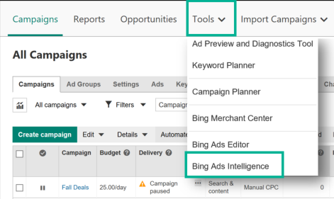
This is Bings Ads’ answer to Google’s Keyword Planner but the Microsoft-owned search tool has a real trick up its sleeve. With Bing Ads Intelligence, you can build your keyword lists in the Excel, which saves a whole bunch of time when you’re doing manual keyword research.
PPC lead generation
Getting traffic onto your site is great but your PPC strategy is only going to be profitable if you’re converting those visitors into valuable leads and customers. So let’s turn our attention to the best tools for PPC lead generation.
#28: Unbounce

First up, you’re going to need a landing page builder so you can create new pages for each campaign and test new variations. There are plenty of landing page builders on the market but Unbounce is the best one we’ve used and the tool we’re still using to build our landing pages today.
#29: Leadformly

Landing pages are a good start but you can’t convert users without web forms. Leadformly is a dedicated form builder and optimisation tool that gives you high-converting forms, which you can embed on any page without writing any code.
It also gives you in-depth analytics and optimisation tools to improve conversion rates and reduce friction. It’s multi-step form designs use conditional logic to guide users through a more engaging conversion process, which we’ve found to increase conversions by as much as 743%.
#30: Hotjar

Hotjar is a conversion optimisation tool that makes a real difference to your landing page performance. With heatmaps, you can see what users are clicking on, scroll maps show you what users are seeing and its user feedback features are excellent as well.
#31: Optimizely


Optimizely is one of the biggest names in conversion optimisation software and it’s an incredibly powerful tool for getting the best performance out of your landing pages. You can use A/B testing to determine which variations convert the most users and implement personalisation to create a more convincing experience for individual users.
#32: Exit-intent popups
Unbounce comes with popup features built into its platform and you can apply them to any page of your site, not only the landing pages you’ve built using Unbounce. This means you can stop traffic leaving your site and present users with a final offer to grab that conversion.
#33: Adroll

Adroll is a PPC, social and email marketing platform that helps you attract more leads, convert more of them into paying customers and optimise your advertising strategy. It comes with dedicated solutions for sB2C and B2B brands to increase traffic, conversion rates and PPC performance.
PPC lead nurturing
You can’t expect people to buy into your products or services the first time they land on your website (the vast majority don’t), but you can turn these visitors into genuine leads with softer conversions and then guide them towards the finishing line.
#34: ActiveCampaign

The first thing you’re going to need is a customer relationship management (CRM) platform that allows you to track leads along the buying process and send them relevant messages at every stage of the sales funnel. ActiveCampaign is a fully-featured CRM, marketing automation and email marketing platform that acts as the centre of our lead nurturing efforts.
We’ve been using it for more than five years now and we’re always happy to recommend it.
#35: SendinBlue

SendinBlue is an email marketing platform that also offers a CRM and automation features. It’s not quite as comprehensive as ActiveCampaign but its transactional emails are excellent and this is precisely what we use the platform for here at Venture Harbour.
#36: Remarketing

Remarketing is a feature you’ll find in Google Ads and most other PPC platforms that allows you to target users who visit your site but don’t convert. You can target these visitors with visual ads as they continue to browse the web and the key thing to know about remarketing in Google Ads is that you can use it to target organic traffic, too.
That’s a big deal.
#37: Remarketing lists
Remarketing lists, as the name suggests, allow you to create segmented lists for different types of users and target them with remarketing ads. This means you can target previous visitors with different messages, based on where they are along the sales funnel and encourage them to take the next step.
Combine Google Ads remarketing lists with events tracking in Google Analytics and you can assign users to lists based on the specific actions they take on your website. You can set this up so that users will be moved from one list to another as they complete actions and automatically targeted with remarketing ads to encourage them on to the next stage of the buying process.
#38: Dynamic Text Replacement
Dynamic Text Replacement is a simple but powerful landing page personalisation feature for Unbounce landing pages that matches the copy of your pages to the text of the ads users clicked on. This feature works incredibly well with Google Ads’ dynamic keyword insertion which essentially matches the text in your ads with users’ specific keywords.
Combine these two features and you can have highly-relevant messages across your ads and landing pages – all of which is automated and personalised.
#39: Invoca

Invoca is a call tracking and analytics solution that means you can attribute calls to digital campaigns and get a better understanding of which ads are driving phone call leads. This is a great call to implement alongside a CRM platform like ActiveCampign to bring your advertising and sales processes closer together.
PPC automation tools
Managing a PPC strategy across multiple platforms is a real challenge and you’re never going to maximise results by doing everything manually. To get the best performance you’re going to need the right PPC automation tools.
#40: Google Ads automated bidding

Google provides its own set of automated features and you can even run fully automated campaigns, called Smart Campaigns. You also have a bunch of automated bidding strategies – suitably called Smart bidding – that adapt your bids based on certain conversion goals, using Google’s masses of user data.
However, I would only ever recommend these features for very small businesses or advertisers who don’t have the resources to handle Google Ads themselves or get an agency in to do it for them.
There are some scenarios (eg: branding campaigns) where experienced advertisers and agencies might use Smart bidding but, in general, you don’t want to hand over control of your budget to Google.
#41: Google Ads scripts
Google Ad scripts give you the freedom automate all kinds of features and functions. For example, you can add your own bidding rules, detect low-performing keywords, track Quality Scores across all of your campaigns and generate custom reports.
#42: Build your own bidding algorithm

With the latest advances in machine learning, an increasing number of advertisers and agencies are building their own bidding algorithms. This gives you the complete freedom to adapt bids based on real-time consumer habits and real-world events that impact buying decisions – anything from the latest economic headlines to the weather in your target areas.
With platforms like ML.NET Model Builder from Microsoft, machine learning algorithms aren’t reserved for the big names in tech anymore.
#43: Adzooma

Adzooma is a Google Ads and Facebook Ads management, optimisation and automation platform that uses its own machine learning powers to improve performance. Its insights help you discover new opportunities, automate bids, discover performance issues and optimise improvements.
#44: AdStage

AdStage is a cross-channel reporting and optimisation platform that packs some powerful automation features. You can manage campaigns across Google, Facebook, Instagram, LinkedIn, Twitter, Bing Ads, Yahoo, YouTube and Quora Ads.
#45: Spaceboost

Spaceboost simplifies multichannel campaign management and PPC automation with a platform that’s powerful but easy-to-use. It’s especially good for structuring campaigns if you’ve got hundreds of thousands of different keywords to work with (eg: a lot of single-keyword ad groups).
PPC Analytics & reporting tools
Finally, it’s time to turn our attention to analytics and reporting tools, the crucial platforms that tell us how well your PPC strategies are performing and help you spot opportunities for improvement.
#46: Google Analytics

First up, we’ve got Google Analytics and this is one tool every Google Ads user wants to be familiar with. While Google’s advertising platform gives you all the basic analytics reporting you need, integrating with Google Analytics opens up a new world of reporting, optimisation and lead nurturing potential.
#47: Google Data Studio (free)

Google Data Studio is a free tool that you can use to create data visualisations and custom reports. You can add data from Google Analytics and other sources to build extensive reports and visualisation that will help you make better marketing and business decisions.
#48: Funnel

Funnel is a truly cross-platform PPC analytics suite that pulls in data from every ad network (Google, Facebook, Instagram, LinkedIn, etc.) and hundreds of third-party data sources so you can compile comprehensive reports from robust data. Used by the likes of Samsung, Ubisoft and Trivago, this is a serious reporting tool for advertisers that want the biggest impact from their data insights.
#49: Dash This

Dash This is an excellent reporting tool designed for advertising agencies that allows you to collect and combine reports from all of the major advertising platforms and digital marketing tools. It’s not as extensive as Funnel but it will help you build your reporting dashboard much faster.
#50: Agency Analytics

No prizes for guessing this one. Agency Analytics is also designed for agencies but the focus is on multichannel marketing reports to give you an overview of how your SEO, PPC, social, email marketing and other strategies are all working together. With automated reports, custom dashboards and full brandable interfaces, this is a great too, for agencies and brands looking to maximise their PPC returns.
Take your PPC strategy to the next level
With the PPC tools we’ve looked at in this article, there’s no reason you can’t take your paid advertising efforts up to the next level. Whether you’re looking for a cross-channel PPC management platform, deeper insights into your competitors’ keywords or ready to build your own machine learning PPC algorithms, these are the best tools to make it happen.
The post 50+ Tools To Help You Nail PPC in 2019 appeared first on Venture Harbour.
July 25, 2019
7 CRO ‘Best Practices’ That Can Kill Your Conversion Rate
Conversion rate optimisation (CRO) is one of the most important marketing strategies for modern brands. If you’re looking to make the most of your traffic and maximise ROI, then optimising for conversions is the obvious place to start.
It sounds like a sweet deal, too. Run a few tests and watch those conversion rates climb, magically turning your business into a more profitable venture without paying increase traffic – or, at least, that’s how CRO is typically sold.
Follow the tried and tested CRO best practices and it’ll all work out.
Except best practices don’t always work out and there are plenty of examples where widely accepted CRO principles can actually hurt your conversion rates and other KPIs.
Here are seven perfect examples.
#1: A/B test your way to success
When you first get into conversion rate optimisation, you’re keen to jump in and start testing changes to your website. You’ve seen all the case studies where changing CTA button colours has increased conversions by 300% and you want in on the action.
You want to run your first A/B test.
Unfortunately, while running tests is an important part of your CRO workflow, there’s often too much emphasis placed on A/B testing and not enough on what comes before/after it.

Before you start plotting your first CRO tests, you need to make sure the key parts of your site are receiving enough quality traffic. First of all, you need enough traffic that your tests will become statistically significant but you also need the right kind of visitors who are likely to convert and buy into your offer.
If your pages are receiving the wrong kind of traffic, CRO is essentially useless to you – so make sure you have the right inbound traffic before you start delving into tests.
Secondly, you also need to have the means to deal with a higher volume of leads after they convert. What’s the point of increasing conversions by 300% if your sales team isn’t capable of dealing with the increase in leads?
#2: Reduce friction to increase conversions
This is probably the most common misconception about CRO and also one of the most widely accepted “best practices”. Essentially, the theory is that the easier you make it for people to convert, the more of them will do so. And, while this is generallly a good principle to follow in terms of UX design, there are scenarios where friction is actually good for conversions.
Think about it: landing pages themselves add friction between clicking through to a website and completing a conversion. All that text, those images, scrolling, CTAs and button clicking increase the workload users have to do in order to complete an action.
Remove all friction from any page, you’re looking at a blank screen with nothing but a form on it – but that’s not going to convert.
The trick is knowing how and when to use friction to your advantage. For example, exit-intent popups have been found to increase conversion rates from traffic that would otherwise leave. Live chat widgets also interrupt the user experience but this isn’t a problem if they help users find what they’re looking for. Likewise, asking users to sign up to your newsletter or create an account adds friction but it allows you to follow-up leads with more relevant messages.

Or, as shown this VWO case study, adding a page and increasing the number of clicks required to complete an action can actually increase conversions – in this case, by 60%.
So, instead of going on a frenzy trying to reduce friction everywhere you see it, learn how to use it. It’s actually a powerful tool for not only increasing conversions in certain situations but also crucial for increasing the quality of conversions – something too many CRO strategies overlook.
#3: Make your web forms shorter
This one is closely related to the idea of reducing friction and you’ll see this “best practice” recommended everywhere. Sadly, countless tests have proven that shorter forms reduce conversion rates and lead quality in all kinds of situations and blindly trying to make every form as short as possible is a bad idea.
Here at Venture Harbour, we’ve increased conversion rates by as much as 743% by using multi-step forms that allow us to ask more questions, get more data and increase lead quality without having a negative impact on the user experience.
More importantly, these multi-step forms are central to some of our most successful lead generation strategies. For example, we ask users more questions about what they need from us so we can score and segment leads. We’ve also used this format to create free online tools people can use and the multi-step process, once again, allows us to pinpoint which of these users are most valuable to us as potential customers.

There’s a time and a place for short forms but we would never be able to achieve these kinds of lead generation strategies by simply asking people for their name and email address.
#4: Place your CTA above the fold
This is another classic “best practice” that harks back to the pre-mobile days where pages were basically all designed for desktop screens. In the mobile age, people are used to scrolling and the idea that every page should have a CTA above the fold is outdated.
Pretty much every landing page these days has a hero section with a background image, a tag line/slogan and a CTA button.
Sure, this is a tried and tested formula that works in a lot of cases but is your offer really so strong that one sentence and a background image is going to convince people to click that button?
Are you sure?

As you can see above, productivity tool Conga doesn’t place a CTA in the main body of the page until way below the fold. This gives the company more space to explain its offer and differentiate its products in a crowded market before hitting users with a CTA button – if you can even call an “Explore all products” button a CTA.
Users reach the bottom of the page before they’re asked to fill out a form for their demo although there’s the constant presence of that “Get a demo” CTA button in the header for desktop users (this is hidden in the off-screen menu for mobile).
So don’t rule out placing CTAs below the fold if you need more space to get your message across. It all comes down to how much intent people have when they land on your page and how clear the message in your offer comes across. test variations with CTAs above and below the fold – you might be surprised by some of the results.
#5: Test those CTA buttons!
One of the biggest mistakes marketers make when they first get involved in conversion optimisation is focusing too much attention on their CTAs. I’m not disputing the importance of CTAs but there’s a whole lot more that goes into influencing someones buying decisions.
You could have the most optimised CTAs on the web and still get a pathetic conversion rate if your site is too slow to load, for example. Likewise, if the content users see before they reach your calls-to-action don’t inspire any purchase intent, they’re hardly going to click just because you tell them to.
An effective CTA is the final stretch in a long-distance race and your mission is to get users over the finishing line, but nobody wins an 800m race if performance was weak in the first 600m.
In conversion rate optimisation, everything that comes before the CTA is just as important, sometimes more so, than the CTA itself – so make sure you look beyond testing one element of your pages.
#6: Add testimonials, social proof
Social proof, testimonials and other trust factors are a staple ingredient of modern landing pages, designed to build trust between users and brands. Just about every landing page guide will tell you to use these but they don’t always result in higher conversion rates – as shown in this Unbounce article.

The original case study was published by a company called ContentVerve that no longer appears to be operating and it’s one of multiple studies showing trust signals can actually hurt conversion rates.

We’ve seen similar results from a DIYthemes case study where the variation of CTA outperformed its rivals and actually improved results over time. So don’t think trust factors are automatically going to increase your conversion rates – they can even plant seeds of doubt in users’ minds or distract from the message you’re trying to convey.
There’s one more twist in the first case study referenced above.

A third variation that reworded the guarantee below this signup form finally resulted in higher conversion rates. The lesson here is to ignore “best practices” that tell you adding X, Y or Z to your pages is automatically going to increase conversion rates.
How you add them to your page is just as important when it comes to influencing conversions.
#7: Higher conversion rates = more profit
Conversion rate optimisation is a poorly named practice because it puts all of the emphasis on conversion rates. I would much prefer to hear marketers talk about performance optimisation or something more inclusive that considers other aspects of successful marketing.
The simple fact is, higher conversion rates don’t necessarily result in more profit – and this is what really matters.
You can optimise your pages to generate millions of conversions but what does it matter if only 3% of those end up becoming customers? That’s a lot of time and money to pump into CRO for a modest return. The quality of your conversions is far more important than the quantity and there comes a point where higher conversion rates mean you’re compromising on quality.
Your priority in CRO should be maximising conversions from users who are going to complete your marketing objectives. Above all, this means people who are going to buy from you, not simply download your free eBook and never interact with your brand again.
This is one of the key reasons why adding friction in the right places is important. It helps you filter out low-intent prospects who are unlikely to go the distance and it also gives you the opportunity to gain more information about them, which you can use to score leads and prioritise those most likely to do business with you.
Keeping best practices in context
There are some best practices that should be followed at all times – such as using high-contrast because the human eye struggles to see low-contrast elements. However, most of the “best practices” talked about in CRO conversations are anecdotal tactics that have worked in the past – not always, just enough times to give them traction.
I some cases, they’re simply selective findings from companies that are pushing their own products or services.
Best practices are genuinely useful if you take them on board and consider them in your design choice but they’re not rules in some guidebook to be meticulously followed. As you can see from the examples in this article.
The post 7 CRO ‘Best Practices’ That Can Kill Your Conversion Rate appeared first on Venture Harbour.
10 GDPR-Friendly Ways to Personalise Your Sales Funnel
One of the biggest challenges for marketers in the age of GDPR and other data privacy regulations is personalising digital experiences. The more relevant you can make your marketing messages to individual users, the greater your chances of converting them into customers and convincing them to make ongoing purchases in the future.
GDPR means you can no longer grab hold of user information as you please and use it to personalise experiences across multiple sessions and devices. So, in this article, we’re looking at 10 different GDPR-friendly ways to implement personalisation across your sales funnel.
#1: Getting consent from users
GDPR is only a problem if you’re not able to get consent from users within the EU and Britain to collect and use their data. If you’re able to get this consent, you’re free to personalise the consumer journey as much as you need to. This is the biggest change in a post-GDPR world: you need to convince users it’s in their best interest to give you access to their data.
In practice, designing non-intrusive consent processes is far more challenging than actually than giving users a good reason to hand over their data.

These default consent popups aren’t only intrusive, they essentially block users from accessing websites unless they give consent – something that’s not GDPR-compliant, if I’m interpreting the guidelines correctly.
Consent should be asked for in a way that’s both unobtrusive to the user experience and allows people to access your site, even if they refuse. After all, you’ve got nothing to gain by blocking people from your website but you may be able to turn them into valuable leads through other strategies.

We use selectable image buttons to make consent more engaging but still give users access to everything.
Too many brands are letting GDPR kill the user experience on their website by implementing obtrusive consent popups and there’s no real need to take this approach. Personalisation should enhance the consumer journey, not get in the way of it – but this is precisely what the majority of implementations I’m seeing right now are doing.
#2: Make personalisation a part of the experience
One of the biggest challenges with consent and personalisation is users don’t trust brands – and why should they? Cookies, tracking IDs, location data and just about everything else brands have access to are used to bombard people with marketing messages.
Sure, companies love telling people that their data is needed to deliver the best possible experience but this is BS in the vast majority of cases. That data is being used for marketing purposes and, if anything, probably detracts from the overall experience.
If the opposite was true, people wouldn’t be so dubious about giving access to their data.
So, instead of giving the usual spiel about how you’re going to use people’s data to enhance their experience, why not start by showing users how beneficial a truly personalised experience can be?

A growing number of brands are building entire services around personalised experiences that start as soon as users land on their website. For example, above you can see the hero section of Stitch Fix‘s homepage, a company that offers personalised online clothes shopping services.
This instantly normalises the concept of personalisation, shows that it’s an essential part of delivering the service on offer and proves that user data is genuinely being used to enhance the experience.
#3: Personalise your blog posts
You don’t always need data to personalise experiences and this was a revelation for us here at Venture Harbour. Sometimes marketers get fixated on ideas and lose all sense of creativity when it comes to problem-solving – like the notion that personalisation isn’t possible without personal data.
I think it helps to remind yourself what the key question is in any scenario. If you’re asking yourself “how can we get the data we need for personalisation?,” then you’re only ever going to implement methods that rely on data.
If you start asking “how can we personalise experiences without user data?,” then you might be surprised by what solutions you come up with.

This is precisely what happened to us when we came up with the idea of a WordPress content personalisation plugin that requires no user data. Instead of showing the same content to everyone, the plugin allows you to tailer the same blog posts to multiple audience types and let them choose which content is relevant to them.

Our WordPress personalisation plugin allows users to select the content most relevant to them.
For example, we can create a blog post covering marketing automation but include content relevant to different types of marketers. Readers can then click which piece of content they want to read and this allows us to deliver more relevant information to them.
Instead of having to read content that isn’t relevant to them, users can dive right into what’s valuable them and forget about the rest – all without requesting a single piece of data.
That said, this data-free approach to personalisation gives users a taste of what can be achieved with personalisation and this gives us a platform to ask them for data that allows us to deliver an even richer experience. Aside from increasing engagement on our blog posts, we’ve also seen an increase in people opting-in to our consent requests after implementing this strategy.
#4: Use multi-step forms to get relevant info from users
Instead of presenting users with multiple form fields and those horrible consent options, multi-step forms allow you to create a more engaging sign-up process. We’ve found this to increase conversions between 300%-700% for multiple ventures and clients and this format has also minimised any negative impact of GDPR compliance.
First of all, we use conditional logic which filters out irrelevant questions based on the answers users have already provided. So we’re delivering a personalised experience while people fill out the form and we’re carefully choosing our questions to get implicit consent from users.
For example, if people give us their phone number the, of course, they expect that we might call them. In this case, GDPR guidelines don’t apply it’s obvious what we’re going to do with this phone number – as long as we don’t use it for any other purposes.

Finally, we ask for consent at the final stage of the form and thanks to a psychological phenomenon known as the sunk cost bias, users are highly unlikely to abandon our forms at this stage because they feel like they’ll have wasted their time filling it out to begin with.
All we need to do at this point is make sure our reasons for requesting data are convincing enough.
#5: Request consent after the conversion
In the last point, I mentioned implicit consent when a user gives us their phone number as a means of contacting them. They’ve already given consent by providing their number for this specific purpose but we would still need to get consent to use it for anything else – eg: reaching out to them with offers at a later date.
The same thing applies to email addresses: you don’t need explicit consent if users provide you with an email address with the expectation you will use it to contact them (a query or customer service issue, for example).
However, you will need consent to continue using this email address for other purposes. You don’t necessarily need to get this consent upon signup, though. You could try and get it in the initial interaction and this also applies in instances where users refused to give consent while signing up.
Let’s say a potential customer has requested a quote from you but they declined to give consent for you to send personalised recommendations or advice in future emails. You’re free to send messages to this person for the purposes of quotation but you can use these exchanges to build a relationship, trust and incentivise them to give consent at a later date.
#6: Create incentive for personalisation
In behavioural science, the Fogg behaviour model illustrates how people’s decisions/actions are facilitated by two key factors: motivators and ability.

Credit: Kristen Sunde, Slideshare
Essentially, the harder it is to do something, the less likely people are to do it – and this is where the concept of removing friction comes into play. However, the other key variable in this scenario is motivation and the more of this you’re able to inspire in people, the more likely they are to take desired actions.
So, as long as your consent process is as intuitive and non-intrusive as possible, the only thing left is to increase motivation.
Create incentive for the personalised experience you’re going to provide. Show users the benefits of handing over their data before you ask for consent and give them reason to believe they’re genuinely better off giving you access to their personal information.
#7: Get personal with customer service
Personalisation isn’t only a tool for generating more leads and conversions. In fact, it’s even more important that you’re able to personalise the customer experience after they’ve bought into your products or services.
Customer retention should be one of your marketing priorities because these are the people who are most likely to keep buying from you in the future – and you’ve already invested a lot in getting their business.
The post-sale journey also provides you with a wealth of opportunities to implement personalisation and get consent from existing customers to use their data. For example, existing customers are going to want to know about your best deals and they can get updates sent right to their inbox.
If that’s not enough, you can also provide product recommendations or special offers relevant to their previous purchases. This tells them you’re paying attention to what they want from you and doing what you can to give them a little something back.
Not generic money-off deals but special offers that are relevant to their interests.
#8: Use chatbots to personalise sessions
Chatbots and live chat widgets are a great way to personalise individual user sessions without using any data. You simply provide answers, product recommendations or resources based on the info users provide within a contained conversation.
This creates a highly-personalised experience that doesn’t intrude on personal information and you’re only using info relevant to the individual session.
You don’t need to end things here, though.
Once an individual session is over (or, at a relevant point during the session), you can ask for user consent to store this information for future conversations. Explain to users that your bot is always there for them and ask if they would like it to remember what was said in this conversation, which will make future interactions faster and more relevant.
Chatbots are great for using playful language, too, so you can try to make users feel more comfortable with some tongue-in-cheek phrasing. Maybe tell them your bot loves helping customers but its memory can be a little fuzzy sometimes – so why not store their details and conversation history for future sessions?
#9: Behavioural personalisation
We’ve already looked at some ways you can implement personalisation without using any data and it’s important marketers realise there are alternatives. Sure, data-driven personalisation is always going to deliver a richer experience across multiple sessions, platforms and devices.
Not all personalisation needs to be this extensive, though.

Behavioural personalisation, which adapts the user experience based on user actions within a single session, is something too many brands and marketers are overlooking. In the example image above, clothing retailer Pull&Bear starts the session by asking users if they want to browse women’s or men’s clothes and the site continues to navigationally personalise the experience from there.

This doesn’t require any data whatsoever but it does create a more relevant and personalised experience that’s intuitive every step of the way. Pull&Bear does ask users for consent to store their data for future sessions but the experience doesn’t rely on this data exchange and users are never denied access to anything for refusing to give consent.
#10: User accounts
Whether you’re in the eCommerce game or software business, encouraging users to create accounts and giving them a wealth of customisation options is one of the most powerful personalisation tactics you can employ.
Why do think Shopify users are so reluctant to cancel their monthly subscription plan when they’ve got thousands of hours worth of playlists saved on the platform.
Are they going to want to go ahead and do that all again on another rival service?
Not likely.
The same thing applies to any kind of software or account-based service. If you create an environment that puts a heavy emphasis on customisation, it becomes very difficult for users to give it up.
It could be a marketing automation suite filled with custom-built workflows or an exercise app filled with years of personal fitness data. Once you achieve a certain level of personalisation, the risk of losing customers to rival brands becomes very small.
Don’t let GDPR kill personalised marketing for you
The key message in this article is that GDPR doesn’t need to spell the end of your personalised marketing strategies. Yes, you may need to adapt a few things but it’s perfectly possible to get the consent you need without killing the user experience and tanking your conversion rates.
Likewise, there are plenty of data-free personalisation strategies you can employ to enhance the experience, improve engagement and boost sales – regardless of whether people give consent or not.
The post 10 GDPR-Friendly Ways to Personalise Your Sales Funnel appeared first on Venture Harbour.
July 12, 2019
CTA Psychology: 11 Principles That Make Users Click
According to research from Unbounce, the average conversion rate on business landing pages is 4.02%. In some industries, these averages can drop as low as 2.6% or reach as high as 6.1% but the key point here is that 90%+ of the traffic that lands on your site isn’t converting into anything valuable.
Source: Unbounce
In fairness, we’ve been hearing these kinds of statistics for years now and average conversion rates are on the up – largely thanks to a major adoption of conversion rate optimisation (CRO) and a better understanding of best practices, such as mobile optimisation.
When talk turns to conversion optimisation, though, there’s one element that tends to dominate the conversion: calls to action (CTAs). There’s good reason for this, too, because it’s the CTAs that seal the deal and push potential buyers over the finishing line – roughly 4% of the time, anyway.
Considering their importance and the amount of room for improving conversion rates, CTAs deserve to dominate the conversation but marketers are all too often guilty of talking about them in the wrong way.
Ask a marketer for advice on CTAs and they’ll probably tell you about button colours, font styles, placement and various other design aspects – all of which are important considerations which may have an impact on your conversion rates. However, there’s rarely any talk about what influences buying decisions most in those final crucial moments.
Well, this is precisely what we’re going to talk about in this article. We’re talking about CTA psychology and 11 trusted principles that’ll really make a difference to your conversion rates.
What are we looking at in this article?
Like I say, there are tonnes of articles out there offering tips on designing CTAs, covering placement, button colours, font styles, colour contrast and all the usual design aspects. Those articles are great for what they are but we’ve got enough of them already so I’m not going to repeat any of that stuff here.
Instead, we’re going to look at something that doesn’t get much coverage at all: the psychology of what makes a high-converting CTA.
Now, I say this doesn’t get much coverage because there are some articles covering CTA psychology, but they tend to focus on things like the subliminal effect of colours, power words, visual cues and other basic design principles.
Again, these are all worth knowing about but they don’t really get into deep psychology of what makes people click CTAs.
This is what we’re looking at in this article and there are 11 key principles coming up:
Loss aversion: People’s natural fear of losing or missing out on something.
Anchoring: Our tendency to be more influenced by the first piece of information we receive than those which follow.
The halo effect: The reason first impressions are so difficult to change.
Sunk cost bias: The compulsion to complete something once you’ve already invested time into it.
The endowment effect: Causes people to place additional value on items they own vs those they don’t.
The mere exposure effect: Why people tend to favour things they’re already familiar with.
The serial position effect: How the first and last items on a list appear to be more important than the others.
Reciprocity: Why, when you do something for someone, they have a natural tendency to want to do something for you in return.
The Baader-Meinhof Phenomenon: After you see something for the first time, this causes you to suddenly start noticing everywhere.
The Verbatim effect: The reason we remember the gist of what we’re told rather than the specific details.
Clustering: Our habit of clustering similar pieces of information together to make them more memorable.
So those are the 11 psychological principles we’re going to be looking at in this article and I’ll be explaining how you can use each of these to create CTAs that really make people click.
#1: Loss aversion

Source: Invespcro.com
What is it?
Loss aversion is a cognitive bias that causes us to fear loss more than we value gaining something of the same value. We’re quite literally more frustrated to lose £10 than we are happy to find one in the pockets of an old pair of jeans.
How it makes people click
As Khalid Saleh explains in this article for Invespcro.com, coupons are a classic loss aversion tactic that has boomed an entire sub-industry of eCommerce. So, why have brands like Groupon been so successful?
Well, one reason coupons are more effective than regular sales is because brands are giving consumers something imaginary – a coupon they feel as if they actually own. And, the fear of missing out on this discount is greater than the sense of gain they’ll get from a regular discount of the same value.
Another way brands exploit loss aversion is by placing time limits on special deals. This creates a sense of urgency because users feel like they’re going to lose out on the opportunity of getting a special deal.
Likewise, you can also create a sense of urgency by using scarcity to trigger loss aversion. You’ll see this all the time on hotel booking sites like Booking.com where every listing seems to tell you how many times a room was booked in the last hour and how few rooms are left available – all designed to make people fear they’re moments away from missing out on their room of choice.

These might sound like crude tactics but they work. We all think we’re too smart to fall for blatant marketing ploys but try telling yourself there’s no rush to book when your partner has their heart set on that suite with a view of the city lights.
For more insights into how loss aversion makes people click, take a look at our article on how to increase conversions using loss aversion.
#2: Anchoring

What is it?
Anchoring is another bias where people assign more significance to the first piece of information they receive. For example, the first review someone reads about a product, service or brand will have more of an impact on them than the second or third.
How it makes people click
The most common use of anchoring you’ll probably come across is manipulating people’s perception of prices. Essentially, if you start with a more expensive price and then follow with something cheaper, the second price instantly feels like a good deal. This is because the first price set the bar of price expectation and anything lower than that will undercut this new-found perception of a default price.
You see this all the time from retailers who display the RRP of an item and then show the discount price.

Software companies often use this tactic, too, by leading with a more expensive plan and then following up with a cheaper option. Instantly, those cheaper plans seem reasonably priced and the sense of this increases with larger price differences.

Let’s face it, $14.99 per month sounds very reasonable when the bar is first set at $299.00 per month. Yet, somehow, this doesn’t sound like such a great deal when the first price you see is free and you’re suddenly questioning why you should pay $9.99 or $14.99 per month – forget about $299.
#3: The halo effect

What is it?
The halo effect explains how our first impressions influence the way we interpret information about the same thing. This is one reason why loading graphics are a poor solution to slow loading times because they essentially telling people you’re a brand that’s going to keep them waiting.
How it makes people click
Loading times aren’t the only thing that can make a bad impression on people. User experience in general and the overall design of your site can leave a lasting impression on people – or simply give them enough reason to quit your site altogether and head back to search or wherever they were before clicking through.
First impressions count and poor design/UX is going to get you off to a really bad start.
The halo effect also helps to explain why delivering the right messages, as soon as possible, is so important. Imagine someone clicks through to your site looking for adventure holiday ideas and they see a generic travel page that doesn’t mention anything about adventure trips.
By failing to confirm that you provide exactly what this user is looking for, you plant that seed of doubt in their mind that you can’t deliver what it wants. This provokes a cautious mindset that’s going to force people to scrutinise everything in more detail – assuming they don’t click right back to Google.

Compare this to someone who instantly sees adventure activities when they click through to a landing page, confirms this brand has what they’re looking for and already starts imagining themselves dune riding in the desert before they even click through to the next page.
The halo effect is also one of many psychological factors that make branding, reach and exposure so important. If someone sees your brand sitting at the top of Google for their search query, they’re automatically going to assume you’re bigger and better than companies ranking below you, even though have no genuine experience to base this on.
For more tips on how the halo effect influences buying decisions, check out these seven examples of how it can increase conversions.
#4: Sunk cost bias

What is it?
Otherwise known as the sunk cost fallacy, sunk cost bias describes how people continue on with something simply because they’ve already invested time, money or other resources into it. This explains why people often overeat when they’ve paid for a meal at a restaurant or go to an event when they’re not feeling up to it because they’ve already bought a ticket.
How it makes people click
When people invest time or money into something, it feels like those resources have been wasted if the desired outcome isn’t achieved. For example, if you spend three hours in different shops, looking for a new pair of running shoes, it feels like you wasted that time if you don’t walk away with a box of shoes in one hand.
However, it feels like a successful use of time if you end up buying what you set out to get.
The funny thing is, if you’ve already spent three hours looking, you feel compelled to continue looking until you find the right pair, to avoid the feeling that you’ve wasted those hours, even though you’ll end up losing more time in the process.
Even more telling is that you’re increasingly likely to make a rash purchase decision and buy a pair of running shoes you wouldn’t normally wear or spend more than you initially intended to – all to avoid that illogical sense perception of wasting time.
We make use of the sunk cost bias on our web forms by implementing progress bars. Sure, these are great for telling people how many more questions there are to fill out but, more importantly, users are far less likely to quit a form once they’re past the half-way point because they feel they’ll lose more time than they gain by quitting now.
You can also use sunk cost bias to keep customers buying from you.
This is how camera companies make it so difficult for photographers to switch to rival brands, by encouraging them to invest money in lenses, essentially forcing them to keep buying from them.

Software companies can also trigger the sunk cost bias by encouraging users to create personal profiles and heavily customise the platform. The more time and effort users put into getting a piece of software how they like it, the more difficult it becomes to abandon and start from scratch with another provider.
Check out our article on how to use the sunk cost bias to increase conversions for more ideas.
#5: The endowment effect

What is it?
The endowment effect occurs when people overvalue something they own or have a perception of ownership.
How it makes people click
In 1991, Richard Thaler, Daniel Kahneman and Jack Knetsch conducted an experiment, giving one group of students a coffee mug and another group nothing. The group with mugs were then asked how much they would be willing to sell them for. The other group were asked how much they would be willing to pay for the exact same mug.
The group who were given mugs demanded significantly more money than the group without mugs were willing to pay ($7.12 vs $2.87 averages).
This is due to the endowment effect, which encourages people to place more value on an item they own than they would if they had no sense of ownership.

Marketers manipulate this all the time by giving potential customers something to establish this sense of ownership, which then increases its value in their minds. When Uber gives you a free ride, you develop a sense of ownership over this offer – it’s yours and the wording of this offer is no accident.
When software companies like Deezer offer people two free months on its premium plan for free, the aim is to make users feel like the premium version is truly theirs. This increases the value of the plan in their minds and makes them far more likely to pay up for the full price when their free two months is up.
The more you can create this sense of ownership before the actual purchase is made, the greater your chances are of sealing the deal – and you can find out more ways to use this technique in our endowment effect examples post.
#6: The mere exposure effect

What is it?
Otherwise known as the familiarity principle, the mere exposure effect explains why people are more likely to buy from brands they know. For example, people are more likely to buy Nike running shoes than shoes from a brand they don’t know, even if they’ve never worn a pair of Nikes before.
How it makes people click
Earlier, I explained how the halo effect helps with branding campaigns and the mere exposure effect is another key psychological factor at play here. Essentially, this psychological phenomenon explains why people favour things they’re familiar with over those they’re not.
This is especially true when a band has a particular reputation or association with something. For example, German cars have a reputation for being reliable and well-engineered but this association is built more on reputation than it is on personal experience.
Likewise, Skyscanner is associated with cheap flights even though it doesn’t do anything different than other flight comparison platforms. The simple fact is the mere exposure effect and strong branding builds these reputations and perception of trust in people who have no prior experience of dealing with brands or their products/services.
#7: The serial position effect

Source: Wikipedia
What is it?
The serial position effect explains how people remember the first and last items on a list more easily than the items in between. While numerous studies have also pointed towards people subconsciously interpreting these two items as more important than others.
How it makes people click
There are two psychological principles at work in the serial position effect:
The primacy effect: Where people assign more value to the first piece of information they receive and stand more chance of remembering it.
The recency effect: Where humans simply stand more chance of remembering the most recent piece of information they receive.
Combine these two principles together and you have the serial position effect, which explains why the first and last items on a list are more memorable than items in the middle.
This principle is crucial when it comes to delivering messages as it tells us to lead with our most important piece of info. You can apply this to entire pages and email designs, lists of benefits and product descriptions.

Layouts of three are especially effective as they allow you to put your most important messages either side of a supplementary offer and you can apply the same principle to information people need to remember.
We use this same principle on the Leadformly website to quickly explain how it works. Our aim here is to showcase how easy the platform is to use so we condense the most complex stages (building and styling forms) either side of the simple steps, choosing templates and capturing leads.

The takeaways people get from this is that they can simply choose a template, play with a few settings and watch the leads roll in. All they need to do is click that blue button and start using Leadormly for free.
You learn more about boosting conversions with the serial position effect from this article with examples included.
#8: Reciprocity

What is it?
When someone does something for you, reciprocity describes the compulsion you have to do something for them in return. Or, when someone receives something for free, they then feel compelled to give something back in return.
How it makes people click
Reciprocity was first introduced by Dr Robert Cialdini in his book, Influence: The Psychology of Persuasion. He cites studies where restaurant customers are given mints with their bill and how this affected the tips they left for staff. Customers who received a free mint with their bill left higher tips by an average of 3.3% but those who were given two mints left a massive 20% more in tips, on average.
This tactic has been used by brands for decades and one of the most common pre-digital examples was companies giving out free samples. Those tiny sachets of perfume and washing up liquid not only give people a chance to try out the product themselves, but also create a sense of debt towards the brand sending them.
Copyblogger offers a collection of free eBooks for writers.
We also see reciprocity everywhere in modern marketing with free content, free downloads, free trials, free gifts, free anything.
There are two key principles you need to understand to make reciprocity work, though:
Give first: To trigger reciprocity, you have to be the first one to give and offer something to prospects without any obvious reward.
Value: You have to offer something of perceived value and the greater this perception of value is, the greater the more prospects feel obliged to repay.
Offering discounts on items or adding free gifts to purchases doesn’t trigger reciprocity because it requires the customer to give first. People need to feel like they’re really getting something of value for free without any obligation to do anything in return. Psychology will take care of the rest and naturally compel these people to repay something of a similar perceived value.
This doesn’t need to be a one-on-one exchange, either. You can give potential customers free gifts over an extended period of time to increase their sense of debt and continue to do so after they’re paying customers to keep them buying from you. Reciprocity plays a key role in the reason customer loyalty rewards are so effective, constantly topping up that compulsion to remain loyal.
#9: The Baader-Meinhof Phenomenon

What is it?
The Baader-Meinhof Phenomenon – or the frequency illusion – occurs when you encounter something for the first time and then it appears to be everywhere you look.
How it makes people click
, this psychological habit is caused by two cognitive processes: selective attention and confirmation bias.
“The first, selective attention, kicks in when you’re struck by a new word, thing, or idea; after that, you unconsciously keep an eye out for it, and as a result find it surprisingly often.”
And then:
“The second process, confirmation bias, reassures you that each sighting is further proof of your impression that the thing has gained overnight omnipresence.”
This is why branding campaigns are so important but there are a couple of things you need to be doing consistently to pull this off:
First, to trigger selective attention you need to grab people’s attention to begin with – and this is where your ads need to make a real impact.
Second, to follow this up and trigger confirmation bias, you also need to be a constant presence on the platforms your target audiences are using.
Ever wonder by major brands spend so much money just to have their logos seen by millions of people at major sporting events? The Baader-Meinhof Phenomenon will help your ads cut through the noise, emphasise your brand message and make potential customers more likely to click before they even land on your page.
#10: The Verbatim effect

What is it?
The verbatim effect describes how people tend to remember the gist of things they’re told, rather than specific details. It also explains why people memorise concise, short messages more easily than longer, complex pieces of information.
How it makes people click
Essentially, you need to cut to the chase when it comes to important content: CTAs, product descriptions, landing pages and anything else that should be memorable or influential.
The best landing pages have short, concise and powerful messages that have more impact than an entire essay could.
The verbatim effect should be something you keep in mind with every piece of content you create. However, it should be a key principle in the creative process of building landing pages, designing page content, creating ads and every other resource that’s designed to influence buying decisions.
The verbatim effect will help you nurture lost leads, too. For example, when someone clicks on your ad, which has a concise, punchy message, and sees the same core bits of info repeated on your landing page, this reinforces the message this visitors establishes with your brand.

Toggl keeps it simple on its homepage, simply conveying the message that its software tool will save time and boost productivity. That’s all people are going to remember – not the precise wording or any longer content about how the platform works.
So after a visitor leaves a page like this (after seeing the same message in an ad and then again on a landing page), targeting these users with the same message via remarketing ads is going to keep this concept fresh in their mind and continuously build this brand associated with the idea.
Over time, the brand becomes synonymous with this topic.
#11: Clustering

What is it?
Clustering is a cognitive habit where people try to group pieces of similar information together in order to remember more. For example, when you create a shopping list, you’re more likely to remember a higher number of items if you group them into categories (eg: meat, dairy, grains, etc.) than you will if you list them randomly.
How it makes people click
Clustering is most important when it comes to page design and content organisation. We’ve already looked at how the serial position effect impacts lists and layouts. We’ve also looked at how the verbatim effect causes people to remember basic concepts rather than specific details. And, now we have clustering, which describes how people naturally group pieces of information together in order to make them more memorable.
We can see how this influence app designed, as in the screenshot of the Any.do app above.
Studies show that most people can only remember seven pieces of information at any one time – give or take two in either direction. Which means you should be optimising content in a way that conveys a maximum of five details at once.
So, if you’ve got more than five services to promote on your website, for example, you might want to try and condense them into categories or only list five of them on your homepage.
What comes before the CTA is just as important
In this article, we’ve looked at genuine psychological factors that influence how people perceive information and make decisions. We haven’t looked at CTA button colours or discussed sans vs sans-serif fonts because those are minimal influencers when it comes to inspiring action.
The most important takeaway from this article should be that the content that comes before the CTA is just as important as anything else. It’s how you set users up with ad copy, page content, layouts and emotional triggers that will determine what they do when they arrive at your CTAs.
So don’t just focus on how your CTAs look; optimise the path to finding them and make the most of the psychological tools at your disposal to influence people’s mindsets before they reach your calls to action.
The post CTA Psychology: 11 Principles That Make Users Click appeared first on Venture Harbour.
July 11, 2019
11 Lead Generation Ideas That’ll Triple Your Email Signups
With the latest research showing online purchases involve anywhere between 20 and 500+ touchpoints, multi-channel lead nurturing has never been so important.

The biggest challenge with multi-channel marketing is reliably tracking user actions, so you can identify them as they make these touchpoints and reach out to them with relevant messages to guide them along the buying process.
Email addresses are the most reliable way to identify and track users – and it’s also the only channel that really allows you to send personalised messages to users individually.
Tracking IDs work, to an extent, but they’re ineffective once people clear their browser caches or move between different devices.
Email solves these problems, giving you a direct line to deliver highly-relevant, personal messages that cater to the unique needs of each lead – so it’s no surprise email marketing is consistently listed as one of the most important channels

Source: Adobe Retail Industry report
The biggest challenge in email marketing is getting your hands on email addresses, to begin with. So, in this article, I’ve got 11 lead generation ideas that are going triple your email signups. Not just any old signups, though – highly-relevant email addresses from people with a genuine interest in buying from you.
#1: First, sort your forms out
The first thing you need to do is sort your web forms out because this is where all of your email addresses are going to come from. According to research from Unbounce, the average landing page conversion rate is roughly 4% with industry lows coming in a 2.6% and highs at 6.1%.
Now, consider the fact that 76.9% of users who start filling out your forms are going to fail to convert.
Let’s face it, anyone who’s ever used the internet knows web forms generally suck and filling them out is a pain. We’ve all given up on purchases because a web form has made it too difficult to complete the conversion or we’ve just filled them out incorrectly and given up.
Either way, the stats all prove one thing: the best way to triple your email signups is to sort your forms out and reduce that form abandonment rate.
We’ve increased our conversion rates by 743% over the past five years using Leadformly. The form builder allows you to create high-converting multi-step forms that use a technology called conditional logic to personalise the filling out process.

This increases engagement by only asking relevant questions, based on the information users submit along the way. Crucially, the tool minimises the amount of typing required to complete forms, which reduces form fatigue and massively improves the experience on mobile. While the multi-step designs allow you to collect more information from users without scaring them away with long forms.
Traditional form designs don’t really cut it in the modern age and designing forms that convert is a priority for every brand. However, something far too many marketers ignore is form optimisation, which is crazy considering there’s so much room for improvement.
We never would have achieved a 743% increase in conversions without continuously optimising our web forms. Leadformly’s dedicated form analytics tools allow us to see how many users start filling out our forms, how many complete them, how long it takes users to fill out each field and which fields cause them to abandon – so we can pinpoint issues with our forms and test new variations.
Trust me when I say you want a dedicated form analytics and optimisation tool.
#2: Optimise CTA placement using heatmaps
Web forms don’t get the attention they deserve when it comes to conversion optimisation but this isn’t a problem for calls to action. CTAs feature heavily in just about every CRO case study and there’s no denying their importance – as long as you remember there are other things on the page that also need optimising.
Marketers who invest in CRO have a bad habit of obsessing over CTAs and A/B testing minute details like font weights and button shapes in the hopes of drastically boosting conversion rates.
Reality check: People don’t buy from brands because their CTA buttons have 4px rounded corners.
CTA placement is far more important than basic styling choices, so make this the first thing you optimise for. We use Hotjar scroll maps to make sure users are actually seeing our CTAs for each page and I can’t recommend this tool enough. You’re never going to get email signups (or any kind of conversion) if users aren’t seeing your CTAs.

Check out our Hotjar review to earn more about what it’s great at and what it’s not-so-great for.
Once you’ve got placement sorted, start optimizing other aspects that make your CTAs more visible:
Colour contrast
White space
Text size
Button size
Button colour (mostly for contrast)
Again, it all comes down to making your CTAs visible enough to grab users’ attention while fitting in with the overall design of your page.
These are the most important visual factors of CTA optimisation and the rest of your attention should focus on your CTA text and the content surrounding it. Don’t get caught up in the finer details until you’ve got the core essentials covered.
#3: Convert blog readers with dynamic CTAs
Everyone who reads your blog content shows a specific type of interest in your business and what you’re promoting. If you’re not turning these readers into leads, then you’re letting a lot of traffic you’ve worked hard to gain slip away.
The thing is, people aren’t going to sign up to your email list just because they’ve clicked through to read one of your blog posts. You need to convince these readers that you’ve got a wealth of valuable content they’re going to want to keep reading over time.
So here’s the deal.
First, you’re going to need killer blog content that gets people clicking through to your site and reading through your posts. Cram as much value as you can into these articles and make them highly relevant to specific themes.

For example, if you’re selling business productivity software, publish in-depth articles in the categories of productivity, automation, growth, b2b marketing and the other topics you consider most important.
Next, create extensive guides on these topics that users can download for free – eg: 101 Ways You Can Improve Business Productivity and The Complete Guide to B2B Business Automation. Now, you can place CTAs on every blog post to promoting your guides for each category/topic.
Users have already shown a strong interest in this topic by reading your blog post and this is your opportunity to show them how much extra value your in-depth guides have to offer.
Break up your blog posts with these CTAs to help reduce text overload and increase the chance of users seeing them.

Here’s an example of our dynamic CTAs in action.
You can create dynamic CTAs that automatically insert the relevant piece of content for each post category, as well. This allows you to create this CTA space universally and the code will automatically insert the relevant CTA for every post you publish.
Something along the lines of this should do the trick in WordPress:
if ( is_category( ‘productivity’ ) ) {
get_template_part(‘productivity-cta’);
}
If you’re not using WordPress, you can place your CTA content as HTML in individual .php files and call them in with a similar if statements related to blog categories.

Another dynamic CTA design we’ve tested out on our blog posts.
Try this out for yourself and stop letting blog readers leave your website as soon as they’re done with your content.
#4: Publish educational content
Educational content promises to empower people with knowledge, something they can use to improve their own lives. Nobody signs up to sales pitches; we like to think we make our own decisions without being influenced by the brands we buy from. But we’re quick to sign up to something if we think we’re going to get something genuinely valuable for free.
So what’s the difference between educational content and the in-depth guides we looked at earlier?

Well, that’s up to you to decide but I suggest you strongly emphasise that this content is a learning resource and avoid any titles/headlines that sound even remotely promotional.
On our homepage, we take the approach of passing on our insights to – everything we’ve learned from building Venture Harbour and turning our clients into bugger businesses. We don’t only talk about our successes, either. We candidly talk about the mistakes we’ve made and the lessons we’ve learned along the way so other business owners – the kind of business owners who are potential customers for us – can also learn from them.
Of course, this also demonstrates everything we’re capable of doing here at Venture Harbour.
#5: Promote your free downloads on social media
Social media is the ideal place to promote your free downloads and other lead generation content with paid ads. This will get an instant stream of traffic from potential leads and the targeting options available on networks like Facebook and LinkedIn allow you to deliver your ads to highly-relevant audiences with an interest in the topics you’re covering.

While Google Ads can also be a good tool for this, the search queries that trigger ads for this kind of content are somewhat limited. By all means, do your keywords research and make the most of the opportunities that are there on Google Ads but results will probably be faster (and definitely more straightforward) on social media – so I recommend starting here.
Your long-term goal should be getting your content to rank well in organic search so you can rely less heavily on paid ads and get free traffic rolling in. This will take some time, depending on the keywords you’re targeting and quality of your content, but it’s worth doing.
In the meantime, you can supplement any SEO weaknesses with paid ads.
#6: Personalise landing page content to match search intent
As I’ve mentioned multiple times already in this article, email marketing is all about delivering relevant messages. You’re only going to maximise signups if you create tightly-themed campaigns that generate inbound traffic from users with specific interests, which you can use as incentive to hand over their email address.
This means you need to create relevant landing pages for each campaign with messages centred around those interests.
If you’re using a landing page builder like Unbounce (highly recommended), creating landing pages for each campaign is relatively straightforward. Each of your landing pages should match the intent that encouraged users to click through in the first place and this isn’t too difficult to do topically if you’re creating relevant landing pages for each campaign.
However, matching the exact queries terms people type into search engines is far more challenging. You can’t create campaigns and landing pages for every variation of the same target keyword and the good news is you don’t have to.
Unbouce also comes with a feature called Dynamic Text Replacement, which adapts the content on your landing pages to match the search terms users type into Google. So, as long as you’re creating relevant landing pages for each campaign topically, Unbounce will go the extra yard and help yo match the specific words people are typing into search engines for 100% relevance.
#7: Use remarketing to bring previous visitors back and get them to sign up
Remarketing is one of Google Ads’ most powerful features for getting email signups and it all comes down to getting previous visitors to come back to your site and sign up after they’ve already shown an interest in your brand. A lot of users aren’t going to sign up on their first visit and this gives you a channel to keep reaching out to them.
You can also combine remarketing with events tracking in Google Analytics to create lists for users who abandoned your form and other segments, allowing you to target each audience with more relevant messages.
A key feature of remarketing is that you can use it for both paid and organic traffic.
So you can target people who click through to your site from Google Search and target them with remarketing ads based on the pages they’ve visited and the content they’ve engaged with. This means remarketing only becomes more valuable as your SEO efforts pay off and your lead generation content starts ranking higher in organic search.
#8: Build a free tool to get users on board
If you can solve problems for your target customers, you’re on to a winner. And, if you can do this for free, everybody wins – especially if you get your hands on that all-important email address in return.
Welcome to the world of free tool lead generation. You create a free online tool that your prospects can use to solve a problem relevant to your business and all you ask for is an email address to send them the results.
One of the best examples of this is Crazy Egg’s free heatmaps tool that features on the company’s homepage. All users need to do is type in the URL of the page they want to analyse, click the “Show me my Heatmap” button and then submit their email address to get their hands on a free heatmap.
We’ve taken a similar approach with Marketing Automation Insider, an online resource we created to help businesses choose the best marketing automation software for their needs. On the homepage, we’ve implemented a free tools businesses owners can use to get a custom list of software recommendations.
Once again, we’ve used Leadformly to create a multistep form that asks users how large their business is, how many contacts they have to work with and what their monthly budget is.
Then, all they need to do is submit their email address to get the results.
Now, the problem we’re solving with this tool is the overwhelming process of choosing from the countless marketing automation software options out there. Business owners want to know they’re getting the best tools for their money and this tool will help them do just that.
For us, the value is in getting email contacts from potential customers ourselves and the real magic here is that Leadformly allows us to segment signups, based on the information they’ve given us. This means we can place users that match our buyer personas to email lists and prioritise them in our email marketing efforts.
#9: Run an automated evergreen webinar strategy
A recent study of B2B professional revealed that 91% prefer to engage with webinars over any other kind of content. That’s a huge statistic and we’ve written about the important of webinar marketing numerous times on this blog. We can also say that our automated evergreen webinar strategy has become one of our most successful lead generation tactics.
If you’re not familiar with the term, an automated evergreen webinar strategy involves recording a single, high-quality webinar and then using automation software to routinely play it at scheduled intervals – eg: every hour.
This means people can sign up to watch your webinar and there’s always a screening coming up in a matter of minutes. We place a timer on our CTAs to increase signups by creating a sense of urgency that people will miss out if they don’t book their seat now, even though there’s be another screening in less than an hour.
This is far more effective than playing webinars on demand.
The fact there’s always a screening coming up in a matter of minutes also helps us to keep attendees engaged while they’re still interested in viewing. Leave it any longer and their interest will start to fade, reducing the chance of them actually viewing the webinar when it plays.
For a more in-depth look at this strategy and how you can implement it yourself, read our guide to automated evergreen webinars.
#10: Exit-intent popups

This is another topic we’ve covered multiple times on the Venture Harbour blog and it’s rightly a divisive subject. Generally speaking, popups are negative in terms of user experience and I’m not a fan of them popping up just after I land on a page.
That said, if a popup triggers when I’m about to leave a page or my scrolling habits suggest the page deliver what I’m looking for, then it doesn’t feel like the experience is being impeded. In fact, if you nail the offer in this kind of popups, you’re improving the experience by delivering something users deem valuable.
If you can achieve this (and it will probably take some testing), exit-intent popups become an incredibly powerful tool for increasing email signups.
We’ve implemented this strategy on certain pages of our own website and the results have been really positive. It does take some time to find the right message/offer that maximises signups but the process has been worth it for us.
You can find out more about how we did this – and some of the alternatives to popups – in our article asking: Do exit-intent popups actually increase conversions.
#11: Prioritise your best-performing pages
As you implement these lead generation strategies, you’ll start to see certain pages perform better than others. The pages that were generating the most signups might not be leading the pack any more and this is something you’ll want to pay attention to.
It’s important you prioritise the pages that perform best so you can continue to maximise the number of leads you’re generating. You also want to try and identify why these pages are performing better than others. Applying these findings to other pages may improve performance across the board and help you in your CRO efforts.
Going back to the top performers, make sure you continue to optimise these pages for search to maintain and maximise their reach. Dedicate more budget to the ads for your most profitable landing pages and promote your highest-converting content most aggressively on social media.
Keep a constant eye on where the bulk of your leads are coming from and keep these at the centre of your marketing strategy while optimising elsewhere for better performance.
Always think about lead quality
Although the focus of this article is growing your email marketing list, I want to make the point that the quantity of leads is more important than the quantity. There’s not much point having a list of 10k contacts if they’re not opening, reading and engaging with your emails.
Remember: email marketing is all about delivering messages that resonate with the specific needs, wants and expectations of your target audiences.
A “quality” lead is one that has genuine potential to convert and anyone that doesn’t is only going to waste your time and other resources. Check out our guide to lead qualification and scoring to find out how you can increase the quality of your leads.
The post 11 Lead Generation Ideas That’ll Triple Your Email Signups appeared first on Venture Harbour.
July 10, 2019
10 Best All-in-One Email Marketing, Automation & CRM Platforms
According to research from Google, it can take anywhere between 20 to 500+ touchpoints for people to complete an online purchase. Not only that, but the number and type of touchpoints can vary greatly, depending on the purchase in question and the individual needs of each buyer.
The modern sales process is a complex and highly personal journey, which makes it difficult for marketers and sales teams to deliver the right messages, in the right places, at the right time.
Luckily, there are some tools that will help you achieve this:
CRM: A customer relationship management (CMS) system allows you to compile data about prospects, track their progress along the buying cycle and send targeted messages to them along the way.
Lead generation: The tools to create landing pages, web forms and other lead generation essentials easily.
Email marketing: Still the most reliable and effective way to keep leads/customers engaged, before and after the initial purchase.
Multi-channel marketing: With leads coming in from search, social, email and multiple other sources, you need a space where you can bring them together and manage them collectively.
Marketing automation: Cut out the manual workload of data-driven marketing so messages are automatically delivered, based on the actions and changing interests of your prospects.
Customer support: To keep those customers happy and coming back for more.
Optimisation tools: To constantly improve results and grow your business.
That’s a lot to expect from any marketing toolkit but there are plenty of all-in-one CRM and marketing automation platforms that promise to deliver everything on the list above – and more.
Here are the top 10 available right now.
#1: ActiveCampaign

Key features:
Email marketing
Marketing automation
Sales & CRM
Email, SMS, Facebook & on-site messaging
Predictive lead scoring, analytics
ActiveCampaign is a true all-in-one marketing automation and CRM platform that should cater to the vast majority of your software needs. You also get extensive email marketing features, multi-platform messaging and predictive lead scoring and analytics, powered by machine learning – all of which is pulled together by the platform’s excellent automation capabilities.
We still use ActiveCampaign as our CRM and main marketing automation tool and one of the key reasons we stuck with this platform is its pricing policy.

This isn’t a budget piece of software by any means but the company charges far more reasonable prices than most of its competitors and the price increase as you move up to more advanced plans is relatively modest, whereas other providers often sting you on their pricier plans.
#2: Hubspot

Key features:
Free CRM
Marketing automation
Landing page builder
Email marketing
Excellent customer service tools
Hubspot is one of the biggest names in marketing software, offering a comprehensive suite of tools for brands of all sizes. First of all, you get its excellent CRM for free although the company splits its marketing hub (landing pages, automation, analytics, etc.), sales hub and customer service hub into separate products – each of which you have to pay for separately.
Pricing can get quite complex and your final monthly bill can easily end up costing more than you expected. Price increases between different plans are pretty steep, too, although Hubspot’s enterprise pricing is still competitive with the more expensive names in marketing software.

In return for your money, you get one of the best marketing automation suites on the market and certainly one of the most pleasant to use. It’s amazing how many marketing software platforms suck in terms of usability but this isn’t something you have to worry about with Hubspot.
#3: Pardot

Key features:
Salesforce CRM
Marketing automation
Email marketing
B2B analytics
Pardot is the B2B all-in-one offering from Salesforce, which remains the most popular CRM in the industry. In true Salesforce fashion, Pardot crams a lot of powerful features into its platform but get ready for some setup and usability headaches.
Don’t get me wrong, this is still one of the best all-in-one solutions available but you’re probably going to need to pay for a consultant to get you started. Likewise, any new team members are going to need some training to get to grips with using Pardot.
Usability, in general, isn’t one of Pardot’s strengths.
In terms of pricing, Pardot doesn’t really do a budget entry option for smaller businesses. Prices start at $1,250/mo but you’ll need to be signed up to one of the more expensive plans ($4,000/mo) to unlock its best features.
#4: Keap

Key features:
CRM
Marketing automation
Quotes
Invoices & payments
Reporting & insights
Multichannel messaging
Keap is the new name for Infusionsoft and the company now offers two products: one called Keap and the other called Infusionsoft by Keap. Couldn’t be simpler, right?

Essentially, Keap is the new version of Infusionsoft and Infusionsoft by Keap is the old Infusionsoft.
Still lost?
Well, get used to it because although Infusionsoft Keap is a crazy powerful CRM and marketing automation platform it can be confusing as hell to use. If you’ve been a loyal Infusionsoft customer for years and know the platform inside-out, congratulations – you’ve got yourself one of the best marketing software tools out there.
If you’ve never used Infusionsoft or Keap before, I can only suggest anyone with a heart condition, stress-related illness, anxiety or a short fuse start elsewhere.
#5: Autopilot

Key features:
Marketing automation
Email marketing
CRM
Multichannel marketing
Autopilot is a relative newcomer to the CRM and marketing automation game and, in truth, we could use a few more young innovators joining the flock. You can sense this as soon as you start using the platform. Everything is designed with usability in mind and this feels like a modern piece of marketing software with every click.
It’s genuinely a pleasure to use compared to many of the older marketing software options.
Pricing has a modern twist, too. You pay a monthly fee based on the number of contacts you have (eg: $325/mo for 25,000 contacts) and then you decide how much you want to pay for support.

There’s a free option that gets you 24/hr live chat support, online training and access to Autopilot’s knowledge base or you can pay up for priority support ($99/mo) or Platinum support ($899/mo) for a dedicated account manager, on-demand training and 1:1 strategy sessions – the latter of which is clearly designed for enterprise businesses.
Very reasonable, all things considered.
#6: GetResponse

Key features:
Marketing automation
Email marketing
Landing pages
Webinars
Automated funnels
Autoresponders
GetResponse has a really impressive set of features and it comes in with pricing plans for businesses of all sizes. You will have to sign up to one of its more expensive plans to unlock all of these features, which is a bit of a shame – but you can also select pricing based on the number of contacts you need to handle. This allows smaller businesses to unlock powerful features like webinar marketing for a reasonable price, as long as your contact lists are relatively small.
Personally, I prefer it when providers give you access to most or all features on all plans and base pricing purely on the number of contacts and/or users you have, but GetResponse does a good job keeping this double variable reasonable.

GetResponse plans start from as little as £7.70/mo for 1,000 contacts, but you’ll have to sign up to a 24-month contract to get this price. You can pay monthly for the same plan at £11/mo, which is still competitively priced. Moving up the contact count, the basic plan will cost you £49/mo for 10,000 contacts and the enterprise version comes in at £1,199 per month, keeping things competitive across the board.
The main downsides you might come across with GetResponse is some limited functionality with certain tools – especially its CRM and landing page builder. There can also be too many clicks and screens to complete certain tasks or access reports and the reporting, in general, could be improved.
All in all, at these price points, GetResponse is worth trying out for 30 days if your priorities are more focused on email marketing.
#7: AgileCRM

Key features:
CRM
Marketing automation
Landing page builder
Email marketing
Extensive customer service tools
Agile CRM is an incredibly affordable all-in-one CRM and marketing automation platform. It’s an excellent first step into the world of CRMs and marketing software for smaller businesses that won’t eat up your budget like most providers.
However, it’s not a platform that’s going to grow with your business so you’ll probably need to upgrade to a more comprehensive provider in the future.

It’s not that Agile CRM is short of features. You get marketing automation, email marketing, a landing page builder, multi-channel marketing, content management and all kinds of features. The only problem is those features aren’t particularly sophisticated – for example, the automation blocks can’t handle complex workflows.
If your business is going to grow through automation, it’s going to outgrow Agile CRM but there’s nothing wrong with that if the platform can help you get there.
#8: Drip

Key features:
eCommerce CRM
Marketing automation
Personalisation
Multi-channel marketing
Drip is the only major CRM and marketing automation provider that’s specifically designed for eCommerce. You can read our Drip review for more details but the short story is it’s a great option for eCommerce brands with every feature tailored for the needs of online retailers and consumers.
Sadly, the platform can be a little buggy and the email templates included aren’t particularly inspiring. You also don’t get a great deal of CRO features, which is disappointing considering Drip is a little pricey, so you’ll have to get your hands on some dedicated optimisation tools from elsewhere (and pay for the privilege).
#9: Mautic

Key features:
Open-source
Marketing automation
Email marketing
CRM
Landing pages & forms
Mautic is an open-source marketing automation solution that gives you complete control over your data and workflows. There really isn’t much you can’t do with Mautic and its integrations capabilities are excellent. The downside to all of this freedom is the learning curve and you’re going to need some decent developers on your side to make this work.
On the plus side, Mautic has a growing community of developers and users who are there to help you when you run into any problems. The downside is you don’t get any actual support from Matic itself – all part of the open-source experience.
If you want pure freedom and have the necessary dev skills on board, though, Mautic is an excellent platform.
#10: Intercom

Key features:
Send messages to people using your website/app
CRM
Email marketing
Chatbots
Customer support tools
Intercom is different from the usual crop of CRM and marketing automation tools. The platform’s focus is on sending targeted messages to people using your website and/or app, which you can do in real-time, via email, by implementing chatbots – or all three.
You don’t get much in the way of marketing automation with Intercom aside from its targeted messaging and chatbot capabilities. If you want to set up advanced automated email workflows, for example, you’re going to need a more comprehensive automation tool on your side.
That said, if targeted messaging, chatbots and real-time user communication are important to your business, Intercom will be a valuable addition to your marketing software stack.
Choose your weapon
We tried just about every all-in-one CRM and automation platform on the market and eventually settled with ActiveCampaign, thanks to its advanced, robust features and reasonable prices (that stay reasonable as you move on up to more expensive plans).
The right platform for you will depend on what your priorities are. None of the tools in this article will give you every feature you need but they’ll all get you damn close. The key difference is in the finer details, like user experience, the learning curve, integration and – of course, pricing.
Now the choice is up to you.
The post 10 Best All-in-One Email Marketing, Automation & CRM Platforms appeared first on Venture Harbour.
10 CRO Case Studies You Can Replicate to Increase Conversions
Running a successful conversion rate optimisation (CRO) campaign is easier said than done. Statistical significance can be a challenge in itself and this doesn’t guarantee you’ll even get a positive result when you get enough data to draw conclusions.
Arguably, the most difficult part about conversion optimisation is pinpointing what to test.
So, in this article, I’ve got 10 excellent CRO case studies you can replicate to increase conversions on your own website. I’m not just going to rattle off a bunch of stories about optimising CTAs, though. Instead, I’ve got 10 case studies that each address different aspects of business websites – from web forms to pricing pages and, of course, CTAs – so you can apply each of these success stories to your own site.
#1: How Venture Harbour increased conversions by 743% with multistep forms
Goal: Increase web form conversion rates.
Test: Ongoing form analytics, tests and optimisations.
Results: Conversion rates increased by 743% on the Venture Harbour enquiry form (from 0.96% to 8.1%).
We may as well start with our own case study, showing how we managed to increase conversion rates on our website through form optimisation. We’re not just being biased here (maybe a little) but the results from this ongoing CRO campaign have been incredible.
It all started when our CEO, Marcus Taylor, inadvertently started experimenting with multi-step forms on one of our previous ventures. The nature of WhatIsMyComfortZone.com meant he couldn’t reduce the number of fields on the website’s primary form to an acceptable number.
The site simply couldn’t function without getting detailed information from users.
This led Marcus to the multi-step format, which guides users through a series of questions, one at a time – rather than bombarding them with a long form to fill out. He was so impressed with the performance that he decided to test it on other ventures, including our own website.
The results were even more remarkable.
After implementing multi-step forms on the Venture Harbour website, using a tool called Leadformly, we saw conversions increase by more than 300% within the first week.
We weren’t done yet, though.
By using Leadformly’s form analytics tools, we were able to see where users were running into problems with our forms and test new variations to remove issues getting in the way of conversions. To this day, we continue to measure web form performance and run CRO tests to refine our designs this way.
Almost five years later and we’ve increased conversions on our website from 0.96% to 8.1% – an incredible 743% increase!
Read the full CRO case study here.
#2: How DashThis turned 50% more free trial users into paying customers

Goal: Increase the number of free trial users who buy into the paid version of its platform.
Tests: Simplify the onboarding process. Identify problems preventing users from setting up the software quickly and getting results before the trial ends.
Results:
50% increase in free trial users turning into paying customers within 10 months.
Increased customer satisfaction by 140%.
New feature opportunities identified.
Next, we have this case study from CRO software provider Hotjar, which shows how DashThis used the platform to turn 50% more free trial users into paying customers over the course of 10 months.
DashThis allows marketers to create automated marketing reports and it’s a really great tool. The problem was, most of the people signing up to its free trial were encountering problems that were preventing them from setting up and using the tool correctly.
“One of the particular challenges DashThis was facing was the onboarding process. When a user starts a free trial, it’s important that (s)he learns how to use the tool as quickly and easily as possible. The first two steps of the onboarding funnel (adding an integration and a data source) seemed way harder to complete than the others.”
DashThis turned to Hotjar for help, using the CRO tool to look at user sessions and see where they were running into problems. This allowed the company to pinpoint a number of minor design issues that were stopping users from getting to grips with the platform – things like buttons not being bold enough and confusing layouts.

With these insights, DashThis was able to tweak the design of its software to improve the user experience, remove these friction points and identify new feature opportunities – like adding popup hints and tutorial videos to guide users through the setup process.
The results speak for themselves: 50% more free trial users were paying up for the software and customer satisfaction was up by 140% within 10 months of starting this CRO campaign.
You can read the full case study here.
#3: How Avid increased transactions +34% with A/B testing

Goal: Avid wanted to increase conversion rates and increase customer loyalty by making special offers more prominent on its site.
Test: Test placement of special offers, design of CTAs and CTA copy.
Result: Conversions increase by 34%.
This next CRO case study comes to you from AB Tasty, showing you how multimedia content creation platform Avid increased the percentage of users who bought into its special offers.
Avis ran a relatively simple A/B test with one variation using purple banners to highlight special offers going against a second variation where they were presented in bold as a bullet point under each purchase option.
Ultimately, the first variation with offers highlighted in bold came out on top and Avid earned itself a 34% boost in conversions.
#4: How comScore increased lead generation +69% by testing customer testimonials

Goal: Increase conversion rates by using social proof on the comScore homepage.
Test: A three-way multivariate test pitching different customer testimonial designs and placements against each other.
Result: Conversions increase by 69%.
Optimizely offers up this next case study, showcasing comScore’s CRO campaign to boost conversion rates on its homepage by utilising social proof. More specifically, the company’s hypothesis was that putting a greater emphasis on customer testimonials would have a positive impact upon conversions and it devised a three-way multivariate split test to try out different testimonial designs and placements.
Variation 1 featured a vertically-aligned testimonial, alongside product descriptions, with the customer’s logo prominently showing at the top. Variation 2 placed a horizontal testimonial below the product descriptions without a logo and Variation 3 also used a horizontal placement below the product description but, this time featuring the customer logo.
Variation 1 came out on top with a +69% increase in conversions while Variation 3 achieved a +30.5% increase ahead of Variation 2 with +14.8%.
You can read the case study in full here.
#5: How Hotjar generated 408 leads in three weeks by testing popups

Goal: Capture leads from users who are about to leave the Hotjar’s using exit-intent popups.
Test: Place an exit intent popup on the pricing page for first-time visitors who look like they’re about to leave the site.
Results:
408 new leads in the space of three weeks
60-70 new users per month from the popup
Converted 3% of those leads into paying Hotjar customers
Now it’s time for a case study from Unbounce, showing how it (somewhat ironically) helped CRO software provider Hotjar increase conversions on its website. While Unbonce is best known as a landing page builder, it comes with a handy feature that uses exit-intent popups to try and capture leads from visitors who are about to leave your website.
Hotjar wanted some of this action.

So it implemented an exit-intent popup on the pricing page of its website and set it to only trigger for first-time visitors who look like they’re about to leave the site – all of which is incredibly easy to do with Unbounce.
When a user looks like they’re about to leave, they’re greeted with a popup offering them the Hotjar Action Plan, which promises to help them uncover their “best growth opportunities” by finding out how visitors are using their website.
It’s a classic example of free content in exchange for an email address that allows Hotjar to turn outgoing traffic into leads and chase them up, rather than simply letting them go.
The test worked a treat, too. The popup converted 408 visitors in its first three weeks and is now generated between 60-70 new leads per month – all from visitors who would otherwise leave Hotjar’s website. Most importantly, 3% of these users end up converting into paying Hotjar customers, which equates to roughly two new customers every month who’ll continue to pay a monthly fee for using Hotjar’s software.
#6: How Evernote increased user retention by 15% with UserTesting

Goal: Drive down the cost of user testing and gain insights that will boost customer retention.
Test: Evernote turned to UserTesting to conduct user testing at scale.
Results: A 15% increase in customer retention and UserTesting remains a part of Evernote’s product development cycle, to this day.
This case study comes to you from UserTesting, an online platform that allows brands to tap into a community of user testers and gain valuable insights. Evernote had conducted its own user testing programmes in the past but the process was proving too time and cost inefficient.
This led the company to UserTesting, which has a pool of participants ready to call upon.
“In addition to hearing the study participants as they narrate through their actions and decisions, Evernote product managers and designers are able to watch where the testers’ hands are physically tapping, swiping, and even resting. This was especially helpful on Android since multiple devices run on the platform. Because the device type had an impact on the experience, the team needed to be able to identify and fix ergonomics issues before new products were released to the public.”
The end result was a 15% increase in user retention for Evernote and UserTesting remains to be a part of the company’s product development process, which tells you a lot.
It’s a short case study but it highlights the importance (and challenges) of user testing while acting as a nice little promo for the benefits of UserTesting.
Everybody wins.
#7: How AliveCor increased revenue by 27.39% with A/B testing

Goal: Increase conversions by optimising CTAs on AliveCor’s website.
Test: A/B testing design and copy variations on selected CTAs.
Results: A 27.39 increase in revenue.
Of course, it wouldn’t be right to have a list of CRO case studies without at least one that looks at CTAs. I’ve purposely focused on different types of tests in this article so far to make the point that CRO involves a lot more than optimising calls to action. However, CTAs are incredibly important and we’ve got Omniconvert to thank for this next case study.
It’s a classic case of A/B testing CTA copy and designs but the results more than validate the process:
Uplift of +2.46% on add to cart rate
Revenue increased by +27.39% on variation
Conversion rate increased by +25.74%
Engagement increased with a +5.82% uplift
That’s right, a revenue increase of +27.39% from running this test, which is by far the most important KPI of any CRO campaign.
To find out how AliveCor pulled it off, you can download your copy of this case study here.
#8: How Humana increased CTA clicks by 433%

Source: Marketing Experiments
Goal: Increase landing page conversions by improving hero section design and CTA.
Test: A series of A/B tests to pit design improvements against each other and continually improve results.
Results:
433% increase in CTA clicks in the first test
A further 192% increase in CTA clicks in the second test
This is a bit of a classic CRO case study that I’m pulling out of the archives here but it’s still relevant enough to feature in CRO articles by the likes of Crazy Egg (and Venture Harbour, of course).
The reasons I think this case study is still relevant now is that it shows the fundamentals of hero section and CTA design in action – many of which a lot of brands still fail to implement.
If you’re one of these brands, it’s time to get your act together.

This case study from Marketing Experiments pinpoints the following three key issues with Humana’s control design:
It has too much copy
It doesn’t have a strong call-to-action
It doesn’t have a clear, concise message
How do your landing page hero sections stack up against this list of essentials? If the answer is not so great and you’re in need of some motivation to put things right, this Variation resulted in a massive 433% increase in CTA clicks for Humana.

By adding plenty of white space, reducing CTA copy into a clear, concise message and using an image that highlights the key benefit of its services more effectively, Humana achieved a big win with this A/B test.
The company didn’t pat itself on the back, though.

Instead, it continued to test CTA copy variations in order to improve results further, which ended up increasing CTA clicks by another 192%. This reaffirms another CRO essential: that one test is never enough – no matter how great you think the results may be.
#9: How New Balance doubled in-store sales & reduced cost by 50% with mobile CRO

Goal: Convert leads to in-store sales by offering special discounts in exchange for visitors’ email addresses.
Test: Optimise Facebook ads, landing pages and implement email marketing automation.
Result: Doubled sales for New Balance Chicago at half of the cost prior to running this campaign.
We’re back with another Unbounce case study now, this time showing New Balance Chicago doubled sales while halving its marketing spend with a combination of Facebook Ads, landing pages and email automation.
The case study shows you how the company optimised this three-pronged marketing strategy to achieve some impressive results – a worthy read for any retail brand (B2C or B2B) looking to drive more in-store sales from digital leads.
#10: How TUI optimised its product pages to increase conversions by 150%

Goal: Increase user engagement among holiday planners (bottom of the sales funnel) and increase conversion across all devices.
Test: A/B test design variations for package holiday pages.
Results:
Increase conversions by 150% on mobile
Increase conversions by 79% on desktop and mobile
Lastly, we’ve got one more case study from AB Tasty for you, showing how travel company TUI increased conversions across all device types by A/B testing design improvements.
“TUI decided to experiment with the visuals and call to action (CTA) paired with each vacation offering using an A/B test. In the variation, the CTA was changed to, ‘See dates,’ and was placed above the destination image next to the price per customer. In this layout, the destination visual was resized to fit the entire width of the section, in the hopes of being more eye-catching to users.”
The same variation was optimised for mobile and it significantly increased conversion across all devices – by 150% on mobile and 79% on desktop and tablet.
Now, it’s your turn to create your own CRO success stories
So, there you have it. These CRO case studies should give you all kinds of ideas to inspire your own tests and improve results across the parts of your website that matter most (hint: not only CTAs).
Make sure you get in touch with us if you get any results worth sharing, too – we’re always on the lookout for new case studies to feature in upcoming articles.
The post 10 CRO Case Studies You Can Replicate to Increase Conversions appeared first on Venture Harbour.