Seth Apter's Blog, page 54
September 16, 2015
Library of Memories


Join me for a very special 3-day workshop called Library of Memories taking place at Art is You Santa Rosa in April 2016. Registration is now open and details can be found here.


September 14, 2015
Mixology 101.5
Mixology 101
 Mixology 101.5
This series of pop-up posts will focus on sharing ways in which I combine hand made art with commercial products. Since becoming a blogger for Spellbinders in 2013, I have had the opportunity to explore many supplies coming from the craft industry and to learn how to put my own twist on them as I add them into my artwork. The posts in this series may focus on completed art, process, product, and/or any other aspect of mixed media. So put the mix in the media and let's get creative...
DIY Letterpress Printing
Letterpress Printing, a process developed in the 15th century, is a form of relief printing where inked text or designs are deeply impressed into paper. The letterpress process traditionally uses a letterpress machine and wood or metal type - making it largely inaccessible as a DIY for most people.
But did you know that you can use embossing folders and a die cutting machine to create the look?
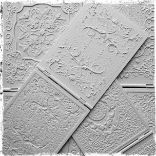
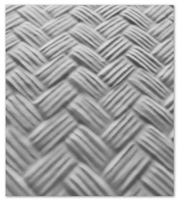
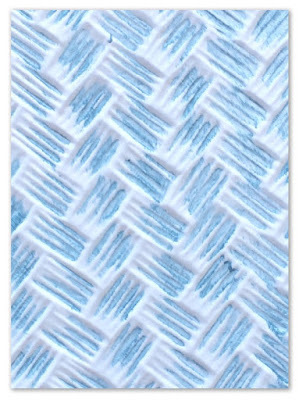
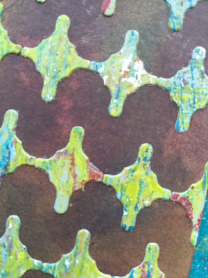
To demonstrate this technique, I am using the Spellbinders Basket Weave 3D M-Bossabilities Folder.
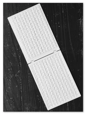
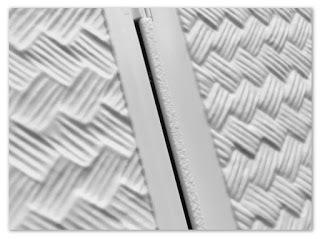
Using a piece of cardstock, I ran the folder through Spellbinders Grand Calibur Die Cutting & Embossing Machine and ended up with a deeply etched design, as you can see from the image of the embossed cardstock below.
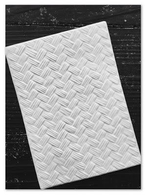
I wish you were able to run your fingers over the surface to really see how dimensional the paper has become.
In order to letterpress, you simply need to rub the surface of an inkpad across the raised side of the double-sided embossing folder before you insert your paper and run it through your machine. I have found that pigment ink works best, as it remains wet for quite some time on the slick surface of the folder. For this demo, I used the Teal Zeal Memento Luxe pigment ink from Imagine Crafts.
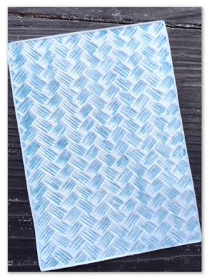
The ink sits in the grooves while the surface remains the original color of the paper.
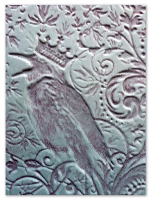
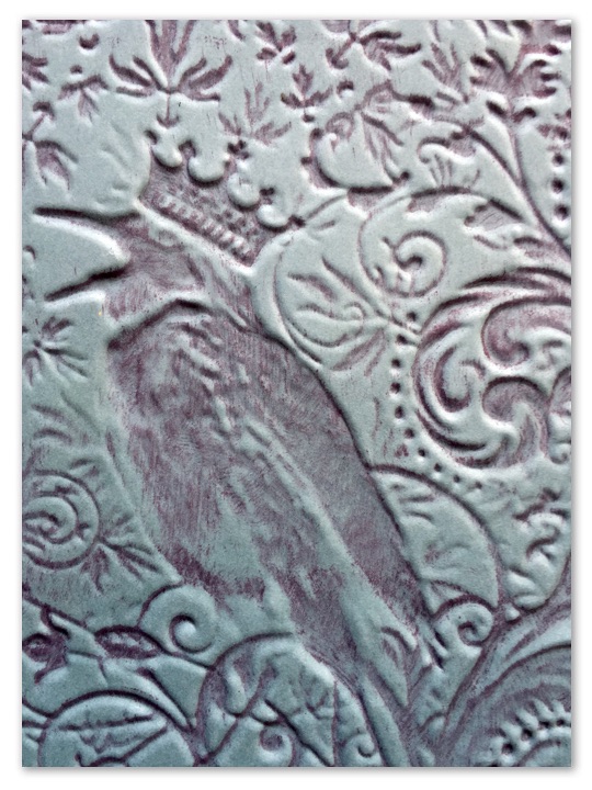
Here is another example using Spellbinders Noble Rook 3D M-Bossabilities Folder.
-------------------------------------Spellbinders has generously provided my blog readers with a special code to use between now and 9/19 that will enable you to buy one embossing folder and to get another one free. Click here to and enter the code SETHEMBOSS.
 Mixology 101.5
This series of pop-up posts will focus on sharing ways in which I combine hand made art with commercial products. Since becoming a blogger for Spellbinders in 2013, I have had the opportunity to explore many supplies coming from the craft industry and to learn how to put my own twist on them as I add them into my artwork. The posts in this series may focus on completed art, process, product, and/or any other aspect of mixed media. So put the mix in the media and let's get creative...
DIY Letterpress Printing
Letterpress Printing, a process developed in the 15th century, is a form of relief printing where inked text or designs are deeply impressed into paper. The letterpress process traditionally uses a letterpress machine and wood or metal type - making it largely inaccessible as a DIY for most people.


But did you know that you can use embossing folders and a die cutting machine to create the look?

To demonstrate this technique, I am using the Spellbinders Basket Weave 3D M-Bossabilities Folder.


Using a piece of cardstock, I ran the folder through Spellbinders Grand Calibur Die Cutting & Embossing Machine and ended up with a deeply etched design, as you can see from the image of the embossed cardstock below.

I wish you were able to run your fingers over the surface to really see how dimensional the paper has become.

In order to letterpress, you simply need to rub the surface of an inkpad across the raised side of the double-sided embossing folder before you insert your paper and run it through your machine. I have found that pigment ink works best, as it remains wet for quite some time on the slick surface of the folder. For this demo, I used the Teal Zeal Memento Luxe pigment ink from Imagine Crafts.

The ink sits in the grooves while the surface remains the original color of the paper.

Here is another example using Spellbinders Noble Rook 3D M-Bossabilities Folder.
-------------------------------------Spellbinders has generously provided my blog readers with a special code to use between now and 9/19 that will enable you to buy one embossing folder and to get another one free. Click here to and enter the code SETHEMBOSS.
September 13, 2015
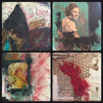
Crossing Paths

Crossing Paths. Something I do with all of you so very often online. And sometimes, when I am lucky, even in person.
Thrilled that my artwork and my stamp line from Impression Obsession are being featured as a free, how-to project on the website of Stampington & Company. Click here to see more pics, check out the supply list, and follow along as I share step-by-step how this piece was created.


September 12, 2015
The Week Links: 67
 Join me every Sunday when I share some of my favorite links I discovered in the previous week. All previous links can be found here.
And here is Week 67...
Inside Joseph Cornell's Studio: pics and text from the exhibition at The Royal Academy of Arts in London.
The "I Could Do That" phenomenon: an art curator responds to this common statement from art viewers in a wonderful video (thanks to Susan McCarrell for the link)
Loving the playful and colorful 3D paper art from Zim&Zou originally seen here on Creative Boom.
And speaking of Creative Boom, check out their essential colour guide for designers. It's a good one.
Judy Wise painted on the same canvas every day for a month. Check out the fascinating evidence here.
Traci Bautista shares a video tour of her art journals and shares her process of making her books.
And speaking of video journal journeys, Martice Smith III takes us through a journal flip in 1 minute 8 seconds.
September 9, 2015
Mixology 101.4
Mixology 101
Mixology 101.3
This series of pop-up posts will focus on sharing ways in which I combine hand made art with commercial products. Since becoming a blogger for Spellbinders in 2013, I have had the opportunity to explore many supplies coming from the craft industry and to learn how to put my own twist on them as I add them into my artwork. The posts in this series may focus on completed art, process, product, and/or any other aspect of mixed media. So put the mix in the media and let's get creative...
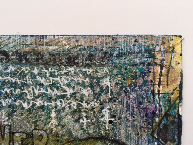
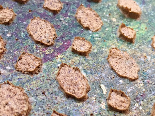
Live and Let Die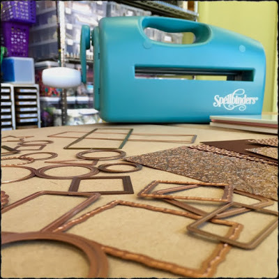 Today's post is about thinking outside of the die. Traditionally, a die is used to cut paper (or other material) to a specific shape or design by running it through a die cutting machine. As the machine applies pressure, the blade on the die cuts the paper to the desired shape. There are, however, many alternate ways to use a die that will allow you to bring an added level of unique creativity to your work and allow you to make it your own.
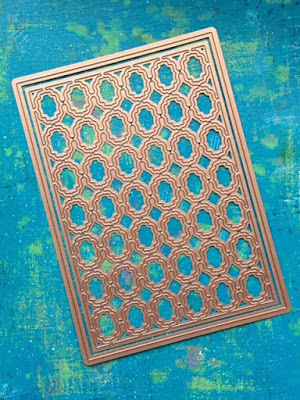 I am using Spellbinders Grate Effect die to demonstrate a few of the many things you can do with die cutting.
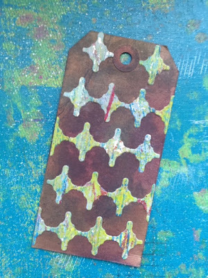
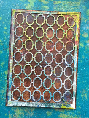 First, here is what the die cut looks like when used as originally intended. I cut hand painted paper and mounted it on another sheet of paper, painted in a contrasting color.
 I love this but it is only the beginning of what can be done.
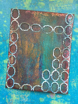 One simple way to make a die cut unique is to cut it up and only use certain sections, often in a way that was not intended by the original design.
 I outlined the inside of each small section with a black pencil to make the designs pop even further.
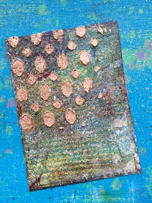
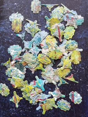 One of my favorite techniques is to use the part of the die cut that falls out and is often discarded.
 Much like sequin waste (the stencil-like sheets that are leftover after sequins are cut), this die waste can be put to good use.
 I love that when you use the drop-off, ANY die all of the sudden becomes MANY dies.
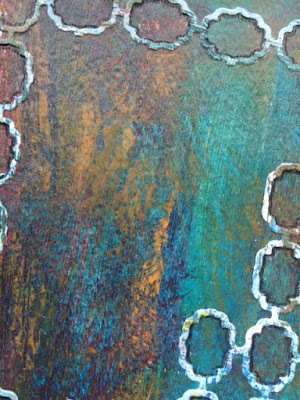
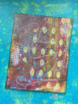 There are many ways to use a die that don't even involve cutting - the action that dies are born to do. As part of a background that I have started on this piece, I used the die as a template. I started by sketching around the inside of the shapes with a white gel pen, deliberately only outlining a few of the shapes.
 I then filled in the shapes using Faber-Castell Pitt Artist Big Brush pens, first with white and then with a green gold.
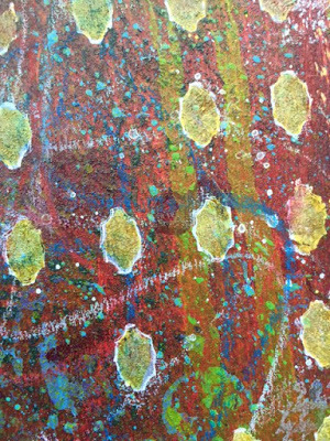
 The die can also be used as a stencil. You can choose to use the actual metal die itself as the stencil or cut a separate stencil using the die and heavy cardstock or other material. If you use the actual die, remember to immediately wash your die to remove the paint or paste.
 For this background, I premixed Golden Fiber Paste with paint and applied it through the holes in the die using a palette knife.
There are many more ways to use a die, limited only by your imagination. Feel free to share in the comments the ways in which you think outside the die.
-------------------------------------Spellbinders has generously provided my blog readers with a special code that can be used to save 20% off items in their online shop (doesn't include shipping, tax, or machines). Head to their store and use code 20OFFSA.
Mixology 101.3This series of pop-up posts will focus on sharing ways in which I combine hand made art with commercial products. Since becoming a blogger for Spellbinders in 2013, I have had the opportunity to explore many supplies coming from the craft industry and to learn how to put my own twist on them as I add them into my artwork. The posts in this series may focus on completed art, process, product, and/or any other aspect of mixed media. So put the mix in the media and let's get creative...
Live and Let Die
 Today's post is about thinking outside of the die. Traditionally, a die is used to cut paper (or other material) to a specific shape or design by running it through a die cutting machine. As the machine applies pressure, the blade on the die cuts the paper to the desired shape. There are, however, many alternate ways to use a die that will allow you to bring an added level of unique creativity to your work and allow you to make it your own.
 I am using Spellbinders Grate Effect die to demonstrate a few of the many things you can do with die cutting.
 First, here is what the die cut looks like when used as originally intended. I cut hand painted paper and mounted it on another sheet of paper, painted in a contrasting color.
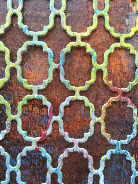 I love this but it is only the beginning of what can be done.
 One simple way to make a die cut unique is to cut it up and only use certain sections, often in a way that was not intended by the original design.
 I outlined the inside of each small section with a black pencil to make the designs pop even further.
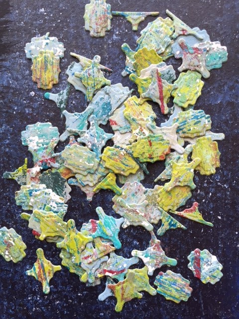 One of my favorite techniques is to use the part of the die cut that falls out and is often discarded.
  Much like sequin waste (the stencil-like sheets that are leftover after sequins are cut), this die waste can be put to good use.
 I love that when you use the drop-off, ANY die all of the sudden becomes MANY dies.
 There are many ways to use a die that don't even involve cutting - the action that dies are born to do. As part of a background that I have started on this piece, I used the die as a template. I started by sketching around the inside of the shapes with a white gel pen, deliberately only outlining a few of the shapes.
 I then filled in the shapes using Faber-Castell Pitt Artist Big Brush pens, first with white and then with a green gold.
 The die can also be used as a stencil. You can choose to use the actual metal die itself as the stencil or cut a separate stencil using the die and heavy cardstock or other material. If you use the actual die, remember to immediately wash your die to remove the paint or paste.
 For this background, I premixed Golden Fiber Paste with paint and applied it through the holes in the die using a palette knife.
There are many more ways to use a die, limited only by your imagination. Feel free to share in the comments the ways in which you think outside the die.
-------------------------------------Spellbinders has generously provided my blog readers with a special code that can be used to save 20% off items in their online shop (doesn't include shipping, tax, or machines). Head to their store and use code 20OFFSA.
September 7, 2015
Rejection Correction
What is the best feedback you have received from somebody about your work? What is the worst?
As artists we are constantly putting our work - and our selves - on view for public display and review. For many, this process of exposure is fraught with anxiety and doubt. Especially if you have ever been the recipient of negative criticism about your work. And let's be honest here: we all have.
The potential of hearing negative feedback is especially daunting for people who are just beginning to show their work publicly. While criticism is never easy to receive, over time many artists develop a "thick skin" and learn how to better deal with negativity - and can even learn to grow from it. And in my mind, the possibility of positive feedback and affirmation of creativity always trumps the worry over criticism.
This topic is always a big issue for artists. You can follow the two links below to hear more and/or add your own thoughts and experiences in a comment to this post.

Five artists, including myself, discuss the topic on Somerset Place and a lively discussion continues in the comments there. Read all the thoughts on the following questions: What is the best feedback you have ever received? Has constructive criticism helped you develop personally or improved your artwork? Do you listen to the comments of others?
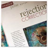
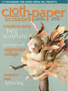
Those of you who have either faced rejection as an artist or are fearful that you will, might be interested in reading my Creative Pulse column in the current September/October issue of Cloth Paper Scissors magazine. In it, I discuss how to deal with rejection and present ways to turn a rejection into an experience with a positive outcome.

As artists we are constantly putting our work - and our selves - on view for public display and review. For many, this process of exposure is fraught with anxiety and doubt. Especially if you have ever been the recipient of negative criticism about your work. And let's be honest here: we all have.
The potential of hearing negative feedback is especially daunting for people who are just beginning to show their work publicly. While criticism is never easy to receive, over time many artists develop a "thick skin" and learn how to better deal with negativity - and can even learn to grow from it. And in my mind, the possibility of positive feedback and affirmation of creativity always trumps the worry over criticism.
This topic is always a big issue for artists. You can follow the two links below to hear more and/or add your own thoughts and experiences in a comment to this post.

Five artists, including myself, discuss the topic on Somerset Place and a lively discussion continues in the comments there. Read all the thoughts on the following questions: What is the best feedback you have ever received? Has constructive criticism helped you develop personally or improved your artwork? Do you listen to the comments of others?

Those of you who have either faced rejection as an artist or are fearful that you will, might be interested in reading my Creative Pulse column in the current September/October issue of Cloth Paper Scissors magazine. In it, I discuss how to deal with rejection and present ways to turn a rejection into an experience with a positive outcome.

September 6, 2015
The Week Links: 66
Join me every Sunday when I share some of my favorite links I discovered in the previous week. All previous links can be found here.And here is Week 66...
Kintsugi: the Japanese art of recognizing beauty in broken objects.
Thoughts on art and fear from Veronica Funk.
15 cool gadgets for the photographer who thought he/she already had everything.
Behind the scenes at a company that makes handmade globes (with a fascinating video).
Stunning drawings by Ed Fairburn of human faces emerge from maps.
Loving this journal spread (and the accompanying tutorial and tips) from Ivy Newport.
Amazing paper sculptures from Calvin Nicholls (thanks to Cecile Graven for the link).
September 5, 2015
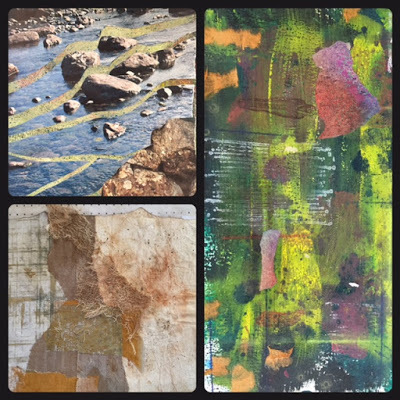
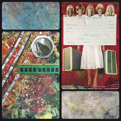
Round and Round
Happy to once again be the guest blogger on the PaperArtsy blog today. If you have been in any of my workshops involving paint, you have probably heard me talk about PaperArtsy's amazing Fresco Finish Acrylics. Love those paints!
The theme of the post was circles -- hands down one of my most favorite shapes. The artwork that I made had circle written all over it. From the shape of the substrate, to the design elements I chose, to the phrase I included.
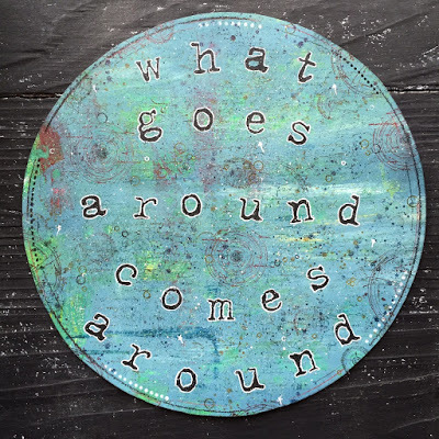
Have a peek over at this post on the PaperArtsy blog to see step-by-step how I made this piece and the ingredients I used.
September 2, 2015
I left my Cards in San Francisco
This past weekend, I had the pleasure to travel to northern California to teach 3 workshops. Before the main event I had a chance to spend a bit of time exploring the area.


I spent two amazing days teaching at A Work of Heart in San Jose. Andrea Chebeleu, the owner, has created a truly magical environment that makes you want to sit down and create.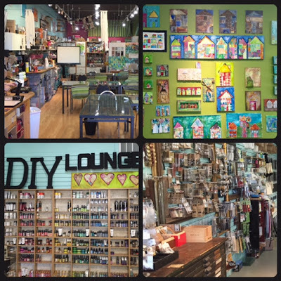
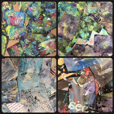
On the first day, I taught one of my favorite workshops: 52 Card Pickup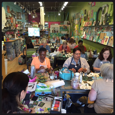
These are the demo cards in progress I made during the class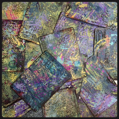
And these are some of my wonderful students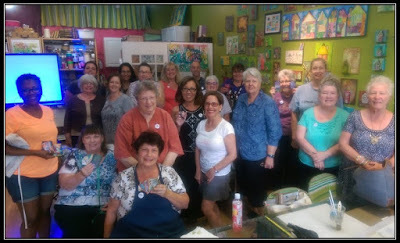
Cards in progress from the crew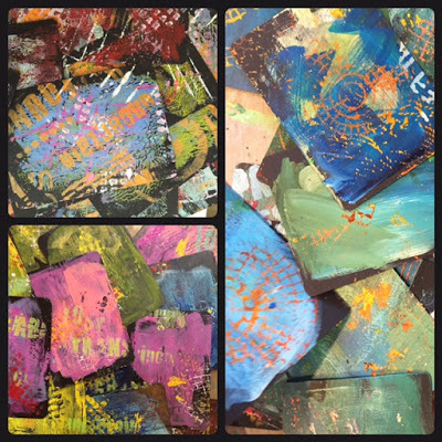

The second class at A Work of Heart was Collage Camp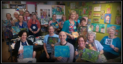
This workshop starts with the creation of a "manual" of pages that focuses on different principles of collage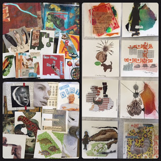
Participants then goes on to creating larger collages with painted backgrounds. Here are some pieces in progress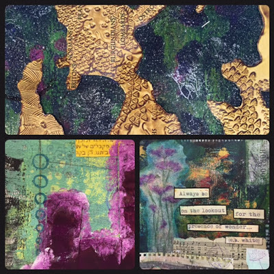
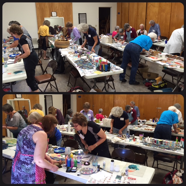
I was lucky enough to be able to teach 52 Card Pickup twice in the same weekend. The Sonoma County Book Arts Guild hosted this class held in Sebastopol, California. A big thank you to the host, Dena Bliss, who has created a very special community of artists.
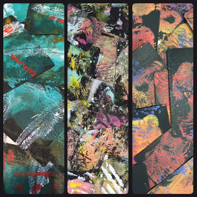
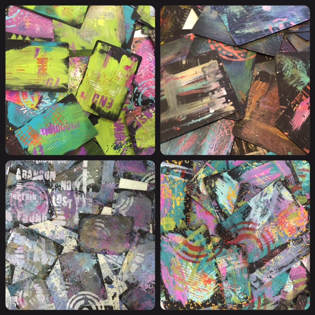
Here are just a few of the decks in progress
Some of the crew after all 1,248 cards were complete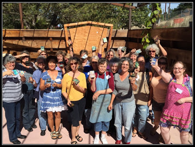


I spent two amazing days teaching at A Work of Heart in San Jose. Andrea Chebeleu, the owner, has created a truly magical environment that makes you want to sit down and create.
On the first day, I taught one of my favorite workshops: 52 Card Pickup

These are the demo cards in progress I made during the class

And these are some of my wonderful students

Cards in progress from the crew


The second class at A Work of Heart was Collage Camp

This workshop starts with the creation of a "manual" of pages that focuses on different principles of collage

Participants then goes on to creating larger collages with painted backgrounds. Here are some pieces in progress


I was lucky enough to be able to teach 52 Card Pickup twice in the same weekend. The Sonoma County Book Arts Guild hosted this class held in Sebastopol, California. A big thank you to the host, Dena Bliss, who has created a very special community of artists.
Here are just a few of the decks in progress


Some of the crew after all 1,248 cards were complete

August 29, 2015
The Week Links: 65
Join me every Sunday when I share some of my favorite links I discovered in the previous week. All previous links can be found here.And here is Week 65...
Three dimensional drawings in ceramics from Katharine Morling
Love the way Mae Chevrette photographs her work as much as I love her work
Here is a headline I never expected to read: Art Exhibit Escapes from Museum, Rampages through City
A lifetime of sketchbooks from painter Richard Diebenkorn (thanks to Austin Kleon for this link in his newsletter)
And speaking of Austin Kleon...you are gonna want to get his newest: The Steal Like an Artist Journal.
Does looking at art make you smarter?
Nobody captures light like J.M.W. Turner does. Shots taken at his current exhibit at the de Young Museum in San Francisco, CA.