
Ros Clarke's Blog, page 15
June 19, 2013
Too much fun for kids
For a number of years now I have had a not-so-secret guilty pleasure: colouring in.
Yes, you know. Colouring in. Like you did when you were a kid.


It’s not supposed to be a hobby for adults. We’re supposed to do important and useful things. Colouring in is neither. It’s entirely about the pleasure of the moment. Selecting just the right colour of felt tips and carefully keeping within the lines. It’s nice to produce something beautiful at the end but it’s ephemeral by nature. Colouring books are completed and thrown out (at least mine are. Maybe some people frame their work.) I love that because it means that the end result doesn’t matter all that much. It’s not like knitting, where you really want to end up with something wearable. Or sewing, which is even more stressful because you can’t easily undo it all and start again. Fabric that’s been cut stays cut. It’s not even ‘proper’ art, whatever that is. Someone else has already drawn the picture for you. Your choices are limited. That’s wonderfully refreshing and soothing.
A few days ago, this glorious book arrived on my doorstep. It is the nicest colouring book I’ve ever owned. It even has a dustjacket! I am saving it up for my holiday. I also love this book by fabric designer Jenean Morrisson. And I’ve enjoyed several Usborne books and the old classic Altairs never stop being fun.
I use a variety of felt tips. These Staedtler ones are beautiful to use but expensive and they are all very saturated colours. I like to have some Berol wide tips for large areas. And recently I treated myself to this box of 40 by Stabilo. They’re not the best pens but there’s a lovely range of colours to use. If you’re like me and you always want more colours, it’s worth getting the cheap packs of pens at the supermarket. They won’t last long, but they’ll add variety to your colouring.
If you’re thinking this sounds fun, there are downloadable pdfs from the Secret Garden book at the link above. Why not secretly have a little go? I won’t tell. 


June 6, 2013
Smile while you dial
A few years ago, this type of fly on the wall documentary was all over the TV schedules, but I guess we got bored of them and they’ve mostly been replaced with competitive reality-ish programmes like The Apprentice and Masterchef. The Call Centre is a throwback, but a fun one, at least for one episode. I’m not sure I’ll be tuning in for the whole series.
I love this sort of television for the glimpse it gives of a world that I know nothing about. I’ve never worked in a ‘normal’ office, let alone one like the call centre. It’s set in ‘Swansea’s third-largest call centre’ which is owned (I think) and run by Nev. Nev is one of those people who is a harassment case waiting to happen. He throws things at trainees who yawn while he’s speaking, he’s fired people who don’t join in his communal singing sessions, he parades newly-single admin assistant Kayleigh through the office while soliciting a date for her. But he gets away with it because beneath it all, he does have a good heart, and his employees recognise that. When Hayley fails to meet her sales targets, instead of sacking her, he finds her another job as the office tea lady. When Kayleigh’s still miserable about her cheating ex, he organises a speed dating event and then, when she gets matched with the office lothario, Nev is the one who sees that would be a disaster and instead sets up a date with a much nicer guy for her.
I would not work for Nev for any money.
But if you’re a school-leaver in Swansea without a job, you could do a lot worse. In fact, Nev’s company, ‘Save Britain Money’ was second in the Times’s list of Best Companies to Work For 2013. We saw him interviewing people and being willing to take a chance on some who didn’t stand out. They might not last in Nev’s call centre, but he’ll do what he can to help them.
I don’t think you could write Nev in a book. No one would believe it. But a call centre romance? Well, maybe.
May 30, 2013
Going in the right direction

Monthly income (averaged over three months, to smooth out the effect of quarterly payments) from sales of my books over the past 19 months. In £.
I’ve also just been working out the total royalties paid so far for each title (in order of publication):*
RRATR (self-pub, 21 months): $530.72
TCW (self-pub, 20 months): $1620
AIWFC (Entangled, 16 months): $1254.33
TFO (Entangled, 14 months): $710.87
TOTAHSS (Entangled, 9 months): $1076.76
12D (self-pub, 4 months): $55.27
I would never have guessed that The Tycoon’s Convenient Wife was going to be my biggest seller. I really don’t think it’s my best book. I think that the two short stories which came out with Entangled have more than earned their keep. They’re both under 12,000 words and were quick to write. I’m a little bit disappointed with sales for the Oil Tycoon and Her Sexy Sheikh. I love that book and I would have hoped it might have sold more. But it is still selling and it may pick up again at some point. Twelve Days came out in a rush just before Christmas and although it had some amazing reviews, sales never really took off. I’m planning a re-launch in November.
*NB: this only includes royalties actually paid up to the end of April. Most of the royalties mentioned in the previous blog post are still to come. They are included in the graph, however.
May 29, 2013
Wow. Wow, wow, wow.
So, a few months ago, I decided to make Reckless Runaway at the Racecourse free for a few weeks. It got a lot of reviews, a few thousand downloads, and I saw a small increase in sales following the promotion. Enough good things to make me think it was worth doing again with The Tycoon’s Convenient Wife.
Which has now had approximately 100,000 downloads. It was #1 in the Amazon UK contemporary romance section and in the top ten of all free books on Amazon UK for several weeks. It didn’t reach quite the same heights on Amazon US but was comfortably in the top 100 for a month. It’s also had a good number of reviews during that time and sales of my other books have improved. But, for reasons I do not completely understand, it was not free everywhere and it is now only free at Amazon UK as far as I know. So it has also sold quite a lot of copies. In the last two months, my royalties at B&N have been around $800. And at Amazon, about $1500. That’s more than in the whole 18 months prior that Reckless Runaway and Tycoon had been on sale. About ten times more, in terms of Amazon sales alone (I had been selling a lot better at B&N before, for some reason).
If you bought the books – or if you downloaded them for free – thank you very much!
May 27, 2013
New book!
Short story, to be honest. It’s not quite ready yet, but I plan to have it on sale on June 17th. Will announce it all over the place when you can buy it. In the meantime…
 It’s the end of an escapist summer for Ellie Richards. Three months cooking and cleaning on a Mediterranean yacht have given her blisters on her fingers, a glorious tan, and an almost whole heart again. Apart from the little bit that’s started hankering after skipper Jake Morgan. So maybe a one night fling is exactly what she needs to get him out of her head before she heads back home tomorrow.
Tomorrow, Jake will be flying to Australia for a few months sailing and diving around the Great Barrier Reef. For him, it’s just another in a long list of short term jobs in far flung places. Jake doesn’t do long-term. He can’t. He lives every night as if it’s his last, and tonight, that means Ellie.
It’s one hot summer night for them both.
But when the dawn comes, it’s not that easy to walk away.
May 25, 2013
Fanfic and me
This one seemed worth re-posting, given the recent announcement from Amazon about publishing fan fiction. Since I wrote this I have deleted my livejournal but I expect there are still copies of my stories in various places there, as well as at the other sites mentioned below.
There is a really fascinating series of posts about fanfiction over at Dear Author at the moment. What’s most interesting to me is the variety of ways in which people have engaged with the fan community and how it relates to their route to original fiction. So by way of adding to the discussion, here’s my story.
I’ve always written fanfiction. Years before the internet and years before I’d ever heard the term, I was writing it. I’d finish reading a book and find that I was still living inside it. I’d want to know more. I’d imagine what happened next, or what happened to the secondary characters, or think about events which had been mentioned in passing but not described in detail. And to get those out of my head, I wrote them down. It wasn’t for other people to read, it was just for my own satisfaction.
At first I scribbled in notebooks, and then I got a computer which I found helped me to write longer, more structure stories. I wrote most of a sequel to Heyer’s The Masqueraders that way and a very long, rambling, shapeless sequel to Antonia Forest’s Marlow books.
And then there was the internet. And on a dull, rainy afternoon, I looked for something to read and after a couple of false starts, I found After The End. I was hooked. This was, I think, after the 5th HP book had been published and it’s a story set after the imagined events of the end of the series. It’s interesting reading it now to see how much they guessed right – and, of course, how much they got wrong. It’s wonderfully written, with a plot of its own, with good characterisation and prose of a high quality. The site that hosts it also had an active forum which included an area for writers interested in developing their skills. Two things happened there: I found someone else who was interested in the Marlows, who pointed me in the direction of their little fan community; and second, I found the people who are still my writing group.
The Marlows was significant for me because the fandom is so small that there is hardly any fanfic at all, and that was what persuaded me to put mine online. People were very kind about it, and that gave me confidence to write more and post more.
The writing group at the Sugar Quill was brilliant. We put up excerpts of writing for feedback each week. We set each other prompts or challenges to try to stretch ourselves. We took it very seriously, even though we were ‘only’ writing fanfic. Practically everything I know about how to write, I learned there. I loved the freedom of fanfic to work on different elements of the craft at a time – characterisation, action scenes, dialogue, world-building, scene-setting, emotional intensity etc, without having to do it all at once, and with immediate feedback. Plus, it’s just really, really fun.
For a long time, I was very clear that I only wanted writing to be a hobby for me. I’m a PhD student in real life and I didn’t want any extra stress. But I did start writing more original stories. It was a natural progression for me – a lot of my HP stories feature original characters. One of my favourites was about an American witch sent over to the UK to work at the Ministry of Magic (she works at the US Ministry – the Pentagram), where she meets in successive chapters each Weasley brother, before finally falling for Charlie (most of my heroines fall for Charlie. It’s the dragons. And the tattoos.)
And then, I can’t quite remember why, I was suddenly submitting books to editors. I had several rejections, self-published a couple, and finally made a sale in November 2011.
I haven’t written fanfic for a while. Partly due to lack of time, and partly because the places where I found my community mostly aren’t very active any more. I’d like to go back to it. Every time I read a book that lives on in my head, I find myself itching to start writing a little scene. One day, maybe I will.
If you’re at all interested, I wrote under the name girlyswot. You’ll find my stories at Phoenix Song, the Sugar Quill and in the Yuletide archives. Or at my livejournal.
Maximising income
Originally published, um, sometime in 2011? Can’t find a date.
I am not an economist. Please don’t blame the recession on me.
But in the dim and distant past, I did study economics for a couple of years at school. One of the few things I remember is the supply and demand diagrams (they have a name, don’t they?). It seems to me that this basic method of determining how to maximise profit has been forgotten by many people. Let me give you two, wholly unrelated examples.
The M6 Toll Road
Most roads in the UK are not subject to tolls. A few bridges/tunnels and other odd bits of road do charge for use. There is one part of the major M6 motorway near me which is notoriously busy and a few years ago, an alternative road was constructed which does charge tolls for use. I’ve used it a few times and it is always empty, or nearly empty. I try not to use it because it is expensive (£5.50 for cars, each way), but I travel that route a lot and often I’m a bit tired or running a bit late. The last time I drove down the M6, I noticed that they were announcing increases to the toll charge. Again. I’m not at all surprised that they want to increase their income from the road, since there’s so little traffic on it. I just think they’re going the wrong way about it. I think that if they were to drop the charge to, say £3.50, they would find that they doubled the amount of traffic and thus increased their income.
Publishing
Okay, this is a lot harder to pin down, since it is a huge and complex industry with lots of different sectors. But the issue I want to focus on is one which affects the whole industry: piracy. Since the introduction of digital books, which have the potential to be copied and distributed electronically, publishers have been panicking about how to prevent pirates from doing this. Piracy is both wrong and illegal and readers ought not to download pirated copies of books.
However, I still think that publishers ought to concentrate more on maximising their income (and thus authors’ royalties) than preventing piracy. It’s true that there is a relationship between piracy and loss of profits. A person who downloads a pirated copy of a book which they otherwise would have bought is taking away from publishers’ profits. The issue for publishers is whether to prevent this by spending money on expensive (and so far wholly ineffective) methods for preventing piracy OR to minimise it by making their books cheaper/more accessible/geographically unrestricted.
You see, I don’t think that it is in the publishers’ (or authors) best interests to make it their goal never to have a single book pirated. I actually think that will not maximise their income. It will require a lot of money to be spent on security and it’s already actively turning customers away. I think it is in the publishers’ (and authors) best interests to maximise their income. Like the toll road, this may be counter-intuitive, but it’s not rocket science. More customers can mean more income, even at a lower price. Don’t price yourselves out of the game.
But even if they’re not prepared to compromise on price, publishers can ensure they get more customers simply buy making it easier for readers to buy their books legally. Get rid of DRM* and geographical restrictions. Give your customers confidence that when they buy one of your books, they’ll always be able to read it. More customers = more purchases = higher income.
Sure, tackle piracy when you see it. Issue DMCA notices. Fine people who misuse their purchased content. But concentrate your efforts on the business you are in. There is HUGE potential for the ebook market to spiral beyond your wildest dreams. Why would you want to do everything in your power to prevent that?
*There’s another point about DRM which I really don’t get. As far as I understand it, publishers are the ones insisting on DRM. But surely it’s the booksellers (especially Amazon) who benefit most from it? If I’ve bought a Kindle, I have to buy Kindle format books. Which, by and large, means I do my shopping at Amazon. Without DRM, I could buy books elsewhere, even if I had to use a tool like Calibre to convert the format. In fact, I could even buy books direct from publishers, cutting out the middle man altogether. I used to do this a lot with Harlequin/M&B before I got the Kindle. But now I have to wait for a month, get the Kindle version, and give Amazon some of the profit which could have gone to the publishers and authors. How is this a good idea?
More on covers
This was first published in September 2011.
Most self-published books these days are primarily sold in digital form because this allows authors to keep the price down and at the same time reach a potentially vast audience. There are specific restrictions – and opportunities – that apply to digital covers, which are worth thinking about to produce something that will really stand out (in the right way) amongst the vast millions of Amazon products.
1. The thumbnail
Unlike print books where the cover is the cover is the cover, most digital books are sold with a range of cover images. There is the image that will appear on an ereader screen after the book is downloaded, the image that will appear on the book sales page, and then there is the thumbnail that will appear in search results and lists. This thumbnail is tiny but vital. If you are uploading your book to Amazon, the thumbnail does not have to be the same image that appears as the cover of your book when it is downloaded. This means you can really have fun with it.
The biggest issue with thumbnails is readability. Images and text that look great at full size may be completely obscured at thumbnail size. Stick with clean lines and clear text for maximum impact. Have a look at the current top bestsellers on Kindle (click through for full size image):
Which ones work? I’d say that ‘One Day’ and ‘Six Seconds’ both work brilliantly. The images are simple but striking and the text is completely readable (with the exception of David Nicholls’ name). In ‘That Summer in Ischia’ the colour scheme is too subtle and so both the image and the text are indistinct, as well as the text being very small. For Victoria Fox’s ‘Hollywood Sinners’ there is insufficient contrast to read the author’s name properly and the whole cover looks messy and cluttered. ‘Three Weeks To Say Goodbye’ is pretty good and ‘Chosen’ is another one that has faded and become indecipherable at this size.
You don’t have to be able to see every detail of the cover but you do have to make sure that the thumbnail works. It’s simple to resize your cover image before uploading it to see what it will look like. The most important thing is that the title is legible. Ideally you also want at least one strong part of the image to be visible too, as in One Day and Six Seconds.
2. The rectangle
On Amazon, your thumbnail and your cover image will appear on a white background. This means that your book cover does not have to be rectangular. I’ll say that again, because as far as I can see, no one else seems to have realised this. (PLEASE link me to counter-examples in the comments if you have any.)
Your book cover does not have to be rectangular.
My first book cover was rectangular with a white background. I liked the fresh, bright look this gives, but I hadn’t realised what an effect it would have against the white background of the Amazon site:

It doesn’t have an edge. Fortunately, I think there’s enough stuff on the cover (including the image which does have an edge) that it doesn’t totally disappear into the background. But if I did it again, I would put a border around it, to define the image as a book. But then I thought, what if I play with that edge? So this is the cover I have uploaded for Tycoon:

It almost looks as though the rings have been laid on top of the book, rather than being part of the cover image. Note that this technique only works when you know what background the image will be on. For Smashwords, I stuck with a rectangular cover because they export the book to so many different retailers that I needed it to conform to the standard. And as I said, the actual cover image that comes with the book download is rectangular too, to fit on your screen. But I love the way that the thumbnail image can stand out a little bit, just by playing with its shape.
I don’t think I’d want to take this technique too far. It needs to be clear that what you are selling is a book. But still, there’s fun to be had.
3. Colour
Lots of ereaders are black and white, not colour, so the cover image that your readers download needs to work in black and white as well as colour. Check what your cover looks like in black and white before you publish it and, if necessary, make changes to the contrast, add in extra shadows/highlights etc, to make it work.
I am not an expert on these matters, but I hope that’s helpful to some of you. Please do share any thoughts, tips or advice in the comments. Or examples of great ebook covers. The Book Designer is launching a new ebook cover design award and I’m really looking forward to seeing what kinds of thing do well in that.
Judging books by their covers
This is another rescued post, this one from August 28th, 2011:
Or at least, judging book covers.
When I first started wondering about self-publishing my stories, one of the things I did was look at a lot of book covers to try and work out what factors made the difference between something ‘professional’ and something ‘homemade’. I put those in quotes because actually I have no way of knowing which self-published authors paid a professional to produce their cover and which didn’t. I can only tell which ones scream ‘self-published’ and which don’t. What struck me most was the importance of the font, colour and placement of the text.
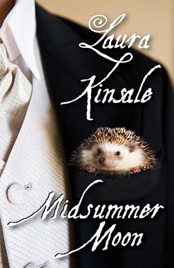
Look at this cover, for instance:
What struck me most was the importance of the font, colour and placement of the text.
I love Laura Kinsale’s books and I know from what I’ve read online that she has hired a professional cover artist for these digital releases of her backlist. But this cover instantly reads as self-published to me. The idea for the cover is adorable, with the little hedgehog in the guy’s breast pocket. I think there are some issues with the photoshop work on the hedgehog and the outline of the jacket, but for me the biggest issue by far is the text:
i) The same font is used for author name and book title, in the same colour and at the same size.
ii) It’s a dreadful font.
iii) The inconsistent shadowing on the font – compare the shadow on ‘Laura’ with that on ‘Midsummer’.
iv) The kerning is really weird – Moon is right up next to Midsummer, while Kinsale is miles away from Laura.
v) The alignment is also weird, neither centred nor justified. Look at the right hand edge of the text – none of the four words line up.
Sorry, Laura. If it’s any consolation, I’ve bought the book anyway. And the thing is, your brand is so well-established that your covers probably don’t make much difference at all to your sales, which is why I’ve used yours as an example rather than a struggling self-pub newbie.
Let’s compare that with a traditionally published cover:
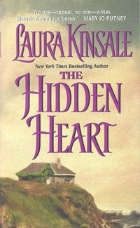
The cover image isn’t nearly as interesting or fun as that for Midsummer Moon, but it’s fine. I like how the sky becomes the background for the whole cover. The point I’m trying to make, though, is that it is immediately obvious that this is a traditionally published book cover. The focus is all on the writing, so let’s look at what makes this work so much better:
i) The same font is used for name and title, in the same colour, but the name is quite a lot smaller so the two are easily distinguished. Also, because there is other text on the cover, it makes sense to keep the total number of fonts to a minimum.
ii) It’s not my favourite font, but it looks professional and is suitable for the genre.
iii) There’s some nice simple shadowing on the font – not enough to draw attention to itself but just enough to make the letters stand out.
iv) The title is nicely spaced with ‘The’ tucked in below the top risers of Hidden.
v) It’s all properly centred.
None of those are things that are difficult to get right but they make a huge difference to the overall appearance of the cover. So here are my ten top tips for book cover text:
1. No more than two fonts in total;
2. Fonts must be readable – this is an issue of colour and size as well as font choice. Have a look at dafont.com for lots of free downloadable fonts;
3. Author name and book title should be distinguished from each other by at least one of size/colour/font;
4. Don’t have big vertical spaces between lines of text;
5. Don’t have ‘flat’ text – it’s almost always better to add some shadow, bevel, gradient or glow;
6. Don’t have too much shadow, bevel, gradient or glow – keep it subtle;
7. Align your text – centre, left or right are all okay;
8. Think about how your text relates to the background – try not to have it spanning very light and dark areas. Text will stand out better on plainer backgrounds;
9. Consider ‘branding’ your books by font. You can use different colours and layouts with different background images for each book, but if you use the same fonts, readers will be able to identify your books as yours;
10. Do not, under ANY circumstances, use Comic Sans.
This has got longer than I expected so I’ll do a separate post on specific things to think about for ebook covers.
May 15, 2013
366 days to go
So, after talking and planning and hoping for over a year, it is now booked. So, I guess that means we’re really going. Where?
Here:

Isn’t she beautiful? She is the Queen Mary 2 and on May 16th, 2014 she will be sailing from New York to Southampton with me on board. Better start planning what to wear.
Ros Clarke's Blog

- Ros Clarke's profile
- 31 followers

