
John Shelley's Blog, page 7
October 11, 2016
Inktober 2016
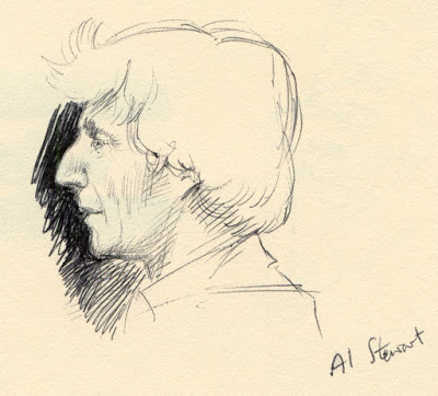
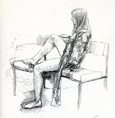
I'd not heard of "Inktober" before, but after a few recommendations, one of them from everyone's favourite anthropologist @DrAliceRoberts I thought I'd give it a go this year. The idea is to post on social media an ink sketch every day throughout October and tag it with #inktober2016 and #inktober. I wasn't sure at first whether the sketches have to be created the same day you post them or can be older, for the first five days of October it overlapped my series on Archives, which included ink drawings, so I just tagged those posts, but this week from 6th October onwards I've been tweeting fresh sketchbook doodles.
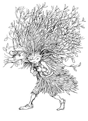 Day 6 Looking at the splendorous work from other artists tagged with Inktober some has clearly been laboured over for several hours, but I'm keeping very much within the spirit of the idea and just posting coffee-break doodles, and other down-times grabbed during the day, so these are very rough around the edges.
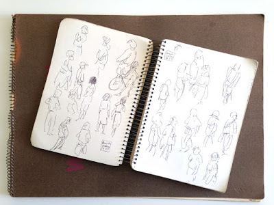
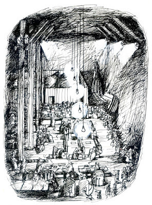
 Day 7In case you don't follow me on Twitter (@Godfox) here's a summary of the last few days worth of Inktober sketches. Anyone can join in, and it's not too late to start now... here's more information
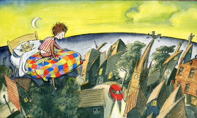
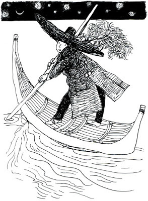 I was offline on Day 8, but this for Day 9.... feeling somewhat adrift perhaps
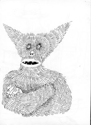
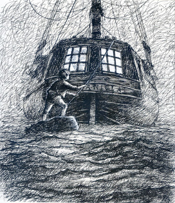
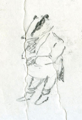
 Day 10. In retrospect I think I might have been subconsciously channelling Mervyn Peake's Captain Slaughterboard
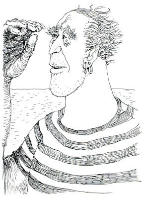
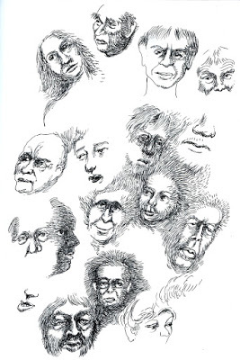 Day 11 - messing about with faces on the TV last night
I'm thinking, well, if I'm going to do it I shouldn't just limit to Twitter, let's put them on my blog, so for the remainder of the month I'll post one a day. Provided I can keep up that is .... lots to do, so few hours in the day....
 Day 6 Looking at the splendorous work from other artists tagged with Inktober some has clearly been laboured over for several hours, but I'm keeping very much within the spirit of the idea and just posting coffee-break doodles, and other down-times grabbed during the day, so these are very rough around the edges.
  Day 7In case you don't follow me on Twitter (@Godfox) here's a summary of the last few days worth of Inktober sketches. Anyone can join in, and it's not too late to start now... here's more information
  I was offline on Day 8, but this for Day 9.... feeling somewhat adrift perhaps
 Day 10. In retrospect I think I might have been subconsciously channelling Mervyn Peake's Captain Slaughterboard
 Day 11 - messing about with faces on the TV last night
I'm thinking, well, if I'm going to do it I shouldn't just limit to Twitter, let's put them on my blog, so for the remainder of the month I'll post one a day. Provided I can keep up that is .... lots to do, so few hours in the day....


October 4, 2016
A History of my Archive in 10 Objects. No.10: Tokyo Sketchbook, 1987
The final item in this History of my Archive in 10 Objects found in my father's loft are two sketchbooks from my earliest days in Japan in 1987.
Just after I arrived in Tokyo in January 1987 I bought a number sketchbooks of various sizes and spent a lot of the first year in particular being the sketching tourist, drawing, painting and photographing downtown Tokyo, the people around me, the whole experience of being in Japan. I didn't think any sketchbooks from early days in Japan had survived, I had a series of major purges for one reason or another over the 21 years I was there, the biggest down-size being at the very end when I left most of my belongings behind and threw away much of my commercial illustration artwork.
These two sketchbooks survived because I brought them back from Japan in the early '90's after buying a house in London, they stayed there until I later gave up the house, then found their way with a few other items to my dad's loft.
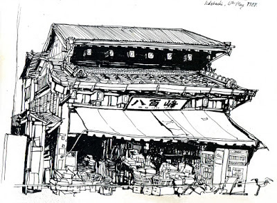 Iidabashi, 6th May 1987. This old building stood near the West exit of the station (the Kagurazaka side), and was I believe demolished in the early '90's development of the area. pen & ink.
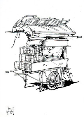 Street vendor's cart, Yotsuya, 6th May 1987. pen & inkThere are so many memories wrapped up in these pages, that first year in Tokyo was a roller-coaster of experiences - I had a sponsor when I first arrived in the country, they had no real work for me but nevertheless required me to sit in their dingy downtown office every day, doing literally nothing except breathe in the permament fog of tobacco smoke (I was a non-smoker) and hope the editor would come back to the office and give me permission to go out. Initial joy at being in Tokyo was soon replaced by deep unhappiness, after six frustrating months of this our relationship finally unravelled, and I was out on my own in Shitamachi, free but penniless, fraught with fear over the future. These two sketchbooks cover that period.
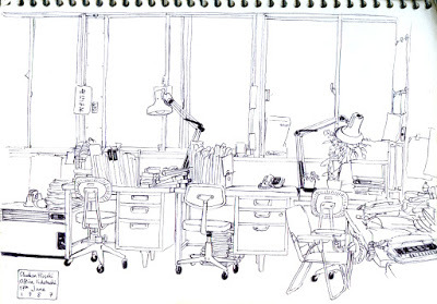 The office, waiting for permission to leave, 17th June 1987. ballpen
Because I was under-employed (and yet tightly under the watchful eye of the sponsor), I leaped on any opportunity to slip out of the nicotine stained office in Iidabashi and study Japanese in the quiet of the British Council building, or go walk-about in downtown Tokyo. When I eventually found my own place to rent in Yanaka and parted company with the sponsor these sketchbooks were both a comfort and way to come to terms with Tokyo, it's architecture, atmosphere, details, all things that would serve me well later on.
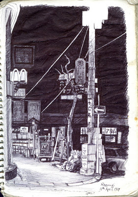 Roppongi, 18th April 1987, ballpen
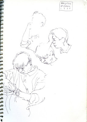 On the Hibiya Line, 8th October 1987. ballpenSo these drawings were at a point of change for me, initially a creative escape from my sponsor's office, they then became a comfort when I was on my own in Yanaka, it was a time just before things started to move for me, so looking back at them now brings a mixture of nostalgia and vivid memories of the turmoil I was in then.
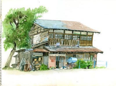 Mishima village near Sendai, painted during a volunteer weekend with UNICEF, Summer 1987. watercolourWith these drawings I come to the end of the 10 pieces from my archives. Discovering all of these things in my late father's loft has made me very contemplative about my current position in life, especially after his passing. If there's any lesson looking through these old archive things has taught me, it's that change is generally good, and provided you keep moving forward, things will most definitely get better!

Just after I arrived in Tokyo in January 1987 I bought a number sketchbooks of various sizes and spent a lot of the first year in particular being the sketching tourist, drawing, painting and photographing downtown Tokyo, the people around me, the whole experience of being in Japan. I didn't think any sketchbooks from early days in Japan had survived, I had a series of major purges for one reason or another over the 21 years I was there, the biggest down-size being at the very end when I left most of my belongings behind and threw away much of my commercial illustration artwork.
These two sketchbooks survived because I brought them back from Japan in the early '90's after buying a house in London, they stayed there until I later gave up the house, then found their way with a few other items to my dad's loft.
 Iidabashi, 6th May 1987. This old building stood near the West exit of the station (the Kagurazaka side), and was I believe demolished in the early '90's development of the area. pen & ink.
 Street vendor's cart, Yotsuya, 6th May 1987. pen & inkThere are so many memories wrapped up in these pages, that first year in Tokyo was a roller-coaster of experiences - I had a sponsor when I first arrived in the country, they had no real work for me but nevertheless required me to sit in their dingy downtown office every day, doing literally nothing except breathe in the permament fog of tobacco smoke (I was a non-smoker) and hope the editor would come back to the office and give me permission to go out. Initial joy at being in Tokyo was soon replaced by deep unhappiness, after six frustrating months of this our relationship finally unravelled, and I was out on my own in Shitamachi, free but penniless, fraught with fear over the future. These two sketchbooks cover that period.
 The office, waiting for permission to leave, 17th June 1987. ballpen
Because I was under-employed (and yet tightly under the watchful eye of the sponsor), I leaped on any opportunity to slip out of the nicotine stained office in Iidabashi and study Japanese in the quiet of the British Council building, or go walk-about in downtown Tokyo. When I eventually found my own place to rent in Yanaka and parted company with the sponsor these sketchbooks were both a comfort and way to come to terms with Tokyo, it's architecture, atmosphere, details, all things that would serve me well later on.
 Roppongi, 18th April 1987, ballpen
 On the Hibiya Line, 8th October 1987. ballpenSo these drawings were at a point of change for me, initially a creative escape from my sponsor's office, they then became a comfort when I was on my own in Yanaka, it was a time just before things started to move for me, so looking back at them now brings a mixture of nostalgia and vivid memories of the turmoil I was in then.
October 3, 2016
A History of my Archive in 10 Objects. No.9: Bag of Portfolio artwork, 1984
The penultimate item in this series of 10 objects from my dad's loft is a bag of unpublished portfolio material from circa 1984.
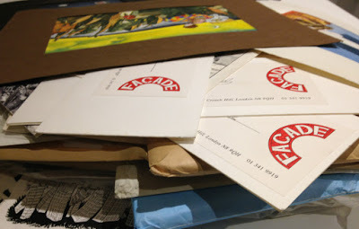
There was a lot of material from London in my dad's loft, when I left my studio just before I flew off to Japan it was the natural place to just shove everything, my entire output from 1983-1986, and it's pretty well all been preserved, waiting for me to reclaim thirty years later.
I moved to London in 1983, encouraged by two children's book commissions, but finding more work wasn't easy, a miserable, barren year went by with precious little work before I eventually reconnected with an old friend from Manchester Andy and eventually joined a couple of other illustrators and designers to set up Façade Art Studios in Crouch End, N.8.
I've blogged about Façade Studios before (here, and here). The aisles of an old church on Crouch Hill had been converted into studio space and were rented to us by animators Bob Bura and John Hardwick (of Camberwick Green/Trumpton fame), whose studio was in the adjacent church hall. On the other side of the church New Statesman cartoonist John Minnion had a studio, while the old nave between the two sides was renovated and used for Sunday services by the Eternal Sacred Order of Seraphim and Cherubim. Bob and John retired soon after we set up the studio, selling the old church hall to Dave Stewart and Annie Lennox (The Eurythmics), who converted it into their recording studio. Cherubim and Seraphim then became our landlords. With such a hotbed of activity all around I found myself spending most of my time in Façade, the studio was my second home, it seemed to turn me into a full time illustrator almost overnight.
When I look through the piles of old artwork now there's so much material it's hard to choose any particular piece, but this bag of unpublished portfolio images from the very early days of the studio sums up the renewed focus I had on illustration. It was a very productive period, especially for editorial work, I experimented in all kinds of directions, from very tight to cartoons, though my ultimate target was always children's books. These were all aimed to grab real paying jobs, I was hungry for commissions and had nothing to lose - no back up plan, no more signing on, it was either make it in London or run back to Norwich and get a day job, and I was certain that wasn't going to happen. I was still gunning for children's book commissions, but magazine work paid the rent. Here's a few.....
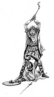 Saxon versus Viking, A drawing aimed at the historical non-fiction niche, circa 1983
 This drawing and the one above are the oldest from this era, I realised very quickly that there was a limited market for tight penwork, and quickly changed tack.
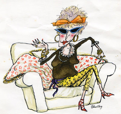
 Two early experiments aimed at picture books
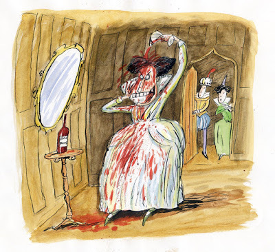 Bloody Mary - Part of a series on visualising cocktails
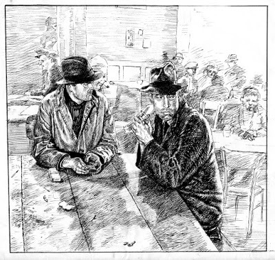
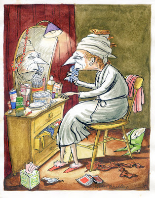 Make-up.
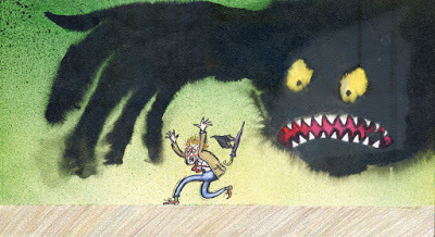
 Give us a job! Self portrait in desperation - it probably wasn't such a good idea to show this to potential clients!

There was a lot of material from London in my dad's loft, when I left my studio just before I flew off to Japan it was the natural place to just shove everything, my entire output from 1983-1986, and it's pretty well all been preserved, waiting for me to reclaim thirty years later.
I moved to London in 1983, encouraged by two children's book commissions, but finding more work wasn't easy, a miserable, barren year went by with precious little work before I eventually reconnected with an old friend from Manchester Andy and eventually joined a couple of other illustrators and designers to set up Façade Art Studios in Crouch End, N.8.
I've blogged about Façade Studios before (here, and here). The aisles of an old church on Crouch Hill had been converted into studio space and were rented to us by animators Bob Bura and John Hardwick (of Camberwick Green/Trumpton fame), whose studio was in the adjacent church hall. On the other side of the church New Statesman cartoonist John Minnion had a studio, while the old nave between the two sides was renovated and used for Sunday services by the Eternal Sacred Order of Seraphim and Cherubim. Bob and John retired soon after we set up the studio, selling the old church hall to Dave Stewart and Annie Lennox (The Eurythmics), who converted it into their recording studio. Cherubim and Seraphim then became our landlords. With such a hotbed of activity all around I found myself spending most of my time in Façade, the studio was my second home, it seemed to turn me into a full time illustrator almost overnight.
When I look through the piles of old artwork now there's so much material it's hard to choose any particular piece, but this bag of unpublished portfolio images from the very early days of the studio sums up the renewed focus I had on illustration. It was a very productive period, especially for editorial work, I experimented in all kinds of directions, from very tight to cartoons, though my ultimate target was always children's books. These were all aimed to grab real paying jobs, I was hungry for commissions and had nothing to lose - no back up plan, no more signing on, it was either make it in London or run back to Norwich and get a day job, and I was certain that wasn't going to happen. I was still gunning for children's book commissions, but magazine work paid the rent. Here's a few.....
 Saxon versus Viking, A drawing aimed at the historical non-fiction niche, circa 1983
 This drawing and the one above are the oldest from this era, I realised very quickly that there was a limited market for tight penwork, and quickly changed tack.
 Two early experiments aimed at picture books
 Bloody Mary - Part of a series on visualising cocktails
 Make-up.

 Give us a job! Self portrait in desperation - it probably wasn't such a good idea to show this to potential clients!
October 2, 2016
A History of my Archive in 10 Objects. No.8: The Blue Blanket, 1981-1982
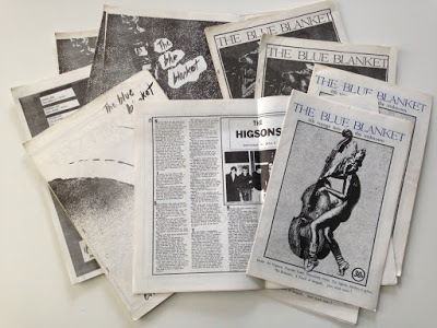
Number 8 in this series of ten archive items from my dad's loft are some surviving copies of The Blue Blanket fanzine, which briefly flared on the streets of Norwich from 1981 to 1982.
Three years in Manchester may have seen a mixed development with my artwork, but it had a profound effect on other aspects of my life - especially through music. It was a fabulous time to be in Manchester - I moved there at the height of punk, and left just before the Haçienda opened. I saw all the iconic bands of the era, from Buzzcocks to The Fall to Joy Division, and all their touring contemporaries. Despite poverty as a student I loved Manchester and often wonder why I didn't just stay in the city after graduating, but I was penniless and disillusioned with my artwork, there were no potential clients for my drawings and the prospect of looking for a job or signing on in Manchester filled me with dread, I couldn't see any reason to stay in the city. A temporary return to the family home was inevitable, however while I was in Manchester my parents had decided to leave the West Midlands and move to a village outside Norwich. It was an entirely alien world to me, from the gritty streets of Manchester to a hamlet in the Norfolk countriside, which I'd only visited there on holiday once. What was I going to do now?
My head was full of musical and creative frustration, I needed some outlet for this energy, I was angry, disillusioned, full of post-grad angst and resentment. I needed to get something off my chest....
 Cut from Blue Blanket issue 4, 1982
Musical ambitions were never to be fulfilled, so I did the next best thing - I started a fanzine.
Why The Blue Blanket? The first thing my parents did after I returned to the family flock, after throwing away my entire wardrobe of arty (to my eyes) second hand rags (in theirs), was to tag me along on a short holiday in Brittany. I was really not in the mood, but there was a large blue blanket at the place we stayed, and blue fluff seemed to attach itself to everything - long after the holiday we were picking bits of blue out of things. I wanted a magazine that would get into the crannies of Norwich, a blanket coverage that would stick everywhere. The name was a joke, but it also reminded me of Der Blau Reiter art movement started by Kandinsky and others.... this was to be a magazine about art as well as music (or so I hoped). Hence The Blue Blanket.
The fact that I knew absolutely nothing whatsoever about Norwich, it's music or art scene didn't seem to matter, in fact I saw it as an advantage as everything came to me fresh, and to my eyes there really didn't seem to be that much of a scene to discuss anyway. Today, Norwich has several venues and numerous galleries, but in 1981 it was more of a city of antiques and second-hand bookshops, there were only a handful of pub venues and two small clubs that put on indie bands - The Gala (a former ballroom) on St.Stephens, and The Jacquard on Magdalen Street, plus occasional gigs at the University of East Anglia (UEA). Nevertheless there was an energy in the city, with some ambitious local bands, an energy which I soon connected with.
The first issue of The Blue Blanket extended to 16 sides of A4, printed (extremely badly) by the Freewheel Anarchist Bookshop in Norwich. It consisted of a manifesto, a news page, a band interview (the non-band Sans Culottes), some gig reviews and lots of opinionated noises from me (under various aliases) questioning whether Norwich was a creative cul-de-sac, a diatribe against the media, jokes, cartoons, an unplayable song and some truly awful poetry. I think the first edition stretched to 200 copies, some of which were stocked by HMV and other local outlets, Rough Trade in London offered to take some, and to my immense pride John Peel at the BBC gave it a shout out on his Radio 1 programme.
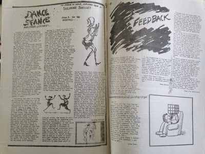 Spread from Blue Blanket #2, 1981
To my amazement it sold out, so I upped the price and print run and produced another one, followed by another, and another. My fanzine wasn't alone in Norwich (there was another Is It Fish?, produced by Farmers Boys compatriot Kid Brian), but my policy was staunchly to focus on the whole of the local indie music scene rather than promote any particular band or cover touring acts. Succeeding issues ran features and interviews on Norwich bands The Vital Disorders, Carl Gustav and the 84's, Zod & the Universe, The Suspects, After Dark, The Higsons (author & comedian Charlie Higson's band!) and Popular Voice, though plans to include the local art scene as well as indie music never really materialised. By Issue Four the print quality had greatly improved and it still regularly sold out of it's much increased print run, it was actually turning over a small profit, but the job of writing, compiling, designing and selling it was becoming a burden, though by that stage I had a few contributors and the distribution was much easier. John Peel's encouragement kept me at it for a quite a while (he announced the release of every issue and phoned me up once to talk about the Norwich scene on air, tragically I was out!), but my energy was being pulled back towards my illustration career. The focus and self-discipline of running the magazine was giving me a more professional attitude to my work, it gave me the determination to research the market and produce a new portfolio of illustrations to show around London.
The decision to finally hang up ambitions of journalism and close the covers of The Blue Blanket came when I was commissioned to illustrate my first children's book in 1982 - Jeremy Strong's Fatbag, published by A&C Black.
I thought I'd lost all but one remaining copies of The Blue Blanket, so was very happy to find a few surviving in my father's loft.
Three years in Manchester may have seen a mixed development with my artwork, but it had a profound effect on other aspects of my life - especially through music. It was a fabulous time to be in Manchester - I moved there at the height of punk, and left just before the Haçienda opened. I saw all the iconic bands of the era, from Buzzcocks to The Fall to Joy Division, and all their touring contemporaries. Despite poverty as a student I loved Manchester and often wonder why I didn't just stay in the city after graduating, but I was penniless and disillusioned with my artwork, there were no potential clients for my drawings and the prospect of looking for a job or signing on in Manchester filled me with dread, I couldn't see any reason to stay in the city. A temporary return to the family home was inevitable, however while I was in Manchester my parents had decided to leave the West Midlands and move to a village outside Norwich. It was an entirely alien world to me, from the gritty streets of Manchester to a hamlet in the Norfolk countriside, which I'd only visited there on holiday once. What was I going to do now?
My head was full of musical and creative frustration, I needed some outlet for this energy, I was angry, disillusioned, full of post-grad angst and resentment. I needed to get something off my chest....
Musical ambitions were never to be fulfilled, so I did the next best thing - I started a fanzine.
Why The Blue Blanket? The first thing my parents did after I returned to the family flock, after throwing away my entire wardrobe of arty (to my eyes) second hand rags (in theirs), was to tag me along on a short holiday in Brittany. I was really not in the mood, but there was a large blue blanket at the place we stayed, and blue fluff seemed to attach itself to everything - long after the holiday we were picking bits of blue out of things. I wanted a magazine that would get into the crannies of Norwich, a blanket coverage that would stick everywhere. The name was a joke, but it also reminded me of Der Blau Reiter art movement started by Kandinsky and others.... this was to be a magazine about art as well as music (or so I hoped). Hence The Blue Blanket.
The fact that I knew absolutely nothing whatsoever about Norwich, it's music or art scene didn't seem to matter, in fact I saw it as an advantage as everything came to me fresh, and to my eyes there really didn't seem to be that much of a scene to discuss anyway. Today, Norwich has several venues and numerous galleries, but in 1981 it was more of a city of antiques and second-hand bookshops, there were only a handful of pub venues and two small clubs that put on indie bands - The Gala (a former ballroom) on St.Stephens, and The Jacquard on Magdalen Street, plus occasional gigs at the University of East Anglia (UEA). Nevertheless there was an energy in the city, with some ambitious local bands, an energy which I soon connected with.
The first issue of The Blue Blanket extended to 16 sides of A4, printed (extremely badly) by the Freewheel Anarchist Bookshop in Norwich. It consisted of a manifesto, a news page, a band interview (the non-band Sans Culottes), some gig reviews and lots of opinionated noises from me (under various aliases) questioning whether Norwich was a creative cul-de-sac, a diatribe against the media, jokes, cartoons, an unplayable song and some truly awful poetry. I think the first edition stretched to 200 copies, some of which were stocked by HMV and other local outlets, Rough Trade in London offered to take some, and to my immense pride John Peel at the BBC gave it a shout out on his Radio 1 programme.
To my amazement it sold out, so I upped the price and print run and produced another one, followed by another, and another. My fanzine wasn't alone in Norwich (there was another Is It Fish?, produced by Farmers Boys compatriot Kid Brian), but my policy was staunchly to focus on the whole of the local indie music scene rather than promote any particular band or cover touring acts. Succeeding issues ran features and interviews on Norwich bands The Vital Disorders, Carl Gustav and the 84's, Zod & the Universe, The Suspects, After Dark, The Higsons (author & comedian Charlie Higson's band!) and Popular Voice, though plans to include the local art scene as well as indie music never really materialised. By Issue Four the print quality had greatly improved and it still regularly sold out of it's much increased print run, it was actually turning over a small profit, but the job of writing, compiling, designing and selling it was becoming a burden, though by that stage I had a few contributors and the distribution was much easier. John Peel's encouragement kept me at it for a quite a while (he announced the release of every issue and phoned me up once to talk about the Norwich scene on air, tragically I was out!), but my energy was being pulled back towards my illustration career. The focus and self-discipline of running the magazine was giving me a more professional attitude to my work, it gave me the determination to research the market and produce a new portfolio of illustrations to show around London.
The decision to finally hang up ambitions of journalism and close the covers of The Blue Blanket came when I was commissioned to illustrate my first children's book in 1982 - Jeremy Strong's Fatbag, published by A&C Black.
I thought I'd lost all but one remaining copies of The Blue Blanket, so was very happy to find a few surviving in my father's loft.
October 1, 2016
A History of my Archive in 10 Objects. No.7: college sketchbooks, 1978-1981
For the seventh selection in A History of my Archive in 10 Objects here are some surviving sketchbooks from my 3 years on the Illustration course at Manchester Polytechnic.
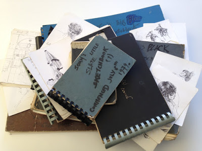 Collection of sketchbooks, 1978-1981Okey, so this is cheating a bit - these are clearly more than one object! But the contents are pretty consistent and were all bundled together in my father's loft, so I think I can safely lump them together as a single item.
Actually, very little remains of my work from the years 1978-1981 while I was at Manchester, as previously mentioned on this blog I ceremoniously threw almost all of my course work out of the 4th Floor window of Chatham House on the final day of the last term, keeping only my degree show portfolio work. It was an act of bravado, but also a statement of the frustration and disillusionment many of us sensed at the end, I felt I'd somehow lost direction during the course. So I was pleasantly surprised to find these sketchbooks still in existence in my dad's loft.
Unfortunately there's not much I want to share, most of the pages are testament to a struggle within confines I'd placed myself in as a pen and ink illustrator. Some time during the First Year I was told by my course head Tony Ross (yes, that Tony Ross) that painting wasn't really my thing, I shouldn't worry about colouring and would be best served by concentrating entirely on pen and ink drawing, with just a splash of colour. I took this advice rather too much to heart and pen drawing was pretty much all I did for most of the 2nd and 3rd years. When I wasn't galavanting off to punk gigs I spent much of my studio time illustrating some of my favourite novels in black and white - The Wind in the Willows, The Lion, the Witch and the Wardrobe, Treasure Island, Tom's Midnight Garden, Mrs Frisby and the Rats of NIMH... all really imaginative books for an illustrator to explore.
 College project: Treasure Island, pen & ink 1980. This drawing survived as a degree show piece.
I saw myself as a black-and-white specialist in the manner of E. H. Shepherd, Mervyn Peake and Edward Ardizzone, it didn't occur to me that in the late '70's fewer and fewer publishers were actually printing novels with text illustrations, that my heroes were all of their time. Most surprisingly of all (and this is something I was to particularly wonder about later), I either wasn't given, or chose to ignore, any guidance to study, write, or dummy picture books, the stock-in-trade of any would-be children's illustrator!
Years later when I met Tony Ross again at Bologna I questioned him about this, and was told, "you have to remember John, it was a commercial illustration course, not a children's book course"... which only partly answered the question. Tony was the head of the course and a children's illustrator, I was the only children's book illustrator in my year (all the others working towards the broader illustration market). I'd set myself very narrow constraints, my pen and ink drawings were still clumsy, the sketchbooks are full of marginalia, doodles rather than dynamic ground breaking work. Maybe I'm being rather hard on myself, but looking through the sketchbooks now from a professional point of view, of the illustration work there's very little I would want to share, I'm not surprised I wanted to throw most of my course artwork out of the window!
 College project: Mrs Frisby and the Rats of NIMH, pen & ink 1981. Another degree show survivor.
However, mixed in with the heavy-handed experiments (which I'm NOT going to show!) the sketchbooks also contain lots of drawings from life, sketches of those around me which bring back very clear memories of the time. As a break from struggling with pen and ink I drew fellow students, the things around me... it seems the more I tried to be a 'proper illustrator', the further away I was drifting from inspiration, yet the sketches from life have an authenticity and lighter touch I was somehow missing in my course work. Here are a few.
The most ready-to-hand subjects were the other illustration students on my course....
 Fellow student Shirley Barker sketch mixed in with a page of course work on The Wind in the Willows, 1979
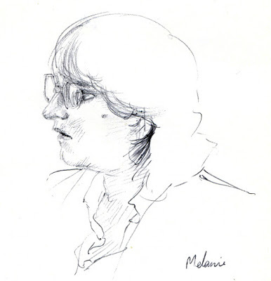 Melanie Dabbs, 1980
 Bob Wood 1980
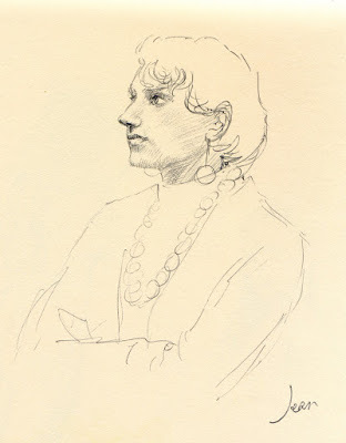 Jean Yarwood, 1981
 Tammy Wong, 1981
... even occasionally the course teachers...
...then there were the places I lived...
 A scruffy room in Didsbury, 1980. That's my Corona typewriter on the table.
 The All Saints campus from the Halls of Residence, around 1979. Student Union on the right, Oxford Road in the distance.
...and there was the Thursday afternoon life class (regretably stopped half way through the course), which was a wonderful escape while it lasted as it was purely observed drawing.
My eyes were greatly opened by my time at Manchester, not least thanks to the indie music scene and my friends. The course itself though had narrowed my output and possibly development, but I don't exclusively blame the tutors, I've a tremendous respect for Tony Ross. We must have been a tough bunch to teach.
 Tony Ross drawing in my sketchbook margin, I think he was encouraging me to make my animals fatter.
 Collection of sketchbooks, 1978-1981Okey, so this is cheating a bit - these are clearly more than one object! But the contents are pretty consistent and were all bundled together in my father's loft, so I think I can safely lump them together as a single item.
Actually, very little remains of my work from the years 1978-1981 while I was at Manchester, as previously mentioned on this blog I ceremoniously threw almost all of my course work out of the 4th Floor window of Chatham House on the final day of the last term, keeping only my degree show portfolio work. It was an act of bravado, but also a statement of the frustration and disillusionment many of us sensed at the end, I felt I'd somehow lost direction during the course. So I was pleasantly surprised to find these sketchbooks still in existence in my dad's loft.
Unfortunately there's not much I want to share, most of the pages are testament to a struggle within confines I'd placed myself in as a pen and ink illustrator. Some time during the First Year I was told by my course head Tony Ross (yes, that Tony Ross) that painting wasn't really my thing, I shouldn't worry about colouring and would be best served by concentrating entirely on pen and ink drawing, with just a splash of colour. I took this advice rather too much to heart and pen drawing was pretty much all I did for most of the 2nd and 3rd years. When I wasn't galavanting off to punk gigs I spent much of my studio time illustrating some of my favourite novels in black and white - The Wind in the Willows, The Lion, the Witch and the Wardrobe, Treasure Island, Tom's Midnight Garden, Mrs Frisby and the Rats of NIMH... all really imaginative books for an illustrator to explore.
 College project: Treasure Island, pen & ink 1980. This drawing survived as a degree show piece.
 I saw myself as a black-and-white specialist in the manner of E. H. Shepherd, Mervyn Peake and Edward Ardizzone, it didn't occur to me that in the late '70's fewer and fewer publishers were actually printing novels with text illustrations, that my heroes were all of their time. Most surprisingly of all (and this is something I was to particularly wonder about later), I either wasn't given, or chose to ignore, any guidance to study, write, or dummy picture books, the stock-in-trade of any would-be children's illustrator!
Years later when I met Tony Ross again at Bologna I questioned him about this, and was told, "you have to remember John, it was a commercial illustration course, not a children's book course"... which only partly answered the question. Tony was the head of the course and a children's illustrator, I was the only children's book illustrator in my year (all the others working towards the broader illustration market). I'd set myself very narrow constraints, my pen and ink drawings were still clumsy, the sketchbooks are full of marginalia, doodles rather than dynamic ground breaking work. Maybe I'm being rather hard on myself, but looking through the sketchbooks now from a professional point of view, of the illustration work there's very little I would want to share, I'm not surprised I wanted to throw most of my course artwork out of the window!
 College project: Mrs Frisby and the Rats of NIMH, pen & ink 1981. Another degree show survivor.
 However, mixed in with the heavy-handed experiments (which I'm NOT going to show!) the sketchbooks also contain lots of drawings from life, sketches of those around me which bring back very clear memories of the time. As a break from struggling with pen and ink I drew fellow students, the things around me... it seems the more I tried to be a 'proper illustrator', the further away I was drifting from inspiration, yet the sketches from life have an authenticity and lighter touch I was somehow missing in my course work. Here are a few.
The most ready-to-hand subjects were the other illustration students on my course....
 Fellow student Shirley Barker sketch mixed in with a page of course work on The Wind in the Willows, 1979
 Melanie Dabbs, 1980
 Bob Wood 1980
 Jean Yarwood, 1981
 Tammy Wong, 1981
... even occasionally the course teachers...

...then there were the places I lived...
 A scruffy room in Didsbury, 1980. That's my Corona typewriter on the table.
 The All Saints campus from the Halls of Residence, around 1979. Student Union on the right, Oxford Road in the distance.
 ...and there was the Thursday afternoon life class (regretably stopped half way through the course), which was a wonderful escape while it lasted as it was purely observed drawing.

My eyes were greatly opened by my time at Manchester, not least thanks to the indie music scene and my friends. The course itself though had narrowed my output and possibly development, but I don't exclusively blame the tutors, I've a tremendous respect for Tony Ross. We must have been a tough bunch to teach.
 Tony Ross drawing in my sketchbook margin, I think he was encouraging me to make my animals fatter.
 September 29, 2016
A History of my Archive in 10 Objects. No.6: Old Man earthenware figure, 1978
The sixth item in A History of my Archive in 10 Objects is an earthenware figure, made during my Foundation Course at Bournville School of Art early in 1978.
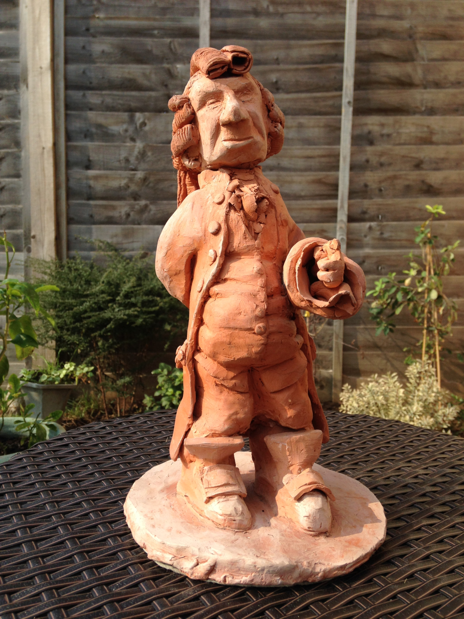
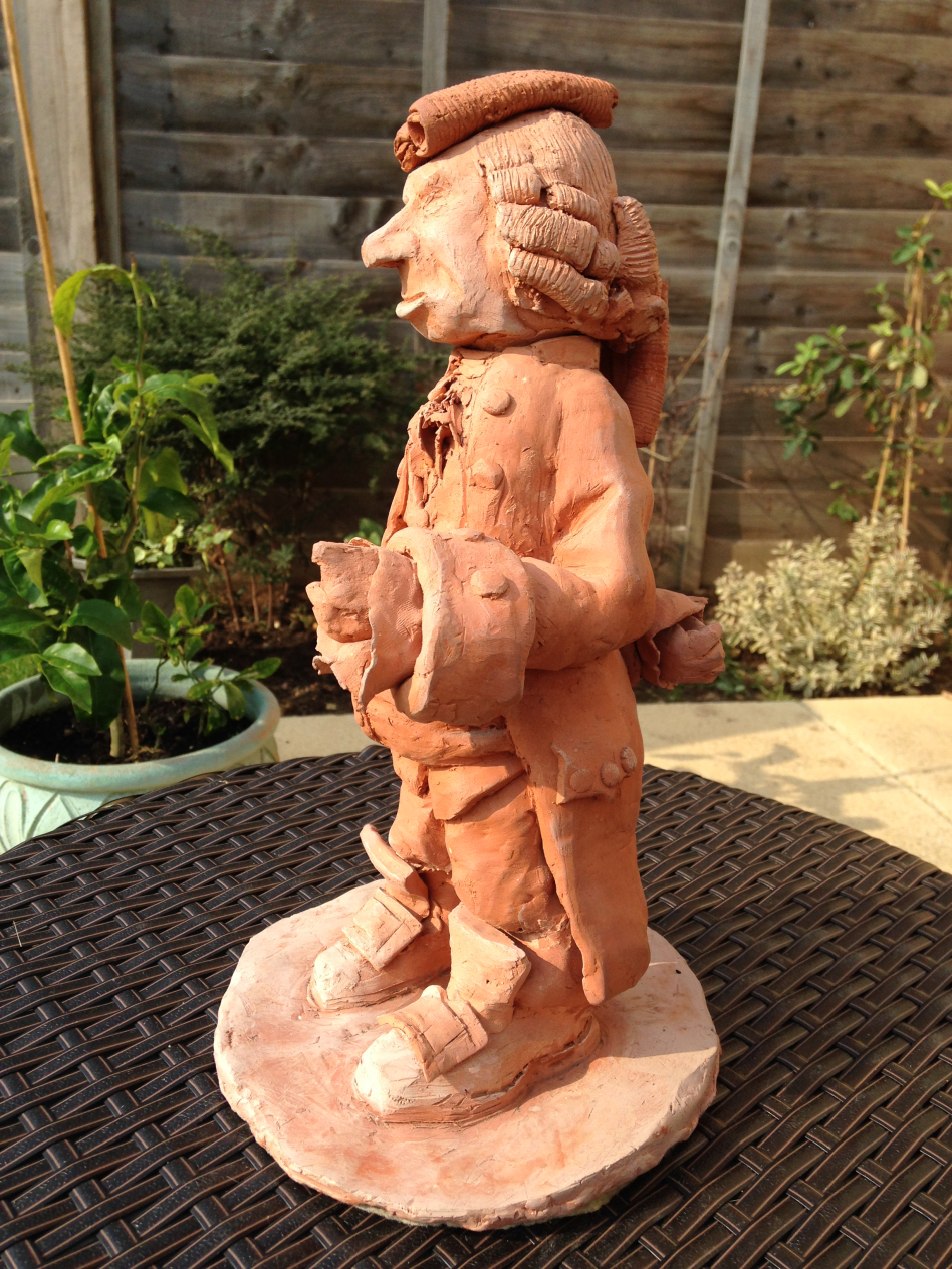
 Old Man, earthenware figure, 31cm tall, 1978
Bournville School of Art was located at Ruskin Hall in the beautiful surroundings of
There was also a secondary studio at Steelhouse in the middle of the city, used mainly for life drawing and painting.
The year I spent at Bournville School of Art was an incredibly rewarding experience, it opened my eyes to new artists and a more directly relevant graphic business, many of the tutors were working artists and designers as well as lecturers, so had direct experience of the creative business, it was an intense, exciting course that broadened my horizons, introducing me to life drawing, etching, photography ... and ceramics.

And so to this figure, the "little old man" as my mum always called him. It's a character from my doomed novel In Search of Summer Gold, so in many ways a last gasp of my adolescent fantasising before the maelstrom of degree course. Standing 37cm tall he's quite heavy, with a detachable head. He used to hold a clay pipe in one hand, which has now broken off and lost.
Like many of the things studied at Foundation Course, this is regretably the only thing I made in ceramics, the course was all too short - focusing all my attention on illustration thereafter, I've never been anywhere near a kiln since. Similarly I've not made etchings either, which I greatly regret.
This figure would have been familiar to anyone who visited my parent's home, as it sat in their front room window looking out onto the world for decades, it was the first thing you noticed as you approached the house.
For that reason it conjures intense memories of the family home to me, every trip back from Japan I'd wander up the drive and there he'd be, my "little man", welcoming me back to the old place. He now sits in my studio, not looking through a window onto the world, but instead glaring reproachfully at my work table. He's telling me to get back to work....
 Old Man, earthenware figure, 31cm tall, 1978
Bournville School of Art was located at Ruskin Hall in the beautiful surroundings of
There was also a secondary studio at Steelhouse in the middle of the city, used mainly for life drawing and painting.
The year I spent at Bournville School of Art was an incredibly rewarding experience, it opened my eyes to new artists and a more directly relevant graphic business, many of the tutors were working artists and designers as well as lecturers, so had direct experience of the creative business, it was an intense, exciting course that broadened my horizons, introducing me to life drawing, etching, photography ... and ceramics.
And so to this figure, the "little old man" as my mum always called him. It's a character from my doomed novel In Search of Summer Gold, so in many ways a last gasp of my adolescent fantasising before the maelstrom of degree course. Standing 37cm tall he's quite heavy, with a detachable head. He used to hold a clay pipe in one hand, which has now broken off and lost.
Like many of the things studied at Foundation Course, this is regretably the only thing I made in ceramics, the course was all too short - focusing all my attention on illustration thereafter, I've never been anywhere near a kiln since. Similarly I've not made etchings either, which I greatly regret.
This figure would have been familiar to anyone who visited my parent's home, as it sat in their front room window looking out onto the world for decades, it was the first thing you noticed as you approached the house.
For that reason it conjures intense memories of the family home to me, every trip back from Japan I'd wander up the drive and there he'd be, my "little man", welcoming me back to the old place. He now sits in my studio, not looking through a window onto the world, but instead glaring reproachfully at my work table. He's telling me to get back to work....
September 28, 2016
A History of my Archive in 10 Objects. No.5: Birds, 1977
Number 5 in the History of my Archive in 10 Objects, is this triple set of bird studies from early 1977.
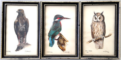 Buzzard, Kingfisher, Long-Eared Owl. Watercolour on paper, 1977I was 17, I was about to leave school and start a foundation course at the now-gone and much lamented Bournville School of Art, I was full steam ahead for a career in illustration, the world of graphic art, experimentation and adventure awaited.
But all that was in the future - in the meantime I was generating some income from selling these kinds of traditional studies in a local giftshop/framing gallery in Mere Green. The owner, Mrs Gameson, was extremely supportive of my work and gave me wall space to display and sell pictures of wildlife and familiar scenes of Sutton Coldfield, in watercolour (as here) or pen and ink. Gameson Gallery on Belwell Lane also managed me as an artist on commission - word of mouth recommendations led me to draw many of the big houses on the private estate in Four Oaks, I'd cycle with sketchpad and ink bottle to anywhere that wanted a drawing - unfortunately this came to an end when one customer returned their house sketch, upset that I'd included the washing on her line in the drawing.
Virtually everything I painted at that time was sold by the gallery, but these three studies survived because they were a birthday gift to my mum in January 1977. I believe they were amongst my first attempts to paint in pure watercolour (that is, just paint, no pen lines).
I carried on working with the Gameson Gallery even after I started my Foundation course, right up until I left for Manchester, Mrs Gameson gave me my first ever one-man (or one kid!) exhibition, mostly wildlife paintings. My parents were particularly proud of this and my father was disappointed when I drifted away from such work. Being an artist in the eyes of my father was to paint attractive pictures, exhibit them, sell them and put them on the wall. He could never really get to grips with my choice to be an illustrator rather than a gallery fine artist, there was a suspicion I was under-selling my talents. I'll always remember him saying "when are you going to paint a proper picture I can put on the wall?" By "proper", he meant a landscape, seascape or genre oil painting. But eventually he did come round to understanding my creative path.
The fact remains though, of all the work I created and showed my parents in the intervening years, the one thing that never left their walls, on display without a break for nearly forty years from 1977 until 2016, were these three bird studies.
I always wonder what became of Mrs Gameson...
September 27, 2016
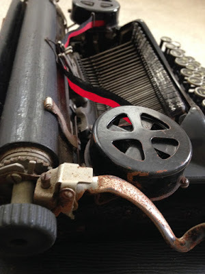
A History of my Archive in 10 Objects. No.4: Corona 4 typewriter, 1924
Number 4 in this series of 10 Images from my archives found at my dad's house is my old typewriter... and I mean old typewriter!
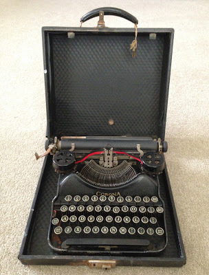 Corona Model 4 portable typewriter, 1924 pattern
When I was 16 I discovered the work of the Golden Age illustrators (Rackham, Dulac, Heath-Robinson, Stratton etc). In fact it was a re-discovery really as my mum had kept a couple of compendiums from her childhood that had been illustrated by these artists, but I rarely saw those. It was only in the mid-70's that I began seriously examining children's illustration, Arthur Rackhams' work in particular began transporting me to realms of the imagination. Gradually my artwork at school began to take on the iconography of old fashioned ethereal fairy tales, anthropomorphised animals and so on. By the time I reached 6th Form I knew I wanted to be a children's book illustrator, so it was only natural I'd also pursue writing too. My first attempts at writing children's books had been laughable copies of Enid Blyton adventures, written by hand when I was around 13.... none extended past the first chapter! But by 1977 I was serious, and so managed to persuade my parents to buy me a typewriter.
Of course, what I had in mind was a modern, zippy electric typewriter that I could churn out pages of manuscript. But, ever watchful for a bargain, my mum spotted an ad for something second-hand, and what I ended up with was a 1920's Corona 4 manual machine, which were first released onto the market in 1924. I remember the day we picked this up from a big old house on the private estate, I didn't quite know what to make of it - this wasn't hi-tech! though I fell in love with it's look.
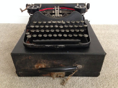
I'd never touched a typewriter before in my life, so the fact the ribbon feed was rusty, you had to bang down the keys so hard it made your fingers ache, or that the 'e' was slightly misaligned didn't bother me, I had no other experience to compare to so just got on with it - it was the only way for me. I felt I was following the route of the great writers, rather than obsolete, it was 'classic'.
While other 18-year olds were discovering pubs, I spent most of my free time typing out my first manuscript In Search of Summer Gold - my one and only attempt at a novel - a long, pretty unpublishable tale of anthropomorphised mice and fairies in the 18th century, a mix of The Wind in the Willows meets The Lord of the Rings, with a good dollop of Brothers Grimm and Peter Pan thrown in for good measure. And of course I illustrated it with highly derivative pen drawings. From a professional level it was not very good and was turned down by two publishers before I eventually shelved it .... but at least it taught me to type!
Later on I used the Corona to type up my degree thesis, and in the early '80's the first issues of the Norwich post-punk fanzine/magazine The Blue Blanket ... banging those keys down with a satisfying smack! smack! smack! as they hit the ribbon, it was the perfect instrument on which to take out frustrations with the world. But thereafter it was retired, and I've never attempted to write a novel again.
It took a battering in the years I used it, 35 years in my dad's loft has not been good to my old stalwart either, but I was very glad to rediscover it there.
 Corona Model 4 portable typewriter, 1924 pattern
When I was 16 I discovered the work of the Golden Age illustrators (Rackham, Dulac, Heath-Robinson, Stratton etc). In fact it was a re-discovery really as my mum had kept a couple of compendiums from her childhood that had been illustrated by these artists, but I rarely saw those. It was only in the mid-70's that I began seriously examining children's illustration, Arthur Rackhams' work in particular began transporting me to realms of the imagination. Gradually my artwork at school began to take on the iconography of old fashioned ethereal fairy tales, anthropomorphised animals and so on. By the time I reached 6th Form I knew I wanted to be a children's book illustrator, so it was only natural I'd also pursue writing too. My first attempts at writing children's books had been laughable copies of Enid Blyton adventures, written by hand when I was around 13.... none extended past the first chapter! But by 1977 I was serious, and so managed to persuade my parents to buy me a typewriter.
Of course, what I had in mind was a modern, zippy electric typewriter that I could churn out pages of manuscript. But, ever watchful for a bargain, my mum spotted an ad for something second-hand, and what I ended up with was a 1920's Corona 4 manual machine, which were first released onto the market in 1924. I remember the day we picked this up from a big old house on the private estate, I didn't quite know what to make of it - this wasn't hi-tech! though I fell in love with it's look.

I'd never touched a typewriter before in my life, so the fact the ribbon feed was rusty, you had to bang down the keys so hard it made your fingers ache, or that the 'e' was slightly misaligned didn't bother me, I had no other experience to compare to so just got on with it - it was the only way for me. I felt I was following the route of the great writers, rather than obsolete, it was 'classic'.
While other 18-year olds were discovering pubs, I spent most of my free time typing out my first manuscript In Search of Summer Gold - my one and only attempt at a novel - a long, pretty unpublishable tale of anthropomorphised mice and fairies in the 18th century, a mix of The Wind in the Willows meets The Lord of the Rings, with a good dollop of Brothers Grimm and Peter Pan thrown in for good measure. And of course I illustrated it with highly derivative pen drawings. From a professional level it was not very good and was turned down by two publishers before I eventually shelved it .... but at least it taught me to type!

Later on I used the Corona to type up my degree thesis, and in the early '80's the first issues of the Norwich post-punk fanzine/magazine The Blue Blanket ... banging those keys down with a satisfying smack! smack! smack! as they hit the ribbon, it was the perfect instrument on which to take out frustrations with the world. But thereafter it was retired, and I've never attempted to write a novel again.
It took a battering in the years I used it, 35 years in my dad's loft has not been good to my old stalwart either, but I was very glad to rediscover it there.
September 26, 2016
A History of my Archive in 10 Objects. No.3: Toothless Old Man, 1976
In part three of 10 objects from the archive of objects found in my dad's house, I'd like to offer this.
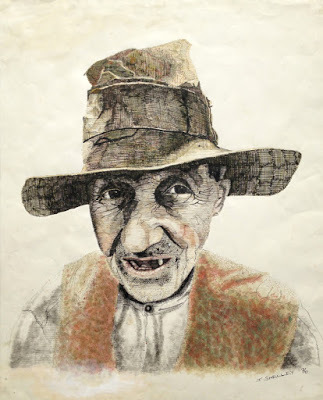 School project: Toothless Old Man. Pen & Ink. 80cm x 60cm, 1976 After the tentative steps of the Henry Hudson picture I worked on two other school projects before setting to work on this large piece, which proved to be the most experimental and successful of my school drawings in pure pen and ink. It was drawn from a randomly selected photo reference using a multi coloured pen and ink line technique - on the face and hat I used three separate pen nibs to switch colours and gradually build up the drawing in different coloured cross-hatching, the waistcoat was filled in by dabbing ink with sponge. It was a labour-intensive technique for such a large sized drawing, but proved a great success. Sadly many of the coloured inks have faded over time.
The image was the centre piece of my school's 1976 art show during the summer festival, and made it to the pages of the local newspaper - my first press appearance! Even my junior school headmistress came to see it. By this time I was absolutely determined to be an illustrator and had my sights set on art college.
After the show this picture adorned the walls of my parent's house for a few years before being consigned to the loft. The identity of the man in the photo I never knew!
September 25, 2016
A History of my Archive in 10 Objects. No.2: The Last Voyage of Henry Hudson, 1975
Number 2 in the discoveries made at my dad's house from long hidden archives of my work. In my wildest dreams I never thought I'd ever see this picture again, but there it was, in my dad's loft, warts and all, the very first drawing I ever attempted in pen and ink, from 1975, aged 16.
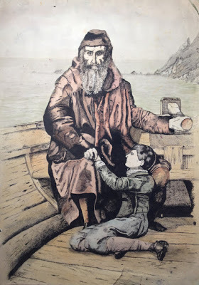 School project: The Last Voyage of Henry Hudson, copy of an engraving in The Graphic, after the painting by John Collier. Pen & Ink with watercolour on paper. 73cm x 51cm. 1975.
Prior to this drawing I'd worked steadily but quietly at school on assigned projects. It was acknowledged that I was "good at art", but this was post modernist, late hippy mid 1970's, most of the art classes were light on drawing skills, heavy on texture and tactility, I found little to inspire me. Batik tshirts? Organic bio-plant patterns? Yeuk! No, I wanted to draw! Draw people! Things!
Away from school however I'd long since discovered the joy of the BIC biro, and filled old unused school exercise books with drawings, copied or inspired by WW2 Commando comics. After my dad bought me a couple of Adrian Hill guides to drawing and sketching I'd taken a sketchbook with me everywhere I went, and on every holiday over the previous year filled it with directly observed sketches from life in biro. This was all entirely independant from school. Finally a confrontation with a school bully ended up with the contents of my school bag scattered across the classroom floor, and my sketchbooks were discovered by my form tutor (and art teacher) Al Sayers.
Everything changed from then on. My wonderful art teacher Jackie Asbury (where is she now?) introduced me to a dip pen and a bottle of indian ink for the first time, and told me to draw something challenging. A 19th engraving of Collier's The Last Voyage of Henry Hudson seemed to fit the bill. I knew absolutely nothing about Henry Hudson or John Collier, or for that matter pen and ink drawing, but I set to and produced this clumsy, tentative piece, little knowing that pen and ink was to become my chief medium for the next 40 years.
Well, this is what I wanted it to look like....
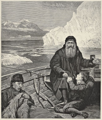 The source engraving, The Last Voyage of Henry Hudson, after the painting by John Collier
It's embarassing - those terribly badly drawn hands... it bears little resemblance to the source image, how could I hope to reproduce an engraving with a dip-pen? I had a lot to learn, but it was a start, and I never looked back.
 School project: The Last Voyage of Henry Hudson, copy of an engraving in The Graphic, after the painting by John Collier. Pen & Ink with watercolour on paper. 73cm x 51cm. 1975.
 Prior to this drawing I'd worked steadily but quietly at school on assigned projects. It was acknowledged that I was "good at art", but this was post modernist, late hippy mid 1970's, most of the art classes were light on drawing skills, heavy on texture and tactility, I found little to inspire me. Batik tshirts? Organic bio-plant patterns? Yeuk! No, I wanted to draw! Draw people! Things!
Away from school however I'd long since discovered the joy of the BIC biro, and filled old unused school exercise books with drawings, copied or inspired by WW2 Commando comics. After my dad bought me a couple of Adrian Hill guides to drawing and sketching I'd taken a sketchbook with me everywhere I went, and on every holiday over the previous year filled it with directly observed sketches from life in biro. This was all entirely independant from school. Finally a confrontation with a school bully ended up with the contents of my school bag scattered across the classroom floor, and my sketchbooks were discovered by my form tutor (and art teacher) Al Sayers.
Everything changed from then on. My wonderful art teacher Jackie Asbury (where is she now?) introduced me to a dip pen and a bottle of indian ink for the first time, and told me to draw something challenging. A 19th engraving of Collier's The Last Voyage of Henry Hudson seemed to fit the bill. I knew absolutely nothing about Henry Hudson or John Collier, or for that matter pen and ink drawing, but I set to and produced this clumsy, tentative piece, little knowing that pen and ink was to become my chief medium for the next 40 years.
Well, this is what I wanted it to look like....
 The source engraving, The Last Voyage of Henry Hudson, after the painting by John Collier
It's embarassing - those terribly badly drawn hands... it bears little resemblance to the source image, how could I hope to reproduce an engraving with a dip-pen? I had a lot to learn, but it was a start, and I never looked back.


