Melissa Bowersock's Blog, page 26
October 18, 2012
Tying Up Loose Ends
Life is messy. Much as most of us like symmetry, life tends more toward the chaotic, the unresolved, the disproportionate—messy. Have you ever have been tail-gated by a jerk that seems intent on ramming your rear bumper one minute, then dashes dangerously around you and speeds off in a spurt of smoke and gravel while you pray for a cop lurking up ahead who will give said jerk the instant karma that he deserves? Have you ever felt that gratifying sense of pleasure when you’ve helped someone unasked—retrieved dropped groceries for a little old lady in the parking lot, grabbed a wayward shopping cart for a frazzled mother with her arms full of cranky baby—only to get back to your own car and find someone keyed the side of it? What’s up with that?
We seem to have an innate sense of balance: good deeds deserve appreciation; bad deeds deserve punishment. Questions deserve answers; chaos requires order. We like things to have balance; we like tit for tat. We like it when loose ends are tied up in nice, neat little bundles.
Not so, life. If karma does exist (and I think it does), it seems to operate on a much larger scale than anything we can discern. More often than not, we do not see the scales dip and rise, then level off in that perfectly symmetrical way. We do not see the jerk get his comeuppance; we do not see the truly generous person rewarded for their giving nature.
So here is the writer’s dilemma: in your story, how little or how much do you tie up the loose ends?
It’s a valid question. If you opt for tying up all the strings into a nice, neat little package, most likely you have imparted a very agreeable sense of satisfaction to your reader. The caveat is that a perfectly resolved story can have an unreal fantasy feeling to it, leaning toward the Disneyesque. If, on the other hand, you opt for a true-to-life feel, you leave some things unresolved and/or dissatisfactory, which can give your reader an uncomfortable, letdown feeling.

In my current work-in-progress (WIP), I am debating that very thing. The overarching plot concerns my protagonist and his struggle against his own stoic, rather cold nature. Throughout the course of the story, events with his girlfriend and mother shift, he evolves slowly, sometimes painfully, finally reaching the point at which we know he will be able to connect with the people around him in a meaningful way. Along the way, I introduced a side plot that was initially there to add texture and explain my character’s background. What I’ve found is that I actually have the mechanism built into the story that could bring this side plot full circle and resolve another big part of my character’s personality. So now my dilemma is, do I tie it all up neatly? Or let the side plot just hang?
One of my favorite movies mixes these two scenarios into a jarring yet pleasing whole. This is the Clint Eastwood Western Unforgiven. In the movie, Will Munny is a ruthless gunman who gave up that life when he met and married his wife. After her death, struggling to make a go of his rickety pig farm, raising two children alone, he is tempted to return to his old life in order to collect a bounty put on a man who cut up a prostitute. The ensuing battle brings back all the old ruthlessness in spades as Munny cuts down multiple heartless bullies and brings justice (aka vengeance) to the prostitutes. In the end (spoiler alert!), after committing numerous cold-hearted murders, Munny is left alive to return to his home.

At first I thought this ending was one of those uncomfortable, dissatisfying real-life endings where things do not balance out. After all that Munny had done, it would seem only fair that he die in the end. But the more I thought about it, the more the ending made sense. He had done unspeakable things. He had killed countless men. His death would balance the accounts. The worst punishment he could experience was not dying—it was staying alive. Staying alive to ruminate on all that he had done. Staying alive to mourn his dead wife. Staying alive to think about the redemption that lay beyond his grasp.
Perfect.
But now back to my story …


October 2, 2012
Thanks to Military Writers Society of America!
I want to send a huge shout-out of thanks to the Military Writers Society of America. This is an organization that keeps history alive by reviewing and promoting books about all aspects of military history: fiction and non-fiction, biography, young adult, poetry, even children’s books. The society is well-organized and well run, supported by thousands of members and numerous reviewers. Although they get inundated with requests for reviews, they do a good job of staying current and getting the reviews up online as quickly as possible, and to help potential readers wade through the “stacks,” every year they nominate the best of the books they’ve reviewed in a multitude of categories. Along with the traditional categories of military literature, they also nominate the best books in reference, business, humor, spiritual, romance, memoirs, sci-fi and thriller genres.
I was drawn to the MWSA because my most recent book, Marcia Gates: Angel of Bataan, seemed a good fit. I joined the group and requested a review. I received an immediate e-mail that they were backed up due to the volume of requests, but I appreciated the communication. It was about 4 months before my review came up, but well worth the wait.

This is the true story of a nurse, Marcia Gates, during World War II and her experiences during the battle of Bataan and three years as a prisoner of war. But it is more than that because this story also relates how the families at home were feeling–frustrated and concerned about their lack of information about Marcia and her safety.
This book is easy to read and many will find it difficult to put down as one wants to know–does Marcia make it home? The format is also augmented by actual letters written by Marcia, other nurses and from family members to Marcia. It may be difficult for some who are so used to the modern e-mail system to even imagine the problems of letters not arriving home for months and how that affected the family who used every resource they could to get any information they could of their daughter. The author uses these letters to carefully weave a true account of what was happening on both sides of the world.
I found the story exciting, surprised by some of the descriptions of conditions and wondered why I hadn’t heard this story before. The author has brought out one of the untold stories of World War II–about a nurse. I believe this book will have wide appeal to many audiences including: medical personnel, historians, veterans and anyone interested in good story with a happy ending. –Edward Kelly
Imagine my surprise, then, when I was notified that my book had also been nominated for Best Biography of the year! I felt deeply honored to have my book placed in such prodigious company. The MWSA has an annual conference (this year in Dayton, Ohio) where they pull out all the stops for their members and authors. The conference offers a multitude of workshops, lectures, one-on-ones with publishing insiders, social activities and the coveted awards ceremony. They also sell books and offer an anthology compounded exclusively for the conference. It’s one-stop shopping for anyone who loves reading and writing about military history in all its guises.Unfortunately for me, I was unable to attend the conference. I waited on pins and needles for the awards, however. It was somewhat of a letdown to find out my book did not, in fact, win the gold medal for biographies, but it was gratifying to receive an Honorable Mention. I am sure the voting was done fairly and the books that won the top awards deserved them. And after all, I never suspected that my slim volume of a very personal, family story would ever receive such recognition. It was exciting and encouraging to have my book so honored, even if it didn’t bring home the top prize.As a writer, I have found that the MWSA does a tremendous job promoting authors and their books. Not only do they review and showcase the books and give prestigious awards to the best, but they continue to support the author long after the conference is over. I continue to get messages about book promotion sites, about bloggers and radio stations wanting to interview authors and other opportunities to get the word out. Unlike many promotional organizations, the MWSA does not simply post a review and then forget it. It actively invests time and effort into keeping its membership in the limelight. Like the servicemen and women represented in the thousands of books, the MWSA never sleeps. It continues to carry the banner of literacy, history, honor and humanity ever forward. MWSA, I salute you.
September 17, 2012
Formatting for E-Books
With so much of the publishing world going digital, it’s important for authors to wade into the e-book tsunami that is flooding the industry. Some authors may assume the e-book format is exactly like a physical book format, which is a large mistake. Others may assume formatting for e-books is terribly difficult, another mistake. Actually e-books are an entirely different animal and somewhere in between, but they are definitely doable.
With print books, you (or your editor) control exactly how that book will appear; you control the size of the font, the white space, the size of the page. Whatever you decide the format should be is exactly what your reader will see.
With e-books, it’s not that simple. Readers may have any of a dozen reading devices, not even counting the Cloud on their computer or their smart phones. What this means is that an e-book must flow into any of these devices, whatever the size or shape of the screen, and still be readable.
Okay, how do you do that?
You do that by simplifying.
First of all, use a common, easy-to-read font. You might choose Times New Roman, Arial or Garamond, but don’t use an exotic or fancy font that may not be supported by e-readers. The best size font is 11 or 12, 14 at the very most. Don’t forget that most e-readers allow their owners to magnify or decrease the size of the font to suit them. If you want to use a particular font for your title or chapter headers, the best way to ensure that the reader sees what you want them to see is to create an image and insert that in the proper place. More on images below.
Choose your paragraph style. Either use a block paragraph format (as this blog is: no indent and a blank line between paragraphs) or a first-line indent style. Either is fine, but choose one and be consistent, and don’t mix the two. If you choose to indent, don’t use tabs. Indent by choosing or creating a paragraph style and format all your paragraphs with that style rather than manually. It’s also a good idea to get rid of total justification in text, allowing ragged edges which spread the words from margin to margin. Fully justified text sometimes shows up with large gaps between words.
Don’t use page breaks, section breaks or large quantities of blank lines to separate sections of your book. Because e-books flow continuously through an e-reader, page breaks (and page numbers, for that matter) are useless. If you want to show some separation between chapters or sections of the book, use “hard” line returns, but no more than four at a time. More than four blank lines could simply show up as blank screens on the e-reader, confusing and annoying your reader.
Along with getting rid of page numbers, get rid of any headers or footers. Text boxes are an absolute no-no, and you will need to convert any tables into images.
As you can see, what we are doing is essentially “stripping down” the book to its barest essentials. Once you’ve done that, though, you need to check and make sure no unwanted and unnecessary formatting remains. How do you do that?
In MS Word, there is a button on the top Home menu that looks like a paragraph symbol ( ¶ ); clicking this button allows you to see all formatting in your document—spaces, tabs, indents, section breaks; it makes all the invisible visible*. You may be surprised at how much junky formatting is left over, even after you’ve stripped it down. Word tries to be “helpful” by having quite a bit of automatic formatting, plus any mistakes made while typing can insert an invisible but problematical bit of formatting. This way, you can see everything that’s in there and strip it out even more than you already have.
(*This sentence should be true, but it’s sometimes not. Recently a friend found that her e-book contained the number 3 centered alone on lines between paragraphs of her book, and she could find no evidence of anything to account for it, even when she made all formatting visible as above. She was then forced to go to the next step.)
If, however, you’ve done this and still have some weird results that you can’t trace, there’s a method to “nuke” all formatting. This method is endorsed by Smashwords, but with a caution. Doing this will get rid of all formatting, so that means that you’ll have to go back in afterward and re-format the book the way you want it. Here’s how to do it:
Open your Word document and copy the entire thing, then paste it all into Notepad or some other text application. You’ll see all your formatting disappear. Now copy the entire body of text in Notepad and paste it into a NEW blank Word document. Now your document is as clean as you can get it, but you will need to go back in and re-format your chapter headers, etc. (For more about the Smashwords style guide, go here.)
Images can be particularly annoying in e-books; they have a tendency to jump about or not appear correctly. I’ve found the best way to deal with images is, again, simply. Insert your image where you want it, but do not change the text wrapping to anything from the default “in line with text.” You can certainly change the placement of the picture to left-justified, centered or right-justified, but beyond that, just leave it alone. Type in captions below the picture (choose a different style for those to set them off from the main text), but do not use the automatic caption feature of Word or a text box.
Finally, because so often e-reader devices support wifi and the internet, you can do something with your e-book that you can’t do with physical books—connect your reader to you online. It’s a simple matter to add an About the Author section to the end of the book with links to your Facebook, Twitter, blog or website.
September 5, 2012
DIY Focus Groups
Writing is a very isolated endeavor. Ideas spawn in our minds and we nurture them in our silent brain cells. We enlarge on them, imagine them growing, changing, moving forward, but it’s all very quietly within us until we set it down on paper. Even that process is isolated unless we have someone hanging over our shoulder waiting breathlessly for every word.
When we’ve finished our story-telling, the time has arrived for us to step out of our secluded little world and present our creation to others. We’ve captured our imaginings, we’ve pushed and prodded and wrangled and polished and refined until we are 100% certain it’s good and it’s done.
Or are we?
It’s not enough to write the book (although, of course, that’s the biggest milestone), and publishing now is not that hard if you choose to go the self-publishing route, which many of us are doing. So you’ve written the book, you’re ready to publish, but how do you reach out to the readers? How do you say to them, “This is a good book; take a look; read it!”
Think of the cover of your book as the doorway. This is the place where you put out the welcome mat for the reader and beckon them to enter. This is the place where you invite them to suspend their normal sense of time and space and enter into a different world. The cover of your book is the threshold, the connection, the passage. It will either call a reader in or turn them away.
Packaging is very much an instant, impulse thing. I’ve heard it said that a book has less than 10 seconds to grab a reader’s interest (perhaps even as little as 3 or 4). The title, the cover, the backcover blurb, even the predominant color of the book all must be crafted in a way that entices the reader to look deeper.
So how do you know how your book cover strikes readers? How do you know what it says to them?
Answer that question by creating your own focus group.
In the digital age, this is not that hard to do. Many writers have their own webpages already in place, and that’s a perfect vehicle for creating a focus group. Many writers also have blogs, and although these cannot be as focused on a target group as a webpage, they can still afford a window on the world for those who find webpages challenging.
When my book Goddess Rising was ready to publish, I had a couple ideas about the cover. My editor and I talked back and forth about it, but I really wanted input from the people this book would appeal to. (My editor, sweet man that he was, thought the book was worthy of publication but never really “got” it.) I have to admit, this book was difficult to market. Set in the future, the book is about a time when a geologic holocaust has destroyed civilization and left only a few scattered colonies of people who have reverted back to a simple agrarian lifestyle and worship the Great Goddess. Their one hope lies in a dream-given prophecy that Greer the Sibling, a female savior, will arise and lead the people back to greatness. The book follows Greer’s journey from simple obscurity to prophesied reign as she struggles with her destiny and discovers the rewards of power—and the price.
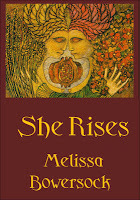
My first title for the book was The Sibling, simple but nondescript. One friend told me it sounded like a slasher movie, so I think I tossed it at that point. I wanted to convey the two-fold theme of the book, the rising of the Great Goddess and the rising of Greer. I finally settled on She Rises, a title that could refer to either, or both, themes.
For my graphic, I turned to one of my very favorite artists in the whole world, Meinrad Craighead. Meinrad was raised in a dynamic blend of Catholicism (she was a nun for many years) and awareness of the Great Goddess, and she weaves the living themes of both into her strong, iconic paintings. The one that I particularly liked for my book is called Mother and Daughter. I felt the graphic conjured up all relationships between all women: mother to daughter, of course, but also sister to sister and woman to Goddess.
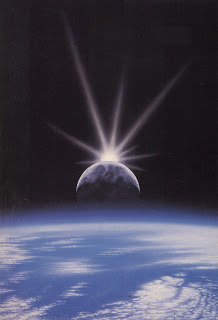
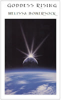
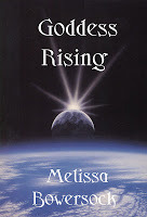
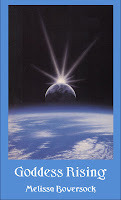
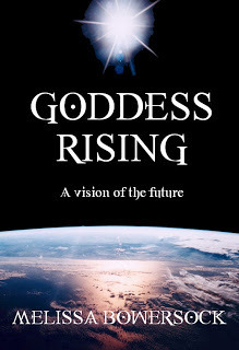
 Another piece of artwork that struck me was a painting by Dennis Davidsoncalled Spatium Lux. Diametrically different than Meinrad’s, the space art of Davidson was at once evocative, spectacular and stunning. It had a very different feel than the warm tones of Mother and Daughter, but I liked and considered both. At the same time, my editor suggested Goddess Rising for the title, so I incorporated that into my options.
Armed with these graphics, I played around in MS Word, creating a mock book cover and trying out several different colors, different configurations, different fonts. When I had a range of styles, I put them up on a web page and asked several friends to take a look and tell me their reactions. Because I put up a new, unpublicized web page off my main page, I was able to e-mail friends the link and control who saw the page.
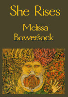
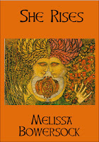
I invited friends to chime in on color, style, placement, font. I wanted to hear all about how the book cover and all its elements invited or intimidated, intrigued or turned off. I was mildly surprised when the votes for title favored Goddess Rising and the space art over She Rises with Meinrad. The votes also overwhelmingly preferred the center layout with the graphic making up the entire book cover, a layout I liked as well.
My next job was getting approval to use the artwork. I contacted Mr. Davidson but found him reluctant to let me use his work. He was unsure about the fit of my story with his art and being an artist of a different kind, I could well understand and respect that. This book is not for everyone. If I wasn’t 100% sure my story would be enhanced by someone else’s art, I wouldn’t marry the two, either. I resigned myself to another search for a fitting graphic.
As coincidence would have it, an acquaintance who knew I liked all things space sent me an e-mail with a stunning NASA photo. This man had no knowledge of my book or my struggles with the cover, but just happened to send me the most perfect picture I could imagine. Well, almost perfect. I had a feeling the arm of the Space Station wouldn’t quite fit in.
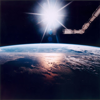
The good news about this was not only that I loved the picture, but that as a NASA file, it was easily accessible. If I remember correctly, it cost me something like $10 or $20 to get a beautiful hi-res copy of the photo. My editor immediately went to work tweaking it for the book cover. What resulted was, I thought, absolutely stunning, a book I was proud to hand out to readers.
As isolated as we are when we’re writing, any author concerned about the commercial success of their books can benefit greatly by using a focus group. When I look at this book, I see not only my own story, but the nudging encouragement of my talented editor and helpful friends. This book truly was a labor of love from many standpoints.
When we’ve finished our story-telling, the time has arrived for us to step out of our secluded little world and present our creation to others. We’ve captured our imaginings, we’ve pushed and prodded and wrangled and polished and refined until we are 100% certain it’s good and it’s done.
Or are we?
It’s not enough to write the book (although, of course, that’s the biggest milestone), and publishing now is not that hard if you choose to go the self-publishing route, which many of us are doing. So you’ve written the book, you’re ready to publish, but how do you reach out to the readers? How do you say to them, “This is a good book; take a look; read it!”
Think of the cover of your book as the doorway. This is the place where you put out the welcome mat for the reader and beckon them to enter. This is the place where you invite them to suspend their normal sense of time and space and enter into a different world. The cover of your book is the threshold, the connection, the passage. It will either call a reader in or turn them away.
Packaging is very much an instant, impulse thing. I’ve heard it said that a book has less than 10 seconds to grab a reader’s interest (perhaps even as little as 3 or 4). The title, the cover, the backcover blurb, even the predominant color of the book all must be crafted in a way that entices the reader to look deeper.
So how do you know how your book cover strikes readers? How do you know what it says to them?
Answer that question by creating your own focus group.
In the digital age, this is not that hard to do. Many writers have their own webpages already in place, and that’s a perfect vehicle for creating a focus group. Many writers also have blogs, and although these cannot be as focused on a target group as a webpage, they can still afford a window on the world for those who find webpages challenging.
When my book Goddess Rising was ready to publish, I had a couple ideas about the cover. My editor and I talked back and forth about it, but I really wanted input from the people this book would appeal to. (My editor, sweet man that he was, thought the book was worthy of publication but never really “got” it.) I have to admit, this book was difficult to market. Set in the future, the book is about a time when a geologic holocaust has destroyed civilization and left only a few scattered colonies of people who have reverted back to a simple agrarian lifestyle and worship the Great Goddess. Their one hope lies in a dream-given prophecy that Greer the Sibling, a female savior, will arise and lead the people back to greatness. The book follows Greer’s journey from simple obscurity to prophesied reign as she struggles with her destiny and discovers the rewards of power—and the price.
My first title for the book was The Sibling, simple but nondescript. One friend told me it sounded like a slasher movie, so I think I tossed it at that point. I wanted to convey the two-fold theme of the book, the rising of the Great Goddess and the rising of Greer. I finally settled on She Rises, a title that could refer to either, or both, themes.
For my graphic, I turned to one of my very favorite artists in the whole world, Meinrad Craighead. Meinrad was raised in a dynamic blend of Catholicism (she was a nun for many years) and awareness of the Great Goddess, and she weaves the living themes of both into her strong, iconic paintings. The one that I particularly liked for my book is called Mother and Daughter. I felt the graphic conjured up all relationships between all women: mother to daughter, of course, but also sister to sister and woman to Goddess.
 Another piece of artwork that struck me was a painting by Dennis Davidsoncalled Spatium Lux. Diametrically different than Meinrad’s, the space art of Davidson was at once evocative, spectacular and stunning. It had a very different feel than the warm tones of Mother and Daughter, but I liked and considered both. At the same time, my editor suggested Goddess Rising for the title, so I incorporated that into my options.

Armed with these graphics, I played around in MS Word, creating a mock book cover and trying out several different colors, different configurations, different fonts. When I had a range of styles, I put them up on a web page and asked several friends to take a look and tell me their reactions. Because I put up a new, unpublicized web page off my main page, I was able to e-mail friends the link and control who saw the page.


I invited friends to chime in on color, style, placement, font. I wanted to hear all about how the book cover and all its elements invited or intimidated, intrigued or turned off. I was mildly surprised when the votes for title favored Goddess Rising and the space art over She Rises with Meinrad. The votes also overwhelmingly preferred the center layout with the graphic making up the entire book cover, a layout I liked as well.


My next job was getting approval to use the artwork. I contacted Mr. Davidson but found him reluctant to let me use his work. He was unsure about the fit of my story with his art and being an artist of a different kind, I could well understand and respect that. This book is not for everyone. If I wasn’t 100% sure my story would be enhanced by someone else’s art, I wouldn’t marry the two, either. I resigned myself to another search for a fitting graphic.
As coincidence would have it, an acquaintance who knew I liked all things space sent me an e-mail with a stunning NASA photo. This man had no knowledge of my book or my struggles with the cover, but just happened to send me the most perfect picture I could imagine. Well, almost perfect. I had a feeling the arm of the Space Station wouldn’t quite fit in.

The good news about this was not only that I loved the picture, but that as a NASA file, it was easily accessible. If I remember correctly, it cost me something like $10 or $20 to get a beautiful hi-res copy of the photo. My editor immediately went to work tweaking it for the book cover. What resulted was, I thought, absolutely stunning, a book I was proud to hand out to readers.

As isolated as we are when we’re writing, any author concerned about the commercial success of their books can benefit greatly by using a focus group. When I look at this book, I see not only my own story, but the nudging encouragement of my talented editor and helpful friends. This book truly was a labor of love from many standpoints.