
Doug TenNapel's Blog, page 8
January 23, 2013
The Doug TenNapel Sketchbook Archives now you’re really late!
If you didn’t contribute to the Doug TenNapel Sketchbook Archives (http://www.kickstarter.com/projects/1812253609/doug-tennapel-sketchbook-archives) through Kickstarter but still want the leather-bound hardcover super-special book, this is the way to get it. I have but 10 signed copies left, and it’s first come first serve until the lot is gone. This offer is only available until February 15, 2013.
The cost is $100 per book, and you can order up to 5 books.
Please add the following shipping fees for each book ordered:
USA – $10
Canada or Mexico – $25
Anywhere else in the world – $40
Here’s how to order:
1. Email dougt(at)tennapel(dotcom) with a request for the number of books you want and include your shipping address.
2. I’ll reply with an invoice requesting a Paypal payment.
3. Once the transaction is complete, you’ll get your book delivered in late April 2013 after I deliver the books to the initial Kickstarter donors.


The Doug TenNapel Sketchbook Archives available for one week only!
If you didn’t contribute to the Doug TenNapel Sketchbook Archives (http://www.kickstarter.com/projects/1812253609/doug-tennapel-sketchbook-archives) through Kickstarter but still want the leather-bound hardcover super-special book, this is the way to get it. I am making around 100 signed copies available, and it’s first come first serve until the lot is gone. This offer is only available until January 31, 2013. I’ll take down this post once the limit has been reached.
The cost is $75 per book, and you can order up to 5 books.
Please add the following shipping fees for each book ordered:
USA – $10
Canada or Mexico – $25
Anywhere else in the world – $40
Here’s how to order:
1. Email dougt(at)tennapel(dotcom) with a request for the number of books you want and include your shipping address.
2. I’ll reply with an invoice requesting a Paypal payment.
3. Once the transaction is complete, you’ll get your book delivered in late April 2013 after I deliver the books to the initial Kickstarter donors.
January 7, 2013
Doug TenNapel – Ghostopolis
Fanmail:
“Thank you. I can not tell you how grateful I am for you to be in this world, you are my inspiration, you are my hero. About 2 years ago I lost one of the most important people in my life, he committed suicide. his name was Jacob (he was a very close family friend). I wiped away all faith in everything, my art, my friends/family, and my personality. I was truly terrified of life and what scary things come with it. The pain i felt is hard to explain. My mom took me to the book store and said to buy something, anything, to make me happy. I bought your book called Ghostopolis. I had never red anything better in my life. And still to this day I cry thinking that it turned out this way but I am OK that it happened.
Sincerly,
Bean
P.S. Don’t ever, ever stop making books. Do you Promise?”
I promise.


January 3, 2013
Doug TenNapel – Comics
This letter from a fan was a real punch in the gut:
I just wanted to thank you for restoring my enjoyment of comics. As a kid growing up in the 70s and 80s I loved comic books. But they became so expensive and grim I gave them up by the mid 1990s. I always missed them, but I just couldn’t find anything that made me feel the same sense of wonder and fun I’d felt as a kid. That was until I checked out a copy of Tommysaurus Rex from my local library. What a fun read. I shared the book with my autistic nephew (I’ve been caring for him since my sister passed away Autumn of ’10) and he loved it too. Since then I’ve managed to find Monster Zoo and Power Up also at my local library and loved them both. Books are I and my nephew and primary source of entertainment. We don’t get out much (I too am disabled). But we really love sharing a good read and talking about it. Thanks for writing such excellent and entertaining stories!
I do my comics for my own story telling reasons, but I really do want to make my audience experience something good. So my internal motive is the cake, but these readers are the frosting. Cake is a lot better with frosting.


December 31, 2012
Doug TenNapel – Final Ink Detail
This is the final post in a three part series on how I ink a two page spread comic page. Make sure you’re familiar with the post on penciling pages…
http://tennapel.wordpress.com/2012/12/08/doug-tennapel-penciling/
…and spotting blacks…
http://tennapel.wordpress.com/2012/12/15/doug-tennapel-spotting-blacks/
Now that I’ve got the pages penciled and have spotted the blacks, it’s time to make the final ink details. It’s important to make sure the foundations of an artwork are right before going on to detail. As I critique a lot of portfolios of up-and-comers the most common mistake I see is a poor foundation. That is, and artwork isn’t likely to gain strength if the foundations are weak. A bad start will limit the greatness of a final work. I observe this problem across almost all disciplines including writing, music, sculpture and even marriage! No amount of detail and finesse can completely cover a bad start. As an impatient artist, I’m tempted to go straight to detail because I want the thing to start looking good right away. Experience has taught me to avoid going to finish right away.
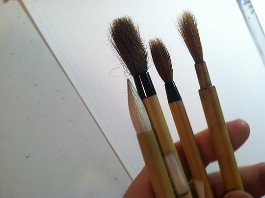
Here’s a look at my final inking tool; the Winsor Newton Series 7 brush (size 3):
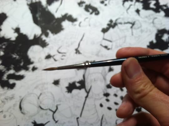
You don’t have to use this brush, or this size. Some people do great work with tech pens, and I’ve even done final inks using a twig! What I like about committing to a reliable tool is that I can get to know its weak points and strengths then get on with the task at hand. Having experience with an imperfect tool will often get better results in the short term than superior tools with less experience. I’m always trying to get better and better tools, but it comes time to do the work, I use what I’m familiar with over something “better” I’m not entirely trained to exploit.I like to ink detail in one of two ways, from the upper left hand of the page down to the lower right, or I start at the most important part of the illustration: the focal point, and work my way out to the less important parts of the page. Starting with the focal point means my best and frostiest attention is given to the first thing, then when I’m fatigued by the end of a drawing session, I can slop in less important material.Treat the brush like a pen, and treat a pen like a brush is an old artist’s saying. When I’m inking with a brush, I’m using it like a dramatic pencil:
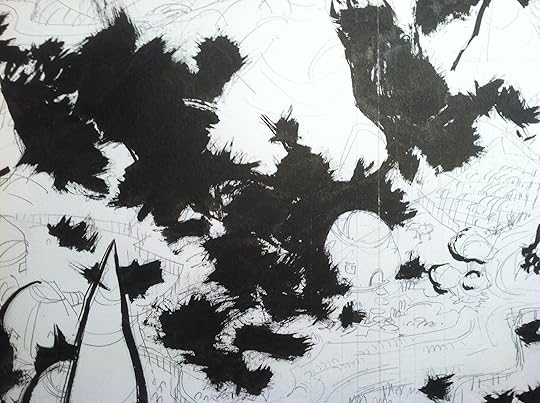
Detail: (http://tennapel.files.wordpress.com/2012/11/img_2345.jpg)
Notice that I’m not trying to give everything the same amount of detail. Nature doesn’t present everything to the natural eye with identical weight, and our perception isn’t trained to look at everything the same way. As an artist, I want the picture to look natural since I’m trying to convey reality to the viewer. That means I’m not just expressing whatever I want from inside my head, I need to address my audience and consider their perception of the work. This is particularly true of mass media works, the bigger the mass that I want to read it (everyone) the more I have to hold that masses hand through the reading of the work. When I’m doing pencil doodles in my personal sketchbook, I don’t consider an audience other than myself. That will necessarily produce different content and presentation.
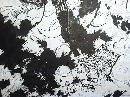
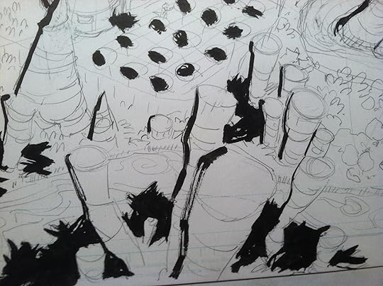
Below shows how well those spotted blacks hold up against the new detail. Oh, I almost forgot! Just as you spot in chunks of blacks to hold the page down, we also have to preserve large chunks of whitespace for contrast. I learned that from doing watercolor painting, because once you paint over white in that medium, you’re never going to get it back. So we “preserve the white pace” in inking because putting black marks on a paper is generally a one way trip. You can always add more blacks to white, but it’s hard to pull them back out if you over detail something.

Detail: (http://tennapel.files.wordpress.com/2012/11/img_2346.jpg)
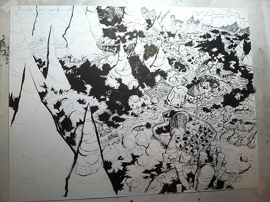
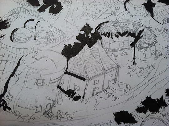
This page is getting close to done. I’ve worked from the upper right focal point to the left, where I’m at the end of my drawing session and I can easily blow in some detail and be done with it. If you squint your eye, there should still be a good amount of blacks and whites to create an interesting, solid, cluster of shapes to hold the page down. Then upon closer look at the page, the details emerge and a story is constructed in your mind.
Once again, we can ink details with confidence if the foundation of the pages are done right. If I find something wrong with the page at this point, I can usually trace it back to a weakness in the pencils, or thumbnail composition, and it’s rarely due to the final inking phase. The final inks reveal strengths and weaknesses that were there all along at the start.
Detail: (http://tennapel.files.wordpress.com/2012/11/img_2347.jpg)
Once the page is done, I can go in and do some tidy up with white out or further blacking in sections that can handle it. Then I erase the pencils, and it looks like I just threw down a well structured, gestural landscape. But now you’re in on the secret… even the apparent spontaneity of final inking detail was completely reverse engineered from the start.


December 18, 2012
Doug TenNapel – Nnewts
Ho-hum, just another day in the world of Nnewts.


December 15, 2012
Doug TenNapel – Spotting Blacks
Now that we’ve got this two page spread penciled (see pencil post: http://tennapel.wordpress.com/2012/12...), it’s time to go to the inking.
I have a concern before inking every page and it’s that the page will come off all chopped up with separate bits of black all over the place that don’t make the page look good as a whole. My way to address that is by spotting blacks. What is spotting blacks? It’s blasting in large chunks of black ink to hold the page down. I’ll look for any large section I can make black. Shadows are your friend when spotting blacks. They hold the character or object down on the paper and make it look solid.
Here’s my tools… a bunch of cheap, junky, Japanese horse-hair brushes:
Here’s the page after I finished spotting my blacks. I blotched in a bunch of trees, then hit the left side of every mountain, building and tree. This automatically sets the light source to the upper right so the volume of every shape will subconsciously register with the viewer:

This is a detail that shows how much fun I’m having with those horse hair brushes. Every artist is tempted to go straight in to detail, and that can be a bad tactic. But when people see the page, they’ll wonder how you were so bold with your inks. This is where the drama on the page comes from. Drama doesn’t come from the amazing detail, that’s where the finesse and secondary reads come into play.
More detail. You’ll notice a lot of trees and buildings are not hit with a shadow. If I treat every object with an equal shadow, it may be more accurate, but it’s bad for creating a focal point. Not all objects are equal in the arts. Some things aren’t useful to draw the eye across the page so to punch them up is a disservice to story telling. By treating things unequally, the reader will naturally read them unequally. It makes the story easier to read with clarity.
I could go into these buildings a put a HUGE core shadow down the left side of the entire structure. That might even be accurate. I mean, there are huge mountains here that I just outlined with a single line. I blasted in those big core shadows on GEAR and it starts to make a cartoon, light, fun world look like a heavy, dark, film noir atmosphere. This is where genre starts to dictate how you might render one story over another. Stories by Frank Miller or Mike Mignola are darker and justify heavy shadows, but a lighter fairy tale like Bone or Chicken Hare wouldn’t have these heavy noir shadows in a scene full of daylight.
My next post will go into the detailing of this two page spread. Until next time, spot those blacks!


December 8, 2012
Doug TenNapel – Penciling
When I pencil a comic page, my goal is to place a marker on the paper that is a guide for my inks. That’s all. I want the pencil line to do the kinds of things that minimize the mistakes I can make with inks without sacrificing the energy and power of a final ink line. I’m not trying to draw the same line twice, or I could just as easily go straight to inks.
It’s hard for me to get perspective right at the inking stage without a marker set down on the page first, so placing characters, buildings and environment on a believable plane is the the first job of my pencil work. It can be scribble-y, but only if the scribbles look good and appealing. If the first pencil line doesn’t look appealing, then I make sure I fix it at the pencil stage, knowing it ought to look good before a permanent ink line casts that drawing in cement forever.
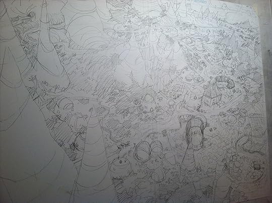
Above is an opening two-page spread for my comic, Nnewts. I’m going to force the reader’s eye to go from left to right by putting the most basic, simple images on the left, and drawing them to the more detailed, interesting town on the right. Merely spreading detail equally across any panel is mean to do to readers, as it doesn’t tell a story. I can push the eye by guiding it with roads, beauty, little characters doing things on the ground like swimming or talking to other characters, until they end at a natural place to grab the page on the right and turn it for the next page of the story.

A detailed close up shows how flexible I am with perspective. The middle building’s vertical lines don’t make the tilt of the building before or after, but the shapes are pushing your eye where I want it to go. It’s not accurate, but it’s dramatic. The building on the left leans to the right pushing you to the next building before it meets a curved building that stops the eye like a backstop. To the right of this building are little Nnewt children playing ball in the street. That’s really all the story I need the reader to see before turning the page.
Next up… the inks.


November 30, 2012
Doug TenNapel – Klaymen
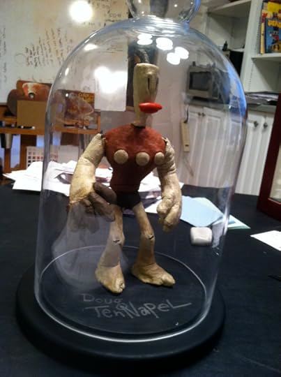
This is the last surviving Klaymen puppet from my personal collection. The latest is brittle so I have to be careful not to repose it too much.


Doug TenNapel – On Comics
Answer: Small increments are your friend. Commit to 20 minutes a day, 5 days a week for a year and you’ll be a more prolific comic artist, piano player, or carpenter than most others who long to do the same. The key is in the longevity of your commitment, not in the amount of time you are committing. Set aside 20 minutes a day, preferably in the morning before work, and only work on your graphic novel. Do this for a year and you’ll start seeing profound results.
The problem is that we aren’t used to seeing our art as a craft or a skill that needs practice and discipline, not inspiration and feelings. On any given day my feelings come and go about my faith, my commitment to my marriage, my place in the world, my sanity, my desire to draw or not draw, my care about you as a person, but my values do not change. Try to find the values-shaped handles on your art, not your feelings. Tell me that you will commit to it, that you will simply do it regardless of how you feel about it and you’ll accomplish a lot over time.
The ant is stupid. He has one millionth of your intelligence at best but moves one grain of sand until it is placed at its destination. Ants rework the whole world. The little termite can completely dismantle your house, not because of his passion, but because of his tedious, regular work at small, repeatable tasks. If you want to do something big, then the ant’s way is one good way to try.


