Jennifer Becton's Blog, page 3
February 28, 2018
The Design Department (Part 4)
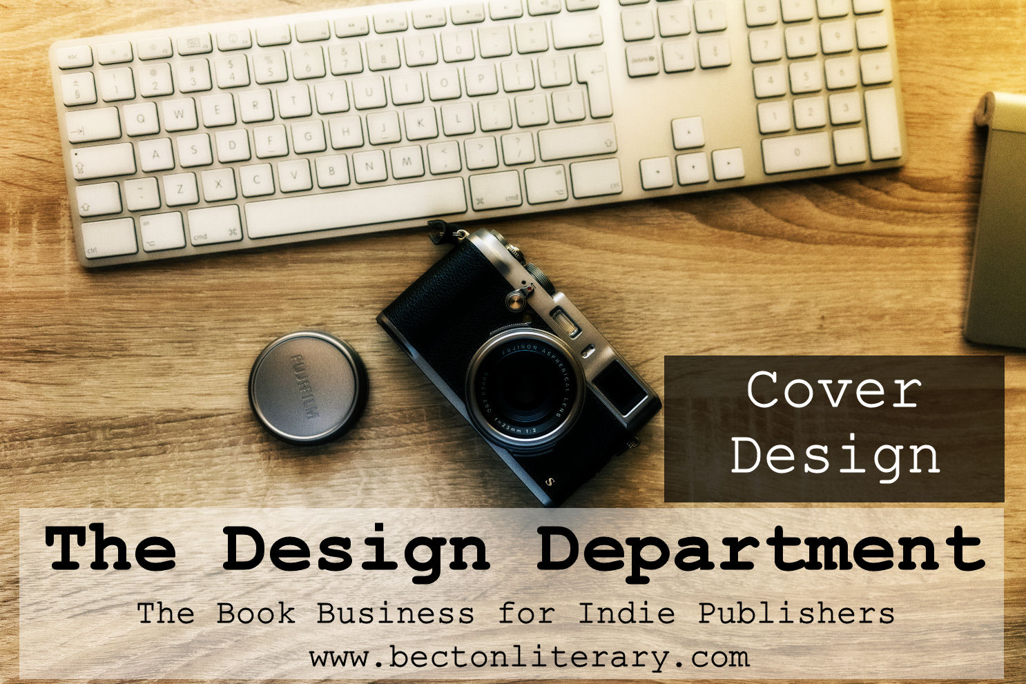 Cover Design
The Design Department (Part 4)
A book’s cover introduces the reader to the content even before they peruse the first sentence. A good cover will convey the subject, tone, and genre of the work upon first glance. Plus, it’s got to stand out among thousands of other books that are also trying to catch a reader’s eye. That’s a lot of work for one image!
When you begin to plan your cover, consider:
Genre. Look at other books in your genre, especially those that are similar to yours in style and tone. The answers to these questions will provide you with a good starting point.
What do their covers look like?
What type of fonts do they use? Serif? Sans serif? Script? Block?
What type of images?
Mood. Within a broad genre, there are several different moods a book can strike. Select images that reflect the mood of the book will help readers know what to expect. Think about your book’s overall mood. Is it:
Dark?
Playful?
Business related?
Thumbnails. The vast majority of book sales today are made online. Thumbnails will likely provide the first exposure to your book as potential buyers scan genre lists or search results. So think small as you plan your design.
Use large fonts. The title and author name should be readable in thumbnail size.
Use legible fonts. Limit use of fancy and fine fonts. Again, as a thumbnail, these loopy or skinny fonts are difficult to read.
Use a clear image. View art options in full size and thumbnail size. Ensure that you can easily tell what it is in both sizes. Very busy images or those without much contrast sometimes are difficult to see when small.
Background. Most booksellers’ websites have plain white backgrounds, so take that into consideration in your design.
Branding. You can spot a book by J. K. Rowling, Stephanie Meyer, or Janet Evanovich from across the biggest bookstore on earth. Why? Because you know what their covers look like. You know the color palette, the type of art, and the fonts. You don’t have to see details to know their work even from a distance. They have branded their series, and you should consider branding books in the same genre even if they aren’t technically a series. The goal is for readers to be able to pick your books out even if the title and name have been removed.
Options for Cover Design
If you are serious about the book business, your cover should reflect it by looking professional too. There are three main choices for cover creation:
Premade Covers. Premade covers are available from many designers. Most sell each cover only once, and they offer options for creating a series theme. As part of your purchase, the designer adds your title and author name to the cover. This can be a good choice if budget is a concern.
Custom Cover Design. Many designers who create premade covers also offer custom designs. You choose the design direction, fonts, images, etc, but the designer does the work. They may also offer custom art or illustrations. This is a more expensive option, but it offers more customization.
DIY. This can be the most cost effective choice depending on your choice of art and font and the cost of design software. If you are already acquainted with graphic design software or you are willing to learn, go for it. You will need to purchase commercially licensed art and fonts.
Art
Because you intend to use photographs or illustrations on a product that you will then sell, you must use art that is licensed for commercial use or that is already in the public domain. Just downloading an image from the internet without compensating the artist can leave you open to lawsuits.
Custom Art. Genres that require extensive world-building, like fantasy and sci-fi, can beg for original art. Check out sources like Deviant Art, which provide places for writers and artists to meet and do business. Make sure you get a signed contract in writing when you commission a piece.
Free for Commercial Use/Public Domain Images. If you’d like to use completely free art, it’s got to be licensed as free for commercial use or in the public domain. Be certain to research the piece before you use it to be sure it is, in fact, in the public domain. Trust, but verify. You don’t want to get sued later.
Royalty-free Art for Sale. There are various online resources for royalty-free art. There are several sites that have millions of images to choose from all all categories, but some sites have a smaller, curated selection of a specific type of image (such as romance or fantasy images). Once you purchase and download the image, you can alter it to suit your cover. It’s also possible to purchase exclusive images, which means no other book will have the same image, but they tend to be more expensive. Be sure you fully understand the terms of use before purchase.
Sources for Art
Deviant Art
Dreamstime
iStockphoto
Getty Images
Shutterstock
Wikimedia Commons
Fonts
Think of fonts as little works of art. They’ve got licensing terms of use too. Be sure the fonts you choose are licensed for commercial use. Some fonts are licensed for personal use only. Just because a font is free to download does not mean it is licensed for commercial use.
Sources for Fonts
1001 Fonts
DaFont
Font Squirrel
Google Fonts
Remember: you only have once chance to make a first impression. In the bookselling world, it’s not your writing that makes the first impression. It’s the cover. Do not skimp on it. Do it right.
 Want to keep up with the Book Business for Indie Publishers series?
Sign up for email notifications and receive free spreadsheet templates and PDFs for use in your own business!
#mc_embed_signup{background:#fff; clear:left; font:14px Helvetica,Arial,sans-serif; width:100%;}
/* Add your own MailChimp form style overrides in your site stylesheet or in this style block.
We recommend moving this block and the preceding CSS link to the HEAD of your HTML file. */
Yes, Keep Me Updated!


February 22, 2018
The Design Department (Part 3)
 Typesetting Paperbacks
The Design Department (Part 3)
The main difference between formatting an ebook and typesetting a print book is the ability of the text to reflow. A printed book is static. Once you place an item, it never moves. You have ultimate design control from the title page to every single word break. You may choose to hire a designer or save money by doing the work yourself. Because most books can be formatted in your existing word processing program, this is a great place to save money!
As with ebook formatting, consistency is key in typesetting physical books. But with paperbacks and hardcovers, you have more control of the overall look of your product. In addition to making sure every type of item is formatted the same way every time, you can increase the professional appearance of your book by following some standard typesetting guidelines. Look at your favorite physical book. There are certain standard items: front matter, back matter, page number placement, font style, text justification, etc.
Here is an overview of the general process and some tips for making your book professional:
Save a copy of your final manuscript and label it as your print version.
Choose a trim size for your book.
For more information on trim sizes and requirements, choose the “printing options” tab on the Creastespace’s book publishing information page.*
Be sure to choose an industry standard size to ensure widest distribution.
Check Createspace’s “royalty calculator” tab to get a feeling for how the size and paper type will affect the royalties your book may earn.
Change size of your manuscript’s pages to match trim size.
Mirror your margins.
Space needs to be added to account for the binding of your print book.
For more information, see Createspace’s chart of margins.
Adjust to two-page view for ease of viewing page breaks and getting a better sense of the full layout.
Add front matter
For a comprehensive list of front matter order, see the Chicago Manual of Style.
Or consider using the layout of a paperback in your collection as a template.
Title pages are great places to use interesting, commercially licensed fonts.
Choose your main font and type size.
Body font
Don’t get creative here. The object is to choose the most easily readable font and size.
Choose a serif font to help lead the eye across the page.
Good choices include but are not limited to Garamond and Palatino.
Most paperbacks use font size from 10-12. Large print begins around size 14.
Commercial fonts
Be sure the fonts you choose are available for commercial use!
Fonts for chapter heads and subheads
Get as fancy as you’d like, but make sure they are consistent in font style and size.
Fine tune the text.
Indents
Make sure each indent is consistent.
Full justify
The text should be in a straight line down each side of the a page.
Line spacing: widows and orphans
Widows (a short, paragraph ending line appearing at the top of a new page) (CMOS, Key Terms)
Orphans (a short line appearing at the bottom of a page or a word or part of word appearing on a line by itself at the end of a paragraph) (CMOS, Key Terms)
In a dialogue-heavy novel, sometimes there is no choice but to leave some widows and orphans. But in general, when it comes to the end of an old page or the beginning of a new page, a line must have at least two words, and a paragraph must have at least two lines.
Use spacing to adjust any obnoxious widows and orphans.
If formatting in Microsoft Word, turn on widow an orphan control. This will not eliminate the problem, but it will make your job easier.
Add page numbers and headings.
Front matter, back matter, and other blank pages should not have headings or page numbers.
Review each page to check for consistency.
Save as PDF.
Upload to print venue.
Review the proof, digital or physical
To save money, use the online reviewer.
To ensure quality of your product, order a physical proof.
Typesetting Resources
Chicago Manual of Style
Createspace
This is not a complete instruction list. It’s just a compilation of advice for intrepid paperback DIYers. If you have any questions, please feel free to ask them in the comments below.
*Because Createspace is the most widely used print-on-demand source for paperbacks, this post will link to resources from that site. However, the same general concepts will apply at other printing venues. Check your preferred printer for specifics.
Want to keep up with the Book Business for Indie Publishers series?
Sign up for email notifications and receive free spreadsheet templates and PDFs for use in your own business!
#mc_embed_signup{background:#fff; clear:left; font:14px Helvetica,Arial,sans-serif; width:100%;}
/* Add your own MailChimp form style overrides in your site stylesheet or in this style block.
We recommend moving this block and the preceding CSS link to the HEAD of your HTML file. */
Yes, Keep Me Updated!
February 16, 2018
The Design Department (Part 2)
 Formatting Ebooks
The Design Department (Part 2)
The Design Department posts will present an overview of basic book design for indie publishers, but it is by no means an in-depth how-to. This series will offer options for making your vision come to life, and as we go along, I’ll suggest some resources that will tackle each subject in more detail.
Once you have written, edited, and proofed your book, the next step is getting it into the hands of readers. To do this, you’ll need to format it so that it can be converted into a paperback and/or ebook.
Again, you have two main choices:
Go Pro
DIY
Money Saver: In most cases, ebook formatting is relatively simple, so you can save money by doing the formatting yourself.
Formatting ebooks can range from simple to complex, and there are steps you can to help ensure your success. When in doubt, the simpler the formatting, the better. Once you make your main formatting choices, you can add fancy items as time and money allow.
Because of the personalized nature of ereaders, there is only so much you can do to make your book’s format stand out from other ebooks. No matter what font you choose for the body of your work, it will be converted into a standard font upon upload. You can add special fonts for chapter headings, title pages, and even drop caps for chapter openings, but that can be more complicated and may require special software and/or some knowledge of coding.
Remember: ereading devices allow people to change the main font to one of their preference and to adjust the size of the text to suit their needs. So you don’t have to spend time pondering the exact right font or size for the main body of your ebook. Formatting for a digital device isn’t really about typesetting a pretty, static book. Because text reflows and moves around on an ereader, ebook formatting is more focused on creating a road map for the text to follow.
Instead of getting caught up in word breaks and line breaks, ebook formatting concentrates on the relative size, placement, and consistency of the following items:
Headings (chapter and subheads). Are they bold and centered? Right justified? How far are they down the virtual page?
Indents. Are you using indents or line spacing to denote paragraph breaks? If indents, what size?
Section breaks. How much space occurs between sections?
Page breaks. Do they fall in the right places (at the end of chapters)?
Use of bold and italics. Bold and italics sometimes vanish, especially if you must use the nuclear option. Make sure the bold and italics stay where you want them.
Images. Are they centered? How does the text flow around them? How do you set off photo captions from body text?
Spacing. How much space is between paragraphs?
Consistency is key. There are lots of guidelines for manuscript formatting. You don’t really have to observe them all as long as you make sure each of the above items are formatted the same way. Ensure that each chapter heading uses the same font size and spacing. Space section breaks the same every time. It doesn’t matter so much if you use the perfect size indent, but make sure they are all the same size. Readers may never know if you used a .25, .33 or .5 inch indent, but they will definitely notice if the indents change sizes or disappear as they are reading.
Basic Steps to Prepare a Document for Ebook Conversion:
Save file as Microsoft Word document. (There are other programs available that do fancier formatting, but again, we’re keeping it simple here.)
Format Text Manually, being sure to keep each item consistent throughout
Optional: Convert to .mobi and .epub
Upload to Publishing Venue
Proof
Unless you decide to go exclusive with a particular retailer, you’ll need to make your book available in as many different formats as possible: .mobi, .epub, .pdf, etc. Each one starts with the same Word document, which you should only need to format once. Once you have completed the main document, save it. Then save copies specifically for each publishing venue. That way you always have your original unformatted manuscript, your generic formatted version, and your retailer specific versions. If anything goes wrong, you have 3 levels of protection.
Kindle Direct Publishing, Barnes and Noble Press, Kobo Writing Life, Smashwords, Apple, and other distributors all have their own sets of instructions and recommendations for how to format for their venue. Some are more complicated than others. Some offer free downloadable programs to do the work for you. Others offer paid services, like Kindle Create.
Pro Tip: Because Smashwords distributes to all vendors, their directions for formatting a Word file for conversion are the most generally applicable. They can be found in the Smashwords Style Guide, which is available free.
There are overwhelming amounts of info out there, and you can drive yourself crazy trying to read all the directions for each venue. Worse, you could convince yourself that formatting is too difficult to be done on your own. But it’s not true! You can save your sanity–and your money–by keeping your formatting simple. Skip the fancy fonts and drop caps, and consider these tips for making your formatting experience easier.
The more automated options you use, the more potential you have for trouble. If possible, stay away from using templates to format for you. Just use the normal template. Set it up with your preferred indent size and line spacing options. Don’t fool with anything else. Don’t have it add bold or center certain portions of text. These template settings do not always translate. Besides, how hard is it to hit “center” for each chapter head as you go along?
Turn on hidden text. You need to see every space, hard return, and hidden character.
Don’t use multiple hard returns to build space into a page. Adjust the before and after spacing in the paragraph formatting menu instead.
Use paragraph formatting to indent the first line of each paragraph by about .25 inches, not the traditional .5 inches. A half-inch indent too big in an ebook. Also, don’t use tabs for indents. They don’t translate.
Do not double space after a period.
Rather than using page breaks, use “section break (next).” For some reason, it works best for keeping page breaks between chapters correct.
Sometimes files get corrupted, so never work from the original. (Seriously. always work from a copy.) The more complicated your document, the more likely you are to have hidden issues in the file. If you find you have a corrupted file, use the nuclear option described on Smashwords.
This simple formatting method starts with your Microsoft Word document. Everything is based off the formatting of one file. Once you have your Word document prepared, you can upload copies to each publishing platform, where the file will be converted into the appropriate ebook type. However, you also have the option of converting the Word file to .mobi or .epub yourself, using a free program such as Calibre.
If using Calibre, save your Word file as an html file, which is easy, but be sure you use the web page (filtered) option.
Once your file is formatted (and maybe converted), upload it to each publishing venue. It will take a few minutes to be converted and then you can either use an online proofer or download the shiny new ebook file to proof later. Make sure everything looks the way you wanted it to, but realize that ebooks are fluid. Your page breaks, chapter heads, and section breaks should be intact, but not all lines of body text will break at the same point. If you kept it simple and created a good road map, the text should flow generally the same way as it did in the Word document.
This is by no means a complete instruction list. It’s just a compilation of tips and tricks. Again, the general rule is this: Simpler is better. So if something isn’t covered here, ask yourself: what is the simplest and least automated method and do that.
If you have any questions, please feel free to ask them in the comments below.
Want to keep up with the Book Business for Indie Publishers series?
Sign up for email notifications and receive free spreadsheet templates and PDFs for use in your own business!
#mc_embed_signup{background:#fff; clear:left; font:14px Helvetica,Arial,sans-serif; width:100%;}
/* Add your own MailChimp form style overrides in your site stylesheet or in this style block.
We recommend moving this block and the preceding CSS link to the HEAD of your HTML file. */
Yes, Keep Me Updated!
February 2, 2018
The Design Department
 Welcome to the Design Department! As an indie publisher, you are ultimately responsible for the presentation of your product–your book–to potential readers. You get to choose your cover art, the title font, and even the interior layout of your book.
The Design Department is where your edited text turns into a real book! Your manuscript goes from boring, ol’ word processing format to something eye-catching and fun. This is where the visual creativity happens and where you unleash your inner artist.
Think you have no inner artist? Think again. You don’t have to be Rembrandt to recognize an appealing cover or notice an interesting font. Before you begin planning your book’s design, take a moment to list the qualities you admire in covers. What catches your attention and makes you pick up a new book?
If you need a nudge in the right direction, consider other books in your genre. What do their covers look like? How are their interiors arranged? Consider the way other books in your genre use images, colors, and fonts. How can you make sure your book both fits into the genre’s conventions and yet stands out among the others?
Once you can name what appeals to you and what is genre-appropriate, you will have a better chance at choosing a visually stimulating cover for your own book.
But how does it all come together?
To create a cohesive, eye-catching design as an indie publisher, you have to basic choices:
Hire professional designers
Do it yourself
Professional Designers
Many publishing platforms offer cover design and typesetting services, but before you click “buy,” be sure to price some of the other options available. Freelance designers are available everywhere online and are often less expensive. We’ll talk more about professional options as we go through each section of the Design Department.
Money Saving Tip: Do some–or all!–of the design work yourself.
DIY Design
It’s possible to design your book without professional help. You just need a few tools and the desire to learn. It may seem like purchasing and learning to use design software would be an unnecessary expenditure of time, effort, and money, but consider how these skills may actually cross over into other aspects of the book business. Not only can you save money by doing your own cover design and book formatting in the future, but you can also use the same skills to create marketing materials, such as ads, memes, and other images for social media sites like Pinterest and Instagram.
Typesetting and ebook creation can be done for the most part in Microsoft Word. In fact, many publishing platforms accept Word documents as book submissions. You don’t even have to convert to .epub or .mobi. They do it for you.
In order to design your own cover, you’ll need to have access to a graphic design program like PhotoShop and a basic knowledge of how to use it. You’ll also need to access art and fonts licensed for commercial use. We’ll discuss these topics in the cover design section.
The Takeaway
Before you decide whether to hire a professional to design your book, consider the following:
The simpler your manuscript, the simpler the typesetting. If your book is a text-only novel, the formatting is easy. But if your book is image heavy with many inset boxes and graphics, you might consider hiring a pro.
Be sure to understand the basic requirements of each platform before making a decision. Some publishing platforms are easier to format for than others. Some of the less user friendly venues require a knowledge of coding in order to finalize submissions.
What type of book covers catch your attention?
Want to keep up with the Book Business for Indie Publishers series?
Sign up for email notifications and receive free spreadsheet templates and PDFs for use in your own business!
#mc_embed_signup{background:#fff; clear:left; font:14px Helvetica,Arial,sans-serif; width:100%;}
/* Add your own MailChimp form style overrides in your site stylesheet or in this style block.
We recommend moving this block and the preceding CSS link to the HEAD of your HTML file. */
Yes, Keep Me Updated!
January 29, 2018
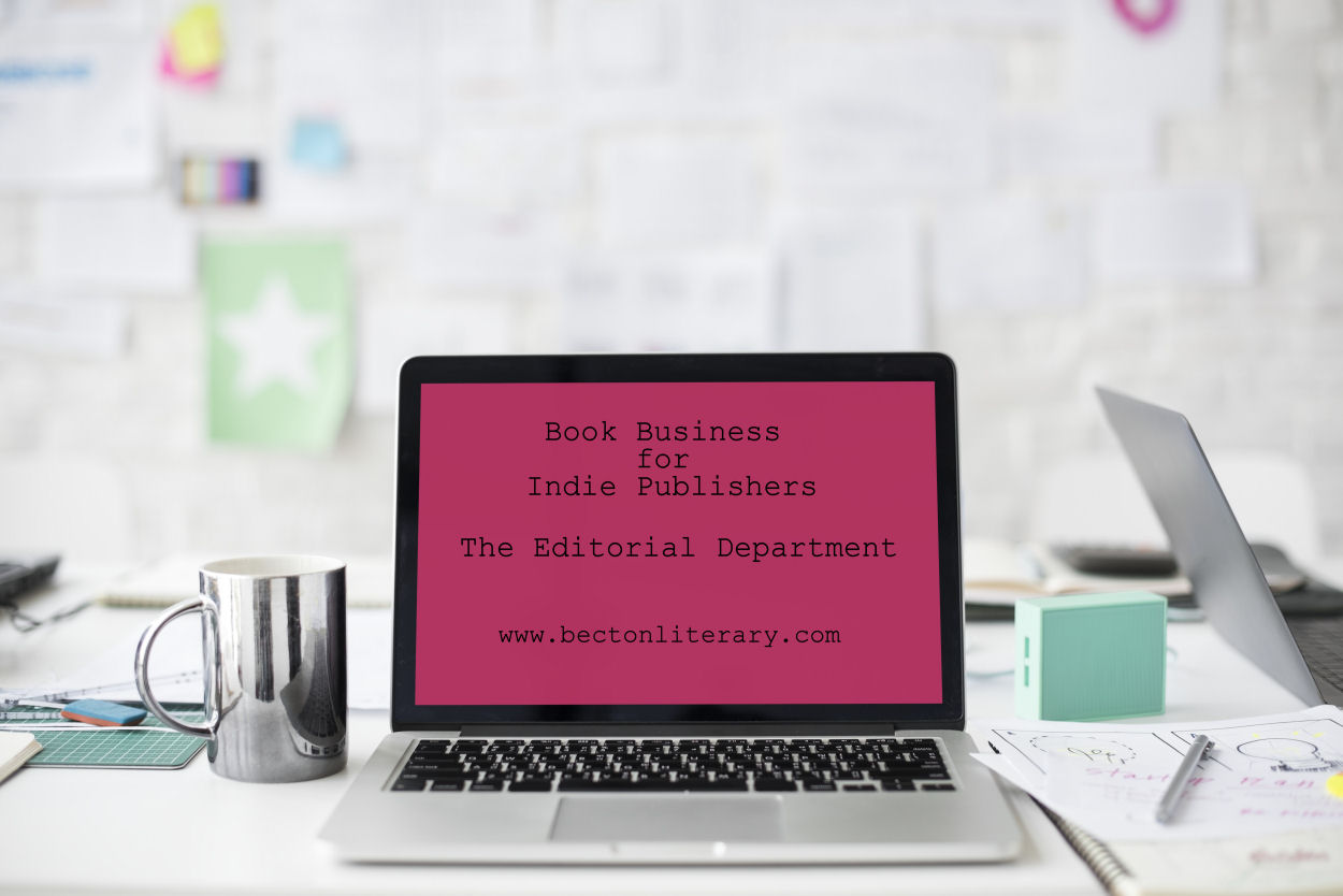
The Editorial Department (Part 3)
 What to Expect from Your Editor
So far, in this series on the editing aspects of the book business (part 1 and part 2) , we discussed author-editor relations, levels of editing, and some general pricing structure. Now let’s talk about what authors should expect from editors.
When your work comes back from the editor, you should be able to recognize it. That means, the editor should not send you back a rewritten or completely reorganized version of your own work. Every suggestion should be made in such a way that the author can either approve or disapprove of it. The author is ultimately responsible for every change made to the manuscript. Editors can only make suggestions.
What’s the best way to handle the suggestion process? It depends on your preferences, but in general, here are two things you should expect when you get your manuscript back.
A detailed explanation of large issues. This could take the form of a letter included with the manuscript or a phone call with the editor. This is where the editor should point out issues and make suggestions for clarification.
Your marked up manuscript. If you’re working on paper, it should be done in a visible color of ink (RED) and the marks should be done boldly. There is nothing worse that searching a sheet of paper for a wee teeny comma written in black ink. Use proofreaders marks and make them BIG!
This brings me to a pet peeve of mine. Red is the color editors use to make corrections on paper. Not because it symbolizes blood, but because it is the easiest color to see on white paper covered in black ink. If you have some kind of grade-school trauma related to red ink, now is the time to get over it! If you can’t handle seeing the color red on a sheet of paper given to you by someone who is trying to help by making their marks easy to see, then you are really going to struggle when it comes time to read reviews written by people who are not as invested in your work.
Corrections and Comments
In lieu of paper, many editors will mark up a manuscript in Word using corrections mode or bold and all caps. Or some combination thereof. This saves time and money shipping paper around, and it’s the easiest to work with.
In digital manuscripts, notes should be made in the comments section of Word or within the text in [BRACKETS, BOLD, AND ALL CAPS]. In-text, comments in text should be blatantly visible from outer space. You don’t want these slipping into your published work.
ProTip: Most will find that using corrections mode and the comments features of their word processor will be the easiest, most efficient method.
Aside: You’ll note that I’m recommending Word here. I know not everyone writes in Word. I don’t, but I do all my editing in Word because it is an industry standard and is usually the simplest to use when shipping documents across platforms.
During the editorial process, your formatting is likely to be altered. In fact, some of your formatting will be gone. Why? Because it may be wrong. There are right and wrong ways to add sections and subsections to a written work. There are right and wrong ways to space different punctuation marks. So don’t get upset if your manuscript looks different upon its return. All formatting should take place at the end of the process anyway.
As you dig into your freshly edited manuscript, remember that the editor can only make suggestions. The author has the final and ultimate word on what goes to press. You don’t have to take any of the editor’s suggestions if you don’t want to. The corollary to that is that the author has the final and ultimate responsibility for every choice and every single mistake that gets published.
The Takeaway
Editors should return a manuscript with clearly marked suggestions that will allow the author to make good decisions about how to improve their book. And a good author will consider their suggestions thoughtfully and then choose which to employ and which to ditch.
Want to keep up with the Book Business for Indie Publishers series?
Sign up for email notifications and receive free spreadsheet templates and PDFs for use in your own business!
#mc_embed_signup{background:#fff; clear:left; font:14px Helvetica,Arial,sans-serif; width:100%;}
/* Add your own MailChimp form style overrides in your site stylesheet or in this style block.
We recommend moving this block and the preceding CSS link to the HEAD of your HTML file. */
Yes, Keep Me Updated!
The Editorial Department Part 3
What to Expect from Your Editor
So far, in this series on the editing aspects of the book business (part 1 and part 2) , we discussed author-editor relations, levels of editing, and some general pricing structure. Now let’s talk about what authors should expect from editors.
When your work comes back from the editor, you should be able to recognize it. That means, the editor should not send you back a rewritten or completely reorganized version of your own work. Every suggestion should be made in such a way that the author can either approve or disapprove of it. The author is ultimately responsible for every change made to the manuscript. Editors can only make suggestions.
What’s the best way to handle the suggestion process? It depends on your preferences, but in general, here are two things you should expect when you get your manuscript back.
A detailed explanation of large issues. This could take the form of a letter included with the manuscript or a phone call with the editor. This is where the editor should point out issues and make suggestions for clarification.
Your marked up manuscript. If you’re working on paper, it should be done in a visible color of ink (RED) and the marks should be done boldly. There is nothing worse that searching a sheet of paper for a wee teeny comma written in black ink. Use proofreaders marks and make them BIG!
This brings me to a pet peeve of mine. Red is the color editors use to make corrections on paper. Not because it symbolizes blood, but because it is the easiest color to see on white paper covered in black ink. If you have some kind of grade-school trauma related to red ink, now is the time to get over it! If you can’t handle seeing the color red on a sheet of paper given to you by someone who is trying to help by making their marks easy to see, then you are really going to struggle when it comes time to read reviews written by people who are not as invested in your work.
Corrections and Comments
In lieu of paper, many editors will mark up a manuscript in Word using corrections mode or bold and all caps. Or some combination thereof. This saves time and money shipping paper around, and it’s the easiest to work with.
In digital manuscripts, notes should be made in the comments section of Word or within the text in [BRACKETS, BOLD, AND ALL CAPS]. In-text, comments in text should be blatantly visible from outer space. You don’t want these slipping into your published work.
ProTip: Most will find that using corrections mode and the comments features of their word processor will be the easiest, most efficient method.
Aside: You’ll note that I’m recommending Word here. I know not everyone writes in Word. I don’t, but I do all my editing in Word because it is an industry standard and is usually the simplest to use when shipping documents across platforms.
During the editorial process, your formatting is likely to be altered. In fact, some of your formatting will be gone. Why? Because it may be wrong. There are right and wrong ways to add sections and subsections to a written work. There are right and wrong ways to space different punctuation marks. So don’t get upset if your manuscript looks different upon its return. All formatting should take place at the end of the process anyway.
As you dig into your freshly edited manuscript, remember that the editor can only make suggestions. The author has the final and ultimate word on what goes to press. You don’t have to take any of the editor’s suggestions if you don’t want to. The corollary to that is that the author has the final and ultimate responsibility for every choice and every single mistake that gets published.
The Takeaway
Editors should return a manuscript with clearly marked suggestions that will allow the author to make good decisions about how to improve their book. And a good author will consider their suggestions thoughtfully and then choose which to employ and which to ditch.
Want to keep up with the Book Business for Indie Publishers series?
Sign up for email notifications and receive free spreadsheet templates and PDFs for use in your own business!
#mc_embed_signup{background:#fff; clear:left; font:14px Helvetica,Arial,sans-serif; width:100%;}
/* Add your own MailChimp form style overrides in your site stylesheet or in this style block.
We recommend moving this block and the preceding CSS link to the HEAD of your HTML file. */
Yes, Keep Me Updated!
January 24, 2018
The Editorial Department (Part 2)
Editing: Scheduling and Services
(The Editorial Department, Part 2)
Editing is hard work, and it requires a great deal of time, focus, and concentration. An editor does not approach an editing job as if it is a pleasure read. This is meticulous work. As such, a book that may take the average person 8 hours to read for pleasure will take far, far longer for the editor to edit. And by far, far longer, I mean weeks, or in the case of nonfiction manuscripts with footnotes, I mean months (really awful, horrible months…but I digress).
If you are hiring a professional editor, then you need to be aware that each job they accept requires weeks or months of their dedication and commitment. Because of the large chunks of time required for a manuscript, they need to be able to schedule in advance, and they need authors to have reasonable expectations about turnaround time.
Scheduling: Don’t Treat Your Editor Like a Supercuts
At Supercuts, walk-ins are welcome, and appointments are unnecessary. You can walk in on a whim and get a quick cut and style and then walk out an hour later with a new look. But not all companies can operate profitably and effectively using this business model. Whereas a stylist can perform a buzz cut on a male in ten minutes and please their customer, editors cannot be nearly as spontaneous or fast with a manuscript. Authors should want to offer readers the best book possible, and because of the time and effort required to hone each book, good editors need to be scheduled in advance, and they should be allowed adequate time to perform their job.
Walk-ins Unwelcome: Unless they have a sign on their virtual door that reads “Walk-ins Welcome,” then you need to contact the editor and schedule your book in advance. Phone or email your editor 1-3 months before you anticipate that the book will be ready for them. Let them know when you’d like to publish, and ask if they can work with that timetable. Reserving time may sound impossible as an indie because there are all kinds of problems that may cause delays, but you can give them a rough timeframe.
Time “in the Chair”: Talk to your editor about her time requirements, and be sure to realize that good editors will likely take more than a few days to turn around a novel-length manuscript no matter what level of editing you request. (Below, I’ll share more of what’s involved in each level of service.)
I like to contact editors 1-2 months in advance of when I think my manuscript will be ready for them, and then I allow 30 days for them to perform their job. That means a full month of my book-writing process is devoted solely to editing, and that doesn’t include the pre-readers who see the manuscripts in their earlier stages or the proofreaders at the end.
Levels of Service: Trims, Cuts, and Makeovers (Am I taking this analogy too far?)
Proofing: The editor performs a line edit on your manuscript—either using corrections mode in Word or ink and proofreaders’ marks on a hardcopy—to correct errors in the rules of standard written English, which include the following: grammar; punctuation; spelling; sentence structure; shifts in tone, tense, person and number; subject-verb agreement; modifier placement; mechanics; and more. Proofing is meant to be a final check on a manuscript that is already polished for publication. Proofers do not comment on story or style. It’s just typos and grammar here. It is the most basic and least expensive service.
Copyediting: This service is one part in-depth proofing and one part light story editing, and it’s an important.
Mechanical Editing – This process involves a close reading of the manuscript with an eye to such matters as consistency of capitalization, spelling, hyphenation, and punctuation; agreement of verbs and subjects and other matters of syntax; number of ellipsis points; treatment of numbers; treatment of quotations; use of abbreviations and acronyms; use of italics and bold type; format of footnotes; and many similar details of style.
Style refers to rules regarding the mechanics of written communication as prescribed by specific publishers or by the author. Style also refers to an author’s literary expression, which is taken into consideration during the second, nonmechanical, part of the editorial process.
Substantive Editing – This process involves suggestions for rewriting, reorganizing, or presenting material in other ways. A good editor will not alter an author’s style but will ensure that the expression of the author’s style will not interfere with the reader’s understanding of the material.
(Adapted from The Chicago Manual of Style, 14th ed. [The University of Chicago Press, 1993] 65.)
Story editing: Story editing involves a critique of character, plot, voice, pacing, style, etc. Many indie authors replace professional story editors with beta readers, and this is a good option if the beta readers are extremely honest and have some skill in articulating the problems with the manuscript and making suggestions for correcting them. It is difficult for friends and family members to perform this task adequately because they have to navigate the “friendship/kinship issues,” and they also have to have an in-depth understanding of book mechanics.
When I look for story editors, I always enlist the services of people who have experience in editing or publishing, and I like to keep it strictly business between me and the story editor. I want their honest reactions, and I want them to be harsh. In fact, I look for the most blunt story editors I can find. (I mean the ones who have absolutely no compunction about telling me how awful a scene is. I’d rather hear it from an editor before publication than a reviewer after the fact. By the time my book hits the market, I want to have heard the worst things I can possibly hear and then have corrected the problems.) I hire the most publishing savvy people I can find because not only do they have to tell me how awful a scene is, but they also need to tell me why and give me ideas for fixing it.
The cost of this service can run the gamut from free (for beta readers) to fees similar to or exceeding copyediting (for editors with experience in this field).
When a book is traditionally published, it (usually) goes through all three types of edits. There is a lot wrong with the traditional publishing world, but the editing process is something indies who are attempting to become professional writers should strive to emulate. Why? Because it actually works. Story editors address global issues, copyeditors handle in-depth mechanical and style issues, and proofers get rid of the typos and silly errors at the end.
Are traditionally published books perfect and error free? No.
Will hiring an editor make your book perfect and error free? Nope. Mistakes happen.
But think of how many times you’ve read reviews of indie books that complain about the volume of grammar errors or typos. Grammar and typos seem to be issues that set apart indie-pubbed books from most put out by traditional houses. Every writer, whether trad pub or indie, should want to put out the best books possible, and that means editing, editing, editing!
Want to keep up with the Book Business for Indie Publishers series?
Sign up for email notifications and receive free spreadsheet templates and PDFs for use in your own business!
#mc_embed_signup{background:#fff; clear:left; font:14px Helvetica,Arial,sans-serif; width:100%;}
/* Add your own MailChimp form style overrides in your site stylesheet or in this style block.
We recommend moving this block and the preceding CSS link to the HEAD of your HTML file. */
Yes, Keep Me Updated!
January 19, 2018
The Taxman Interrupteth
 We interrupt this mini-series of posts from The Editorial Department to discuss a time sensitive matter: taxes.
I can hear your whoops of joy and elation. Everyone loves to talk about federal taxes, right?
Sure you do.
January 31 is the deadline to send 1099s to contractors. We’ll discuss 1099s now, and the remainder of the tax series will be available starting in mid March. (Don’t miss out! Sign up to be notified of each new post in the Book Business series.)
The Basics
A 1099 is a tax form for reporting miscellaneous income to the federal government. One copy goes to the person you hired, and the other goes to the IRS. This person (contractor) could be an author who published their work through your company or a co-author (someone to whom you distribute royalties); an editor, a proofreader, or a graphic designer (someone who provides a business service); or any other business contractor. For more information, go to the IRS website. Here’s a snippet of what you can expect there:
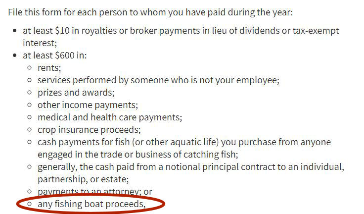 Don’t forget to document your fishing boat proceeds. What!?!?!?!
When you, as an indie publisher, file a 1099, you are essentially informing the government that a portion of your company’s income is actually someone else’s income. Because it is not ultimately your money, you are not required to pay taxes on it. Your contractor is responsible for paying the taxes on their income. A 1099 ensures that the right person (the actual money earner) pays the right taxes.
The key number is $600. If you paid a contractor more than $600 over the course of one calendar year, then you must (as in, you are required by law to) send her a 1099.
Aside from not breaking the law, there are other practical advantages to sending a 1099. A 1099 officially documents your expenditure as a business expense. You are not required to pay taxes on income that is used to pay business expenses. That’s why record-keeping is so important. Save your business receipts!
Again, if you hired a contractor, but paid them less than $600, you are not required by law to send a 1099. You can still claim the expenditure as a business expense, but you are responsible for keeping a record of it yourself. So keep good records. (Did I already mention that?) You are required by law to report all your income whether you earn $5 or $5 million.
The Takeaway
The deadline for filing a 1099 is January 31. To access the form, take a fun-filled trip to the IRS website.
$600 is the number to remember. If you paid $600 or more in one calendar year to one person/company in business expenses, then the law requires you to send them a 1099. If you paid them $599.99 or less in a single year, you do not have to send a 1099.
Disclaimer : Don’t trust me. Go to IRS.gov and confirm the information for yourself. I’m not responsible if you get audited. Also, state income taxes are separate beasts, and you’ll have to tame them for yourselves unless you are fortunate enough to live in a state without them.
Want to keep up with the Book Business for Indie Publishers series?
Sign up for email notifications and receive free spreadsheet templates and PDFs for use in your own business!
#mc_embed_signup{background:#fff; clear:left; font:14px Helvetica,Arial,sans-serif; width:100%;}
/* Add your own MailChimp form style overrides in your site stylesheet or in this style block.
We recommend moving this block and the preceding CSS link to the HEAD of your HTML file. */
Yes, Keep Me Updated!
January 16, 2018
The Editorial Department (Part 1)
 Any publishing venture starts with a book. I assume you have already a manuscript either in progress or completed and that you plan to make your book available through one or more publishing portals. Because this series focuses on the business aspects of book publishing, we’re not going to cover the how-tos of book creation in depth. If you would like to know how I write, read here. If you need more information on self-publishing portals, please check out my post here.
Let’s begin our discussion of your Book Business in the Editorial Department.
The most critical part of the pre-publication process is editing. In reviews, readers can leave all sorts of opinions about your characters, plot, and style, but those facets of a book are subjective, open to interpretation. But reviews can also contain objective, provable feedback about typos and spelling and grammar errors. Poor editing stands out, but writers can take simple steps to prevent embarrassing typos by hiring professional editors.
You cannot proofread your own work. I don’t care who you are, at a certain point, you become so familiar with your writing that your mind supplies words/letters/phrases that may actually be missing from your manuscript. I worked as a professional editor for more than ten years, and I hire professionals to edit my work. I cannot do it myself.
Spellcheck isn’t going to cut it. Spellcheck may be wonderful at fixing simple spelling errors and typos, but it cannot yet tell you if you’ve used the wrong word entirely. Consider this screenshot my friend sent me from USA Today:
 Yikes! Don’t let this happen to you.
Because “pubic” is spelled correctly, spellcheck did not indicate a problem. But clearly there is a big problem here. No one can dispute that is wrong and careless, and errors like that devalue your product. Good editing is worth the cost.
Money Saver: Beta readers (knowledgeable friends who read and critique your work) can save money. However, use them with care. Sometimes friends may not feel comfortable being as honest as necessary to help you create your best work possible. You need a critic, not a yes-man. Betas also may not have developed the skills to asses a manuscript problem and offer a solution. Beta readers can be great as long as you know they come with risks.
Pro Tip: Hire a Professional Editor
When in doubt, hire a pro. Before I became a full-time writer, I worked as a freelance editor, and before that, I worked as a copy editor at a small press, so I’ve been on both sides of the author/editor relationship. There a few simple steps that can help smooth the road for both parties.
Contract Matters
Get a sample edit. Before entering a service contract with an editor, get a sample edit. Send the editor some pages and ask them to perform the service you need—proofing, copy editing, story editing—on those pages. This will benefit you because you will know exactly what you are getting beforehand, and it will help the editor know what level of work is required for your manuscript.
Get a contract in writing. This is a business deal, so be smart and protect your interests. This should include the level of service, fees, and timetables.
Never send the full payment up front. When I freelanced, I asked for half the cost up front and half upon completion. That protected both parties.
Agree on a deadline. The editor should have a time limit. The contract can’t go on forever. You have a deadline, and you don’t need the editor sloughing your work off for a higher paying job.
Make sure you understand how your fee will be determined.
Fee Calculation
Per Hour: The theory behind this billing method is the cleaner your manuscript, the less time it will take to edit, and the smaller your bill. Sounds good, but it’s also the least defined method, and you’ll be depending on the editor accurately tracking her time. You won’t know if she’s playing Pong for an hour and billing you for the time she spent bouncing a little hyphen around a screen. If the editor you like uses this method, get some time estimates or build a fee cap into the contract.
Per Word: After looking at your sample pages, the editor will give you a fee per word based on the level of editing you request and difficulty of the manuscript. You’ll know ahead of time exactly what you’ll pay.
Per Page: Same general concept as the per word system. If you are paying the editor per page, then make sure you understand how pages are calculated. For example, I did it this way: The standard page, typed in Times New Roman (12 pt) with 1 inch margins, holds approximately 250 words. To determine the number of pages in your manuscript, the editor will do a word count of the entire work and divide the total number of words by 250. For example, if your manuscript has 60,000 words, the editor will charge you for 240 pages.
Next, we’ll talk about the different editing levels: what’s involved and what to expect as far as cost.
Want to keep up with the Book Business for Indie Publishers series?
Sign up for email notifications and receive free spreadsheet templates and PDFs for use in your own business!
#mc_embed_signup{background:#fff; clear:left; font:14px Helvetica,Arial,sans-serif; width:100%;}
/* Add your own MailChimp form style overrides in your site stylesheet or in this style block.
We recommend moving this block and the preceding CSS link to the HEAD of your HTML file. */
Yes, Keep Me Updated!
January 15, 2018
The Book Business for Indie Publishers

When you decided to write a book, you might have envisioned selling your work to a traditional publisher and sitting back while the adulation and royalty checks rolled in.
But wait! The market changed, and writers have the option of publishing their own work through various portals, including Kindle Direct Publishing, Nook Press, Kobo, Smashwords, iTunes, and Createspace.
There are many advantages to being an indie publisher:
Complete freedom to write the story you want to tell
Ability to choose when to release books and at what pace
Better royalty rates (Compare 25 percent of net sales receipts on a traditionally published ebook to 70 percent on list price for indie books.)
Ability to choose price and change it at will
Control over all aspects of book design and marketing
The chance to make a living writing and not just be a starving artist
Writing is an art; publishing is a business. Many new writers might not realize that the decision to publish independently comes with all the business responsibilities normally handled by a traditional publishing company. You are not only the writer, but you must deal with all the duties of your very own small business. You assume all the financial risk usually taken on by the publishing company, and you have to pay for it all before even knowing if your book will take off.
Plus, as an indie publisher, you are the head of every department you would find in a traditional publishing house:
Manuscript Creation and/or Selection
Editorial
Graphic Design and Typesetting
Marketing
Finance
Payroll
Legal
Customer Service
 Your indie publishing office might be your living room, but it’s still a business.
Book publishing is a business, and if you want the best chance of maximizing your success, you have to do more than write a good book. (And that’s hard enough already.) You also have to take the business aspects of publishing seriously.
In my upcoming blog series, I’m going to share my experiences as an editor in a traditional publishing company, as a self-publisher, and as the publisher of other writers. I’ll offer an overview of each department and discuss tips for handling their tasks as an indie. If you have any questions, please leave them in the comments below.
Want to keep up with the Book Business for Indie Publishers series?
Sign up for email notifications and receive free spreadsheet templates and PDFs for use in your own business!
#mc_embed_signup{background:#fff; clear:left; font:14px Helvetica,Arial,sans-serif; width:100%;}
/* Add your own MailChimp form style overrides in your site stylesheet or in this style block.
We recommend moving this block and the preceding CSS link to the HEAD of your HTML file. */
Yes, Keep Me Updated!