Scott McCloud's Blog, page 15
February 11, 2011
The Scale of the Universe
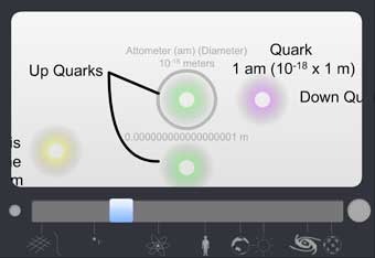
Here's a great z-axis zoom-through of the universe [link via Kris Lachowski] showing the vast range of scales from the sub-atomic level to the outer reaches of the known universe.
When I was a kid, I read an illustrated book from 1957 called The Universe in 40 Jumps that pulled a similar trick in a succession of 10x steps; a predecessor to films like Powers of Ten (and partial inspiration for The Right Number).
Looking at this latest effort to make the incomprehensible comprehensible, all I can think is that the universe has gotten A LOT bigger, since I was a lot smaller.
Have a great weekend…
…you tiny, insignificant specks.


February 10, 2011
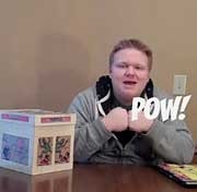
DAVID OREILLY
Funny, disturbing, beautiful. I liked this a lot.
Heidi already mentioned the Chris Ware similarities, and I'd throw in Al Columbia, but on the whole, OReilly still has plenty of his own vision to run on.
[Not safe for work. Barely safe anywhere.]
[Also note: An HD version of External World can be downloaded at OReilly's shop, and yes, apparently, he's dropped the apostrophe.]
February 9, 2011
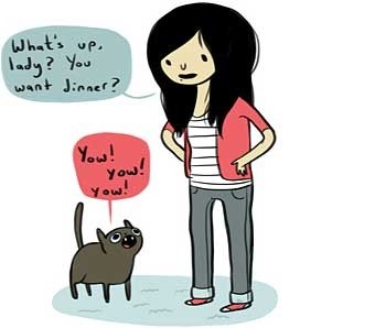
More than One Way to Skin a Cat

Having trouble with perspective? Lucky for you, David Chelsea has a great book on the subject (in comics form no less) that explains everything you need to know about drawing 3-D scenes in Flatland.
But if you still feel out of your depth with full western perspective, David points out in a recent blog post, that there's a simpler alternative — the isometric approach — that can help create the illusion of depth by following a few simple rules.
Part One is here, with more examples in Part Two, including my photo from the CN tower with it's Sims-like isometric composition.
February 8, 2011
Gingerbread Girl
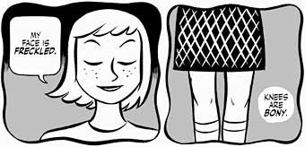
So, there's this silly, adorable, sexy little comic (NSFW, but only barely so far) called Gingerbread Girl by Colleen Coover and Paul Tobin running on Top Shelf's ts2.0 section.
Like, I assume, all of the comics on ts2.0, Gingerbread Girl can be read online, but they'd really like you to actually buy the book. Which is reasonable, of course. They are a publisher.
Thing is, I really like the web presentation when you first get there. It's clean, nicely designed. Colleen's black and white artwork looks great online and they've thoughtfully broken the pages into two tiers each so they'll fit on most screens.
Best of all, when I'm done reading Page One, I can just click and Page Two instantly loads. And when I'm done reading Page Two, I can just click and Page Three instantly loads. And when I'm…
Oh.
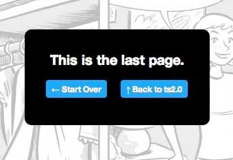 *sigh*
…which is not true, because there are five more parts online already that I can read.
At this point, if I want to keep reading, I can ignore the alert box, find the drop down menu at the top or bottom of the page (maybe with a bit of scrolling), see the options to remind myself which installment I'm on, based on which installment is missing from the context sensitive menu (sophisticated touch, that) and select the next installment.
And… back to reading!
Fortunately, I only have to do this every three pages so it's not distracting. No, not at all.
Is this what we've come to? When even the best designers (again, I like the way ts2.0 is designed for the most part) have to degrade the reading experience online for fear of making the print version superfluous?
2011, People.
2011.
February 7, 2011
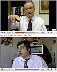
Bill and Eugene
February 4, 2011
Nancy and… Bucko?
 Well, this seems to be the week of jaw-dropping over-the-top tributes.
Gaming in Obscurity's guide to Five Card Nancy features host Ryan McSwain's own home-made Five Card Nancy deck (learn about the game here) and a complete explanation of the rules and origins of the game and, um… me.
And then, about seven and a half minutes in, um…
Uh…
…a thing happens.
I don't know how to describe it. It's wonderfully bizarre and funny, and — if you're me — even more terrifying than yesterday's infographic, but it's kind of a must-see.
 Meanwhile, back in Scott World Prime, Jeff Parker and Erika Moen have begun an adorable new webcomic called Bucko.
It's off to a great start. I especially like the local, rainy, Portlandiness of it. Feels like a love letter to that wonderful, cartoonist-clogged city already. Definitely one to bookmark.
Have a great weekend!
February 3, 2011
The Infographic that Ate Comics
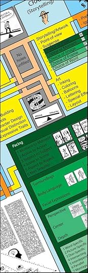
Damian Niolet recently sent word of a giant infographic he created as a personal cheatsheet showing…
Um…
Well, here's his (perhaps a bit tongue-in-cheek) description from the graphic itself:
"A graphical representation of the process of creating a work of fiction in comic book form and the tools and knowledge necessary to do so, as based on the theories and works of Scott McCloud (with some minor additional concepts from Damian Niolet)."
It's big, beautiful, and kinda terrifying (to me at least), and if you want to download a hi-res copy, you can find a link to do so either here or here.
I have a weird job.
February 2, 2011
February 1, 2011
What Year is This Again?
This video confuses me.
I mean, I like it; it's funny, well-made, etc, etc… And I strongly endorse the basic message. I'm just not sure it fits comics in 2011 as I see them.
I whined about diversity with the best of 'em a decade ago in RC and I think there's plenty of room for improvement even now, but when I look at today's comics scene, I see great progress on multiple fronts, and somehow that doesn't seem to be reflected in the more serious rant portion (starting about 5 minutes in) of this otherwise great video.
Graphic novels, Manga, All-Ages Comics, Non-Fiction Comics, Webcomics… all of these have had some genuine success stories in the last decade. Hell, all five largely began as serious markets in the last ten years. When looking at diversity as they define it, I wonder if Eric and Co. really considered Persepolis, Fruits Basket, Bone, The 9-11 Report, or Penny Arcade?
Maybe I'm missing the point, but it seems like kind of a direct market, comics store centered complaint. A bit like saying that TV doesn't try anything new, based on the fall schedule of ABC, CBS and NBC.
Anyway… still a great funny video, and its heart is in the right place. Do check it out.
[via pretty much everyone]
January 31, 2011
Cartoonist Sighting
Natasha Allegri is like the Ivory-Billed Woodpecker* of comics artists. You have to camp out in her old natural habitat (LiveJournal apparently) for weeks to catch a glimpse, but it's always worth it. Funny, wonderfully-drawn stuff.
There was a time when LiveJournal spread all the way from Venezuela to the northern tip of Uruguay, and Allegri was the talk of the rainforest. Literally the #2 account in terms of popularity at one point.
But her presence — like LJ itself — has dwindled due to… I dunno, actually. Day job, I assume.**
Now she's joined the ranks of the many great cartoonists that deserves a much more solid web presentation.
Maybe, if we're lucky, she has a big project on the way, and hasn't just been struck by that humility virus that's been going around. [see update below]
Keep your binoculars ready.
*[UPDATE #1: I have been informed that the Ivory-Billed Woodpecker is a bit more than rare. It may actually be EXTINCT. Clearly Natasha Allegri is not extinct. Sorry for any confusion. I just meant her Livejournal comics are rare and beloved.]
**[UPDATE #2: Yup. Allegri's day job is working on Adventure Time. So yeah, gainfully employed, etc, etc... but I want more comics, dammit!]
[UPDATE #3: Fun fact: Pen Ward, creator of Adventure Time, took my original comics workshop at MCAD several years ago.]
[UPDATE #4: Okay, you can also follow her on Twitter, which links to her Tumblr, which seems to be updated a bit more often.]
[UPDATE #5: I am wrong about everything.]