
Todd Klein's Blog, page 365
November 3, 2010
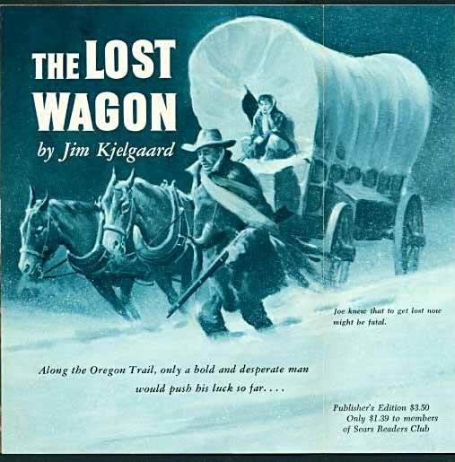
And Then I Read: THE LOST WAGON

I read and enjoyed many of Jim Kjelgaard's books growing up, most are stories about boys and animals, some just about wild animals, and a few about hunting. Kjelgaard's most famous book is "Big Red," about an Irish Setter, made into a Disney film. I found this novel recently in an antique shop, it's one I'd never seen or heard of, and the jacket flap calls it the author's first adult novel. It might be his only one.
The subject is the Tower family of 19th century Missouri, working a farm there, but having a tough time making a go of it. Father Joe Tower is restless, and stories of rich lands in the west convince him to sell his farm, outfit a covered wagon, and take the Oregon Trail toward a new life. His wife Emma is afraid of the idea, their nearly grown daughter Barbara and son Tad are all for it, especially Tad. Convincing Emma at last, the family sets out, but later than the usual yearly trek, and soon find themselves alone in the vast plains of the west, beset by obstacles and danger.
This book differs from Kjelgaard's others mainly in the way it focuses on the inner thoughts and conflicts among all the family members, obviously aiming for a more general audience, including women. Emma's struggle with leaving behind the safety of the known, and all her beloved household goods, is an example. While the characters are well developed, the story runs pretty slowly until they finally get moving west. Then it becomes much more of a pioneer adventure story, but with the addition of the romantic entanglements of daughter Barbara once the family reaches the first frontier army fort.
I enjoyed reading it, but the level of suspense is not huge, one feels the family is going to get through their troubles, and they do. In that way, it's a bit like the TV series "Little House on the Prairie." Only near the end is there any feeling of real danger when the long-anticipated Indian attack on their new home out west finally happens.

While the cover painting is vague and not very well done, the endpapers show better technique, but the woman (Barbara, I'd say) is laughably outfitted in 1950s clothes, and made up like a fashion model. I think this again shows how the book was being marketed.

And inside was this advertising flyer from the Sears Readers Club, obviously where the sale was made. I'd never heard of this club, modelled on the Book of the Month Club, I'm sure.
There's a better illustration inside, though the woman is still suspiciously modern-looking, it might be by the endpapers artist. Even in the mid 50s, $1.39 sounds like an attractive price for the book.
Not a bad read, but I like other Kjelgaard books such as "The Black Fawn" much better. Still, worth a try if you can find it. The subject matter seems well-researched.


November 2, 2010
And Then I Read: THE AMAZING SCREW-ON HEAD

© Mike Mignola.
No one does comics quite like Mike Mignola. Once the purveyor of a more traditional comics art style, he simplified his technique to a point where everything is in high contrast, shadows and black areas dominate, and figures are defined in an almost abstract way. It's deceptively simple, and only an artist with a firm grounding in all the structural basics could make it work.
So, perhaps Mike has been waiting for someone to parody him, but no one has the chops, and he's decided to do it himself. This book is quite funny, as if Mignola was writing a National Lampoon version of his own work. The art is played straight, but the dialogue and storyline are silly in a quite amusing way. Even the concept is silly, which makes the serious art even funnier.

Also here are other works in the same vein, including this story co-written by Mike's young daughter. It has the blunt honesty of youth that can be quite funny, too. Really, this entire book is a hoot, and rather than putting Mignola's other work in a bad light, it merely shows his well-developed sense of humor. Kind of like reading an EC horror comic, then an early issue of MAD with some of the same artists. Good fun and recommended.
November 1, 2010
And Then I Read: WHATEVER HAPPENED TO THE WORLD OF TOMORROW?

© Brian Fies.
This is a charming story of a boy and his dad enthralled with the idea of space travel and the utopian dreams of America. It begins in the late 1930s when they visit the 1939 World's Fair and all its rosy visions of the future, and continues through the space race and to the present times of disillusionment, when so many of those ideal futures have failed to arrive…or have they? Interspersed among that story are inserts in comic book format, extremely realistic ones made to look as much like real comics of the period as possible, with printing flaws, aged newsprint interiors, and drawing styles to match. The comics are selected issues in the imaginary title SPACE AGE ADVENTURES, starring Cap Crater and his sidekick The Cosmic Kid, who of course are the perfect imaginary alter egos of Buddy and his pop. Here's a sample page:

And here's a page of the main story:

Brian's art style is simple but accomplished, and just as charming as his writing. I found the book moving and nostalgic, bringing back many good memories from my own childhood, though mine started considerably later. I grew up with the US space program, though, a major theme here. And as the story enters the present and moves on into the future, Buddy has his own kids to inspire. How will he handle that?
Fies is lucky to have placed this project with Charlie Kochman at Abrams, who clearly went all out to make it work, sparing no expense, overlooking no detail, and producing a book that's a delight not only to read but to handle and look through. Everything about it is of top quality, and the comics inserts have to be seen to be appreciated fully. Quite a fine achievement, and highly recommended.
October 31, 2010
And Then I Read: HELLBOY, THE CROOKED MAN and OTHERS

Images © Mike Mignola.
Richard Corben seems like an odd choice of artist for Hellboy, as his style and Mignola's own are so different, but in the title story it works surprisingly well. Written by Mignola for Corben, it's inspired by the dark folk tales of Manly Wade Wellman, whose character Silver John wandered the backwoods of America's Appalachians encountering all kinds of monsters and menaces in stories written for the pulp magazines originally, later for book publication. Mike does an excellent job of capturing that eerie genre of witchcraft, demons, ghosts and other bad doings, which Hellboy tackles with his usual matter-of-fact approach: ask questions when you can, punch when you have to.

Richard Corben has been a mainstay in comics since the 1960s, but always outside the mainstream, first in undergrounds, then Warren horror, and gradually into markets like DC's Vertigo imprint. I think, if anything, his art has grown more accomplished over time, while his style remains uniquely personal. He follow's Mignola's lead in drawing Hellboy himself, but the rest is pure Corben, and full of Corben's brand of grotesquery, sexuality and creepy horror. Great stuff. The rest of the collection has an Abe Sapien pirate story written by Josh Dysart and drawn by Jason Shawn Alexander that I thought was pretty good but not great, a book-lengther written and drawn by Mignola (the first in a while) that is top notch, and a short drawn by Duncan Fegredo that's more of a nightmare episode than a story, but pretty good all the same. Recommended.
October 30, 2010
And Speaking of Eagles…
Via THE BEAT:
The Eagle Awards were presented at the MCM Expo in London Last night,. And the winners are:
Roll of Honour – Brian Bolland
Favourite Newcomer Writer – Jonathan Hickman
Favourite Newcomer Artist – Jamie McKelvie
Favourite Writer – Warren Ellis
Favourite Writer/Artist – Darwyn Cooke
Favourite Artist: Pencils – Frank Quietly
Favourite Artist: Inks – Kevin O'Neill
Favourite Artist: Fully-Painted Artwork – J.H. Williams III
Favourite Colourist – Ben Templesmith
Favourite Letterer – Todd Klein
Favourite Editor – Axel Alonso
Favourite Publisher – DC/Vertigo
Favourite American Comicbook: Colour – Batman & Robin
Favourite British Comicbook: Colour – 2000 AD
Favourite American Comicbook: Black and White – Walking Dead
Favourite New Comicbook – Batman & Robin
Favourite Manga – Fullmetal Alchemist
Favourite European Comicbook – Requiem Chevalier Vampire
Favourite 2009 Single Story – Phonogram – The Singles Club 4: Konichiwa Bitches
Favourite 2009 Continued Story – Walking Dead #61-65: Fear The Hunters
Favourite 2009 Cover – Batman & Robin #4
Favourite 2009 Original Graphic Novel – The League of Extraordinary Gentlemen: Century
Favourite 2009 Reprint Compilation – Captain Britain Omnibus by Alan Moore & Alan Davis
Favourite Magazine about Comics – Wizard
Favourite Comics-Related Book – The Insider's Guide to Creating Comics and Graphic Novels (Andy Schmidt)
Favourite Comics-Related Movie or TV Show – Watchmen
Favourite Comics-Related Website – comicbookresources.com
Favourite Web-Based Comic – Freak Angels
I have to admit I forgot I was nominated for one this year. I'm surprised but delighted to have won, and also glad to see wins for Kevin O'Neill and the book he and I worked on with Alan Moore, as well as a win for my friend J.H. Williams III. Thanks to any of you who may have voted!
Million Bird Flight
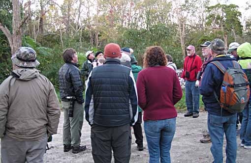
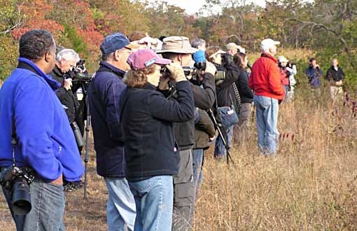
Friday and Saturday I helped lead field trips for the New Jersey Audubon Society's Fall Weekend Event in Cape May (with Ellen on Saturday), and it was amazing. We've done this for many years, and of course you never know what the weather will be like, and weather is a key factor in bird migration. This year fate and the gods conspired to order up the perfect weather scenario for a huge migration: warm humid weather for about a week before, rain and southerly winds, then on Thursday night early a strong cold front came through bringing cold air, strong northwest winds and clear skies, all the signals birds to the north and west of us were waiting for. And they came by the hundreds of thousands! Here's Don Freiday talking to our early morning group on Friday, while all around us there were masses of birds.
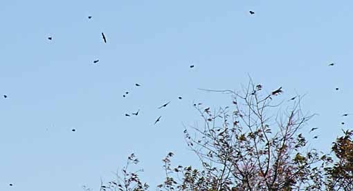
Birds filled the sky…
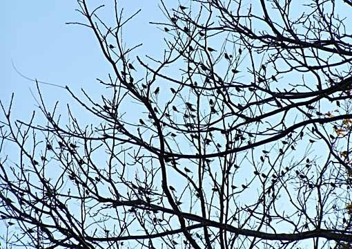
…and the trees, not to mention the ground and every available surface, even cars and buildings in town. People woke to find birds everywhere. Driving down the Parkway in the gathering light, I saw waves of them coming in off the ocean where they'd been blown by the wind. Once they reached land, they began to spread out in search of food and shelter, often flying north and west a while against the wind until they reached a place they felt safe in.
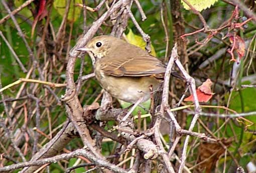
What kind of birds? Not a huge number of species, but of the ones present, there were great numbers. For instance, above is a Hermit Thrush, generally a solitary bird. I've rarely seen more than three in a single day. This day there were flocks of 50 to 100 all over the woods of Higbee Beach, where our walk was. There were thousands of Robins, Yellow-rumped Warblers, Red-winged Blackbirds, Flickers, and so on. Then, in search of breakfast among this bounty came hundreds of Sharp-shinned Hawks diving and swooping after them. While there's no official count of this massive migration flight, there was a count of birds passing one spot at Higbee, about 150,000. And that's only what was moving and passing that one spot. There were masses of birds everywhere in the area. As one veteran birder put it, "I'd be shocked if there weren't over a million!"
Saturday was much the same, but with less wind and perhaps about two-thirds of the birds. This time some rarities turned up, though. One, a Henslow's Sparrow, hasn't been seen in the Cape May area in over 20 years. Here's our group at Higbee lined up along a path…
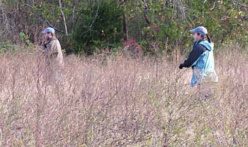
…while leaders Michael O'Brien and Louise Zemaitis circled around through the field to gently flush the bird back toward the group. Everyone got to see it, plus more in later groups. It was a life list bird for nearly everyone, including Ellen and I.
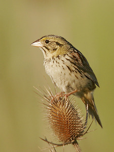
Henslow's Sparrow photo by Brian Zwiebel
About 100 yards down the same path an hour or so later we found another rarity (not as rare), Ash-Throated Flycatcher. Also a life bird for us.
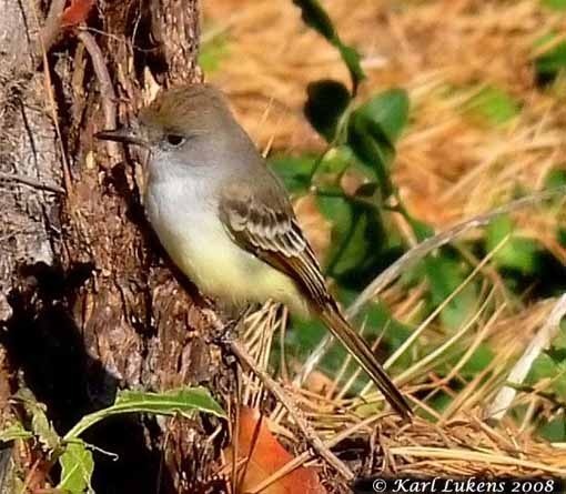
Ash-throated Flycatcher by Karl Lukens, local guide
It's been years since I had a saw a new bird for my life list in New Jersey, two in the space of an hour is unprecedented! Small birds don't interest you? Okay, how about the two Immature Golden Eagles that passed overhead a little later in the morning. That would get anyone's attention who's at all interested in birds.
Cape May is truly one of the best places to watch birds in the world, but days like this here are rare and precious. And there are now a few hundred people who came to the Fall Weekend event for their first visit here and think it's always like this…!
October 28, 2010
And Then I Read: RICHARD STARK'S PARKER, THE OUTFIT

Art © Darwyn Cooke.
I've never been a fan of crime fiction, but Darwyn Cooke's fine adaptations of the Parker novels make me realize what I must be missing. The characters are honed down to their essential archetypes, the plot is a chessgame of clever moves, the language is precise and accurate, the world of the story is 1950s mobsters and con men brought to life with knowing familiarity and cruel honesty. Parker is in trouble, someone's put a price on his head. Rather than trying to run and hide, he fights back, marshalling his resources brilliantly to find and torment his tormenter, all without losing his smart, cool confidence.

Darwyn's art is deceptively simple in two colors, black and blue, without panel borders, and using a variety of page layouts. There are also several sections in the styles of magazines of the period that seem spot on, adding another layer to reading enjoyment. Despite a fair number of wordless panels, this is dense narrative, getting across lots of information in 152 pages, perhaps nearly as much as the original novel. I've enjoyed Darwyn's work for DC Comics, but this series seems even more of a labor of love, and a perfect vehicle for his obvious talent. Highly recommended.
Incoming: FABLES THE DELUXE EDITION BOOK TWO

© Bill Willingham & DC Comics, Inc.
Just got my copies of this slightly oversized hardcover. This is the best printed version of the series, not so much for the size, but for the paper. The bright white semi-gloss stock brings a whole new look to the colors, art and lettering, like when Dorothy goes from sepia Kansas to technicolor Oz. Even if you have the trade paperbacks, you should take a look at these hardcovers for that reason alone.
October 27, 2010
And Then I Read: THE COMPLETE DRACULA

Images © Savage Tales Entertainment, LLC.
Writers Leah Moore and John Reppion have carved out a niche for themselves at Dynamite adapting literary classics for comics, and the level of commitment, research, and writing skill they bring to it is impressive. As I said about their Sherlock Holmes story, of all the literary, comics, film and television adaptations of Bram Stoker's Dracula I've encountered, none have captured the true flavor and excitement of the original work as well as this one.
"Dracula" is an epistolary novel, meaning one told completely through letters, diaries, newspaper articles and other similar documents, without any other overarching narration. In one sense it puts distance between the reader and the events described, in another it brings a level of immediacy and realism hard to capture any other way. And Stoker was particularly clever in allowing his readers to know much more about the Count and his activities than any one of his characters, a great way to build suspense. Unlike every film version and all other comics versions I can recall, this one follows the epistolary plan as much as can be possible while still using illustrations to convey the images. Through the use of letter and diary excerpts in many different fonts (some that work well, some that don't, but that's another matter), as well as newspaper articles, etc, we get the story points, while the images bring a second level of involvement. It's brilliant work by the writers.
Another aspect of this story that I found interesting was seeing how Leah and John handled the character of Mina Murray, here in her own story, but so often the central character in Leah's father's series THE LEAGUE OF EXTRAORDINARY GENTLEMEN. I found the character in both to be very much the same, though as Leah points out in the afterward, Mina is literally thrown to the wolves about halfway through the book by Van Helsing, and Leah's thoughts on that are also eye-opening.

I wish I could say the art is as successful as the writing, but I can't. At times the art worked fine for me, but often it pulled me out of the story because of its unevenness, and the inconsistent look of the characters and the entire approach. Apparently there are some sections done by different artists, which explains some of it. On pages like the one above, many of the interior scenes seem to have been posed by actors and photographed, then the photos were painted over to give it a more artlike look, but it's not done consistently, and in places you can see what seem like pure photos, while some of the faces seem like actors wearing really clumsy and poorly done makeup.

Other pages seem completely painted, as the one above, and all of the more fantastic scenes, where photos wouldn't have been practical. The look of the characters changes enough that at times I wasn't sure who was who among the men, not helped by the similarity of their clothing. Reading this book is a bit like watching a play where different actors and actresses slip in and out of the same roles, and the set and scenery morphs as well. An earnest attempt, but an uneasy result.
I can overlook all that because of the fine writing, which brings the story to life in comics form as never before. Recommended.
October 26, 2010
And Then I Read: FRACTURED FABLES

© Jim Valentino and the respective creators.
This attractively packaged hardcover reminds me of the "Little Lit" series, short comics stories aimed at younger readers, but with creators and sometimes content that will appeal to adults as well. As with most short story anthologies, the quality is mixed, and I wouldn't put it at the same level generally as the aforementioned books, but it does have its moments, and would probably appeal to many readers. The theme, as you can see, is off-beat takes on traditional fairy tale and similar characters and ideas, though some stray pretty far from that.

Bill Morrison's charming entry depicts the kid's song "On Top of Spaghetti," though a new version, not the one by Allan Sherman, for instance. Hardly a fable, but still fun. Some stories go for obvious yocks: The Tortoise and The Hare in a pie-eating contest–while others are more subtle: Cinderella as a modern sarcastic teen who doesn't think much of her fairy godmother's taste. The art for the latter story by Rodin Esquejo is is most classically accomplished in the book, quite attractive, but as with the stories, there's a wide range of styles, from cartoony linework to lyrical painting. Nothing here really excells, nor has much room to develop, and if you're looking for something as involving as Vertigo's FABLES, you won't find it, but if short, amusing stories in a variety of styles appeal to you, this will too. The cover by Mike Allred is a winner, too. Recommended.
Todd Klein's Blog

- Todd Klein's profile
- 28 followers

