
Todd Klein's Blog, page 245
June 8, 2014
And Then I Read: ABE SAPIEN VOLUME 3
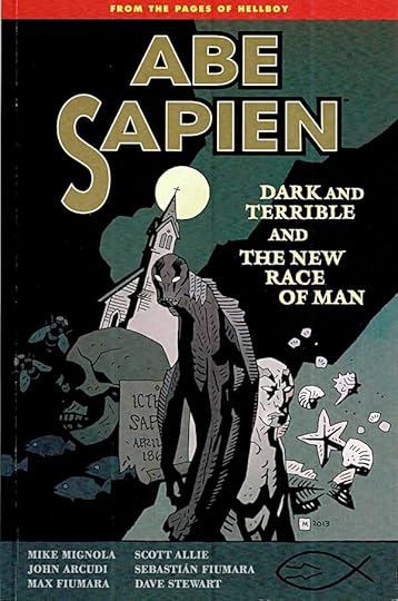
Image © Mike Mignola.
The fish-man and former B.P.R.D. agent Abe Sapien has become a fugitive of sorts, and these stories reminded me a little of the old TV show of that name, but with supernatural elements and with the goal of the main character much less clear. It’s the B.P.R.D. that are trying to track him down, and they come very close in the first of these two stories, but Abe does not want to be found. His reasons for that remain murky, perhaps to him as well. Meanwhile, in the first story he encounters help from a small-town preacher whose village has been devastated by one of the hellish monsters unleashed recently, and while Abe appreciates the help, he is soon drawn into a town drama that he would rather avoid, not to mention more monsters. In the second story, Abe has reached the Salton Sea in California, the scene of more monster eruptions, and gets involved with a small group of young people there partly as thrill seekers, partly as worshipers of the monsters. The group is conflicted, and Abe’s presence only adds to that, in his new more monstrous shape. As one might expect, things go downhill from that. Despite the gloomy outlook, I enjoyed these stories and the characters in them.
Recommended.


June 7, 2014
And Then I Read: SWAMP THING 31

Image © DC Comics, Inc.
Writer Charles Soule continues to intrigue me by adding new ideas and depth to the mythos of this series. Now, in addition to the Green, the Red and The Black we have the Grey…see if you can figure out what realm that avatar represents. Alec Holland has been tricked into a human body that can not long sustain him. His Swamp Thing body has been stolen for corporate dirty work. Through some clever maneuvering, Holland is aiming to get it back, but if he does, will The Green be too damaged to allow his return? Nice art by Jesus Saiz and Javi Pina, too.
Recommended.
June 5, 2014
And Then I Read: DETECTIVE COMICS 31
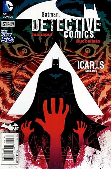
Image © DC Comics, Inc.
I was a little disappointed in the first issue of this storyline, so I’m happy to report I liked this one much better.
A recently murdered body is found on the front steps of Wayne Manor, and it’s someone Bruce Wayne was working with on a Gotham revitalization construction project. Beside the woman is a canister of a drug called Icarus that apparently causes an overdosing user to burst into flames. Harvey Bullock is on the case, and he suspects Bruce of the crime. The interplay between them is excellently done by co-creators Buccellato and Manapul. Of course Batman investigates, and that investigation takes him to the dirty streets of Gotham, where trouble is waiting for him from drug dealers and human traffickers. The writing on this is fine throughout, and Manapul’s atmospheric water-color style art is looking great, too. Okay, I’m in, looking forward to more!
Recommended.
June 4, 2014
And Then I Read: THE EL DORADO ADVENTURE by Lloyd Alexander
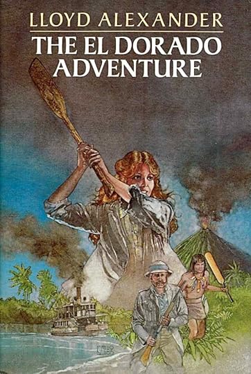
Image © estate of Lloyd Alexander, illustration by Stephen Marchesi.
This is the second of a series of six books written by Alexander featuring Holly Vesper, and the first I’ve read. It takes place in the 1870s, mostly in the fictional Central American country of El Dorado, which is similarly placed to Costa Rica on the map, though it has some of the features of Panama. Holly Vesper is a spunky American teenager from Philadelphia who inherited a good deal of money from her deceased parents, and is now cared for by an aunt and uncle. She apparently enjoys making expeditions to obscure corners of the world, accompanied by her Uncle Brinton, and appears fearless, venturing into any possible danger with enthusiasm. Being a very modern sort of heroine, she gives the book a slightly Steampunk feel, though the adventure is more along the Indiana Jones line.
The tale this time revolves a round a large amount of land in El Dorado that Vesper owns, land that is wanted by an unscrupulous developer to build a new canal through the country, along the lines of the Panama Canal. To do that, he would have to destroy the lives of a native tribe that has already been decimated, and when Holly investigates, she soon comes down on the side of the natives and their charismatic young leader. There’s lots of thrills, from kidnapping by steam locomotive to battles with the men of the developer to desperate escape attempts through jungles and down rivers. There’s an evil villain behind the development scheme that has it in for Holly (apparently returning from her first book), and finally, there’s a volcano that might just be the native tribe’s salvation…or not, depending on how Holly’s plans work out.
Good fun, fairly lightweight. Alexander never lets Holly get in trouble too deep that we fear she won’t get out of it, and she seems to lead a charmed life full of lucky coincidences. Still, the characters are appealing and fun to read about.
Recommended.
June 3, 2014
And Then I Read: GREEN LANTERN NEW GUARDIANS 30
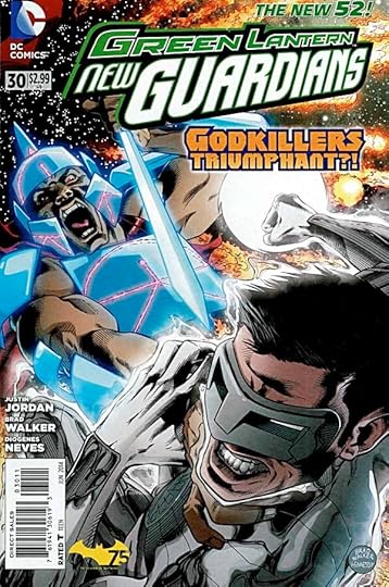
Image © DC Comics, Inc.
In this conclusion of the “Godkillers” story, Kyle Rayner and his crew of Guardians and a Star Sapphire are trying to contain a fierce battle between the goddess X’Hal (formerly of the Vegan star system) and a group called the Godkillers, out to destroy her. The battle threatens to destroy all life on the planet they’re on, and neither side seems concerned about that. Lots of cosmic energy blasts and furious speeches here, but an effective story as well. The art and writing are both quite good. The collateral damage, when it comes, is emotionally effective, and Kyle himself is left in a damaged state with some doubt as to what kind of power he actually wields at this point. Nicely done.
Recommended.
June 2, 2014
And Then I Read: GREEN LANTERN CORPS 30

Image © DC Comics, Inc.
This issue fills in some details about the shape-shifting Durlans and why they have it in for the Green Lanterns. It also features a hunt of sorts by the Corps for some Durlans who have infiltrated the planet. Both story lines are well done, more interesting to me than the big battle that’s coming. The art by Scott Kolins (on Durlan history) and Chris Batista with two inkers on the current story is all excellent. Well done, all.
Recommended.
May 31, 2014
And Then I Read: ASTRO CITY 11
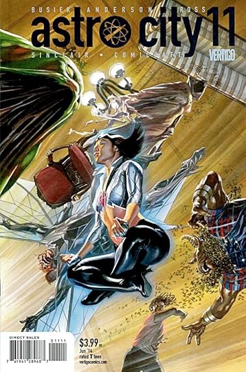
Image © Juke Box Productions.
What would it be like to be employed as a personal assistant to a powerful sorceress? Doctor Strange and Clea come to mind, but that was a long time ago. Today that job would probably involve lots of computer time and phone calls, as well as the occasional bit of magic on the loose, and so it proves for Raitha, the p.a. in this issue. The job has its perks, like the outside office on some distant paradise, but it also has its dangers. And keeping her somewhat ditzy boss on track is definitely no easy task. Really enjoyed this one.
Highly recommended.
May 30, 2014
And Then I Read: GREEN LANTERN NEW GUARDIANS ANNUAL 2
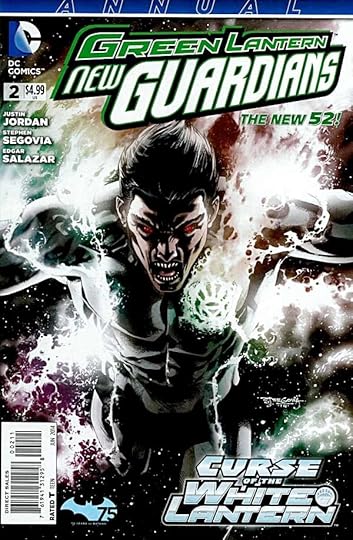
Image © DC Comics, Inc.
Here’s an annual worthy of the name. While it does reflect what’s going on in the main title in general, it stands on its own in a way that seems rare these days, and further, is an interesting psychological look into Kyle Rayner that the main series never seems to have any time for. Perfect subject for an annual.
It begins on Earth, with Kyle at his drawing board trying to create, but it soon becomes clear that something is very wrong. The story escalates and moves to Arizona, bringing in Star Sapphire (Carol Ferris) and Kyle’s dad. Eventually the distortions of reality resolve into a dark version of Kyle, his Black Lantern side, trying to gain control. The struggle that ensues is physical and emotional as well as thoughtful and interesting.
Recommended.
May 29, 2014
And Then I Read: DARK HORSE PRESENTS 27 & 28
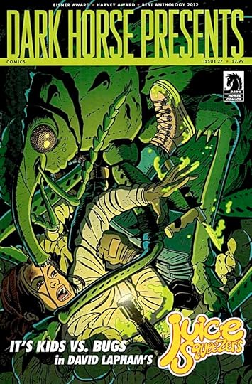
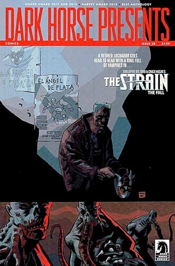
Images © Dark Horse Comics and the respective copyright holders.
I’m still well behind on this title, trying to catch up. I’ll just be commenting on things I read and liked.
“Squish, a Juice Squeezers Tale” by David Lapham is certainly one of those. A group of kids taking on giant insects is an interesting premise. Make it a school club activity, even better! No explanations are offered in this section of what I imagine will be a larger work, but the visuals and storytelling work great, the characters are well-rounded and interesting, not to mention they act like real kids, and it’s an exciting ride. And when one of the bugs starts to sort of talk, well…what IS really going on here? Good stuff.
Peter Bagge does a humorous historical tale in “Alexander Hamilton in Mr. Unpopularity.” I’ve never read much by Bagge, but this is pretty funny, and unexpected from him.
“Mr. Monster: Dark Stearn” from Michael T. Gilbert splits his long-running monster-fighter in two, with a light mild-mannered half and a dark, violent one. The dark half is great at fighting monsters (brain-bats in this case), but not very concerned with collateral damage to anything including people. The light side has a relaxing vacation for a while until he realizes he has to try to curb his other half. With sexy sidekick Kelly, Stearn has his work cut out for him in this frenetic strip that’s full of old-time comics fun.
I’m really impressed with Ron Randall’s “Trekker” in this current serial, “The Train to Avalon Bay.” Ron’s art is better than ever, and the story and characters are well-crafted and exciting. Ron’s main character, Mercy is tough as nails dealing with assassins, desert terrain, huge wild animals, and the most dangerous of all, human treachery. She struggles on, fighting the odds, never giving up. Well done.
“Alabaster: Boxcar Tales” by Caitlin R. Kiernan and Steve Lieber has been a mixed bag for me. The storytelling jumps around as if it’s trying to shake me off, but the art is great, and I keep getting drawn back in by the fine dialogue writing, even when I’m not sure what’s going on plotwise.
“The Silver Angel” from “The Strain” by David Lapham is less appealing to me than his Juicers, but intriguing. We have an apocalyptic dying urban world overlaid by the memories of an old man who used to be a champion wrestler, and at times thinks he still is.
“Edgar Allan Poe’s The Assignation” is another odd adaptation by Richard Corben. He’s mining barely known poems I think, I’ve never heard of this one, and clearly the adaptation is a very loose and free-wheeling one, but Corben is always interesting.
That’s about it. There’s also a new chapter of Neal Adams’ “Blood,” but I gave up trying to read that early on. Nice art.
Generally recommended.
May 28, 2014
Logo Study: ELECTRICOMICS

A few months ago I was contacted by Leah Moore about designing some logos for a new project she and her dad Alan Moore were working on, an app for making and reading comics in digital form. They had the name, and a few sample logo treatments, but they weren’t completely sold on any of them and asked me to have a go, which I was happy to do. From the sample provided above, I liked the retro Victorian feel and the old light bulb.

From this second provided sample I liked the style of the word “Electricomics,” and the old black and white film feel. I mulled these things over and began to work on a design of my own incorporating some of those ideas. The first version wanted was in a square format for social media use. I thought a large early light bulb could be at the center of it, so I looked for some images on Google and found these.
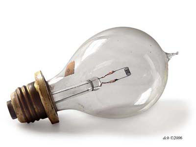
The shape of this bulb seemed right for a square logo, and I liked the raised droplet of glass at the top and the wide base. The wires inside rose through a glass shaft that I also liked.
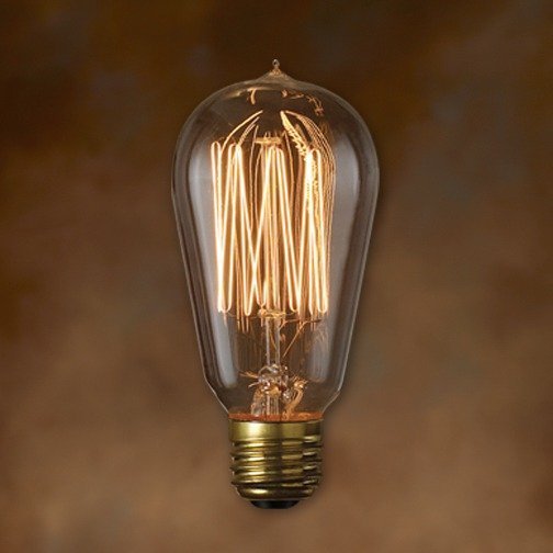
This one didn’t have much I could use, but I was interested to see how the filaments inside looked lit up.
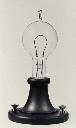
This old Edison bulb on a wide base gave me more ideas. I particularly liked the screw-on contacts for wires.

With all that in mind I created this logo design in Adobe Illustrator. Inside the bulb I made the filament into a large curved E, and for Electricomics I stole the lettering I liked from one of the provided samples. I wasn’t sure if I wanted to keep it, but it gave me something to show Leah and company to see if they liked the direction.

They did, and also liked my suggestion that we try the word in script. On a yellow sticky note I sketched out a small script version that seemed right, above, scanned it, and then worked over it in Illustrator using the pen tool and a calligraphic brush. I designed each letter, one at a time, until I had the entire word as I wanted it.

The way the E was formed in almost a corkscrew shape made me rethink the shape of the large one inside the bulb. I redid it to match, and found it looked better filled with white, more readable and iconic. I also increased the contrast in the background and fiddled with the gradients giving the glow effect around the bulb. Leah and the Electricomics crew were happy with this, but also wanted a wider version, a more standard logo shape, so I worked on that next.

First I simply extended the original image, making the beams continue far to the right. I placed a much larger version of “lectricomics” with the beginning of the L seeming to be plugged into the bottom of the E in the bulb. All the letters were given the same kind of glow effect as if the entire name was lit up. I liked it, but wasn’t sure about the amount of open space above and below the name, so I also made a trimmed version to remove some of that. Leah and her partners liked the full version best.

Here’s the square version as submitted after some very minor tweaks…

…and the wide version, likewise. They’ve both been showing up all over the place since the story about Electricomics broke online this morning, and you can read more about the project at their WEBSITE, as well as their Facebook page and Twitter feed. I’m sure there will be more information as we go forward. I’ve already designed some other logos that haven’t been released yet. As always, it’s great to work with Leah and Alan in any capacity, and I’m proud to be involved in this new project. Hope it goes well!
Todd Klein's Blog

- Todd Klein's profile
- 28 followers

