
Todd Klein's Blog, page 223
March 30, 2015
And Then I Read: TWO BY JANE LOUISE CURRY


Jane Louise Curry has been writing novels for children since the early 1970s. Her most recent book came out in 2005. Over the years I’ve gradually collected and read and enjoyed nearly all her books, but these two, written in 1975 and 76, eluded me for a long time. I found them recently, the first in a Kindle edition, the second on Amazon as a used book. They’re connected, though they can certainly be enjoyed separately as well.
In “Parsley,” a present-day girl named Rosemary is sent to stay with her aunt in a very old family home in Maine, one she’s never seen. When she arrives, she finds the house, called “Wychwood” fascinating, and enjoys exploring the surroundings. There’s a small herb garden that’s fallen into disrepair, and through it Rosemary finds herself transported back to the past, the 1720s to be precise, when the house was actually the home of an old woman, Goody Cakebread, who the local folks considered to be a witch. She’s actually a harmless old lady except for one thing: she has a cupboard with unusual magical properties. Things put into it often disappear, but other things Goody needs appear there instead. Rosemary soon discovers she’s not the only one drawn to this time and place from its future, there are two others, a younger girl, Baba, and a boy baby named Wim. Before any of them can figure out how to return to their own time, they’re drawn into turmoil in the local town, where a preacher is determined to burn Goody Cakebread as a witch. The children and Goody try to escape, but are caught and thrown into jail, and things are looking grim for them.
In “The Magical Cupboard,” we follow the 1722 era adventures of another young girl, Felicity, who has ended up in the clutches of Parson Grout and his wife, the ones persecuting Goody Cakebread, and now in possession of her cupboard, though they don’t know how to use it. Felicity is taken to an orphanage run by the Grouts, which she soon discovers is really a forced labor home for the children they put there. The Grouts are running from their past bad deeds, and decide to head into the Maine wilderness to escape the law, taking their orphans along. The expedition is full of troubles, and when it’s attacked by Indians, things seem to be headed for a sad end.
Both these books are connected in interesting ways through characters and events, and reading the two together was fun, though I wouldn’t put them among Curry’s best work. I love any story involving time travel, though there isn’t very much of it here, but the characters are engaging and the plots are clever.
Recommended.


March 27, 2015
And Then I Read: SWAMP THING 39
 Image © DC Comics, Inc.
The ride that writer Charles Soule has taken Swamp Thing on continues to surprise and entertain me. Every time Alec Holland seems to have a handle on his problems, things change again for the worse. Right now, the former avatar of the Green, Lady Weeds, now avatar of Machines, is making his existence miserable, and even his allies like Abigail Arcane and John Constantine can’t seem to help him put things to rights. And despite the grim situations, Soule manages to find moments of humor and real emotion that are so often missing from comics these days. The art by Jesus Saiz is excellent, making this one of my favorite comics right now.
Recommended.
March 26, 2015
And Then I Read: GREEN LANTERN 39
 Image © DC Comics, Inc.
This is one of those between-crisis issues that I usually enjoy, as it allows for some character development. Hal Jordan as been so well explored that there’s not much new to say about him, though he is surprised when he hears what the Guardians have to tell him this time. A few minor characters get some space, and the ongoing issue of the Corps’ bad name in the universe is carried further. And, of course, another crisis is developing. Not a great issue, but not bad.
Recommended.
March 25, 2015
And Then I Read: THE SILVER AGE OF DC COMICS by Paul Levitz
 Images © DC Comics.
The second volume by Paul on DC history (drawn from and expanding on the even more massive “75 Years of DC Comics”) covers 1956-70, and encompasses the comics of my childhood, at least those put out by DC. If you were a comics reader in this period, you’ll enjoy all the wonderful pictures of the covers, interior pages and descriptions of the series, genres, editors, writers, and of course the artists. I liked the fact that some of the comics covers were worn and well-read, rather than all the best possible pristine copies. Some of the more important creators get a spotlight of several pages, others just a paragraph, but it’s a large subject, and even with 400 pages to fill, not everything can be covered in depth. I was already familiar with most of the subject matter, so there wasn’t as much new material for me here, though I did miss plenty of the comics from the time, and it was fun to see so many of them represented.
 I particularly enjoyed the photos that Paul and his team were able to find and include, especially this one of a company gathering at the 21 Club in New York in 1957. Like the 1948 staff photo in the first volume, there are many people here I can’t identify, but I do know a few. A larger version is HERE.
 Here are DC editors Larry Nadle at left, someone I don’t know, then Mort Weisinger and Julie Schwartz.
 At left is DC production manager Sol Harrison, an elderly man I don’t know (but I think he was also in the 1948 photo), then Jack Schiff behind another man I don’t recognize, and Murray Boltinoff at right.
 The bosses are standing in the back. I don’t know the first man, but then left to right are Harry Donenfeld, Paul Sampliner, Jack Liebowitz and Irwin Donenfeld.
 There are other photos I hadn’t seen, including a great one of my old boss Jack Adler at work coloring a G.I. COMBAT cover in 1961, and next to long time colorist Jerry Serpe, the only photo I’ve seen of Jerry, though unfortunately his face is obscured.
This is a very large and expensive book, but if you’re a fan of comics history it’s an excellent one to add to your collection. As with all Taschen books, the quality is top notch. Recommended.
March 24, 2015
Rereading: THE TOUGH WINTER by Robert Lawson
 Image © estate of Robert Lawson.
About a month ago, when Winter was getting me down, I found rereading this childhood favorite a good antidote. One of writer/illustrator Lawson’s best and best known books is “Rabbit Hill,” but this sequel is nearly as good. The setting is Lawson’s actual home in Westport, Connecticut, but the talking animals are pure whimsy. Very entertaining all the same. When Lawson and his wife head south for the winter, they hire a house-sitter who is a very poor replacement in the eyes of the many animals on and around the property, who Lawson has been feeding regularly. When the caretaker arrives, that’s clearly over, and the caretaker’s foolish dog, while no real threat to the wise country critters, is still very annoying. Winter hits hard with lots of snow, and while young Georgie Rabbit and his friend Willie Fieldmouse find it all a great adventure, many residents are forced to move to other farms and homes where they can find food. Even Georgie’s mother is sent off to relatives while Georgie’s father and Uncle Analdas decide to tough it out. Before long they’re starving and desperate, but the younger creatures manage to keep the fun in their winter travails, as can be seen in the cover picture above. Lawson’s illustrations for this book are in lush and detailed pencil, only colored on the cover, but there are lots of them, and they’re wonderful. Yes, the animals act more like people much of the time, foibles and all, but that’s part of the charm of this delightful story.
Recommended.
March 23, 2015
And Then I Read: SUPERMAN 38
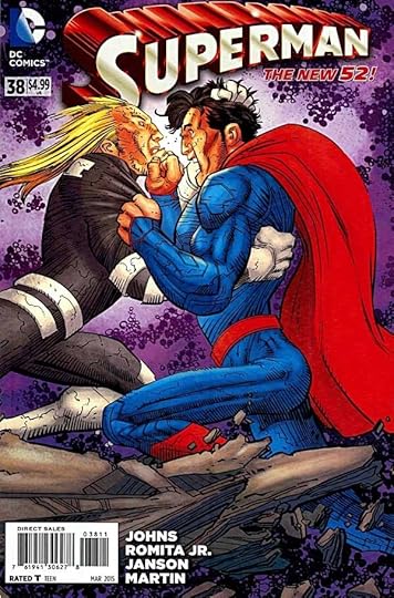 Image © DC Comics, Inc.
Superman has been trying to help Ulysses, but things went very wrong, and now Ulysses is out to destroy Superman and Earth, even though it’s the home of his own parents. This is a setup for major melodrama, but the fine writing of Geoff Johns keeps it real and believable, even though of course it’s unbelievable how two such powerful beings go at each other. There are many effective character moments among the blasting and explosions, including an appearance by Batman, Clark Kent back to work at The Daily Planet, Ulysses and his parents, and my favorite, the closing scene with Jimmy Olsen setting up the return of Jimmy’s best role.
Recommended.
March 20, 2015
Watching iZOMBIE
 I watched the first episode of this new CW show last night, based on the Vertigo comics. There have been a number of TV shows and movies adapted from comics I worked on, but this one is unusual in that I lettered the entire series, so I was curious to see what I’d think. I liked it a lot, and there are definitely connections to the comics, though not as many as there might have been.
First, let’s consider the logo. It’s crude and distressed, in a familiar style these days especially for horror, but there’s also a little humor in it. The letters are slightly cartoony, and the bite out of the first one is amusing. Seems like a good logo for the concept, and I think better than the one on the comics:
 I don’t know who designed the comics logo, but it’s more generic and not as entertaining as the TV one. I’m glad they kept the lower case i, by the way, I always liked that, but it’s more obvious in the TV logo. In the comics one all the letters were lower case. Note that there’s also a bite out of the last letter, but it’s easy to miss.
The main character of the show looks very much like Mike Allred’s version of her in the comics. Creepily similar, I’d call it. The pale complexion and shadows around the eyes are effective, and yet not so different as to be alarming to the normal people she’s with. In the comic she was named Gwen, in the series it’s Olivia, or Liv, and different last name. Not sure why the change, unless someone was thinking of Gwen Stacy from the SPIDER-MAN movies. Liv’s personality and ironic voice-over seems similar to the comics, but in most other ways her life is different. Different origin, different home and family situation, different friends, different job. Despite that, she does definitely remind me of the girl in the comics. None of the other characters introduced so far seem to be from the comics. The writing style is entertaining and fast-paced. I’ve heard comparisons to “Veronica Mars” and “Buffy, the Vampire Slayer,” neither of which I’ve seen.
So, Liv works in a morgue and gets her brains fix from the corpses she and her boss, the coroner are working on. (Ellen bailed at the brain-eating scene, so I’ll be watching this alone, but I thought it was all handled well without excess grossness.) When she’s eaten some of a crime victim’s brains, she gets flashbacks about what happened to them, much as in the comics, the other main story connection. Here, this leads to her becoming the “psychic” sidekick of a rookie police detective, and soon out chasing a murderer. Okay, I’m not a huge fan of police shows, but this one worked pretty well, and there was just a little Zombie fantasy involved to make it more interesting.
 The other visual tag to the comics involves the opening animated title sequence which uses Mike Allred’s art to recap Liv’s origin and current life, complete with lettering! I thought this was pretty cool, and the lettering used in that opening sequence was very well done. It almost made me feel like I had some influence myself!
 But as we got into the episode, credits were shown also in the comics font, but not well done. Can you see the problem here?
 Another example with an obvious error, one that signals a designer unfamiliar with comics lettering: the use of the serif I inside words. That’s the one with the crossbars at top and bottom. This is meant to only be used for personal pronouns like I, I’m and I’ll. In other words, one uses the I without serifs, in the lower case i position on the font keyboard. Since it was right in the animation, I’m guessing a different person did it on the episode credits. Oh well, can’t win them all.
 Even with that mistake, it was nice to see this credit come up. Yay Chris and Michael! Yay Vertigo! By the way, I think I’ve tracked down the font, it’s a free font designed by Neale Davidson under the studio name Pixel Sagas, and called simply “Comic Book” or “Comic Book Normal,” depending on where you find it. I don’t like the actual font that much, but I have to admit it looks fine on my TV screen, so I guess a good choice. Throughout the show, new scenes are introduced with lettering in captions, and the image morphs from a drawing to live action, nicely done.
I hope the series does well, I enjoyed it and will be watching more of them.
March 19, 2015
And Then I Read: A GAME OF THRONES VOL. 3
 Image © George R.R. Martin.
I liked this comics adaptation of the first “Game of Thrones” novel pretty well when I started reading it, but did not care fir this volume so much, mainly because of the art by Tommy Patterson. He’s doing pencils and inks, which is a ton of work on such a big project, but in places here the inking looks rushed and sketchy. The characters seem to be looking more like each other all the time, and in places there’s a cartoony feel to the figures and faces that doesn’t seem right for the subject matter to me. There could be some artistic burnout involved, I don’t know. The story is compelling, the adaptation seems good, though it’s been over twenty years since I read the book, so I’m not a very good judge of that. But for it to work visually, the art has to draw me in, and this doesn’t. Instead, I find myself mentally critiquing it as I read. In all, I felt like I’d rather imagine these characters in my own head than see them depicted in this form. I haven’t watched any of the HBO adaptation, so I don’t yet know how I’ll feel about that, but it seems likely it’s going to be a more realistic approach than some of the art in this book. I’m thinking I may not get the final hardcover volume.
Not recommended.
March 18, 2015
And Then I Read: ASTRO CITY 19
 Image © Jukebox Productions. What a great cover!
The saga of Quarrel continues, bouncing around from her present-day concerns about getting too old for the super-hero business, and episodes from her past, including family issues and early crime-fighting days. One constant is the ever-turbulent relationship with Crackerjack, her partner at home and sometimes at work. There IS a lot of quarreling in this story, but it’s a great partnership to read about. Reminds me some of Oliver Queen and Dinah Lance, but with its own unique flavor. Good comics; thoughtful writing by Kurt Busiek, nice art by Brent Anderson, and of course Alex Ross on the cover. Hey, the coloring and lettering are nice too!
Recommended.
March 17, 2015
And Then I Read: GREEN LANTERN CORPS 38
 Image © DC Comics.
In the aftermath of the latest crossover confusion, the Corps are taking a breather on Mogo and regrouping. The Guardians want John Stewart to take the leadership of the Corps, but he has other ideas. Meanwhile, some of the newest members are taking full responsibility for their sectors, heading out to begin local patrols, with John along to help. In a book like this, it’s hard for new characters to get the attention needed to become known to and liked by readers. Hope that happens here in this storyline for a few of them. None of them seem familiar to me yet. In all, a good read with fine art.
Recommended.
Todd Klein's Blog

- Todd Klein's profile
- 28 followers

