
Todd Klein's Blog, page 198
April 6, 2016
Four George Kleins
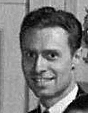 This is George Dunsford Klein, who had a long career in comics (known simply as George Klein) as an artist and inker. He was born in Louisiana in about 1915 (records differ) and grew up in Wyoming. He attended the Kansas City Art Institute and then moved to New York City where he took a staff job at Timely Comics, the precursor of Marvel Comics. He initially was a penciler and inker on super-hero stories but later moved to funny animal comics at Timely. Since he was on staff, much of his work there is unsigned and hard to identify.
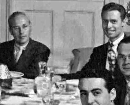 The first photo is cropped from a much larger one taken on August 14, 1942 at a Timely staff luncheon. As seen in this wider view, George was sitting next to company owner Martin Goodman.
 Here’s the entire photo, which is titled “Prelude to Bambi,” as the staff were going to see that Walt Disney film together afterwards. It’s the only Timely staff photo I know of, and the only picture of George from the 1940s I’ve found.

My ace research partner Alex Jay discovered this photo of George on Wikimedia Commons. It was posted there by his niece Diane Boden, who guesses it’s from the late 1950s, and is free to use. According to Wikipedia, George worked as a freelancer for a variety of comics companies after World War Two, including DC Comics. In 1955 he began a long association with penciler Curt Swan as his inker on many SUPERMAN and related stories and covers.
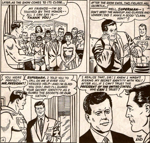 Image © DC Comics.
Here are the last few panels of one of the more celebrated Superman stories Swan and Klein did, featuring the character meeting President John F. Kennedy, from ACTION COMICS #309 dated Feb. 1964. From the mid 1950s on, George was primarily an inker, and a highly respected and sought-after one. Though creators did not receive credit on stories at DC at the time, good records of his work at DC are known and easy to find online.
In 1968, George and other long-time artists were “eased out” at DC in favor of younger talent, but George had no trouble finding work at Marvel Comics, where he became one of their highest-profile inkers for a brief time until his death on May 10, 1969. His untimely passing at age 52 or 54 (records vary) was due to cirrhosis of the liver. Many of his peers spoke highly of him and his work.
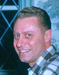
 Sometimes the internet gets things wrong. This is a photo of George Charles Klein, my father, though he didn’t use the full middle name, only the initial C. My dad was born in Brooklyn, NY on March 10, 1924. The photo is from the 1950s, I believe. I put it on my website in 2007 on a page of family photos. I don’t think it was ever online before that.
A few days ago I was reading an article/interview with comics writer and publisher Jim Shooter in ALTER EGO magazine #137, dated January 2016. Imagine my surprise when, on page 2, a sidebar with comics creator photos had this one in it identified as comics inker George Klein! I searched online and found the probable source: the Wikia website, where my dad’s photo is shown as that of the comics artist on both the DC and Marvel parts of the site. I’m guessing someone saw the photo on MY website and jumped to the conclusion that my dad was the comics artist. If you do a search today for “George Klein comics,” this photo is the only one that turns up. Friends have told me they’ve seen it in print in other magazines from TwoMorrows, who publishes ALTER EGO.
I find this amusing because, as far as I can remember, the entire ten years I was on staff at DC Comics, no one ever asked me if I was related to their former artist George Klein. I thought about it occasionally, and wondered why, but never found out. Klein is a pretty common name, after all, and maybe no one ever made the connection.
 My dad did have some artistic talent, though he didn’t make a career of it. After getting out of the Army in World War Two, he studied for and became a Licensed Land Surveyor, and his drawing skills then were mainly used on property blueprints. Late in life he took to working with wood, refinishing furniture and occasionally drawing scenes on it, as shown above. He also carved birds in wood and painted them. My dad died on March 8, 1978 after a battle with lung cancer and emphysema, just short of his 54th birthday. He was a great dad, and I still miss him.
 His father, my grandfather, was also George, simply George Klein, no middle name. He was born in Brooklyn, NY to German immigrant parents on July 21, 1899. He worked at a variety of jobs. The one I know about for sure was as a tile-setter in his own business and for others. Grampa Klein, as I knew him, didn’t ever show any artistic talent that I recall, but tile-setting takes some skill at least. This is him in his World War One uniform. He died on May 9, 1978, not long after my father. The two were close, and family members feel his passing at age 78 may have been precipitated by the early death of his son.

The fourth George? That would be me, Todd George Klein, though I only use the George on a few legal documents. Not that I have anything against the name, in fact I like the family connection, but I preferred Todd, and never felt I needed three names. I was born on January 28, 1951, in Plainfield, New Jersey, not far from where my dad’s parents then lived. I grew up in more rural areas of central New Jersey, and in 1977 landed a staff job at DC Comics. I’m happy to say my father got to see that, and knew how thrilled I was to be working in a field I loved.
 But I would very much like to set the internet and print record straight on this man, comics artist George Klein, and get THIS Wikimedia Commons photo used for him instead of the one of my dad, amusing as that is. I doubt this George’s family are or would be as amused. If any of you are able, get the word out to Wikia, Wikipedia, and any other site that uses the wrong photo, and see if they will switch to this one. Let’s help the internet get it right.
Thanks to Alex Jay, Jody Andreatch, Patrick Ford and Michael J. Vassallo for research help.


April 5, 2016
And Then I Read: B.P.R.D. HELL ON EARTH Vol. 11
 Image © Mike Mignola.
This series is getting too complicated. There are lots of story lines, including one in the distant past about a mighty warrior who also seems to be in the present on a mission with a group of Bureau agents after a monster in the far north (probably Canada). Then there’s a group in a big city, including some scientists doing research on one of the smaller monsters they’ve captured. There’s a story line about monster fighters in Russia, and occasional glimpses of the relative quiet of Bureau headquarters in Colorado. Possibly a few more I’ve forgotten. There used to be bios of the main agents on an early page in this collection, which helped. Now there’s a brief synopsis, but it’s not enough. Place captions at the beginning of each scene change would be welcome.
I’m also getting tired of the very long “Hell on Earth” storyline in which there may be small victories occasionally, but the Bureau and Earth in general are losing to the monsters of Hell, and most of the world is a war zone. It’s almost as depressing as real life news. I have the next collection already, and I’ll be reading that, but it might be my last. There are things I like about the series, including the writing, art, coloring and lettering, but even with that the fun is fading for me.
Mildly recommended.
April 4, 2016
Two Rare Klein Prints on eBay
Images © Todd Klein
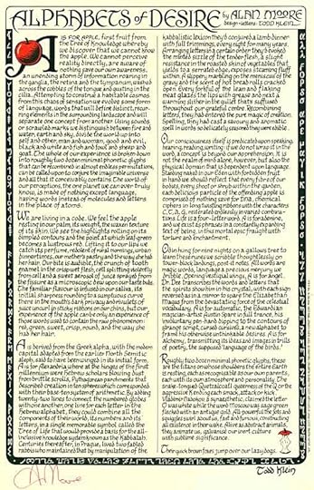
The first signed print I did was with Alan Moore, “Alphabets of Desire.” I had no idea how well it would sell. I priced it at $16, and the initial 500 copy print run sold out in about a week. I did a second printing of 500 that sold more slowly, but eventually that went, too. In the fall of 2008 I did a third printing of 500 copies, and that has sold gradually since, I’m down to about 150. Each printing was signed in different colored ink by Alan, and the second and third printings also say that in the small type on the lower right edge. As with all my prints, I made a few extra copies for myself, and I have one of my own first printing copies on eBay this week. The link is The last one I sold went for lots more than the starting price.
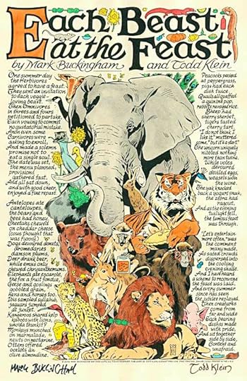
My fifth print in the alphabetical series was “Each Beast At The Feast” in 2010, written by me with wonderful animal art by Mark Buckingham. The print run was 500 copies on pale orange paper, and Mark signed them in orange marker. That version is HERE. I thought it would be cool to do a much shorter edition on paler paper which I could paint with watercolors when I had time. I made 50 of those, as seen above. Mark signed them in black marker and I signed in brown. Painting them was fun, but took lots of time. An article about the process is HERE. In the winter of 2010-2011 I painted 20 copies. I priced them at $50 each plus shipping, and they sold pretty quickly. Earlier this year I painted 10 more copies. I offered them first to my mailing list, and sold six that way. I’ve put one of the remaining four on ebay The starting price is $29.99. No one has bid on it yet, but I don’t expect that will last too long. Hope you’ll have a look. There’s one other print on eBay this week that’s not so rare, and not published by me, but I did the lettering and design. It’s “In Reilig Oran” by Neil Gaiman and Michael Zulli, printed in full color by Neverwear (Cat Mihos) in 2011. That auction is
Sorry for the commercial, back to regular blogging soon.
April 2, 2016
And Then I Read: THE MAGIC STONE by Leonie Kooiker

Any children’s novel with the word “Magic” in it will get a second look from me. I’d never heard of the author, who is Dutch, and seems to have written several dozen books. This is one of only two translated and published in English.
A boy named Chris lives with his family in a suburban home. His friend Frank has a grandmother with a very unusual wheelchair, one with three wheels that is powered by two handles that give it propulsion like a bicycle when pumped up and down. Chris has a plan for him and Frank to take the wheelchair for an unauthorized ride through town. Frank is not keen on the idea, he’s afraid of his bossy grandmother, but Chris convinces him, and they do have an exciting ride, and no one seems the wiser. Unknown to Frank, Chris finds an unusual stone in the wheelchair, and absent-mindedly slips it into his pocket. That evening he has some unusual visions. The next day, with the stone still in his pocket, Chris has an argument with his teacher, and suddenly the teacher thinks he’s a monkey and climbs out the classroom window! Chris is beginning to think the stone is magic, and he’s right, but he doesn’t understand how to use it.
As the story progresses, Chris learns that Frank’s grandmother is a witch, and the stone is the source of much of her power. At first Chris doesn’t want to give it back, but when frightening things begin to happen to him, to turns to the grandmother for help. Grandmother takes Chris on a trip into the country to a lonely house in the woods where she says her sister witch can help them both, but before long that gets even scarier.
This was a well-told story with believable characters and just enough magic to make it fantasy without taking things too far beyond reality. Recommended.
April 1, 2016
Pulled From My Files #38: DC COVER LETTERING
 Images © DC Comics.
After looking at a lot of Danny Crespi cover lettering lately, I thought I’d show a few of my own hand-made ones. My lettering for this cover was very large and very long, so I’m showing it in two parts. The letters are made of brush-strokes, probably a size 3 brush dipped in india ink. The outline is made with a size 0 technical drawing pen.
 As printed, the black letters are yellow on red-brown, and look pretty good that way to me. This issue of JUSTICE LEAGUE AMERICA is #103 dated Sept. 1995. So, after I started doing some cover lettering jobs on my first Apple computer, but for certain styles, I went back to hand-lettering.
 This cover lettering was for IMPULSE #2 dated May 1995. It was a fun way to use Kirby Dots. I would have sketched out the letters in pencil, then made the dots with tech pens, probably several sizes.
 Here’s a section of it larger. The dots are pretty blobby, but that makes it more organic. And like the previous one, this is a technique that would have been a lot harder on the computer. Or at least more time consuming, and probably too precise.
 On the cover the black dots are held in dark red, with an orange fill in the letters. The Kirby Dot effect is lessened by this, but I think it looks fine.
 This cover blurb for JUSTICE LEAGUE TASK FORCE #29, Nov. 1995, is also quite large. I had fun with the ragged letters of DEADLY, and the textures inside, another technique that would have taken much longer on the computer.
 A closer look at part of it. Notice the thin points sticking out of the corners, my way of making them appear sharp when reduced and printed. This was all done with tech pens of several sizes over pencilled letters.
 Sadly, much of my work was buried under too-dark purple coloring this time. That’s how it goes in comics, you can’t win them all. These examples are all from a time when I was scanning and emailing cover lettering to DC rather than giving them the original work, which is why I still have them. I was doing the same thing with early computer lettering. DC would print out what I sent, resized as needed, cut it out and paste it on the cover art. The all-digital workflow we have now is much simpler, but there’s no denying some of the organic flavor and feel is lost.
March 31, 2016
And Then I Read: UNFOLLOW #5

This story took a turn I wasn’t expecting in issue 5, which is usually a good thing. I thought we were going to have all the beneficiaries of the massive fortune of billionaire Larry Ferrell stuck on his Caribbean island fighting it out for the money, since we now know that each one who dies increases the fortunes of the rest. Instead, the 138 remaining men and women are being sent home, or wherever they want to go. This seems like a good thing for them, but as we see, maybe not. The story has been widely told, many of the recipients, or maybe all, are known to social media. That means they are still targets, as at least one of them finds out back in St. Louis.
Several characters’ stories are being followed more closely than the rest, as is only natural with such a large cast, and they’re all interesting and each very different. The writing by Rob Williams is excellent, and the art by Mike Dowling likewise.
Recommended.
March 30, 2016
Rereading: GALACTIC DERELICT by Andre Norton

Cover illustration by Ed Emshwiller.
After enjoying rereading “The Time Traders” recently, I had to go on to the next book in the series, a favorite of my youth. It begins with a new character, Travis Fox, an Apache rancher out looking for a water source in the back country of his brother’s ranch in the desert southwest of America. He sees a helicopter landing in a canyon, and intrigued, goes in carefully for a look. Not carefully enough, he’s caught and brought into camp by a man with as much tracking skill as himself.
That man is Ross Murdock, the lead character of the first book, and with him is Gordon Ashe, also a Time Trader. They’re part of a secret government project that can travel far back in time to prehistoric days, and they’re in search of alien spacecraft they know can be found there. Murdock was in one before. It had been found by the Russians in a similar time-travel scheme, and Ross’s inadvertent contact with the alien ship’s owners had led to the destruction of the Russian ship and bases. Now Ashe is leading a new project to reach another crashed alien ship in this remote location, but again, far in the past. Travis Fox is fascinated, and agrees to join them. They’ll be in the time of Folsom hunters, named for their distinctive stone spear points, about 9,000 B.C., but the mission is urgent, and there isn’t time for the intense training Murdock and Ashe got for their previous mission.
Back they go, and soon are tangling with fierce local people and dangerous animals. The ship is there, but badly damaged, and surrounded by trouble. Just when their luck is looking bad, it changes. They find another smaller ship that seems undamaged, and isolated. A new plan is quickly developed: to bring this entire ship back to their own time for study. Such a large object has never been transported before, but the machines needed are soon being built around the ship. Then their luck starts to change again when a nearby volcanic eruption threatens to send herds of wildlife crashing through their delicate machinery. Just in time the jump to the present is made with Travis, Ross and Gordon inside the ship, along with a technician, Renfry. They arrive in their own time, but the trip triggers an automatic pilot program in the ship. Before they know it, they are blasting into space! Then the real story begins, as four Earthmen become the first to travel to distant planets on the preset course of the ship. They can’t control or change their course, only go along for the ride. And what will be there when they arrive, thousands of years after the ship originally came to our world?
This book was just as much fun to read as I remembered. The space voyage is full of tension and peril, but also full of unknown wonders, and pretty good ones for 1959, when the book was written. Norton was on a roll, clearly, and letting her imagination free in a way she couldn’t with earth-bound stories, good as those were.
Recommended.
March 27, 2016
Easter Egg Coloring 2016
 We’re at Ellen’s sister Ann’s house for Easter, and we’ve done our traditional egg coloring. The participants this year were Ann and her husband Dave, their daughter Ina, Ellen and myself, and my friend Tim. This is us in the process, but nearly done. The Halloween tablecloth was the only plastic one Ann had.
 Here are all the eggs in one basket, literally, a big one. We started with 36 eggs. Most people colored 6 eggs. We have a number of techniques developed over the years using tools like Scotch tape, wax and regular crayons, rubber bands, and food coloring for darker colors.
 After all the eggs are done, there is judging in a number of categories we all choose. Usually the judge is Dave, but this year Ann and Dave’s son Zack wasn’t with us to color, he was at his girlfriend Abby’s house doing pysanka egg coloring instead, so this morning he did the judging for our eggs. Most Abstract is by Tim, Most Unusual is by Ann.
 Most Colorful is by Todd, Most Beautiful is by Ann.
 E for Effort and Most Traditional are both by Tim. This is only his second year, he’s learned fast!

Funniest is by Dave, Technical Achievement is by Todd. The latter used a new tool provided by Ann this year, ring binder hole saver stickers. Worked great!
 Most Creative is by Todd, Judge’s Choice is by Ann. Those are all the ones Zach judged, without knowing who did them. We felt bad that Ina and Ellen didn’t win any awards, so we decided to create special awards for them.

Ina got the Cutest award for her Minions.

This charmer by Ellen is Most Eggzact, whatever that means. Really, all the eggs are beautiful, so the awards are all pretty arbitrary, but we have fun with them.
 Here are the two pysanka dyed eggs that Zack did with Abby’s family. It’s a completely different technique done on raw eggs with stronger dyes and hot wax. We are thinking about trying it next year, if we can get the tools and dyes by then. They take a long time, but are quite stunning, and after dyeing you can remove the wax and also the raw egg, so the shells can last for many years. Abby’s family uses them for Easter decorating.
March 24, 2016
THE DANNY CRESPI FILES PART 4
Here are a few biographical details about Danny from census records found by Alex Jay. In 1930 the family lived on Junius Street in Brooklyn. They were father Sam Crespi, mother Sarah Crespi, Daughter Rachel (age 9) and son Daniel (age about 4). Danny’s birth year is given as “about 1926.” His parents were born in Turkey. By the 1940 census, the family was living on Claremont Parkway in The Bronx. Rachel is now listed as Ray. Social Security records give Danny’s mother’s maiden name as Sarah Asher, and have a birth date for Danny of Feb. 13th, 1926. His date of death is given as May, 1985.
This time we’ll look at pages 13-16 of the collection of cover lettering assembled by Phil Felix.
 PAGE 13. This and all images © Marvel.
I believe all this cover lettering is by Danny. There are several versions of BLACKOUT and MURDER, probably trying different things for the same cover. The wobbly border around “OUT OF YOUR MIND!” is a style we haven’t seen before. Note that all the balloon and caption borders are thick and a similar line weight. Below are the places these were used that I could identify.
“Real Captain America Lives!” from CAPTAIN AMERICA 219, March 1978.
 “Nightmare” and “Out of your Mind” from NOVA #18, March 1978.
 Top burst from HOWARD THE DUCK #22, March 1978. Red letters on yellow read well, but the inks used at the time did not give as much contrast as those used now.
 “Doom” from MASTER OF KUNG FU #61, Feb. 1978.
 Wide balloon from THE DEFENDERS #34, April 1976.
 “ZULA!” from CONAN THE BARBARIAN #84, March 1978.
 “What’s this?” from IRON MAN #82, Jan. 1976.
 “Trapped!” from NOVA #19, May 1978.
 PAGE 14. The arrow at upper right is by Gaspar Saladino. Notice the O’s are less round and the S’s more angular. The arrow border is also thinner. I’m not sure who lettered the arrow below that with “LA OF OPAR” in it. Possibly Gaspar. The rest are by Danny Crespi, I believe. Here are the ones I can identify.
 “Giant!” from DEVIL DINOSAUR #3, June 1978.
 “Omega” from OMEGA THE UNKNOWN #1, March 1976. Lettering by Gaspar Saladino.
 “Assassin” from POWER MAN #33, July 1976. A handsome round caption.
 “Firelord” and “Thunder God” from THOR #247, May 1976. The burning letters are nicely done.
 “Frightful Villain” from POWER MAN #29, Feb. 1976.
 “KLAW!” from KA-ZAR #15, April 1976. Thanks to Kurt Busiek for finding this one.
 “La of Opar” from TARZAN #3, August 1977, but the version on the cover is different from the one on Page 14. The final version could be by Danny Crespi. Note that it was probably relettered to better fit the space available.
 “Battle on a Busy Street!” from MACHINE MAN #4, July 1978. Dark green is not a great choice for open letters, but the light background helps it.
 The three character names are part of a large burst from WHAT IF #9, June 1978. The rest is also lettered by Crespi.
 PAGE 15. “Man Into Monster” is by Gaspar Saladino. The rest looks like the work of Danny Crespi to me. With help from Kurt Busiek, we’ve found them all. Many are from 1974.
 “OZAMM” from WHERE MONSTERS DWELL #29, July 1974.
 “HELL!” from DEAD OF NIGHT #7, Dec. 1974.
 “Man Into Monster” from THE MAN-THING #8, Aug. 1974. Lettering by Gaspar Saladino.
 Avengers names from THE AVENGERS #137, July 1975. The black fill on the background ruins a nice scroll caption by Danny. No one caught the misspelling of “bludgeoning.”
 “Martial Arts Action” from MARVEL PREMIERE #19, Nov. 1974.
 “SHOOT ON SIGHT!” from WESTERN GUNFIGHTERS #30, July 1975.
 “AGE OF BLOOD” from CONAN THE BARBARIAN #42, Sept. 1974.
 PAGE 16. “Eternity Lives” does not look like Danny Crespi’s work, and Tom Orzechowski suggests Irv Watanabe. (It’s too late for Sam Rosen, who would be my first guess.) I believe the rest are by Danny. Here are what I’ve found:
 “I Dream of Doom!” from DEAD OF NIGHT #10, June 1975.
 “Eternity Lives!” from DOCTOR STRANGE #10, Oct. 1975. The burst does not look like Danny Crespi’s work either. The letters are too narrow, and “supreme” should have gone on the third line. Tom Orzechowski writes: “Irv Watanabe did the cover blurbs for Doc Strange #12. He did solid but unadorned title work. Well designed, but no focus on variety.”
 “Dracula battles Doctor Strange” from TOMB OF DRACULA #44, May 1976. “Doctor Strange” is in the style of the then-current logo, but lettered to fit the space.
 “AGE OF BLOOD” from CONAN THE BARBARIAN #42, Sept. 1974. The other lettering was on Page 15.
 “SCALPS!” from TWO-GUN KID #124, June 1975.
 “BOOM!” from MARVEL TWO-IN-ONE #10, July 1975.
That wraps up this post, previous parts of the Danny Crespi Files can be found on the COMICS CREATION page of my blog. More when I have time to research them.
March 23, 2016
And Then I Read: DICEY’S SONG by Cynthia Voigt
 Cover illustration © James Shefcik
Dicey Tillerman is the eldest of four children who have been on the run, but have now found a home with their grandmother in the family home beside the Chesapeake Bay. Dicey had been watching over her siblings since their mother had been committed to an asylum up in Boston, and had been responsible for them during the long and dangerous trip to Maryland. Now she was happy to give up some of that responsibility to Gram.
In school, Dicey soon finds out Gram is considered an eccentric and a loner, but she really does want her grandchildren, and the bond between them grows as the fall progresses. Dicey’s pet project is trying to restore an old sailboat in the shed out back of the house. She doesn’t have much time for school or making friends, but when the chance for an after-school job comes along, she’s happy to take it. And when some of the other kids in school start acting friendly, despite her rebuffs, she finds friends anyway. It’s a good thing, because her sister Maybeth and her brother Sammy are having school trouble, and she and her wise brother James need any help they can get. Gram helps, too, of course, gradually coming out of the shell she’s made of her life. All their lives are changing, and Dicey isn’t happy about that. She doesn’t want to grow up, to put on girly clothes and take on adult responsibilities. Dicey can soon see life is going to force that on her. Especially when the call comes from Boston that her Momma needs them again.
This is an excellent book, beautifully written, insightful, and never preachy. The characters are as real as real. There’s no melodrama. If anything, it’s the opposite of that. It feels like the truth, and spending time with some fine people who are finding their way in a difficult world. The book is a sequel to Voigt’s first book, “Homecoming,” which I haven’t read, but this story is complete and well-rounded as is, nothing important is missing. I can see why it was a Newbery Award winner.
Highly recommended.
Todd Klein's Blog

- Todd Klein's profile
- 28 followers

