
Todd Klein's Blog, page 193
June 12, 2016
And Then I Read: THE MAGICIAN OF HOAD by Margaret Mahy

Cover art © Gene Mollica.
Margaret Mahy is a New Zealand fantasy author whose works are full of complex characters and plots, always rewarding reading. She has won the Carnegie Medal twice as well as the Hans Christian Anderson Award.
Heriot Tarbas is a troubled boy living on a remote country farm in the land of Hoad, far from the capital city of Diamond. His mind and even his body are subject to strange pains, odd visions, frightening dreams, and the feeling that another mind is there with his own, and one that means him harm. Through a long and eventful life he strives to solve these mysteries as well as the puzzle of his own magical powers, which come along unbidden and at first unwanted.
Hoad has a King and royal family, and also a Hero, equal in power to the King, who lives on an island just over the hill from Heriot’s farm. What Heriot experiences there as a boy almost ends his life, but also begins the growth of his own abilities. Those in power in the King’s household are somehow aware of Heriot’s magic too, and try to gather him in, but after an attack by the Hero, Carlyon, Heriot flees the farm and ends up on a battlefield where Hoad and their rival neighbor Dannorad are trying to negotiate peace. Wounded and ill, Heriot is rescued by the King’s third son, Dysart, and a strange connection is revealed between them. Before long, Heriot is living in the royal palace in Diamond learning about his powers, but still troubled, and uneasy about the struggle for power all around him. At times the friendship of a street orphan boy, Cayley, is the only solace he can find.
That’s just the first third or so of this engrossing book, and I enjoyed reading it, though at times the many mysteries in the main characters’ lives make understanding them difficult. It does all get sorted out in the end.
Recommended.


June 10, 2016
THE DANNY CRESPI FILES Part 6
 Images © Marvel.
This time I’m covering pages 21 to 24 of the collection of Marvel cover lettering from about 1974 to 1978—mostly by Danny Crespi—compiled by fellow letterer Phil Felix. Above is page 21. These are all lettered by Danny I believe. If you’re following the series, you should have picked up some clues by now about his style. One obvious one on this page are the heavy panel borders that often extend beyond the corners. Those extensions were cut off when the lettering was photostatted and pasted onto the cover art. Another clue is the right leg of the R in display lettering often turns up at the end. Not every time, but there are several examples here. Danny’s non-display or regular lettering is very wide and very even and regular with little or no “bounce.”

“Monster Triumphant!” is from MARVEL SUPER-HEROES, Jan. 1976. On the original, the thin white spaces between the letters of MONSTER are memorable, but they are largely buried by the coloring here.

“Nightmare!” is from MS. MARVEL #7, July 1977. The color on this one works very well, I like the white reverse on the bottom two lines.

“The Hulk Cracks Up!” from SPIDEY SUPER STORIES #33, April 1978. The drop shadow on “Cracks Up” is lost here with the box filled black, but it still reads well.

“A Duck Possessed!” is from HOWARD THE DUCK #14, July 1977. Note that the structure of these last two boxes is the same: straight open letters on the top line, wavy letters on the second. Works well on both.

“Conan and Zula” from CONAN THE BARBARIAN #86, May 1978. On the original it said “Battles,” here it’s corrected to “Battle.” All the lettering is spooky, the outline on the two words at the bottom add emphasis.

“Photon!” from NOVA #12, Aug. 1977. By making the open lettering fit the space, it gets smaller at the beginning and end, which kills some of the emphasis. In that case I would have made it overlap the circles and all be the same size.
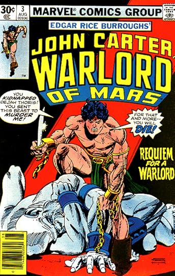
“Requiem for a Warlord” from JOHN CARTER, WARLORD OF MARS #3, Aug. 1977. The circle on the original and the doubled outlines are lost here, but it allows the lettering to fit the space better and be larger without impacting the art. That sort of decision was made by the person pasting the lettering on the art, which could have been Danny himself, or someone else.

“Punisher” is from THE AMAZING SPIDER-MAN #161, Oct. 1976. Looks fine, but in the other caption, “Nightcrawler” is made almost unreadable by the coloring. We may see that one again later.

Page 22. Some of these are cut off, I’m guessing because they didn’t fit on the photocopier’s live area when Phil was first copying them. There’s enough to know what they all are. See if you can find the one NOT by Danny Crespi on this page. I’ll reveal it at the end of my source descriptions.
“River of Death!” is from CAPTAIN AMERICA #208, April 1977. Danny’s shading and texture hold up well against the red color in the letters, very effective.

“Spider Kill!” is from PETER PARKER, THE SPECTACULAR SPIDER-MAN #5, April 1977. I love the whimsical spider webs between the letters.

“They Come From Beyond the Grave” is from AVENGERS #131, Jan. 1975. Again, the heavier outlines on “Grave” are lost when the caption box is filled black, but it still reads well.

“Cathedral Prime!” is from LOGAN’S RUN #7, July 1977. I like the caption shape on this one, and the rough outlines and drop shadow. In this case the color allows it to show nicely.

“Silver Dagger!” is from DOCTOR STRANGE #5, Dec. 1974. Filling the caption box black buries the drop shadow, but the colorist has enhanced “Silver Dagger” nicely.

“Luke Skywalker” is from STAR WARS #2, Aug. 1977. “Strikes Back!” is yellow on green, not very effective contrast, but readable.

“Day of the Doom Wagon!” is from MS. MARVEL #5, May 1977. Danny didn’t often do open letters with no caption box, but it works well here, allowing the art to be more effective.

“Dejah Thoris!” is from JOHN CARTER, WARLORD OF MARS #11, April 1978. Filling black around the open letters has made them look too thin to my eye.

“Mutiny on the High Seas!” is from MARVEL CLASSICS COMICS #27 of 1977. Love the scroll caption and the dot shading. The lettering is a little crowded and small, but it needed to clear the sword.
And the one I haven’t found a source for, “All-New” to “Thoth-Amon!” is by Gaspar Saladino. Notice the different style of burst on the top half: more points, deeper angles, and the rough edges Gaspar liked. On the arrow, the regular lettering is much narrower than Danny’s, and notice how the horizontal strokes touch each other on the E in NEW, something Gaspar did, but Danny did not.

Page 23, all by Danny I believe, except the one at lower right. Some nice textures on HAVOC and SAVAGE LAND. I haven’t found all of these.

“Havoc!” is from THE INHUMANS #10, April 1977. The texture works fine over a red color fill.

“Savage Land!” from MARVEL TALES #81, July 1977. Again, the texture works against the red fill, and this lettering is very effective to my eye, with the banner caption adding depth.
 “In Death’s Dark Waters!” is from MS. MARVEL #8, Aug. 1977. The black fill kills the drop shadow again, but it still reads well.

“Death by Fire” is from THOR #252, Oct. 1976. As usual, balloons are lettered without tails or connectors, which are added when the lettering is put on the cover art.

“The Final Hour!” is from MS. MARVEL #4, April 1977. In this case, the lettering had no caption box or burst, but a burst was added before it was put on the cover, no doubt to make it read better. The added burst is also by Danny.

“Son of Satan” from GIANT-SIZE DEFENDERS #2, Oct. 1974. I wasn’t sure about the letterer at first, but the more I looked, the more Gaspar Saladino style points I found: the distortion of NEW, the small points on the burst, the bounce and angularity of FROM and IT CAME, the flames on HELL all look like the work of Gaspar to me.
I couldn’t find “House of Nightmare,” “Confrontation!” or the circle at upper right.

Page 24, a tough one. I only found four of them. “Zogg the Terrible” was the name of a monster toy produced by Ideal in 1977, so possibly that one was for a custom comic made to go with it, but I can’t find any evidence of one.

“Worlds in Collision” is from FANTASTIC FOUR #153, Dec. 1974. Notice that as lettered it ended with a double dash, and the caption below it could easily have gone along with it. On the cover the first part now ends in an exclamation point. I theorize the second part was vetoed because it might give the impression the villain Doctor Doom was in the story, which he isn’t, and a new caption was made to feature “Mahkizmo,” the actual story villain. This cover is kind of a mess, the lettering does not fit well and is in too many different styles.

“Star Jaws” is from SPIDEY SUPER STORIES #31, Feb. 1978. A Star Wars parody that’s enhanced by lettering slightly similar to the Star Wars logo.

“Raknor the Slayer!” is from KA-ZAR #19, Dec. 1976. I like the white letters on black here for spooky lettering, but in the other caption it looks odd on the banner.

“Asylum Earth” is from CAPTAIN MARVEL #49, March 1977. The squared letters are not typical for Danny, but I think it is by him, probably getting an idea from Gaspar.
That’s all I found on this page. Other parts of this series and more articles you might enjoy can be found on the COMICS CREATION page of my blog. More when I have time.
June 9, 2016
And Then I Read: DOCTOR FATE #11
 Image © DC Comics.
With a cover like this and a story titled “Great Caesar’s Ghost,” we know exactly what we’re in for from writer Paul Levitz and artist Sonny Liew, and they deliver it brilliantly. This ghost is more powerful than most, and yet is under the command of an Egyptian general, the one who caused all the trouble for Khalid’s friends in New York. As usual, Khalid has taken his role of Doctor Fate into a situation he doesn’t really know how to handle. Therein lies the charm of this series, how will the hapless youth deal with the new trouble he’s put himself into? Meanwhile, his neglected life back home is getting more and more precarious. Fun story, charming art.
Recommended.
June 8, 2016
And Then I Read: SURVIVORS’ CLUB 6
 An excellently creepy cover by Bill Sienkiewicz leads off this issue. I have to confess I’m losing track of the characters’ back stories, but they remain interesting and fierce in various ways when attacked by the evil presence of the 1970s video game that has haunted them all for decades. The game seems to have become the embodiment of several kinds of horrible creatures, and its secrets are still unfolding. Chenzira tracks it to its lair of sorts in a small town called Silverweed Cove, which looks like a place one shouldn’t go to. Meanwhile, the two Alices have a house full of “guests,” one of which makes a shocking entrance. Then there are the hanging people being used as hosts for growing larvae. Plenty of jarring incidents and images by writers Dale Halvorsen and Lauren Beukes and artist Ryan Kelly, with some inks by Mark Farmer.
Recommended.
June 7, 2016
And Then I Read: JACKED #6

Writer Eric Kripke and artist John Higgins (Glenn Fabry on covers) wrap up their cautionary tale with this issue. It’s been a story of the perils of drug use–in this case the mail order pills called “Jacked”–which in this story not only create a feeling of euphoria, but actual super-powers as well. Of course, Jacked is addictive, and when the protagonist, middle-aged family man Josh runs out of it, he finds himself in even more trouble than he was when taking the pills. His wife and kids are being held hostage in their home by a drug lord, Ray, who wants MORE of the pills himself. The creator of the drug is with Josh, but has no clue how to recreate the prescription. Jessica, Ray’s ex-girlfriend is also with Josh, and wants nothing more than to shoot Ray. Josh himself is in bad shape: wounded in the arm and suffering withdrawal symptoms and drug hallucinations. Is there any way he can possibly save his family at the very least?
Well done, nice conclusion, though very violent. Recommended.
June 5, 2016
Pulled From My Files #42: WEB OF SPIDER-MAN

Images © Marvel.
Some time in 1984 I was contacted by Marvel editor Eric Fein and asked to submit logo design sketches for a new title, WEB OF SPIDER-MAN. This is the first of four sketches I did using markers on typing paper. It uses the webbing from a decades-old AMAZING SPIDER-MAN logo and a similar shape, but with different letter forms.

Sketch 2 is in straight lines with another style. This would have taken the least amount of space on the cover of the sketches I did.

Sketch 3 is very tall and would have taken up a lot of cover space. The style is based on the pointy Spider-Man logo revision I had recently done, which was in turn based on my Sabretooth logo for Marvel. This one is hard to read and the least successful, I think.
 Sketch 4 is another straight-line design that’s also pretty tall. Not so easy to read, but I think it would have been easier in color. I like this version of WEB OF the best, and probably should have done the whole sketch like that.
 When the first issue came out it featured a logo by someone else, probably Jim Novak. I was not asked to do more work beyond my four sketches, and was probably paid a kill fee, usually about a third of a finished logo rate. So it goes sometimes.
June 3, 2016
Incoming: CLEAN ROOM BOOK 1

Cover art by Jenny Frison.
CLEAN ROOM is the first time I’ve worked with writer Gail Simone. I’m impressed, this book is scary on a gut level, beautifully written and unpredictable. The characters are fascinating, the art by Jon Davis-Hunt is excellent, and I’m delighted to be lettering it. Well worth a look.
June 1, 2016
And Then I Read: THE BIG CHUNK OF ICE by Bertrand R. Brinley
 Illustration by Charles Geer.
The final story featuring the Mad Scientists’ Club, published posthumously in 2005. Like “The Big Kerplop!” it’s a novel, but unlike any other adventure in the series, it takes the Club far from Mammoth Falls, to the Alps in Austria.
Professor Stradivarious, the scientist introduced near the end of the previous novel, drives the story this time. He has a research trip planned to a glacier in the Alps which he wants to study, measuring the speed of the ice flow among other things. He needs help, and enlists the entire Mad Scientists’ Club, who will get a free trip with all expenses paid in exchange for their work. Also going are two students of the Professor, Angela and Angelina. The method of travel is unusual, they go by blimp! It seems the Professor has a blimp that he used to escape from Europe during World War Two, and it still works. Not surprisingly, all the parents, and indeed the entire town, are fine with this trip, and give the group a good send-off. The blimp flight is already filled with some unusual adventures, and when they arrive in the town of Heiligenblut, where they will be staying, the entire town there turns out to welcome their old friend, the Professor, too.
Once they get started with their research, things become stranger and stranger. People keep warning them of the dangers around them, and several groups seem to be watching and following them. Indeed, three of the party are trapped in a crevice by an avalanche, one that seems to have been started intentionally by gunshots. When the team moves their base to an ancient, haunted castle overlooking the glacier, things get weirder still. The castle caretaker is a very small man with a malicious bent who likes to play tricks on them. Henry Mulligan and the other Club members soon find plenty of mysteries to solve: who is living in the sealed room and watching them with a telescope? Who is making broadcasts from the castle? What do four lawyers who keep following them want? And what about the mystery of the diamond smugglers who fell into a glacier crevice and died a hundred years earlier reportedly while possessing the world’s largest diamond? Is that what everyone is after? Is that the real big chunk of ice?
I have to say that I didn’t enjoy this book as much as “The Big Kerplop,” for several reasons. First, by taking the group out of their home territory and putting them under the charge of others, much of the group’s independence and initiative is lost. Henry Mulligan still comes up with some good scientific ideas, but it’s not quite as much fun as when they’re free and on their own. Second, Brinley has made heavy use of dialects that get annoying, particularly the German/Austrian one of the Professor. One of the girls speaks in “hippy lingo,” which seems very dated, and the girls also introduce a game of making geographic puns that continues through the book and gets tiresome. The adventures and mysteries are fun, but are wilder and harder to believe than most of the previous ones in the series.
That said, I did enjoy some aspects and parts of the story, and if you are a fan of Brinley’s Mad Scientists’ Club, you’ll certainly want to read this final adventure. Mildly recommended.
May 31, 2016
And Then I Read: FUTURE QUEST #1
 Image © 2016 Hanna-Barbera.
While much of comics fandom is focused on the DC UNIVERSE REBIRTH and CAPTAIN AMERICA, I had more fun with this rebirth of some cartoon adventure heroes. I did not watch any of the cartoon shows they’re from, and I only recognize Space Ghost and Johnny Quest, but I found this first issue easy to understand and enjoy anyway.
After a prelude on a distant world where a battle has raged between opposing forces, the main story comes to present day Florida where the thrill-loving boy Johnny Quest and his friend Hadji are trying out some cool jet-pack flyers. Watching over them in a helicopter is pilot and bodyguard Race Bannon, along with Johnny’s dog Bandit. Things turn serious when they’re attacked by Dr. Zin, and things get stranger when Vortexes to other worlds open up allowing strange beasts and beings to emerge. Visiting Johnny’s father, Doctor Benton Quest is another hero, Birdman, who flies off to help, and the action and adventure roll on from there. The story by Jeff Parker is entertaining and even though it introduces so many characters, the focus stays on Johnny and his friends for the most part, allowing readers to get to know them.
This is fun stuff, and I loved the art. Most is by Evan “Doc” Shaner, but there’s a seven-page segment by Steve Rude, too, that steps up the game even more. I’m certainly going to try more of this series. Recommended.
May 30, 2016
Our Backyard Zoo
 Images © Todd Klein.
This time of year animals are roaming, either looking for mates, or new food sources and territory. We get a good variety of birds coming to our bird feeders, but this one was a surprise, a lone hen Turkey! She looked over the yard carefully, watching the other birds at the feeders…
 …then came into the back yard. If you’ve ever wondered where the dinosaurs went, watch one of these guys for a few minutes!
 Soon she was pecking up sunflower seeds on the grass around the feeder.
 The cats were not on the porch when the Turkey appeared, but before long, Tigger had spotted her. He seemed startled and a little afraid as they eyed each other. No wonder, the Turkey is much larger than Tigger!
 Soon Leo had joined him, and the Turkey now began to make short nervous sounds. She circled the yard and then headed off into the woods. Perhaps she’ll be back, but Turkeys have a large territory, and usually travel in flocks, so I don’t know what this single was was doing here.
 That was yesterday, today on a rainy Memorial Day there was a Box Turtle walking across the back yard in the rain. The cats and I watched it, too. It’s a regular zoo around here lately!
Todd Klein's Blog

- Todd Klein's profile
- 28 followers

