
Todd Klein's Blog, page 162
August 22, 2017
My Partial Eclipse Photo
 There are lots of great total eclipse photos from yesterday, but I haven’t seen any of the partial eclipse (about 75% coverage) in our area that I like better than this one. Took about 20, only one worked, but I think it worked well.


August 21, 2017
Sand Sculpting with Tim, 2017
 My friend Tim (since 4th grade!) was here this weekend, and as we like to do, we spent much of the weekend doing sand sculptures at the beach. In 2015, Tim discovered the work of sand sculpture wizard Calvin Seibert, go to the link to see his amazing work, and since then Tim has been trying to emulate Calvin’s methods and concepts. This year on Saturday he did quite well with that, as seen above. The hemisphere was made with the help of a special tool called a Willy Sphere, with different sizes that make different size globes of sand. The rest is all Tim’s hard work, patience and skill.
 Later in the day his sculpture looked like this. Two of Tim’s home-made tools are seen here, new this year.
 I also tried to do something in the Calvin Seibert line, but it’s not nearly as good. I don’t have the patience, skill or tools to do it as well, but I had fun with it anyway.
 The other side, which Tim thought looked like a Spanish mission.
 Later in the day my sculpture looked like this. The dormered façade fell, and I then added a wall.
 On Sunday we were back near some rocks, all that shows of a buried jetty. Rather than large structures, we decided to decorate the rocks and surrounding sand with smaller structures, mostly simple geometrics. In the front here are partial spheres made with the Willy Spheres of different sizes.
 Looking from the other direction with Tim’s largest and best sphere closest to the water.
 This shot reminds me of a moonscape, specifically the one in the film 2001 where they were excavating the monolith.
 Here’s that ball of Tim’s as the waves moved in.
 And the arch I built between two rocks just after a wave put water through it. Shortly after this, it fell to a higher wave, and we left the rest behind as we headed home. Always fun to make things with Tim at the beach!
August 18, 2017
Pulled From My Files #61: BATTLEAXES Logo
 Images © DC Entertainment.
In early 2000 I was asked by DC to create a logo design for BATTLEAXES, an upcoming miniseries from Vertigo. Here’s my initial idea, playing heavily on medieval ornaments and actual weapons as letters. My note about the double T addresses the concern that they might stick up too far, and could be lowered. My note at the left is from a phone conversation about the logo and requested changes: lose the gem stuff, and lose the axe/knife in the letter X.
 I think I was also told to make it rougher overall, and that’s another thing I did in this second version. Except for the two swords, these letters might have been made of rough-hewn stone. This was closer to what they wanted, but I was asked to leave out any texture in the letters and perhaps make them a little less rough.
 I drew and inked this version on vellum, probably lying over the second version above, simplifying and adjusting as I worked. I did heavier outlines on just the first two letters to see how they would look, but planned to do most of that on my Apple computer. I scanned this drawing, and traced it in Adobe Illustrator.
 Here’s the result. I would have just traced the inner edges of the letters. The thick outline was created by putting a copy of those outlines behind and adding a thicker stroke to the shapes.
 One more version was requested with the center horizontal pieces angled. I don’t have a version marked final, but this seems to be it.
 The printed version of the logo has lots of texture added in Photoshop, and there are some minor changes to the letter shapes. Most obviously, the center piece of each E has been lowered a bit. This was probably done by cover artist Alex Horley when he put the logo on the cover. Different colors were used in the logo texture for each issue. I think it looks fine. A fun one to work on, even if they didn’t go for all of my elaborate ideas!
August 17, 2017
And Then I Read: WONDER WOMAN #21
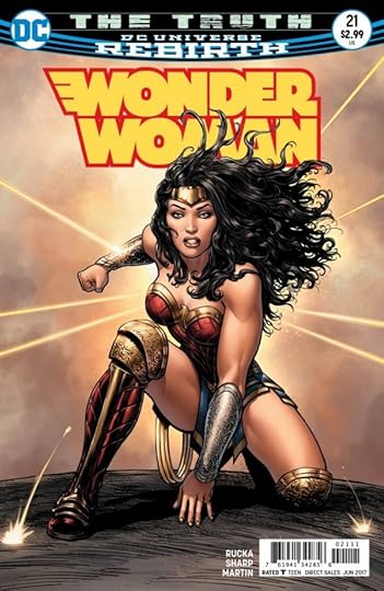 Image © DC Entertainment.
In the odd-numbered issues of this title, we are up to Part Four of “The Truth,” taking place in the present time. Wonder Woman and Steve Trevor are under attack by Colonel Maru and her guns-for-hire, and Diana has already been shot by Maru. Apparently her bullet-deflecting bracelets do not always get there in time! Meanwhile, Veronica Cale, her faceless daughter, and the godlings Phobos and Deimos turned into dogs, are arriving at a remote island in the Black Sea, where they and Cheetah hope to open a portal to Themyscira. That place where Wonder Woman was raised can no longer be reached by Diana, or anyone as far as she knows, but Cale has a plan, and she is driven by the need to get her daughter’s soul and face back. She’s been told it’s there. Meanwhile, in Themyscira, the Amazons and their queen stand before their side of the gateway ready to do battle with whatever comes forth. When Diana and Steve arrive on the gateway island, she’s attacked by her former friend Dr. Minerva, now once more Cheetah, who feels herself betrayed twice over by the Amazon. Then things really open up! Fine story by Greg Rucka, wonderful art by Liam Sharp.
Recommended. Four issues to go in this run.
August 16, 2017
Photos of H.G. Peter, Wonder Woman co-creator
 If you search for photos of Wonder Woman’s first artist and co-creator, Harry G. Peter, the one you are most likely to find is this one, a publicity photo from the All-Star Comics offices, around 1940, showing William Moulton Marston (seated left) Harry G. Peter (standing left), editor Sheldon Mayer, and publisher M.C. (Max) Gaines. When I was researching the early DC offices and employees, this was the only one I could find. (This version was tweaked by Paul Guinan, there are many versions out there of poorer quality.)
In June of this year, Jackie Estrada posted on Facebook that she was searching for a photo of Peter to use at this year’s Eisner Awards in San Diego, as Peter was being inducted into the Hall of Fame. Many people tried and found nothing new, but Alex Johnson came up this this image:
 He saved it from an eBay auction of Peter’s personal effects in 2016. Looking for that, I found this on Bryan Hayes’ “Hayfamzone Blog”:
An interesting lot of personal effects from the estate of original Wonder Woman artist Harry G. Peter is now up for bid on ebay! Maybe you’ll be interested in the National Cartoonists Society group photo shown above, featuring Rube Goldberg at third from the left and Frank Robbins at far right. Or maybe you’re curious to see a Wonder Woman Christmas card that Mr. Peter drew, shown below. The lot even includes the gentleman’s wedding certificate! The bidding lasts a few more days and, while it’s available, you can investigate the auction description over here.
Sadly, the auction link is gone, and the images the Bryan put in his blog article are also gone. The one above is all we have from that auction other than a photo labeled as Peter’s wife that Alex Johnson also saved. No other information about these photos is out there, but I later learned from Jackie Estrada that she had been in touch with a friend of a friend who was the winner of the auction. That person, who apparently wishes to remain anonymous, was willing to give her a different photo of Peter for the Hall of Fame slideshow as long as it wouldn’t be used anywhere else. I asked Jackie if she could put me in touch with this person, but haven’t heard anything, so I’m guessing he doesn’t wish to be contacted. Could it be a comics historian gathering material for a book or article? Or just a Wonder Woman fan who does not like to share? In any case, it’s a shame that we can’t add his images of Peter to the public knowledge base online.
 I did some tweaking to the photo above, and offer it as at least one alternate photo of the elusive Harry G. Peter. This is him as a young man, which at least gives us another reference point, as the All-Star photo shows him as a much older one. I hope more of the mysteriously held images of Peter surface at some time in the future.
August 15, 2017
And Then I Read: WONDER WOMAN #20
 Image © DC Entertainment.
I’m well behind on this title, but actually I’m savoring the last few issues of this Greg Rucka run. In Part 3 of Godwatch, Doctor Cale’s quest to cure her daughter has her calling up the ancient witch Circé, as seen on the cover. Circé in this incarnation is a charming trickster who seems to have no problem staying one step ahead of Doctor Cale, her digital assistant, and Wonder Woman. Cale also wants revenge on Phobos and Deimos, who have taken her daughter’s soul and face, and Circé’s plan will give her that as well. Meanwhile, Diana is confronting Cheetah in Greece, and then fighting terrorists in Qurac, but is drawn into Circé’s plan without even knowing it. What happens when the plan is fulfilled and the trap sprung is going to mean even more trouble for everyone. Great story by Rucka, nice art by Bilquis Evely.
Recommended.
August 14, 2017
Rereading: THE VOYAGES OF DOCTOR DOLITTLE by Hugh Lofting
 Above is my much loved and much battered copy of this book. It was already battered when I bought it for five cents at a book sale, an ex-library copy from my own grade school in Bedminster Township, New Jersey. The book was first published in 1922, the second published book in the Dolittle series by Lofting. This was the 11th printing in 1929, so clearly it was popular and sold many copies from the start. It is, in my opinion, the best of the series.
The kind, bumbling but strong-willed human doctor who learns the languages of the animals through his parrot Polynesia and becomes the most successful and well-known veterinarian in the animal kingdom (at least among the animals themselves) was introduced in 1920’s “The Story of Doctor Dolittle,” reviewed by me in the link. It’s a fun, if improbable story with lots of great characters, many of them the animals that the Doctor considered his family. What the second book added that greatly improved the concept was the character of Tommy Stubbins, who narrates this book. Tommy is a young boy in Dolittle’s home town of Puddleby-on-the-Marsh in rural England. He’s the son of a cobbler, but he has a desire to see the world, a wanderlust that is unlikely to be fulfilled until he meets the Doctor and becomes a part of his family too. By seeing the unusual man and his animal companions through fresh, wondering eyes, Tommy Stubbins gives us, the readers, a new, deeper understanding of all the characters, and allows us to become part of the story. Tommy’s parents are puzzled by his new friends, but when the Doctor offers to employ Tommy in his own home as his assistant, with room and board included, and seeing their son wants this very much, they agree. Soon Tommy, with the help of Polynesia, is learning the animal languages too, and is a vital part of the Dolittle household.
Tommy knows that Dolittle and his animals have made several ocean voyages of discovery and adventure, in Africa and elsewhere, and more than anything he wants to go on one of them. The perfect reason for a new voyage arrives when the Doctor learns that his fellow naturalist, the native American Long Arrow, has disappeared on Spidermonkey Island in the south Atlantic Ocean. Dolittle decides he must sail there and try to find Long Arrow, who he greatly admires but has not yet met. Spidermonkey Island is a strange place: it’s a floating island that moves around the South Atlantic, but with help from his animal friends, and a sturdy ship he buys, the Doctor is sure he can get there. This begins an epic voyage that is a delight to read and full of exotic adventures, great characters, humor and wonder, enhanced by Hugh Lofting’s quirky but appropriate drawings. Forget the movie versions, this is the real deal.
Highly recommended!
August 13, 2017
Pulled From My Files #60: BLAZE, BLACK & WHITE Logos
 This and following images © Marvel.
In 1994 I was asked by Bobbie Chase at Marvel to submit ideas for a Blaze logo. This was to be a spin-off from theIr GHOST RIDER series, and its main character Johnny Blaze.
 I liked the logo of that series, though I don’t know who designed it, and I thought I would follow its lead as far as having flames around the letters. My first marker sketch used letters that were similar to others I’d used on Marvel logos at the time with lots of sharp points. Marvel liked that.
 My second sketch used somewhat similar letters, this time without the arc and slanted to the right. No drop shadow, just a heavy rough edge around them.
 My third sketch used the same idea but going back to more curved shapes and an open drop shadow. I submitted these sketches, but Marvel did not go with any of them. I would have been paid a kill fee, and that was the end of my involvement.
 The final logo (designer unknown to me) used a symmetrical design with only a very stylized suggestion of flames at either end. Some of the letter forms are similar to mine.
 A more complex version with bevels appeared on some issues, and I suspect this was the original final design that was simplified for the one above. The bevels add dimensionality, but remove any hint of flames from the framing device. It’s an interesting design, maybe a bit hard to read.
 This and following images © Art Thibert.
Also in 1994 I was contacted by writer/artist Art Thibert who was preparing a miniseries to be published by Image Comics. I don’t recall the details, or whether he supplied me with ideas or suggestions. The comic was to be a superheroic team of opposites, a bulky man in black with a slim woman in white. I had way too much fun playing around with the visual contrasts of the opposite colors. This design was clever, but rather hard to read and not very appropriate for superheroes.
 If anything, this marker sketch is even harder to read, and much too clever for its own good.
 Version 3 is a more sensible approach, and one that I think could have worked. You can see where I had put in more star-shapes in all the letters, but thought better of it and covered them up except for the first one in each word. Art Thibert was not happy with any of these designs, and decided to go another way.
 The final logo, designer unknown to me, used simpler block letters, not too different from my version 3, in a straight line with a cryptic ampersand for “and.” It’s certainly easy to read and appropriate for a superhero comic.
August 10, 2017
And Then I Read: LARK’S KILLER PREVIEW
 Image © Lark’s Killer LLC.
I worked with Bill Willingham for many years at DC Comics, mostly on FABLES, and I love his writing. So when he offered me this preview of his new comics project at SDCC, I was happy to get it.
In an unusual move, the story is framed by a sequence taking place almost 100 years AFTER the main story, showing that Bill has things planned out thoroughly. In the frame, three treasure hunters are attempting to penetrate the lair of a dragon to capture his reputed riches. To do so they must defeat monsters and solve the maze of passageways to reach the center. When they reach it, the dragon is very different from what they expect. Meanwhile, the main story is about their famous ancestor, a feisty girl thief who seems to be from our own world, Lark. As her story begins, Lark has apparently been somehow transported from shoplifting at Walgreens into a medieval fantasy world she knows nothing about. Nothing except that there are three men trying to catch and kill her! Luckily, Lark is quick on her feet, and quick-witted enough to evade her pursuers, at least for a while. Lark doesn’t understand the world she’s now in, though, and when she flees into an inn looking for help, she seems to have gone from the frying pan to the fire.
This was a fun read, and at 33 pages, a good chunk of story that introduces intriguing characters and ideas. Willingham has always excelled at portraying tricksters, and this book has plenty of them. The art is by Mark Dos Santos, whose work I don’t recall seeing before, though he has plenty of credits covering the last 15 plus years. It’s a bit too cartoony for my taste in a story of this kind, pulling it toward Anime or Disney, but he certainly draws well and knows his stuff.
This was a fun read from a friend and favorite comics writer. I hope the book does well, and I look forward to seeing more of it. Recommended.
August 7, 2017
See you in Baltimore?
 I’ll be a guest at this year’s Baltimore Comic-Con, Sept. 22-24. I’ll have a table where I’ll be selling my prints and perhaps other things, and I’ll be attending the inaugural ‘Ringo Awards as a nominee. That’s all I have planned so far. John Workman and his wife Cathy will be there, and several other letterers, so perhaps a lettering panel will be arranged, but I haven’t heard anything yet.
If you’re going and would be willing to help out at my table, I have openings on Saturday and Sunday for volunteers. I will be by myself, so I’m looking for someone to cover the table for perhaps an hour or two total, watch my stuff, perhaps make sales, allowing me to take some breaks. I can offer you some prints and lunch money as payment. You’d be welcome to hang out at the table as much as you like when I am there. Email me if you’re interested. Baltimore is a fun show, and one that focuses on comics rather than other kinds of popular entertainment. Hope to see some of you there!
Todd Klein's Blog

- Todd Klein's profile
- 28 followers

