
Todd Klein's Blog, page 153
January 4, 2018
And Then I Read: THE FLASH #24
 Image © DC Entertainment. Written by Joshua Williamson, art by Carmine DiGiandomenico and Pop Mhan, colors by Ivan Plascencia & Hi-Fi, letters by Tom Napolitano.
Barry Allen has been forced to put aside his worrying and tackle a tangible threat: Multiplex, a madman who can make as many duplicates of himself as he needs. Hal Jordan is there to help, fortunately. Meanwhile, the Reverse-Flash has captured Iris and Wally West. Wally takes him on as Kid Flash, but his powers seem to be unequal to the task. The two stories converge in the 25th Century.
This was an enjoyable read, with lots of action but also some good character moments. Reverse-Flash seems to keep turning up, but he is a good foil for the Flash team.
Recommended.


January 2, 2018
And Then I Read: WONDER WOMAN #25
 Image © DC Entertainment.
The conclusion of Greg Rucka’s recent run on WONDER WOMAN is something I almost hated to read because I wish it had gone on longer, but having read it, I feel satisfied with the story Rucka told. Some of this issue is, inevitably, set up for the next person, putting the toys back in the toybox. One good thing about that is, there’s a sense of closure which is rare in monthly comics today.
Diana is angry. Her golden lasso is gone to bind two gods, and her Justice League partners, among others, notice immediately. Wonder Woman’s furious defeat of The Shaggy Man is one aspect of her anger, and her friends want to help, but Diana isn’t ready to tell them everything. In Washington, The Picket, Etta’s dark ops group, is getting back into operation, and they would just as soon Wonder Woman was not involved, which will come as a shock to their operative Steve Trevor, who has a surprise waiting for Diana whenever she can get to it. Doctor Cale seems to have gotten away with all her evil doings, and rebuffs the FBI with lawyers at hand. Diana has a request for her that doesn’t get a good answer. Diana’s biggest challenge this issue is to face her patrons, the gods of Themyscira (and Olympus). That confrontation is almost the best part of the issue, and stunningly depicted by Liam Sharp. Almost.
Fine work by everyone involved. Recommended.
January 1, 2018
DC Comics Offices at 666 5th Avenue Promo Video, 1984
 This and all images © DC Entertainment.
Yesterday I received a link to a wonderful artifact from my own and DC Comics’ history, a promotional video made in the DC offices recently posted on YouTube. The link is HERE.
It was a joy to watch because of all the people in it that I used to work with (and I’m there too), and I think makes an excellent companion piece to my articles about the DC offices in this building, beginning HERE.
It was produced for DC by Lynn Vannucci Productions. I found only one other reference to that company, another video produced for DC in 1985: “A Chat with Alan Moore.” I’m not seeing that one on YouTube, though one reference says it was there in 2014. A Lynn Vannucci wrote a novel, “Coyote” that was published in 1987 by Bantam, could be the same person. If so, she had a Facebook page that uses the same photo as the book’s author page on Amazon.
This was a very small-time production, one actor: Matt Sarles playing reporter Jack Ryder (the alter-ego of The Creeper in comics) and an unseen cameraman, Bruce Robertson. I found an entry on Linked-In for Matt Sarles (at least it certainly looks like the same person) HERE. He seems to be teaching English in China. All footage is hand-held as Sarles interviews DC editors and some writers and artists, mostly in the DC Conference Room, with an opening bit in the reception room. This was obviously a promotional effort meant to be shown to retailers and fans, and nearly all those talked to promote specific upcoming or ongoing projects. I’m going to run through who’s talking and what’s talked about to see if we can get a better handle on when it was made, though the video is © DC Comics Inc. 1984.
 This logo for DC’s 50th Anniversary is shown at the beginning, and the video title on YouTube is:
DC Comics 1984 Kick-off 50th Anniversary Editorial Party
If you take the first comic published by Major Malcolm Wheeler-Nicholson as the beginning of the company, that was NEW FUN #1, which hit newsstands in January, 1935:
 NEW FUN became MORE FUN, and was soon joined by NEW COMICS (ADVENTURE COMICS), DETECTIVE COMICS, and the beginnings of ACTION COMICS before Wheeler-Nicholson was pushed out of the company he started a few years later by Harry Donenfeld and Jack Liebowitz. Kind of ironic for DC to celebrate that heartless beginning, but it does make 1985 the 50th anniversary year.
 The video opens on 5th Avenue with a hapless “Jack Ryder” dropping his hat several times, and pointing up at the 666 sign before entering the building. Sarles has some fun with the Clark Kent statue that sat in the reception area at 666. The outer door with porthole can be seen briefly.
 Receptionist Ruthie Thomas Chisolm greets “Jack Ryder,” an actress playing Wonder Woman meets him to bring him into the offices, and soon we’re inside, heading into the Conference Room, where a party is underway.
 The first person interviewed is editor Karen Berger (2:01), who talks about SWAMP THING, specifically the “American Gothic” storyline written by Alan Moore, which began in SAGA OF THE SWAMP THING #37 cover dated June 1985.
 Also seen is the first of many pieces of promotional art, not printed comics. I think these were large photostats that were hand-colored by production staffers like Bob LeRose.

This art appeared on the cover of SAGA OF THE SWAMP THING #38, cover dated July 1985 with very different colors by Tatjana Wood. The issue would have hit newsstands in May 1985, and probably went to the separator and printer around March 1985.
 Next up is editor Julius Schwartz (2:54), who promotes an Ambush Bug Mini-series, a Superman Annual by Alan Moore and Dave Gibbons, and hints at his upcoming Science Fiction Graphic Novel series. The first AMBUSH BUG miniseries is cover-dated June-Sept. 1985. SUPERMAN ANNUAL #11 by Moore and Gibbons went on sale in May, 1985. The first SF Graphic Novel, “Hell on Earth,” went on sale in Sept. 1985.
 Next is writer/editor Michael Fleisher (4:27) promoting HEX, a relaunch of western character Jonah Hex in a dystopian future. The first issue went on sale in May 1985.
 Writer Gary Cohn (5:18) is next promoting he and co-writer Dan Mishkin’s BLUE DEVIL, which ran 22 issues from (cover dates) June 1984 to March 1986. He also mentions the miniseries CONQUEROR OF THE BARREN EARTH which was cover-dated Feb.-May 1985.
 Editor Bob Greenberger (6:02) talks about the DC CHALLENGE maxi-series, and V, based on the TV show. DC CHALLENGE ran from (cover dates) Nov. 1985 to Oct. 1986. V ran from Feb. 1985 to July 1986. The first issue of V went on sale in November, 1984, and Bob talks about the TV production company’s high opinion of it when they saw it, so that would date this video to not long after that, probably mid to late November 1984, which seems right to me.
 Artist Richard Howell (7:17) promotes the mini-series THE SHADOW WAR OF HAWKMAN, which was cover-dated May-Aug. 1985. Writer Tony Isabella gets a shout-out.
 Writer/editor Paul Kupperberg (7:46) promotes ARION, LORD OF ATLANTIS, which was ongoing, the final issue appearing with a Sept. 1985 cover date.
 Editor Nick Cuti (8:33) talks about the reprint series he’s working on, specifically Deadman by Neal Adams, and a WARLORD Annual with a first map of Skartaris, where the series takes place. Note a brief appearance by artist Ross Andru behind Nick. The DEADMAN reprints ran from May to Nov. 1985. WARLORD ANNUAL #4 with the map went on sale in April, 1985.
 Editor Andrew Helfer (10:07) talks about a new direction for GREEN LANTERN with writer Steve Englehart. The Englehart run began with issue #188 cover-dated May 1985.
 LEGION OF SUPER-HEROES penciller and inker Steve Lightle and Larry Mahlstedt (10:51) talk about new characters and aliens coming up in their book, but nothing specific.
 Artist Ron Randall (11:40) talks about the graphic novel ME AND JOE PRIEST, which went on sale in August of 1985.
 He also briefly introduces his editor, Janice Race (12:37).
 Editor Alan Gold (12:56) promotes a RED TORNADO miniseries, and a return for SWORD OF THE ATOM. The Red Tornado mini has cover dates of July-Oct. 1985. the latter reference is probably to SWORD OF THE ATOM SPECIAL #2 which went on sale in April 1985.
 Writer/editor Marv Wolfman (13:35) talks about TEEN TITANS and VIGILANTE, but not specifically enough for me to pull issues. He also mentions CRISIS ON INFINITE EARTHS, which was cover-dated April 1985 to March 1986.
 Editor-in-Chief Dick Giordano (15:07) has some fun with the character of Jack Ryder, who he edited when the character first appeared from DC years earlier, and talks about a planned series of crossovers with publisher First Comics beginning with Batman and Jon Sable by Mike Grell. Sadly, that never happened.
 Next “Jack Ryder” talks to Advertising and Sales Manager Linda Robak (16:58), who models some DC character sweatshirts.
 Writer/editor Mike W. Barr (17:43) talks about the wedding of Metamorpho in BATMAN AND THE OUTSIDERS ANNUAL #2, on sale June 1985, and STAR TREK ANNUAL #1, on sale July 1985, featuring the first mission of Captain Kirk.
 Writer Don McGregor (18:58) talks about the second NATHANIEL DUSK miniseries, which is cover-dated Oct. 1985 to Jan. 1986, and unlike anyone else in the video, he has some photocopies of the artwork in hand, though it’s too small to see well.
 Writer/editor Len Wein (20:14) talks about WHO’S WHO IN THE DC UNIVERSE, the first series, the first issue of which was cover-dated March 1985.
 The penultimate speaker is…ME! (20:49) promoting OMEGA MEN, which I was then writing. I have no memory of doing this, and it was as much a surprise to me as anything here, but also fun to see. Wish I still had that suede vest, but it probably wouldn’t fit now…
 And the program ends with a nice toast from editor Joe Orlando, a triple toast. First, to the people who began the company (without naming anyone specifically), then to the current staff keeping things going, and finally to the fans. A very classy closing.
Also seen in that final screen capture is production man and colorist Bob LeRose at left. Elsewhere I spotted the following staffers: Bruce Bristow, Albert DeGuzman, Denise Vozzo-Conaty, Pat Bastienne, Peggy May Ordway and Helen Vesik. I’m sure there are more that I missed. Thanks to Karen Berger to sent a link to this video my way yesterday, it brought back many fine memories!
December 31, 2017
Ira Schnapp in BUZZY
 This and all images © DC Entertainment.
Continuing my research into the comics lettering work of Ira Schnapp, BUZZY was National (DC) Comics’ first attempt at a teen humor comic, probably spurred by the success of Archie Andrews and company over at MLJ, soon to become Archie Comics. National’s approach was more akin to the college humor magazines like LIFE, JUDGE and COLLEGE HUMOR, particularly the style of John Held Jr. seen on this LIFE cover from 1926:
 Not as heavily stylized, but getting cues from 1920s jazz age fellows and flappers. The writer on most early stories was Alvin Schwartz, and the artist was George Storm. The cover lettering on early BUZZY issues has some style similarities to the work of Ira Schnapp, but not enough to convince me they were lettered by him, though it’s possible.
Buzzy himself is a jazz-mad teenage horn-player who is sweet on Susie Gruff, and hated by her father Popsy Gruff, as seen on the cover above. His rival is an oddly vampirish boy named Wolfert, always after Susie too. Storm left the title around issue 20, and the art and writing soon became much more like Archie Comics.
 Though the art style had changed by issue #30, the cover lettering is still quite similar to the earliest issues, and probably not by Schnapp. It might be by the unknown letterer I call Proto-Schnapp because of his many similarities to the work of Ira, and I think the person Ira used as inspiration.
 Issue #43, May-June 1952, is the first one I think might have been lettered by Ira. Note that cover lettering on BUZZY was much simpler than most other DC covers of the time, often a single word balloon or sign, so it’s a little more difficult to pick up style points.
 Issue #47’s larger balloon with open letters is more typical of Ira Schnapp’s work, and the first I’m sure is definitely by him.
 I don’t think the balloon on issue #48’s cover is by Ira, but I do think he created this new logo for the book, using the same letter shapes as before, but more even and aligned. It’s possible Schnapp designed that first BUZZY logo too, I’m not sure about it, but this one is definitely in his style.
 Another cover NOT lettered by Schnapp, in my opinion. The balloon shapes are wrong, the letters are too thick overall, and the question marks are also wrong.
 Issue #54 is by Ira, using a shaky style for the first two words and the balloon shape to indicate shivering. From this point on, I believe all the covers are lettered by Ira.
 On issue #57, the balloon shapes are clearly not by Schnapp, and probably by the cover artist, but the letters are Ira’s.
 Issue #69 has a four-panel gag lettered by Ira, an interesting way to give readers a little extra for their money, but by this time the title was fading, and soon being published less often.
 The final issue, #77 dated Oct. 1958, has some nice art by Owen Fitzgerald and fine lettering by Ira, but it was published a full year after issue #76, perhaps to use up remaining inventory.
Here are the BUZZY covers I believe were lettered by Ira Schnapp:
43, 47, 49, 53-77, a total of 28.
 Interior lettering on the early issues is probably by artist George Storm himself, as seen on this page from issue 3. Here you can more clearly see the the jazz age caricatures he used.
 By issue #6, Storm had turned the lettering over to others. This might be by Proto-Schnapp.
 Issue #17, and others near it, are lettered mostly by Proto-Schnapp, as seen here. His letterforms are similar to Ira’s but the large display letters are not, everything is a little wider, and the balloon shapes have more air in them than Ira’s.
 Compare it to this story from issue #26, July-Aug. 1949, which I think is lettered by Ira. Notice there’s less air in the balloons, and the emphasized words are not larger than the rest, for example. Schnapp lettered two other stories in this issue, and many more from this point on. As I’ve already documented, Schnapp lettered plenty of superhero stories for National/DC, but I think his total pages lettered on humor titles will turn out to be far greater.
From his standpoint as a letterer very likely being paid by the page, there’s a lot to like about working on humor titles such as BUZZY. First, there’s generally fewer balloons and less talking than in superhero comics. Second, these are anthologies of short stories, often six pages, rarely more than eight. That would help Ira get more done on his own schedule, between longer assignments. Third, until the last few issues, there were no story titles, which take extra time, and few sound effects. As someone who did not grow up reading comics, Schnapp might have also found humor more appealing than heroics, but that’s just a guess. One reason for his taking on more work in this title is that Proto-Schnapp’s involvement begins to decline across all National titles around this time, and is mostly gone by 1950. I surmise he was an older man who either became ill or retired.
 A Schnapp-lettered page from issue 27.
 Toward the end of the series, another letterer comes in with a very good imitation of Ira Schnapp’s style on many points. One clear difference is the shape of his question marks, which are much more rounded than Ira’s.
 Most of the stories in the final issue, #77, are lettered by Ira, though they may have sat in the drawer for a while. Here he tackles the difficult task of making a complicated formula work in word balloons.
Here’s a list of all the Ira Schnapp-lettered stories I’ve found in BUZZY:
BUZZY #26, July-Aug. 1949. 2nd Buzzy story 4 pages, 3rd 5pp, 6th 6pp
BUZZY #27 Sept.-Oct. 1949. 1st Buzzy story 6 pp, 2nd 5pp, 3rd 6pp, 4th 3pp, 5th 7pp
BUZZY #28 Nov.-Dec. 1949. Ist Buzzy 6pp, 2nd 6pp, 3rd 9pp, 4th 8pp
BUZZY #29 Jan.-Feb. 1950. 3rd Buzzy 4pp, 4th 7pp
BUZZY #30 March-April 1950. 1st Buzzy 10pp, 2nd 4pp, 3rd 5pp, 4th 9pp
BUZZY #31 May-June 1950. 1st Buzzy 8pp, 2nd 6pp, 3rd 6pp, 4th 6pp, Howie 1page, 5th 4pp, 6th 6pp
BUZZY #32 July-Aug. 1950. 1st Buzzy 6pp, 2nd 5pp, Pam 6pp, 3rd 6pp, 4th 6pp
BUZZY #33 Sept.-Oct. 1950. 1st Buzzy 6pp, 2nd 7pp, Willy Nilly 4pp, 3rd 4pp, 4th 7pp
BUZZY #34 Nov.-Dec. 1950. 1st Buzzy 6pp, 2nd 6pp, 3rd 7pp, 4th 6pp
BUZZY #35 Jan.-Feb. 1951. 1st Buzzy 7pp, 2nd 8pp, Liz 3pp, 4th 7pp
BUZZY #36 March-April 1951. 1st Buzzy 10pp, 2nd 7pp, 3rd 8pp
BUZZY #37 May-June 1951. 1st Buzzy 8pp, Pam 3pp, Liz 3pp
BUZZY #38 July-Aug. 1951. 1st Buzzy 8pp, 2nd 6pp, 3rd 7pp, Willy Nilly 3pp, 5th 6pp
BUZZY #39 Sept.-Oct. 1951. 1st Buzzy 8pp, 2nd 7pp, 3rd 6pp, 4th 8pp
BUZZY #40 Nov.-Dec. 1951. 1st Buzzy 8pp, 3rd 6pp, 4th 7pp
BUZZY #41 Jan.-Feb. 1952. 1st Buzzy 6pp, 2nd 5pp, 3rd 7pp, 4th 9pp
BUZZY #42 March-April 1952. 1st Buzzy 9pp, 2nd 6pp, Coby 3pp
BUZZY #43 May-June 1952. 1st Buzzy 8pp, 3rd 6pp
BUZZY #44 July-Aug. 1952. 1st Buzzy 8pp, 2nd 6pp, 3rd 6pp
BUZZY #45 Sept.-Oct. 1952. 1st Buzzy 8pp, 2nd 6pp, 4th 7pp
BUZZY #46 Nov.-Dec. 1952. 2nd Buzzy 6pp, 3rd 4pp, 4th 6pp, 5th 6pp
BUZZY #47 Jan.-Feb. 1953. Coby 3pp
BUZZY #48 March-April 1953. 1st Buzzy 6pp, 2nd 6pp, 3rd 6pp, 4th 3pp
BUZZY #49 May-June 1953. 1st Buzzy 6pp, 2nd 6pp, Tips for Teens 2pp, 3rd 6pp, 5th 6pp
BUZZY #50 July-Aug. 1953. 2nd Buzzy 7pp, 3rd 6pp
BUZZY #51 Sept.-Oct. 1953. 3rd Buzzy 7pp, 5th 6pp
BUZZY #52 Nov.-Dec. 1953. 1st Buzzy 6pp, 2nd 5pp, 3rd 6pp, Willy 5pp
BUZZY #53 Jan. 1954. 1st Buzzy 6pp, 2nd 6pp, 3rd 6pp, 4th 6pp
BUZZY #54 Feb. 1954. 1st Buzzy 6pp, 5th 6pp
BUZZY #55 April 1954. 1st Buzzy 6pp, 2nd 6pp, “The Fittin’ Thing” 2pp
BUZZY #56 May 1954. Liz 6pp, 3rd Buzzy 6pp, 4th 6pp, 5th 6pp
BUZZY #57 July 1954. 1st Buzzy 6pp, 2nd 6pp, 3rd 6pp, 4th 8pp
BUZZY #58 Aug. 1954. 2nd Buzzy 6pp, 3rd 6pp
BUZZY #59 Oct. 1954. 2nd Buzzy 5pp, Kitty Kar 3pp, Coby 6pp, 3rd Buzzy 6pp
BUZZY #60 Nov. 1954. 2nd Buzzy 5pp, 3rd 7pp
BUZZY #61 Jan. 1955. 1st Buzzy 6pp, 3rd 5pp.
BUZZY #62 Feb. 1955. 1st Buzzy 6pp
BUZZY #63 April 1955. 2nd Buzzy 7pp, 3rd 6pp
BUZZY #64 May 1955. 2nd Buzzy 6pp
BUZZY #66 Aug. 1955. 2nd Buzzy 6pp, Liz 5pp, 3rd 3pp
BUZZY #67 Oct. 1955. 3rd Buzzy 7pp
BUZZY #68 Nov. 1955. 2nd Buzzy 6pp
BUZZY #70 March-April 1956. Buzzy & Susie 4pp, Susie 2pp, 2nd Buzzy 4pp, Wolfie 2pp
BUZZY #71 May-June 1956. 2nd Buzzy 4pp, 3rd 3pp, 4th 4pp, 5th 1 page, Buzzy & Boppo 1 page
BUZZY #74 Nov.-Dec. 1956. 1st Buzzy 6pp, 3rd 6pp
BUZZY #75 Jan.-Feb. 1957. 1st Buzzy 6pp
BUZZY #77 Oct. 1958. 1st Buzzy 6pp, 2nd 6pp, 3rd 7pp, 4th 6pp
That’s 878 pages, if my math is right, a solid amount of work. Other articles in this series as well as more you might enjoy can be found on the Comics Creation page of my blog. I’ll continue when I have time.
December 30, 2017
Pulled From My Files #72: FANTASTIC FOUR LOGO
 This and all images © Marvel.
In 1994 I was asked by Marvel Licensing, specifically their ToyBiz division, to create a new Fantastic Four logo for toys. They wanted something inspired by the original FF logo by Sol Brodsky and Artie Simek:
 but with a modern feel, or at least that’s my surmise, as I don’t recall the details of our conversation about it. My first marker sketch, above, took the original letter shapes and made them more square and thicker, as well as lined up evenly. I made some changes beyond that, but you can see the reference.
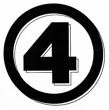 I don’t have sketch #2, but I think it was the marker version of this, the 4 symbol, which they wanted separately. This is the final version of that. I wish now I’d extended the horizontal bar to the right a little more to balance the placement better.
 Sketch 3 is closer to the original logo in letter shapes, though they are thicker, and one F works for both. I still like that, but the squished 4 is not such a good idea.
 The final marker sketch combines the letters from #1 with the layout from #3, but slanted and with the 4 shown behind. The texture is dark pencil on a textured book cover I think.
 They liked version 1 best, here’s the final logo inked on Denril plastic vellum.
 An example of the way it looked on toy packaging, though they messed with the 4 design to add that foil outline.
More posts in this series can be found in the “Pulled From My Files” category on the right column of this blog. Other articles you might enjoy are on the Logo Links page. More when I have time.
December 29, 2017
And Then I Read: MISTER MIRACLE #3
 Image © DC Entertainment.
Unusual. That’s what I’d call this version of Kirby’s characters. Mostly we’re looking at them as real people here on our world, but there are trippy sequences from another sort of life, where Scott Free and Barda are fighting in a war with Darkseid, each a general leading many troops. They’re under the leadership of Orion, who is now the Highfather, and who demands obedience and loyalty, and has no compunctions against handing Scott a beating when he doesn’t get it immediately. Scott himself seems unsure what’s real and what’s only in his head. He’s still recovering from a suicide attempt, and is doing a professional escape act to make ends meet. One of the best lines in the book is when Barda describes it as “performing.” “I’m not performing. It’s escaping. I’m ACTUALLY escaping,” he tells her. And maybe that’s what he’s doing in other areas, but from what exactly? That’s the interesting part.
I like the writing by Tom King, it’s complex but not hard to follow. The art by Mich Gerads is good, but hard to follow at times. That said, a book with good writing always wins me over.
Recommended.
December 28, 2017
And Then I Read: HAL JORDAN & THE GL CORPS #23
 Image © DC Entertainment.
I continue to fall further behind on this title, but when I do get to it, I usually enjoy it. Hal Jordan was my childhood GL, and I’ve also liked John Stewart and Guy Gardner at times. Stewart and Soranik have forged a fragile alliance of the Green and Yellow corps, an unnatural team of police and criminals, and forces are already at work to shatter it, even as they work to prevent that. Kyle Rayner, also here, has some unfinished issues with Soranik, Gardner and his new yellow partner Arkillo are going after space pirates, while their leader is threatening to broadcast a damning video. An interesting interplay of situations and characters. The series is no longer tied much to Earth, except in its Earth characters, and that’s fine with me. Well written by Robert Venditti, well drawn by Ethan Van Sciver.
Recommended.
December 21, 2017
And Then I Read: FROM THE EARTH TO THE MOON and AROUND THE MOON by Jules Verne


Early editions of the books, which I read in e-book form.
Jules Verne’s science fiction books were intended to first be exciting adventure stories, though he did strive to use the best scientific knowledge of the time, and to keep things plausible for his readers. These books, published in 1865 and 1870 (and forming a complete story) have aspects that seem foolish or wrong to us today, but at the time they were quite believable, and to enjoy reading them, you have to accept that, which I was able to do. Verne is, first of all, a good storyteller, and I enjoy reading his work for that. In these books he depicts America and Americans of the mid 1800s, and though at time he drifts into caricature, often I thought he got right.
As the story opens, at the end of the American Civil War, the Baltimore Gun Club, made up of leaders in weapons manufacturing, is looking for a new challenge, since their expertise will not likely be needed for a while. They decide to try to build a giant cannon large enough to fire a projectile that will hit the moon. Public interest is massive, funds are pledged by all kinds of companies and private donors, until the funds needed are raised. Barbicane, the president of the gun club, with the help of other experts, puts his plan in motion, setting the launch site near Tampa, Florida, and construction begins. Meanwhile, his enemy and rival, Captain Nicholls, does everything he can to stop the project, finally resorting to challenging Barbicane to a duel. Meanwhile, a brave (or crazy) Frenchman, Michel Ardan, declares he is determined to travel to the moon inside the projectile, a hollow capsule, and he arrives in Tampa just in time to stop the duel, and befriend both Barbicane and Nicholl. At length, the three decide they must all travel to the moon in the experiment, and plans are made for the projectile to house them. After many months of planning and construction, well detailed, the launch or firing is finally ready, and the three men descend into their aluminum chariot, which is sealed. The launch is massive and successful, and the capsule disappears into space. So ends the first book.
The second book mostly follows the three voyagers from their launch. Verne has clever ways for them to survive the forces of the explosion, which at least seem plausible, though in fact it’s impossible. One problem with their capsule is that it’s not controllable by the occupants at all, it can’t be steered, accelerated or slowed. A close encounter on their ascent with a large asteroid is exciting, and has the unexpected consequence of throwing them slightly off-course, so instead of hitting the moon, they fall into a parabolic orbit around it. By doing this, Verne avoids having to explain how they might have survived on the moon itself, supposing the impact didn’t kill them, but it makes the second book rather dull at times, as all they can do is try to observe the surface (until they’re above the dark side). The three talk endlessly, theorizing about what the moon’s surface might be like, though they do not see anything suggesting animal life there. One scientific error of the time was to think all the craters and mountains on the surface were caused by volcanic activity rather than impacts by asteroids, and one exciting episode brings them close to a massive volcano, a frequent Verne element. Eventually they are swung back toward Earth, and a landing in the ocean where events on our own world are finally caught up with before the end of the story.
This was a fun read. Some errors were hard to overlook, such as the travelers having full gravity in space most of the time, and managing to create oxygen and heat through chemicals, not to mention being able to just open a hatch to throw out their refuse, but in all I thought this was well worth my time, and I plan to read more Verne when I can.
Recommended.
December 18, 2017
A Christmas Message from 1513 A.D.

Photo © Jon Oliver.
Longtime readers of my blog may remember this entry. I’m rerunning it today in honor of the season.
For many years I attended the annual Christmas concert at Kirkpatrick Chapel, Rutgers University in New Brunswick, NJ. First because I had friends in the choirs that performed there, later because I loved the music and it had become an annual tradition for me and my friends. When I moved to southern New Jersey I couldn’t get to it any more, and I miss it.
I’m not a very religious person, belonging to no church or other organized religion, but I did grow up in a church-going family, and what I always liked most about it was the music. Particularly choir music. For over twenty years the annual concert at Rutgers gave me a joyful chance to hear some great choral singing. Between the songs, there would be readings from the Christmas story in the Bible, and also another reading. I don’t know where the tradition began, or how long ago it started, but most of the years I attended, there was a reading from a letter written by Fra Giovanni Giocondo. A google search will tell you more about the historical figure, though there seems to be some uncertainty that he did indeed write the letter. Whoever the author was, I find it very moving, especially at Christmas.

Many years ago I lettered up this document and gave it out to friends as a Christmas present. I thought I’d do the same for all of you this year, in the spirit of the season. There’s a higher resolution copy HERE which you can download and print if you’d like.
Thanks to Linda for reminding me about this, share it with anyone you think might be interested. And if you ever get the chance to attend “Christmas in Carol and Song” at Kirkpatrick Chapel, don’t pass it up. It’s a wonderful experience.
December 14, 2017
And Then I Read: THE SHEPHERD’S CROWN by Terry Pratchett
 Cover art and design by Jim Tierney.
It was both sad and wonderful to read this book, the last published novel of Terry Pratchett, whose work I came to rather late in life. There’s plenty more I have yet to read, but I was particularly fond of the Tiffany Aching series, of which this is the final one.
Tiffany has grown in knowledge and power through the series: “The Wee Free Men,” “A Hat Full of Sky,” “Wintersmith,” and “I Shall Wear Midnight.” Her constant allies and companions, the diminutive Feegles, are always watching over her, and provide lots of comic relief, though they are also quite powerful. Tiffany began as a country girl with a knack for magic, and by this final book, is asked to take on the role of head witch among a group, the witches, who do not acknowledge that authority. Tiffany has learned much about magic, but has still to master some important skills in handling her own workload. She works way too much, and resents the lack of appreciation she gets, but soldiers on anyway. She never has enough time for her own needs, and is constantly juggling commitments and over extending herself. When the dangerous Elves begin emerging in her territory again (she defeated their queen once before), she has to gather all the resources she can, call in all the favors, corral all the magic users, enlist the help of regular folks, and hope it will be enough to counter this threat to her world and position. Along the way, Tiffany makes a few new friends, and gains new insights into her magic and her situation. When the Elves make their full-force attack, Tiffany will find out if she and her allies are enough to resist them.
Terry Pratchett died of conditions related to Alzheimer’s, diagnosed a few years ago, and I wondered if there would be any detectable loss of quality in the writing of this last book. There isn’t. An afterword by Rob Wilkins explains that Terry had an unusual writing method. After working out the framework of a book, he would gradually develop and add sections and incidents to it, rather than writing from the beginning to the end. In this case, he felt the book was finished, but perhaps would have added more to it if there was time. Sadly, there wasn’t. Despite his health problems, Terry went out in fine form here, and he will be missed.
Highly recommended.
Todd Klein's Blog

- Todd Klein's profile
- 28 followers

