
Todd Klein's Blog, page 144
June 26, 2018
Incoming: THE LEAGUE OF EXTRAORDINARY GENTLEMEN: THE TEMPEST #1
 Image © Alan Moore & Kevin O’Neill. Written by Moore, drawn by O’Neill, colors by Ben Dimagmaliw, letters by Todd Klein.
Printed copies have just arrived. This will be the final League series (six issues, 32 pages each), and the last comics work by Alan Moore and Kevin O’Neill, so they have said. Alan and Kevin are throwing lots of difficult challenges at me, both as letterer and as designer, and I’m having a great time working on it! Currently lettering issue #4. The book is bi-monthly, this first issue was originally due out in June, though the Top Shelf website now says July, so I’m guessing it will hit stores very soon. In case you haven’t been keeping track, the League series are as follows:
Volume 1: The 1898 League is formed by Mina Murray (formerly Harker) and consists of Allan Quatermain, Captain Nemo, Hawley Griffin (the “Invisible Man”), Dr. Henry Jekyll/Mr. Edward Hyde and Miss Murray. Recruited by the mysterious “M” as part of British intelligence, their main foe is a master criminal in control of the Chinese quarter of London.
Volume 2: Also taking place in 1898, the League helps oppose the Martian Invasion, as depicted in H.G. Wells’ “The War of the Worlds.” Among other menaces.
Black Dossier: In 1958, long after leaving British Intelligence, and having been followed by other incarnations of the League, Mina and Allan have returned to London in search of an infamous book, The Black Dossier, a record of all versions of the League kept at M.I. 5 headquarters. Once they find it, they are pursued by government agents and forces, even as they, and we readers, peruse the Black Dossier and learn much more about the League.
Volume 3: Century. Three long episodes taking place in 1910, 1969 and 2009, Mina and Allan, with others such as Orlando, take on a new supernatural menace to Britain and the world across the span of a century.
Nemo: Heart of Ice, The Roses of Berlin, River of Ghosts. These three short novels follow the career of Janni Nemo, the granddaughter of Captain Nemo, as she rises to take his place among the pirates and misfits that make up her family and comrades. The novels take us to Lovecraftian horrors at the South Pole, Nazi threats in World War Two Germany, and a hidden Nazi colony in South America.
Volume 4: The Tempest. The current series that promises to wrap up all the many League storylines across space and time, and in a rousingly exciting manner! Many more secrets of the League will be revealed in this tale that begins in 2009 shortly after the end of Volume 3.
Needless to say, working on this series is a highlight of my career, and I recommend it!


June 19, 2018
And Then I Read: THE MYSTERY OF THE CRIMSON GHOST by Phyllis A. Whitney
 I have read only a few of the many mystery novels for younger readers by this author, who also wrote mysteries for adults with a gothic flavor. The ones I have read I’ve liked, including this one.
Janey Oakes narrates her story, and confess right up front that she has a disease: horse fever. She loves them, and wants to ride them. When Janey and her parents stay with Janey’s Aunt Viv for the summer in Sussex County, New Jersey, she’s hoping there will be horses nearby. As it happens, they find one right away, but the owners are stand-offish and strange. Later, Janey learns the Burleys, or something on their side of the lake where Aunt Viv lives, have been causing lots of anger among the other residents. A ghostly dog surrounded by red flames has been seen from the Burley’s side and is keeping everyone awake with its haunting howls.
Janey is determined to befriend the Burleys and get a chance to ride their horse, Star of Sussex, but they don’t make it easy. There’s an elderly grandmother and two boys, all of whom seem to be angry and suspicious, or even a bit crazy. It seems to solve the Burley mystery, Janey will have to discover the secret of the ghost dog, leading to frightening midnight expeditions.
A fun read that kept me guessing for a long while, aimed at girls with horse fever, but written well enough for anyone to enjoy. Recommended.
June 18, 2018
Watching DETECTORISTS

My friend Tim told me I should watch this, and he was right that I would enjoy it. The two lead characters, above, Lance (played by Toby Jones) and Andy (played by Mackenzie Crook, also the writer and director) belong to a metal-detecting club, but don’t call them detectors, they are quick to correct you, they are detectorISTS. Both are convincingly nerdy, often make poor life choices, and use their hobby as an escape from their real-world problems. There are many funny moments, but also lots of charming and heart-warming ones, as well as some sad and dramatic ones. Mostly the characters seem quite real, full of real-life flaws and foibles, but with good hearts and intentions when they have the courage to follow up on them. The rest of the detectorists’ club are equally entertaining. The show does not usually laugh at the characters, but allows us to see the humor in what they do even when they don’t. Andy’s wife, played by Rachel Stirling, is the parental figure, seeing Andy’s hobby as somewhat childish perhaps, but loving his enthusiasm for it. Rachel’s real-life mother is Diana Rigg, who also plays her mother in the show, an older and more sarcastic parental figure.
This show is likely to appeal to anyone who collects things, as I’m sure many of you reading this do. Detectorists are collectors of bits of metal they find, most often things like ring-pulls from aluminum cans or metal buttons, but what they really are after is bits of history, the older the better, things that have a story to tell. We can all empathize with that, and their nerdy approach to the hobby will certainly be familiar to many.
I watched the first two seasons free on Amazon Prime (free with my subscription, that is). The third and final season is only available on Acorn TV, and I liked the show enough to sign up for that, at least for a month. Highly recommended.
June 16, 2018
THE DANNY CRESPI FILES Part 15
 This and all images © Marvel.
Continuing my exploration of the cover lettering work of Danny Crespi at Marvel Comics from about 1974 to the early 1980s, with some examples from Gaspar Saladino and others. Photocopies of saved cover lettering from Danny’s files were compiled into a collection by letterer and friend Phil Felix during the 1980s when he worked with Danny on staff at Marvel, and Phil sent me copies. This time I’ll look at pages 57-60. Page 57, above, is by Danny except for the three on the right side, which are by Gaspar. Sources follow.
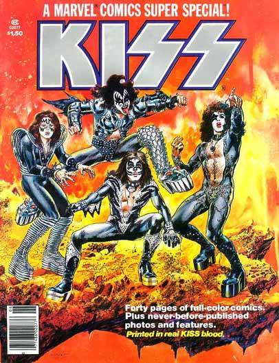
KISS from MARVEL COMICS SUPER SPECIAL #1, 1977. This is adapted from the band’s logo by Ace Frehley. I can’t really say who might have lettered it, but the timing is right for Crespi, and it could have been by him, so I think it probably was.

“Montsers of the Mind Machine” by Crespi from AMAZING ADVENTURES #32, Sept. 1975. The dark colors don’t help this, but it still reads okay. OF THE is type.

“A Vault Full of Fear” by Crespi from PETER PARKER, THE SPECTACULAR SPIDER-MAN #25, Dec. 1978.

“Monumental Menace” by Crespi from CAPTAIN AMERICA #222, June 1978. The heavy letters work well reversed white on black.
 “Versus Brother Voodoo” by Crespi from WEREWOLF BY NIGHT #39, July 1976.

I was unable to find the “GUEST STAR” arrow by Gaspar at the upper right corner of Page 57, but blog reader David Goldfarb did, on this MARVEL CHILLERS cover dated June 1975, near the top over part of the logo. Well done, David!
 “Blade and Hannibal King” from TOMB OF DRACULA #48, Sept. 1976 by Saladino. Gaspar’s style is my favorite for cover lettering, it’s just a step above everyone else in energy, creativity and style. His scary lettering, as in “Minions of Hell” here, is the scariest!
 “This is it!” from INCREDIBLE HULK #200, June 1976, by Saladino. Gaspar was also excellent at making large blocks of copy interesting and varied, and was still able to fit them in tight spaces. One reason his fans, such as myself, called him The Master.
 Page 58. Seven of these are by Danny Crespi, four are by Gaspar Saladino. Sources follow.

“To Challenge a Dragon” from MASTER OF KUNG-FU #64, May 1978 by Crespi. The black fill around the lettering makes the letters look a bit too narrow, but it still works okay.
 “A Child Dies Mourning” from TOMB OF DARKNESS #19, March 1976 by Crespi. I like this one a lot. Danny Crespi clearly followed Gaspar’s lead for scary lettering, and this one is great.
 “Scarlet Witch” from MARVEL TEAM-UP #41, Jan. 1976. Note that “Scarlet” in the Crespi lettering has been replaced by headline type. On a book like this where a different guest star appeared in most issues, and each needed some kind of logo, that became part of the cover lettering when they didn’t have one that worked.
 “Fury of the Night Creature” from FRANKENSTEIN #14, Jan. 1975 by Crespi.
 “When Flies the Hellbird” and “World” from KA-ZAR #15, April 1976 by Saladino. Again, the dark color does not help the main cover lettering, but it still works okay.
 “Carnival” from DEAD OF NIGHT #10, June 1975 by Crespi. It should be noted that even though I’m tagging one bit of cover lettering, it’s almost always all by the same person.
 “Survive” from ASTONISHING TALES #35, May 1976 by Crespi.
 “Trilogy of Fear” from TOMB OF DRACULA #48, Sept. 1976 by Saladino. The other blurb on this cover we’ve already looked at. A poor color choice for TRILOGY OF, as it blends in with the background and is hard to read, but great lettering.

“Avengers Assemble” from WHAT IF? #9, June 1978 by Crespi, found by Michael Styborski. That particular phrase has been on a lot of covers!
 Page 59, all by Danny Crespi. Sources follow.
 “Assault on an Angry Sea” from MASTER OF KUNG FU #32, Sept. 1975. The texture Danny used on ANGRY SEA looked fine on the original lettering, but once the letters were filled with red it became harder to read. Nice work, though.
 “Blood-Stalkers” from TOMB OF DRACULA #25, Oct. 1974. This one pops well, white on red.
 “Doom in the Desert” from MIGHTY MARVEL WESTERN #44, March 1976. Here the texture in DOOM works great. A very effective blurb.
 “Exorcism” from TOMB OF DRACULA #23, Aug. 1974.
 “The Night After You Saved…” from HOWARD THE DUCK #24, May 1978. I think Danny’s slightly softer approach here works very well.
 “King Cadaver” from JUNGLE ACTION #10, July 1974. Unlike many of the covers from this era at Marvel, the color scheme on this one is very attractive.
 “The Temple…” from THOR #245, March 1976.
 “Doomed by Diablo” from FANTASTIC FOUR #194, May 1978. This cover blurb works well as colored.
 Page 60. Six of these are by Danny, five are by Gaspar Saladino: ASSASSINS, BLADE, GHOULS, DESOLATION RUN and FLAMING GOD. Sources follow.
 “Assassins” from OMEGA THE UNKNOWN #1, March 1976, by Gaspar. So many of these covers are crowded, and also have lots of cover copy. Smart move to put one on the cape here.
 So, how can I tell this is lettered by Gaspar? The most important clue is the style of the word MEET in this blurb, definitely in his style, and not something Danny Crespi would do. The regular letters are generally not as wide as Danny’s either. There are other, more subtle clues.
 “City of the Dead” from JOHN CARTER #12, May 1978 by Danny. White letters on red almost always work.
 “Blade battles Hannibal King” from TOMB OF DRACULA #45, June 1976. Note “Hanibal” in original has been corrected to “Hannibal”. By Gaspar. Nice use of the sword blade behind the letters BLADE.
 “Are they Vampires” from DEAD OF NIGHT #5, Aug. 1974 by Gaspar. GHOULS is so well done!
 “The Kingdom of the Ants” from DEVIL DINOSAUR #5, Aug. 1978 by Danny.
 “Desolation Run” from GHOST RIDER #11, April 1975 by Gaspar. Note part of lettering is missing on the original, the words JOIN THE.
 “Rat Pack” from MARVEL CHILLERS #5, June 1976 by Danny. Note part of text is revised on the printed version.
 “Flaming God” from TARZAN #3, Aug. 1977 by Gaspar. This blurb works great even with the banner behind it filled black.
 “Wildfire” from POWER MAN #32, June 1976 by Danny. I love the flaming balloon on this one!
 “The House of Ideas” is probably from MARVEL PREMIERE #31, Aug. 1976 by Danny. The final version is relettered, but I can’t find anything else that matches better. The original may have been rejected because it didn’t fit the space well.
 “7 Spine-tingling Shockers” from GIANT-SIZE CHILLERS #3, Aug. 1975 by Danny.
More of these when I have time to research them!
The Danny Crespi Files Part 15
This and all images © Marvel.
Continuing my exploration of the cover lettering work of Danny Crespi at Marvel Comics from about 1974 to the early 1980s, with some examples from Gaspar Saladino and others. Photocopies of saved cover lettering from Danny’s files were compiled into a collection by letterer and friend Phil Felix during the 1980s when he worked with Danny on staff at Marvel, and Phil sent me copies. This time I’ll look at pages 57-60. Page 57, above, is by Danny except for the three on the right side, which are by Gaspar. Sources follow.
KISS from MARVEL COMICS SUPER SPECIAL #1, 1977. This is adapted from the band’s logo by Ace Frehley. I can’t really say who might have lettered it, but the timing is right for Crespi, and it could have been by him, so I think it probably was.
“Montsers of the Mind Machine” by Crespi from AMAZING ADVENTURES #32, Sept. 1975. The dark colors don’t help this, but it still reads okay. OF THE is type.
“A Vault Full of Fear” by Crespi from PETER PARKER, THE SPECTACULAR SPIDER-MAN #25, Dec. 1978.
“Monumental Menace” by Crespi from CAPTAIN AMERICA #222, June 1978. The heavy letters work well reversed white on black.
“Versus Brother Voodoo” by Crespi from WEREWOLF BY NIGHT #39, July 1976.
I have no guesses for the GUEST STAR arrow at upper right by Saladino. Very hard to search for something that generic.
“Blade and Hannibal King” from TOMB OF DRACULA #48, Sept. 1976 by Saladino. Gaspar’s style is my favorite for cover lettering, it’s just a step above everyone else in energy, creativity and style. His scary lettering, as in “Minions of Hell” here, is the scariest!
“This is it!” from INCREDIBLE HULK #200, June 1976, by Saladino. Gaspar was also excellent at making large blocks of copy interesting and varied, and was still able to fit them in tight spaces. One reason his fans, such as myself, called him The Master.
Page 58. Seven of these are by Danny Crespi, four are by Gaspar Saladino. Sources follow.
“To Challenge a Dragon” from MASTER OF KUNG-FU #64, May 1978 by Crespi. The black fill around the lettering makes the letters look a bit too narrow, but it still works okay.
“A Child Dies Mourning” from TOMB OF DARKNESS #19, March 1976 by Crespi. I like this one a lot. Danny Crespi clearly followed Gaspar’s lead for scary lettering, and this one is great.
“Scarlet Witch” from MARVEL TEAM-UP #41, Jan. 1976. Note that “Scarlet” in the Crespi lettering has been replaced by headline type. On a book like this where a different guest star appeared in most issues, and each needed some kind of logo, that became part of the cover lettering when they didn’t have one that worked.
“Fury of the Night Creature” from FRANKENSTEIN #14, Jan. 1975 by Crespi.
“When Flies the Hellbird” and “World” from KA-ZAR #15, April 1976 by Saladino. Again, the dark color does not help the main cover lettering, but it still works okay.
“Carnival” from DEAD OF NIGHT #10, June 1975 by Crespi. It should be noted that even though I’m tagging one bit of cover lettering, it’s almost always all by the same person.
“Survive” from ASTONISHING TALES #35, May 1976 by Crespi.
“Trilogy of Fear” from TOMB OF DRACULA #48, Sept. 1976 by Saladino. The other blurb on this cover we’ve already looked at. A poor color choice for TRILOGY OF, as it blends in with the background and is hard to read, but great lettering.
“Avengers Assemble” from WHAT IF? #9, June 1978 by Crespi, found by Michael Styborski. That particular phrase has been on a lot of covers!
Page 59, all by Danny Crespi. Sources follow.
“Assault on an Angry Sea” from MASTER OF KUNG FU #32, Sept. 1975. The texture Danny used on ANGRY SEA looked fine on the original lettering, but once the letters were filled with red it became harder to read. Nice work, though.
“Blood-Stalkers” from TOMB OF DRACULA #25, Oct. 1974. This one pops well, white on red.
“Doom in the Desert” from MIGHTY MARVEL WESTERN #44, March 1976. Here the texture in DOOM works great. A very effective blurb.
“Exorcism” from TOMB OF DRACULA #23, Aug. 1974.
“The Night After You Saved…” from HOWARD THE DUCK #24, May 1978. I think Danny’s slightly softer approach here works very well.
“King Cadaver” from JUNGLE ACTION #10, July 1974. Unlike many of the covers from this era at Marvel, the color scheme on this one is very attractive.
“The Temple…” from THOR #245, March 1976.
“Doomed by Diablo” from FANTASTIC FOUR #194, May 1978. This cover blurb works well as colored.
Page 60. Six of these are by Danny, five are by Gaspar Saladino: ASSASSINS, BLADE, GHOULS, DESOLATION RUN and FLAMING GOD. Sources follow.
“Assassins” from OMEGA THE UNKNOWN #1, March 1976, by Gaspar. So many of these covers are crowded, and also have lots of cover copy. Smart move to put one on the cape here.
So, how can I tell this is lettered by Gaspar? The most important clue is the style of the word MEET in this blurb, definitely in his style, and not something Danny Crespi would do. The regular letters are generally not as wide as Danny’s either. There are other, more subtle clues.
“City of the Dead” from JOHN CARTER #12, May 1978 by Danny. White letters on red almost always work.
“Blade battles Hannibal King” from TOMB OF DRACULA #45, June 1976. Note “Hanibal” in original has been corrected to “Hannibal”. By Gaspar. Nice use of the sword blade behind the letters BLADE.
“Are they Vampires” from DEAD OF NIGHT #5, Aug. 1974 by Gaspar. GHOULS is so well done!
“The Kingdom of the Ants” from DEVIL DINOSAUR #5, Aug. 1978 by Danny.
“Desolation Run” from GHOST RIDER #11, April 1975 by Gaspar. Note part of lettering is missing on the original, the words JOIN THE.
“Rat Pack” from MARVEL CHILLERS #5, June 1976 by Danny. Note part of text is revised on the printed version.
“Flaming God” from TARZAN #3, Aug. 1977 by Gaspar. This blurb works great even with the banner behind it filled black.
“Wildfire” from POWER MAN #32, June 1976 by Danny. I love the flaming balloon on this one!
“The House of Ideas” is probably from MARVEL PREMIERE #31, Aug. 1976 by Danny. The final version is relettered, but I can’t find anything else that matches better. The original may have been rejected because it didn’t fit the space well.
“7 Spine-tingling Shockers” from GIANT-SIZE CHILLERS #3, Aug. 1975 by Danny.
More of these when I have time to research them!
June 14, 2018
And Then I Read: A YEAR IN PROVENCE by Peter Mayle
 Cover Illustration by Ruth Marten.
I seem to have drifted into mainstream summer reading territory with this book, and I quite enjoyed it. After fifteen years in advertising, the author decides to buy a house in the French countryside of the Lubéron, known for it’s small picturesque villages, wine production, and excellent food. It seems an idyllic place to live and write about, and it is, but there are some caveats. The old stone farmhouse is in a perfect spot surrounded by a national park so it can’t become too developed, but the house needs lots of work. Hiring locals to do that work is the first of many friendships forged and humorous adventures and escapades survived. Mayle writes about the people of his new home with wit, insight and love. Yes, he’s highlighting their quirks, faults and bad behavior at times, but also their passions, warm-hearted generosity, and kindness. There are plenty of gastronomic adventures, lessons in growing and harvesting wine grapes, local festivals and customs, and Mayle has many funny things to say about both his own English foibles and habits as well as the French ones.
The writing of this book is a great pleasure to read and savor. If only the amazing meals and drinks came with! Highly recommended. Two more in the same vein are waiting.
June 13, 2018
And Then I Read: GREEN LANTERNS #47
 Image © DC Entertainment. Written by Tim Seeley, art by V Ken Marion & Sandu Florea, colors by Dinei Ribeiro, letters by Dave Sharpe. Alternate cover above by Brandon Peterson.
I feel like I’m missing some of the story here, probably because I came in late. The Justice League don’t seem to have a lot to do except get captured and rescued. I do like the role for John Constantine as magic consultant. The main story is what’s happening to Jessica on a world inside the villainess Singularity Jain. There she’s trying to deal with the loss of some old friends, while being helped by Simon, though he does not have his power ring. This kept my interest despite art that doesn’t completely work for me. I must add the cover above is excellent, though it’s not by the interior artist. Not a bad read, but I can only mildly recommend it.
June 11, 2018
And Then I Read: WONDER WOMAN #46

Image © DC Entertainment. Written by James Robinson, art by Stephen Segovia, colors by Romulo Fajardo Jr., letters by Saida Temofonte.
I haven’t read WONDER WOMAN since Greg Rucka left as writer last year, but I like James Robinson’s writing too, the art is appealing, and this new story arc seems a good place to jump on again.
Diana’s friend Dr. Barbara Minerva has been changed permanently to her alter-ego The Cheetah by Veronica Cale, who now learns that Cheetah has escaped the place where Diana had put her. She recaptures Cheetah to resume experiments (shades of Dr. Moreau), but Cheetah escapes from her too, babbling of some new Dark Gods that are coming, and that she must prepare for. When Wonder Woman appears on the scene, she finds she can’t reason with Cheetah, and perhaps catches a glimpse of these new gods. Meanwhile, a man named Jason in heroic armor has broken into a Kobra research base in Montenegro to free his father, and a surprise attacker, also obsessed with the new Dark Gods, faces Wonder Woman on the final page.
Nicely done by all, the story is intriguing, and I will read on. Recommended.
June 10, 2018
Pulled From My Files #87: STRYFE’S & STRIKEBACK Logos
 This and following two images © Marvel.
In 1993 I was asked by Marvel to design a logo for this X-Men spinoff one-shot. I have two marker sketches remaining, and no final inked version. This follows the pointy and dangerous mandate from Marvel at the time. I rather liked the way I snuck in the apostrophe between the E and S.
 A second version is nearly the same with different treatments of each line. You can see the pencilled note “THIS” pointing to the tagline here, they wanted this tagline below the main logo from sketch 1.
 Here’s the printed cover, which had a silver ink fill on the logo and the character’s costume. Not a very attractive look in my opinion. There was a second printing with an even duller bronze ink fill. Note that they pulled the apostrophe up a bit to make it more obvious.
 This and following images © Jonathan Peterson & Kevin Maguire.
In 1994 I was asked to design a logo for a series that writer Jonathan Peterson was developing with artist Kevin Maguire that ended up in Malibu’s Bravura line. I thought having the letters lean to the left, or backwards from the usual slant, would give it a distinctive look and tie in to the name. Otherwise, this is heavily influenced by earlier Marvel and DC logos I’d done in the recent past.
 Sketch 2 was taller, and added a left-leading arrow to the S to emphasize the “back” idea. The telescoping drop-shadow was narrower to take up last space horizontally as well.
 Sketch 3 replaced the telescoping with a drop shadow.
 Sketch 2 was chosen, and here’s the final logo inked on plastic vellum.
 Jonathan also commissioned this logo for the book’s letters column (remember those?).
 The printed first issue looks good to me, though I’d have preferred to see the logo larger. Once you put in all the trade dress there isn’t much room, but it could have been a little larger than it shows here.
More of these when I have time.
June 9, 2018
Our Wedding Program 1989


Images © Todd Klein.
While cleaning out our guest room for redecorating, I found a small pile of these printed programs I made for our wedding. Hand-lettered and drawn, printed on pale pink paper, colored pencil on the drawings. I hadn’t seen it in many years. Still looks okay to me. Happy to say we remain together.
Todd Klein's Blog

- Todd Klein's profile
- 28 followers

