
Todd Klein's Blog, page 137
October 18, 2018
And Then I Read: MR. WOLF’S CLASS
 Image © 2018 Aron Nels Steinke, art by Steinke.
Mr. Wolf is about to begin a new teaching job at Hazelwood Elementary School. As the story opens he is cleaning up and preparing his classroom for the students, who are about to arrive. We also see images of his 17 students either at home, about to begin their day. Mr. Wolf and the students are human with animal heads and characteristics, drawn in a charmingly simple style. As the book continues, we follow the adventures of each student and their teacher as they interact, make friends, get into trouble, get lost, get into fights, and generally have all kinds of adventures. The book is aimed at young readers with easy-to-read words in large balloons. I think I would have loved it as a kid myself, both for the art and writing, and because I could easily relate to it. Not a book I would have normally chosen, it was given to me at the ‘Ringo Awards in Baltimore, but I’m quite happy I read it, and I commend it to children and parents everywhere.
Recommended.


October 16, 2018
And Then I Read: GREEN LANTERNS #54
 Image © DC Comics. Written by Dan Jurgens, art by Marco Santucci, colors by Hi-Fi, letters by Dave Sharpe, cover by Mike Perkins.
Part Five of “Evil’s Might” begins with the top GLs questioning Simon Baz’s loyalty, as he left the scene of battle with the Ravagers suddenly, creating a crisis that was only resolved by the arrival of Hal Jordan. Baz said the Guardians told him to, but the Corps has been out of contact with the Guardians for some time. Simon’s partner Jessica Cruz defends him, but it doesn’t look good for Baz. Meanwhile, on Earth, Simon is following the request of Superman to free him from his own Fortress of Solitude where he says he was imprisoned by Brainiac. When Simon does, his inexperience and foolishness is soon apparent.
This issue moved slower than previous ones, with a protracted battle scene. As I’m not fond of those, I didn’t enjoy it as much, but the overall story is still worth reading, and the true villain is finally revealed. Recommended.
October 15, 2018
And Then I Read: THE DREAMING #2
 Image © DC Comics. Written by Simon Spurrier, art by Bilquis Evely, colors by Mat Lopes, letters by Simon Bowland, cover by Jae Lee & June Chung.
In my review of the first issue of this revamped series, I complained that the absence of the most important character, Dream himself, limited and harmed the series. Writer Simon Spurrier proves me wrong here, and also makes the absence of Dream in The Dreaming a major plot point, as Neil Gaiman did in the early issues of THE SANDMAN.
Mervyn Pumpkinhead is the main character this time, and he has a lot to say. At first it seems like he’s talking to us, the readers, but when an off-camera gun is pointed at him, it becomes clear he’s talking to someone else, someone powerful, or at least well-armed. This is a narrative technique I haven’t seen used often in comics, and it worked really well to pull me into the story. Merv was always one of my favorite Dreaming residents, and Spurrier does an excellent job with his dialogue and attitude, a grouchy passive-aggressive mixture with unconscious humor and funny word-mangling that’s not easy to do. Merv’s narrative is about how everything is falling apart, barriers are weakening, dreamers are becoming powerful disruptors of The Dreaming, new characters like Dora have too much power, and old ones like Lucien are struggling to keep up. Since Merv’s job in the realm is to fix broken things, he has a lot to complain about, and clearly he’s looking for help from the unseen character he’s talking to. Knowing Merv, that help may not be at all what he wants or needs.
This is really a fine read. Highly recommended.
October 13, 2018
Carla Speed McNeil’s Lettering Process
 At this year’s Baltimore Comic-Con, I was surprised by a visit from writer/artist Carla Speed McNeil and delighted with what she had decided to give me, a page of her original art as well as her layout and lettering guide. Carla’s process is unusual, and I found it fascinating. I told her I’d write about it on my blog, and here it is.
 This and all following images © Carla Speed McNeil.
Carla is best known for her own series FINDER, but the page she gave me is from a Dark Horse series written by Adam Warren, EMPOWERED. Specifically, the page she gave me is from EMPOWERED & SISTAH SPOOKY’S HIGH SCHOOL HELL #6. Here’s the full finished page:
 As you can see, the art includes lots of distinctive lettering in a variety of sizes and styles. I like both the art and the lettering a lot. Detailed but clear storytelling and full of energy. The size of this page, on which the art runs right to the edges, is 9.5 by 14 inches.
 Carla begins work with a layout on a sheet of copy paper almost the same size, 8.5 by 14 inches, or legal size paper. This is done in pencil, and some areas are quite detailed while others are looser. The lettering is pencilled at roughly the shape and size she wants it. Carla will put this layout on a light box under her art paper to create the final inked art, but the lettering goes through an additional step.
 Carla first works on the lettering in pencil on a separate piece of thin graph paper, using the horizontal lines to keep things straight. “I tried using the Ames guide,” she told me, “but this works better for me.” It actually reminds me of the art paper some comics artists have used in the past with pre-ruled horizontal lettering guidelines in pale blue ink,, and letterer John Workman sometimes uses a pre-ruled sheet of paper with guidelines on it in a similar way behind art he’s lettering by hand, so it’s not a new idea. One advantage of doing it on graph paper as Carla does is that she can reposition each piece of lettering as needed before inking it on the art. All the ideas are here, the finesse comes in the inking.

Since I can’t show the full art page very detailed on this blog, let’s look at two individual panels. Here’s the layout for panel 6 with a large off-panel balloon and a cool collection of question marks.
 The lettering layout is pretty close to the art layout, but a little more carefully aligned on the graph paper, and the question marks are worked out better.
 The finished panel shows the top balloon repositioned to have the tail go up, and the question mark one opens at the left border. I particularly like the notched edges on “HAIR TEXTURE.”
 Here’s the art layout for panel 8 with four connected balloons and a small single one.
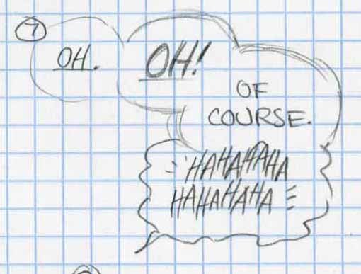 The lettering layout allows Carla to keep things aligned, but still bouncy where she wants that, as in the HAHAs.
 The final art is similar, but with size and emphasis worked out in ink. There are plenty of other examples on the page that add variety and interest to both the lettering and the work as a whole.
Thanks again to Carla for the insight into her process. It was fun to learn about it, and I appreciate the gift!
October 11, 2018
And Then I Read: SPENCER & LOCKE
 Image © David Pepose. Written by Pepose, art by Jorge Santiago Jr., colors by Jasen Smith, letters by Colin Bell.
This trade paperback collects four issues of the comic. Locke is a brash young detective, Spencer is his anthropomorphic black panther sidekick, but nothing is quite what it seems. Spencer is also a stuffed toy panther, similar to Hobbes in “Calvin and Hobbes,” which Locke has apparently had since childhood. Like Calvin, only Locke can see the “living” Spencer, who is reminiscent of Blacksad. Locke is investigating the murder of Sophie Jenkins, a school teacher and childhood friend of his, and he soon finds out that Sophie had a daughter, Hero. A prime suspect is another childhood friend who bullied Locke, and he takes pleasure in returning the favor, but things get much more complicated than that, and before long Locke and Spencer are involved with drug lords, exchanging gunfire with thugs in high-speed car chases, and taking all kinds of risks.
But wait, is Locke a reliable narrator? How much of what he’s telling us is real, and how much is as hallucinatory as his partner? The unusual places the story takes us make it hard to know, and periodically the film noir style switches to “Calvin and Hobbes” pastiche, with story elements played for laughs…sometimes. That’s actually what makes this book most interesting, that and the characters and their relationships, which are complex.
I enjoyed reading this, but can’t help feeling there’s too much from other sources. Mildly recommended.
October 10, 2018
And Then I Read: FANTASTIC FOUR #1 (2018)
 Image © Marvel. Written by Dan Slott, art on main story by Sara Pichelli, on backup by Simone Bianchi, colors by Marte Gracia, letters by Joe Caramagna, one-pager by Skottie Young. Cover variant above by Mike Weiringo.
I haven’t read an issue of FF since John Byrne was doing it, but this one worked for me. Reed and Sue Richards and their two children are lost in the multiverse, and presumed dead. Many on Earth, including Johnny Storm think they will be back, though Ben Grimm takes a more pessimistic approach. As the story opens we see Johnny and his roommate Wyatt Wingfoot are at a Mets game having fun while Ben and his girlfriend Alicia Masters are shopping and considering adopting some kittens. An FF flare goes up over the city, getting hopes up that they’ve returned, but Johnny and Ben soon find out differently. Former FF substitute members are interviewed on TV, and Ben tells the tale of a lost FF adventure. There are many fine character moments in the book, and I can see myself enjoying more in this series. There’s also a very positive surprise ending which shouldn’t be too much of a surprise.
The book also opens with a four-page remembrance of Steve Ditko that I’m guessing ran in all the books at some point. Nicely done.
Recommended.
October 9, 2018
And Then I Read: HIGH HEAVEN #1
 Image © Ahoy Comics. Main story written by Tom Peyer, art by Greg Scott, colors by Andy Troy, letters by Rob Steen. Backup written by Tom Peyer, art by Chris Giarrusso. Additional material by Shannon Wheeler, Grant Morrison and Rick Geary.
Disclaimer: I am designing cover logos for this company, so I wish them well. Otherwise, I’m just reading along with the rest of you.
David Weathers presents himself as a man who is dissatisfied with his life in almost every way. The cute co-worker he’s out to lunch with brings his latest embarrassment and humiliation, but he does have one thing to boast about. His life ends spectacularly. Soon after, David finds himself entering Heaven, but as should come as no surprise, that too is full of disappointments. Can Heaven really be as mundane, sterile, dirty and sometimes threatening as life on Earth? There are some perks: a halo card allowing access to a free room with a TV, and all the junk food you might want, but there are definitely some downsides. And lots of feathers.
The backup, “Hashtag: Danger” is lighter, cartoonier, and a mix of kids cartoons and teen sarcasm. Both are funny and entertaining, though not so much in a laugh-out-loud way, more wry amusement. The backup text feature by Grant Morrison with illustrations by Rick Geary guides us through a World’s Fair like no other. Is this why we don’t have them any more?
Recommended.
October 8, 2018
And Then I Read: THE CAPTIVE by Scott O’Dell

Cover illustration by Marie Lemoine.
This is the first book of a trilogy about the conquest of Central America by the Spanish in the sixteenth century, after the voyages of Columbus. I’ve put off reading it for a long time because I expected it to be a sad and painful story. The first section is just that: Julian Escobar, a young Jesuit seminarian is enlisted by a Spanish nobleman, Don Luis, with a charter of ownership for one of the Caribbean islands. He tells Julian he wants him to bring the word of God to the natives living there. When they arrive, Julian soon finds out he is nothing but a way for Don Luis and his shipmates to charm and calm the natives while they collect all the gold they can find, and take many of the natives prisoners to be sold as slaves.
Is it the wrath of God that next takes the ship into a hurricane that wrecks it? Julian ends up on the shore of what is now probably Mexico, and for a while he is a hermit like Robinson Crusoe. Things change again when he is found and helped by a native girl, and eventually meets another Spaniard, Don Guillermo, who is working for the Mayans. Guillermo sees in the handsome, golden-haired Julian the echo of the old Mayan legend of Kukulcán, a man from their past they worship as a god. Julian would soon be ritually slain by the Mayans, but if as Guillermo suggests, he pretends to be Kukulcán, he might instead gain great power. Julian doesn’t want power, but neither does he want to die.
A well-written and thoughtful historical novel, as all O’Dell’s books are. I will look for the rest of the trilogy, even though I know it can’t end well.
Recommended.
October 6, 2018
Pulled From My Files #94: CON BADGES AND BUTTONS

I’m not a hoarder, really I’m not, but I do save things that I like. Looking for something else, this morning I came upon a small cache of convention badges and buttons. The ones above are all comics related. At upper right are badges from the first two comics conventions I attended, organized by Phil Seuling and taking place in mid-town Manhattan in 1975 and 1976. The ’75 con was at the Hotel Commodore, July 3-7. I just went in for one day, Saturday July 5th. The Barry Smith button is not dated, but I got it at one of those. The Berni Wrightson Howard the Duck badge came from the ’76 con, as did the Frank Thorne Red Sonja badge. Both are © Marvel Comics Group. I don’t know when I got the Bat-symbol one, it could be from later. The Spirit Jam badge is from 1981, and not from a con, it was sent to me by Dennis Kitchen for lettering several pages of the many-hands homage story that first appeared in THE SPIRIT #30 dated July 1981. It was later collected in a separate book in 1998.
 In the same place were these science fiction convention badges and button. I think my first such con was the one at upper left, MidAmeriCon in Kansas City, Missouri, Sept. 2-6 1976, the 34th World Science Fiction Convention. A Kansas City friend got my badge for me, hence the incorrect town and state. It was the one time I got to see my favorite science fiction writer, Robert A. Heinlein in person, a great thrill. Disclave 1977 was in Washington DC on Memorial Day Weekend. I had fun there, but did not actually have a hotel room, I had to sleep on someone else’s floor. IguanaCon, the 36th World Science Fiction Convention, was held Aug. 30 to Sept. 4 in Phoenix, AZ in 1978. I got cute on the badge. Noreascon Two, the 38th World Science Fiction Convention, was held in Boston Aug. 29-Sept. 1 1980. I had lots of fun at all of these cons, and met many of the science fiction and fantasy writers and artists I admired, but after 1980 I was too busy with my DC Comics staff job and freelance work to attend others. “The White Dragon” by Anne McCaffrey, subject of the button, came out in June 1978, so I must have picked that up at Iguanacon. Last is the original art badge by William Rotsler I bought from him at one of these cons for $2. He would sell them in the dealer’s room to cover his con expenses. They were meant to be con badges you would write your name in, but I never did that. Rotsler was a well-liked fan artist and writer.
Now that I have these out of the box they were in, I may offer them on eBay in the coming weeks. More file stuff when I have time.
October 4, 2018
And Then I Read: THE WRONG EARTH #1
 Image © Ahoy Comics. Main story written by Tom Peyer, art by Jamal Igle and Juan Castro, colors by Andy Troy, letters by Rob Steen. Backup written by Paul Constant, art by Frank Cammuso. Additional material by Grant Morrison and Shannon Wheeler.
I must say up front that I’m working for Ahoy, doing their logos, so while I’m certainly wishing them well, I’m not involved in the interiors, just reading along like most of you.
This book begins with a clever idea: two versions of the same heroes and villains, one in a world reminiscent of today’s grim and gritty heroes, one in a Bronze Age comics world where things are brighter, happier and safer. Then the heroes get switched. Their reactions to a world they never made are entertaining and sometimes funny, but it wouldn’t work unless we empathize with the characters, and I did. I think it works well both on the writing and art.
The backup featuring the Bronze Age boy sidekick is fun, and I like the cartoonier art and old comic approach of Frank Cammuso, but there’s one thing that pulled me out of the story: the lettering. It’s perfectly readable, but it uses the crossbar (serif) I everywhere instead of just in personal pronouns like I, I’ve and I’m. This is a rookie mistake. Tom Peyer, why was it not caught? I enjoyed the story anyway.
The text piece by Grant Morrison, along the lines of the ones that used to appear in old comics that didn’t have letters pages to gain second class mailing permits, is a hoot. Robert Kanigher on acid?
The one-pager by Shannon Wheeler is fun, too. And there are interviews with Peyer and Igle.
A nice package, recommended.
Todd Klein's Blog

- Todd Klein's profile
- 28 followers

