
David Erik Nelson's Blog, page 2
July 29, 2025
What Makes This Work is Everything They’ve Left Out
This is my little Ozzy Osbourne memoriam. I’ve been meaning to post this for ages. The older I get, and the more times I listen to “War Pigs,” the more fascinated I become with how finely crafted it is, guiding and orchestrating the listener’s emotional states. Despite everything metal is purportedly about, it’s really defined by being an exercise and almost preternatural restraint and fine articulation:
You can follow everything that is happening; each phrase is stated clearly, so when things get hectic, you are still able to keep up. Almost more importantly, Black Sabbath let’s a lot of air in when it is needed, so that they can build up to a big and satisfying conflagration. They appreciate that silence is just as much an instrument as the guitars and drums and voice, and requires as fine an ear as any other instrument.
This is a live recording from 1970, when Ozzy was 21 years old—about a year year after recorded their debut album, and a few months after their follow-up (neither session lasted more than a couple days; for the first album, all the tracks were laid down in a single 12-hour session, and mixed the next day).
Imagine being able to hear and speak that clearly at 21. Imagine how much Osbourne subsequently was able to see and hear in the ensuing 55 years.


July 25, 2025
In the pines, in the pines, where the sun don’t never shine ♬♫♪ (Sketch of the Week for Week 29 of 2025)
My wife and I spent last week canoeing in the backcountry along the Minnesotan-Canada border in Voyageurs National Park, which is noted as being among the nation’s least visited parks—an extremely attractive feature if, like me, your favorite quality of the National Park system is the opportunities it presents for spending a week never getting closer than several hundred feet to a stranger (and that only across a body of leech infested water).
Along with solitude and no cell coverage, this trip afforded an opportunity to work on landscapes and natural still life, both of which I’ve largely neglected recently (I spent my sketching time over the last very hectic month focusing on timed gesture exercises).
Here’s my son’s pick for the Sketch of the Week. He especially liked the “gesture of the shoreline,” and the rendering of light and shadow in the pines and on the water along the shore:
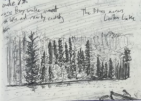
This was the far shore across from our campsite on Loiten Lake, which was the furthest back we went on our trip (the second day, during which we canoed across three lakes and did three portages, schlepping indestructible aluminum National Park canoes through ankle-deep mud, mosquito-blessed pine forest, and over rocky hills).
That treeline was lovely, because of how it changed with every moment of the shifting light. It brought to mind my favorite Impressionist work, which wasn’t even a work, but rather an exercise in self-torture: Claude Monet’s Rouen Cathedral series. I don’t really like Impressionism, or Europe, or Frenchmen, or Cathedrals, but I’ve loved those painted sketches since I first saw them in college, at maybe 18-years-old, because I love what they say about shadow and light—all of which is to say that I may dislike Impressionists, but I’m deeply touched by what they are grappling with, and eager to grapple with it as well (albeit on my terms, you cheese eating surrender monkeys!)
BONUS: The title of this blog post is a reference to this traditional tune:
June 25, 2025
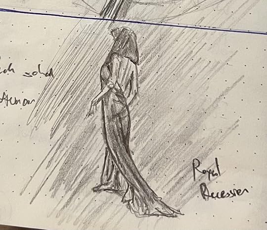
A God and a Bar of Soap (Sketches of the Week for Week 25 of 2025)
My son voted for this god as the sketch of the week, primarily because he really liked how the reflections came out on the water. There’s actually a lot I dislike about this sketch (the major one being that the gesture is wrong: her body is too stuff and vertical, and doesn’t capture the motion I wanted to imply. I wasn’t trying to draw a god idly gazing at the horizon; I wanted to show one treading off to capture it).
But as I’ve said before, powerful naked women are a crowd-pleaser, and so they lead when I’ve got ’em. Besides, I really am pleased with that reflection, and with my first attempt at a diaphanous cloth.

The runner-up is this bar of soap, and probably the better sketch:

I write for a living, have terrible penmanship, and struggle mightily to “unsee” text as text: when I draw something with a prominent hunk of text in it, it’s devilishly hard for me to draw what that text looks like instead of writing what it says. I’m working on that, and this is the first attempt that got anywhere close to right.
June 18, 2025
“Don’t hand me no lines and keep your hands to yourself” ♬♫♪ (Sketches of the Week for Week 24 of 2025)
This was another split decision sketch week. I was actually mostly happy with every sketch this week (which is extremely rare) but also felt that each of them had unresolved issues, either with legibility or just minor composition decisions early in the sketch that ended up creating headaches.
At any rate, my son felt that these two were the best showing.
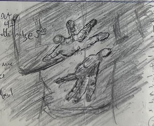

He really liked how the hands loomed out of the gloom, and the overall gesture in the second sketch. I really liked working on the first (the extremely foreshortened hands were both challenging but super engaging to work on) and the second is, as discussed in the past, an indisputable crowd-pleaser (saucy powerful ladies garner second glances and clicks—although, that aside, capturing the depth of the way she is sitting and the angled and occluded way the axe-hand-arm interact was really pleasingly challenging).
Final note: For ladies and gent of a certain age, the title of this post will trigger a potentially catastrophic earworm. To the rest of you, I offer a mostly forgotten one-hit wonder of my Cold War youth, the presumably ironically (???) named Georgia Satellites.
June 13, 2025
Flex and the Water Bottle (Sketches of the Week for Week 23 of 2025)
This was another week of sketches more about shading and volume than form. My son slightly preferred this first sketch (the model was wearing crazy long-fingered claw-gloves):

But he also really liked this water bottle sketch:
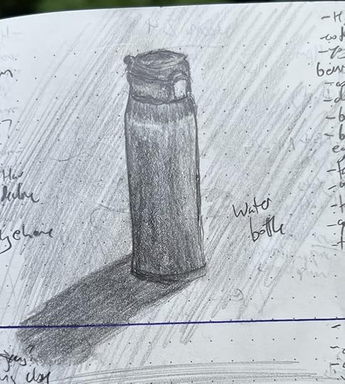
I recognize that the top sketch is more compelling (scantily clad women in powerful poses are a crowd-pleaser!) but the bottle was a bigger victory. The “Flex” sketch was from a two-dimensional image on my phone; I sketch that way a lot, and have gotten accustomed to translating two dimensions of pixels into two dimensions of graphite on wood pulp. The water bottle was just sitting on the table IRL. When you are sharing actual real space and time with an object, it’s much harder to fight the brain’s need to tell stories about what the “actual” shapes are, and instead let the eye tell the hand what it sees where.
June 4, 2025
Your introduction to the Crypto-Jews of the American Southwest
Some readers are thrown by a reference in my latest story to the protagonist, home inspector and minor-TV celebrity Sadie Espinoza, who describes getting bullied in high school, noting that:
Jewish Espinozas weren’t remotely “wetbacks.” They weren’t even “immigrants”: they’d been in New Mexico—where her dad and his brother grew up—since before it was “New Mexico.” The only thing calling her “wetback” did was make it clear how stupid those girls were, like a house cat strutting around thinking it caught a snake when all it had was a shitty old lizard tail.
Some folks are confused because they had an American public school primary education east of the Mississippi (as I did), and thus don’t know that Santa Fe is the oldest state capitol in the US, having been establish 150 years before the country was founded.
A much greater portion of readers are confused because they think of all Jews as European shtetl folk who came here in the late 19th and early 20th C (as mine did), and thus know nothing about the extremely long history of Jews in the New World (short version: we’ve always been here, and you’ve never liked us).
Anyway, if you’re curious about any of this, the graphic novel El Illuminado is a good introduction to Crypto-Jews and the impact the Inquisition had on world Jewry. Maybe more importantly, it’s really fair in how it illustrates the divisions and discomforts within and among Jews of different traditions/colors/descents, as well as the way that even established, assimilated, respected, modern, “White” Jews often find themselves alienated no matter where they try to stand or sit.
May 28, 2025
Knowing when to take the drawing away (Sketch of the Week for Week 21 of 2025)
My son was extremely emphatic that this was the sketch of the week, despite it being a week of many good sketches for me:

The reference is another still from a horror movie (frustratingly, I cannot recall what film; I think it was a short indie film, but can’t even—Oy! I just remembered! It’s The Blue Drum!) The film wasn’t much to shout about, in terms of story, but I liked it visually; it was understated and made good use of light and framing.
At any rate, my son really liked the shadows and shading and the way that (with his help) I captured how piercing the actress’ eyes are in the particular still frame. As we chatted, it seemed to me what he liked about this sketch was the restraint: it put on the page what needed to be there to capture the mood and her strength, and left off the page what wasn’t part of that. Thinking this one over—and continuing to sketch this week—I was reminded of a bit in John Guare’s play Six Degrees of Separation. If you’ve never read it or seen it, the film with Will Smith is a very faithful adaptation, and worth your time. There’s also an audio drama (or maybe a stage recording?) of it floating around out there, with Alan Alda as Flan, which is great.
At any rate, there’s a point where Flan—an art dealer and collector, passionate about art but no artists himself—recalls his kids having this amazing art teacher in grade school:
FLAN Why are all your students geniuses in the second grade? Look at the first grade. Blotches of green and black. Look at third grade. Camouflage. But the second grade --your grade. Matisses everyone. You've made my child a Matisse. Let me study with you. Let me into the second grade! What is your secret? THE TEACHER Secret? I don't have any secret. I just know when to take their drawings away from them.So, that’s what I guess I’m trying to learn now: when to take my drawings away from myself.
As an aside, if I’d been left to my own devices to pick a sketch of the week, I would have chosen this one. Yes, it’s also one that I took away from myself at the rate time (or nearly so), but that isn’t why I’d pick it. I like it because it felt the best working on it, flowed the most naturally and painlessly from pencil to paper. That’s no measure of art or craft, but it left me inordinately fond of this sketvh, because I so enjoyed the process of becoming with it:
May 21, 2025
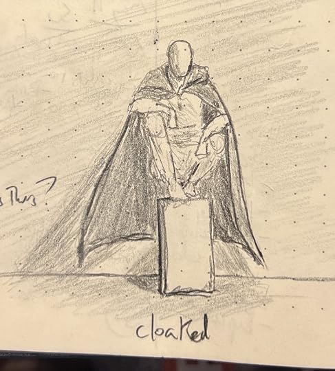
Cloak, dagger, sword, sorcery (Sketches of the Week for Week 20 of 2025)
My son is into D&D and Magic and martial arts, so he sorta loved all of the sketches from this past week, which was all fantasy topics. He thought “Cloaked” was the standout, because the shadows gave it the best depth:
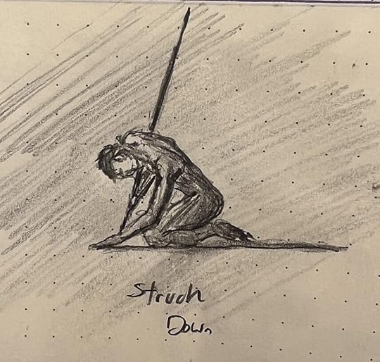
He also liked the rightsized detailing on the “Herald of the Odd God” and the gesture of the man she struck down:

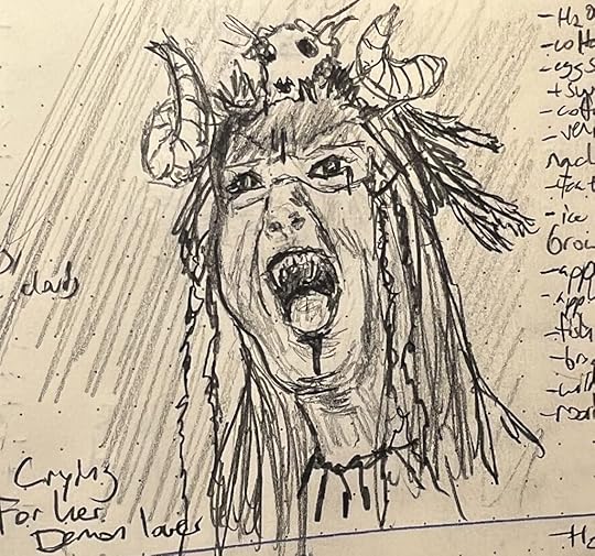
I also liked how this shaman wailing for her demon lover came out. The technique isn’t great—she almost drifts into Ninja Turtle territory, for godsake—but it’s really legible: It catches the eye from a distance, is easy to immediately read, and worth giving a second look. Honestly, should I really be asking for more? It’s sorta like last week’s deep sea diver: a reminder that composition and technique and artistry aren’t the goal on their own, but at the service of catching someone’s eye and making it worth looking twice.
May 15, 2025
Throwing shade (Sketches of the Week for Week 19 of 2025)
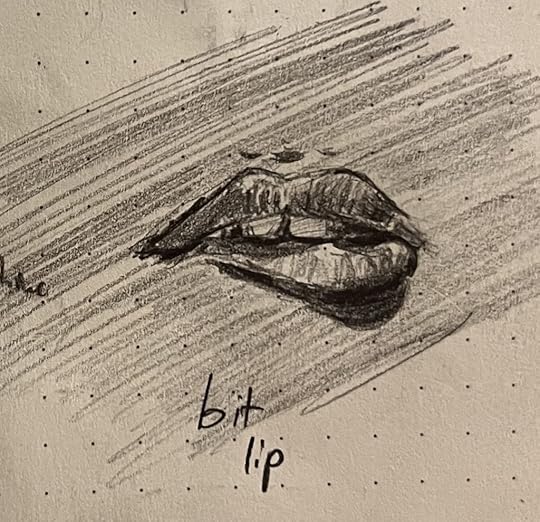
I’ve been thinking more and more about shade and tone and value, and how much more important to form these are than line is. I have pretty crummy distance vision, so just taking off my glass is a quick reminder: most of the time, I mostly cannot see lines at any meaningful distance. Instead, my brain intuits form by assessing tonal values.
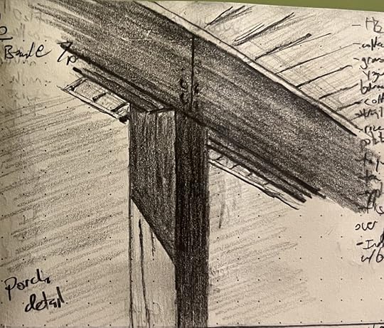
So, the big project right now is turning that whole processing system off in my head, so the hand can just draw the layers of darkness the eye sees, without the stupid brain telling me what’s round and where a corner comes together at 90 degrees. Yeah, that lip is round in real life, but it is flat on paper and just grading from deep black to untouched; that beam’s corner where it meats the joist is 90º on my porch, but is waaaaaay closer to 140º on the paper; the same shadow is way darker on the interior face of the beam than it is on the side.
Anyway, my son opined that “Bit Lip” was the best sketch of the week, so I’m posting that here:
But I think I was more pleased with “Porch Detail”; I’ve struggled mightily to “unsee” 90º angles in architecture, and I think I finally got there on this sketch.
That said, my boy is right: the lips are a more compelling picture overall, even if technically rougher.
Meanwhile, I’m tossing this guy in as a bonus, because he’s proven sort of a mystery: it’s a failed sketch, to me, totally missing what I was trying to capture, and pretty technically sloppy. But everyone who glances him in my journal asks about him. There’s something about him that is speaking to people along a wavelength I cannot detect. 

May 14, 2025
To be clear: I am in no way suggesting that IKEA may pose an existential threat to the fabric of reality
My latest horror story, “The Nölmyna,” is now officially published and free to read on Reactor: https://reactormag.com/the-nolmyra-david-erik-nelson/
A few months back I hung out with Ann VanderMeer, who edited this story for Reactor, at a conference in Florida. We ended up talking about Grady Hendrix, and I mentioned that this story sort of arose out of my frustration with Hendrix’s first book, Horrorstör. It wasn’t that there was anything wrong with that book—which I really liked—just that it wasn’t the story I would have written about IKEA. This one is.
I’ve spoken before about how much of my writing (and, I believe, much of art in general) arises from frustration that some artist Isn’t Doing It Right, Dammit! . That’s certainly the case here: I wrote “The Nölmyna,” in part, because Hendrix hadn’t Done It Right, Dammit!, and so I’d better just jump in and take care of that.
But it wasn’t until this morning that it dawned on me how deeply unreasonable it was for me to pick up Horrorstör and expect it to be the story I expected, because I have deeply weird feelings about IKEA that are simply not the norm:
Almost 20 years ago I was diagnosed with panic disorder with agoraphobia. This is well managed now, but I continue to struggle with certain public spaces, especially those like IKEA: cavernous places that have poor sight lines, lots of people, no windows, and obtuse wayfinding. I can function in these places, but I experience dissociation and depersonalization, intrusive thoughts, a free-floating dread, and pretty much would rather be anyone or anyplace else. If you’ve ever been too stoned on too much edibles, you’re in the ballpark.
IKEA is the seat of cosmic horror for me. This morning it dawned on me that maybe other people don’t experience this. Like, when I say “I hate IKEA,” what I mean is “When I’m in IKEA, I often feel like it would be better to stop breathing and being alive anymore.” I’m beginning to suspect when other people say “I hate IKEA,” they just mean “it’s crowded and weirdly stuffy” or “that furniture only holds up half the time” or “my partner and I always get in arguments there about lamps.”
Anyway, the publisher’s legal team very nicely asked me not to call the store “IKEA” in this story. But it’s IKEA. This story is about the true nature of IKEA and the distinct possibility that, through no fault of their own, they are creating the conditions for the absorptive annihilation of All of Everything by an Eminent and Imminent Immanence. You’ve been warned.


