David Drazil's Blog, page 2
July 19, 2022
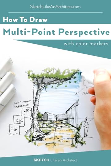
How to Draw Multi-Point Perspective Sketch with Color Markers
What is a multi-point perspective? Can I still sketch a multi-point perspective as a complete beginner in drawing? How many vanishing points are there in a multi-point perspective drawing? Today, I am going to answer all of these questions while drawing a country-side theme with you.
At the same time, you can also draw along with me by watching this Youtube video below.
Let’s get started!
A multi-point perspective is a scenario with more than 2 primary Vanishing Points on the Horizon Line.
It is actually a very common and realistic scenario that happens when objects in your perspective view
don’t lie in just one orthogonal grid (like in a typical 2-point perspective),
they are not parallel to each other or are slightly rotated,
or have irregular shapes (e.g. hexagon).

Learning how to draw a multi-point perspective is especially helpful if you are an urban sketcher. Every curved road technically needs multiple vanishing points describing its changing directionality. Moreover, it can create a more realistic impression, add visual intereset and better guide the viewer’s eyers accros your image.
Here are a few examples of a multi-point perspective view for better visual explanation:
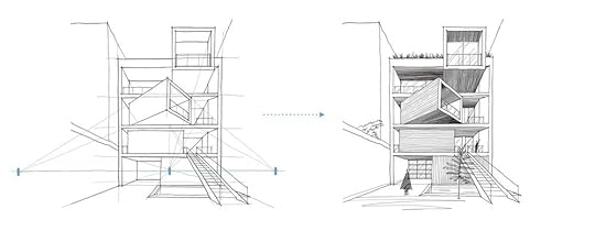
Sharifi-Ha House in Tehran, Iran - The rotated middle box doesn’t fit into a simple 1-point perspective view, and we need 2 more vanishing points to describe it. Find the full step-by-step tutorial on this alongside other 99 famous buildings in my newest book 100 Buildings & Archtiectural Forms.
 Step 1: Preparation
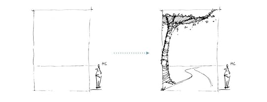
First, I draw a picture plane which acts as a frame to fit in my drawing. Since it is countryside scenery, I draw a tree in the foreground to show the context. Then draw the horizon line at the lower third of the picture plane, which is a relatable eye-level view.
Step 2: Adding Objects & Selective TexturingA quick Tip: It is always a good idea to avoid straight roads or streets in your images. Introduce a curved road instead so that it nicely leads the eye across the sketch.
Next, I placed a small barn along the road. If you look closely, the walls are divided roughly into halves by the horizon line which sets the scale.
When placing different objects in your scene, always ask yourself: how does it relate to the viewer’s position?
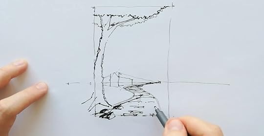
Selective Texturing - 3:18 in the video. Click to watch!
I also used selective texturing to suggest a stony road and extended the texturing slightly outwards from the picture plane to create more depth. Then I sketch another barn and positioned it closer to the viewer. This is when another vanishing point is created and makes it a multi-point perspective view.
Put in some effort to add details to the foreground object. It is because a higher level of detail and contrast can help support the illusion of depth. In this case, I am adding more details to the tree which is framing the view.

Multi-point perspective - 3:45 in the video. Click to watch!
At the same time, keep the rules of atmospheric perspective in mind, where the thicker strokes are used in the foreground. As we draw elements towards the background, further from the viewer, thinner lines are used.
It is also a practice commonly used in architecture section drawing to distinguish what elements are being cut and what is displayed in elevation.
I added a couple of annotations and human figures to anchor the scale. Check out this article to learn how to populate your sketches, and why it is so important to draw human figures.
Then, I move on with adding vertical hatching to the shaded surfaces of the barns. If you look closely, I drew a sun outside the picture plane to remind myself where the light source is.
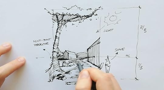
Cast Shadows - 6:56 in the video. Click to watch!
To learn more about constructing shadows in perspective, check out this step-by-step tutorial from my blog.
Step 5: Colouring with MarkersOne of the questions that I get asked most often is — What color marker am I using?
If you are a beginner in hand sketching, most likely you will be overwhelmed by the vast choices of tools out there. This is why I have organized all of my favorite tools in a list to help you make better decisions. Click this link to read.
After coloring the sky, trees, and road, I used a brush pen to darken the shadows and increase the contrast of the sketch. And voila… the final result looks something like this.

If you want to sketch along, I have prepared 3 process sheets to make it easier for you to follow allong or just focus on the coloring part with markers. Click the button below to download the practice sheets for free.
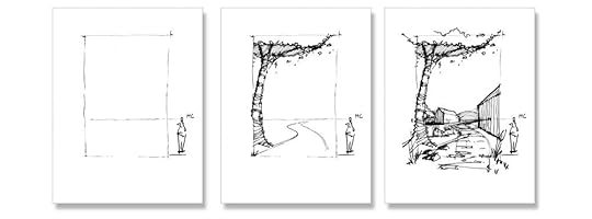 Download the Practice Sheets FOR FREE
What’s next?
I hope you enjoyed this article - if you did, check my other blog posts below!
Save this article on Pinterest for future reference & inspiration 👇
June 19, 2022
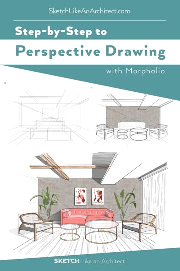
Draw 1-point Interior Perspective on Ipad for Beginners / 7 Easy Steps
For a beginner in perspective drawing, there might be lots of unanswered questions. E.g. What do the grid lines suppose to mean? How to keep everything in the right proportion? How to make it look more realistic?
Since perspective drawing is the closest visual projection to how we - as humans - see and experience the world, it’s especially important for architects and designers to communicate and explain their ideas in perspective so that their clients (and other involved parties) can easily understand them.
In this blog article, you’ll learn my step-by-step drawing process plus a few tricks in Morpholio Trace app on iPad which assists me with the drawing in this example.
Step 1 : Set Up the StructureStart by drawing the Horizon Line (horizontal line in eye-level ) across the page, and draw a cross (main Vanishing Point) at the center of this line. Then draw a big rectangle indicating the back wall of the room. To draw the other four sides of wall, simply drag a straight line from the vanishing point and go past each of the wall’s corners.

Interior Perspective Drawing Step-by-Step
If you are using Morpholio Trace, this can be done easily with just a click. You can quickly set up your composition structure using a perspective grid tool and light grey pencil brush.
A big advantage of digital drawing on iPad is the option of ‘drawing assistance’ which keeps your lines aligned with the perspective grid you set up so that your lines are always precise.
STEP 2 : Bounding BoxesI love to use the bounding box technique to help me keep the perspective and proportions of all the objects right. In this case the sofa, coffee table and other furniture in the room. First think of what are the biggest elements and key objects you want to include in this space, then simply draw boxes along the perspective grid to define their outlines and indicate their placement.
The result will look something like this :
 Step 3 : Wall Texture
To show the texture of the wall, add a new layer with an image texture of your choice for the back wall. Then move this new layer under the initial pencil sketch. Adjust the transparency level if necessary.
 Step 4 : Inking
Add a new layer for inking on top of the initial pencil sketch. In Morpholio Trace, you can use an inking brush set to black colour. Then take advantage of the perspective grid assistance, smart ruler and protractor to draw straight lines and ellipses.
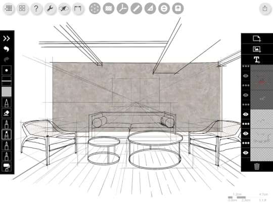 Step 5 : Filling
 It is time to fill in the space with colors and materials! On a new layer, use the smart fill tool to block out solid white areas of the ceiling elements and the sofa. This way, the outlines of the key furniture are more obvious even without the perspective grid.
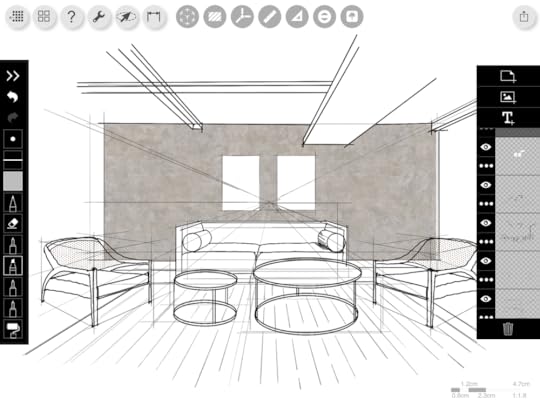
Then use the roller brush to add your desired color & texture to the beams and sofa. I also added abstract art paintings on the back wall.
 Step 6 : Highlight & Shading
Light and shadow add more plasticity and depth to the space, resulting in a more realistic drawing. How to achieve that? It is very easy, simply use white and darker grey color.
In Morpholio Trace, you can adjust the opacity of roller brush and eraser to achieve this realistic effect.
First, with the roller brush, use white colour to add highlights, and darker grey for shadows. Then on a new layer, select the eraser, lower its opacity, and subtly eraser parts of shadows to create smooth shaded gradient.
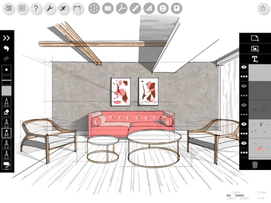 Step 7 : Final Touch
Lastly, I use the same technique with the roller brush to free-hand draw plants next to the sofa. To add highlights and shades, I played around with the lighter and darker shades of green.
And then… Voila! The final outcome looks like this :
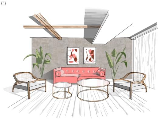
If you find this blog post helpful but still need more in-depth instructions, I have also prepared a PDF Guide with all the steps explained in detail for you to download, completely FREE. All you need to do is to click the button below to download it.
 Download full instructions in a free pdf guide
Save this pin for inspiration!
June 14, 2022
Architecture Concept Development: Perspective Drawing in 7 steps
Developing a design concept for architecture can be intimidating and tough for students, but once you learn how to kickstart this task, your creative juice will start flowing like crazy. For me personally, I love to use 3 different drawings for architecture concept development : floor/site plan, axonometric diagram and perspective drawing.
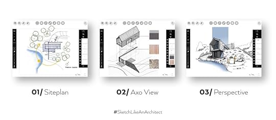
Today, we’ll break down a 2-point perspective drawing from scratch and I’ll walk you through all the steps. On top of that, I’ll share some of my thoughts behind the process, including design considerations.
Why Perspective Sketch?
Perspective sketches and drawings show the space in a very similar way to how we actually perceive it in real world. Unlike other architecture drawings - which are often orthographic - perspective views can be more attractive and are more easily understandable by clients and non-professionals.
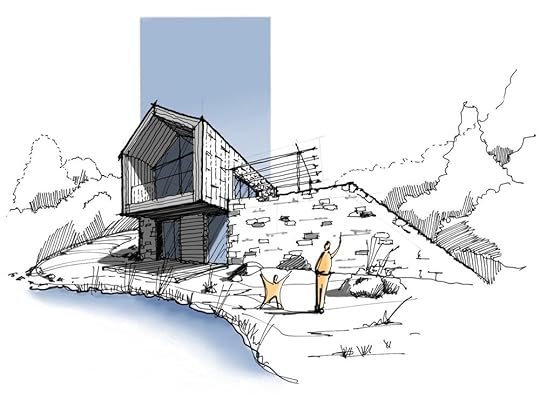
An exterior 2-point perspective drawing conveys important aspects of a design, from how the building looks like in 3D view, to its scale, and the relationship between the architecture and the site context.
 Step 1 : Perspective Grid
 First, draw a horizon line at your eye level. In a 2-point perspective drawing, there are 2 vanishing points. In theory, the vanishing points are at a 90° angle from each other. But our field of view, which is what our eyes really see in reality, is only 40°- 60°. So to keep your view realistic, you only want to include only one of the vanishing points in your picture plane, unless you intend to create a more dynamic & distorted view.
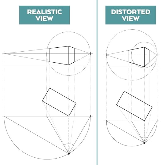
Sounds too complicated? Below are two illustrations to help you understand the concept further :
Realistic view

Realistic View in Perspective | 2:11 in the video - click the image to watch full explanation
Cone of Vision basically determines how close we can be positioned in front of an object, in order to see it fully and without distortion. This is why to create a realistic view, you want to set the station point at the right distance.
Distorted view

Distorted View in Perspective | 2:11 in the video - click the image to watch full explanation
This is how it looks like when we are positioned much closer to the same object. Translated into 2-point perspective, the object cannot fit into the realistic cone of vision. This is when we are forced to increase the Field of View angle from 60° to 90°, which results in an exaggerated and distorted perspective view.
Next, following one of the composition structures - the Rule of Thirds - I placed the cantilevered part of the house, which is the main architectural accent, on the axis of the left vertical third.
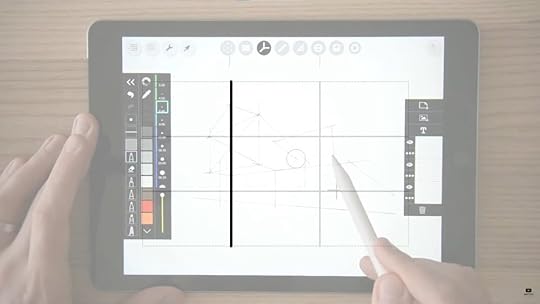
Composition & The Rule of Thirds | 4:36 in the video - click the image to watch
At this point, you can use the Rule of Thirds, the Golden Rule, Fibonacci Spiral or other composition structures as guidelines to place the main elements. You don’t need to follow these ‘rules’ with geometric precision, just to get an idea for better composition.
Step 3 : Adding DetailsNow you can add details to the building, like window divisions, railing, textures, as well as the surrounding terrain, vegetation, and water element to offer important and contextual information to the viewer.
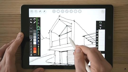
Adding details | 7:07 in the video
This is a tricky part as a lot of us might get caught up in little details, to a point when other parts of the drawing couldn’t get done.
So here’s a quick Tip: Work on all parts of the drawing simultaneously to keep your eye on a bigger picture.
In fact, I wish someone would have given me this piece of advice when I first started out as a beginner. This is why after years of being in this industry and constantly sketching, I have concluded the Top 10 Tips on Architectural Sketching that would certainly help accelerate your skills.
And …. you can now learn it for FREE, yes you heard it. Sign up now by clicking the button below.
redeem free mini courseAfter signing up, you will receive one short video everyday where each time I’ll share 2 tips on architectural sketching, including tips on perspective drawing, shading, human figures, vegetation and so on. There will be sketching worksheet provided for every video so you can practice along!
Step 4 : Section & Sun Path DiagramI have designed the cantilevered part of the house not just for aesthetic, but also functional purpose as a balcony and shading. To demonstrate that, I sketched a schematic section to show the sun elevation angles at 12 noon during summer and winter solstice. This is because on both days, the sun’s position is the extreme during a year.
But how do you know the sun elevation angle? This is when you need a sun path diagram based on the site location. This project is in Prague, and the sun path diagram looks like this :
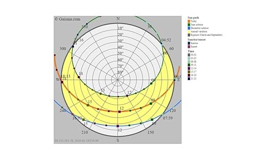
How to use Sun Path Diagram | 8:12 in the video - click the image to watch the full explanation
From this diagram, we have learnt that the elevation angle in June is 60°, while in December it is 16°. This is how I draw it into the section.
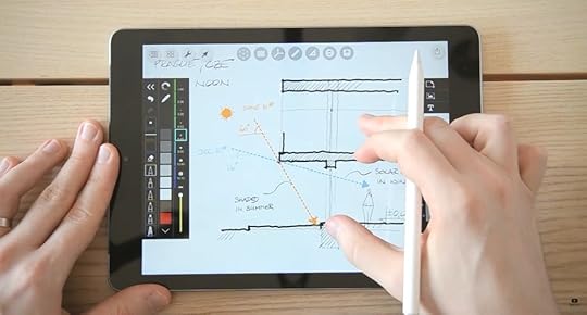
How to work with sun path diagram| 9:18 in the video - Click the image to watch the full explanation
Step 5 : Passive Strategies and ConsiderationsTo optimize your architecture design, you should always consider the passive strategies in the early phase of a design concept development. This is to ensure quality indoor environment and low energy consumption. Here are the example of things to consider :
Building orientation
Surface/volume ratio
Glazing ratio on facades
Solar shading
Thermo-stability of soil
Natural ventilation
Step 6 : Selective TexturingSimply suggest the surrounding without details so that it does not draw too much attention from the focal area. To save time, I use selective texturing, suggesting a stone wall without filling in and rendering the whole surface.
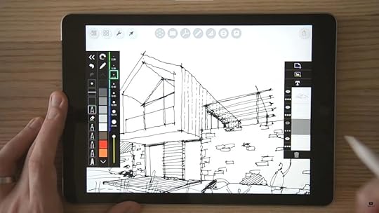
How to use selective texturing | 11:44 in the video - click the image to watch
Step 7 : Add ShadingThen, I create a new layer, set the blending mode to multiply so that it blends well with the linework. Lastly, I added some colour accents to emphasize the focal area of the sketch. Choose complementary colours - i.e colors on the opposite spectrum of the colour wheel, eg : blue and orange, red and green, yellow and purple. Then use them in strong disproportion - for me personally, I’d usually use these complementary colours in 80/20 or 90/10 ratio.
Lastly, I will emphasize on the focal area of the sketch with blue coloured background to suggest a part of the sky. The final sketch looks like this :
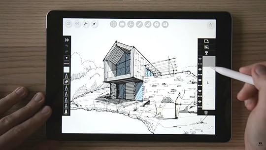
Adding shade & shadow | 14:20 in the video - click the image to watch
So this is how my thought process goes while designing for a commissioned project. I tried my best to summarize them into 7 easy steps so you can follow through. This whole process took me about 45 minutes to complete. The moment you pick up a pen and start sketching, you will come to realize that developing a design concept is not as intimidating as it seems.
I believe if you have read till this end, you must be somehow interested in learning architectural sketching. Maybe you have no idea where to start, so here’s a good news! I have prepared a 5-day mini course for you, where I will be sharing my top 10 tips in sketching. And it is completely FREE!
join free mini course nowNot only you will learn some of my best practices, and the “secret tips” that I often refer back to when sketching. But there are also sketching worksheet provided so you can practice along. I believe this will be a super helpful for you especially if you are a beginner. Happy sketching!
Save this pin for your design inspiration!
January 30, 2020
How to Place People & Trees in Your Drawings
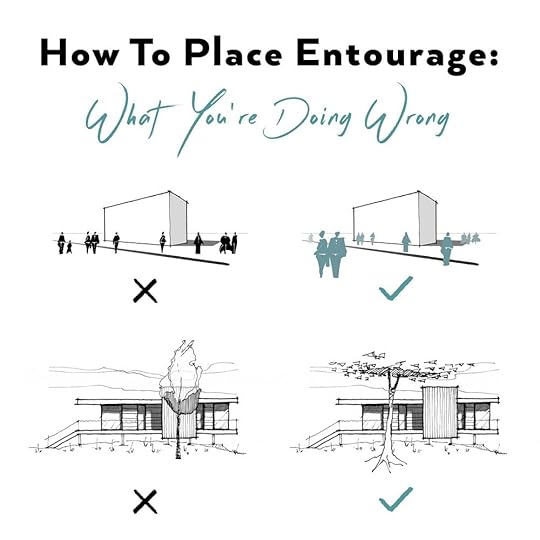 UNSURE HOW TO PLACE ENTOURAGE TO COMPLEMENT YOUR DESIGN? FOLLOW THESE RULES.There are certain composition rules to be followed when placing entourage, trees and people in this case, to complement a building in a drawing or a sketch. Note that these rules might change slightly according to a form of a building.
In this blog post, we’ll go through some common mistakes when placing entourage and explain the do’s & don’ts on examples.
Note that these following considerations don’t take into account some factors which are usually considered as a part of architectural or landscape design, such as weather conditions, orientation, soil properties, and overall site analysis. This article offers advice on composition of a drawing or a sketch.
PLACING A TREE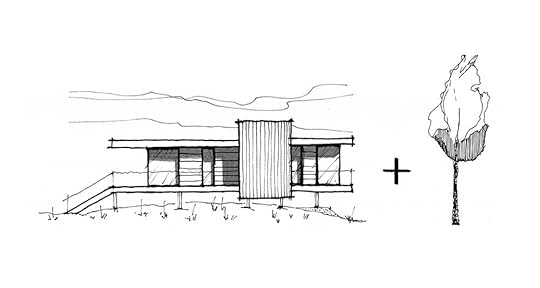
Let’s start with placing a tree in an elevation sketch.
DON’Ts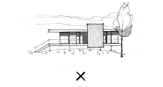
A tree is aligned with an edge of a building, creating a visual tangent. Never align it in a way where its axis directly overlaps with a vertical edge.
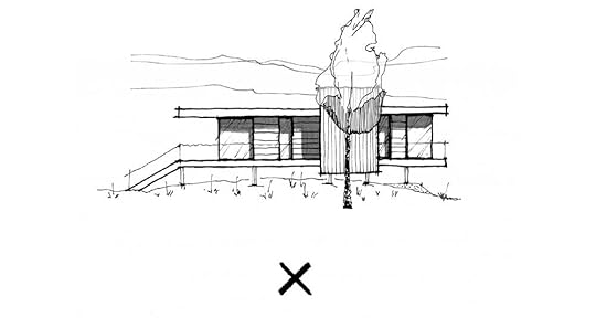
A tree is covering the architectural accent of a building.
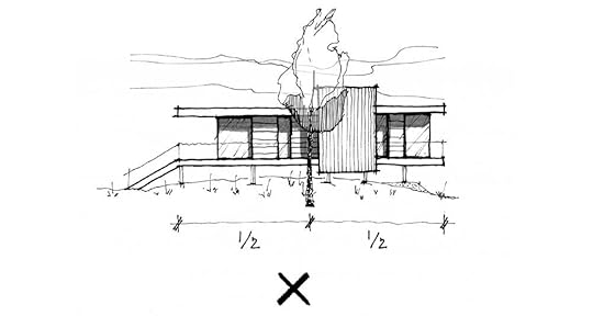
A tree is placed directly in the middle of a building.
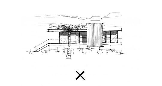
Such type of tree and its placement doesn‘t complement a building‘s form.
DO’SNow that we’ve seen the wrong ways, let’s take a look at some correct options of placing a tree in this elevation.
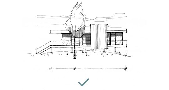
Such vertical tree complements the horizontal form of a building and its placement balances out the composition.
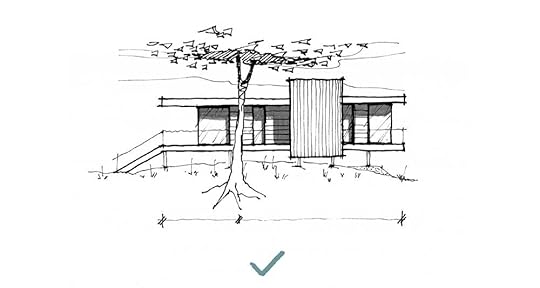
Optionally, such tree can be used when positioned properly.
Placing PeopleIn this section of the article, we compare always 2 scenarios of populating a single drawing and explain what to avoid, why, and how to do it better.
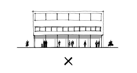
The repetitive and equally distant distribution of people competes with the building‘s rhythm.
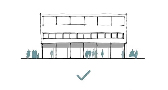
People create groups and complement the rhytmical facade by their uneven distribution.
TIP: Always try to use entourage or any secondary graphic elements of a drawing to complement your design‘s form and features.
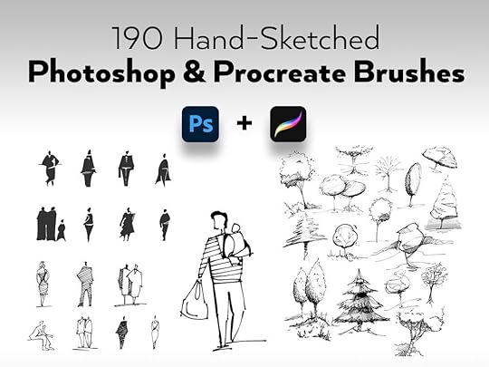
Download my library of 190 hand-sketched people and trees as Photoshop + Procreate brushes and raster & vector images. Speed up your workflow and have fun pimping your drawings and illustrations with these ready-to-use brushes & graphics.
* includes how-to videos and installation guides
download 190 hand-sketched people and trees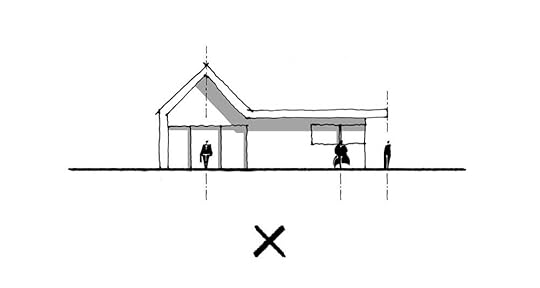
Human figures (or any other entourage) should never be placed directly on a geometrical axis of important elements such as a gable, windows, or an edge of a building.
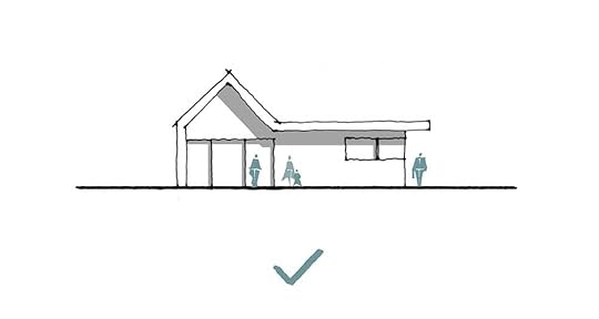
People are placed to complement the overall composition of the elevation.
TIP: By intentional placement of people, you can direct the viewer‘s attention towards important parts of a drawing to highlight the benefits of your design.
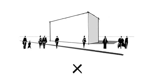
All human figures are placed in the same level of depth which makes the image look more flat.
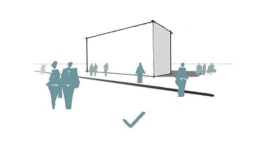
The distribution of human figures supports the illusion of depth in perspective.
So these are the do’s and don’ts when it comes to placing entourage in your drawings or sketches. Have you ever made any of these common mistakes? Let me know in the comments below.
Recently, I’ve published my second (e-)book focused on Advanced Techniques where you’ll learn a lot more about:composition & design principles,advanced perspective,how to draw more complex and organic shapes,how to improve your imagination, and much more.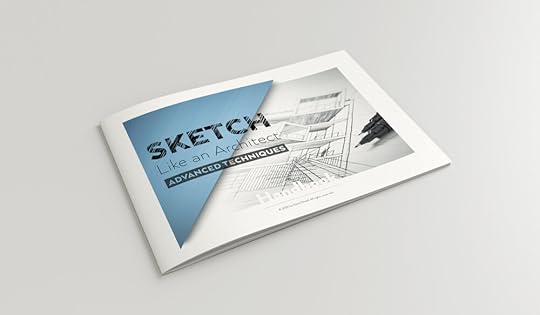 YES, LET ME PEAK INSIDE!
November 28, 2019
5 (Non-)Architecture Books You Should Read
 An influential Swiss architect Le Corbusier (by name Charles-Édouard Jeanneret) said that if you want to be an architect you should do 2 things:TravelRead books
In this blog post, I’m presenting you with some of my favourite books - both architecture-related and non-architecture. The latter are still very relevant to any creative mind, in my opinion.
My love for books is growing as I grow older and the time spent reading a book becomes more and more precious to me. Here are 5+5 books which are already on my bookshelf and which I can only recommend. Let’s start with architecture ones:
[Affiliate Disclosure: If you decide to purchase through the links below, I’ll receive compensation without any extra cost to you.]
Architecture Books
Wood Architecture Now!, Philip Jodidio
I'm a big fan of using timber in architecture and this book represents great case studies for your projects or inspiration on what's possible with wood.
Yes is More, Bjarke Ingels Group
An Archicomic on architectural evolution - one of the best known and most sought-out architectural studios - BIG (Bjarke Ingels Group) - represents their projects and evolution in an entertaining way through a comic format.
The Language of Architecture - 26 Principles Every Architect Should Now, Andrea Simitch, Val Warke
Very well structured and categorized overview of the foundations of architectural design presented in a digestible way.
Understanding Architectural Details, Emma Walshaw
150 construction details explained and presented in both 2D and 3D, including downloadables in both DWGs and Sketchup file formats. Invaluable resource for every architectural student and professional. I wish I had that during my studies!
101 Things I Learned in Architecture School, Matthew Frederick
Great and reflective book on architectural studies, including concise lessons in design, drawing, the creative process, and presentation.
Non-architecture Books
These books are not directly related to architecture, but they are on many levels extremely relevant to any creative mind. I cannot recommend Austin Kleon's books enough! Having all 3 of them, I still keep coming back to them every now and then.
Steal Like an Artist, Austin Kleon
Extremely relevant in today’s digital era, very funny, and a bit scary.
Show Your Work!, Austin Kleon
This book got me started with sharing my work with the world, starting with Instagram and building my online presence. It sounds like I owe you, Austin!
Keep Going, Austin Kleon
Most recent one offering advice on how to overcome struggles and keep going anyway. Ten simple rules for how to stay creative, focused, and true to yourself—for life.
Don’t Get a Job... Make a Job - How to make it as a creative graduate, Gem Barton
The title says it all. I've found it very helpful in times of frustration and not knowing what to do with myself. The book offers many case studies, advice and examples from real life. Inspiring and motivating.
Grit: The Power of Passion and Perseverance, Angela Duckworth
Success, deconstructed. It’s not about talent and this is the proof. Amazing resource for anyone striving to succeed in any area of life.
Never miss another blog post!
Join 20,000+ readers and get updates on new blog posts, freebies, educational resources, and more! No spam. Spam sucks!
YES! Sign Me Up!Hope you find these interesting and give them a read! What are your favourite (non-)architecture books? Let me know in the comments below!
Happy reading,
David
November 22, 2019
My Essential Drawing Tools
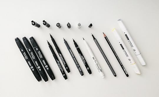 “What pens do you use?”Of all the questions, this one above is THE. SINGLE. MOST frequent question I get asked.It’s time to give you some proper overview of the analogue tools that are lying on my table right now. So here goes my personal recommendation…
But before I dive into the specific brands and types of pencils, pens, and markers, I want to ask you this:
Will better tools make you a better artist?If you ask me, they won’t.
However…
…new/different/better tools might help you discover or learn new techniques, get you excited about the process and eventually, because of the effort and time you put in, help you improve after all.
And that’s great!
The bigger point here is, in my humble opinion, that tools you use are secondary. They are nothing without you.
You may or may not agree with me on that and that’s absolutely fine. I just wanted to make my point about tools being overrated sometimes. Now that we have that off the table, let’s have a look (finally!) at what tools I use on a frequent basis.
Before digging into these awesome tools I use and recommend, an important disclosure: This article includes affiliate links, which means that if you choose to make a purchase through them, I get a little commission without any extra cost to you. This is a great way to support my blog which allows me to continue to bring valuable information to you.
To make it nicely organized for you, I divided my tools into several categories - pencils, pens, markers, and papers/sketchbooks.
PENCILS
I wasn’t really keen on using any specific pencils until recently when I got to try these Arteza Expert Pencils. There’s a set of 12 pencils in hardnesses ranging from 4H to 6B. They come pre-sharpened in a protective metal tin. On top of that, they are extra resistant to breaking thanks to high-density graphite cores.
Arteza Expert Pencils - Set of 12
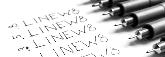
With pens, specifically fineliners, I’ve experimented a lot because they are the main tool for my black&white sketches. These days I’m using one of these 3 types:
Staedtler Pigment Liners (set of 12, thicknesses ranging from 0.05 - 1.2 mm)
Uni Pin Fine Liners (set of 9, thicknesses ranging from 0.05 - 0.8 mm)
Arteza Fineliners (set of 12 in thicknes 0.4 mm)
COLOUR MARKERS

Colour markers are essential for both analyses, concept sketching, as well as presentation sketches and drawings. I very often use just one colour to add colour accent to the focal point of my sketch, but in interior or industrial design, the use of such colour markers is more intensive. There are many options to choose from, I can recommend these types based on the budget available - listed from more expensive to cheaper ones:
Copic Markers
Set of 12 (in various colour schemes)
Touch Markers
Arteza Markers

Depending on the context, I’m choosing between separate sheets of paper/tracing paper and sketchbooks. At my home office, I usually use separate sheets and when traveling or on the go, I use my sketchbook.
Very often I use tracing paper for layering information on top of each other and iterating my ideas and designs. Again, I prefer separate sheets because they are easier to scan. All in all, here are all the options I use:
Sheets of normal white office paper 80g/sqm
this one’s great because of its thicker paper which withstand even colour markers without soaking through and because of its nice and handy format
Never miss another blog post!Join 30,000+ readers and get updates on new blog posts, freebies, educational resources, and more! No spam. Spam sucks!
SIGN ME UP!
Hope you’ve found this overview useful! Let me know which sketching tools you like to use!
Take care and happy sketching,
David
September 26, 2019
3 Common Mistakes When Drawing People
 Very often we make these same mistakes when it comes to drawing people in our sketched compositions. Let's break them down and see how to quickly fix them!In today’s blog, we’re following up on the previous
blog post with a downloadable Worksheet
for practicing and Freebies related to sketching Human Figures. Here are some more tips on how to make your sketched populated scenes look even better!
Very often we make these same mistakes when it comes to drawing people in our sketched compositions. Let's break them down and see how to quickly fix them!In today’s blog, we’re following up on the previous
blog post with a downloadable Worksheet
for practicing and Freebies related to sketching Human Figures. Here are some more tips on how to make your sketched populated scenes look even better!COMMON MISTAKE #01: Wrong perspective
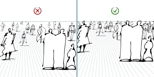
Solution: For eye-level perspective (from a standing human's point of view), place all the standing people's heads on the horizon line. This is applicable also for other cases, when the horizon line is lower then at natural eye-level. Then it should always cut through all the figures in the same place - be it elbows, waist, knees, etc.
As with every rule, here are exceptions, too - children and sitting people will be naturally positioned lower. Another exception is in the case where there are multiple height levels in our scene - in case of ramps, staircases and similar.
Tip: In an eye-level perspective, place all the standing people's heads on the horizon line.
Download Free Printable Worksheet for Human Figures!DOWNLOAD NOWWe respect your privacy. Unsubscribe at anytime.COMMON MISTAKE #02: Scale is off
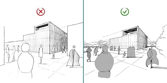
Solution: By scale here, I mean relative size of one object to another. You already know that a human figure can determine scale of our scene as it's relatable for us and we can easily compare it to other objects in the scene.
On the left hand side you can see an example from a student from my online course. The mistake is in making one storey (floor) the same height as a human figure. This results in the depicted space looking too small or human figures looking too big.
The correct example on the right hand side uses a general rule of thumb, making a storey (floor) the same height as 2 human figures, which is a more realistic approximation (considering a human height 1,75m and a storey height 3,5m).
Tip: Start your sketched composition by referring to a human figure to determine the scale of all other objects in your scene.
COMMON MISTAKE #03: Unnatural placement
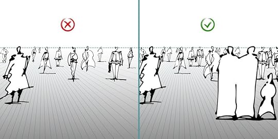
Solution: When placing human figures across your scene, try to group people together instead of drawing just a bunch of individuals. In that way, your scene will look more natural as people are social beings and tend to create small groups or couples. Nobody wants to feel left out ;)
Tip: Create a better sense of depth in your image by overlapping human figures and working with 3 depth planes - foreground, middle ground, and background.
Hope you've found this at least a bit helpful and will avoid these mistakes in the future ;)
Happy sketching,
David
#SketchLikeAnArchitect
Join 30,000+ readers and get updates on new blog posts, freebies, educational resources, and more! No spam. Spam sucks!
SIGN ME UP!September 19, 2019
How To Improve Your Imagination Drawing - 3 Easy Steps
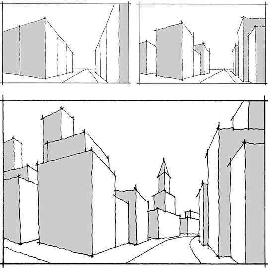 Drawing from imagination might be difficult.
try these specific tips to improve your process!This blog post offers an example of drawing process from imagination. Follow along and learn several tricks you can use to ease your own sketching process and enhance your results.

Step 01: Start simple
First step is to start very simply by outlining a basic structure of your composition. You can refer to your favourite composition rule such as the rule of thirds, the golden ratio, or other (more on composition below).
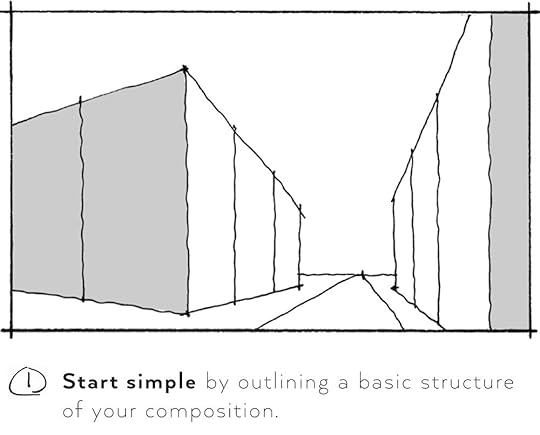
Thumbnail sketches
Thumbnail sketches are exactly what they sound like - small, initial sketches which serve well for validating your ideas and optimizing you composition. Because they’re small, they force you to focus only on important elements of your sketch without digging into details. Thumbnail sketching is also fast so you have time create more of them, to iterate and verify your intention.
It may be difficult to draw what we see, but it’s even more challenging to draw what we cannot see yet.
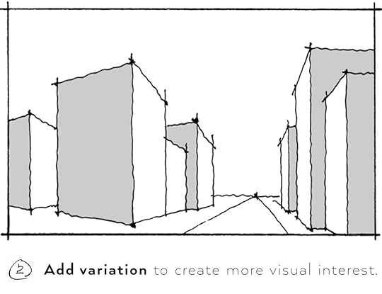
Step 02: Add Variation
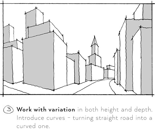
Once you set up a basic composition structure, try to break it down and add variation to different elements. This can include variation in height and footprint of your elements, which will add more visual interest and better opportunities to suggest plasticity and depth through shading later on. Optionally, you can also introduce different height levels of terrain to break the flatness even more.
Step 03: Optimize & repeat
Lastly, work further more with variation and adding more details to your scene. Now, that your composition is more varried and visually interesting, it should be easier to fill in extra complementary elements and add details to focal area of your sketch.
Never miss another blog post!
Join 30,000+ readers and get updates on new blog posts, freebies, educational resources, and more! No spam. Spam sucks!
SIGN ME UP!Couple more tips and thoughts on compositionAs promised above, here is a composition break-down of this sketch in progress - basic principles which we should keep in mind from the start. Composition really is what makes or breaks your image.
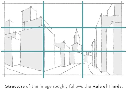
Structure
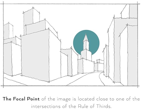
This sketch roughly follows the Rule of Thirds, which is basically a simplified version of the Golden Section. Usually, we try to align our main vertical edge in our scene to this division into thirds. It’s important to work also with the intersection points where it’s a good idea to place the focal point.
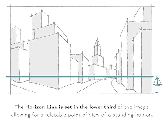
Horizon Line Position
Similarly to aligning the vertical edges to the thirds, we work also with the Horizon Line. Good rule of thumb is to place the horizon line in the lower third if we depict a natural point of a view from a human eye-level. If we depict an aerial view, the horizon line is usually in the upper third.
TIP: For exterior views, try to avoid placing the horizon line in the middle of an image - it leads to static and boring compositions.
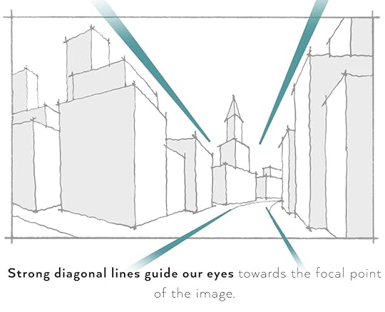
Guiding Lines
Strong diagonal lines or curves in our scene are tools which help us to guide the viewer’s eyes accros our image. In this case, we take advantage of the vanishing point and strong converging lines to focus our attention towards the church-like volume.
Focal Point
Focal point or focal area is the part of image we want our viewer to pay the closest attention. As mentioned before, it’s a good idea to place such focal area close to the intersection points of the Rule of Thirds.
TIP: Draw attention to the focal point be making it the area with the highest contrast.
Observation and visual library in your mind
Observation skills play a big role in imagination drawing and becoming a better artist. By careful observation you train your eyes - you start paying closer attention to and better understand:
details
forms and shapes
positive and negative spaces
play of light and shadows
reflections
textures and materiality
and more…
By training your observation skills you also build a library of visual references in your mind which you can always get back to when sketching from imagination.
Layering
For iterations and optimizing your sketch on the way, it’s great to use principle of layering new information on top of each other. If you draw traditionally by hand, you can use layers of tracing paper for that purpose. In case of digital sketching and painting, most programs and apps work with layers as well - take advantage of it when refining your drawing!
Recently, I’ve published my new PDF Handbook focused on Advanced Techniques in architectural sketching where I dive much deeper into:
advanced perspective,
how to draw more complex and organic shapes,
how to improve your imagination, and much more.
Click the button below to check it out!
Yes, keep me posted!
Happy sketching,
David
#SketchLikeAnArchitect
PS: Explore Resources for related downloadable Freebies and more educational materials on architectural sketching!
August 2, 2019
What Type of Perspective Should You Use?
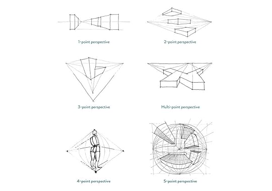 There are several types of perspective - so which one should you use and when?In this article, you’ll get an overview of linear and curvilinear perspective types and I’ll show you examples for each of them. By the end of this blog post, you’ll know what each type of perspective is suitable for and when to use it. Let’s dive into it!
What is perspective?
The way we see the world is driven by rules of perspective. Perspective in sketching is a tool how to create a realistic illusion of 3-dimensional space. Everything we draw, from an apple to a spaceship, needs to follow the rules of perspective in order to look realistic.
Perspective works like an invisible grid helping us to place objects in our spatial composition. It is a way how to describe 3-dimensional space and express depth on a 2D plane.
Linear Perspective
In linear perspective, there are 4 major types of perspective defined by the number of primary Vanishing Points lying on the Horizon Line:
1-point perspective,
2-point perspective,
3-point perspective,
and Multi-point perspective.
Let’s look at some examples of each of the types.
1-point Perspective
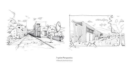
1-point perspective (aka frontal or central perspective) has only one vanishing point on the horizon line located somewhere within the picture plane and all the orthogonals converge towards it.
When to use this type of perspective:
when you want to create a single strong focal point in your sketch (with orthogonals leading our attention to it)
for close to front view, seeing one side of an object (almost) flat
for straight on looking points of view
for view perpendicular to the scene we draw
Common examples of such perspectives depict a view down the street, railways, or frontal interior views (central perspective).
2-point Perspective
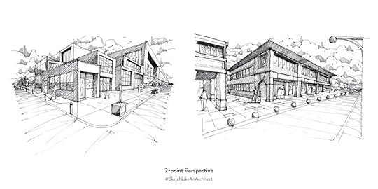
2-point perspective (aka angular perspective) has two vanishing points on the horizon line, which don’t necessarily need to be within the picture plane.
When to use this type of perspective:
when you’re seeing two perpendicular sides of an object, both distorted/foreshortened
for non-perpendicular point of view
In 2-point perspective, the focal point of the scene is usually NOT located near the vanishing points, but rather following the rule of thirds composition.
Common examples of such perspectives depict a street corner view or a corner view of an interior showcasing a single dominant object (e.g. a bed or a sofa).
Vertical 2-point Perspective
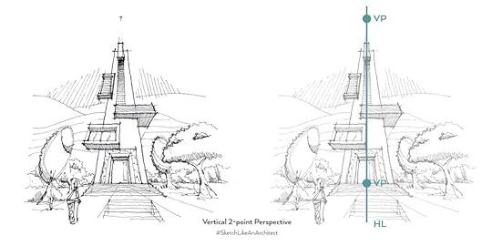
This sketch is still a 2-point perspective - just with a little twist. The horizon line here is vertical which allows us to simulate the dynamics of 3-point perspective with only two vanishing points. What’s important here is to realize that the horizon line in perspective doesn’t always represent the real physical horizon.
If you want to master the basic perspective rules and other 5 steps to awesome perspective sketches, check out my online course Sketch Like an Architect: Step-by-Step From Lines to Perspective. i want to master perspective
3-point Perspective
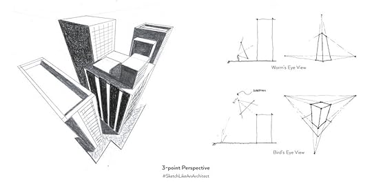
3-point perspective uses three vanishing points where two of them are on the horizon line and the third is either high above the horizon line or way below it. There are two basic types of 3-point perspective based on the position of the horizon line:
Worm’s Eye View - imagine yourself looking high up. The horizon line is situated very low.
Bird’s Eye View - imagine being Superman flying over a city and looking down.
See the above sketch and the diagrammatic explanations of these two types.
3-point perspective offers more dynamic views thanks to all the three spatial directions converging towards their own vanishing points and creating more diagonals in our scene.
Multi-point Perspective

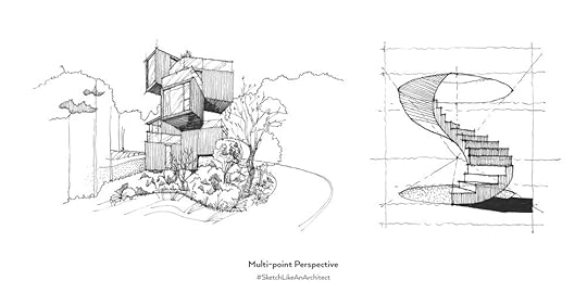
The last type of linear perspective is Multi-point perspective - it is the case when there are more than two primary vanishing points on the horizon line. Surprisingly, this is the most common type of perspective we can observe in the real world. Here’s when you should use multi-point perspective:
when objects in our scene don’t lie in the same orthonogal grid
when sketching curved roads
when you want to add visual variation, breaking out from a (boredom of a) single orthogonal grid
when sketching non-orthogonal objects (like pentagon shape)
See the examples above of the multi-point perspective sketches. Even though the staircase example can seem like a 1-point perspective, it is indeed a multi-point one as each of the steps converge to its own vanishing point on the horizon line.
Curvilinear Perspective
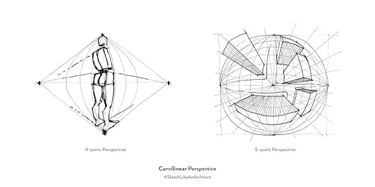
Curvilinear perspective is another type of projection, different from all linear perspectives as it introduces curves into the grid system. The curvilinear perspective grids work with 4, 5, and even 6 primary vanishing points. They can be also divided into these categories based on their type of field of vision:
Cylindrical field of vision (4 vanishing points)
Hemispherical field of vision (5 vanishing points)
Spherical field of vision (6 vanishing points)
You can see examples of 4- and 5-point perspectives in the image above. Curvilinear perspective represents more advanced ways of projections (like fish-eye effect) and they are fun to experiment with, but they are more suitable for comics illustrations than for common architecture purposes. Nevertheless, it’s always a good idea to broaden our knowledge by stretching the usual boundaries and learning from other visual areas.
Recently I launched my new PDF Handbook focused on Advanced Techniques where I’ll dive much deeper into:advanced perspective,how to draw more complex and organic shapes,how to improve your imagination, and much more.Click the button below to learn more about and see what’s inside! Show me more!Happy sketching,
David
#SketchLikeAnArchitect
PS: Explore the Resources for related downloadable Freebies and more educational materials on architectural sketching!
July 23, 2019
[PODCAST] Advice to Fresh Graduates, How to Overcome Fear of Failure, My Backstory, and More...
 How to overcome fear of failure?
How to get a job as a fresh graduate?
How to get noticed online?I’m excited to share with you a podcast episode from The Archiologist where we have an exciting talk with Maria Flores. Maria is the founder of The Archiologist as well as an undergraduate design professor at Florida International University and she interviews me on many different topics including:advice to fresh architecture graduatesmy journey from being an unemplyed graduate in Denmark to getting hired and gaining 90k followers on Instagramwhy the Sketch Like an Architect project was born from frustrationhow to overcome fear of failurehow can sketching make us better designersand much more…Click the links below to listen to this episode!
Click the links to listen to the podcast on your favourite platform:
Listen on the The Archiologist Website.Listen on Spotify.Listen on iTunes.Listen on YouTube (Audio).Listen on Anchor.
Excerpts from the Interview Transcript:
(…)
M: Since I met you through Instagram; are you doing this full time or is it a part-time job?
D: It’s been, as they say -- a real hustle from the beginning. When I started this I was actually unemployed back then, in Denmark. Right now I’m in Prague. But back then, I started in the time when I was looking for a job to work as an architect. At that point, I started with Instagram, I think it was 2017… The beginning of the year. Soon after that I got hired, and actually most of the time, those two years, it was working in the evenings and early mornings in the weekends on Sketch Like An Architect.
M: Haha, I know how that feels.
D: I was working as a full-time architect, and as an extra thing, I was doing the Sketch Like An Architect project, and things related to that. Up until now it has always being a side hustle, part-time thing.
M: But I mean, at the end of the day it’s something that you love. You feel very passionate about it, so at the end of the day it doesn’t really seem like work, you know?
D: Yeah, not at all….. At work my responsibilities at the job were kind of limited, because I was a fresh graduate, I was new, I started getting experienced…. So the responsibility I was given was not as big. So when I would come home, I was doing this little project of mine, this online thing, I get all the responsibilities. And all the decisions are made by me. So it’s a nice experience, a nice balance… Ok, working and getting experience in real practice, and doing something completely on my own which I’m in charge of everything. So it was a nice balance I guess.
M: You know, I actually look up to that because there’s some people that don’t really have the time to do the side hustle that they want. And then, it becomes a thing that they say “Well… you know I’m not actually gonna do it.” But that step of actually doing it and working on it, is really hard. Taking the evening when you want to be with your family or friends, but you know that you have to do it and stay consistent, is really inspiring.
How did you start it though? What was it in your head that told you “I want to do this, I want to help people, teaching them how to sketch.” How did it all start?
D: That’s a good question. Actually… To be completely honest, it started all from a frustrating experience I had in my University in Denmark, where I was doing my Masters. And a lot of students, a lot of my peers, were not taught how to sketch or how to draw, how to draw. And nobody actually taught them during the studies. It was very visible in the graphical outputs, in everything you do; every drawing. Even though it is technical, you can feel if the person has a visual sense for how things are clearly communicated… That inability to not sketch and draw take its toll in those outputs, and since we were working in groups, sometimes I was not satisfied with the level of standards that we would produce.
(…)
It somehow took off… Because I was providing a lot of value when it comes to tips and how to improve. Tips that are very easy to digest and you can take them and apply them to your own sketching and illustrations. From that point on, it’s been very meaningful to me. I have found a lot of purpose in that. I think teaching is such a great purpose to have. When you know something a little bit better than most people, I think it’s such a nice feeling to share it with the world. To help someone that might need it for their work too.
M: And it’s so fulfilling too!
D: Yeah, and I stay consistent. Because I believe in it and I still believe it brings value to any designer.
M: Oh yeah, for sure. And I also saw something you put on your new website, SketchLikeAnArchitect.com… You said something about how technology right now is taking over the whole aspect of sketching. For architects, sketching is such an important tool. Designers also, in general. And there was a question that they asked in your community which was… “Do you think architecture sketching is becoming a lost art form, due to computer sketching?”
D: That is a really good question. I think it is becoming more lost than it was before because of all of the technological advancements. And I think that’s also the reason why the Sketch Like An Architect project can be alive, because there’s more demand for that analog skill. I believe that it [sketching] still has huge benefits and values that provides for better design and better presentation. But at the same time, because of all the new softwares and all the focus of the world in new technology, sketching is becoming lost.
So yes, it is becoming lost, but my mission is to say… “Hey, there are so many benefits, so much value that you can take out of simply using pen and paper.” For simple design and communication, for idea development…. Sketching is a part of process for many architects and designers. I see a huge technological barrier when you use any digital software. Being AutoCad or any BIM platform. Many people just use generic walls and predefined windows and they put it together and call it a facade. That’s not really what creative process in design is for me…
In BIM, many architecture students just use generic walls and predefined windows and they put it together and call it a facade. That’s not really what creative process in design is for me…
One of the biggest advantages of sketching is the instant connection between your head and mind. You get very easily into the state of flow where your creativity and problem-solving skills are at their peak. And you really get to do something productive and creative. Once you know what you want to achieve with your sketch, then you can take it to digital space. That’s totally OK. But I’m against diving right into digital software when you don’t know what you want to create in the first place; when you don’t have a clear intention. And I think just sketching it out is the fastest and more natural way of how to get there first.
One of the biggest advantages of sketching is the instant connection between your head and mind. You get very easily into the state of flow where your creativity and problem-solving skills are at their peak.
M: When you started drawing though, this is a really good question -- were you always good at it?
D: Haha, I sucked! I totally sucked! Like you say, it’s a process. It’s a journey. You don’t practice when you’re good. You practice to become good. They say it all the time, “practice makes perfect” and it is not a cliche, it’s true… It’s a really long journey. And I don’t think I’m at a stage when I can say “I’m really good at sketching.” No, I have lots to learn still. And the more I learn, the more I’m aware of the things I do not know yet. It’s just opening wider options and opportunities for me to learn.
You don’t practice once you’re good. You practice to become good.
To me, most of the sketches I do are for the design process. For problem solving and iterations. When you have tracing paper and you lay them over again and again to make it better. That’s 80 or 90% of my sketches. Just dirty sketches that get me into the flow... Sketching is just a way of thinking.... I wasn’t always good… If you just keep practicing, it is going to serve you very well and it will serve you better in time. It just takes patience, as everything.
M: When you said that sometimes when you are sketching you thought you were going to be a failure at it, how did you overcome it? I know some students that have a brand new sketchbook and are so afraid of ruining the page because the sketch might look horrible. How do you overcome that fear?
D: I don’t know if I overcame that fear. I have it too. Not only beginners have that feeling. But I think it’s important to shift your mindset. Back then I was afraid of failures. I was afraid to fail. But now I'm actually happy to fail because I think failing and making mistakes is just a part of the process and it’s important. The more you fail, the better your result at the end. So I actually encourage people to fail as often as possible. That’s where you make mistakes, but that’s also where you learn. That’s how you grow and improve your designs and improve yourself as a designer. It’s applicable to any area of life.
Fail as often and early as possible. The more you fail during the process, the better the result at the end.
One of the good advice I also give sometimes to people that are afraid to fail too much at sketching is creating the habit of creating one simply, crappy sketch a day. It doesn’t have to be nice. Just sketch for five minutes. You don’t have to put it online, or show it to anyone. Just for yourself and for the sake of sketching, for the sake of practice. Develop this habit and in one month, 6 months, you will be so much better. Fail as often and as early as possible.
(…)
M: Ok, another question I have is… How would you describe architecture in just a few words? For you particularly, what does architecture mean?
D: That’s a tough question. Since I was a student I developed a simple definition which is ‘Architecture is about creating spaces for people’. It’s important to always talk about spaces, be it public, interior, etc… And it’s always for people. We have to think about target groups, end-users, who we are designing it for. We create spaces for people.
M: What about in one sentence, a piece of advice you would give to an architecture student right now? Just one sentence.
(…)
Read the full transcript or listen to this podcast episode on The Archiologist Website.


