
Rob Peters's Blog, page 195
February 5, 2013
Random Scribblings
One of the difficulties of keeping a blog like this is that I can’t show off my paying work until it’s in print. So I can’t show off what I’m working on right now. But at least I manage to draw other things from time to time…
Like durring the Super Bowl Sunday night, I watched the game with friends but I had a sheet of paper if front of me. By halftime, this is what I had…

These are just idle “see what comes out of the pen” drawings with very little thought put into them. None are meant to be any one or anything specific. Well, other than Donald Duck, he’s rather specfic. A couple years back I almost had the chance to draw the Disney ducks for kaBoom! comics. KaBoom!’s deal with Disney fell apart before I had my chance. But I still find myself scribbling out old Donald from time to time, just to stay in practice. Someday I’ll get my chance…
In other news, I just started an official “Rob Peters Illustration” page on Facebook. If you care need one more way to follow me, feel free to “like” me there.


January 18, 2013
Drawing a Dino, part 2
Last week I talked about designing the main character in my new book “We Believe in Dinosaurs:Practice” based on the song “Practice” by children’s band We Believe in Dinosaurs. Today I want to talk about how I created a page for the book.
For every project I do, I “reinvent the wheel” somewhat, adjusting my style and working method to fit the project. I felt like the prehistoric landscapes in this book required a softer and more restrained color scheme than I usually use. But I wasn’t quite sure how to proceed until I read an article on Drawn.ca about artist Ryan Andrew’s unique coloring methods. I would adapt the technique as I went, but this gave me a starting point.
Let me show you how I worked one of the spreads from the book:
First I worked up this rough pencil sketch which I had my client approve. The book’s unique structure required comic book style inset panels which added an extra design challenge, but I came up with a solution that made everyone happy.
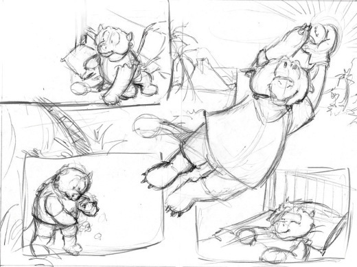
From there, I inked the image like I always do: on paper using a combination of my trusty Rapidograph pens and Pentel Brush pen. The inked artwork was scanned into Photoshop.

From here on, I began to deviate from my usual form. Following Ryan’s example, I colored everything in shades of gray. Major elements were done on different Photoshop layers to make selecting things easier later. By working in grayscale, I was able to make sure that there was proper contrast in the image before I got too deep in the coloring.

But that wasn’t quite enough for me. So I placed in a sloppy watercolor texture in the background. I have a couple dozen of these textures that I’ve made over the years. They help eliminate the harsh, overly perfect feel that my Photoshop work can get sometimes. I used various layer effects (overlay, multiply, screen) as needed so that the texture showed through in places. Then I converted everything to CMYK color mode (this caused a few of the grey shades to turn blue for some reason, but that didn’t matter at this stage).

I had planned to use Ryan’s method of coloring but found three colors to be too restrictive for my tastes. Instead, I used Photoshop’s Gradient Map tool and applied a custom gradient over the whole thing.
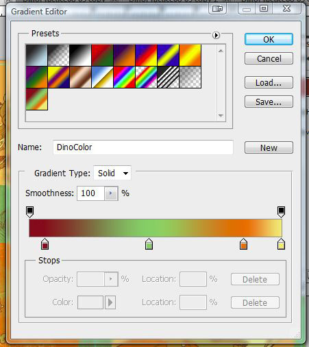
This turned my blacks into dark brown, mid-tones green, lighter tones into orange, and the whites became yellow.
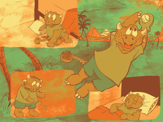
I was almost done. But now came the longest, but most fun part: painting in the tones. Using my trusty Wacom Cintique and stylus, I painted in shadows and highlights. And I wasn’t afraid to deviate from my color scheme in a few places. I added blue into the sky and colored the dinosaur kids’ clothing less drab colors. I also lightened color of the linework in the background to help it recede and on the kids’ freckles (or are they scales? I was never sure).

And so here is the final product! I’m really quite proud of it.
I’m not sure if I’ll use this technique again for another book, after a few pages it might have been easier to simply color things using the CMYK values I had already established previously. But I will definitely try it again on a smaller project.
The book is currently only available at the band’s website, which you can find here.


