
Seth Godin's Blog, page 232
September 16, 2011
"But what if it works?"
Dr. Dre licensed his name for a line of headphones. I have no idea how much his royalty is, but figure it's $20 a pair.
At some point during the negotiations, perhaps someone said, "wait a minute! What if it's a hit? What if we sell more high-end headphones than anyone has ever sold, ever, and we sell 5,000,000 pairs. That means that he'll get a hundred million dollars. That's absurd! We need to put a limit on this."
We often hesitate to pay a portion of the upside to someone who is taking a risk, because we're worried that perhaps, just perhaps, his risk will pay off and he'll make a fortune...
The thing is, if they make a fortune, you make five fortunes. Don't worry about it. Go ahead and give people the opportunity to have their risk pay off. More than ever, people are motivated by the opportunities that come with scale.


September 15, 2011
Why wait?
Who cares when it's due?
If you're on the critical path, if someone is waiting for your contribution, ship now.
We have deadlines for a reason, but the key word is 'dead'. In fact, you don't have to wait for the deadline or get anywhere near it, especially if you want to speed things up.
Too often, we find ourselves using the deadline as the lever to overcome our fear. If you're relying on drop dead dates to push yourself, the project is paying a price.
The bias is to slow down because otherwise the boss will just give you more work to do. Are you still stuck in the us/them dichotomy of factory work?
All other things being equal, faster wins.
PS the challenge with being an initiator of projects is that you are never, ever done.

September 14, 2011
Merging/Emerging
Emerging is when you use a platform to come into your own. Merging is when you sacrifice who you are to become part of something else.
Merging is what the system wants from you. To give up your dreams and your identity to further the goals of the system. Managers push for employees to merge into the organization.
Emerging is what a platform and support and leadership allow you to do. Emerging is what we need from you.

September 13, 2011
Confusing obedience with self-control
It's an expensive confusion.
We organize our schools around obedience. Tests, comportment, the very structure of the day is about training young people to follow instructions.
We organize our companies around obedience as well. From the resume we use to hire to the training programs to the annual budgets, revenue targets and reviews we create, the model employee is someone who does what he's told.
And the rationale for this appears to be that at some point, obedience transforms into self-control. That at some point, people start obeying themselves and become leaders. Self-control is without a doubt one of the building blocks of success, a key element of any career worth talking about. We need self-control if we're going to make a difference.
But help me understand why obedience is the way to get there? Compliant sergeants rarely become great generals.

September 12, 2011
The alternative to failure
"What would you have me do instead?"
To the critic who decries a project as a worthless folly, something that didn't work out, something that challenged the status quo and failed, the artist might ask,
"Is it better to do nothing?"
To the critic who hasn't shipped, who hasn't created his art, anything less than better-than-what-I -have-now appears to be a waste. To this critic, progress should only occur in leaps, in which a fully functioning, perfected new device/book/project/process/system appears and instantly and perfectly replaces the current model.
We don't need your sharp wit or enmity, please. Our culture needs your support instead.
Each step by any (and every) one who ships moves us. It might show us what won't work, it might advance the state of the art or it might merely encourage others to give it a try as well.
To those who feel that they have no choice but to create, thank you.

September 11, 2011
It's different here
The other day, walking through Grand Central, I bumped into a friend, here on vacation with his fiancee.
I got to thinking about why New York City attracts so many tourists, more than just about any city in the world. Not because of natural wonders or even outdoor sports activities. It might be because:
It's different here (as in not the same)
You can find someone to have an argument with, about just about anything
There are fringes--cultural, educational, architectural, societal
More than 42 languages are spoken at the Queens public library
You can get something that's not the regular kind
There are profit-seekers who will happily sell you something, anything
There are many who do things for no profit at all and will eagerly entertain, entrance and change you for the better
You will find a diversity of religious belief like no other
It's changing
The food hasn't been entirely homogenized
People are active
A stranger will go out of his way for you, perhaps, and more often than you expect
There is more information per minute, per meter and per interaction
Neighborhoods are more important than homogeneity, and co-existing is most important
The thing is, here can be anywhere. There are New Yorks going on in towns large and small, in companies big and tiny and in families that support and respect at the same time they embrace and encourage difference.
I remember ten years ago like it was yesterday, looking out the window of my office and wondering if it (all of it) was over. I remember those that suffered and were lost, and those brave enough to risk everything. Not sure we'll ever forget, or if we should.
But now more than ever, I believe we have an obligation to stand up, stand out and to do work that matters. Wherever you are, there's an opportunity to be different, with respect.

September 10, 2011
Mass elite
You've probably noticed that the line for regular check in is now shorter than the line for Platinum/First Class/Club/Elite/Diamond/Whatever. That the hold time for your super-exclusive access card is longer than ever.
Marketers have figured out that the incremental cost of promising better service to better customers is pretty cheap. Of course, delivering that is expensive, but that's someone else's problem.
Once you create two classes of service, there's an overwhelming temptation to undo that effort in two ways:
--continually degrade the upper class service as a way of saving money
and
--offer more access to the upper class as a way of leveraging your investment in setting it up in the first place
Should you treat different customers differently? There's no doubt about it. It's the single easiest operational way to transform your organization, by giving loyal and profitable customers a reason to come back. The danger is that your team will misunderstand the entire point of the exercise, using it as an opportunity to cut corners on the hoi polloi (who are merely elite customers who haven't converted yet) at the same time they try to save money by investing less in the very people you set out to serve better in the first place.
Go ahead and charge extra to people who want to pay (in money or loyalty) extra. But don't forget to give them something in return.

September 9, 2011
Getting serious about your org chart
Manu's funny brilliance aside, this collection of org charts might help you think hard about why your organization is structured the way it is.

"Do it tomorrow"
Stupid advice, certainly. But free. I didn't charge you anything for it.
There are very few categories where there is less correlation between price and quality than advice. You can buy a million dollars worth of consulting, a thousand dollars worth of coaching or read a few tweets for free--your choice.
This widespread variety of pricing leads to two interesting questions:
Are you confusing what you pay with what you get? (Does expensive advice feel more valuable than the free stuff?)
and
Are you more likely to take action because you've paid a lot?
One of the most effective ways to get your ideas implemented is to charge a lot for them. It increases the perception of value and creates an impulse to execute so that the investment won't be wasted.
Of course, I said that for free...

September 8, 2011
Getting serious about your org chart
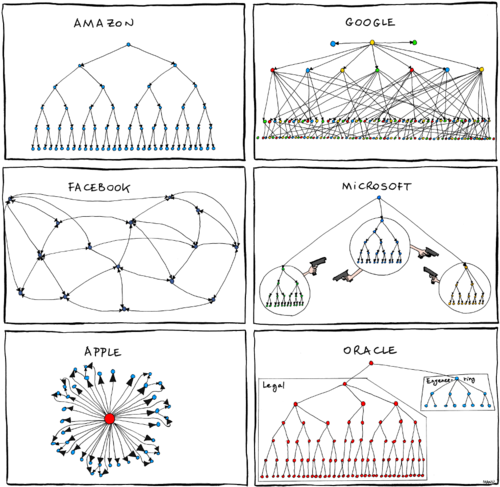
Manu's funny brilliance aside, this collection of org charts might help you think hard about why your organization is structured the way it is.
Is it because it was built when geography mattered more than it does now? Is it an artifact of a business that had a factory at its center? Does the org chart you live with every day leverage your best people or does it get in their way?

Seth Godin's Blog

- Seth Godin's profile
- 6535 followers

