Jen Betton's Blog, page 5
January 25, 2017


November 2, 2016
Color 8: Picking a Palette
This post is part of an ongoing series on color. To see previous posts, click here.
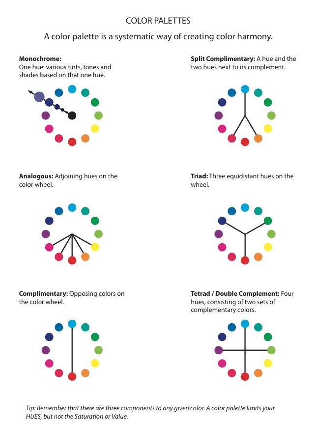
Sometimes coming up with a good color palette for a piece is a struggle. When I'm picking a palette I want one that is pleasing to the eye, appropriately emotive, AND represents all objects as seen in the same light. Here are a few different methods you can use to choose a set of colors.
1. Borrow it: use the color palette of another artist. Someone else has already put together a combination of...
October 4, 2016
September 29, 2016
Common Color Mistakes: #1 Over-Saturation
Over the course of teaching college art students, and of fighting my own color battles, I've noticed what tend to be the most common mistakes artists make with color. I'm going to use some of my own student work as examples of what NOT to do. Get ready for some retro Jen art. I figured if I was going to show bad art it better be mine, but please, for the love of pete, don't post these paintings anywhere else!
Color Mistake #1: Over-Saturation
Color is so pretty – lets make it really bright ever...
Color Mistake #1: Over-Saturation
Color is so pretty – lets make it really bright ever...
June 28, 2016
A couple of weeks ago, SCBWI Insight included a...
A couple of weeks ago, SCBWI
Insight
included a bunch of portfolio tips from the KidLitArtists, and a number of them mentioned including sequences of related images in your portfolio. When developing a portfolio for the children’s book market, you want to demonstrate your ability to tell a story, and a series of images is a key way to do this.
Pick a picture book, and then select 3 of the images from it – they will all look related. They will have a similar feel, palette, and u...
Pick a picture book, and then select 3 of the images from it – they will all look related. They will have a similar feel, palette, and u...