
K.A. Wiggins's Blog, page 13
March 30, 2019
A Villain Origin Story TRANSLATED
Before her deal with the devil, Maryam Ajera was . . . anything but ordinary. Read the letter she can never send to the son she can never acknowledge confessing the true story of their world before its fall.
Brilliant academic, driven professional, cynical wife, and reluctant mother, Maryam Ajera���s ambition knows no bounds. She���ll sacrifice whatever it takes to rise to the top. But when her secret mission to stop the end of the world gets hijacked by tragedy, the monstrous intelligence possessing her dying city forces her to choose between surrendering her life or signing on for an eternity of sacrifice.
In a city overrun by monsters, she���s not the only one who���ll pay the cost.
Discover the unexpected villain origin story of the unearthly Mayor of the Towers of Refuge in this short spinoff to the Threads of Dreams series. Suggested as a companion read, this short story covers events leading up to Blind the Eyes and can also be enjoyed as a standalone.
Letter from the End of the World launched on January 31, 2019 and it is a Kindle Unlimited exclusive short story/flash fiction title, so you can only get it on Amazon (at the moment).

Now Available in Italian
I���m also very excited to announce that Italian language ebook rights for this title have been licensed to international publisher Virgibooks, Inc. The Italian translation, Lettera dalla fine del mondo, hits Amazon stores today!
Since this is a short read, print editions are not planned at this time.


March 27, 2019
A Standalone and a Prequel
I���ve been aiming for one new story a month this year.
First up was Letter from the End of the World, a Threads of Dreams flash fiction at the end of January. The translation, Lettera dalla fine del mondo, comes out at the end of March. I managed to wedge these two right in between:
The Unsought Light: A Japanese Fairytale Retelling with a Gothic Twist
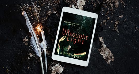
Daughters don���t get to choose their fate. But there���s one choice no one can deny her.
Promised from birth to the son of the clan lord, Hana���s only joy is gazing out over the lake beyond her window. She dreams of floating away on the breeze like the cherry blossoms, but when an otherworldly stranger offers a chance at escape, duty and desire collide in a war that threatens to bring down her family, her clan, and her village.
Freedom. Passion. Family. Fate. What do you do when there are no good choices left?
A gothic retelling of the ancient Japanese folktale The Maiden of Unai, this short story explores the untold perspective of the ���maiden��� destined for an arranged political marriage in a time and place where family fortunes mattered more than individual happiness or choice. A historical romance in the vein of Rome & Juliet with a supernatural twist.
Trigger warning for suicide.
This is a standalone short story (the setting might have tipped you off?) and it is also, at least for the moment, exclusive to the Kindle Unlimited program, so you can get it on Amazon as of today.
(Pro tip: Kindle Unlimited books are always free to KU subscribers, but one advantage of the program is the ability to do dramatically lower pricing or even price to free every so often, so you might want to follow me on Amazon to get alerts about sales.)
Under
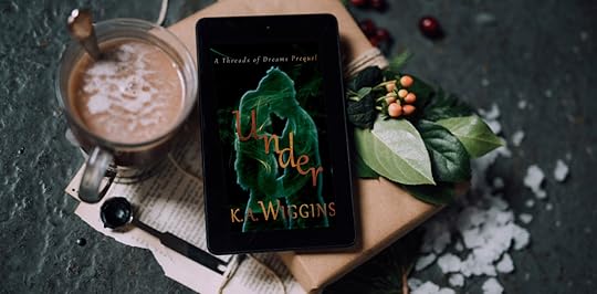
So, I���ve been promising you guys a prequel novella since last summer and it���s (past) time to deliver.
The reason you didn���t get Under last July is that I finished drafting it, replotted it, and came up with a much bigger story to tell, and one which needed tweaks to fit properly into all the complexity of the Threads of Dreams series. That story is Below the Surface, and it���s going to have to wait its turn (lol).
But Under is a fun, fast-paced little romantic thriller all on its own, so I cleaned it up a little and made it into a newsletter subscriber freebie!
Sibling rivalry takes a new turn as sisters fight for love, identity, and survival in a monster-infested drowned city.
The twins��� bond kept them together through everything the Towers of Refuge could throw at them. But when Ange fakes her own death in a rash attempt to protect her sister, her twin runs away to join a secret club in the abandoned levels of the tower below the floodwaters.
Ange is determined to bring her sister back. But the secrets���and the strangers���they discover below the waterline could sever their bond for good.
This SFF/spec-fic prequel story takes place less than a decade before Blind the Eyes and blends monsters and magic with near-future post-eco-disaster cityscapes for a fast-paced, genre-bending romantic thriller.
Join the newsletter to download a free complete copy of Under and an extended preview of Blind the Eyes.
February 22, 2019
Playing Catch Up
Bear with me, guys. There���s been a ton going on this year (how is it almost March?!?) but between releasing new stories, writing newsletters, book marketing, sublicensing, translations(!), international speaking invitations, and even a dash of actual writing in all that, I���ve fallen behind on updating this site.
So . . . keep an eye out for all those things, I guess? And I���ll try to copy important news over here as soon as I get a chance.
February 17, 2019
More Than You Ever Wanted to Know
Amy Bernal of My Books-My World interviewed me on her blog.
Check it out for awkward photos, way more than you ever wanted to know about my process, and a sneak peek excerpt!
December 20, 2018
Wishing you hope this Christmas
Christmas is next week. How are you doing?
I hope you���re having an awesome holiday season with not a cloud in the sky, but for many of us, Christmas is a tough time.
And maybe it���s because New Years looms���with all of its pressure to look back, reevaluate, and set those dreaded resolutions���that it also tends to be a season that shines a harsh light on the gap between reality and our dreams.
Christmas movies love diving into this stuff.
The endless flood of holiday romances, with or without kids in the picture, unpack the longing for love (and freedom from family and societal expectations) and a desire to return to a childlike place of belief.
We dream our prince will come . . .
Or our dead-end career will be replaced by something we love���that also makes us super-successful . . .
(The turkey will make itself . . . )
We���ll save the farm/family business/small town/ . . .
Estranged family members will reconcile . . .
Our enemies will repent from their wicked ways . . .
The ones we���ve lost will return to us . . .
(Peace on Earth . . . )
The true meaning of Christmas will transform our hearts . . .
Magic will return to our world . . .
It���s easy to read those lines with a cynical inner voice. How silly. How childish. We live in the real world.
Geez, those fantasy writers, amirite?
To be honest, I���m really not a fan of all those Hallmark-channel specials.
I don���t believe a prince will come and transform my world.
I already quit the terrible job, and while the new one is amazing, it���s still a tough slog and when it comes right down to it, work is still work.
Family is complicated and magic is hard to hold on to.
Peace on Earth and goodwill to men (& especially women) seems to get further away every year.
So where does that leave us?
While I���m all for escapist fantasies in whatever form of media you prefer, it���s also important to live in the real world at least some of the time.
But almost every woman I know is on depression and/or anxiety medication. Suicide rates are skyrocketing.
If right here, right now is all there is, people are opting out in droves.
And, without discounting the value of medication, therapy, and other treatments, I think there���s something about Christmas that can help all of us, wherever we���re at.
Before the song was the poem.
It gets crowded out these days by endless renditions of Jingle Bells and the controversy swirling around Baby It���s Cold Outside, but perhaps you���re familiar with an old carol: I Heard the Bells on Christmas Day.
It���s a pretty tune, even if it doesn���t get that much radio play.
But take a look at the original text:
I heard the bells on Christmas Day
Their old, familiar carols play,
and wild and sweet
The words repeat
Of peace on earth, good-will to men!
*
And thought how, as the day had come,
The belfries of all Christendom
Had rolled along
The unbroken song
Of peace on earth, good-will to men!
*
Till ringing, singing on its way,
The world revolved from night to day,
A voice, a chime,
A chant sublime
Of peace on earth, good-will to men!
*
Then from each black, accursed mouth
The cannon thundered in the South,
And with the sound
The carols drowned
Of peace on earth, good-will to men!
*
It was as if an earthquake rent
The hearth-stones of a continent,
And made forlorn
The households born
Of peace on earth, good-will to men!
*
And in despair I bowed my head;
���There is no peace on earth,��� I said;
���For hate is strong,
And mocks the song
Of peace on earth, good-will to men!���
It���s a poem about war and death and destruction.
Cheery, right? So festive!
Here���s the backstory:
In the mid-1800s, the dress of an accomplished artist, academic, art critic, mother, and wife named ���Fanny��� (Frances) caught on fire while she was with her children.
(Flammable women���s fabrics & dress designs were an epidemic of the time.)
Though she ran to her husband for help (and presumably to spare her children) and he sustained severe injuries trying to save her, she died the next morning.
Her husband had pursued her for over seven years prior to their marriage and would mourn her to the end of his days. Christmas was a particularly hard time after her death, as evidenced by his journal entries.
But the story doesn���t end there.
This widowed father of six was the famed American poet, Henry Wadsworth Longfellow, and his home was the headquarters for George Washington in the early days of the American Revolution.
The year after Fanny Longfellow died, their eldest son ran away to join the Union Army during the American Civil War.
The following year he was shot in The Battle of Mine Run.
His father raced to his side in early December, learning that the bullet clipped his spine and paralysis was likely. Young Charley Longfellow survived, eventually recovering most of his mobility, but that moment had to have been devastating.
Henry Longfellow was nearly 60, widowed twice over, with six children under the age of 20, the eldest of whom was likely to be paralyzed for life.
And his country was ripping itself apart.
Longfellow wrote the poem Christmas Bells that December���but there���s one more verse that I didn���t include above.
He ends his lament against loss, death, and destruction like this:
Then pealed the bells more loud and deep:
���God is not dead, nor doth He sleep;
The Wrong shall fail,
The Right prevail,
With peace on earth, good-will to men.���
Hope.
Do you hear the triumph in that final stanza?
���The Wrong shall fail, The Right prevail . . .���
What an absurd perspective. The world was a scary place in the mid-1800s.
It still is today.
There���s pain, loss, the small deaths of day-to-day miseries and the greater deaths of the ones we love.
War continues on, unrelenting. Oh, and we���re probably ruining the planet.
But Christmas reminds us to find and hold on to hope in the darkness.
It makes sense���the earliest baby-in-a-manger source of Christmas was about hope for a broken world.
Along the way, it���s picked up on other influences. Winter solstice���light returning to a dark, cold world. Legends of spirits and saints bringing some comfort into the harsh realities of winter.
Even the commercialistic modern Santa offers a kind of hope���if only for parents to be freed from shopping lists, for kids��� dreams to come true. For a last taste of magic in our prosaic, capitalist world.
Hope can make a difference.
It doesn���t deny or ignore yesterday���s mistakes and losses or today���s realities, but it validates dreams for a better future.
It doesn���t tell you you���re wrong or weak or foolish for the longings of your heart, but encourages you to continue on through whatever today may hold for you.
Hope frees you to keep living. To keep trying. To keep believing. To keep loving.
So this Christmas my wish for all of you is that you find hope that sustains you through this season and all your tomorrows.
Kaie
December 17, 2018
BTE is a 2018 fave!
So excited to announce that Barnes & Noble Press have just named Blind the Eyes as one of their top ���20 Favourite Indie Books of 2018���!!
Here���s what they had to say about it:
���Why we loved it: A unique twist on the YA-dystopian genre, Wiggins weaves a complex tale that unfolds like a dream itself ��� mystical, and sometimes odd, but always captivating.���
Thanks guys!
Check out the other awesome titles on the list for more great indie book recommendations!
November 26, 2018
All About Covers Part 3
Welcome back to the book cover design miniseries! To recap:
Part 1 was all about the different types of covers (D.I.Y., premade, and custom)
Part 2 was about the process of commissioning a cover design
Part 3 (first published in the Nov. 27, 2018 NL) is about the design for Blind the Eyes specifically.
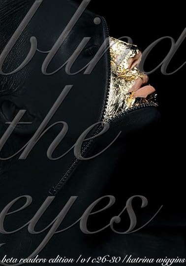
If you���ve been with us for a while, you might remember some of my (D.I.Y.) prelaunch covers, like this one:
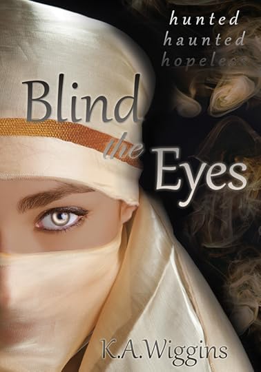
The last version before the true cover reveal!
I did try to get the design as close to story���accurate as possible, but the limitations of stock photos and my Photoshop skills are clear.
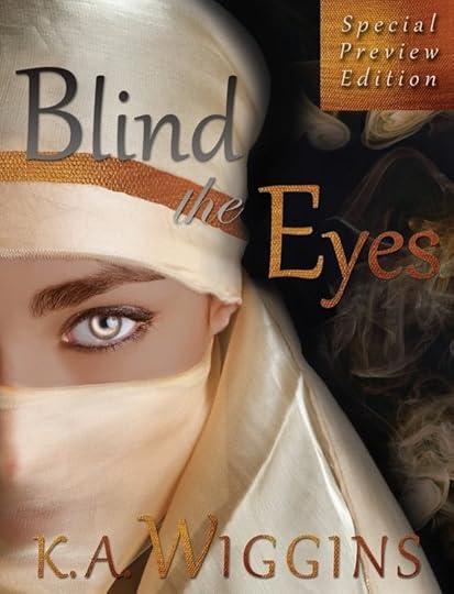
Thankfully, superstar cover designer Regina Wamba���s mad skills and hyper���organized approach came together to create something both subtler and more specific, as well as, you know, gorgeous.
I flooded her with 10 pages (!!) of notes about genre, setting, symbolism and visual elements, inspiration, characters, etc. plus an overstuffed Pinterest board of cover inspiration, and she came through with a stunning concept that made sense of the chaos I dumped on her:
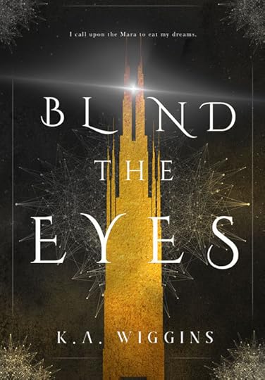
Here���s how some of those themes, plot elements, worldbuilding details, etc. informed the visual design:
The Tower
For those of you who haven���t had a chance to read BTE yet, the entire book takes place in (and under) a single tower in a flooded and monster���overrun city. The tower is a place of both refuge and oppression, as is so often the case, and defines the limits of main character Cole���s worldview and identity for much of this first book.
While technically fantasy, BTE also has a post���apocalyptic setting, and the Towers of Refuge are based on a real���world location: Bentall Centre, a series of integrated office towers built over an underground shopping mall in Vancouver, BC.
I love the way this blends gothic fairytale castle with imposing corporate monolith. The tower looms and bisects the flow of the page. The textured gold fill is simultaneously enticing and tarnished. Perfection.
Gold & Silver/Light & Darkness/Mist & Decay
I wanted to get away from communicating in terms of white and black/light and dark, so in the book (/trilogy), silver and gold are the most important visual cues.
Gold is extravagant, enticing, overwhelming, excessive, even menacing. It���s a glittering mask over reality. Silver is subtle, ephemeral, subversive, easily overshadowed, but also a bearer of light. It manifests in the margins with unexpected power (and readers may recognize a character���driven reason for the rooftop beam dominating the cover.
Both are present throughout the design, pushing against one another, holding the tension. Mist/fog is part of the worldbuilding, trapping humanity, corroding the city, and hiding the nightmarish Mara, and adds visual texture. The negative space of the title speaks to hidden realities, both truth and lies that hide in the shadows, exposed not by their presence but by the weight of their absence.
Threads/Networks
Cole exists in a world that insists on isolation, and she starts from a place of embracing that value. She quickly starts to question her world, discover what lays beyond its borders, and find the power to change the world and her place in it.
The interconnected threads/web visual elements speaks both to this theme of connection (both productive and destructive, illustrated by the gold and silver tones), as well as the powers that Cole begins to perceive and interact with.
It also just looks wicked cool . . .
Genre Crossover, Detail & Format
Cover design needs to meet readers��� expectations for the genre and perform on a functional level. Genre is MUCH harder to pinpoint than you���d think. It incorporates age group (MG vs. YA vs. adult), subgenres (is it Gothic fantasy? Gaslamp? Dystopian fantasy? etc.), and there are even differences between indie vs. traditional cover design trends within the same subject matter/subgenre.
In the case of Blind the Eyes, it hews closer to traditional/big publishing trends in YA fantasy (illustrated/graphic cover design) as opposed to indie trends (girls looking fierce with weapons and/or ball gowns), and I love it.
On the functional side, the cover needs to be eye���catching in small, thumbnail sizes, but still work at full���size and, in my case, various formats of print. Tucking enough detail so it doesn���t look raw and unfinished at larger sizes without muddying the form so much that it looks like a mess at smaller sizes is no joke, and colour profiles vary widely between digital and print formats. (Things look brighter on a screen, since they���re backlit, for instance.)
I���m in awe of how subtle, dynamic, and eloquent the design turned out, and I can���t wait to see how the designs for the sequel looks!
November 23, 2018
All About Covers Part 2
Welcome back to the book cover design miniseries! To recap:
Part 1 was all about the different types of covers (D.I.Y., premade, and custom)
Part 2 is about the process of commissioning a cover design
Part 3 (first published in the Nov. 27, 2018 NL) will be about the design for Blind the Eyes specifically.
What it���s like working with a cover designer
While designing my own covers was good practice and the outcome could have looked (much) worse, leaning too hard into a D.I.Y. ethos can be a mistake. I felt it was important to work with experts where appropriate���and design work (like editing) is one of those areas where it makes sense to recognize your own limitations and invest.
In this case, those limitations were both creative and technical. My artistic and Photoshop skills aren���t that finely honed, and light alterations to stock photos were about all I can manage. All my attempts at cover designs were only as strong as the stock photos. I could have flailed around for a few hundred more hours and hoped to hack my way into a reasonable layout, decent photo, and genre-appropriate outcome . . . or I could work with a professional.
I started looking for a cover designer WAY early (mostly because I originally planned to publish about a year before my actual launch date.) Many of the character traits, themes, and worldbuilding elements were already established, but some things did change considerably. It all worked out, as you���ll see, but I���d recommend caution if you���re a pre-published author eager to get your cover ordered.
That said, there���s usually a waitlist involved. I���d been keeping an eye out for cover artists and enquired with Regina Wamba in early March after seeing her work on Instagram. She has her business very well organized, which was helpful in quickly getting a sense of whether we could work together or not.
Specifically, I sent a sort of preliminary enquiry clarifying what I was looking for and asking about rates. She confirmed that she���d be interested in the project, sent over a ���menu��� of services, and set the timeline.
Because Regina���s also a superstar photographer, her offerings ranged from ebook-only cover design (using purchased/3rd���party stock photos) all the way up to custom photography shoots to capture the exact look of the story.
Once a design package was agreed upon, there was a contract to sign, a 50% deposit to pay, and lots of homework. Depending on what you select and who you work with, these terms could vary, but creative work tends to take time, and freelancers have to schedule projects (and therefore often can���t do things immediately/last minute).
In this case, the designer asked for 4-6 weeks minimum to process design inspiration, and I ended up letting her know that there was no rush on the design (because I got held up on the editing side) so it was a few months between drafts.
Design homework on the author���s end can look like anything from some quick notes about design ideas to a collection of images or comparable covers. In this case, Regina had a sort of survey for me to fill out that asked about everything from technical requirements (who���s your printer? what are the dimensions?) to setting, characters, theme, and visual elements to the story.
Given my (obvious) inability to be concise and restrained when it comes to wording, I flooded her with ten pages of chaotic scribbles. And a Pinterest cover inspiration board with over a hundred covers to sort through. So, yeah, you can see why designers ask for several weeks to let it all sink in!
That was the main effort on my end. There were a few small back���and���forths with the draft, but it was over 90% there from the beginning. (The first round had a flowery, more ���fairytale������looking border, and no beam of light.) Deciding on cover text was also surprisingly difficult and made for extra work for the designer; I change up my hooks and blurbs too often, lol.
Design drafts are low-res screencaps, so once a design was finalized, I got a dropbox link to full-size covers. In my case, I hadn���t anticipated all the design resources I needed in the initial order, so that added a few steps. Since the overall concept was there, though, and the cover art was graphic not photo���based, ordering larger���format covers (i.e. the square���shaped audiobook cover and the extended artwork for the hardcover) wasn���t a matter of redesigning so much as simply specifying the dimensions and any new cover text. And then, every new format goes into a work queue, so that takes some time as well.
So, that���s pretty much the process from my end! If you���re a first���time author or indie���publisher getting ready to order your first cover, the steps are roughly:
Decide vision (will the D.I.Y. or premade approach work for you? how are you positioning this book?)
Check budget (and revise vision or postpone and start saving!)
Research cover designers, maybe check in with authors/publishers to see what their experience was like
Initiate contact, communicate goals/vision, and ask for quote/timeline
Sign contract/pay deposit/schedule cover design
Send design reference material (instructions/specifications/subgenre, design inspiration, cover text, etc.)
Review artwork & approve or specify changes
Pay remaining fees, securely download/save full resolution artwork
Plan a cover reveal!!
Launch book
Part 3, how the design of BLIND THE EYES is informed by worldbuilding and thematic visual elements, is in the Nov. 27 newsletter.
November 22, 2018
All About Covers Part 1
Thanks to the team of lovely human beings at Kobo for shortlisting Blind the Eyes as one of this year���s top 10 Science Fiction & Fantasy covers!
You can check out the full list and vote in the public voting round until Nov. 30.
I started drafting a special cover edition of the newsletter and realized there was WAY too much content, so I���m breaking it out into a blog series instead!
First of all: shoutout to my amazing cover designer Regina Wamba who designed the published covers for the Blind the Eyes ebook, paperback, hardcover, and audiobook editions. I���ll link out to some of her content within this series to bring in the designer���s perspective, but mostly this will be from the author/publisher���s perspective.
Part 1 is all about the different types of covers (D.I.Y., premade, and custom).
Part 2 will be about the process of commissioning a cover design.
Part 3 (first published in the Nov. 27, 2018 NL) will be about the design for Blind the Eyes specifically.
As promised: all about cover design (from an author���s perspective)
Okay, here we go. Let���s start with an overview of the options, starting with D.I.Y.
A great cover can have a huge impact on the success of a book, which is why it���s one of the most important outsourcing choices and biggest expenses after your editor (and, y���know, the author���s time).
If you���ve been with us for a while, you might remember some of my prelaunch covers:
For those of you aspiring authors: yes, it���s entirely possible to make your own and spend . . . well not quite zero dollars, but very little.
When I worked in corporate marketing, I used Photoshop and did a certain amount of design, so I wasn���t completely without skills. As an early publicity stunt (& just for the practice), I actually released the first beta readers editions in five���chapter segments and created a unique cover for each one. I paid for some stock photos, but the total cost was fairly minimal. I also had an old version of Photoshop to use, but you can subscribe for a month at a time or use other desktop, app-based, or online design programs (like Canva) with varying levels of sophistication.
For instance, the two Wattpad story covers (on the homepage) were made in the Typorama app with (free) built-in images and fonts, so obviously your mileage varies in terms of outcome. Are they the worst thing in the world? No���especially not for free or very low cost. But they���re also limited by a LOT of factors, including technical specs, imagination, design sense, understanding of genre trends, etc.
The next level up when it comes to cover design options are premades.
Designers sometimes sell covers with placeholder text, and you can get a great deal if there���s one that matches your book, as long as you don���t need any changes. (Shoot me a message if you���d like some suggestions of where to look if you need one!)
And then there���s custom design.
This is a pretty broad category, which could include everything from photomanip (Photoshopping stock images) to dedicated, exclusive photo shoots, to graphic or fine artists producing original works of art and then converting these into a cover or working with a design team to create the finished product.
On the low end of custom design, you might work with a less experienced or polished designer for under a hundred dollars to a couple hundred. On the high end, you���re talking thousands or tens of thousands (e.g. for a photoshoot���possibly with paid models and on location���or an original work of art).
That can sound breathtakingly expensive (especially when placed against the likelihood of actual earnings from your book), but it takes time, skills, and experience to produce professional quality work, and the best designers are in high demand.
Cost will also be impacted by formats. An ebook cover is the least expensive option: you just need a rectangular .jpg that looks okay in thumbnail format and on a screen. But a paperback cover is more work for the designer���they have to produce a print���ready PDF and make the design wrap around the spine and back. A hardcover dust-jacket is even more work (you need to continue the design further into the flaps), and even an audiobook cover may be a challenge if your design was originally meant for portrait mode, not square format.
Then there���s the marketing extras. Some cover designers offer additional services like graphics for social media, cinemagraphs or gifs (motion versions) of your cover, book trailers, ���making���of��� or behind���the���scenes videos, etc.
If you���re an author pricing out covers, always check what���s included in a price against what your actual needs will be (and consider bundling formats at the start for a discount.)
Part 2: What it���s like working with a professional cover designer.
November 21, 2018
Overdue Update
So, clearly I don���t update the site often enough. Just a heads-up if you dropped in looking for more interaction: I���m on social media at least weekly and even the newsletter goes out more often than I post here, so stalk accordingly. (links in the sidebar)
That said, I���m going to try to get a little more content up on here. Some stuff you mighta missed over the last 4 (!!) months:
Hardcovers are OUT!! They look rad, and you can request paperbacks or hardcovers from your local library, indie bookseller, trade bookseller, or shop online at your preferred bookstore.
The next release (Under the Surface) has been delayed, but it���s still coming! It���s a prequel novella (assuming I can keep the wordcount under control) and newsletter subscribers at the time of release will get it in ebook format for FREE because y���all are amazing. But it probably won���t stay free forever, so def. get those subscriptions in!
I���m trying out a weekly newsletter format with feature content, some of which may make its way over to this blog space eventually. Planned topics include the recap edition (photojournal/apology for where I���ve been for the last few months), the cover edition, the library edition, the plotting edition, and the character edition (and maybe one on worldbuilding? or edition? who knows!)
Also re: the newsletter, I do featured reviews and bookish shoutouts, so if you want to recommend a book to the other subscribers or feature your feed, sign up & give me a shout.
I try not to span the NL list all the time, so if you���re really keen on hearing about sales, follow me on social media or on a specific bookstore for alerts.


