
Jeffrey Zeldman's Blog, page 17
March 23, 2019
Healthcare in America
I’m one of the lucky ones. I have a great doctor and good health insurance.
A boring generic healthcare company bought my longterm doctor’s group practice a few months ago. First thing they did was screw up the online patient portal, changing it from the poorly designed, barely usable mess I’d learned to navigate to a slightly more polished but somehow blander portal that instantly got hacked. In consequence, they seem to have hired an Internet security firm that advised them to make changes they apparently didn’t understand how to execute. Thus, sign-in was broken for two months. Doctors kept sending patient results to the site, but patients couldn’t access them, and nobody told the doctors. You’d try to explain the problem to a phone receptionist, but if it ever got to the doctor, it was likely phrased as “Another one complaining about the website.”
The site’s makers apparently weren’t informed of the problem for some time, and there was no way to find out who they were to contact them, since there was no contact information available until you signed in, which no one could. Healthcare in America, 2019.
Anyway, they seem to have fixed a couple of the nonfunctioning loops that would prompt you to create a new password and then not recognize that you had done so and prompt you to create a new password and then not recognize that you had done so and prompt you to create a new password and then not recognize that you had done so and…
So today I was able to create a password, almost get 2FA to work, and reorder medication I’d been doing without. Yay!
Designing usable websites is an undervalued art.
The post Healthcare in America appeared first on Zeldman on Web & Interaction Design.


December 7, 2018
Browser diversity starts with us.
Developers, designers, and strategists, here’s something you can do for the health of the web:
Test all your sites in Firefox.
Yes, we should all design to web standards to the best of our ability. Yes, we should all test our work in *every* browser and device we can. Yes, yes, of course yes.
But the health of Firefox is critical now that Chromium will be the web’s de facto rendering engine.
Even if you love Chrome, adore Gmail, and live in Google Docs or Analytics, no single company, let alone a user-tracking advertising giant, should control the internet.
The development and adoption of accessible standards happens when a balance of corporate powers supports organizations like the W3C, and cross-browser-and-device testing is part of every project.
When one rendering engine rules them all, well, many of us remember when progress halted for close to ten years because developers only tested in IE6, and more than a few of us recall a similar period when Netscape was the only browser that mattered.
Don’t think the need to test in phones will save us: Chromium powers most of them, too.
And don’t write off the desktop just because many of us love our phones more.
When one company decides which ideas are worth supporting and which aren’t, which access problems matter and which don’t, it stifles innovation, crushes competition, and opens the door to excluding people from digital experiences.
So how do we fight this? We, who are not powerful? We do it by doubling down on cross-browser testing. By baking it into the requirements on every project, large or small. By making sure our colleagues, bosses, and clients know what we’re doing and why.
Maybe also we do it by always showing clients and colleagues our work in Firefox, instead of Chrome. Just as a subtle reminder that there are other browsers out there, and some of them kick ass. (As a bonus, you’ll get to use all those amazing Mozilla developer tools that are built into Firefox.)
Diversity is as good for the web as it is for society. And it starts with us.
See also…
The State of Web Browsers, 2018 edition
The post Browser diversity starts with us. appeared first on Zeldman on Web & Interaction Design.
December 4, 2018
The state of things
At the end of therapy this morning, I felt like the lone Samurai at the end of a Japanese movie. His warlord has betrayed him, his fellow Samurai have fallen into dishonor, and the rice crop failed. After a last meditation, he emerges from his tent, sword flashing, to die fighting 10,000 men. I told this to my therapist and we both laughed.
The post The state of things appeared first on Zeldman on Web & Interaction Design.
November 18, 2018
A narcissist’s prayer of Thanksgiving. (My Glamorous Life)
I’m about to have Thanksgiving at home with my daughter for the first time since her mom and I split ten years ago. Ours is a gender reversal of a typical divorce situation: usually it’s the mom who does the everyday caregiving, and the dad who gets holiday time with the kid(s).
I grew up in an isolated nuclear family. No relatives came for holidays. My dad, who was always off working or away on some mysterious other business, would be physically present for holidays, but his mind was elsewhere. Instead of holiday cooking smells, the house was notable for my dad’s loudly booming classical music.
My mom, who hated “women’s work,” would announce that she had done the very minimum—for instance, quickly boiling chicken instead of slowly baking turkey. “Done, enough, finished!” she’d exclaim, as if we were all rooting for her to get out of that sexist kitchen prison. And we were.
We ate like the animals in “The Fantastic Mr Fox.”
As soon as we could decently say we were finished, my younger brother bolted out of the house to hang out with his many friends, and I retired to my room to draw comics.
…Until I was about thirteen, when I took over the dishwashing so my mom wouldn’t have to bother with it. This wasn’t, as you might think, simply cheerful pitching in. No. I was trying to rescue my mom from her deep depression, and model what I thought was feminist behavior to my dad.
That my dad worked sixty-hour weeks to support us, and was every bit as imprisoned in a thankless role as my mom, somehow didn’t enter my calculations until I was much, much older.
And that both my parents, if they were somehow made differently, could have enjoyed working and doing for their family, was also something I didn’t understand. I didn’t know that doing for those you love could be joyful until I grew up and fell in love. And even then, I didn’t totally understand until I became a father.
…
From my still-bewildered perspective, I had a wonderful marriage with my daughter’s mom until everything suddenly fell apart. It was like plunging into an alternate universe. And felt like falling down an endless shaft. My love for my daughter, and her need for me to be here—stable and strong—is all that saved me, I know.
During the next ten tumultuous years, one thing was constant: I spent most holidays alone.
Given how little most of them had meant to me growing up, this was less of a problem for me when I just hung out at home, than when I tried to do better by joining other people at their festivities. There is one exception—a gentleman in Chicago whose family absolutely makes me feel like one of them, and with whom I have passed a joyful Thanksgiving.
But other times, when kind friends and acquaintances opened their homes to me, and I took a subway into another borough, say, to spend the holiday with their friends, whom I did not know, the warm laughing flesh surrounding me actually made me feel my divorced aloneness and temporary childlessness much more profoundly. I really did better just slurping down Ramen alone at home, as sad as that surely sounds to you.
For I had spent many hours as a child alone in my room, drawing, and they were good hours. As a young adult, I spent many hours alone writing unpublished fiction and producing music with no commercial potential that went nowhere except my own headphones. The point being, I don’t mind alone. Alone is familiar. I’m happy parenting. I’ve been happy when I’ve been in love. And I’m also quite happy alone. It’s only the contrast of missing someone that makes it bad.
…
But this Thanksgiving, I’ll be with my daughter. A 14-year-old vegan.
So yesterday, in a low-key way, because doing things up in a big way is not our style, I showed her a dozen or so vegetarian Thanksgiving recipes I’d been saving for probably five or six years, and we picked four of them to make together on the big day. Four simple vegetarian recipes. Not much work or time required. Like momma used to make, only meatless. Things we can make together, because the kitchen belongs to everyone.
Somehow this story, which was supposed to be one sentence—Yesterday my daughter and I planned our small Thanksgiving dinner together—has turned into yet another episode of All About Me. But the day itself will be about us.
…
To those who celebrate, whether alone or together, at home or far from it, Happy Thanksgiving.
For Jim Coudal.
The post A narcissist’s prayer of Thanksgiving. (My Glamorous Life) appeared first on Zeldman on Web & Interaction Design.
October 11, 2018
My Glamorous Life: On Returning
Landed 10:00 PM JFK, picked up baggage after Delta sent everyone to the wrong carousel and an exhausted airport worker before giving up told maybe five passengers about the correct carousel, and those passengers told nobody else because people are selfish, but I am hyper-vigilant about luggage—being anxious and having had some bad experiences—so I spider-heard the airport worker’s whisper from 10,000 feet away, made sure to tell everyone around me that the carousel had changed, and ran to get my bag.
More drama at the cab stand. A pirate in a three-piece suit tried to steer me into his air conditioned sedan, claiming he worked for Uber (but then why would he be standing around instead of cruising and waiting for a signal?). The cab drivers then called him a crook and told him to fuck himself and he directed them likewise and it looked like a hot night fistfight at JFK was going to break out like the rash I felt growing on my sweaty back, but then I made a decision and got into a hot cab with duct-tape-patched seats and the driver sat down to drive, and the dispatcher, who hated all of us, after a great show of delay and neglect, eventually reluctantly gave the cab driver permission to drive me, and we drove for 30 sweaty minutes with the windows open, blowing humid NYC air into our faces, and then before midnight I was home, sweet, home. I  NY.
NY.
The post My Glamorous Life: On Returning appeared first on Zeldman on Web & Interaction Design.
October 5, 2018
Lucky, he said. (My Glamorous Life.)
IN MARCH of this year, I had the honor to serve as a Juror in a civil case in the New York court system. In the months since I served, the city and state have been trying to honor me over and over again. And so, on a hectic Friday where I should have been at my desk, working, I found myself heading to the New York State Supreme Court.
The rule is, after you serve, you’re excused from serving again for six years. Yet a month after my service, I received a second summons. I responded logically, by returning the summons with a copy of my proof of service and a cordial explanatory letter. A few weeks later, I received a third summons stating in red capital letters that I was now in violation and absolutely had to present myself at 60 Centre Street or suffer the consequences.
I was too busy to go, and, after all, I had served. Then this morning, a free U.S. postal digital service I subscribe to (which emails you scans of postal mail you are about to receive) showed that I was about to get yet another summons. So I hustled to the bottom of Manhattan Island to throw myself on the mercy of the court … clerk.
Have mercy
At 60 Centre Street, I went through Security, walked down a hall, and within a few minutes was speaking with a very nice, overworked, underpaid, exhausted clerk, who, in spite of those things, treated me with courtesy, compassion, and respect, and took the time to help me understand what had happened.
Turns out New York can’t deal with my having a first and middle name. Specifically, the fact that my parents named me Lewis but called me Jeffrey (long story) apparently broke all the computers in the New York courts. The court thought that Lewis Zeldman, Lewis Jeffrey Zeldman, L. Jeffrey Zeldman, and Jeffrey Zeldman were four different people, each of whom was required to do jury duty.
This kindly clerk sorted it all for me in under ten minutes. As we were finishing, I asked her what to do about the summons that was still headed my way (per the US Postal Service). She didn’t know the post office offered that service, so we talked about that first. Then she punched her computer keys for a while, and told me nothing from the State or City courts was on its way to me. If yet another bogus summons was en route to my mailbox, it must be from the Federal Courts. “Since you’re down here already,” she advised me to cross the street and talk to her counterpart in the Federal Court system, whom she believed would do me the same solid service she had just performed for me.
So I did.
No country for old men
In contrast to the sleepy but fairly friendly backwater from which I’d just emerged, the Federal Courthouse was a fluorescent nightmare of angrily wisecracking security folks who behaved as if any first-time visitor unfamiliar with their unique security procedures was mentally defective, and who loudly commented on my shortcomings in my hearing. (“He thinks I’m his Mommy and I’m supposed to watch his stuff for him,” one guard complained after I laid my hoody on a counter because I thought that’s what she had just told me to do.)
They made me hand in my phone and yelled at me again for leaving my hoody on a counter and told me to go to a room number that didn’t exist.
I felt like I was in a different country. One court was New York. The other was Federal America. The air was ripe with sullen triumph.
Eventually I found a clerk who could and would help me. But when I tried to explain my problem, he gave me that same withering “you pathetic mental case” look and cut me off at every other word. The situation was a bit complicated. I wasn’t trying to over-explain, only to tell him what he needed to know to understand my problem.
I present to audiences and clients and I’ve written a couple of books. I’m usually pretty good at leaving out extraneous details and communicating quickly and clearly. But here, I was tongue-tied.
No, I said, I hadn’t actually received the federal court summons yet, but I’d been told by the state clerk that the summons I’d seen in my mail program must be federal, and, if it was, it was because the state system had inadvertently created duplicate accounts for me as a result of their difficulty with my name. The system from the post office that lets you preview your mail before you arrive. The New York Supreme Court across the street. Jury Service.
I stammered. I couldn’t get the story out. I couldn’t get my words out. I began to believe that maybe I was crazy. I felt myself sweating. The clerk’s eyes narrowed. He shook his head meaningfully at my every word.
“The New York State—“
“We’re Federal.”
“I know. But I received a—“
“We’re a different system.”
“I understand that. But—“
Eventually, after sufficiently chastising me and telling me he couldn’t do anything for me, the clerk allowed me to go back to the formerly angry man to whom, minutes before, I’d surrendered my phone.
“Out so soon?”
“Yes.”
“Lucky,” he said.
The post Lucky, he said. (My Glamorous Life.) appeared first on Zeldman on Web & Interaction Design.
Grateful X 2

NONE of us knows what today will bring. And for many of us, these are fearful times. So I wanted to take a breath, pause a moment, and share two small gifts I received this morning at the start of my workday:
You know, for kids
First, Rob Ford wrote to my daughter and me to tell us that Macaw Books will be at Frankfurt Book Fair next week to promote The Little Trailblazers, a children’s book of illustrated stories to which we contributed.
It’s been more than two years since a younger Ava and I co-wrote a rhyming story for this collection of tales written by “Internet pioneers” and illuminated by brilliant illustrators from around the world—50 contributors from over 25 countries, 50/50 female/male ratio.
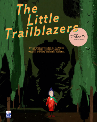
When the book’s original publisher withdrew their support due to its lack of mass commercial potential, Rob could easily have given up. Instead, for over two years, he fought to find the right publisher and charity organization to align with the project.
Today word came that The Little Trailblazers will be in aid of Unicef’s work for children. I can’t think of a better fit. Rob’s vision and perseverance have been something to behold, and I am grateful to have had the chance to collaborate with my kid on what will be her first published story.
Art & copy
Next, Dougal MacPherson presented a trio of narratively related illustrations for an important upcoming A List Apart series directed by Aaron Gustafson. I’m thrilled that Aaron conceived the series, found the authors, chose ALA to publish it, and is shepherding the entire project. I can’t wait for you to read it.
And, although I should be used to it by now, I’m still gratefully astonished by Dougal’s ability to take complex, technical topics, find their common truth, and create a unifying visual narrative tying them together for A List Apart’s readers. Oh, and he draws great, too.
Breathe
There is much that can go wrong in our lives, most of it beyond our control. Sometimes how the afternoon sunlight looks as it warms the tops of trees is what you get that day to remind you that life is a gift. Or, hey, don’t knock a good sandwich.
But sometimes—especially if your line of work can at least partly be described as “creative”—sometimes you are reminded how just how incredibly lucky you are to know and work with passionate, talented people. And that is fuel, not only for continued effort, but for gratitude.
Also published on Medium.
Illustration: Justin Dauer
The post Grateful X 2 appeared first on Zeldman on Web & Interaction Design.
June 23, 2018
My Glamorous Life: Riding North
Woke 5:00 AM New York. Fed cats, crossed town to Penn Station.
Uber software was misbehaving, so instead of Penn Station New York, it booked me in Penn Station Dallas, Texas—a three-day ride costing tens of thousands of dollars. The driver and I had a good laugh over it.
Amtrak Acela First Class Lounge, a dingy little smut box in a catpiss corner of Penn Station, was dark. It does not open till 7:00, and, by God, the attendant sat there in the dark, with her door locked, until 7:00 AM on the dot.
Acela Express has two classes: Business and First. First comes with meals, early seating, and (experimentally, on some trips) selectable assigned seating. For some reason, First cost only $5 more than Business on this trip, so I sprang for it, and was rewarded with a Greek omelet, endlessly flowing beverages, and a nearly empty train car staffed by two highly professional waiters. One was tall and lean; the other, short and round. I mention this only because it was highly cinematic.
The man seated across from me had a kind smile and a deep need for coffee. From his mildness, I inferred he was an alcoholic on a business trip.
I spent the rest of the ride with Guillermo del Toro. What did we do before the iPad? Oh, that’s right—read books.
Cab from Boston South Station to waterfront hotel: $9. The driver let me hoist my impossibly heavy bag into the trunk myself, and tug it back out again on arrival at the hotel. “Okay,” he said, scowling, as I gently lowered the hood of his trunk. I don’t think he approved of my beard. Or maybe he blamed me for the African Diaspora. My people didn’t do it. We were hiding in barrels.
My hotel room was ready when I arrived, and even included a clean little kitchen area, which I sprinkled with little bags of nuts and dried fruit I’d brought with me.
My friends and team mates Marci & Toby, without whom the conference and our company would not function, have been in the hotel for days setting up next week’s event, so I spent a lovely hour catching up with them. Marci, who’d just undergone her sixth surgery on the same shoulder, had her arm in a sling, so I asked permission before carefully hugging her.
Rehearsed my presentation. Took a nap. I seem to have entered a phase of life where naps are a daily thing. Bingo’s next, I suppose.
Left hotel on foot to go meet a guy for dinner. I don’t really know the guy, but we’re both designers, and meeting other people who do what we do is part of what we do.
Last time I was in Boston’s Seaport area was shortly after 9/11, when there was nothing here but the World Trade Center. I’m in Boston every year but I don’t know this terrain. Between Foursquare, Apple Maps, Google Maps, and operator error, I somehow spent 20 minutes walking in circles before I finally broke down and asked a cop how to get to the place where I was meeting the guy.
Called the guy to tell him I was running late and got his voicemail.
Got to the place. The dark-eyed hostess awakened thoughts I can’t write about in our present cultural moment as I followed her in search of the guy I was supposed to meet. The hostess asked me what the guy looked like and I told her I didn’t know. So she interrupted a septuagenarian couple’s dinner to ask if the husband, digging into his lobster, was the guy I was supposed to meet. “No, the man I’m meeting is a guy by himself in his thirties,” I offered, pleasing neither the hostess nor the lobster fan. We returned to the hosting stand, where the other hostess looked at a screen and said my guy had never shown up.
So I walked out in the light rain, left another voicemail for the guy, and worked my way back to the hotel.
Called my daughter to wish her goodnight—she laughed when I told her I hadn’t expected Boston to be cold. Cracked open a room service hummus and a bag of dried banana chips. Business travel, baby. It’s the life.
The post My Glamorous Life: Riding North appeared first on Zeldman on Web & Interaction Design.
June 14, 2018
On Rejection
Recently I had the privilege of reading a book proposal which the author shared in hopes of being published. It was a beautifully written treatise, well structured, nicely paced, logically argued, and thoroughly researched. The author had clearly poured time, thought, and years of lived experience into the text. The topic had relevance for our professional UX design audience, and the reading experience of the proposal alone was entertaining.
We turned it down.
I publish books, and it turns out the main job of a publisher is deciding which books not to publish. Accordingly, we give strong consideration to quite a large number of book submissions—and reject more than a few of them.
A few of these books are clearly targeted at A Book Apart’s readers. Some suffer from structural or conceptual problems. Others are too niche to interest more than a handful of readers.
But many submissions we receive are from qualified authors who are familiar with our catalog and mission. Many of these writers are subject matter experts, and stylists with distinctive voices and particular points of view. They know how to design narratives that engage the heart and persuade the mind. They write books that deserve to be read. When we decline to pursue even some of these proposals, it is not because there’s necessarily anything wrong with them. It’s because they don’t fit into our particular series of brief books for people who design, build, and write web and digital content. It’s because they’re good—but not for us.
Love means having to say you’re sorry
Over the years we have turned down more than a few gorgeously articulated proposals. In one case we even had to say no to a beautifully written, fully finished book. Some of these works found other publishers, others got self-published. Several books we rejected have gone on to be quite successful. And their authors’ success thrills us.
Here’s a secret. In most cases, we’ve turned down the successful ones knowing in advance that they would be successful. Do this long enough and you get pretty good at knowing when a submitted manuscript has genuine breakout potential.
So why did we turn down books we knew would sell? Because, again—they weren’t quite right for us.
The loneliness of the long-distance publisher
At least four books we’ve rejected in the past few years were written by friends and colleagues of mine. It hurt to say no to these people. I dread conflict and am even more fearful of inflicting pain. I love my friends. If one of them comes to us with a solid book idea, I want more than anything to be able to say yes. But these beautiful, elegant, useful books didn’t fit into our schema. They weren’t right for our audience. And for a small trade press like us, that’s what matters most.
Respecting those constraints is what makes us who we are; over time, it’s what builds the brand our audience comes to trust. For a publishing house brand, rejection over time equals design. It’s as important to our brand as the content we choose to help shape and publish. You can rejection as whitespace.
We’re not trying to be the most popular publisher in design and tech. We don’t even sell through Amazon because, although it might broaden our reach, it would impair our ability to pay our authors fairly. A Book Apart is a particular canon for a particular audience. It’s both a brand and a curriculum.
Ensuring that we only publish material that fits both criteria—while also ensuring that every book we publish has a unique authorial voice that comes through, and that every book we publish is both thought-provoking and useful—is our job. It’s also the job of other deliberately small design and UX publishers whose books you may know and love. (Waves to friendly competitors.)
As a good designer, developer, or editor, you work like hell so your customers/users/readers don’t have to. Publishing books is the same.
Keep those cards and letters coming in
Don’t fear the Reaper. Authors, keep those proposals coming in. We strive to say yes to books that belong in our curriculum.
And if you’ve sent us a proposal that ultimately wasn’t for us, don’t be afraid to try again if you write something new—and most importantly, believe in yourself and keep writing.
The post On Rejection appeared first on Zeldman on Web & Interaction Design.
June 1, 2018
The Cult of the Complex

“IN AN INDUSTRY that extols innovation over customer satisfaction, and prefers algorithm to human judgement (forgetting that every algorithm has human bias in its DNA), perhaps it should not surprise us that toolchains have replaced know-how.”
Our addiction to complicated toolchains and overbuilt frameworks is out of control. Web-making has lately become something of a dick-measuring competition. It needn’t stay that way.
If we wish to get back to the business of quietly improving people’s lives one thoughtful interaction at a time, we must rid ourselves of the cult of the complex. For more about why and how, see my new article, “The Cult of the Complex,” in A List Apart, for people who make websites.
Illustration by Kevin Cornell
The post The Cult of the Complex appeared first on Zeldman on Web & Interaction Design.


