Michael C. Goodwin's Blog, page 28
December 16, 2014
Biliban
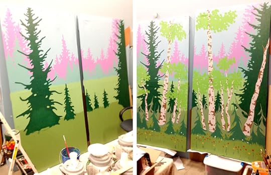
One of the things I enjoy doing is set design. Building and painting backdrops for plays is something that I have done since high school. I have worked for a couple of local theater groups and most recently for Treehouse Children’s Museum. Every fall the Treehouse Troupe does a set of three plays for children, written, directed and acted by employees of the museum. The most recent production is an adaption of a Russian fairy tale titled, The Princess Frog. When asked to paint some 8-foot tall flats, I decided to keep the Russian theme and paint them in the style of the great Russian illustrator, Ivan Biliban. Biliban was born in St. Petersburg in 1876 and later traveled through the north of Russia and became interested in old architecture and folklore. In 1899 he published a book with illustrations of Russian fairy tales, which made him famous. His style was reminiscent of Arthur Rackham and Edmund Dulac, both contemporaries of the time. During the first Russian Revolution of 1905 he drew revolutionary cartoons, but when the communists came to power in 1918, he moved from Russia and eventually settled in Paris, France where he painted decorations for private homes and churches. He painted interiors for the Soviet Embassy there and longing for his homeland, he finally returned to Russia in 1936 where he lectured at the Soviet Academy of Arts until the beginning of World War II. Biliban died during the horrific German siege of Leningrad in 1942 and was buried in a common grave.
One of Biliban’s other favorite things to do was set design. So using his style for some forest background flats was no great stretch. His stylistic renderings of forests as backgrounds for his folklore paintings is something that is readily recognizable. Since this set design art had no need of extreme detail I was able to freely splash on some paint. It is quite liberating to be able to do something 8 feet tall rather than a smaller illustration of less then a couple of feet. In other words, it was a great deal of fun and having fun with your work is very appealing to me these days.

December 4, 2014
Cartoon evolution
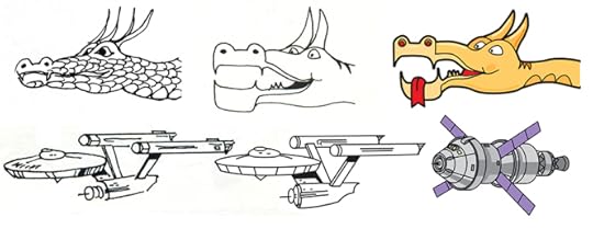
While it is never a good practice to look back to the past, it is sometimes very instructive. For instance, my early cartoon work. This was back in the last century, back to B.C., (Before Computers. What did you think I meant? I’m not that ancient). The cartoons were, of course, hand-drawn with pen and ink. The cartoon panels were drawn stacked vertically as they would appear in a book or in the newspaper as a strip. Not being very experienced at the time in drawing cartoons, the look was rather primitive. Note the first outer space monster, very scaly and somewhat thin looking. His next incarnation was a bit bigger and chunkier and since it took a lot of time to draw all those scales they have vanished along with a couple of the horns. There is also a hint of tiger striping on the neck. In the modern color and computerized version he is a good balance between fit and hungry. I spent a lot of time playing with the color before deciding on the tan to match my experiences in the southern Utah canyons and deserts where it is all tan, orange and reds. The space ship at the time was the Enterprise of Star Trek fame. It also evolved into a smoother version when computers came along and then vanished, as the ship is a completely copyrighted object easily recognized in this day and age. I am now using the Orion space vehicle, the new NASA space capsule finally being tested as I write this blog. The space vehicle is going to be used to travel to Mars for a human exploration of that planet, (finally). All of this has now ended up in the release of my cartoons in e-book format. (My Stars and Galaxies! A Comic Cosmic Journey). It has been a very long journey from the first pen and ink cartoons in 1976 to the modern electronic version in 2014. I wish I could say that I prefer the hand drawn versions, but I would be lying. The versatility and ease of computers has seduced me to the dark side and my aging hands are no longer as nimble as they used to be.

December 1, 2014
The difference between writing and painting
The great thing about painting is that I can accomplish a lot in one day, many of my old paintings were done in less then three days at a time. The not so great thing about writing is that it cannot be accomplished in anything less then 6 months or so and that is if you have a lot of unintrupted time to work with. It is equally easy to visualize a painting and a novel in your mind, it’s the details that are a bit fuzzy. If I want to do a painting I may make a sketch or three, then a small color rough to see how possible things are and then finally commit to painting a large illustration. Thankfully it is over in a few days and I can see if I have succeeded or failed. With a novel I generally do an outline, though not a very detailed one, usually less then 10 pages, so there are a lot of unfilled-in spaces. The real great fun is in the writing, I get to see how events and the character interactions play out over the course of the work. The bad thing is that I only get to see about 5 to 10 pages of it a day. It would be nice to be able to read through it faster but it takes forever to get through the book that way. Writing is just slow motion painting.
I guess it seems funny that I am just like someone reading the book for the first time. The sad thing is that I don’t always stick to the outline, a lot of strange events can happen along the way and I am not in complete control of my characters and action. They have minds of their own and they take sidetracks from the main flow of the novel on occasion. It is something that I have finally learned to live with gracefully. My first book, (Field Trip, now out on Amazon Kindle), eventually turned out to be more or less what I expected, the details were somewhat different but it finally stayed on track after I moved the action back 40 years. I fought a lot with my characters then, before I learned to let them have their way most of the time. Because of this, the second book unexpectaly turned out to be something more of a love story, and not with my two main characters. This came as a bit of a surprise, a pleasant one, but still a surprise. The third book was supposed to be about ecology and climate, but that didn’t happen either because the characters had other agendas. I have no idea where my 4th and current book is going. I guess I will have to keep writing and see that place where it will eventually take me to. In the end there is always the delete key, but I tend to visualize my characters standing there frowning their disapproval every time I try to use it and it is very hard to argue with all of them.

October 28, 2014
Up in the air
When I was a young lad I joined the Boy Scouts as many often do. However I was never satisfied with the unruly, haphazard approach to learning anything useful through the scouts. Besides, the troop was organized through the church where our family worshiped. I was already an altar boy, attended catechism and I was not interested in any more religious connections in my life. One day a friend of mine mentioned the Civil Air Patrol, (a civilian auxiliary of the Air Force). It was for kids 13 to 18; we got to learn military discipline, leadership, wear cool Air Force uniforms and best of all, learned how to fly. Even better, it was co-ed; there were lots of very lovely young girls. Through the CAP I eventually worked my way up the ranks from airman to cadet major, where I learned that being an officer is much better then being one of the grunts. (Which explains why I never really wanted to join the military as a career, I would never make officer rank there.) But flying was a revelation, the pure freedom of leaving the earth, (which is very odd because I have a fear of earthbound heights), was a truly amazing feeling. Flying offered a different perspective on life, the universe and everything. When I reached 18 and went away to college, I reluctantly gave up the CAP and I almost never flew again in light aircraft. Flying in a large jet is not flying, it is a bus ride and about as boring.
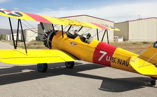
So when my lovely wife, Lynne, bought for me a ride in 1942 Stearman (Boeing) Model 75 recently, I got very excited. The Stearman was used to train thousands of pilots during WWII. It was a two-seater, open cockpit biplane that was very easy to train in and fly and many a fighter or bomber pilot got his first experience in the air via a Stearman. The instructor would sit in the back seat and the trainee would sit in the front. The Stearman has a left and right rudder pedal and a rudimentary stick in the middle. Push the stick forward and the plane goes down, pull it back and it goes up. Push it to the left and the plane will turn left, push it right and there you go. Push it right or left while stepping on the rudder pedals and you turn much faster. As I am an amateur World War II historian, the ride was additionally a wonderful dream come true. We flew in a Naval version of the aircraft with the appropriate markings. Since my father was involved in naval aviation operations during WWII it was quite satisfying to also honor his military experience. The half-hour flight, (slightly longer since we were part of an honor flight operation for a recently deceased local pilot), was wonderfully liberating and I regained that different perspective on things once again. In the middle of the flight, when the pilot told me to take the stick, I didn’t hesitate. Being in control of that aircraft made for flight, was a highlight in a year that has held few really fun things for me.

September 25, 2014
My own book cover
Over the years I have done many cover assignments, mostly for the newspaper that included various magazine covers for entertainment, outdoors and special sections. I have done some fan magazine and actual book covers on occasion, but the most difficult assignment I have had in a very long time was trying to create a cover for one of my own books. I took up writing over six years ago and have produced 3 and a half novels so far. Looking to publish these novels as e-books I needed to prepare a cover for the first book’s promotional and publication needs. It has turned out to be much harder then I thought. I can justify most any cover idea based on the contents of said publication, but I really cannot tell myself the same sort of thing. Having written something I know inside and out, I am very aware of what is important and what should be highlighted. I also know what kind of cover material stands out for a book and what does not. So you can see where this is going, I find it almost impossible to be both artist and writer on the same project and the result has been nothing short of chaos. But, I am not going to pay someone for something that I am perfectly capable of doing myself, so I am going to have to live with the results, whatever they may be. (See below.) The first cover was done quite some time ago and reflects an original idea that I had at the time, but it is too dark and busy. The second is one using my own art and why not? Except that I painted that piece a long time ago and it does not entirely fit the story. So why don’t I do something new and original? I am just not ready yet to tackle a difficult illustration assignment like that. I haven’t painted a science fiction picture for some time now and I need to get back into it one step at a time. It is very difficult to explain to a non-artist, but there it is. The next one is a step in the right direction based on modern trends in book cover design, keeping a couple of elements from my first concept. The last one is pushing that another step further and looks to be almost what I want to accomplish with the cover. Something is still not quite right, but I just may have to go with it as I have waited far too long to get the book out. For goodness sake, some people are just never satisfied.


