
David Chelsea's Blog, page 31
December 24, 2014
Coming In January: Snow Angel Goes To Wizard World

I will be making my first comics convention appearance of 2015, and my second annual appearance at Wizard World Portland this January 23-25. I had a fine time at Wizard World last year, and this year I’m bringing something special for the fans– a new minicomic featuring Snow Angel, in which, fittingly enough, she and her brother Aidan go to a comics convention. (In the panel below, Snow Angel is in her off-duty guise of a little girl named Angel. Her brother Aidan is in costume as Snow Angel, however, for complicated reasons. Not to worry; the real Snow Angel shows up eventually.)

Eventually I intend to add color to this story, and include it in a projected book collection of Snow Angel stories, but for now I am bringing a black and white version which I am titling SNOW ANGEL’S COMICS CONVENTION COLORING BOOK!
There is a controversy swirling through Facebook, if nowhere else, about the role of “cosplayers”, those people who like to attend comics conventions dressed as their favorite comic characters. Comics writer J. Michael Straczynski wrote a widely circulated screed against cosplay, which was followed by equally impassioned defenses. Straczynski and his allies criticize cosplayers for taking up too much space at conventions, crowding the aisles, and making it difficult for exhibitors like himself to sell, for not spending money themselves, and for being generally ignorant of the history of the medium they celebrate. The argument echoes the familiar wrangle over gentrification, with cosplayers cast as the yuppies who walk obliviously past the shoe repair shop that has been in their neighborhood since 1949. For their part, cosplayer defenders accuse the critics of being geek dinosaurs who resent their all-male paradise being invaded by (mostly) Girls Who Just Wanna Have Fun. For myself, I have noticed that my own sales have been lower at cosplay-heavy conventions like Wizard World and Emerald City than they were at the late, lamented Stumptown, but I tend to blame higher ticket prices for tapping attendees out. SNOW ANGEL aims to be nothing more than pure escapism, but I couldn’t resist taking a tiny poke at the issue (I thank Terri Nelson of Periscope Studios for the observation that cosplayers don’t carry wallets.):

Apart from the new Snow Angel story, I will be bringing both of the books in my PERSPECTIVE! series, as well as the recent collection published by Dark Horse, EVERYBODY GETS IT WRONG! (AND OTHER STORIES): DAVID CHELSEA’S 24 HOUR COMICS VOLUME 1, and sundry other goodies. Angel and Aidan quickly discover that they do better selling snacks than comic books, and I intend to follow suit- I’ll be offering a free Voodoo Doughnut with purchase!

Portland Comic Con 2015
Wizard World Convention
January 23-24-25, 2015
FRI-SAT-SUN
Oregon Convention Center
777 NE Martin Luther King Jr. Blvd.
Portland, OR 97232
Show Hours:
Friday, January 23, 2015 – 3pm – 8pm
Saturday, January 24, 2015 – 10am – 7pm
Sunday, January 25, 2015 – 11am – 5pm


October 31, 2014
Snow Angel For Halloween!

First off, we are talking about NEXT Halloween. I have just had my second Snow Angel story accepted by DARK HORSE PRESENTS, which is set to appear in the October 2015 issue.
David Chelsea is watching:
In The Realms Of The Unreal
featuring Henry Darger
This is an eight page adventure set at Halloween. The little girl who becomes the superhero Snow Angel when she makes an angel in the snow is off-duty for the night, trick-or-treating in a Headless Man costume, but there are plenty of other Snow Angels around:

BTW, this story is being colored by the very gifted Jacob Mercy, who is doing an excellent job of digitally replicating the watercolor and airbrush style of the first Snow Angel story in Photoshop. Here’s a finished panel, in which it seems Snow Angel has found a reason to show up after all:

Jacob and I are working on a number of other Snow Angel stories, with the aim of an eventual book-length collection.
Blog post about my first Snow Angel story
October 17, 2014
Work In Progress: The Men Of SANDY & MANDY

SANDY & MANDY, the story I drew as an upcoming series for DARK HORSE PRESENTS, was designed specifically to pass The Bechdel Test, cartoonist and MacArthur Genius Grant recipient Alison Bechdel’s set of rules for determining if a story is sexist or not. To wit:
1. It has to have at least two women in it,
2. Who talk to each other,
3. About something other than a man.
Some people amend the rules to require that both women have names.
David Chelsea is watching:
American Horror Story: Season 1
starring Connie Britton
Bechdel formulated The Test to apply to movies, but I see no reason why it can’t work with comics- a story is a story. A list of films that fail The Test would incorporate most of the video shelf, but here are the top-grossing films of all time that pass it:
1 Titanic
2 The Exorcist
3 Jurassic Park
4 Star Wars: Episode I – The Phantom Menace
5 Grease
6 Harry Potter and the Sorcerer’s Stone
7 Independence Day
8 Transformers: Dark of the Moon
9 Shrek 2
10 Harry Potter and the Chamber of Secrets
A quick tip of the hat to COWGIRLS AT WAR, a 1970s National Lampoon story combining dialogue which Michael O’Donoghue seemingly wrote to pass The Test decades before it was devised, with matchlessly titillating girlie art by Russ Heath. Who says guys can’t be nonsexist?:

Page from COWGIRLS AT WAR
There’s not a lot of plot to SANDY & MANDY, just two friends walking around a cityscape that looks much like Venice, window shopping, drinking wine, fishing for crabs, and talking mostly not about men. They do encounter a few men along the way. At one point Sandy has an appointment with a male escort:

I originally drew this story while on a trip to Europe, mostly during plane hops and while waiting for trains. I incorporated elements from books I was reading or had recently read. I took the prostitution theme and the conceit of never showing the escort’s face from Chester Brown’s memoir PAYING FOR IT.
I made a number of changes when I redrew this story for DARK HORSE PRESENTS. “Candy” changed her name to “Sandy”, and I moved the scene underwater, which entailed giving the escort a makeover. I took inspiration from this sequence in Winsor McCay’s LITTLE NEMO:

Frame from LITTLE NEMO by Winsor McCay

Mandy has her own encounter, a blind date which begins promisingly:

One of the books I was reading at the time was I THINK I LOVE YOU by Allison Pearson, a novel about a Welsh girl infatuated with David Cassidy. I therefore based the blind date’s appearance on Cassidy:

David Cassidy
A psychedelic, Peter Max-inspired sequence gave me a chance to indulge my interest in kaleidoscope tiling:

The original story was fourteen pages long, and I added a few scenes to bring the length up to twenty-four pages. One was this encounter with a seemingly blind man, which I took pretty much verbatim from a review skit I wrote for The Storefront Theater in 1977:

I based the character’s appearance and body language on the original performer in the skit, veteran Portland actor Ross Kerr:
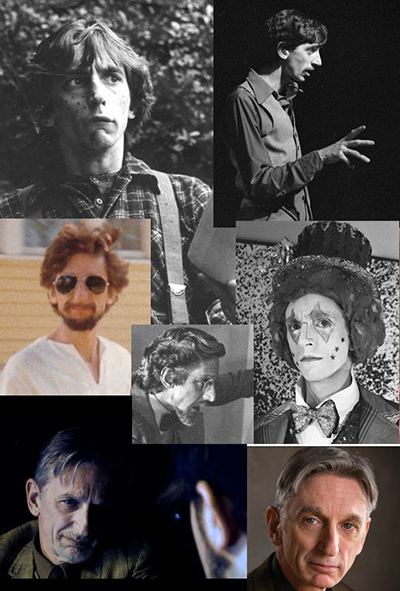
Ross Kerr
To keep the character’s appearance consistent from frame to frame, I virtually molded a head in the 3D application Sculptris, based on photo reference of Ross:
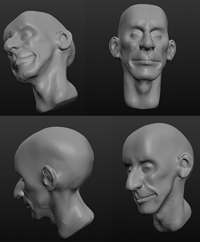
Head modeled in Sculptris
It’s a date! I just got word that SANDY & MANDY will begin serialization in Dark Horse Presents Vol. 3 #15, appearing in December, 2015.
Previous blog post about SANDY & MANDY
October 15, 2014
Another Batch Of Funny Facebook Posts

David Chelsea is listening to:
The Very Best of the Manhattan Transfer
The Manhattan Transfer

Italians Make The Best Jews!:

Jews Make The Best Italians!:

I’ll bet they found that King wasn’t up to much:

Nearly everybody who works in the movies has had some work done:

Michael Cera is starting to look like Sterling Holloway to me. BTW, his father’s name is Luigi, so it should be pronounced “Chair-a” not “Sarah”, right?

The police equivalent of the rubber room:
A Little Orphan Annie strip that bizarrely prefigures The Truman Show: a Hollywood producer casts Annie as a jungle princess in blackface, then insists she hang around the set in full makeup for weeks while they’re “waiting for filming to start”. Meanwhile, he’s filming her every move with a hidden camera:

October 10, 2014
Work In Progress: From CANDY & MANDY To SANDY & MANDY

I recently wrapped up work on SANDY & MANDY, an upcoming story for DARK HORSE PRESENTS, so here are some more preview images from it. The sequence of panels below shows my working method, from sketchbook rough to pencil to inks to watercolor to the final assembled frame:

David Chelsea is reading:
The Invisible Bridge: The Fall of Nixon and the Rise of Reagan
by Rick Perlstein
This story went through more than a few changes from the original version in my sketchbook to the final color comic. Sandy & Mandy started out as CANDY & Mandy, and they looked considerably different. Mandy lost her baseball cap and sneakers in favor of a Pebbles Flintstone topknot and crocs, while Candy/Sandy went through a total makeover, from a soccer mom look to milkmaid braids and a peasant blouse (she also acquired my favorite style of eyewear, round black glasses); it all has to do with a plot development that I won’t spoil:

Sandy & Mandy’s friend Colleen changed less; in both versions her look derives from this still of Shelley Duvall in NASHVILLE:


When I began work on this story both of these characters were new, (I have since used both of them in 24 Hour comics) so I did some exercises to get familiar drawing them. Here is an early set of model sheets, before Mandy got her topknot. I later rethought her tattoos, eliminating the eye on her navel and shifting Snow Angel from her back to her bicep:

I went through a few sketchbooks and copied old one minute poses from life class, substituting Sandy & Mandy’s heads. Don’t get too excited- there’s no nudity in the comic itself:

Next up- the men of SANDY & MANDY!
Previous blog post about SANDY & MANDY.
August 14, 2014
RIP, Lauren Bacall

Caricature from the New York Observer
August 12, 2014
RIP, Robin Williams

MRS. DOUBTFIRE illustration from the New York Press, 1993
July 29, 2014
I Try That Tilted Mirror Copying Method From TIM’S VERMEER

David Chelsea is reading:
Updike
by Adam Begley

As seen in the movie

Vanity Fair photo of Courtney Love

In process

Final painting
By the way, Vanity Fair reportedly retouched Courtney’s hand so she wouldn’t be seen smoking while pregnant. Does anyone have a copy of the photo with cigarette intact?
July 2, 2014
Perspective Police!: Boxing The Sphere
The twentieth anniversary of my book PERSPECTIVE! FOR COMIC BOOK ARTISTS is fast approaching , and it’s time to take care of some long-unfinished business.
A reader of this blog wrote recently to ask me to tell him how to draw a sphere correctly in perspective. He had touched a sore spot- I spend a lot of time in my book explaining how the instructions on how to draw a sphere in other perspective books are wrong, wrong, wrong, but I never lay out a method that is right, right, right.
David Chelsea is watching:
Tim’s Vermeer [Blu-ray]
Directed by Teller
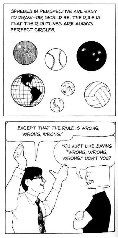
There are a few reasons for this. One is that is actually not that easy to draw a sphere correctly. The other, is that it is VERY easy to draw a sphere incorrectly. Just trace a circle from a template, or use a compass. We can tell just by looking that a sphere always and everywhere has a circular silhouette, right?
The reason this is wrong, wrong, wrong, have to do with the effect of foreshortening. Yes, a sphere always does appear as a circle in the real world, where we view everything head-on. But when we look at an image in perspective, we only see the central part of the picture head-on; everything else is seen from an oblique angle. To compensate for foreshortening, a sphere that is not exactly at the center of the picture must be drawn as an ellipse in order to appear circular, and the further from the center it is, the more distended the ellipse has to be.
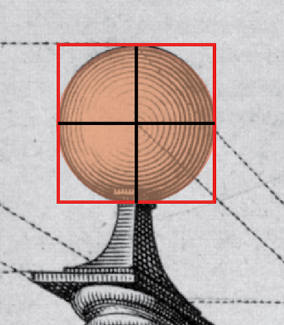
Most books tell you to ignore this effect and draw spheres as circles wherever they appear for aesthetic reasons (though I suspect there is some laziness involved as well); some go so far as to term this compromise of the rules as “correcting an error”: circles are pleasing and natural, ellipses are disturbing and gross. However, cameras as well as CGI software have a philistine insensitivity to aesthetics, and a sphere photographed off-center will appear uncompromisingly elliptical:

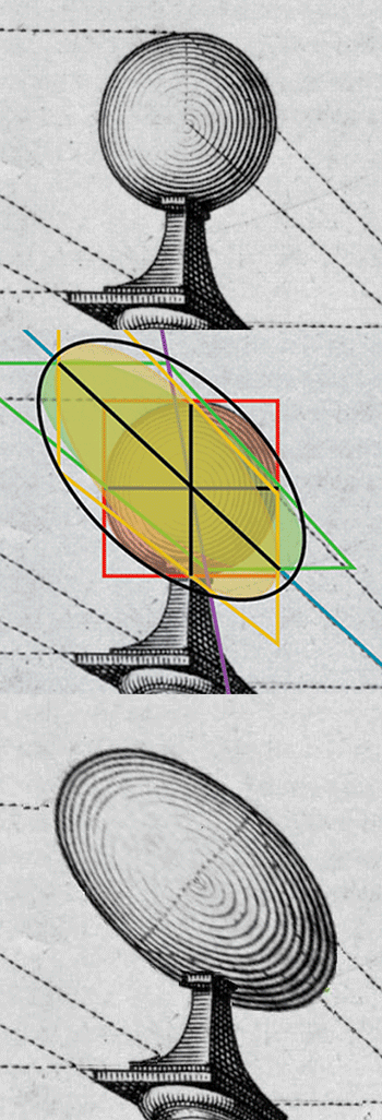
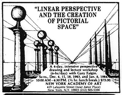
I have two methods of constructing a correctly spherical ellipse anywhere in the picture, and to demonstrate them, I will play cop on this one-point perspective image by the 16th century Dutch artist Hans Vredemas de Vries. Beautifully drawn, and literally a textbook example, since it shows up in a lot of textbooks, it was on the ad for the first perspective course I ever took, and it’s wrong, wrong, wrong!

Perspective engraving by Hans Vredeman de Vries
My first method involves building a boxy shape to fit the sphere in, then drawing three intersecting circles which provide tangent points to plot the silhouette of the sphere. Here’s an isometric drawing of the shape I intend to draw:
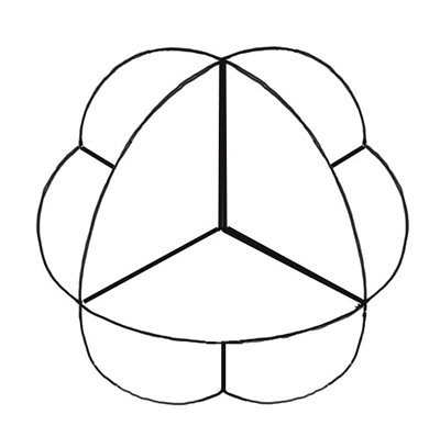
De Vries has already done much of the preliminary work; in his picture there is a horizon, a central vanishing point, and two 45° vanishing points for the diagonals. I can even use his existing sphere as one of the three intersecting circles; since it is facing us, its shape is not distorted. All I need to do is add a square outline and two lines crossing the midpoint.
Now, I create a green square intersecting the red square horizontally, using a line back to the diagonal vanishing point to establish its depth:
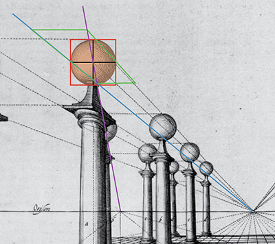
Then I inscribe a circle in perspective- that is, an ellipse- in the green square. I’m working in Adobe Illustrator, so I create an elliptical box and fit it in the square so that it touches the midpoints of all four sides. If you’re working on paper, you may want to use the 12 point method for inscribing a perspective circle in a square.


12 point method of drawing perspective circles
Now I repeat the process for a vertical square in the receding plane, building off the two squares already drawn.


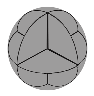
Now I have three differently colored circles. An ellipse that is tangent on all their outmost edges gives us the outline of the sphere. Because it is far from the center of vision, it is VERY distended:

I stretch de Vries’s sphere to the right shape, and the job is done.

For a second sphere, further back in space, I use a method I outline in EXTREME PERSPECTIVE! for drawing anamorphosis, which is an image meant to be viewed at an extremely oblique angle (the same method, with slight variations, also works for drawing cast shadows). First, I find the station point, a spot directly below the center of vision exactly as far from it as the observer is from the picture plane. Again, de Vries has made this easy; the distance to that spot happens to be exactly the same as the distance between the central vanishing point and either of the two 45° vanishing points.The station point and the two 45° vanishing points form a right triangle, with the 90° angle on the bottom:

Now, I find the cone of vision for the center of the sphere- that is, its angular distance from the center of vision, by drawing a circle through it centered on the center of vision. That circle intersects the horizon at almost, but not quite, 45°:

I can use a protractor to determine the exact cone of vision the sphere sits on, but I don’t need to- all I need to do is establish a point on the horizon exactly 90° away. I find it by first drawing a line from the intersection point on the horizon to the station point, then drawing another line at right angles to the first and marking where it intersects the horizon.

Next, I take a circle the size of de Vries’s sphere and place it on the horizon with its center on the cone of vision. I draw tangent lines from the station point on the circle, marking where they intersect the horizon, and then erect vertical lines from those points.


Now the point 90° away gets into the act. Lines drawn from that point, touching the circle, complete a square in perspective which has a trapezoidal shape. An ellipse touching the sides gives us the shape of the sphere. Since it is closer to the center of vision than the first sphere, it is not quite so distended.
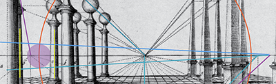

Now I rotate that bad boy along the cone of vision, using the center of vision as a pivot, until it is directly over deVries’s sphere. Its long axis should be pointing at the center of vision.

A little Photoshop magic, and de Vries’s errors are corrected:


Some day when I have time, I’ll get around to correcting the rest of the spheres..
Got an example of iffy perspective to show? Be a whistleblower! Send an e-mail to me at davidchelsea(at)comcast(dot)net and include Perspective Police! in the subject line.
June 17, 2014
Work In Progress: Sandy & Mandy

Here’s a story for Dark Horse Presents that I have been working on for over two years. I have mentioned it in passing in a few previous posts, but I haven’t done a full post about it before because I was making such slow progress. However, now that I’m at the two-thirds point (16 pages finished out of 24) I at last feel ready to offer a sneak peek.
David Chelsea is watching:
Codependent Lesbian Space Alien Seeks Same (Special Edition DVD)
Directed by Madeleine Olnek
It began as a sketchbook comic drawn during a European vacation I took with my family in the Summer of 2011. Mostly I worked on the plane and during long waits at train stations. The idea behind it was to draw something that would pass the Bechdel Test.

Page 1 of the sketchbook version
Alison Bechdel is the cartoonist responsible for the comic strip Dykes To Watch Out For and the graphic novels Fun Home and Are You My Mother? but is best known for The Bechdel Test, which she formulated to determine whether a movie is sexist or not. For a story to pass the test:
1. It has to have at least two women in it,
2. Who talk to each other,
3. About something other than a man.
Some people amend the rules to require that both women have names.

The Test
Even though Bechdel devised this test for movies (some notable ones that fail it: The Godfather, The Graduate, Citizen Kane and the original Star Wars Trilogy) there is no reason it can’t apply to comics; a story is a story. When I first heard about the test I mentally applied it to my own work and was embarrassed to discover that only two stories passed: my first graphic novel David Chelsea In Love, thanks to a single sequence taking up part of two pages (41 and 42 in the Reed Press edition), and the 24 Hour Comic ID, which you can read in its entirety here. Therefore I created Sandy & Mandy (who in my original sketchbook version were Candy & Mandy), two named female friends who talk about everything under the sun as well as the occasional man (I couldn’t resist having a bit of fun with such a P.C. restriction- notice the convoluted way they manage to bring up men’s names without actually talking about a man).
Since a large part of the trip was spent in Venice, I have the characters walking around a somewhat Venetian landscape (it also has features taken from the Venetian section of Las Vegas), even though the story is pretty clearly set in the States. I incorporate elements from books I brought along on the trip or had read recently, among them I Think I Love You by Allison Pearson, The Astral by Kate Christensen, Under The Banner Of Heaven by Jon Krakauer, Paying For It by Chester Brown, Colin Upton’s series of comics about his diabetes, and Alison Bechdel’s own graphic novel Fun Home. In Germany I saw a high school production of Wagner’s Ring,so I threw in a reference to that as well:

I’ll go into more detail on the changes I made between the sketchbook and final versions of the story, as well as showing some working drawings and model sheets of the characters in the next post, but here’s an advance look:

You can read Are You Being Watched?, a 24 Hour Comic with Mandy (but not Sandy) in it, at the Comics Lifestyle website here. Warning: this story does NOT pass the Bechdel Test.
David Chelsea's Blog

- David Chelsea's profile
- 8 followers

