
Joseph J. Romm's Blog, page 1133
August 13, 2010
Toles' "last rant about the climate" and Tom Tomorrow on conservatives, "Reality: Who needs it!"
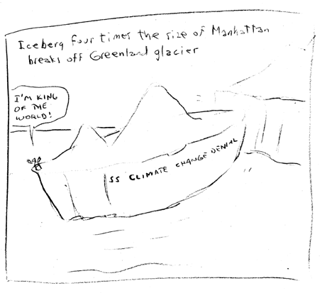
That was Toles' sketchpad "outtake" cartoon that didn't make it into the paper. And here is his self-proclaimed final rant on climate:
This will be my last rant about the climate. Cartoonists sometimes look just like the archetypical cartoon character crawling across the desert. Gary Larson did a cartoon about two guys crawling across a desert, dying of thirst. They have come upon a drinking fountain. One is letting it run without drinking and saying he's going to let it run until it...


A conversation with Paul Greenberg about his new book Four Fish
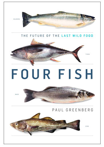 In this podcast, Andrew Light, Senior Fellow at the Center for American Progress interviews Paul Greenberg, a lifelong fisherman and author of the new book Four Fish: the Future of the Last Wild Food about the overfishing crisis, international agreements, and other issues. That is followed by a book review by Sean Pool and Laurel Hunt and is cross-posted at ScienceProgress.
param
Big Oil's long history of compromising national security for profit
This
Wonk Room
cross-post
is by CAP's Rebecca Lefton
.
 Months after the worst environmental disaster in U.S. history, BP is delaying deepwater drilling off the coast of Libya and exploratory drilling off of the Scottish Shetland islands. The delays also reflect the political pressure BP faces because of its lobbying efforts "over the prisoner transfer agreement with Libya that led to the release of Lockerbie bomber Abdel Basset al-Megrahi." Senator Robert Menendez (D-NJ) is planning to
August 12, 2010
NASA reports hottest January-July on record, says that 2010 is "likely" to be warmest year on record and July is "What Global Warming Looks Like" - WMO: "Unprecedented sequence of extreme weather events ... matches IPCC projections of more frequent and mo
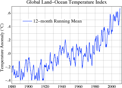
Both NASA and the World Meteorological Organization both have excellent posts I'm going to excerpt at length. The first, from NASA's Goddard Institute for Space Studies website, is titled
July 2010 — What Global Warming Looks Like
The July 2010 global map of surface temperature anomalies (Figure 1), relative to the average July in the 1951-1980 period of climatology, provides a useful picture of current climate. It was more than 5°C (about 10°F) warmer than climatology in the eastern...
NASA reports hottest January-July on record, says that 2010 is "likely" to be warmest year on record and July is "What Global Warming Looks Like" - WMO: "Unprecedented sequence of extreme weather events ... matches IPCC projections of more frequent and mo
Both NASA and the World Meteorological Organization both have excellent posts I'm going to excerpt at length. The first, from NASA's Goddard Institute for Space Studies website, is titled
July 2010 — What Global Warming Looks Like
The July 2010 global map of surface temperature anomalies (Figure 1), relative to the average July in the 1951-1980 period of climatology, provides a useful picture of current climate. It was more than 5°C (about 10°F) warmer than climatology in the eastern...
Joseph J. Romm's Blog

- Joseph J. Romm's profile
- 10 followers

