S.L. Viehl's Blog, page 45
September 20, 2015
Color Week #4: Color Words
Bearded Iris. Ectoplasm. Zephyr. These are three of the lovely words Chandi at Expression Fiber Arts uses to describe the colors of her beautiful yarns. I found her site when I started watching tutorials on how spin art yarn (and she has an adorable video here on that.) I've also been rather awed by the wide range and inventive creativity of the words she uses to name her products.
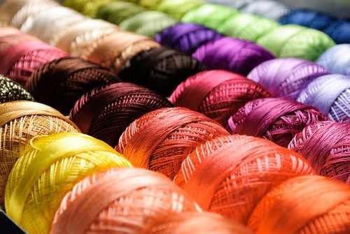 For writers, describing color is both an everyday task and a perpetual challenge. Basically everything we create ends up being black (print) on white (page), so the words we choose to communicate the colors of anything contained in a story are particularly vital. We need to invoke imagery in a reader's mind as they read, and we can't do that if we never share with them what we see in ours as we write.
Employing the basic words for every color -- red, green, blue, yellow, orange, black, white, brown, purple -- are the easiest way to communicate what you want someone to see in a story. Sometimes that may be all you need, too: A red roof. A green door. A purple crayon. But if you use only basic color words, you'll end up with a story that reads like a pile of LEGO blocks looks.
The other end of the color word writing spectrum is using color words that are so elaborate or obscure that they colorblind the reader. I was reading a story last week in which the author described a color using only the word hopniss. I had no idea what that was, so I not only had to look up what the word meant, I then had to go search for an image of it before I saw the color. I don't mind doing this once, as there is no way in the world I can know what every plant on the planet looks like. If I have to do it ten times before I read the end of the first chapter, however, I'm probably not going to read the rest of the book.
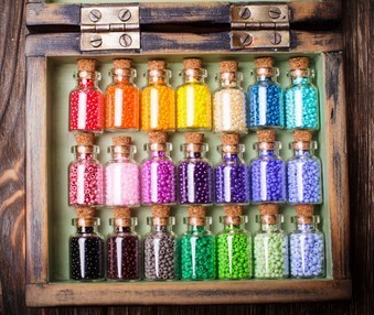 So how do you avoid using color words that are too simple or too obscure to keep the reader engaged? One way is to exercise and beef up your own color vocabulary by creating charts and word lists. Haul out your basic color words, and begin collecting paint chips, fabric swatches and other visual samples for one of the words. Pay attention to how others name them as inspiration, and then begin a list with your own descriptors. Keep in mind terms that are universal enough for others to imagine. While not everyone knows what hopniss is, I'll bet nearly every reader you reach will recognize something you describe as the color of elephant hide, a fresh bruise, or a sunset cloud.
Tomorrow we'll wrap up color week by putting together a color notebook in which you can keep your charts, word lists and color ideas for future reference. In the meantime, what's the most interesting color description you've ever encountered? Let us know in comments.
Images credit: oksixx
 For writers, describing color is both an everyday task and a perpetual challenge. Basically everything we create ends up being black (print) on white (page), so the words we choose to communicate the colors of anything contained in a story are particularly vital. We need to invoke imagery in a reader's mind as they read, and we can't do that if we never share with them what we see in ours as we write.
Employing the basic words for every color -- red, green, blue, yellow, orange, black, white, brown, purple -- are the easiest way to communicate what you want someone to see in a story. Sometimes that may be all you need, too: A red roof. A green door. A purple crayon. But if you use only basic color words, you'll end up with a story that reads like a pile of LEGO blocks looks.
The other end of the color word writing spectrum is using color words that are so elaborate or obscure that they colorblind the reader. I was reading a story last week in which the author described a color using only the word hopniss. I had no idea what that was, so I not only had to look up what the word meant, I then had to go search for an image of it before I saw the color. I don't mind doing this once, as there is no way in the world I can know what every plant on the planet looks like. If I have to do it ten times before I read the end of the first chapter, however, I'm probably not going to read the rest of the book.
 So how do you avoid using color words that are too simple or too obscure to keep the reader engaged? One way is to exercise and beef up your own color vocabulary by creating charts and word lists. Haul out your basic color words, and begin collecting paint chips, fabric swatches and other visual samples for one of the words. Pay attention to how others name them as inspiration, and then begin a list with your own descriptors. Keep in mind terms that are universal enough for others to imagine. While not everyone knows what hopniss is, I'll bet nearly every reader you reach will recognize something you describe as the color of elephant hide, a fresh bruise, or a sunset cloud.
Tomorrow we'll wrap up color week by putting together a color notebook in which you can keep your charts, word lists and color ideas for future reference. In the meantime, what's the most interesting color description you've ever encountered? Let us know in comments.
Images credit: oksixx
Published on September 20, 2015 09:23
September 19, 2015
Off to Write

I'm unplugging today to finish up a deadline for a client. See you tomorrow.
Published on September 19, 2015 04:00
September 18, 2015
Yep
I should tattoo the lovely narration for this advertising video somewhere on my body, only Mom would kill me (with background music, too, for those of you at work):
Field Notes "Write." from N O R T H on Vimeo.
Published on September 18, 2015 04:00
September 17, 2015
Just Write

I have two deadlines to knock out before Friday, and we're getting socked with bad weather, so I was going to cancel Just Write today. I hate doing that, though, so today I will write something new -- which will probably only be a couple of pages in between assignments and thunderstorms, I'll warn you -- and post it online before midnight. If lightning permits. Everyone inclined to do the same is invited to join me. Hopefully you write more than I do.
My link: Got this knocked out ahead of the storm, so here's a bit more on Ghost Writer (click on the title to go to the .pdf), with new material beginning on page 124 (brace yourselves for a major character revelation, too.)
For more details on Just Write Thursdays, click here to go to the original post.
Image credit: windujedi
Published on September 17, 2015 04:00
September 16, 2015
Color Week #3: Character Color Tags
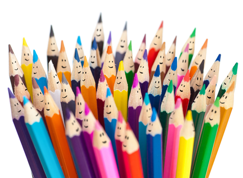 You may not know this about me, but I'm a green. As a kid I was a blue, then went all Goth-black during my high school poetry days, and then faded back to a blue again. I had a couple years when I bounced between being an orange and a plum, and a couple other duos, but about ten years ago I finally settled on being a green. A dark green -- pine, hunter, shadowed emerald, that end of the scale -- but definitely green.
 Why? Well, it's not because I'm green with envy, or greedy for the cash variety of green, or even ready-to-puke green. Green has always been a color symbol of creation to me. As colors go it's fresh, cool, and soothing. It's always growing. That's what I want to be -- and to remind myself to be -- so I embraced being a green.
I assign color tags to characters in the same way. Most of the time I use character palettes, but I've assigned single color tags to many of my characters, too. Cherijo from the StarDoc books was always a silver from the minute she popped up on the page. For me character colors can change, too -- Alexandra from the Darkyn novels began as angry scarlet and changed to lavender when she became an immortal and got tangled up with Michael, who I'd tagged as a lovely sky blue (which was also the reason I chose that scent for her.) Some character colors are so strong in my head I doubt they will ever change (for reasons that will ruin some books I haven't yet written, Dredmore from the Disenchanted & Co. series will forever be a gray to me. Since that color is now associated with all things naughty it also annoys me immensely, but I can't change it.)
Using color association with your characters is another of those creative things you can do to enhance them. You don't have to use a single color, or resort to a huge palette, either. Make a list of your character names, and beside them write the first color(s) you think of when they're in your thoughts. This can be something you draw from their physical description (Cherijo being a silver came from the sheen of her hair) or something you associate with them (Jessa Bellamy from the Kindred novels was a sapphire blue thanks to the original paint on the house she grew up in.) If you have nothing you associate with the character that gives you a color tag for them, pick a random color.
Once you have your color tag list, you have some visual mojo to work with in developing your character. Let's say your female protagonist is a pink: a bright, bubblegum shade of pink. Okay, not my favorite color, but I'm working on rehabbing my negative attitude toward pink. Meanwhile, you're already forming your own opinions about this gal based on that color tag, right? Is she girly, childish, pretty, naive, shy? Or is she hot, sexy, daring, electric? Pink is the symnbolic color of hope for the victims of breast cancer, so it has a more thoughtful/wishful association, too. Pink can be a power color as well -- if you're wondering how a pink-tagged protagonist can be kick-ass, you should read Karen Marie Moning's MacKayla Lane novels. That chick is ferociously pink.
If the first tag you choose for your character doesn't inspire you, trash it and pick another color based on why the first color didn't work. Let's say your protagonist doesn't feel like a pink because she's dark-mooded and has a mean streak. So what is the color of dark/moody/mean? For me it's the purple-red of a fresh bruise, but your association will probably be different.
Choosing color tags for your characters won't solve all your development issues, but it can help you think in different directions as you build your story people. Too often writers construct their characterizations based solely on appearance, which while convenient is really lazy writing. Try tagging your crew, and see what assigning colors can do to inspire how you bring them to life on the page.
Image credit: Audrey_Kuzmin
Published on September 16, 2015 04:00
September 15, 2015
Color Week #2: Color Mood
Sorry I'm late posting this morning; I misplaced my camera, and I wanted to take some pics to go with this post, starting with this one:
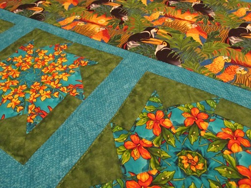
I put the final hand stitch in my tropical-themed quilt last night, and once I bind it it'll be ready to use. Working on this quilt reminded me of so many things that surrounded me as a kid in the tropics: the red hibiscus growing outside our house, all the birds who come to south Florida for the winter, the beauty of the ocean, the year-round green everywhere. A few times I could almost smell sun tan lotion and hear the endless rush-crash of the waves on the beach.
These are the colors of my childhood, and if you asked me to name them based on those memories then I'd call them jungle green, mango orange, hibiscus scarlet, and sunlit Atlantic blue.
For contrast, here are two sides of a crazy quilt tote I made, which was the first thing I sewed after my eye surgery last year:
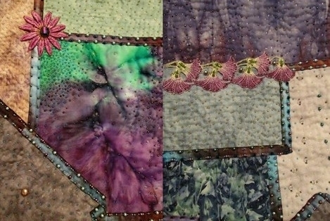
Not quite as joyful as the quilt, right? That's because at the time I was coming out of a long and dark period of absolute dread. These colors, these blues and purples and grays, all reflect how I felt during my recovery. Relief, peace, some lingering fear over the healing process. Darker feelings about what was for me the indescribable experience of being conscious (and helpless) while my surgeon cut into my eye with a scalpel. A different kind of joy at being able to see clearly again. Definitely somber, but not depressed -- recovering. For me these are the colors of hope and dreams.
Although psychologists would have it otherwise, I don't think the moods colors bring out in us are all universal. Our personal associations influence how we feel when we see a color, or a combination of colors, and the same should be true of our characters. If you haven't given this a lot of thought, consider your favorite color, and ask yourself some questions about it: why is it your favorite? What do you think of the moment you see it? How do you work it into your life? Is it on your walls, in your wardrobe? Once you've analyzed your favorite, do the same with a color you hate. All of these things you discover about your color moods can be then worked into your characters, your story elements, your settings -- and they don't have to reflect your own feelings (in fact, it's better for your writing range if they don't.)
You don't have to mention color moods in your story directly, either. Just as colors affect you, working them into a story will do the same for the work and the reader. A character who dresses in dull colors or paints her bedroom gray isn't a happy kid from the tropics, obviously. A guy who wears a loud yellow tie -- what I think of as a wardrobe exclamation point -- obviously wants attention. The adult antagonist who sleeps in a candy-pink room filled with toys (that he keeps locked at all times) has some serious, creepy issues.
Now it's your turn: What's your favorite color, and what is the first thing you think of whenever you see it?

I put the final hand stitch in my tropical-themed quilt last night, and once I bind it it'll be ready to use. Working on this quilt reminded me of so many things that surrounded me as a kid in the tropics: the red hibiscus growing outside our house, all the birds who come to south Florida for the winter, the beauty of the ocean, the year-round green everywhere. A few times I could almost smell sun tan lotion and hear the endless rush-crash of the waves on the beach.
These are the colors of my childhood, and if you asked me to name them based on those memories then I'd call them jungle green, mango orange, hibiscus scarlet, and sunlit Atlantic blue.
For contrast, here are two sides of a crazy quilt tote I made, which was the first thing I sewed after my eye surgery last year:

Not quite as joyful as the quilt, right? That's because at the time I was coming out of a long and dark period of absolute dread. These colors, these blues and purples and grays, all reflect how I felt during my recovery. Relief, peace, some lingering fear over the healing process. Darker feelings about what was for me the indescribable experience of being conscious (and helpless) while my surgeon cut into my eye with a scalpel. A different kind of joy at being able to see clearly again. Definitely somber, but not depressed -- recovering. For me these are the colors of hope and dreams.
Although psychologists would have it otherwise, I don't think the moods colors bring out in us are all universal. Our personal associations influence how we feel when we see a color, or a combination of colors, and the same should be true of our characters. If you haven't given this a lot of thought, consider your favorite color, and ask yourself some questions about it: why is it your favorite? What do you think of the moment you see it? How do you work it into your life? Is it on your walls, in your wardrobe? Once you've analyzed your favorite, do the same with a color you hate. All of these things you discover about your color moods can be then worked into your characters, your story elements, your settings -- and they don't have to reflect your own feelings (in fact, it's better for your writing range if they don't.)
You don't have to mention color moods in your story directly, either. Just as colors affect you, working them into a story will do the same for the work and the reader. A character who dresses in dull colors or paints her bedroom gray isn't a happy kid from the tropics, obviously. A guy who wears a loud yellow tie -- what I think of as a wardrobe exclamation point -- obviously wants attention. The adult antagonist who sleeps in a candy-pink room filled with toys (that he keeps locked at all times) has some serious, creepy issues.
Now it's your turn: What's your favorite color, and what is the first thing you think of whenever you see it?
Published on September 15, 2015 04:00
September 14, 2015
Color Week #1: Collections
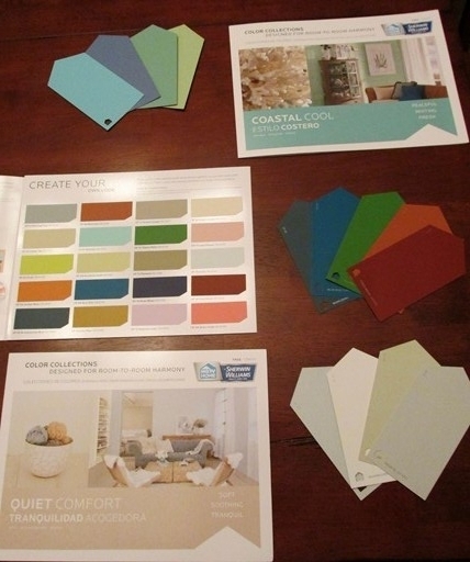 I was at the home improvement store last week when I spotted these new paint sample folders from Sherwin Williams, who teamed up with HGTV to put together some neat color collections. I especially fell for the individual color paint chips, which are shaped like fat bookmarks and have a punch in one corner which you might use with a binder ring to keep a stack together.
Collecting colors in some fashion can help you improve your own descriptions when you're writing. Paint manufacturers invent some terrific names for their products that invoke a sensory connection to the shade, i.e. Brookside, Mint Sprig, Cabin Plank. You can almost hear the rushing water, taste the cool sharpness, feel the weathered wood of those colors -- not something that may happen when you default to the standard blue, green or brown. I find that when I study colors with inventive names I become more creative with describing them myself, too.
I think exploring color wakes up more of your storytelling side. I've talked about creating palettes for characters and stories, but I also use them for working out and enhancing my settings, and even creating a particular mood in a scene or a chapter. Learning more about color psychology can help you understand how assigning a particular color or palette to a story element can affect the element, but I think once you start working with color and storytelling this tends to evolve naturally as well.
This week I'll be showing you various ways to think about color, use it to inspire your creativity, and incorporate more of it in your writing. I'm also putting together a color collection notebook to help anyone create, find and save color combinations for future reference, so stop in when you have a chance.
Published on September 14, 2015 04:00
September 13, 2015
Sub Op
Mystery and Horror LLC has an open call for their upcoming humorous paranormal antho: "Strangely Funny III - It's baaaaaaaaaaaaack! Our annual collection of funny paranormal stories. Story must be funny and have supernatural/paranormal elements. Previous published stories include a farting contest with the Boogeyman, a Shriner who becomes a weregoat, and a hoarding intervention at the home of a wizard. Story length should be 2000-6000 words. If you sub something longer than that, it'd better be really funny or you need to be Stephen King. Our submission window is October 1-31, 2015. Please do not sub sooner because there's a 90% chance it won't get read till October anyway and could get buried under other emails. Publication of SF3 should be in spring 2016 (note the use of 'should' here)." Payment according to Ralan.com is "$5 advance, shared 35% net royalty, POD copy" Query on reprints, electronic submissions only, see guidelines for more details.
Published on September 13, 2015 04:00
September 12, 2015
Free Pics (Weekly!)
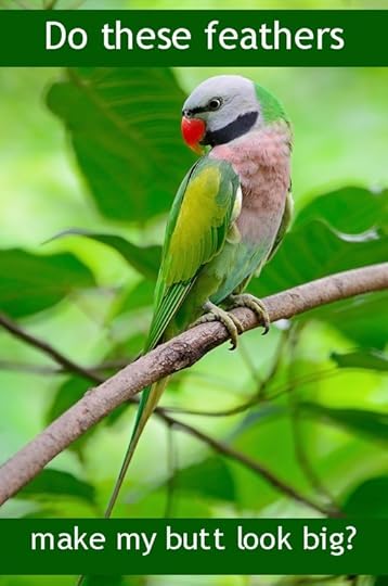
I delete most of the unsolicited newsletterish e-mails I receive without reading them, but there is one I do look at every week from DepositPhotos.com, which features links to a few pics that are free to download that week. Mr. Parakeet here was one back in August; here are a couple more (the text is mine, btw):

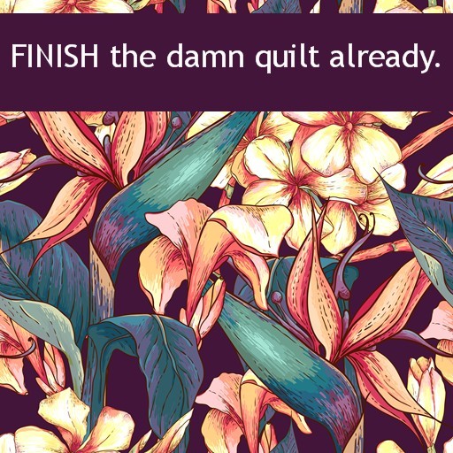
The terms of use are limited, obviously, but most of the images are quite nice, and could be fun to incorporate in a blog post or use as inspiration. I've made some of the free images into note cards to send to friends (the floral quilt threat got raves) and I might use Mr. Parakeet for some bookmarks. Thanks to Maria for letting me know about DepositPhotos, too, back when I was looking for cover art inspiration for In the Leaves.
Image credits:
Bird: panuruangjan
Barcelona: El_Camino
Floral Pattern: Depiano
Published on September 12, 2015 04:00
September 11, 2015
Delicate
As this lovely film shows us, making a silk painting in the Chinese Gongbi style requires a discerning eye, lots of patience and absolutely steady hands:
Masterpieces of Chinese Painting 700 - 1900: How a Chinese Gongbi Silk Painting was Made from Victoria and Albert Museum on Vimeo.
Published on September 11, 2015 04:00
S.L. Viehl's Blog
- S.L. Viehl's profile
- 224 followers
S.L. Viehl isn't a Goodreads Author
(yet),
but they
do have a blog,
so here are some recent posts imported from
their feed.


