Gareth Hinds's Blog, page 9
September 17, 2012
Painting Workshop on Little Cranberry Island, Maine
Alison and I just returned from a lovely 4-day weekend in Maine, where I attended a great little painting workshop with Henry Isaacs and Ashley Bryan. Henry is a landscape painter whose work I find absolutely stunning and inspiring. Ashley is inspiring to me both as a children’s book author/illustrator, a painter, and a radiant beacon of joy in the world. The workshop is organized and hosted by the Islesford Dock Gallery and Restaurant (Cynthia and Dan Lief are the wonderful proprietors). The gallery has excellent art, as I had seen on many previous visits to Islesford. The restaurant, as I discovered over the weekend, has really spectacular food — by any standard! We were fed so well I’d have to say the meals threatened to upstage the painting.
I will post a few of my paintings above the cut, and the rest below — along with a bunch of thoughts about painting that are bouncing around in my head.
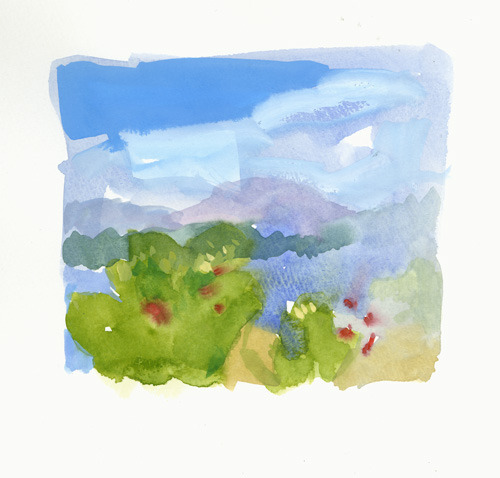
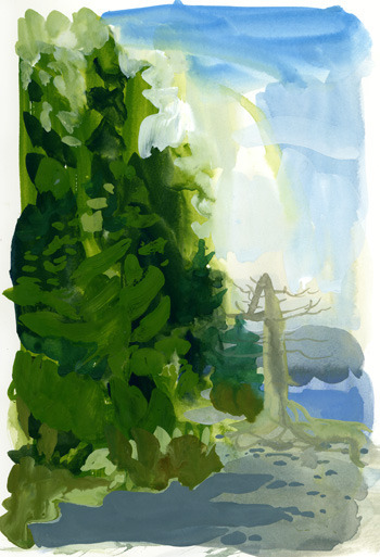
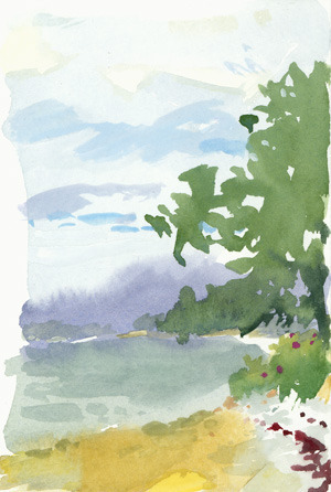
Friday was a very foggy morning on the beach. Henry gave a great little demo and talk about seeing everything as solid, even the air, and treating it that way, rather than having a background with a subject in front of it. My first attempt at this was clumsy. I was using gouache, which is my favorite medium for landscape. It’s hard to cover a large surface with gouache though, and that caused some problems every time I tried to work larger than about 5×7″.

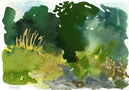
My second attempt used too complex a subject, and while I like this piece, it feels more like a drawing than a painting, and more like my habitual approach than what I was going for.

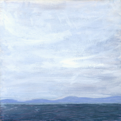
After that I did some pieces that caught parts of what I was after.

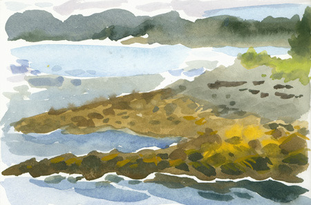
Friday afternoon I worked smaller and explored various pieces of the territory between realistic depiction and a more abstract or expressionistic approach.


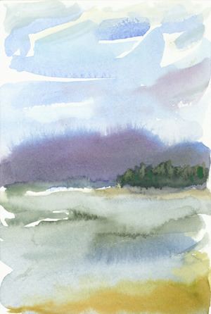
This was my favorite in terms of what I was trying to explore, and was admired by Henry and a couple of the other painters:
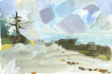
On Saturday I started out loose and tried to stay that way. I used acrylics in the morning and gouache in the afternoon.


Alison also joined in, and did two paintings in acrylic. She struggled on the first one a bit, but had fun, and then did this second piece, which I think is extremely respectable, especially for only her second painting.
Sunday we just had a short time to paint from the dock. I don’t really like these pieces. I kept the paint-handling loose (maybe even too) loose, but was still basically trying to capture an optical composition. Also I didn’t let the paint get quite heavy enough on the surface.
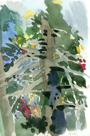
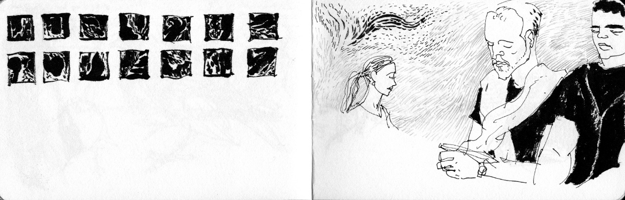
On the plane home, I found myself compelled to make some small sketches in my sketchbook — sort of visual notes about some of these ideas and ways to treat mark-making and breaking up the picture plane.


I found myself thinking about the film Dream of Light, a documentary about realist painter Antonio López García attempts to paint a quince tree. Unfortunately it doesn’t seem to be available digitally, but it’s quite an interesting film. Garcia’s methods are incredibly rigid and precise, much the opposite of Henry and Ashley, but in his conversation with another artist he talks about a certain kind of fullness that must be brought to every observation, every mark or every part of the picture. Wikipedia quotes him as saying ”the pictorial nucleus begins to grow and you work until the whole surface has an expressive intensity equivalent to what you have before you, converted into a pictorial reality.” If you understand the phrase “pictorial reality” more generally to mean that the picture has its own reality, rather than necessarily being pictorial in the sense of a reflection of optical reality, then I think this is consistent with Henry’s approach, and is perhaps fundamental to making a successful painting in any style.
I’ve been bouncing this around in my head, comparing it to ideas I have from zen and aikido. I may be straying from what Henry’s talking about, I don’t know, but I like the idea that it’s all about looking at the world non-materialistically — as we get away from mental constructions and Platonic ideal forms, we see reality as it is. This is necessary to draw accurately, since our idea of what a tree looks like is one of the first things that gets in our way of drawing a specific tree. Going further, we can say that all matter is just made of energy, particles and waves bouncing around and interacting. The “empty” air is full of this stuff just as “solid” objects are (and the latter are mostly made of empty space). It is the stuff of the waking dream we call our life. Seeing it all as equally full (or empty), and seeing the paint likewise, painting becomes much more like sculpture — building a thing out of stuff (the painting) that replicates some aspect of the experience we have when we look at other stuff (the subject).
Incidentally, in this view the word “abstract” is problematic. Replicating any aspect of the experience of observing is no more abstract than replicating the illusion of what we “see” (the scene/seen being an imposition of our understanding of forms on our visual field).
Anyway, I had a great time. I recommend coastal Maine and Acadia National Park. I recommend going to Northeast Harbor and getting on the mailboat out to Little Cranberry Island. I recommend while you are there you visit the Dock gallery and eat at the restaurant. And if you like to paint and/or eat, I recommend this workshop.


September 14, 2012
Literary Lights Video
This video is edited way down, so a lot of great stuff is on the cutting room floor, but what remains still gives a glimpse of a very fun event.
Pam Munoz Ryan, MT Anderson and Kate DiCamillo all gave wonderful speeches which are barely hinted at, and Annabell’s intro was also particularly good. Oh well. At least you get to see me draw.
August 27, 2012
A drawing explained – Harvard Museum of Natural History
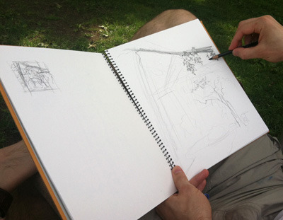
My friend Theo asked me to go out and draw with her sometime and try to teach her how I sketch from life. That seemed like a bit of a tall order, but I was very willing to give it a shot, and I think it actually worked fairly well. I should mention that Theo does have quite a bit of art experience already, so we weren’t starting from scratch.
So anyway, we walked over to Harvard and found a spot to sit and draw. This piece took about 40 minutes, with a few breaks to explain things. Since some of my readers may be interested in this topic, I will attempt to capture some of what I told Theo, and walk through the process of how I choose a composition and do a drawing from life.
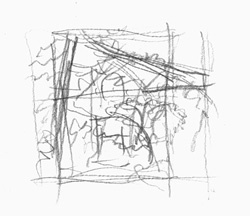
First I look around for something interesting to draw. For me, that often means an interesting overlapping or framing of shapes. In this case Theo pointed out a tree she liked, and I found a distance and angle from which that tree (The small one) was framed by two larger trees, with the entrance of the Natural History Museum behind it.
I often start out with a quick “thumbnail” composition, to figure out the framing and the main elements I’m interested in. In this case you can see I’m emphasizing the curve of the small tree, the trunk of the pine on the left, and the large branch of the oak coming in from the right, and you can see how I tried both horizontal and vertical framing.
At this point Theo did a thumbnail which she didn’t like, and I encouraged her to work over it with a different, heavier tool. One way to think of an artwork is as a record of a process, and leaving the mistakes there often makes it much more interesting.
Next I transfer the rough composition to the larger size of the “real” drawing (unless I have skipped the thumbnail step). These are Theo’s photos (thanks Theo!).

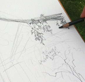
Then I start to add some values and details. Because life sketching usually needs to be done quickly (whether because of changing light, need to eat, other time constraints, or just to stay loose), I try to find some quick, scribbly marks that represent the different types of leaves for each tree.
I deliberately experiment a bit here, because sometimes the first/automatic marks I make are something habitual that doesn’t really reflect what I’m seeing. This will be especially true if you are a beginner or haven’t drawn for a while — you might revert to some canonical leaf/tree shape you have in your head, ignoring what’s really there. It still happens to us professionals too.
Here’s a closeup showing the scribbly oak leaves and the much smaller/lighter leaves on the small tree below it. Note that for some of the closer oak leaves, I’m drawing (roughly) their actual shape. Having a few examples lets the viewer extrapolate to figure out what the other leaves on that tree would look like.
Theo was writing down my comments while I talked so she didn’t get another photo until I was pretty well along. I’m trying to work the whole picture plane without obsessing about any small areas of it, keeping the marks loose but based on observation. That’s important! By the way, that’s a Cretacolor Nero (medium) pencil I’m working with, on a Holbein multi-drawing sketchbook.

Here’s the finished drawing at the point where I chose to leave it. I could of course add/refine more details, but this basically captures what I was after, and if I worked it further it might lose some of its freshness.

Hope that was useful. I’m happy to answer questions in the comments.
August 24, 2012
Portraits of YA authors reading
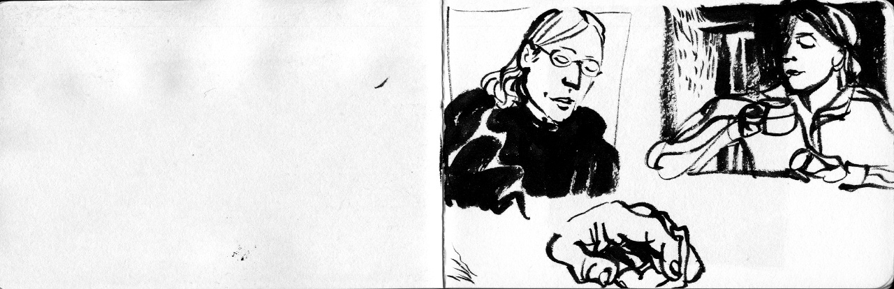
Last week I went to David Levithan’s YA author reading series at the Jefferson Market NYPL*, and quite enjoyed it. There were nine authors reading samples of their newest books, including my friend Tim Decker. I doodled some (probably bad) likenesses of the authors as they read.
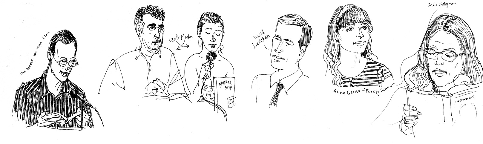

Featured: Andrea Cremer, Tim Decker, Lisa Graff and Martin Leicht, Alissa Grosso, Deborah Heligman, Kody Keplinger, Emma McLaughlin, Rebecca Serle and Suzanne Weyn.
(*If you haven’t seen this branch, definitely check it out. It’s in an odd but super-cool building that apparently used to be a courthouse.)
August 14, 2012
The Hand-book sketches
It’s been a while since I posted. I delivered Romeo & Juliet back in June, but apparently scanning art and updating the blog is pretty low on my list of priorities when I have my choice of what to work on. Mostly I have been chipping away at some of my original scripts, which I hope will turn into full-on projects one of these days.
But anyway, here I am, and I though I’d scan and share the contents of one of my current sketchbooks. It’s a cool little book with very nice paper and an elastic band to keep it closed. I like to carry it around in the cargo pocket of my convertible pants (does anyone besides me actually convert them from pants to shorts and vice versa?) so I always have it with me. I present the contents (thus far) in full, with a few comments on the drawings. The ones which are in the wrong orientation link to larger, rotated versions.
I usually do a little title page, for fun and in case the first page gets smudged against the cover:

Some random doodles and thoughts:
Central Park:
Some notes from the Museum of Art & Design, plus park sketches.

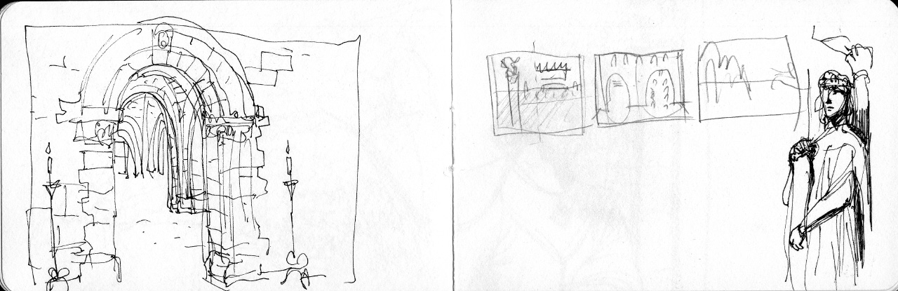
The next few pages are from The Cloisters:


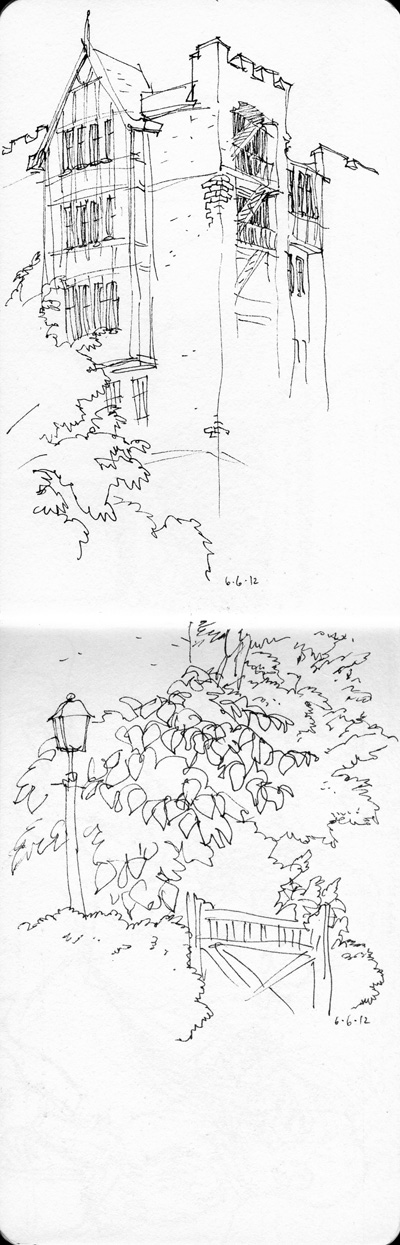
A cool building in my neighborhood:
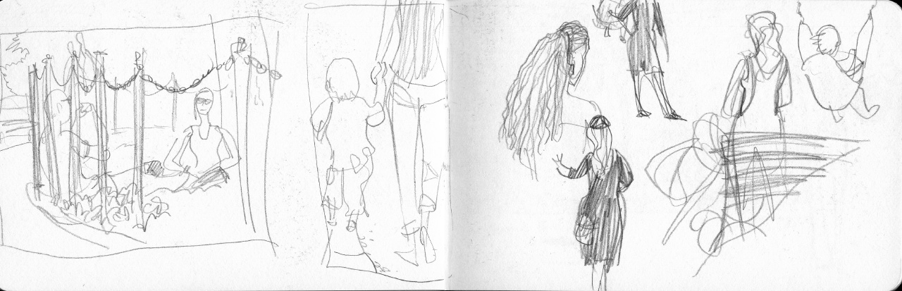
People on the bus:
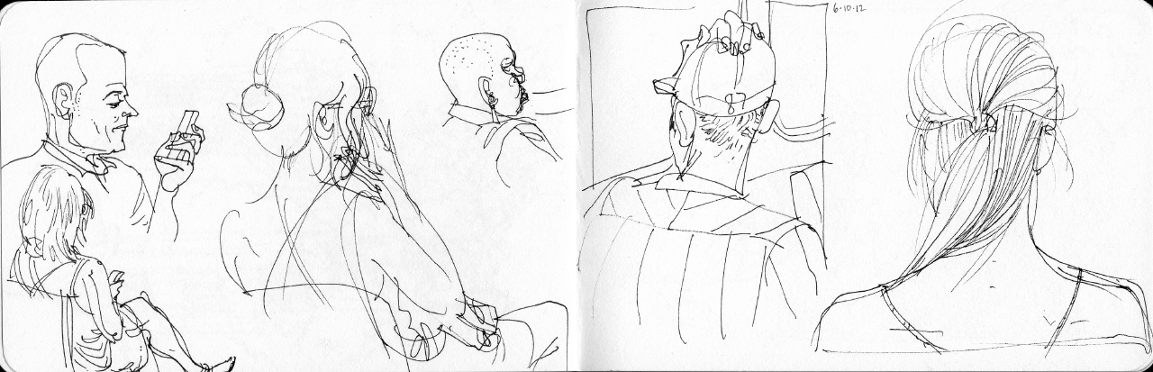
More bus sketches, plus views of my local park:

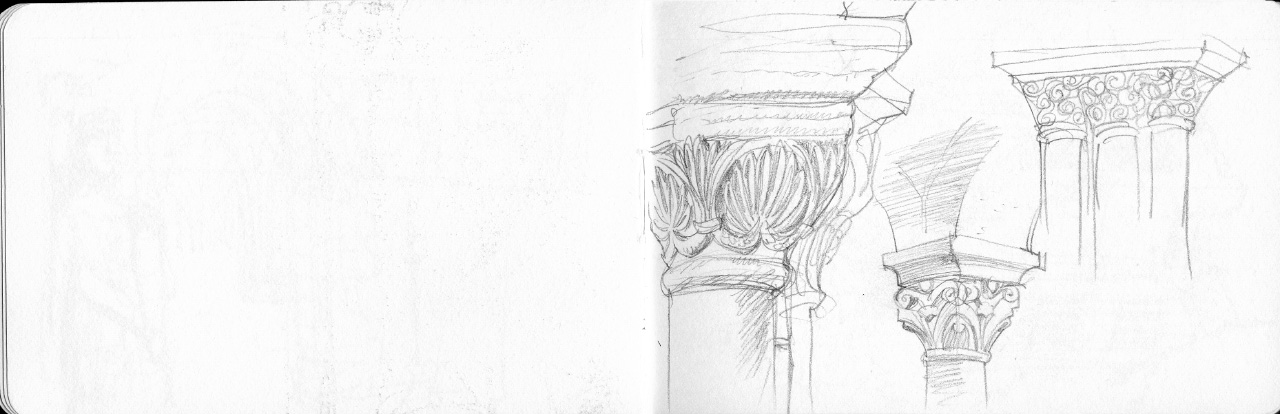
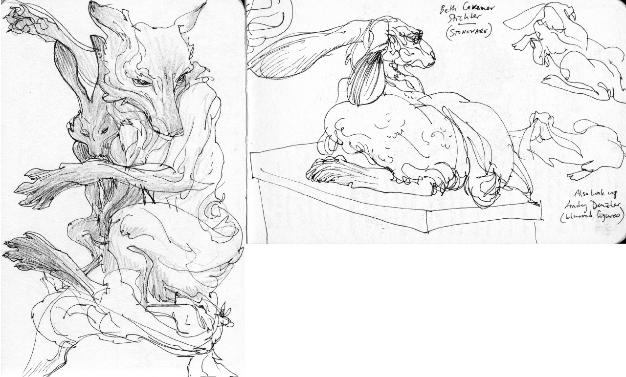
The amazing work of Beth Cavener Stichter in a Chelsea gallery:
Cute pug, and cute goats (on Governor’s Island.)
Governor’s Island Jazz Age Dance Party:
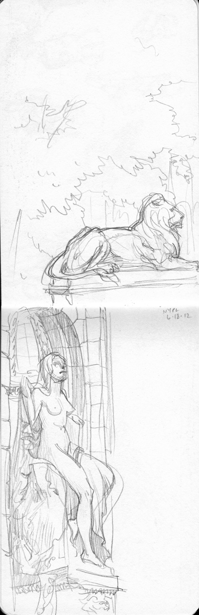
NYPL:
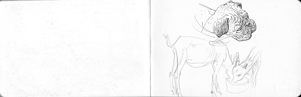
Maine, near Owl’s Head Light House:

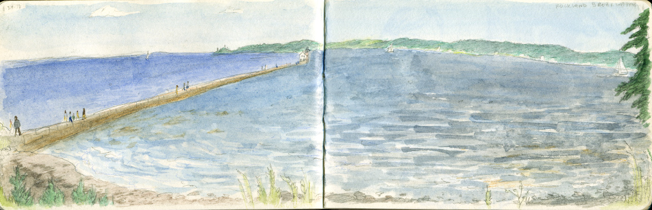
Rockland breakwater:
Cafe sketches with new brush pen:
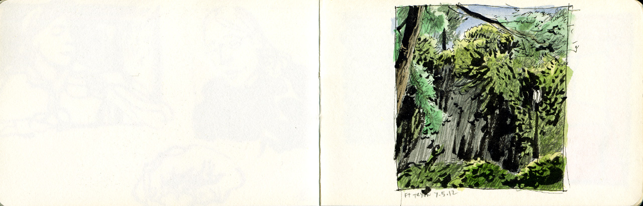
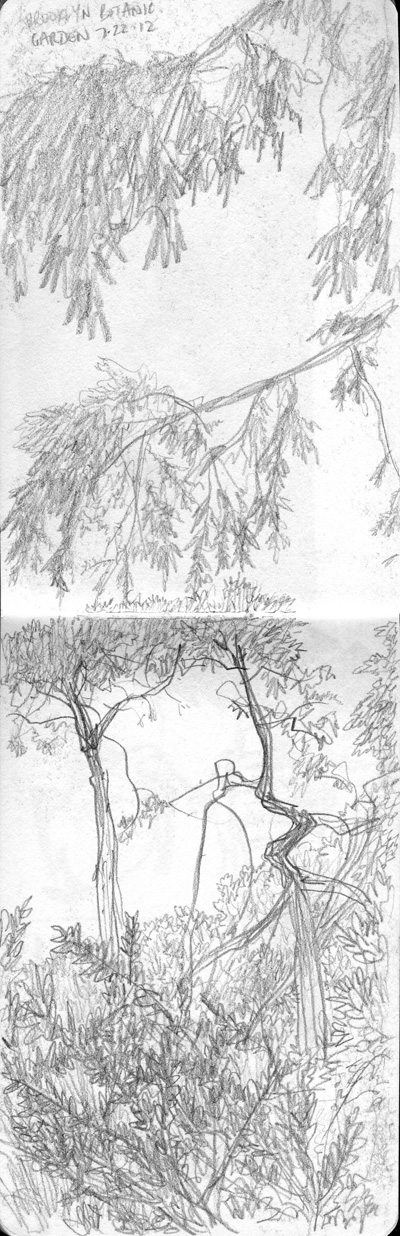
Fort Tryon Park:
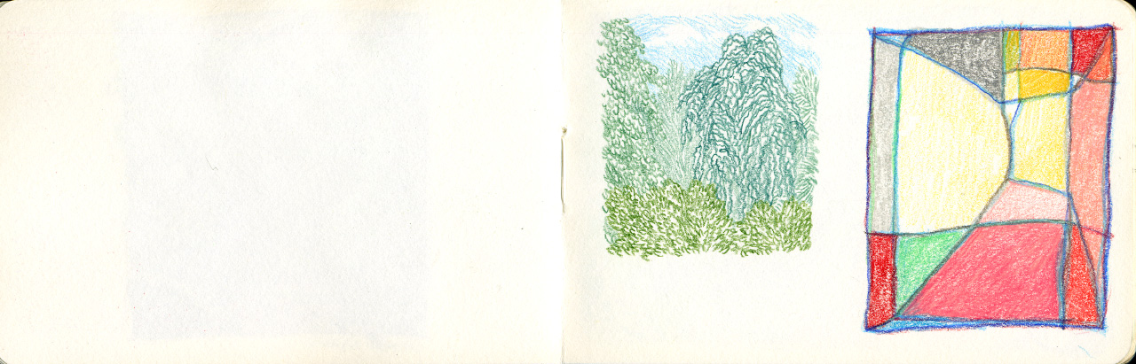
Sometimes I like a little abstraction:
This is how I sometimes study comics I admire. At some point I will do a full post just about this:

Kids and parents playing in the park:
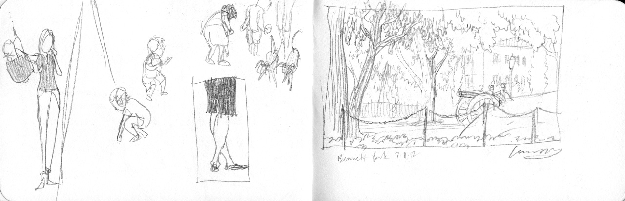
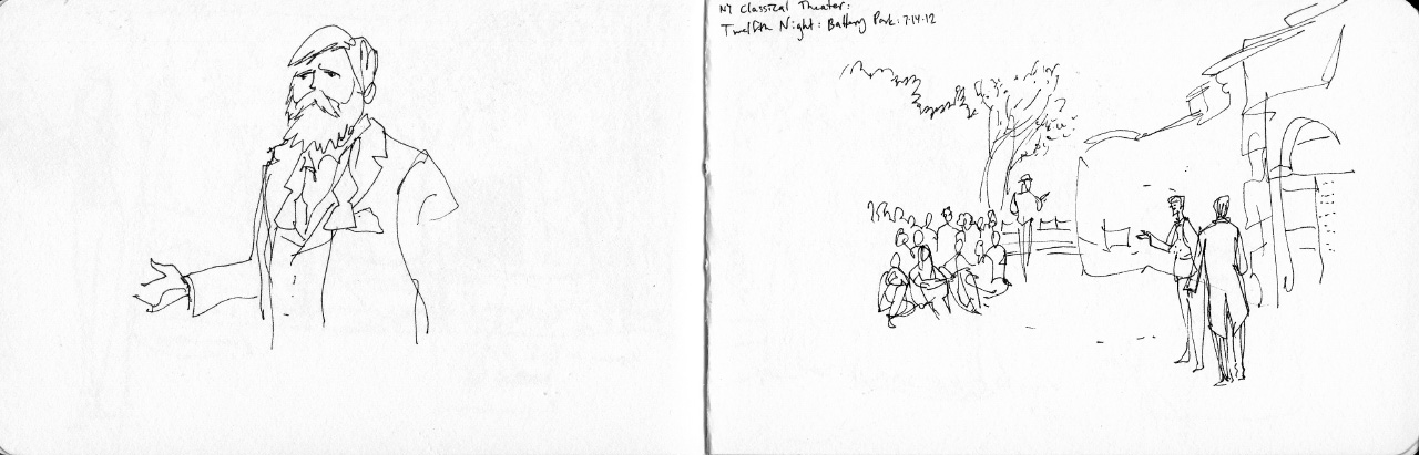
The NY Classical Theater‘s excellent outdoor performance of Twelfth Night.

Vermont:


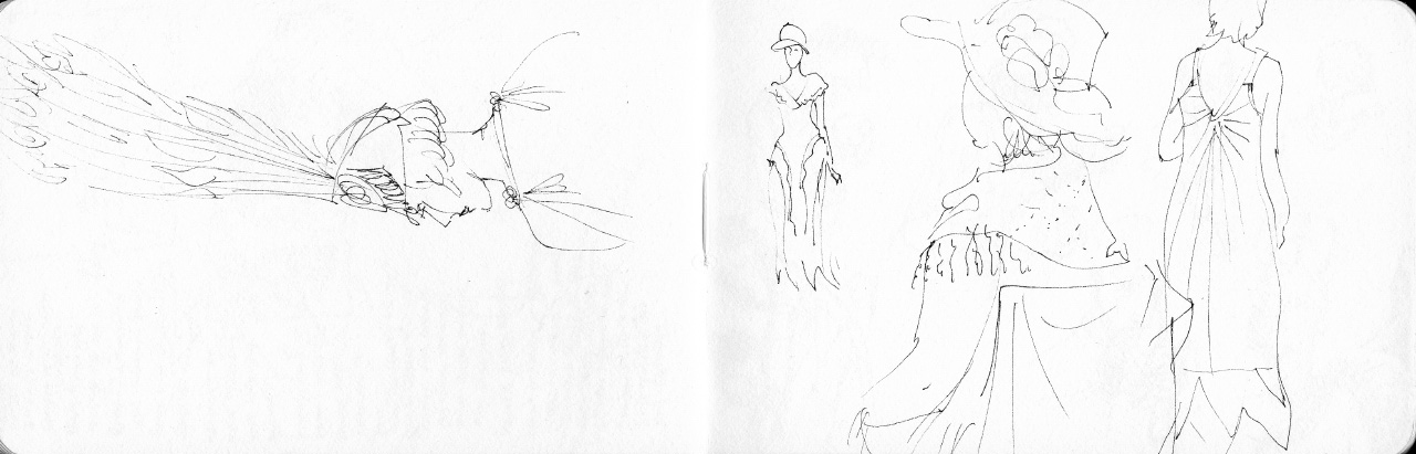
Project Runway, how I missed you  After watching episode 1 I got a sudden urge to sketch bizarre outfits:


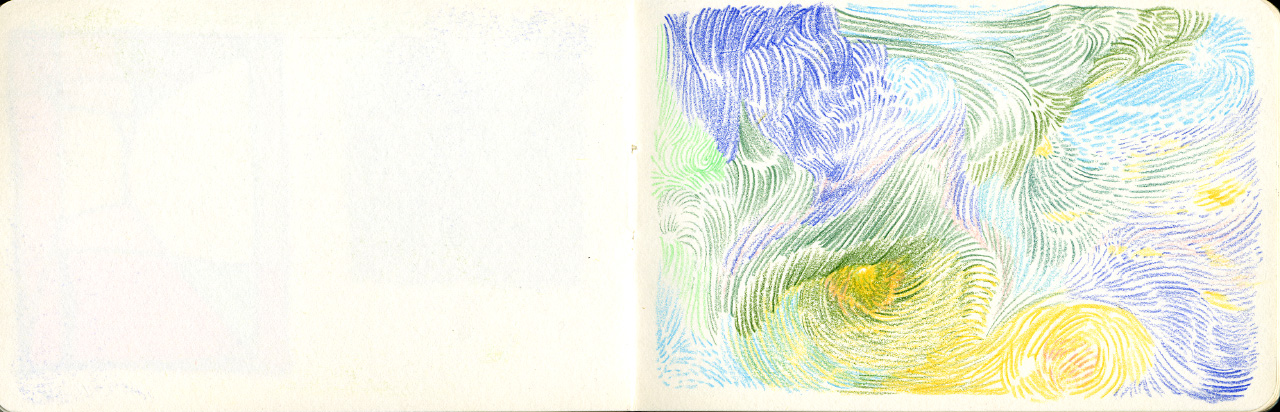
Abstract brush-pen compositions, and a few subway sketches:
May 3, 2012
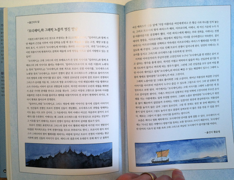
The Odyssey in Korean
I got an awesome surprise package in the mail yesterday. A box from Candlewick which turned out to contain 4 copies of my first translated edition: The Odyssey in Korean!
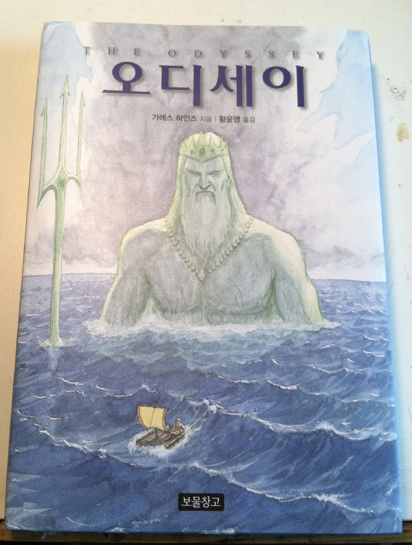
I suspect prose authors feel the same excitement when they get a copy of their book with an unfamiliar cover and a foreign title, but then of course the interior is completely impenetrable. With a graphic novel, on the other hand, I get to see my own artwork interspersed with cool Korean pictographic text and — best of all — sound effects. It’s *so* cool to see what they did with the sounds.
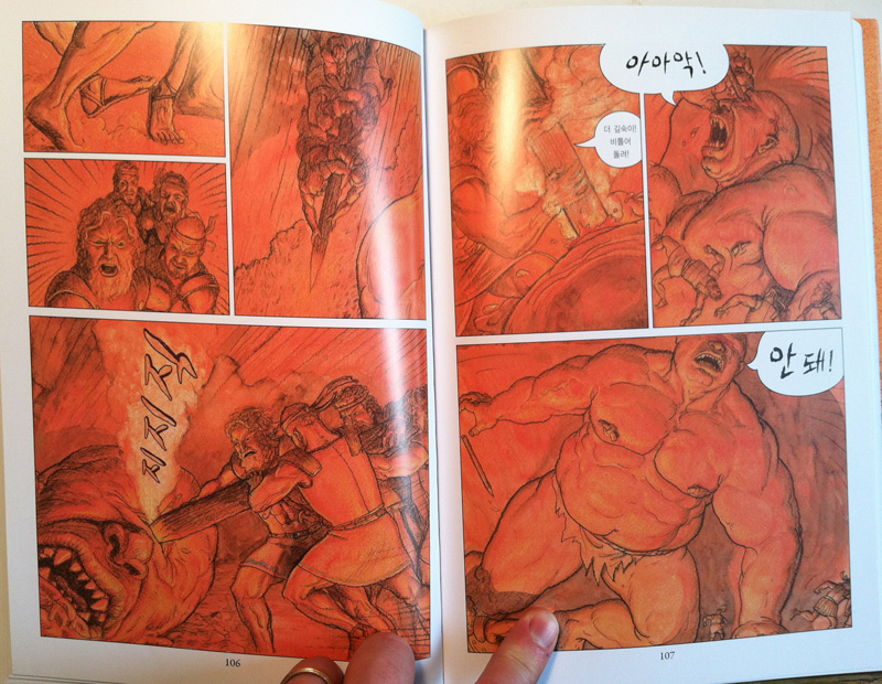

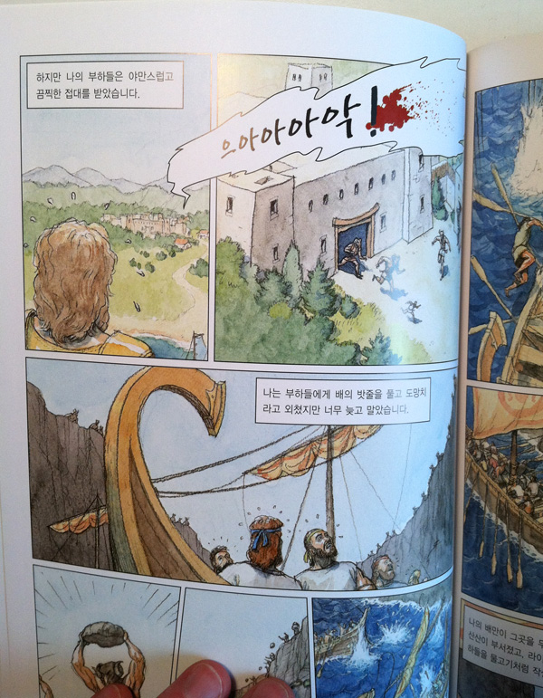
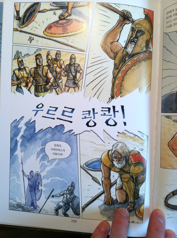
Then again, maybe the impenetrable wall of foreign text is cool:
So now the question is, do I have any readers out there who are fluent in Korean? If so, would you like a free copy of The Odyssey (on the condition that you read it and tell me what you think of the translation)?
By the way, the publisher is Prooni Books. For some reason Google Translate doesn’t work on their site.
May 1, 2012
MoCCA Postscript
In my attempt to keep my write-up short and quick yesterday, I forgot to mention the amazing Alec Longstreth. I met this dude when we did a talk at CCS a few years ago, and I have to say that among the many super-nice people in the comics world, this guy might just be the nicest. And I don’t just say that because every time I see him he gives me comics and refuses to take my money (though that is certainly a concrete example).
Alec had a mega-beard last time I saw him, because way back in 2008 he pledged not to shave until his book Basewood was done. Well, it is now done, and he’s clean-shaven once more. Check out the story – it’s quite good (though I always find the covers confusing, since he has this “Basewood is just a story in my ongoing magazine I call Phase 7″ thing going on). But anyway, it’s a very humanistic, meticulously drawn story. With dragons.
Also, check out this cool poster by my friend Casey.
Coloring due today. Back to work!
April 30, 2012
MoCCA 2012
Had a great time at MoCCA comics festival this past weekend. Tabled with my friend Tim Decker, author/illustrator of excellent historical picture books which are not really for kids.
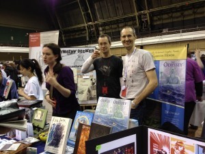
The Decker/Hinds table (pictured: the two artists, plus Tim's wife Mandy doing the actual work)
I didn’t sell a huge amount of books, but that’s okay, as I feel these shows are more for marketing and networking. Highlights were meeting Tom Gauld, one of my favorite cartoonists, and P. Craig Russell, who was the guest of honor this year, and whose work in many ways parallels (and predates) my own. Also in the “always delightful” category were such folks as Colleen Venable, Mo Willems, Lucy Knisley, and many more. I also saw one of my favorite teachers from Parsons, Warren Linn — he moved on years ago to be full-time at MICA, so it was great to see him again. Actually we were sitting next to a bunch of his current MICA students on one side, and on the other side were a bunch of current Parsons seniors, some of whom I had met before when visiting drawing classes there. So that was good for some nice conversations (most notably with Yasmin Liang), even though it did make me feel old
I also met the lovely folks at Seven Stories Press who are publishing The Graphic Canon, a super-cool and ambitious mega-volume in which excerpts from several of my books appear. It goes on sale in just a few weeks, and can be pre-ordered now.
I didn’t bring home a lot of other books, but some things that especially caught my eye were Spera, Kiki of Montparnasse, and Baby’s in Black. I really look forward to those, just as soon as I finish up the coloring on Romeo & juliet, which is due (gulp) tomorrow!
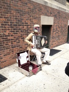
Boba Fett on the accordion
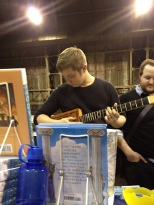
a fan trying out one of Tim's dad's way-cool cigar box guitars.
(Photos by Alison Morris!)
March 7, 2012
Romeo & Juliet coloring work-in-progress
I haven't been posting much as I have my nose to the grindstone coloring Romeo & Juliet. But for some reason this partially colored page demanded to be scanned and posted.
(Romeo, Mercutio and Benvolio on their way to the party at the Capulet mansion, just after the Queen Mab speech.)
February 6, 2012
Hwaet?
I'd like to tell you a story. It's about two huge fans of a certain Old English Epic poem you may have heard of. Beowulf.
Back in 1998, after self-publishing my first graphic novel Bearskin, I had decided to adapt Beowulf. It was one of my favorite works of literature, and a great action story which I hoped would resonate with both literature and superhero fans. The original text of Beowulf is in the public domain, but it's not really readable in Old English (though it's kind of fun to try), so I started researching different translations to use as the basis for my book (note that this was before Seamus Heaney's translation came out, and in any case I strongly preferred to use one that was in the public domain). I soon came across a resource that proved absolutely invaluable in this search.
It seems a fellow named Syd Allan loved Beowulf so much that he had put together a website, beowulftranslations.net, comparing every available translation of the poem. You could choose from several key sections of the story, and read them in over 20 different translations, ranging from the 1800s to the 1980s (in subsequent years I think he more than quadrupled the number, adding many new translations as they came out and finding more obscure ones as well). He also summarized the available Beowulf films, comics, and novelizations. Using this site I was able to quickly settle on the Gummere translation for my book, and when I later went back to choose an easier translation for the Candlewick edition, I again found it by way of Syd's site. I should also mention that when my book came out, Syd happily added info and samples to his page on Beowulf comics, and said nice things about it. Syd and I haven't really correponded that much, and we've only met once (we arranged to have lunch at one point just so we could each put a face to the name behind the emails, and of course geek out a bit about Beowulf) — but it's always been nice to know that his site was out there, a functional monument to the greatness of this poem and a resource for folks like me.
But apparently there aren't a huge number of people looking to compare ~100 translations of an ancient viking poem, and Syd eventually got tired of putting energy into the site and let it lapse. However, he kindly made the whole thing available in a zip file via Google docs, here. Also, the Internet Archive, aka Wayback Machine, has it archived here.
So, I post this as a tribute to Syd's hard work, and as a place where those links can live for my own reference and that of anyone searching for Beowulf translations. Enjoy.
-
(PS, the title of this post, "Hwaet" is the opening word of Beowulf. In Old English it means "Listen", so it should more properly be followed by an exclamation point, comma, period, almost anything but a question mark. But since it scans like modern English "what", I tried to make a little joke there about my reaction to finding that the site had gone down.)