
Jonathan Allen's Blog: Mutterings and Witterings, page 2
April 24, 2013
The Dads!
Engaged as I am, in an ongoing decluttering process. Not going mad and throwing everything out but just being sensible, in as far as that word can apply to me, and shifting stuff I don’t need, don’t want, and haven’t looked at for up to ten years. You know the kind of thing. . . Yes you do. . .
Every now and then I come across things of interest. To me anyway.
Some of the things I find are possibly interesting enough to share. Yes they are. . .
Here’s one of said interesting things. A small scrap of very yellowy paper with some artwork on it. (Scanned and cleaned up for your delectation and delight) Interesting to about five facebook friends who may get to read this anyway.
 This is a Logo I knocked up for the band I was in at Art School. Yes, an Art School Band, oh dear
  Not so much of the ‘Oh dear’ please, we were all right. We were all young kids in the sixties, which seemed like a golden age for pop music, so playing sixties covers seemed the natural fun thing to do. So we did. This was before the short lived sixties revival mini trend of the late seventies/early eighties so we were ahead of our time, sort of. It was fun, but fell apart by slow degrees over the years that followed. No commercial success was forthcoming, largely because we didn’t have a bleedin clue, and didn’t have a go-getting managerial type involved either. Ay well, I hope any ex Dads reading this get a twinge of nostalgia
Why ‘The Dads’? Was fatherhood a desired prospect at the time. Nah, it was more to do with the concept of not being hip and cool, reacting against the self serving narcissism of the self proclaimedly cool. We liked ( were amused by ) the patronisingly fatherly older men depicted in sixties comics and magazines. Men with pipes dishing out good humoured advice and instruction. We thought that calling a band ‘The Dads’ would be funny in an absurdist kind of way. We didn’t really think it through to any huge extent, we just went with it.
The guy in the logo was nicked from Tiger comic circa 64 I think. There was a page called ‘Talking Sport, with The Skipper’. He is ‘The Skipper’. Obviously all sporting activity benefits from a good puff on a pipe. . .


April 22, 2013
Chaotic Trees
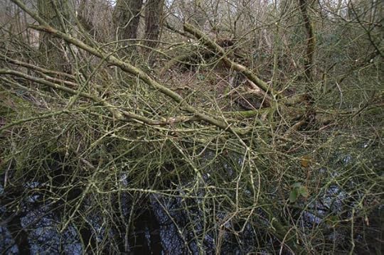
I’ve been pointing my camera at bits of tangled undergrowth and mad strips of hedgerow for a few years now. Most people don’t get it. But then most people don’t get a lot of things. It’s not compulsory  But if you were wondering why I bother, read on. . .
I am evidently finding something that fascinates me enough to keep exploring the subject, but what that something is, isn’t easy to define. However, I’ll give it a try.
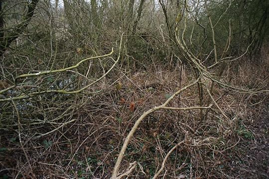
I love the way the seeming linear madness resolves itself into a kind of crazed but beautiful compositional whole when photographed. I like the feeling of arrested movement, like a frozen explosion, or like a wave caught at the moment of breaking. I like the complexity of the overlapping lines, never allowing the eye to rest. I like the way the viewer isn’t allowed to relax into resolving the image into some kind of familiar woodland scene, although what is in the image is familiar, just unregarded. I like the negation of depth and the emphasis on pattern. I like the sheer tangled vitality of it all. . .
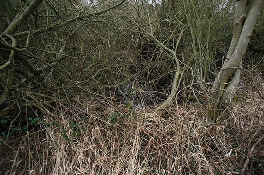
The act of framing, the act of choosing what should be framed and from where, turns what others might regard as an unstructured mess into a statement about nature, about beauty about photography and about me.
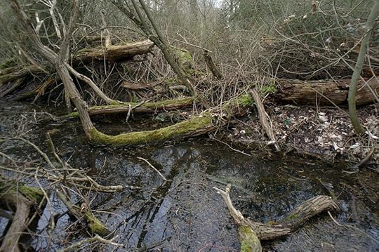
I don’t want to find something beautiful and photograph it. I want the photograph to be the thing of beauty.

Hope that helps Not that you were fretting about it or anything.
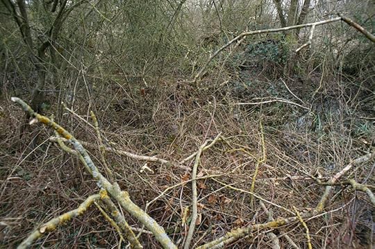
All photos taken with a Fuji X100 with a Nikon WC-E86 wide angle adaptor.


April 19, 2013
The Wonders of Old Book Covers – Trash in The Attic

I’ve been sorting through the boxes of comics and books in the garage with a view to sticking a lot of them on ebay. The idea of photographing them all and listing them one at a time is daunting, but if I divide the task into manageable chunks it should be doable.
Who knows, I might get a bob or two out of it. Considering a lot of the stuff I bought was in the region of ten or twenty pence I might just get me money back
I’ve started the process anyhow and so far I’m enjoying it.

You see, the reason I accumulated a lot of this stuff in the first place was for the artwork on the covers. You know the kind of thing, hand painted dramatic scenes from cheesy, hard boiled detective fiction, based on cheesy American films. Garish and overblown, but often beautifully drawn. It had a sort of kitsch value for me at first, but now I have a much more genuine admiration for it. And if I don’t admire some of the genre, I have an affection for it. It’s stuff that my parents would probably have thought of as a bit naff, and therefore not something I would have been exposed to as a kid. Which is probably why it had an impact on me when I did discover surviving examples lurking in junk shops and suchlike places when I was a feckless Art Student.
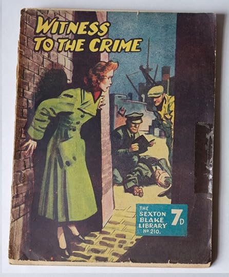
I love the boldness and the often clichéd, but unashamedly so, drama. As time goes on I like these book covers more and more. At least if I photograph them all I will have something I can look at on screen, which makes the images a darn site more available than them being in a box in the garage or the loft. And it means I can share them with you lucky people!

As you should have noticed by now, dotted throughout this post are some great covers from a really cheaply printed series, The Sexton Blake Library. Captured before they completely fall apart. No date inside, but looking on ebay at similar ones they might be from the thirties and forties. The clothes and hairstyles seem to suggest that.
Anyway, enjoy. . .


April 17, 2013
I want to be a Commercial Artist. . .
And ‘I Want To Be. . . An Eagle Book of Careers’ is here to encourage me. from about 1962 I would guess. There is no date in the book. There are all sorts of careers featured. I will scan and post requests
‘I want to be a Miner’ being possibly the most ironic. . .


 I must develop my personality and try to make my designs more splendid. . .
A wonderful word, a Valerie Singleton, Blue Peter word. there are not enough splendid things in the world these days.
My old art teacher at school used to wear a velvet jacket and a bow tie, maybe he was at Art School (approved by The Ministry of Education) with young Adrian here.
And when was the last time you called anyone ‘sir’?


April 16, 2013
Picture Book Den
The Picture Book author website that I wrote a guest post for a few weeks ago, called Picture Book Den has an interesting post from author Pippa Goodhart, featuring a character I invented.
In my post I mentioned how sometimes I come up with a drawing of a character that arrives with no story attached. Usually the concept and the character arrive in my head together, as a kind of package, or the drawing of the character suggests the story. I gave an example, a cute character called Small Bear, who I just couldn’t get a suitable story idea for.
Pippa, with my blessing, based her blog post on the thought process she would go through to create a story based on that character. The post is a very interesting insight into how a writer’s mind works, and into the creative process involved in producing a story for a children’s picture book.
Here’s the direct link – The ‘Small Bear’ Challenge

Small Bear


April 15, 2013
111th!
I put a design into the Spoonflower monthly fabric design contest last week. The theme was Baby Animals, which I thought was just up my street. I repurposed an existing drawing as a simple repeat and sent it in.
Kind of like this mock up.

Anyway, I came 111th Out of about 500 though.
I should have made it more of a design I think, it’s just a drawing set to repeat, which isn’t much of a cleverly worked out surface pattern at all really. I thought it was fun though.


April 14, 2013
Just started up a Tumblr
Which sounds odd. . ’A tumblr’ as if a tumblr was a specific thing rather than a type of blog or blogging platform. Still, it has it’s own sort of feel, something a bit more throwaway and loose than a ‘proper’ blog. Somewhere between a flickr page and a pinterest board (which I haven’t explored yet. . . do I need to? I dunno)
Any road up, here it is -
http://jonathanburgessallen.tumblr.com
I’m going to put an old illustration, a digital pattern/artwork and a photograph up every day and see if I get any likes or follows or whatever. It does seem quite a hassle free process so I’m enjoying it in a quiet way. There does seem to be quite a lot of good stuff on Tumblr. It’s easier to find it than on WordPress or Blogger I reckon.
Here’s a pic from my tumblr, which, by the way is called ‘lessisless’ which isn’t necessarily true but I had to call it something.

cheers
Jon x


April 11, 2013
Well, my nose is most definitely out of joint. . .
 My lovely cat drawings have not been accepted for the Cambridge Drawing Society Open Exhibition. Hmmph!
Apparently the ‘cartoony’ style didn’t find favour with the panel. . .
Oh well, it’s their show. Definitely a bit put out though, even though I know I shouldn’t be I feel a bit like that TV presenter character in Father Ted who, as soon as he imbibes even the tiniest drop of alcohol, goes into a massive rant about how he was unjustly sacked.
Henry Sellers, that’s the feller, so it is. He’s in the Song For Europe one. God I love Father Ted
Feck! Arse! etc.


Fat Cat book went down well. .
Feedback from the Bologna book fair re the large moggy pictured below was good. My publisher now has to firm up arrangements etc, and seeing as it’s the London Book Fair at the end of the month as well I don’t expect any sensible conversation about it until after that. But it looks like it will go ahead, which is good news.
Hoorah! and Pip Pip! etc. . .


April 10, 2013
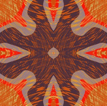
Pattern and Surface Design Stuff, and stuff. . .
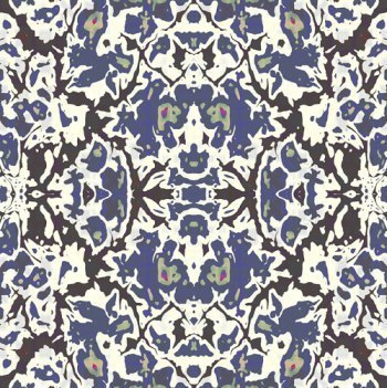
I have been doggedly and slightly obsessively (if you can actually be slightly obsessive) producing and refining pattern ideas for fabric and related surface design on and off over the last several months, repurposing images and patterns I create in the texture creation engines of certain bits of 3D software, (pursuing my possibly delusional conviction that what I am producing is quite interesting and would look great on fabric. . .) and have been learning quite a lot in the process. I have been trying out my designs the fabric print on demand website Spoonflower (click the image, it is linked to the site). Not a lot of response yet, but I haven’t been promoting anything I have put on there. I do need to start doing that really, but getting seen, let alone noticed amongst the mass of designs on there is pretty hard . . .
This design is simple sine based shape overlaid with a textural linear pattern
-
This is a simple repeat pattern in three colours based on a simple recursive sine fractal shape.
-
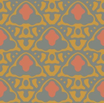
This design struck me as being like a digital version of a traditional damask. The symmetry helps. There is an echo of traditional design to it, without there being any trace of a traditional motif there at all.
-
I have to say I find these echoes of human design occurring in a purely digital medium, (strongly directed by me), really fascinating. Many pattern designs and motifs are stylised from nature. Nature is (arguably) underpinned by fractal mathematics. So when fractal mathematics throws up forms evocative of those in nature, and of natural forms stylised by being processed by the human brain, (arguably, another fractal process) it’s perhaps not too surprising. There’s something of the basic maths of how the brain is constructed and how it constructs the world in there somewhere. Or it might just be in my head that this echo happens, I don’t know. I see fractal mathematic related forms and distributions of things everywhere. Mainly coz it is everywhere, and because I’m looking for it. . .


Mutterings and Witterings
- Jonathan Allen's profile
- 43 followers

