
Janice MacLeod's Blog, page 12
March 19, 2019
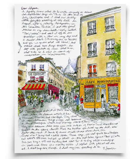
Paris Letter #99 Art Lessons from Karl Lagerfeld
 With the recent passing of Karl Lagerfeld, the creative head honcho behind Chanel, I found myself binge watching documentaries about him on YouTube. At first, I was going to list a bunch of poignant quotes like I did when our beloved Anthony Bourdain passed. But unlike Bourdain, Lagerfeld wasn’t as eloquent in his delivery, and a lot of the things he said were rude.
However, I can name ten people on my right hand that say rude things just like Lagerfeld, but unlike Lagerfeld, they sit around and do jack all day. Lagerfeld was one accomplished dude. So instead, I focused on what we could learn creatively from this guy, rather than quote him.
1. His failures were guide posts. His mother told him he had no real talent for playing piano and suggested he take up drawing. It was quieter. Just watching him sketch has already made me a better sketcher. Thank goodness he wasn’t much of a piano player.
2. His bookshelf was horizontal.
 At first I was horrified, but then saw the genius of it. It’s easier to read the spines. Duh. And each shelf isn’t high, so he doesn’t have more than a small handful of books to lift to get a book from the bottom of a pile. Plus he uses a few books as little separators between piles. Why oh why have I not thought of this?
3. He employed Time Condensing Tools. The books are a clue. They are the seeds of his output. With a collection like this, you know this guy spent a lot of time lounging in bed and flipping pages. That is a lot of inspiration from around the world delivered into your hands without having to travel to get it. And with 10 collections a year to create, he had to condense time. It makes an argument for splurging at the museum gift shop.
4. His motivation was an inner motivation, not an outer motivation. He said some nasty things about weight and women. No doubt. When he himself gained, he said that his inspiration for wanting to take off a few pounds was fashion. He loved fashion and wanted to look a certain way in his favourite clothes. That’s all. That’s enough. He wasn’t motivated to shed pounds because of the judgemental gaze of The Other (unlike so many of us, myself included). This made me feel better about the whole subject.
5. Don’t focus so much on the end of something. People, places and things fall out of fashion or they die or change. That’s life… *shoulder shrug* Now that my cancer treatments are complete, I have been living in fear that it will return. Somehow Karl’s big shoulder shrug about things we can’t control helps me relax… a bit. I still feel like I’m being chased by death and must do everything all at once, but I suppose we are all chased by death. I just have medical documents as evidence.

“One day it will be over and I don’t care. As my mother used to say, ‘There is one God for everybody and all the religions are shops”. Karl Lagerfeld
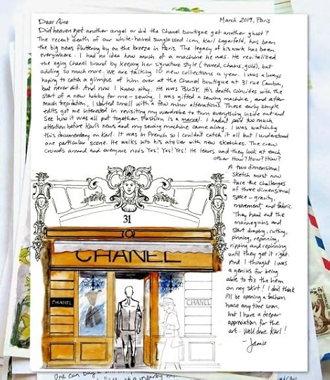 The March Paris Letter of ol’ Karl is in my shop. I’ve also started taking commissions. I have said no to this in the past, but recently, I’ve had a handful of invitations to make original art for people. And I suppose after 99 Paris Letters, I know what I’m doing. If you’re interested in a one of a kind piece of art, let me know over in the shop.
PS Paris Letters ebook is still cheap as chips this month. Around $2.51 USD. Now is a good time to indulge in a good bit of Paris.

Buy it at this fine stores:
Barnes and Noble
Apple
Amazon (USA)

Amazon (UK)
Indigo + Chapters (Canada)
Books a Million
Indie Bound


March 5, 2019
Airmail Note Cards. Why did that take so long?
These long winter days have me dreaming up note card designs. This week I’m full of wanderlust, fantasizing about warm summer days in far off locales, hence the new airmail note cards. Now listed in the shop.
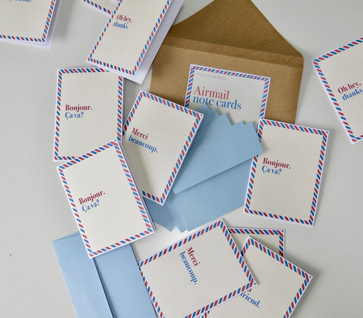 They were inspired by a few airmail envelopes I came across recently while going through a few boxes of old papers for my collages.
 Rifling through these boxes feels like scrounging for loot. Many fun papers.
 A closer look at that gorgeous PAR AVION logo.
![]() Another great logo…
Another great logo…
![]() And chevron usage…
And chevron usage…
 The note cards I designed include blue non-airmail envelopes. Dommage. The postal lady gave me a stern look with a grade-school teacher pointed finger. No sending letters with airmail envelopes if they are not required to be sent via air. I received this lecture in French AND English in two different countries so it was VERY CLEAR that I wasn’t to use envelopes PAR AVION or for AIR MAIL. Neither are you. Tsk tsk.
 Oh hey, thanks for the lecture post office lady.
Originally I was going with a white background, but because of the envelope situation, I had to choose a blue envelope instead of an airmail envelope, which meant a creamy background look best…
 I love when an idea comes together.
 Blue envelope, cream background, red and blue border, friendly messages. So fun. A nice way to say Hello. Or said another way…

![]() Bastille Day fun.
Bastille Day fun.
 Christophe and I were always AIRMAIL themed.
 Airmail note cards are in the shop. I’m also finishing up March’s Paris Letter, which will be my 99th Paris Letter. Incroyable! Also, quick reminder that the PARIS LETTERS ebook is on sale. A mere $2.51 USD over at Amazon.com. And it is price matched across platforms, with some currency exchanges in place, so now might be a good time for some armchair travel to Paris.
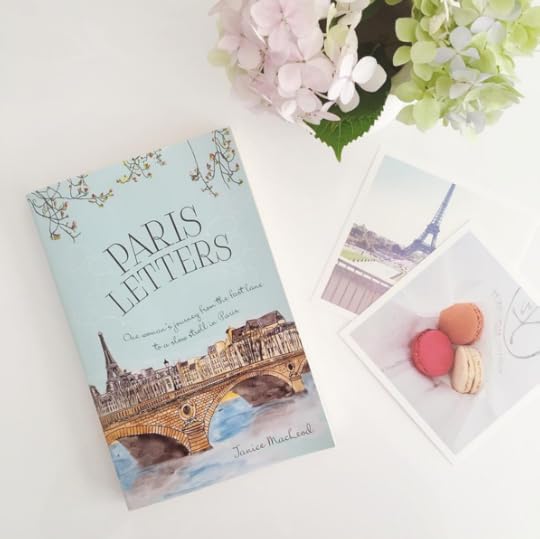
The most delightful photo of the book, from the beautiful, inspiring blog madefromscratch.
February 24, 2019
February Paris Letter: Signs, signs everywhere signs
 This February Letter is all about those ornate signs swaying in the breeze above our heads in Paris. Why oh why doesn’t the rest of the world make pretty ornate signs? Why oh why must we Helvetica everything?
Even Coco…
 But it wasn’t always this way. There was a time when illiteracy was rampant so store owners made more decorative signs to woo customers sans words.

©Antoine Dumont
Musée Carnavalet in Paris is dedicated to the history of the city and has a room dedicated to these old signs.
Many of these great signs have disappeared. Weather and time taking its toll, but there are still a few hanging about.
 The covered passages in Paris is a good place to start looking. Signs are protected from weather.
 Signs are everywhere, and pretty as a collection.
 Outdoor covered walkways are also a nice place to find signs protected from weather…

 But some signs are still out in the open, enticing passersby such as myself…
 Was every there a more lovely word? Non.
French words are always nice when they are painted with flare.
 Shoes or shoe repair. I can’t recall… or maybe a café for witches.
 I like the subtle M.
 Back when they sold horse meat. They don’t sell horse meat anymore, but only because it’s not popular. The French have no qualms about eating all the things.
 Definitely a coffee shop.
  You know F. Scott Fitzgerald came up with the idea for including a sign like this in the Great Gatsby after walking the streets of Paris and coming across spectacles such as these. Kinda creepy.
 Of course, these signs are everywhere and nowhere. The moment you decide to look for them, you can’t find them or remember where they were when you first saw them. As I peruse my 40,000 photo library, I only found a few, but there are soooo many more and better ones. This calls for more urban hikes all over this great big Paris. Lacing up.
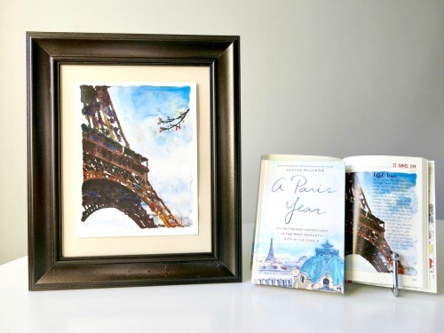
P.S. I’m listing the original paintings from my books Paris Letters and A Paris Year in my shop. It takes time so check back often. Much like the ornate signs of Paris, they are one of a kind, so once they’re gone, they’re gone.


February 15, 2019
Original Art: A love affair with collage and Paris
I’ve been sorting through piles of papers. Not as much joy as one expects after watching Marie Kondo’s Netflix series. Paper piles can be such jerks. They require time and energy to sort through, and if you don’t sort and discard correctly, you run the risk of identity theft or losing that all important tax form. This week I was in search of said tax form.
I found many tax papers one must retain for years, but didn’t find the ONE tax form I was looking for, obvs. I also found a few old books that had aged so very gracefully. I love the look of yellowing paper. The binding was coming apart on many and the papers were attached with dust and a prayer, but I loved them all the same and greeted them like they were old friends.

The colour of Paris is the same colour as faded books.

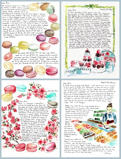
Then I took a few sketches, slipped some old book paper behind them and voila!
 The faded papers become a soft pastel paint for my sketches. And with Paris being such a literary city, it seems fitting that words hover in the air on the art.
So many great lines from those old books. So very quotable. Here is one of the quotes in the Montmartre collage above.
“Memory is a notoriously biased and sentimental editor, selecting what it wants to keep and invariably making a few cosmetic changes to past events. With rose-coloured hindsight, the good times become magical; the bad times fade and eventually disappear, leaving only a seductive blur of sunlit days and the laughter of friends. Was it really like that? Would it be like that again?” Peter Mayle, Encore Provence
 And another great line from John Glassco’s Memoirs of Montparnasse on this Shakespeare & Co collage.
“During our first week in Paris we never left Montparnasse at all, simply moving from one café and restaurant to another. It was then early March and the enclosed stove-heated terrasses were the best places to sit and pretend to work, for work was for us more a pretense than anything else… But it was more fun to play at being a writer. Later I found that a great many other young writers felt and behaved the same way. Indeed Paris is a very difficult place fore anyone to work unless he is dull and serious.”
That John Glassco wrote a slew of good one liners. I added one such line to this boulangerie sketch:
“His regular mistress was a large, fat, wise-looking middle-aged Frenchwoman who worked as a pastry cook on the Right Bank. She had no interest in art and did not seem particularly fond of him, but, as he said, she was easily available and had always a wonderful smell of freshly-baked pie-crust.”

Who wouldn’t want to snuggle up to someone who smelled of pie. Notice the Guest Check I added. For some reason, in sifting through my papers, I came across this gem of a restaurant receipt from a day I don’t remember at all. I hope the French toast was good. I think our chef looks rather French, though I suspect the paper came from a diner in California.

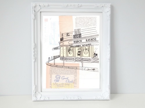
They say good art deserves a frame and bad art needs one. I don’t know if this is true, but I know that framing something tends to complete it somehow so I framed up the collages.
 Part of me wants to just make an entire book of these collages; match my sketches with wonderful literary words and gorgeous faded paper. (After completing 98 Paris Letters so far, I have a lot of sketches and Paris-based books.) In the meantime, these three originals are in the shop. I’m adding other original art from my books in the shop as well whenever I find the best frame for the job. Not all frames are created equal. Frame hunting could be a sport.
I watched an interview with James Cameron once when he was asked what happened to the nude drawing of Kate Winslet. He walked over to the file cabinet and pulled it out of a folder. I was horrified. This wonderful art was in a FILE CABINET? It was later auctioned off for $16,000 in 2011, but Titanic came out in 1997. That’s a long time in a file cabinet.

James Cameron was the artist who drew Kate. WHAT?!?
Then I looked at my own files and realized all my art is in file cabinets and binders and PAPER PILES. And as we know, paper piles can be such jerks. So as I sort, I now create, frame and list in my shop. Now THAT is some Marie Kondo-type joy. Happy dance!
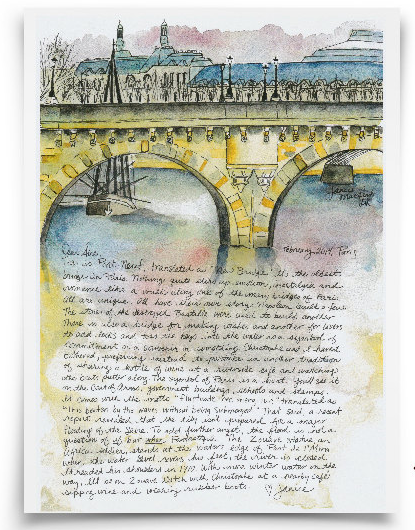
January 30, 2019
Paris in Blue, Red and Brown
 In one pivot over by the Seine I spotted a great little colour combination.
 It was quiet and still… remarkable for all the buzz one usually finds along the Seine.
 Imagine being a bookseller along the quay and having this view. Incroyable.
 The lamps seem almost regal in Paris.
 A five minute jaunt toward the sixth led to Le Comptoir du Commerce, a busy little place even on the chilliest of days… and a willing participant for my artist date.

January 24, 2019
Macaron note cards and sweet obsessions

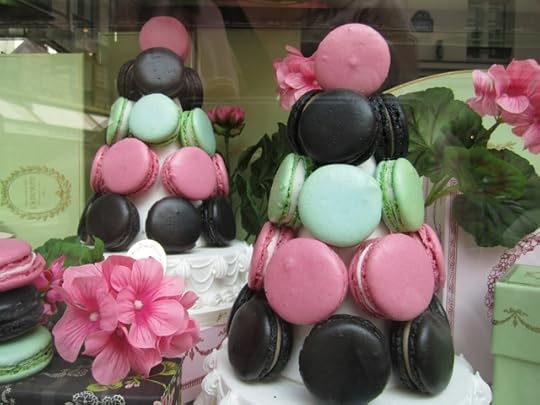
The problem with writing each day in a journal is that some ideas keep popping up. Sometimes these ideas pop up for years and won’t let you go. This is the case with my new macaron note cards now, finally, available in the shop.

How many times have I written in the margins of my journal: Create macaron note card. Hundreds! I’m not sure why they have haunted me so. I’m not sure why I haven’t created them yet, but when a friend requested them as her thank you cards for a recent shower, I finally did it. Voila! Done and done. *happy dance*
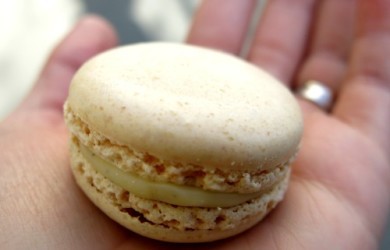
I love painting macarons but I don’t really like eating most of them. Sometimes the taste combinations are too bizarre, too sweet, too fruity or flowery, or pistachio. As you can see from this horrid little video I took when I first arrived in Paris.

Nice still shot for the cover photo. Oh dear. I called them “macarooooons” like the coconut haystacks of my youth. Rookie error. It’s especially horrible when people leave comments about my rookie moves. How was I to know?!?!?!
My friend Sandro from Rome (who also INSISTED I call him Sandro in my book, Paris Letters) gave me a stern talking to when I told him I basically only tried hazelnut gelato when I was in Rome. He shook his head and told me I owed it to myself, to the artists who make gelato, and to Rome itself, to try other flavours. He was right. I soon discovered that Pear gelato was a refreshing delight. This is Sandro being smiley before he got all serious about gelato…
Oh how I miss the me with long hair. Here is a chemo-do, taken the other day on Amélie’s birthday…
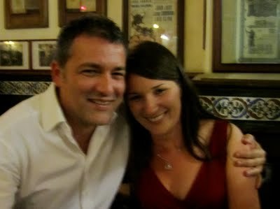
 Christophe is a handsome fella. And Amélie is taking her new 2 year old status in (fast) stride. I digress. Back to the macarons. So I tried many macarons. Here are the lovely staff at Ladurée before they yelled at me for taking the photo…

So I took photos outside, flushed with embarrassment and high on sugar.
I even made four Paris Letters, all extolling the study of les macarons.
And yet… at the end of it all. After all the taste testing, all the painting and writing, dealing with comments on my rookie YouTube video years later, these tiny treats have haunted me. I just can’t stop painting them. Finally, the note cards exists. I spent half the day yesterday just tucking the new cards into the pink envelopes because it looked neat and pleasing.
 Very Kondo. Tidy tidy tidy.
I’ve also come to one conclusion that you’ll probably not like.
Vanilla.
If a boutique can perfect vanilla, they are worth it. If not, keep on trucking.
*the world shakes its head in disbelief. First a government shutdown, then the yellow vests, now this?!*
Vanilla is the hazelnut gelato of the macaron world. It really is that good. Or it can be. You’ve got to taste them all to find out. Not all macaron are created equal. That said, a note card of just vanilla macarons doth not a pretty note card make, so I painted up the pretty ones.

Including pistachio. Italians have a saying, which applies to the pistachio macaron: Bello ma non balla. He’s pretty but he can’t dance.
That’s kind of how I feel about most macaron flavours, but they sure are pretty. Even pronouncing the names feels good on the tongue. Here is a digital macaron note card over at my Paris Printables shop. Tagline: Digital downloads for your printing pleasure.
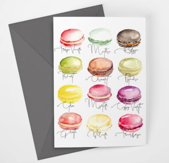
Griotte! Menthe! Citron! Even Pistache has a certain panache when said out loud. But Vanille, oh sweet vanille, sounds good on the tongue and tastes good on it too.
I’m hoping that my macaron note card creation will finally break me free of the spell of painting them. After all, there is a lot of France to paint.
January 13, 2019
Mixed emotions about the Yellow Vests and that pesky Arc de Triomphe
Creating the Paris Letter for this month was tricky. First, I wanted it to feature the Arc de Triomphe, which has been circumnavigated by the Yellow Vest protesters for a couple months (and counting?). The problem is that I’ve never really liked this particular Paris monument. Why? When there are the lacy steel lines of the Eiffel Tower…
 The bulbous dome of Opéra…
 The maze of Montmartre…
 The reflective magic of the Seine…
 The je ne sais quoi of the Paris café…
 The Paris café always feels like anything could happen.
The Arc de Triomphe is a blocky Lego of mixed emotions.
 At mostly every angle…
 Yes, it’s about triumph, but it’s also about conflict, which bums me out these days when there is so much world anger out there. But I had a concept in mind and I wanted to explore it in a Paris Letter. So I set out for inspiration.
 Eugène Galien-Laloue was known for painting bustling city life.
 Naturally, this led me down a rabbit hole of Google searches for his work. I love his fashion, reflections, trees, and the fact that the monument is in the background, not the foreground. Inspired, I set out to begin.

And added paint…

Things were coming along. I wasn’t totally loathing our monument. Added more paint which turned out okay on the monument but became framed by tearful, black bushes. NOT the plan.

Bushes out, some conflicty looking fire clouds in the back, a possible foreshadowing of the sad boulangerie explosion? How much more can Paris take?

Added a nice little stamp I found in my usual searches around Paris where I look for nothing at all in particular and come home with bags full of what Marie Kondo would call “Miscellaneous.”

Settled on this hue…
 Wrote out the thoughts I’ve been mulling all month (A Paris Letter really does take a month to concoct)… and voila…
 It’s darker than in real life. One must factor in the odd things that happen when one must actually print the thing. You can get it in the shop. A great gift for anyone who adores the Arc de Triomphe. Military buffs perhaps. Or Lego aficionados.
January 8, 2019
Paris in the Pantone Color of the Year 2019: Living Coral
Pantone released its 2019 Color of the Year: Living Coral

Pantone releases a color each year. During that year designers from all genres include the hue in their work.
 Who was on trend before her time?
 This shot was for an article I was in about slowing down and painting. It was in the August 2014 edition of Psychologies Magazine.
Some years I’m all BLECH with the Pantone choice, like in 2016 with Rose Quartz:  What was annoying about this choice is that for anyone who has ever lived in Paris and purchased a light pink anything, they soon find that it turns to this dirty pink hue on its own. Could be the water, the detergent, the way washing machines work, but mostly it’s just from living in a sooty city. So we already have a closet of that hue, thanks, without even trying.
Living Coral is different. It’s vibrant and it looks great with other colors, like with the blue in this dish I picked up at a flea market:

I’m excited to see how this shade trickles into the mainstream. In the meantime, you can find plenty of shades of Living Coral around Paris since red, orange and pink all fade to coral eventually, also without even trying.
 Pantone also includes color harmonies with the Color of the Year so you know how to pair it. Repetto has known all along:
 As has Picasso…
 And this nameless artist, who also included a Living Coral shawl on our subject:
 And let’s not forget our culinary artists…
 Or our street artists…
  And some ladies about town…
 By the way, January is a month of sales in Paris. Perhaps the boutiques are trying to offload all the old Pantone Colors of the Year to make room for our darling Living Coral.
 But I don’t need to go shopping. I’ve already got a whole wardrobe of Living Coral. Just as well. I need to stay home and work on my new Paris Letter. Will it include our new Pantone hue? Subscribe over in the shop and find out.
 Also, two treats for New Year’s resolutions. Both my Paris books start with January and go to the end of the year. They make for nice pals as you navigate your way through 2019. Find links to fun stores to buy them here.
 Hee hee.
 I’ve got my fingers crossed for Limpet Shell to be the 2020 Color of the Year.
December 27, 2018
Paris Lettering is my birthday pressie to self
Today is my birthday. I’m celebrating with 20% off at my shop this week. If you didn’t get a Paris Letter under the tree, go get yourself a little pressie now. I call it my “Glad I’m not dead” deal of the year.
Second, so many thoughts. First of all, 2018 can be done already. I’m not quite at that stage when I feel like my recent cancer situation feels like a lesson or a gift. It feels like a random shot by an Anti-Cupid, who instead of making people fall in love, makes people ill. Jerk.
There seems to be a chain. My friend had it, then I got it, then another woman nearby got it. And so on and, tiresomely, so forth.
But enough about that. Glad to be alive. Glad the cancer is gone. Not glad to be rid of body bits, but you can’t mourn what can’t come back.
Third, I learned recently that people are going back to paper books. They tried the ebook, loved it, then somewhere along the line, reading an ebook felt like scrolling through a Facebook feed, while reading a paper book felt like an escape from all that. This pleases me because my paper book, A Paris Year, is infinitely cooler in print. I feel it came out during an e-craze, and now it’s finding its groove as a tactile paper handful of joy.
 Thanks USA Today.
In the book, I chose to make December 27th about my favourite thing in Paris: Neon signs and lettering. So much glorious eye candy.

 I can’t get enough of pretty signage. The obsession began when I lived in California. All that Route 66 signage meant many trips to neon sign hot spots like Barstow and Salton Sea. But Paris, ah Paris, is condensed metropolis of pretty signs…


Fourth, I’m going for a walk. It’s my birthday and I’ll walk if I want to. Christophe has given me the gift of hanging out with Amélie so I can go outside and blow off the stink of 2018.
Onward folks. Onward.
December 14, 2018
Paris Letter Christmas Blues and Yellows… especially yellows
 This is the latest Paris Letter. Ah the rooftops of Paris at night with the glorious Eiffel Tower sparkling bright. One could argue that the Eiffel Tower is the ultimate ornament. I listed this latest letter in my shop if desire a little Paris this holiday season.
France itself has been in the spotlight a little too much for my liking. The Yellow Vests… the upcoming Acte 5. The movement certainly hasn’t faded away. One must admire the whole Yellow Vest idea. Everyone can score one of those. You can decide last minute to fetch yourself a common yellow vest and get out there and protest. And each week is an Acte… as if they are already setting the scene for a modern day Les Misérables musical. So many points of view on this one. I’m still mulling my own, and watching each Saturday for what happens next.
The world seems so tense these days. I have already declared my New Year’s Resolution to “Not be so pissy.” I think it’s cancer trauma. While you’re going through it, you have too many appointments, treatments and side effects to address. No time for emotion. Once it’s done, whaaaaaa!!!! The tears and anger just flop out.
By the way, update: All the treatments are done. YA! Let’s assume I’m cancer free. My hair is growing back. I have short hair for the first time since I was in Grade Two. I don’t even know what to do with it. Suggestions welcome. Right now it’s a bit… Wolverine.
While we are all feeling the effects of World Anger, let’s just give ourselves a salve of pretty Paris pictures. This time, blues and yellows.
 Sparkly round lights, a yellow car and an azure blue sky. Paris is very good at colour wheel theory.
 Perhaps not so pretty, but interesting to take an early morning walk and see all the loading and unloading. I wonder if those potatoes were to become fries alongside steaks.
  This is right outside my front door on rue Mouffetard. The windows are just as lovely on the outside as they are inside St. Médard church.
 Gotta love a Paris café diner cup and saucer. I think I have photos of every colour combination. After coffee, naturally…

Unless you go here, where they are notoriously grumpy…
 I even wrote nice things about his café for a paper in Montreal at one point in time. But the photo is nice and I like the neon sign against the blue shutters.
 Why is graffiti so hard to read at times? Why must one be indecipherable when tagging? Here’s some graffiti that is more straightforward…
 Found this cute couple in the 13th. I rarely walk around the 13th. Much of it is a monument to questionable architectural decisions, but the graffiti is nice and is updated often. There must be a lot of painting happening in the middle of the night in the 13th.
 The 13th. Ugh. But look… blue shirt stranger showing up for my photo theme. Thanks guy.
 I believe this is right outside Hemingway’s door. I’d like to think he used this box to post his letters and stories. The boxes have been updated so I doubt it, but wouldn’t that be grand? Book business sent from THIS box?!?!?!?
 Since the time changed, it gets dark earlier in the day, so a late night stroll for nice azure blue and yellow can happen before dinner.
 I’m told this bit of a church is haunted by Nicolas Flamel, of Harry Potter fame. I’m not sure this is accurate. I was walking around with the ultimate Harry Potter fan at the time so I think revisionist history was at play. I just like the colour combination.
 Another beautifully lit church against an azure sky. St. Moustache… err, I mean St. Eustache.
 I love it when I’m looking for a blue and yellow theme, and some stranger turns on the TV just as I walk by. Thanks stranger.
 These candies are fine but the packaging is fantastic. These containers keep kicking around the house long after the candy is gone. They are perfect pretty holders for my hair pins… that I hope to use again when my hair is longer.
 I like to think of this little graffiti man to be the Mary Poppins of the mail. A little angel sending letters on their way. I could have used one of those this month. Almost every letter and package of note cards I sent out on mid-November was delayed by the post, but everything seems to be moving along now. I was told it was due to a postage strike (now resolved, thank goodness), volume, and a bunch of federal holidays. I can’t blame President Bush. That’s not cool, especially when everyone is blaming Trump and Macron for everything these days.
My Sorbonne note card is rather blue and yellow.
 It is part of a newer note card pack of 12 available in my shop. Note cards and letter subscriptions are available… perfect for that Francophile friend on your list… or for you. Treats for self! There are so many pretty things on Etsy created by people who are getting crafty at their kitchen table and thinking up wild ideas in their basements. Some of these people are trying to quietly solve the problems created by all the reasons the Yellow Vest movement was born. Quietly revolting with scissors, glue guns, and yarn.


