Jump to ratings and reviews
Rate this book

Visual Thinking for Design

Rate this book

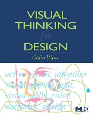
Increasingly, designers need to present information in ways that aid their audience’s thinking process. Fortunately, results from the relatively new science of human visual perception provide valuable guidance.

In Visual Thinking for Design, Colin Ware takes what we now know about perception, cognition, and attention and transforms it into concrete advice that designers can directly apply. He demonstrates how designs can be considered as tools for cognition - extensions of the viewer’s brain in much the same way that a hammer is an extension of the user’s hand.

Experienced professional designers and students alike will learn how to maximize the power of the information tools they design for the people who use them.

• Presents visual thinking as a complex process that can be supported in every stage using specific design techniques.
• Provides practical, task-oriented information for designers and software developers charged with design responsibilities.
• Includes hundreds of examples, many in the form of integrated text and full-color diagrams.
• Steeped in the principles of “active vision,” which views graphic designs as cognitive tools.

197 pages, Paperback

First published April 4, 2008

35 people are currently reading
666 people want to read

About the author

Colin Ware

9 books10 followers

Ratings & Reviews

What do you think?
Rate this book
Friends & Following

Create a free account to discover what your friends think of this book!

Community Reviews

5 stars
53 (28%)
4 stars
67 (36%)
3 stars
48 (25%)
2 stars
14 (7%)
1 star
3 (1%)
Displaying 1 - 16 of 16 reviews
Profile Image for Katja.
30 reviews1 follower
Read
February 19, 2011
This is more a book on visual perception, than on visual thinking. Filled with neuro-biological stuff like frontal lobes and cortex areas, which makes it difficult to read and increasingly boring. I find myself skipping the "scientific" parts forward to design parts. What remains is the good old Gestald theory. I expected, honestly, something more revolutionary. Am I spoiled?
Profile Image for Jung.
1,824 reviews40 followers
Read
August 11, 2025
"Visual Thinking for Design" by Colin Ware offers a deep dive into how human vision actually works and how understanding it can make anyone a far more effective communicator. Many designers invest hours perfecting layouts, adjusting colors, and finessing every detail, only to watch audiences skim past their work without a second glance. Ware’s core argument is that the key to creating designs that truly engage lies in knowing how the brain processes visual information. Human vision doesn’t work like a camera capturing every detail; instead, it operates like a selective search engine, zeroing in on what’s relevant to a current task while ignoring most of the rest. This means good design isn’t about making every element noticeable - it’s about ensuring that the right information pops into focus when the viewer needs it. Whether you’re building a website, giving a presentation, or designing an infographic, Ware’s research-backed insights can transform how you plan, prioritize, and present visual information.

One of the first lessons is that what we think we 'see' is mostly an illusion. Experiments show that we only process a tiny fraction of our surroundings at any moment, and that the brain fills in gaps with assumptions. In one famous study, a person asking for directions was swapped mid-conversation for someone entirely different while hidden by a passing door, and over half the people didn’t notice. This is because vision is task-driven: we pick up information as we need it, storing little in memory because we can retrieve details from the environment at will. For designers, this means audiences won’t scan and memorize everything - they’ll home in on whatever helps them solve their immediate visual 'question.' The London Underground map works so well because it’s designed for such task-driven searching: riders locate a start, find a destination, and trace a route, aided by color-coded lines and simplified geometry. The takeaway is to identify the key visual tasks your audience needs to perform and design explicitly to support them.

Another cornerstone of Ware’s argument involves how quickly we can detect certain visual differences. Psychologist Anne Treisman’s work shows that single visual features - like a bright color - are processed instantly across the entire visual field, while combinations, like color plus shape, require slower, item-by-item attention. Looking for a red car in a gray parking lot is effortless; finding a specific gray car in a sea of similar ones takes time. For effective design, this means crucial elements should differ in a single, basic feature - color, size, orientation, or motion - from everything else around them. If multiple types of elements need to be easy to find, give each a unique feature so they don’t compete visually. Movement is the strongest attention trigger, rooted in evolutionary survival instincts, which is why even subtle animations can be irresistible to the eye. By working with these perceptual biases, designers can direct attention exactly where it matters most.

Our brains also prioritize two-dimensional interpretation over depth. Although we live in a three-dimensional world, our eyes and visual system work best with 'flat' spatial relationships - up, down, left, and right - because depth perception requires slower, body-based movement. We’re exceptionally good at spotting edges, patterns, and contrasts in 2D surfaces. This happens because brain cells detecting related edges coordinate signals while suppressing irrelevant ones, creating unified objects out of fragmented inputs. Designers can harness this by grouping related elements with shared visual features - color, texture, direction - so they’re processed together naturally. Complex patterns require deliberate scanning, so organizing content into simple, perceptually obvious groupings makes navigation faster and more intuitive.

Color perception adds another layer of complexity. The human retina has three types of cone cells, but the brain translates their signals into opponent color channels: red–green, blue–yellow, and luminance (black–white). Luminance contrast is what makes fine detail and small text readable; without it, even high-saturation colors fail for small elements. This explains why black text on yellow works but yellow text on white does not. Designers should stick to high-contrast combinations for details and reserve muted tones for large background areas. Color coding is most effective with a limited palette of about six to twelve distinctive hues - red, green, yellow, blue, black, and white being the most reliable - and should be tested in real context because colors shift in appearance depending on their surroundings.

Ware also emphasizes that words and pictures are not interchangeable but complementary. Words are better for conveying sequences, conditions, and abstract logic - 'if this, then that' reasoning - while visuals excel at showing spatial relationships, trends, and patterns. A complex set of assembly instructions might be easier to follow with diagrams; a detailed legal clause is clearer in text. The most powerful communications combine both strategically. For example, effective presentation slides tend to rely heavily on images or diagrams while the speaker provides verbal explanation, with gestures linking specific visuals to the spoken narrative. Matching the communication mode to the type of information strengthens clarity and retention.

Creativity itself, Ware argues, is tightly bound to our visual system. Sketching isn’t just recording an idea - it’s a cognitive process where the hand and eye collaborate to explore, test, and refine possibilities. Even random scribbles can trigger pattern recognition, turning meaningless marks into coherent shapes. This externalization of thought allows designers to manage complexity beyond what working memory can hold. The same principle applies to data visualization: presenting information in the right visual form can make patterns jump out that were previously invisible. As technology evolves, the most promising tools will be those that extend human pattern recognition rather than replace it, offering exactly the right representation at the right time to spark insight.

All of these lessons point toward a single, unifying message. Good design works with the brain’s perceptual and cognitive systems, not against them. Since people only notice what they’re actively searching for, designs should highlight the key answers they need rather than trying to make every element equally prominent. Attention can be guided instantly with basic visual features like color or size, and information should be grouped according to natural perceptual rules. High luminance contrast is essential for detail, and colors should be chosen sparingly and in context. Words and visuals each have unique strengths, and the best results come from using them together in ways that suit the information. Creativity flourishes when ideas are externalized visually, and technology should aim to enhance this natural capacity.

In the end, "Visual Thinking for Design" makes a persuasive case that understanding vision is not an optional extra for designers - it’s the foundation. By applying what science knows about how we see, notice, and interpret the world, we can make visual communications that are faster to grasp, easier to navigate, and more likely to stick. For anyone who creates visual information, this book is a reminder that design isn’t about decorating ideas but about shaping the way people experience and understand them. The better we align with the brain’s patterns, the more our work will connect.
Profile Image for Bryan Tanner.
726 reviews222 followers
August 12, 2025
Summary:

In Visual Thinking for Design, Colin Ware explores how our brains process visual information and how this understanding can be used to design more effective visual communications. Drawing from cognitive science, neuroscience, and graphic design, Ware walks readers through the ways perception, attention, memory, and thinking all interplay with visual representation. The book is aimed at designers, UX professionals, and anyone who wants to leverage the brain’s natural visual strengths to communicate more clearly.

Three Key Ideas Worth Remembering:

1. The Visual Brain is Fast and Pattern-Driven: Our brains process visual input rapidly and often subconsciously. Designers should use recognizable patterns, spatial organization, and visual hierarchy to guide attention and reduce cognitive load.

2. Pre-attentive Processing is Powerful: Certain visual properties (like color, size, and orientation) are processed before we consciously focus on them. Effective design leverages these cues to highlight important information instantly.

3. External Visualizations Extend Our Thinking: Drawing diagrams, maps, and other visuals doesn’t just communicate ideas—it can help generate them. Visuals serve as extensions of our cognitive processes, enabling more complex reasoning.

Review:

Ware’s book isn’t about flashy trends or aesthetic styles—it’s about why good design works, grounded in research. Though the material leans more academic than practical at times, the principles he outlines are foundational and enduring. If you’re looking for new hacks or UI patterns, this isn’t the book. But if you want a deeper understanding of how to make visuals that think with you, this is a solid, thoughtful read that’s worth keeping on your shelf.
Profile Image for Scott Pearson.
820 reviews39 followers
December 11, 2019
Colin Ware directs a Data Visualization Research Lab at the University of New Hampshire. His education is broad and interesting: He holds degrees both in computer science and the psychology of perception. He is a (the?) leading expert on integrating neuroscience and psychology with computer graphics.

Most computer graphics books teach how to make things that look cool. This book takes a different tact and discusses why things look cool in terms of the brain’s structure. Should you read this book, be ready for a heavy dose of neuroanatomy, cognition, and perception! It leaves its readers ready not just to make cool graphics but to address their graphics’ viewers “visual thinking.” In other words, it takes graphics to a psychological level.

This work is more accessible than Ware’s other textbook Information Visualization and could serve as a fitting tutorial towards a broader audience. Being a tome of basic research, this book addresses an audience as wide as it is varied. Graphic designers, scientists of visualization, psychologists of learning, and informaticians (like myself) can all glean insights into their craft from this work. Indeed, anyone who presents information that combines word and image can benefit – especially those using electronic images like PowerPoint slide decks. Also, it clarifies the pathways and processes by which humans gain knowledge from visual images. I find this stuff extraordinarily fascinating and am glad that Ware has spent time mastering these disciplines.
Profile Image for Jonathan Gomez.
91 reviews2 followers
February 23, 2024
3/5.

Girl I don't know why I was forced to read this. Nothing wrong with it... there is just no point in me having to literally read the science and specific neurology behind seeing and color and pattern recognition. Interesting facts... just far too much in-depth information on things that I just need to know the practical application for.
Profile Image for Douglas Summers-Stay.
Author 1 book47 followers
March 25, 2020
Read for my teaching job. I was familiar with most of the visual perception science part, but it was interesting to see how it could be applied to designing e.g. web pages. Lots of good color illustrations.
Profile Image for Cristina Aguilar.
54 reviews
May 19, 2021
El tema está bastante bien tratado, de una manera científica y divulgativa a la vez, con muy buen diseño de gráficos, etc. Es cierto que al final ya se hace algo aburrido, monótono más bien
Profile Image for Kathryn.
27 reviews7 followers
September 27, 2021
Really helpful resource on applying how the eyes and mind work and play to dataviz and communication in general
Profile Image for KMT.
49 reviews1 follower
April 11, 2022
An easy read that makes compelling points about how the science of visual cognition can help us create more efficient visual communication.
Profile Image for Samuel.
77 reviews
August 11, 2025
If you want to know how to improve your presentation skills, this is the ideal book for you. You'll also learn some interesting things about your brain and colors.
Profile Image for irfan.
69 reviews2 followers
July 30, 2011
Definitely a must-read for those engaged in the field of visual communication and design-related fields. The book manages to break down, into its littlest of technicality, the various ideas and perceptions that one should know in order to design better...visually. With its look at things from a 2.5D perspective, right up to the science, or common-science'ical of colour schematics and combination, the book has managed to bring forth the idea of how one can actually improve upon the visual design of things, be it in the areas of Graphic User Interface (GUI) design, graphic designs (2D or 3D), or even in the field of product design itself. And what is interesting is the idea that all these basic principles are actually applicable across all cultures, genders and even age groups, more so in this day and age whereby a product is more than just A product, but more so a manifestation of the company's ability to iconify it, and perhaps, just perhaps, make it to be the next 'IPOD'!
Profile Image for Charles.
158 reviews6 followers
Want to read
September 1, 2011
I ordered this book from abebooks.com because it is the text book for the Data Visualisation course I am studying. The course is available at http://www.cs171.org I can watch the lectures, download the slides but I don't get access to the teaching staff unless I enrol in the course next year and pay the fees! I will see how I go "auditing" the course.
Profile Image for Carlos Allende.
Author 2 books35 followers
March 1, 2016
Pretty good. Clear examples and easy to read. I wish all text books were like this one!
Displaying 1 - 16 of 16 reviews

Can't find what you're looking for?

Get help and learn more about the design.