When Mister X hit the shelves twenty-five years ago, no one had ever seen anything like it - a fusion of film noir, Art Deco, and German Expressionism channeled through the talents of the greatest up-and-coming artists of the day. The story of a utopian city with architecture that drove its inhabitants mad and the never-sleeping architect who quested tirelessly for a cure, Mister X captivated a generation of comics fans and creators, transforming the landscape of their chosen medium forever. Still as inspiring and compelling as the first time it saw print, the entire run of Mister X written by Dean Motter gets the deluxe treatment in this volume, every page of its groundbreaking artwork painstakingly restored.
Dean R. Motter is an illustrator, designer and writer who worked for many years in Toronto, Canada, New York City, and Atlanta. Motter is best known as the creator and designer of Mister X, one of the most influential "new-wave" comics of the 1980s.
Dean then took up the Creative Services Art Director's post at Time Warner/DC Comics, where he oversaw the corporate and licensing designs of America’s most beloved comic book characters such as Superman, Batman and Wonder Woman. In his off-hours he went on to create and design the highly acclaimed, retro-futuristic comic book series, Terminal City-- and its sequels, Aerial Graffiti. and Electropolis.
Mister X is a wild ride in a futuristic setting (inspired by the Fritz Lang METROPOLIS film, art-deco, and 1920’s/1930’s architecture) that blends fantasy, social satire, and science fiction with a generous does of noir and mystery. The style of Motter’s creation (both writing and art), especially the expressive surreal (sometimes cubist) cover illustrations, was an inspiration to many creators since then. I wasn’t aware of Mister X until Caliber Comics’ followup series in 1996 and the later mini-series from Dark Horse - none of which I picked up on. This is my very first exposure to the world of Mister X and while the story can be hard to follow at times, I’m impressed.
This high quality edition of the early issues (Canadian publisher Vortex Comics, 1983-1990) is first class, with vivid reproduction and enhancement of the original pages, along with several informative essays by Warren Ellis, Jeffrey Morgan, and Dean Motter. Radiant City exists in a dystopian world, with Mister X (in several different personas) serving as one of the original architects of the city , employing designs based on “psychetecture”, which causes the citizens to go mad. Mister X sets out to undo his wrongs, and his efforts take up the bulk of the series, along with a revolving cast of off-beat and intriguing characters. Mister X is thin and bald, wears a trench coat and sunglasses at all times (to protect his damaged eyes). He never sleeps and stays awake by taking “insomnalin” and other pharmaceuticals from a manipulative drug manufacturer.
Around 1980 an image began circulating in comic shops and trade magazines that showed a beautifully designed retro-future cityscape reminiscent of the 1927 SF masterpiece Metropolis, with a shadowy figure in the foreground. The poster by Paul Rivoche was advance publicity for Mister X, a series created and written by Dean Motter and drawn by Rivoche, set in a dystopia called Radiant City. It was evidently inspired by the ideas of Le Corbusier, a foundational modern architect famous for the Modulor and high-rise buildings made of concrete. As details emerged, anticipation for this series grew and grew, advance orders were high, and more intriguing poster images followed. But years passed and no comics appeared. Eventually it was announced there would be no work from Rivoche or Motter but instead, the Hernandez brothers of Love & Rockets were to be the new creative team. Four issues of Mister X were produced by Gilbert, Mario and Jaime Hernandez before they departed. Eventually it restarted with scripts by Motter and art by Seth, in a kind of Yves Chaland-pastiche style, lasting another nine issues before Seth also left.
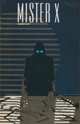
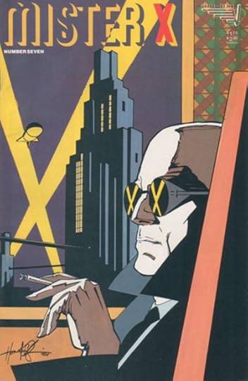
Mister X: The Archives is a 384-page collection that features 13 issues of Mister X with art from Jaime and Gilbert Hernandez, Paul Rivoche, Seth, Ty Templeton, and Klaus Schonefeld, plus the final 14th issue written and drawn much later by Dean Motter. It’s introduced by Jeffrey Morgan, editor of 1980s rock magazine Creem. Warren Ellis writes a foreword and Dean Motter also supplies a short intro. Many artists and writers at various times either did pin-ups or short stories with their tributes to this character, and this book contains a three-page story by Dave McKean plus an eight page story Heartsprings and Watchstops, illustrated by McKean and written by Neil Gaiman; Bill Sienkiewicz writes and illustrates The Brain of Mister X, an ‘unfinished episode’ that is eight pages of painted art plus two pages of sketches; five pages of drawings from Paul Rivoche form the ‘Somnopolitan Sketchbook’; pin-ups from Michael Wm. Kaluta, Howard Chaykin, photographer Dan Couto and illustrator Glen Hansen and all the covers drawn by Rivoche round out the collection.
“Sleep… is a waste of time…so much to do, and so little time to do it,” says Mister X as he injects himself with the drug that will keep him awake. The premise of the driven, restless Nosferatu-esque protagonist silently haunting the giant skyscrapers of his flawed city, looking for answers among its damaged citizens is very compelling. Rivoche’s superbly evocative initial designs were enough to hook a great many people, but ultimately there isn’t much else to Mister X except a great concept. The only version of Motter’s character that feels intriguing is the four issues by the Hernandez brothers who fill the content vacuum by merging their L&R universe with his. The rest of this book is a collection of creaking clichés and vaguery. Some of the art is enjoyable, the exciting graphic design is so good it almost convinces you there is something compelling underneath it, but overall there’s no there here and this archive is likely to be read once and never again. If you’d like to keep your affection for Paul Rivoche’s wonderful image intact, read The Return of Mister X and let your involvement end where the Hernandez brothers do.
The Hernandez run of this is one of the best American comics I've encountered, taking an irresistible concept (architect/detective uncovers the secrets of a city whose esoteric architecture drives citizens to insanity) and executing it as a playful, jazzy pulp caper. Unfortunately, without the brothers the comic sort of collapses -- the city becomes window dressing and the generic characters and criminal intrigue take center stage. It's still fun, but it could've been great. Read the first half.
“This room…is the worst…the very shape of it. It’s all wrong…all wrong for people…it crushes…this city was not meant for people…”
This has not one, not two, but three forewords/introductions in it. So already we see too many people involved and we haven’t even started the main body of the book yet. One of the first things that becomes apparent about the art work is that it has a strange clash of retro with dated futurism to create quite an unsettling dystopia, which sets up the tone nicely.
There are no shortages of these graphic fiction/comic book reduxes out there on the market. The publishers are well aware of their audience, and often by adding all of these quirky and colourful extras it can be an effective way of distracting from often mediocre work elsewhere. In many ways this seems to straddle the era of the old generation, Eisner, Kirby, Lee et al, and the new, revived and more complex experiments that really started to come to prominence throughout the 80s, Moore, Miller, Gaiman et al. In one sense it possesses a dated almost 50/60s vibe about it and yet the issues it concerns is one that is timeless, and relatable to most readers.
It’s a bit ironic that this is the story of someone embarking on a grand project with impressive visions, but it got taken out of their hands, someone else took over and it became something else entirely, and yet this is pretty much what happened with this book and the original writers of this project.
The art work is strong, and at times really impressive, but I also found it far too inconsistent due to the changing cast of artists. “Metropolis” is obviously a big influence throughout, but many other influences come and go, at the start the panels fall somewhere pleasantly between “The Jetsons” and “Blade Runner” it then shifts at various points into Surrealism, Art Deco and Soviet Era imagery and towards the end it almost starts to resemble elements of “SpongeBob SquarePants”.
"Mister X" starts so well, with a really clever and thrilling premise and some compelling characters, but as it goes on, it just seems to lose all focus, shape and inspiration, and just runs out of steam, and by the end it’s all over the place. The original artists gave up on the project before finishing it, apparently over money issues, but either way the loss of interest is almost tangible in the latter instalments.
This was a staggered and intermittent franchise with a changing cast of artists (rarely if ever a good idea, especially in terms of consistency) and it really tells in this book, it’s like listening to a band’s compilation album with various different members on different songs working on unfinished demos and covers, which is then patched together and released with a glossy façade and fanfare, but with very little substance beneath it all.
Mister X is a bit similar to Grendel, in that's ambitious and extremely flawed. It's a comic that was extremely influential and a watershed book.
It's a pure vision. With plenty of buzzwords thrown in...German Expressionism, Art Deco, Noir and Retro-futurist. It's graphic design made universe building.
Its an Ayn Randian hero--an architect who built the perfect city, basses on psychogeometry only to realize it had all gone horribly wrong due to lesser visionaries diluting his vision.
He now lives a sisyphean life trying to fix a city decayin into itself. With a stacked team of Motter, the Hernandez Brothers, Seth, and Dave McKean your think the story would be immoral...
Ultimately though this results in a lackluster story with plenty of mystery for the sake of mystery, macguffins and nonsensical plot twists. As someone else pointed out, the comic is called "Mister X" which phoenetically can sound like "Misdirects". SIGH
I only read the Hernandez Bros. issues and skimmed through the rest since I’d heard the post-Hernandez stuff isn’t as good. I’ll just pretend the series ended when they departed because their run is phenomenal. Beautiful artwork and psychologically engineered architecture gone awry. Really great stuff! As a side note it’s really funny that Seth of all people worked on the series for a while in the back half of this collection.
Let's start with the high points. Dean Motter has created a genuinely unique atmosphere for the setting of this story. Radiant City, aka Somnopolis, is an accomplishment in art deco. In addition, Motter created some of my all-time favorite covers for this series.
Lastly, the first 4 issues feature stellar art and dialogue from Los Bros. Hernández (Jaime, Gilbert, and Mario) of Love and Rockets fame. Sounds like an amazing package so far, right?
Too bad the story is a awful.
The premise is that Somnopolis is a haunted place that slowly drives its inhabitants insane. I know this because it was spelled out for me in the prologue text, which is only confusing because I never got this impression at all while reading the story. The Hernandez issues focus on characterisation, spending little attention on plot or conflict. Motter took over the writing chores with issue 5 and continued doing a lackluster job. From what I can tell, this story is just about a group of people struggling to survive in a brave new world, peppering in a few gangsterland murders.
The title character is very mysterious, which I got the feeling was done so because his origin story had not been established before beginning this adventure and was instead made up on the fly.
Oh, and those awesome covers I showed you? I read this story as run of single issues I managed to collect over the past several years. I'm not even certain the covers are included in this edition of the book I'm reviewing, so... good luck?
Mr. X was one of my first comics obsessions, in the 80s. I remember trying (and eventually succeeding) to track all of these issues down, along with the later Vortex series. The series had a big impact on me - it was one of the first comics I read that put a lot of effort into overall design and thematic tone, and it also was using a sort of noir/art deco/retro future style that was really appealing. The story was a bit baffling at the time, and after re-reading it in this (really very excellent hardback) collection, it still is - but it's still pretty interesting, and a lot of it still looks really great, and overall it's a lot of fun to read. After having read 20 years of comics since this originally came out, you can see where it's influence has popped up in other people's work throughout that time, and I would imagine a lot of current creators who are around my age felt like I did when they first saw it back then. Also cool is that there's work in here by 3 Hernandez brothers, and probably the first work by Seth, as well as an unfinished piece by Sienkiewicz and that one by Gaiman and McKean that turns up all over the place. The book also includes Dean Motter's reworked "finale" to the series (which - although Mr. X went on to have in at least 2 other series for different publishers, if not more - he apparently considers to be the only "canonical" Mr. X series). I got this book for 1/2 off as a "nick and dent" copy, and thought it was well worth it, and wound up enjoying it (again) a lot more than I expected.
Vaguely intriguing plot, but more mystery for mystery's sake. I picked this up because of the focus on cities and city design. The architectural elements are ubiquitous throughout, but they become more superficial as the narrative goes on. Ultimately, the story doesn't really hold up. Nonetheless, it was enjoyable to read and the Archive Edition includes a lot of fantastic art and additional commentary that provides a lot of insight into Motter's vision.
A character better known through iconic images than through people actually reading the stories – and indeed, creator Dean Motter admits in the foreword* that the whole concept of the character was reworked because the original idea (basically, a detective story set in Metropolis) didn't live up to the enigma of the advance publicity. But even in the version we have, I'm not wholly convinced the stories are as good as the covers, and that despite the opening issues being rare collaborative work by los bros Hernandez. Who, y'know, are quite good at this whole comics lark – but for my money give too much away too soon about the enigmatic lead, when I'd have preferred him to be a marginal figure threading in and out of other stories in Radiant City for a while yet. Not to mention bringing in Luba for a guest spot, when I would have thought the SF undertones in Maggie and Hopey's early stories would have made them, or maybe Penny Century, a much more natural fit. Nor is this the only time when their issues feel ill at ease with the whole gig; for all that they've proven over and over again that they can expand the boundaries of comics, their depiction of Radiant City never quite catches that notion of an impossible, ideal, vaguely Art Deco city gone horribly awry. To be honest, mostly it looks more like Croydon. And Radiant City does need to be more than that; Tim Burton's Gotham is an obvious point of comparison, though if anything its true DC heir is Aztek's underused home of Vanity; I can't remember if that series ever used the term 'psychetecture', but it was clearly influenced by the idea, though there I believe the city was intended to drive people mad. Whereas here it's a more horribly plausible case of corners cut – a slight exaggeration with genre trappings of the situation which marred so much of Britain in the 20th century, where architects designed glorious cities in the sky, and then councils and developers scrimped them into soul-sapping concrete hutches instead.
The question then arising, of course, if the city wasn't built as the architect intended, how come his network of secret tunnels is still there and apparently operating exactly as he planned? Assuming he's the architect at all, of course, because soon Dean Motter takes over the writing, instead of just being listed with the unusual credit of creator/designer/covers. On art he's joined by Klaus Schönefeld and then, of all people, Seth. Both of them much better at selling the looming grandeur of the metropolis, even as Motter undercuts what's been established so far about Mr X's identity. This is hardly the first comic where each creative team feels the need to overwrite previous revelations about the lead, but is a rare case where that might actually have been designed in from the off. Even so, Mr X never quite becomes the enigma those publicity images suggested, still generally on the back foot, outplayed by everyone else, frequently thrown out on his arse with a confused expression and a cloud above him that wouldn't be out of place in a light moment of Tintin. Gradually, though, the comic does become a little more Expressionist, a little trickier to follow but a lot better at evoking its own mood, with visuals reminiscent of a Rian Hughes retro-future gone to seed – albeit culminating in a finale for whose slipshod state Motter feels the need to add an apology, even after doing his best to rejig it.
Almost the last thing here is the first Mr X story I ever read, the Gaiman/McKean vignette from A1, and reading it now is the one time the actual comic hints at the same vast, elegantly looming possibilities as the covers and posters did. I wouldn't say I regret reading the rest, but I think maybe Mr X meant more to me as something obliquely glimpsed, and I can certainly see why it hasn't remained part of the canon for new readers in the same way as some of its contemporaries.
*One of three, to be precise. Jeffrey Morgan's has a straining for effect, and that unfortunate insistence on using big words that aren't quite right, which makes one dread his turn as the comic's writer, but the unintentional comic masterpiece is Warren Ellis'. "I've been in love with graphic design my whole life", he tells the reader, which isn't quite having a passion for it, but close enough. He also expresses his fondness for Mr X's catchphrase "So much to do and so little time to do it", which with hindsight seems a perfect summary of the huge number of promised projects he left unfulfilled while sliding into the DMs of an even huger number of people. All the same, the inspiration on Spider Jerusalem and still more so Doktor Sleepless is clear.
Anyone loving Fritz Lang's Metropolis will be in love with Mister X. It is an amazing crossbreed with Rick Kirby, 40's noir, psychobabble, art references and unique 80's visual style.
It is an offspring of Ballard's Vermilion Sands grown out of any proportion, filled with ladies and robots, wealthy crime bosses and impossible drugs. And through it all, above and below, through walls and secret passages, goes Mister X - the mysterious figure who can be one of the inventors of Radiant city, transformed in a similar manner. Doomed saviour, always running against time, recruiting help from various damsels along the way, trying to reverse the current state of Somnopolis.
Yet none of the above gets even close to describing the unique experience of following Mister X through the hidden walkways of that impossible city.
This is the complete collection of the early 1990s series "Mister X" with a few extras. I've read the latter part of the series collected in "The Modern Age" which I did like much more than this early work but this is still great stuff. It's a futuristic look at a utopian city which turned out to be a nightmare. The story involves the architects, a myriad of new-fangled pharmaceuticals and identity switching more complicated than any Shakespeare play. The art is outstanding! Most of it done by the brilliant Seth. The numerous architecture is depicted in a cross of stunning art nouveau and brutalism. Seth's art itself is a combination of art nouveau, Soviet-era poster art and Dali. A complex story with splendid art.
I just read Mr X: The Archives. I have no idea the point of what I read nor do I think that the writers did. The story seemed like it was literally being written each issue the night before with far-fetched twists and an incoherent plot. I am confused and disappointed. The premise after the first few stories seemed promising, and then it just unraveled into an almost unbelievable twist-prone soap opera. I appreciate the visuals of the city, the noir atmosphere, the very concept of a city's architecture making people go insane, but there is absolutely no focus on this for multiple issues at a time. Would not suggest- the concept itself is immensely interesting, but the story doesn't explore it in any rewarding way.
In terms of design, themes and tone, this is a freaking masterpiece. Even the initial storytelling is wonderfully done, but as it goes along, the narrative threads start to rip apart at the seams and by the end it's an incomprehensible mess, so I understand why this classic has been overlooked compared to other important classics from the 80s. That said, anyone with a passing interest in experimental comic art should definitely check this one out.
From the intro and all the extra info/history included, I could start to see as I went through each story just how new and experimental the artwork and storytelling techniques must have been for the time. The artwork certainly still holds today. My only hangup was that the paneling and some changes to character appearances in some stories left me confused. Maybe it was just the nature of the story about a protagonist with mysterious/multiple identities.
It was good. The art was good to great. The story trailed off toward the end. For the life of me, I don't know what the whole ending was about. I got some of it but most of it was confusing as all hell. Its a solid book and worth checking out just on the art alone, so don't let my review discourage you.
Oh man, 1980s comics. This is peak on the art side. There is so much energy, passion and innovation coming from the Hernandez Bros and Seth here. Form, composition, colour, sequencing...it's just immense. I know Dean Motter's writing comes in for criticism across many reviews but he shoots for genuine sophistication and depth, hitting the target more often than not.
Not as good as Motter's later Mister X works. Especially when he's drawing too. The story line was so confusing that at the end you have no idea who is who. It was bad enough that he had to write an epilogue to explain his way out of it. Seth's art never quite got Mercedes and Santos right.
It's very interesting & fun when you read a story and say to yourself, "this reminds me a lot of ____". Then you realize that this is the influence for much of what you've already read. Fun art & story, leaving you with as many questions as answers.
Very cool art. The whole concept is original and fun. After the first 3 or 4 issues plot twist happen. Then the twist those twists until by the end nothing makes much sense.
Read a couple, flip through all the art and move on before you go INSANE!!!!
If it was all like the few Neil Gaiman/Dave McKean pages, I'd have probably really liked it. alas. potentially interesting premise, but after about three "who is Mr. X _REALLY?!_ identity twists, I srsly couldn't manage to care.
Really interesting art and some really neat concepts. The storylines were way convoluted, maybe not even cogent through the end. Maybe that's not the point. I liked reading it but I'm not sure it'll stick with me.
A very ambitious attempt at a series. The artwork is Art Deco in style. The story has problems at times as it gets bogged down in details and becomes hard to follow at times. For this collected edition, the series creator has redone the final Issue.
A non-sensical and scattershot mish-mash of falsely portentous musings. The art style is lauded as being deeply influential to a number of deeply influential creators.
But that doesn't save this drivel from being barely decipherable and wholly forgettable.
Gorgeous, page-turning, and intricate, but also hard to follow and to keep characters straight. I'm glad I read it, but at not necessarily a book I'd recommend.
Beautiful and moody 3 color artwork makes the story just jump off the page as it draws your eye in the exact intended manner, this is a gorgeous book!
Psychetecture; it's like Feng-Shui, but aggressively effective. And the city was warped by the mind of a madman. Only the unsleeping speedfreak, Mister X can fight insanity with insanity! The story is very much a human one, but also contains subtle yet unmistakable social commentary.
The art style of this graphic novel reads very 1940s advertising and noir film. If you're a fan of the many interpretations for rebooted background stories for characters, you will really enjoy being thrown by Mister X. His identity evolves with each issue. By the end, I was unsure even the main character knew what his true origin story was. Gotham technology and social structures without all the capes and superpowers.
One of the original independent comics to come out of the beginning of the non Marvel / DC publishers. A brilliantly realized series. Full of beautiful art.


 _
_ 
 _
_