Jump to ratings and reviews
Rate this book

The Atlas of the Real World: Mapping the Way We Live

Rate this book
Advances in technology have made widespread and detailed data gathering easier, resulting in a deluge of statistics on subjects as diverse as literacy rates, military spending, overweight children, television viewing figures, and endangered species. But how do we represent and compare data from one part of the world to another in a useful way?

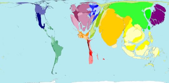
Here, sophisticated software combined with comprehensive analysis of every aspect of life represents the world as it really is. Digitally modified maps depict the areas and countries of the world not by their physical size but by their demographic importance on a vast range of topics.

The rainforests of South America, with thirty percent of the world's fresh water, make the continent balloon in an analysis of water resources, whereas Kuwait, dependent on desalinated seawater, disappears from the map. Fuel use, alcohol consumption, population, malaria: here are hundreds of key indicators to the way we live.

This innovative and exceptionally accessible reference work will be an indispensable tool for journalists, economists, marketers, politicians, financiers, environmentalists, and scholars. Its cartograms are augmented by graphs, tables, and full commentaries.

416 pages, Hardcover

First published January 1, 2008

3 people are currently reading
120 people want to read

About the author

Danny Dorling

66 books98 followers
Danny Dorling is a British social geographer researching inequality and human geography. He is the Halford Mackinder Professor of Geography of the School of Geography and the Environment of the University of Oxford.

Danny Dorling has lived all his life in England. To try to counter his myopic world view, in 2006, Danny started working with a group of researchers on a project to remap the world (www.worldmapper.org).
He has published with many colleagues more than a dozen books on issues related to social inequalities in Britain and several hundred journal papers. Much of this work is available open access and will be added to this website soon.

His work concerns issues of housing, health, employment, education and poverty. Danny was employed as a play-worker in children’s summer play-schemes. He learnt the ethos of pre-school education where the underlying rationale was that playing is learning for living. He tries not to forget this. He is an Academician of the Academy of the Learned Societies in the Social Sciences, Honorary President of the Society of Cartographers and a patron of Roadpeace, the national charity for road crash victims.

Ratings & Reviews

What do you think?
Rate this book

Friends & Following

Create a free account to discover what your friends think of this book!

Community Reviews

5 stars
28 (35%)
4 stars
31 (39%)
3 stars
12 (15%)
2 stars
5 (6%)
1 star
2 (2%)
Displaying 1 - 15 of 15 reviews
21 reviews
March 23, 2021
382 world maps pictorialize world statistics on all sociological and geopolitical matters by enlargement distortion of each country according to its share of statistic. There is a paragraph in the introduction describing how the graphic modelling was done mathematically.

There are many surprises: the only area in the world seeing great decline in wealth (as distinct from chronic longterm poverty) is Eastern Europe, being one example. Also, Ireland is shown to be the greatest world exporter of medical products. The maps represent absolute statistics in that highly populated countries are sometimes over-represented by virtue of shear numbers of inhabitants whereas the accompanying tables give results per capita which often tell a different story.

I actually read the book from beginning to end and I quickly got used to "reading" the maps. I believe the research has been thorough and honest but one is certainly left with the impression of a very unfair political world that ought to be rectified as soon as possible.
Profile Image for Ietrio.
6,948 reviews24 followers
April 20, 2020
An old technique often used by the preachers : massage the data to fit the shape sought by the speaker.
Profile Image for Wilson.
296 reviews2 followers
June 2, 2023
I ate this type of book up when I was younger
Profile Image for Carl Wade.
47 reviews2 followers
April 14, 2015
Contentes: Barford must have done the feminine studies. Many of these topics will nee definition "Radios in Use", "Working Physicians".
Pg. 9 A clergyman James Gall in 1855 was into maps. Cartograms are maps distorted by data rather than projection.
Pg. 16 Algeria is the largest country in Africa, or is it Sudan?
Pg. 18 It looks like India has been a population center for centuries. S.E. Asia, Western Hemisphere (except Peru and Mexico), Australia and New Zealand have grown in population compared to other areas.
Pg. 20 USA's population shot up and has stayed up for decades.
Pg. 25 Ethiopia has only 6% of births attended.
Pg.28 Right to vote is low in the Middle East?
Pg.31 Low immigrant rate will mean a tighter gene pool in the future of that country. Such as the Philippines.
Pg 32 What is it like in the countries that have high Emigration? Empty houses and villages? Some of the desert oases have been abandoned for the city.
Pg. 36 Why do people travel from Czech Republic so much? Just going near by and countries are so small? Fourth from the bottom is Ethiopia for visits abroad, and visitors from abroad. No wonder it is hard to get go rates flying into Ethiopia.
Pg 37 Western Europe is were tourists go.
pg42 Spain has the biggest net income from tourism. They are more distant from other small nations and they don't go out much. Where do they come from? Oh northern Europe coming south in the winter. USA is 2nd and with liberalized ruling we could become number 1. Homeschooling would stand a good chance to reap from this from Dude ranches and working farms and hunting & fishing.
Pg 49 Ethiopia is at the bottom for mopeds and motorcycles.
Pg 53 Ethiopia is at the bottom for freight vehicles.
Pg 66 China was highest in forest growth.
Pg 68 In our defence we rank 9th in fuel use and have not increased much since 1980.
Pg 72 Traditional fuels include wood, charcoal, bagasse (sugar-cane waste) animal and vegetable wastes.
Pg 73 Norway comes to the tip with hydroelectric.
pg 74 Italy is a stand out for oil to electricity.
Pg 89 Zimbabwe stands out as not being in debt. Who was their teacher?
Pg. 100 New Zealand is big in Dairy Exports.
Pg 110 Alcohol and Tobacco are put together. This leaves USA as an importer.
Pg 134 Ray's former company exported pumps but as a whole USA was 14th in machinery. What does Switzerland produce that puts them so high.moved overseas, following cheap labor?
Pg 147 Italy doesn't have a net import of clothes. What do they wear there. Vic village produces wool.
Pg. 167 They ask the question "Is China about to come full circle from 2000 years ago?"
Pg 173 81% of Ethiopians live on less that $2 per day. Then 100% on less than $10 per day.
Pg 175 A Noteable number of people in America live on $10-20 per day. What is the no tax level? What about money back for children. Homeschooling could do this. Live like a Ukrainian.
Pg 179 Surprise Brazil and Argentina have a large number of people that earn more than $200 per day or $72,000 person.
Pg 192 Eastern Europe has less undernourishment than the USA in 1990 but has come up to the same by 2000. Eritrea is worse than Ethiopia.
Pg 195 Costa Rica stands out on equality of the sexes.
Pg 204 Argentina is big on new tractors and low on workers.
Pg 231 China has durable dwellings that are not overcrowded.
Pg 232 Brazil has slums but they aren't growing like Nigeria and South Korea.
Pg 237 Ethiopia has poorest water. What can be done? Those ceramic filters would be good.
Pg 242 41% in USA and South Korea are enrolled to school beyond secondary.
Pg 266 Not many TVs in Africa and Ethiopia has 5.7 sets per 1000.
Pg 276 Ethiopia could use more midwives.
Pg 280 Italy and Cuba have a high level of Physicians.
Pg 298 Polio cases are alive in Nigeria.
Pg 303 Luxembourg has so many things going for it but it has a high level of alcohol consumption.
Pg 304 Canada and Australia are both low in men smoking.
Pg 307 North America has an average of 10 years of poor health. Poor countries have a short time of poor health.
Pg. 312 Men out live women in Maldives, Zimbabwe, Nepal, Zambia and Pakistan.
Pg 339 Russia has really dropped in Armed Forces since 1985. Danger Eritrea has a very large force for it's size. What are their plans? Take over Africa?
Pg 350 Luxembourg has much of the good life but is a big emitter of carbon dioxide.
Pg. 351 Is the air any better over Afghanistan because of low co2?
Pg 367 Saudi Arabia comes to the front on fuel depletion.
Pg 370 Chile and Australia come to the front on mineral depletion.
Pg 379 Ecological footprint for USA is 9.7 hectares. Some are less that 1 hectares.
Profile Image for Dimitris Hall.
392 reviews73 followers
August 5, 2016
This book originally lent to me by Orestis from uni. In fact, if I recall correctly, he'd borrowed it from someone else first. In a weird twist of fate, I have become that shadowy person responsible for lent books gone AWOL. The person everybody loves to hate.

It's not hard to get what this book is all about: it's 366 maps that are much more infographics about human life on Earth than they are maps.

Greece doesn't rank high in almost any of these expected or unexpected lists and their respective cartographic representations, apart from the follwing two, which stuck out for me---links are to the book's source website, Worldmapper, which contains all 366 maps included in the publication for your viewing pleasure).


Mopeds and Motorcycles

"The Asian regions (Southern Asia, Eastern Asia, Asia Pacific and Japan) are where 65% of mopeds and motorbikes are driven. Mopeds are less powerful than motorbikes, having slower maximum speeds because of their smaller engines. Some mopeds can also be pedalled. This form of transport has an advantage over cars in that motorised bikes can be taken on narrow roads and paths. On the other hand the rider is more vulnerable to injury.

Malaysia and Greece have more than one motorbike / moped for every five people. Considering that some people will be too young to drive, this could be one bike per three people in the relevant age group."


Total Elderly

Greece's percentage of people over 65 (wow, that includes my dad!) is ranked fourth in the world, after Japan, Germany and Italy. Doesn't this suddenly make the whole pension crisis seem way hopeless? Also see: why Europe's aging population means that the EU need to welcome 20 million immigrants by 2030 to replenish diminishing workforce.

If this book could have always up-to-date info, and not stuck in 2008 at best, it would earn its 5 stars. But I'm sorry review, I'm afraid I can't do that.
Profile Image for Sam.
8 reviews5 followers
Want to read
June 24, 2013
Dorling, D., Newman, M. E., & Barford, A. (2010). The atlas of the real world: mapping the way we live (2nd ed.). London: Thames & Hudson.

Citation by: Sam Northern

Type of Reference: Geographical Reference

Call Number: 912

Content/Scope: In this geographical reference item, sophisticated software combines with a comprehensive analysis of every aspect of life to represent the world as it really is. Digitally modified maps, or cartograms, depict the areas and countries of the world not by their physical size, but by their demographic importance on a range of subjects, from basic data on population to who’s eating the most vegetables.

Accuracy/Authority/Bias: This item is current, having been published less than five years ago. The data for the maps comes from reliable sources. Each map is accompanied by graphs, tables, brief explanatory text, and, in many cases, a quotation. Thames & Hudson is a well-known publisher of illustrated books on art, architecture, design, and visual culture.

Arrangement/Presentation: This item includes 382 full-color maps. Each territory on a map displays its data geographically, shrinking and expanding in proportion to other areas. The cartograms are organized into topics ranging from Food and Consumables to Pollution and Depletion, and are accompanied by graphs, charts, tables, and full commentaries.

Relation to other works: World atlases are common items in reference collections but his particular title digitally modified maps to illustrate the areas and countries of the world not by their physical size but by their demographic importance on a variety of topics.

Accessibility/Diversity: This atlas represents the world’s varying demographics. This work’s use of cartograms to alter the size of the countries of the world to represent more or less of whatever the map is showing helps users find information quickly. This reference source gives students the opportunity to discover ways of life for cultures around the world.

Cost: $34.95

Professional Review: Frančula, N., & Tutić, D. (2011). The Atlas of the Real World. Cartography & Geoinformation, 10(16), 156-158.
Profile Image for Iris.
283 reviews18 followers
March 23, 2009
Not an atlas but a compilation of "cartograms" -- maps in which the land mass of each country is distorted in size to denote its share in statistical data. For example, a map showing per-capita energy consumption features the United States bloated beyond recognition, Germany puffed up, Japan stretched out, while Africa countries look miniscule.

This way of presenting data could be a big step forward with a few adjustments:
First, start with a different map! The baseline map is a Mercator projection, which wildly distorts land and ocean size.

Then, flesh out the captions. The "Atlas" provides insufficient information about how, when and by whom each set of data was collected.

Judge for yourself with the Telegraph's gallery of a few pages of this book.
Profile Image for Bart.
452 reviews118 followers
September 1, 2016
In this book “sophisticated software combined with comprehensive analysis of every aspect of life represents the world as it really is. Digitally modified maps depict the areas and countries of the world not by their physical size but by their demographic importance on a vast range of topics.” It has 366 maps, with topics as different as fuel use, alcohol consumption, population & malaria.

There’s an excellent free website with the source material. The site even has 696 maps, and has more up-to-date data, so you don’t really need to buy the book at all… http://www.worldmapper.org/

More non-fiction recommendations & SFF reviews on Weiging A Pig...
2,160 reviews
November 23, 2008
c2008 from the library mostly looked at by Rob

CARTOGRAMS maps which change the shape of states or countries to show a rel value

worldmapper.org

from Amazon, a review:This book is brilliant! It uses maps of the world to display data by distorting the physical size of countries according to the relevant data - the result is a very visual feel for the data - much more powerful than figures or words could be. Every page has a global map displaying a different set of data and the range of data is huge, spanning from spread of diseases to energy use, from prevalence of national disasters to effectiveness of legal systems.
Profile Image for Katherine Collins.
Author 2 books14 followers
June 2, 2014
The Atlas of the Real World maps data of all sorts onto the ‘land mass map’ we see all the time, and by the resulting puffed-up and shrunken proportions you can see complex and surprising data at one glance. It is fun (in a sort of geeky way) to flip through this book and stop when you see an especially arresting view, then try to guess what data the view is mapping. Okay, maybe this won’t become your favorite party game, but it is an easy and interesting way to absorb a ‘real’ global view on a wide range of topics.
Profile Image for Dustin.
37 reviews8 followers
January 25, 2015
This book is absolutely amazing. It displays cartograms of the world map, sizing different countries based on different sorts of information. Everything from coal usage to commute time to suffrage levels is in here. Such a wonderful wealth of information.
Profile Image for Marius.
10 reviews
December 12, 2011
Quite a good representation of the way our world really is. Recommended to people who enjoy learning about statistics in our world.
Displaying 1 - 15 of 15 reviews

Can't find what you're looking for?

Get help and learn more about the design.