Poll
Hello Members of Modern Good Reads, our mod, Travis Luedke, needs help deciding on cover art for his "Box Set" of "The Nightlife Series (books 1-4)".
Give us your vote!

*Cover Art by http://www.amygdaladesign.net/
Give us your vote!
*Cover Art by http://www.amygdaladesign.net/
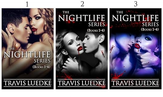
Cover #1
Cover #2
Cover #3
Poll added by: Travis
This Poll is About
Comments Showing 1-50 of 122 (122 new)
message 1:
by
A.D.
(new)
Jun 20, 2013 01:25PM
 Cover #1 is AMAZING!
reply
|
flag
 Despite the rather healthy-looking glow on the vamps on Cover #1, it has the most appeal, the best photo composition, and the best type placement. The type placement in 2 and 3 has an uncomfortable way of scrunching down the people.
 Even the golden tans on the models have something to do with its appeal--I'm a sucker for warm colors on a book cover when possible.
 I love cover #1 and voted for it. However cover #2 was VERY close behind.
 I voted for number 1, 2nd place was number 2
 Yeah number one is best with the earth tones.
 While I love the pale fantasy-like shade of the couple in the third one, the photo on the first cover would turn my head. Definitely #1


 Cover #1. I like the way images bleed to the edge on all sides above the title (no pun intended). The color is the most inviting too.

 the cover 1, like the colors and more sexy :)
 I like #1 best, but #3 looks most on brand with the series.
 She looks bored to death on covers two and three. Sexy on cover one!
 Cover 1 BUT I'd like to see it with the colors used in cover 2!
 I love the cover 1 but I also like cover 2. :)
 Cover three grabbed my immediate visual attention, and if that is the intent, I will go for the reflexive response over other variables.
 Cover #1 is gorgeous. It's my first choice, but when I think about branding the other books in the series, I think covers 2 and 3 will stand out more with the black shading on the top. Readers will automatically know it's a book from your Night Life Series. I chose #3 for this reason. Good luck!
 I didn't vote for cover #1 because I like the shading better on the other covers. I picked #2 simply because you can see both actors fairly equally, and the coloring isn't so bright. One thing I loved about #3 is the male actor's hand. Very sexy.
 It appears my vote for #3 is the only one, so far. By way of explanation, I think the bluish tone has more "pop" compared to the others. And there's a strong focus on the woman's eye as she stares at the viewer. That eye conveys much deeper emotion than the bland, almost bored look of the other two renderings. Also, the red contrasts more sharply against the blue than it does against browns and grays.
 I agree I liked the bluish color of 3. If it could be put on cover one I liked the font and layout of 1.
 Mod
Mod
There are currently 11 votes for #3, so you're not totally alone. You're in the 10% bracket. :)

 The title pops the best on number 2, but the artwork is best on number 1. I'd go with number one.
 Voted for Cover #1 -- It's one that would catch my eye but I do like the color of Cover #3.
 A.D. wrote: "Cover #1 is AMAZING!"
Cover one is the most realistic because of the true color.
I know everyone's voting #1 (I work with designers for advertising for my work) The words are lost on #1...your name is great on all 3 but in people look top left to bottom right...the blood on the girls lips help draw your eye from the title to author's name in no 3...
I don't really like the purple colour in no 3 but it's placement is more pleasing. you could also try the image reversed from #1 in the spot of #3...so the bloody lips are helping to draw the eye from your title to author name.
just saying...lol
I don't really like the purple colour in no 3 but it's placement is more pleasing. you could also try the image reversed from #1 in the spot of #3...so the bloody lips are helping to draw the eye from your title to author name.
just saying...lol
 I love this cover artist's work. These are fabulous. I have to say as much as I obsess about these books, cover #1 just screams Aaron and Michelle to me. Michelle seems to have the power and confidence on that cover. Cover #2 is also fabulous but I think it reminds me of a sweet kind of black and white movie and doesn't hit me as hard with authority of the vampires. I love the blue tint on Cover #3, but I feel like with Aaron's big manly hand there, he is the one with total control. But with the coloring of Michelle's hair and the powerful look in in her eyes on cover #1, I have to go with that.
 #1 has that extra spark that you're looking for in a cover. Colors, contrast, composition all works great, but the woman on cover #1 has the moxie to pull off the warm tone. I believe people are drawn to other people and she really tells you who she is and what she's about with such a powerful look. It's clean, precise and tells the story all on it's own.
Mod
#1 has that extra spark that you're looking for in a cover. Colors, contrast, composition all works great, but the woman on cover #1 has the moxie to pull off the warm tone. I believe people are drawn to other people and she really tells you who she is and what she's about with such a powerful look. It's clean, precise and tells the story all on it's own.
Mod
You're thinking like I'm thinking.
We're on a wavelength here. LOL
:)
 Cover two appeals to me more, even though it isn't the most popular choice. I like the texture of the black and white, which is better suited to the theme of the books. Cover 3 is my second choice.
 Cover #1 definitely shows Michelle as having all the power.#2 is more a film noire flavor.#3 makes Michelle look a little less dominant.
My vote: #1
P.S. These cover rock.

 Hi Travis,
For me it depend on the story line. Cover one looks like she is in control. Cover two looks like a love story and cover three looks like he is in control.
Like them all but the content matters.
Blakely
 The first one is definitely the best while the third one comes in last place.Goodluck choosing!
The first one is definitely the best while the third one comes in last place.Goodluck choosing!
The first one is definitely the best while the third one comes in last place.Goodluck choosing!
 I guess number one is best because in the other ones it looks like he has hurt her....
 #1 has the most visual appeal, coloring of her hair and skin will draw attention. The blue toning of #2 & #3 projects too much of cold athmosphere.

 Love number one with the exception of the flesh tones. They are quite nice and life-like, but therein lies the problem with vamps.
 I was going to choose number 3. But the positioning of the title in number one swung it for me. PS: Though all three are very dramatic.
 They're all striking, but maybe because I love black and white photos, I'm partial to #2....
 Hey Trav, Loved cover one. Might think about lowering the figures and putting your "nightlife" title back up top of the page where it is on your books. Other than that, #1 by far and away.
Patricia
 I like the warmth of their glowing skin in cover 1.
I like the warmth of their glowing skin in cover 1.
I like the warmth of their glowing skin in cover 1.
I like the warmth of their glowing skin in cover 1.
I like the warmth of their glowing skin in cover 1.
I like the warmth of their glowing skin in cover 1.
I like the warmth of their glowing skin in cover 1.
I like the warmth of their glowing skin in cover 1.
I like the warmth of their glowing skin in cover 1.

 I agree with the #1 fans. Like the warmer colors!
I agree with the #1 fans. Like the warmer colors!
I agree with the #1 fans. Like the warmer colors!