
book mapping
I love maps, and Goodreads has the data to generate some interesting visualizations of reading habits tied to location, so I figured I'd do a little map-making. The simplest form of geographic data we store are US postal codes, so I focused on making regional maps of US metropolitan areas, starting, of course, with the San Francisco Bay Area, where I live. First of all, here's a map of users in mind-numbing pink:
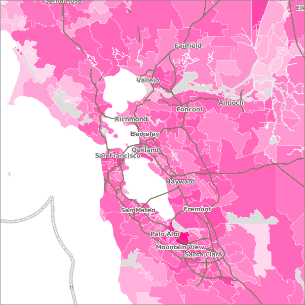
Woah! I think I'm blind. Note that the intensity of the color is on a log scale, so smaller values are more exaggerated than larger ones (please forgive my cartographic irresponsibility in not including legend, just didn't have time to figure one out). Not sure what the deal with the numbers in the South Bay are all about. I actually had to remove Palo Alto all together b/c a lot of users who only use the Facebook app get logged as being from there. Oops.
Now, here's one for reviews of books by Michael Pollan, slightly calmer color scheme:
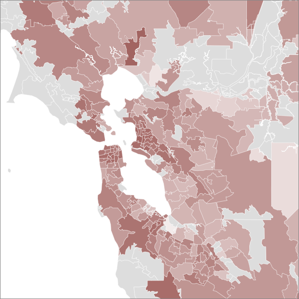
Here the intensity of the color correlates with the number of reviews by people in the zip code divided by the total number of people in that zip code. This isn't perfect because people can review multiple editions of a book or read multiple books by an author, but it's a decent proxy metric. You can see Pollan's greater popularity in wealthy, urban areas like SF and Berkeley. These values are also log-normalized, and I just didn't show data from zips with less than 50 people, since I figured there was too much skew there (I know, not exactly science). Areas with less than 50 users or no data are shown in grey.
Now check out Stephanie Meyer:
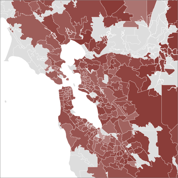
Meyer is so popular that it really isn't necessary to log-normalize the data. Here's the same data on a linear scale and zoomed out a bit:

See, now that's interesting (to me at least). What are we seeing here? Urban / suburban? Liberal / conservative? Adults / kids? Let's repeat the Meyer experiment in some other cities.
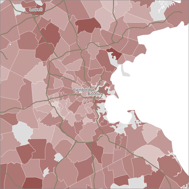
Boston
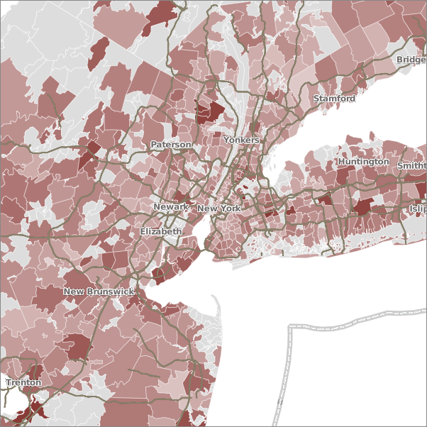
NYC
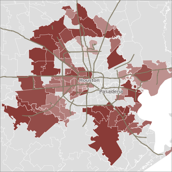
Houston (what's up with those empty areas?!)
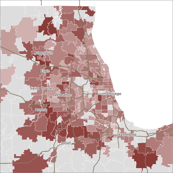
Chicago
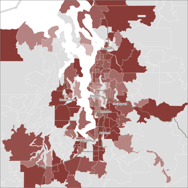
Seattle
I'll leave it to you guys to draw your own conclusions.
Sources & Tools
Woah! I think I'm blind. Note that the intensity of the color is on a log scale, so smaller values are more exaggerated than larger ones (please forgive my cartographic irresponsibility in not including legend, just didn't have time to figure one out). Not sure what the deal with the numbers in the South Bay are all about. I actually had to remove Palo Alto all together b/c a lot of users who only use the Facebook app get logged as being from there. Oops.
Now, here's one for reviews of books by Michael Pollan, slightly calmer color scheme:
Here the intensity of the color correlates with the number of reviews by people in the zip code divided by the total number of people in that zip code. This isn't perfect because people can review multiple editions of a book or read multiple books by an author, but it's a decent proxy metric. You can see Pollan's greater popularity in wealthy, urban areas like SF and Berkeley. These values are also log-normalized, and I just didn't show data from zips with less than 50 people, since I figured there was too much skew there (I know, not exactly science). Areas with less than 50 users or no data are shown in grey.
Now check out Stephanie Meyer:
Meyer is so popular that it really isn't necessary to log-normalize the data. Here's the same data on a linear scale and zoomed out a bit:
See, now that's interesting (to me at least). What are we seeing here? Urban / suburban? Liberal / conservative? Adults / kids? Let's repeat the Meyer experiment in some other cities.
Boston
NYC
Houston (what's up with those empty areas?!)
Chicago
Seattle
I'll leave it to you guys to draw your own conclusions.
Sources & Tools
Comments Showing 1-24 of 24 (24 new)
date newest »
message 1:
by
Athira
(new)
Feb 26, 2011 09:02AM
 Woah, this is awesome! Meyer's map made me laugh! You have me wondering at those empty spaces. I would have expected far fewer of those by now!
flag
 A lot of the postal code data comes from IP geocoding (i.e. trying to determine where you are based on your computer's IP address at that time), which can be somewhat inaccurate if the IP database gets out of date, or if people have dynamically assigned IP's that get associated with the location of their ISP, which might be somewhat distant from where they actually live. Given that the overall user density map is pretty close to population density (at least for the Bay Area, and remember it's log scaled), I don't think that's a huge source of inaccuracy.
That makes sense. But I'm wondering - when you say reviews, does that only include those who have written some form of a review, or is every reader with the book in his/her shelf included?
A lot of the postal code data comes from IP geocoding (i.e. trying to determine where you are based on your computer's IP address at that time), which can be somewhat inaccurate if the IP database gets out of date, or if people have dynamically assigned IP's that get associated with the location of their ISP, which might be somewhat distant from where they actually live. Given that the overall user density map is pretty close to population density (at least for the Bay Area, and remember it's log scaled), I don't think that's a huge source of inaccuracy.
That makes sense. But I'm wondering - when you say reviews, does that only include those who have written some form of a review, or is every reader with the book in his/her shelf included? Do you plan to map user reading habits to all countries? I'll surely be curious about that, though I have once seen a map showing proportion of goodreads' members vs other book cataloging websites.
Every reader who's added a book/author to their shelf, so I guess these maps display interest in a subject more than actually having read the books in question. Friday was actually my last day working at Goodreads, so no, no plans to make more maps. Larger scale maps would definitely be cool, though.
 Please make some tools to generate some maps for the city one is.
 I'd love to see how or what Austin reads.. :)
 Those empty spots in Houston? Those are the lower-income areas, where people either don't read, don't have a computer to log onto GoodReads, or if they do have a computer, don't belong to GoodReads.
That mid-pink area on Galveston Island at the end of the freeway at the south of the Houston map? I'm pretty sure that may be just me. ;) (Hmm... some of the empty spots are "Asia-town," where they probably don't read a lot of English. And I don't think West Galveston Bay got marked as water... there's several miles of water between the island and the mainland, so that explains at least one empty spot.)
This is actually kind of cool. :)
 It seems that don't keep classification numbers like Dewey or library of congress classification number but using that regional interests could be visualized.
This is a visualization I did once using Dewey classification numbers:
http://sepans.com/vis/goodreadsFocus.htm
 I used to be a cartographer. I ♥ this.
And have you ever read How to Lie with Maps? You would love it.
 Knowing Houston, those empty places are probably strip malls!
 Geography rocks!. Looking forward to more maps. I live in Cambridge, MA, don't read Stephanie Meyer, but young granddaughters do - in Northampton. But they're not on good reads although their mother is.

 I'm posting link to this in my GR group Fans of Maps. I'd love to see more of these, especially for members in different countries. And for a different author, maybe (at least for the US) one that's often read in schools, like Mark Twain.


 Excellent work Ken-ichi! So interesting.
I demand you take on Canada next. Alberta to be specific!
So many demands! Sadly, I don't work here any more so I can't generate new data. On top of that, most countries are not as open with their geospatial data as the US is (particularly the Census Bureau, possibly the world's most awesome bureau). I'm not even sure Goodreads collects that kind of data for non-US users, though it might be possible to geocode the cities people say they're from and do something like a county-level analysis.
 Gail wrote: "Those empty spots in Houston? Those are the lower-income areas, where people either don't read, don't have a computer to log onto GoodReads, or if they do have a computer, don't belong to GoodReads..."
Laughs, I used to live in Houston and they didn't read, that's for sure.
 Does the light blue color indicate a high incidence of book-burnings?
Can you compare colors across maps for the Meyer data? I mean, is it possible to tell whether there are more Meyer readers in one location versus another when the locations are on different maps?
Does the light blue color indicate a high incidence of book-burnings?
Can you compare colors across maps for the Meyer data? I mean, is it possible to tell whether there are more Meyer readers in one location versus another when the locations are on different maps?
 I bet a lot of people who consider themselves to be more high-brow readers have read Meyer but haven't added it to their goodreads shelves at all because that's not part of the reader image they're trying to project. That would seem to explain the lighter colors as you get closer to urban areas: urbanites are less willing than their suburban & rural peers to admit it publicly!
Particle_Person: no, these maps don't show where there are more Meyer readers, just where larger proportions of readers for whom we have zip data read Meyer. The numbers are (roughly) percentages, not absolute numbers. So a zip code 10 reviews of books by Meyer out of 100 readers should look the same as a zip with 100 reviews out of 1000 people.
I bet a lot of people who consider themselves to be more high-brow readers have read Meyer but haven't added it to their goodreads shelves at all because that's not part of the reader image they're trying to project. That would seem to explain the lighter colors as you get closer to urban areas: urbanites are less willing than their suburban & rural peers to admit it publicly!
Particle_Person: no, these maps don't show where there are more Meyer readers, just where larger proportions of readers for whom we have zip data read Meyer. The numbers are (roughly) percentages, not absolute numbers. So a zip code 10 reviews of books by Meyer out of 100 readers should look the same as a zip with 100 reviews out of 1000 people.Meredith: totally. These maps are based on the books people choose to review, not necessarily the books they actually read.
 This is magnificant.....but....in the privacy section it says under the What Happens to the Data if GoodReads is Sold section: "we cannot guarantee that our policy will remain unchanged if Goodreads is sold......we will use our best efforts to notify you by email if such a merger or acquisition occurs." which, to me, sounds like they're saying "we are collecting all this information about your reading habits because we are going to sell it and we don't promise that the people we sell it to won't use it for any purpose."
I think that Goodreads should remove the above from thier privacy policy and replace it with something that says something like: "We will never give your private book reading info to anyone for any reason including future potential buyers of our company."
The above blog post (and others like it that I've seen on this site) are exactly why I think the only eventual outcome for this site is a sale to a huge company that will use my book reading habits for marketing purposes. It's astonishingly valuable and one of the reasons why I'm so hestitant to put my own book data here.
Having said all that - this site is cool as hell. It's going to come back to bite me if I use it but I'm going to use it anyway.
I would also like to see that change in the privacy policy, so +1 from me. Not sure what it would take to convince the Powers That Be to do so, though, b/c you're right, the user data are valuable.
