This booklet reprints chapter 2 of Visual Explanations by the same author, analyzing a cholera epidemic in London in 1854 and the evidence used to decide to launch the space shuttle Challenger in 1986. Topics include cause and effect, data errors and credibility, evidence selection, and statistical graphics. For teaching data analysis and evidence in excision making.
Edward Rolf Tufte (born 1942 in Kansas City, Missouri to Virginia and Edward E. Tufte), a professor emeritus of statistics, graphic design, and political economy at Yale University has been described by The New York Times as "the Leonardo da Vinci of Data". He is an expert in the presentation of informational graphics such as charts and diagrams, and is a fellow of the American Statistical Association. Tufte has held fellowships from the Guggenheim Foundation and the Center for Advanced Studies in Behavioral Sciences.
Tufte currently resides in Cheshire, Connecticut. He periodically travels around the United States to offer one-day workshops on data presentation and information graphics.
Note: Some books by this author have been published under the name Edward Tufte.
The more Tufte I read the more I love his style and purpose. This is a teaser for Visual Explanations and as such it delivers, I am totally committed to reading that book on the basis of this publication. It comes in pamphlet format which is a little off-putting but actually that makes it a great size to read on the train or tram.
the material is interesting and the quality of the presentation is impeccable - as you'd expect from Tufte. A very enjoyable read about the use of graphics as support for decision-making
People who do not study history are doomed to repeat it, people who do study history have to watch as others make the same mistakes. Getting people to respond and react to important data is sales in a way. Selling the information that is needed to know can have huge consequences.
Edward R Tufte's short booklet goes through the Cholera epidemic and the space shuttle challenger. Two huge effecting events were affected by the people with data selling to other people about the data.
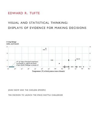
In both cases bunching the important data matters. In the first, it was the dates of people dying from Cholera. (before and after the removal of a water pump); the second was about the temperature of flights and the associated o-ring damage caused. In the first case, John Snow was successful in convincing his government to remove the water pipe saving countless lives. In the second case, the makers of the rocket were not able to convince the governing body not to launch the challenger causing disaster.
With lots of technical aspects about how to create great graphs, it was an enjoyable fun read that took no longer than a few days to do.
Bellingcat does this super well: "(1) documenting the sources and characteristics of the data, (2) insistently enforcing appropriate comparisons, (3) demonstrating mechanisms of cause and effect, (4) expressing those mechanisms quantitatively, (5) recognizing the inherently multivariate nature of analytic problems, and (6) inspecting and evaluating alternative explanations."
His piece on Powerpoint was better, but Tufte is the authority on presenting statistical data, so if that's something you're interested in you should read his stuff. This particular excerpt covers some of the same things as his Powerpoint one, but the Powerpoint one was much more entertaining.
This is a small pamphlet from Tufte's "The Visual Display of Quantitative Information" demonstrating two examples of real-life graphics that had consequences. One was how British medical authorities were able to locate the source of cholera by John Snow's map of cholera deaths in a London locality. Another was the disastrous Space Shuttle Challenger disaster where the root problem was known before the launch, but the engineers were unable to present their facts effectively to management.
WHY THIS IS IMPORTANT: Tufte shows how to examine data for quality and "truthiness". Tufte also shows how to "design" information to turn meaningless data into meaningful, usable information--which could improve your business communications to nuclear-strength, or help the war on "Fake News".
Due to the cost-cutting elimination of many fact-checkers and overseers of information quality & ethics in newsagencies, corporations, and schools, many people are losing important teachers and tools for critical thinking ie. being able to tell or comprehend "real truths" versus "fake" information. This affects everybody's freedom (that we really DON'T think to protect) by manipulating the public, voting, and whether they can protect themselves from fraudsters.
eBook found at: Internet Archive Open Library which works in partnership with public libraries: https://openlibrary.org