Such an excellent little book. 60 pages of pure gold. Hochuli starts at the lowest levels: how various marks make up a letterform, then how letters make up words, how words make up lines, and how lines make a column of text. All the while he points out how fine typography allows the readers eye to take in the text in the most efficient ways... and interestingly, that recent empirical research on reading seems to confirm the things fine typographers have always done.
Loved this exploration of “microtypography,” where we start at the physical process of reading and the smallest unit of type (the letter) and make our way up to the larger (linespacing/columns) and how typefaces make us feel. These details may feel subtle but their impact is large, and this book brings that often-subconscious affect/effect to the forefront—reminding designers AND readers how these details should not and cannot be dismissed.
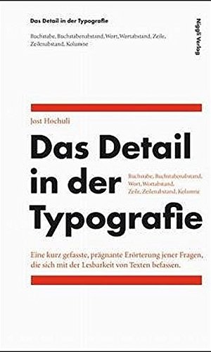
The design of the book itself is beautiful and definitely typography-centric. I could see it potentially being a little frustrating to readers who aren’t typographers or typesetters with the way that the “figures” and examples are set within the text. But I think this choice kind of further contributes to the argument: by radicalizing the hierarchy of elements, the writer/designer has ensured the things that may be often overlooked (figures and footnotes) in a text are not avoidable here, because they are just as important.
A simple yet insightful guide for beautiful typography. Ideal for both students beginning their explorations or professionals wanting a reminder of time-tested guidelines. As with many typographic guidebooks, however, their are a few stylistic conceits that are presented as rules but when compared to other typographic guidebooks (such as Robert Bringhurst’s "Elements of Typographic Style," or or Eric Spiekermann’s "Stop Stealing Sheep and Learn How Type Works") or style manuals (Chicago, MLA, etc.) it is clear that there is not a consensus about every typographic choice. This is not to say that their is not broad consensus about many typographic conventions, but our books would be more beautiful, however, if Hochuli’s few stylistic novelties were better followed.
Książka ma 60 stron i jest to fajna pozycja dla osób pracujących z typografią na codzień. Autor tłumaczy m.in. w jaki sposób odbywa się czytanie dłuższych i krótszych treści dzięki czemu można odpowiednio dostosować font to tworzonych treści. Książkę przeczytałam w godzinę - jest to lepsza alternatywa niż siedzenie w busie i przeglądanie SM.
Le livre donne des bonnes bases aux règles optiques en typographie mais l’auteur est trop critiquant à l’égard de tout ce qui sort de son délire moderniste-suisse.
There isn't much to say about this precious booklet besides that it's good. Very simple, very clear, it is a typical typography book, great for beginners.
I respect Jost Hochuli a lot after reading his 'Designing books' and seeing his work. Having said that 'Details in Typography' came as a bit too shallow for me. Perhaps because I've already read Bringhurst's 'The Elements of Typographic Style' and I have used a lot of the advice in my work, that I didn't find anything new.
All in all, typography is a set of rules: everybody repeats them and some apply them differently. At the end it's always good to refresh some theory.
Well-structured, with plenty of practical real-life examples, easy to understand, covers many topics of typography... All this in a short book which is read quickly. Recommended!
An excerpt I enjoyed from page 39 (maybe influenced by the classical music references), how incorrect use of spacing sets apart what should be together and viceversa:
- Pablo Casals/Alfred Cortot/Jacques Thibaud - Pablo Casals / Alfred Cortot / Jacques Thibaud
I made spaces 2x si it's even more obvious in a computer screen with the default typography. In the second line one can clearly see the grouping of name+surname of each individual. In the first line the effect is the opposite.
A short book about some essential guiding principles in the design of letters, letterspacing, words, wordspacing, lines, linespacing, and shapes.
Pretty damn good, especially for how it manages to convey so much in so little.
One of my key takeaways was that letters that are more top-heavy, like "W" and "u", appear wider than letters that are more bottom heavy, like "A" and "n"; essentially, that optical measurements are different from mathematical measurements.
Non sono un professionista della grafica ma ne sono mediamente appassionato, e trovo che questo libretto sia fantastico: è sia un manuale con indicazioni pratiche sull'uso di caratteri, parole, righe e paragrafi nei testi stampati, sia una filosofia della tipografia, che dev'essere una pratica artigianale al servizio del lettore e quindi il più possibile invisibile.
Definitely something to learn from this little book which is beautifully designed and typeset. But there’s very little content for the price. In the past, I paid less for books that I learned more from. That’s why it’s a 3/5 for me.
A brief read about the finest points of typography, if not necessarily groundbreaking and/or especially lively. A good refresher if your type skills are rusting a little. (Or if you just spend too much time on the web, like me!)
Short must-read for all graphic designers or anyone who works with type. Well-explained with many examples. True to its name, it gets into the details of type and how they can affect legibility or atmosphere. I will treat it like a reference book and return to it from time to time.
This was a pretty close look into the details of typography that served mostly as a refresher for me. Over time my specific reasoning behind certain design choices has kind of receded / transformed into instinct, which isn’t bad, but for the sake of upping my sensitivity it was a great read.
Beautiful book (unsurprisingly). I read it first, then went back and looked at the examples. I'll definitely be keeping this on my desk at arm's length.
A frank guide to the layout of running text. The language explaining the concepts is direct and the examples are well constructed. Should serve nicely as concise and quick reference book.