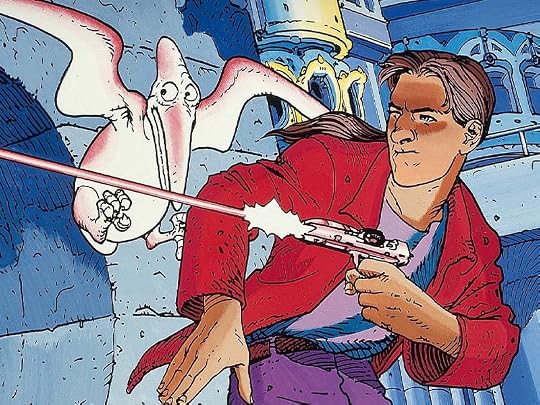
Better known for his surreal films El Topo and The Holy Mountain filmed in the early 1970s, Alejandro Jodorowsky is also an accomplished writer of graphic novels and a psychotherapist. He developed Psychomagic, a combination of psychotherapy and shamanic magic. His fans have included John Lennon and Marilyn Manson.
Το prequel στο μνημειώδες έπος του Ινκάλ νομίζω ότι μου αρέσει καλύτερα! Λιγότερη τεχνοψυχεδέλεια και περισσότερο κοινωνικό-πολιτικό σχόλιο δίνουν μια ενδιαφέρουσα γωνία ανάγνωσης: το άλμπουμ μοιάζει σχεδόν προφητικό αν και γραμμένο τρεις δεκαετίες πριν την άνοδο του τραμπισμού και την παράκρουση του τηλεφασισμού που είναι πλέον κυρίαρχος. Ένας υποβόσκων σεξισμός θα ενοχλήσει κάποιους αναγνώστες αλλά σε εμένα φαίνεται πολύ πιο ενδιαφέρουσα μια (ανομολόγητη?) αγωνία ευνουχισμού καθώς και η συμπλεγματική σχέση πατέρα - γιού, διάχυτη στον πρώτο τόμο, όπου και αποκαλύπτονται τα δύσκολα παιδικά χρόνια του John Difool. Ο Jodorowsky είναι βαθιά βουτηγμένος στην ψυχανάλυση για να είναι τυχαίες αυτές οι αναφορές αλλά όπως και να'χει κείμενο και εικόνες διαθέτουν πολλαπλά layers ερμηνείας.
Προσοχή: κυκλοφορούν δύο διαφορετικές εκδοχές colouring οπότε κάντε μια μικρή έρευνα πριν αγοράσετε την έκδοση που σας ταιριάζει καλύτερα!
It’s apt satire but it makes for a dark and ugly read that sometimes go too far just because it doesn’t have enough story to tell for the page count so it throws extra obscenities at you.
The art is great but the colours are generally too deep and dark and muddle the amount of detail on display.
For some reason, the publishers decided to re-color this book for American release. The digital color work not only completely covers up the original line art, but gives us the awful dodge-and-burn murkiness we'd expect from drawings of pokemon sex on deviantart.
There is a lengthy explanation inside about how the original colors were bright, but Americans wouldn't understand that this was supposed to be hyperbolic satire. It seems they could have saved the art by simply using that space to explain "the use of color here is not only beautiful, it is hyperbolic satire which contrasts delightfully with the subject matter".
They also decide to bowdlerize the art for the American audience, I can only wonder which parts of the dialogue survived translation. Really disappointing.
The title is also translated as 'The Incal' even though this is a prequel series before the character even comes into contact with the Incal. This not only makes the title nonsensical, but confusing, since it has been translated to have the same title as the earlier story which it was written as a prequel to, and by a different art team.
I didn't get this, it was mostly just crude. Some interesting ideas, like the stone seagull but most of it is familiar sci-fi tropes. Also, I understand that the societal structure here would lend itself to unapologetic hedonism but my god, literally every woman shown is a whore and is killed in some grotesque manner, and then peed on. It's just a bit boring more than anything else. Not really sure I want to continue but the series as a whole is so highly rated that I probably should.
Stone seagull's expression echoes mine throughout the book
Le origini di un mito XD Al solito geniale, arzigogolato; non ho dato il massimo dei voti perché un leggero gap (in difetto) rispetto all’opera principale è comunque percettibile.
Il primo e l’ultimo capitolo sono poco incisivi: il primo mostra la giovinezza di John e di come abbia incontrato Croot (e questo fondamentalmente incontro viene consumato in 3 vignette), mentre l’ultimo rimpicciolisse clamorosamente lo sguardo della storia, che si era fatta interessantissima e ritmatissima nei capitoli precedenti. Non ha paura di osare, né sotto il fronte della violenza (il massacro da parte dei Gobbi nel secondo capitolo con violenza molto grafica, o il fatto che la sostanza top 33 sia ricavata dagli spermatozoi e dagli ovuli dei cadaveri di 2 santi) né sotto il fronte della rappresentazione grottesca (John Difool vestito da prostituta, la rappresentazione della tv spazzatori, dei suoi presentatori e dei suoi spettatori, gli Aristoi decrepiti nel simil ospizio ecc.). Gli aristoi vengono rappresentati in maniera spietata, basta vedere come fanno a “guadagnate” l’aureola. Invenzioni visive come al solito fantastiche, comr il design del Sovracomputer divinoide o il mostro gigante similfelino nell’oloteatro. Rispetto a Moebius, i colori più penetranti e meno eleganti e vignette meno leggibili. Anche i volti più grotteschi. Col passare delle storie i disegni e i colori si fanno più puliti, più simili a quelli di Moebius, senza però mai raggiungere le vette del maestro. Splash page incredibilmente strabordanti di dettagli.
This entire review has been hidden because of spoilers.
Incredibile, affascinante, imprevedibile, scritta e disegnata con una maestria assoluta.
Prima dell’Incal è un fumetto attualissimo, nonostante sia stato pubblicato a fine anni 80. La narrazione di un futuro distopico in cui vive una società schiava di droghe, sesso, tecnologia e senza amore, sembra anche troppo realistica letta nel 2023.
Jodo ha genialmente raccontato una storia che non si conclude e, anche quando sembra essersi risolta, trova nuovi risvolti e spunti per proseguire, tenendo il lettore incollato al fumetto. I disegni di Janjetov sposano perfettamente i testi crudi e sfacciati di Jodo, a volte disturbando il lettore proprio per la solida critica nei confronti degli esseri umani e delle loro abitudini.
Stampato postumo a L’Incal, consiglio vivamente di iniziare la lettura di questa trilogia (Prima dell’Incal, l’Incal, Dopo l’Incal) proprio da questo volume.
Le allegorie e i simbolismi raccolti in quest’opera sono talmente numerosi che richiede molta attenzione riuscire a trovarli alla prima lettura. Infatti, consiglio una seconda lettura per soffermarsi sui testi e sulle scelte degli aspetti dei personaggi per poter cogliere eventuali messaggi nascosti.
Consigliatissimo anche ai non amanti dei fumetti (andate oltre i disegni e concentratevi sulla storia e i messaggi dell’autore, non ve ne pentirete).
Um desenho muito fraco se janjetov e um argumento um pouco exagerado , mas relata a juventude de John Difool quando encontra o seu fiel amigo Deepo a ser violentado com pedras, a tragédia da sua mãe como omeoputa que tem de tomar uma droga para sobreviver a uma doença que lhe trás dores e tumores . E o seu pai que é um ladrão inventivo que aparece de vez em quando para com a ajuda do filho cometer um golpe. Só que desta vez faz auréolas falsas dos aristos para os roubar numa festa aristo e é apanhado sendo depois condenado ao recondicionamento num guarda com bossa do prez. Degradação , depravaçào, solidão , violência , crueldade . Mas faltam os desenhos maravilhosos de Moebius para mim
Décidé de me replonger dans l'Incal avec un peu de temps devant moi...et je ne suis pas déçu, une vraie trame, des personnages bien définis, des illustrations très belles...je continue ensuite avec le tome 2, pour me faire les 6 dans le même weekend confiné...
I don't know about anyone else but, I have outgrown most of the super hero genre of comicbooks for something a little more adult. If you have like me then I recommend anything by Jodorowsky.
Un po' più "sensazionalistico" del volume originale, con dialoghi più sboccati e folla ancora più animata da crassa ignoranza e pulsioni estreme, ma di altrettanto piacevole lettura e sapientemente ordita trama.
All The backgrounds of The city scapes are just clever & random, & we assume that they all fit together somehow… Is The story just as random, just a collection of stuff that ‘happens’ without anything holding it together ( ? ) Very tiring.
Dieses Prequel zu den "Incal"-Bänden hat mich an das erste Prequel zu "Star Wars" erinnert. Denn es ist genau so schlecht. Leider. Jodorowskys Phantasie ist entfesselt, er lässt sich von seinen Ideen und seinen "Visionen" treiben und vernachlässigt eine konsistente Geschichte. Die könnte darin bestehen, dass der junge Difool seine Eltern inmitten der desolaten Welt verliert (und am Ende einen Mentor findet). Die Mutter eine Prostituierte und der Vater ein tüftelnder Trickdieb. Und da geht es schon los, denn der Vater heißt nicht nur Oliver mit Vornamen, er sieht auch aus wie Oliver Hardy! Die Gang von älteren Typen, mit denen Johnny Difool herumhängt, erinnern mich auch an bekannte Figuren aus der Comic-Welt. Und die kurzzeit-Freundin, eine Mutantin, hat den Kopf von Bambi. Die Oberschicht der Schachtstadt ist dekadent, die Unterschicht will nur Drogen und Lustgewinn. Das Aufbegehren gegen die Verhältnisse wirkt nur die Neuroemotionalen Kirche, die mittels der Droge Amorin eine Revolution herbeiführn will, irgendwie positiv. Ansonsten ergeht der Comic sich in Gewalt- und Zerstörungsphantasien. Das hat mich einfach abgestoßen. Den schlechten Gesamteindruck machen auch nicht die Paar gelungenen emotionalen Szenen wett.