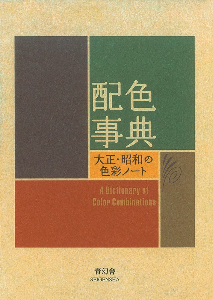
This book is a collection of 348 color combinations originated by Sanzo Wada(1883-1967) who,in that time of increasingly avant-grade and diversified use of color,was quick to focus on the importance of color and laid the foundation for contemporary color research. Sanzo Wada was active as an artist,art school instructor,costume designer for the movies and the theater, and kimono and fashion designer who employed his extensive and versatile talents to do innovative work that centered primarily on visual perception and form.
This is an evocative book. It’s the only book I’ve read more than once. I read it cover to cover almost every month. There are few words, only the names of the colors themselves. There’s no suggestions on when these colors should be used together. You as the reader have the freedom to imagine any and every scenario where these colors would mingle with one another. I like to picture scenes in real life where these colors would exist. Not only on a canvas or a piece of cloth, but organic entities and settings as well. Perhaps it keeps the feeble creative sinew in my brain alive. I will stop reading this book when it no longer gives me joy. That day does not seem near.
You don’t really understand how color works and neither do I. This is a great, tidy reference—I’ve owned it for a couple weeks now and I think I’ll always keep it close for both printmaking and graphic design work (I was pleasantly surprised to find CMYK values for each swatch in the back of this book).
Immense potential as a bedside book. Little assemblages of color--e.g., 'Hay's Russet' plus 'Eosine Pink', 'Blackish Olive' and 'Pale Lemon Yellow'--whose unlikely conjunctions release emergent effects. What these effects do or mean I cannot say, but maybe they slip into your dreams and become unlockable there... but will you remember?
Perfect little pocket book, but one must understand that it is just an endless collection of color swatches. I'd give it five stars, except they've made it very difficult to look up your favorite swatches in the index, and they could easily have put the RGB or HEX values on the actual page where the swatches appear.
Une très belle introduction à l’harmonie des couleurs. Et j’adore l’idée de la dernière partie avec ses couleurs à découper pour créer de nouvelles harmonies. Un petit bijou à garder à portée de mains pour le consulter régulièrement.
So here's the thing, this book is almost entirely in Japanese (which I can't read). But that doesn't actually matter. This book is full of helpful color palette combinations presented in a way that requires no textual understanding. If you are someone who has work or hobbies that involve color combinations then I strongly recommend you pick this book up as a handy reference guide. As someone who paints and makes a million slideshows each year this book is extremely helpful in quickly finding impactful color combinations that drastically improve the quality and efficiency of my work. This is the kind of book that everyone should have on their shelf.
Sanzo Wada was a painter, a teacher, and an Oscar-winning costume designer. He played a key role in developing Japan’s national color system, and his book, A Dictionary of Color Combinations, was his way of passing on a refined sense of aesthetic judgment.
Inside, you’ll find hundreds of timeless color palettes – perfect for inspiring visually appealing social media posts, presentations or why not stylish outfits.
It’s a powerful, time-saving tool, and I definitely plan to make the most of it.
This is a useful reference book of color combinations (2, 3, and 4 colors). Never mind the language barrier, it is easy enough to figure out. The book itself is lovely! A small 4"x5.75" compact paperback with thick high quality pages. It is so useful for anything from wardrobe coordinating to interior design to selecting colors when planning out a painting or other piece of art. I love it.
it feels like cheating to add this book here because it basically doesn't have text (there are a few pages, but they didn't translate it), but I went through all the pages and I use it relatively often (not all the time because I like to have the freedom of committing mistakes). Anyway, I like it, and the process of finding clothes that match the color palettes is pretty fun.
A very useful and fun reference for color theory that isn't too American or Eurocentric. It even has hex code for the colors and I assume color cutouts at the end of the book. Also pocket sized to carry around on the go.
A great guide to have for any sort of color combination, whether it's clothes, furniture, even painting your walls! I have both volumes and these will be my go-to guides from now on!
Literally such a good reference for colour combos!!! It's nice when I'm spending ages looming at my wardrobe and figuring out what to wear, but also for makeup too? Big lOVE