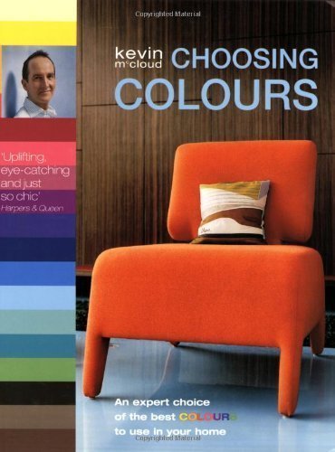
Choosing the right colour for your home can be fraught with difficulties, and with literally thousands of shades of paint available in DIY stores the choice can be overwhelming. With this book, Kevin McCloud has taken the hard work out of home decorating by researching, selecting and combining over 750 colours into more than 60 tried-and-tested palettes that will transform your home. Stunningly well produced and printed in six colours on two different paper stocks for astonishing accuracy, each palette provides a blueprint for a decorative scheme that you can transfer to your own home confident in the knowledge that they have been sourced by a renowned authority on colour with a brilliant visual eye. Taken from a wide variety of sources - historical, regional and cultural - each palette is made up of a collection of 3-16 colour swatches and features a photograph demonstrating how the colours can be used in period or contemporary settings. With hints and tips on how best and in what situation to use each colour, the swatches are individually matched to a commercially available paint so that you effortlessly achieve each look.
An author, broadcaster and designer Kevin is best known for Channel 4's Grand Designs and for his annual coverage of the Stirling Prize. McCloud and his two brothers, Terence and Graham, were raised in a house his parents had built. McCloud attended Dunstable Grammar School which became Manshead Upper School, Dunstable. He originally pursued a career in music, and then went to Cambridge where he changed subjects a couple of times before hitting upon History of Art and Architecture. After graduating, he trained and worked as a theatre designer, then set up his own lighting design practice and manufacturing business 'McCloud Lighting' - at one point employing 26 people. His work includes the carved and painted rococo-style vegetable ceiling in the Food Hall at Harrods, many projects in conjunction with J.J Desmond Interiors and lighting installations at Ely Cathedral, Edinburgh Castle, the Savoy and the Dorchester Hotel. Today he concentrates on television work, journalism and product design, including work for British manufacturers such as Fired Earth. In 2006 Kevin formed Hab Housing. (HAB stands for Happiness Architecture Beauty) In partnership, the company is now building sustainable housing schemes across the West of England. He also devised and launched the Great British Refurb, a campaign supported by several institutions and retailers as well as the government, to promote the retrofitting of Britains's 26 million homes to low-energy standards. Kevin is an Honorary Fellow of the Royal Institute of British Architects.
A gorgeous book, highbrow but not snooty, with brilliant, knowledgeable text and captions by color and paint expert Kevin McCloud. Contains 64 different palettes (and includes an index matching them to actual retail paint hues, mostly by Benjamin Moore). Many of the photos are atypical for coffee table design books and shelter magazines. I've spent hours staring at this inspirational book and never gotten tired of it. It sits on my shelf and constantly beckons to me.
A problem I find common with decorating books is that they date so quickly. This book was published in 2003, and it could have been 1980, studying the examples. There is definitely a European feel to the way the rooms are put together--things most Americans wouldn't settle for in their homes. I do think he could great care to get as accurate as possible color readings in his color selection palettes, and he chose interesting "themes" to match certain color combinations, for example, Sevres porcelain or "Seen through a fine gauze." Overall, my complaint against the book is the same one I have for just about all books in this field--they age too quickly.
Well written and informative, I particularly liked the references to colour throughout history. The print quality is spectacular, especially for the vibrant colours. An interesting book to reference for colour inspiration!
Oh wow what a great book! Very practical, gorgeous, inspiring. The cover doesn’t do it justice! Not sure if the author is the definite authority but for me this is a great first book on choosing colours
If you were the type of kid who marveled at the colors in the giant crayola box and enjoyed looking at the names and determining the differences between red-violet and violet-red, this is the book for you. Learn palettes from different eras and nationalities and how colors were created. I didn't like any of the pictures of interior spaces using these color palettes, but it really isn't a book about contemporary decorating. My favorite section? Pseudo-historic colors that have been muddled by grime and tobacco--the minerals in the paints deteriorate over time and become more yellow or green--so what you see at Colonial Williamsburg is probably not what they painted. Fun.
I'm no expert on art. I need to see something before I know for sure if I'll like it or not. This book takes a look at various rooms and dissects what colors it uses and why those colors work. I started out knowing I wanted a specific shade of red for my living room - this book helped me see what would work together with it. yay!
This book really help me visualize a more creative color scheme in my living room and kitchen. The color combinations and the photos were great. It was hard to choose, there were so many great options. I hope to buy this one day because I have a feeling as my tastes change and I want to repaint, this will continue to be inspirational.
I use this book on an almost daily basis. It's helped med to choose the colors in my home that work best, considering many things - the lighting, the climate, the direction the rooms are facing...Kevin McCloud is a color genius.