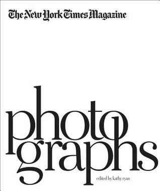
For over 30 years, The New York Times Magazine has been synonymous with the myriad possibilities and applications of photography. The New York Times Magazine: Photographs reflects upon and interrogates the very nature of both photography and print magazines at this pivotal moment in their history and evolution. Edited by Kathy Ryan, longtime photo editor of the Magazine, and with a preface by former editorial director Gerald Marzorati, this volume presents some of the finest commissioned photographs worldwide in four sections: reportage, portraiture, style and conceptual photography, including photo illustration. Diverse in content and sensibility, and consistent in virtuosity, the photographs are accompanied by reproduced tear sheets to allow for the examination of sequencing and the interplay between text and image, simultaneously presenting the work while illuminating its distillation to magazine form. This process is explored further through texts offering behind-the-scenes perspective and anecdotes by the many photographers, writers, editors and other collaborators whose voices have been a part of the magazine over the years. Issues of documentary photography are addressed in relation to more conceptual photography; the efficacy of storytelling; and what makes an image evidentiary, objective, subjective, truthful or a tool for advocacy; as well as thoughts on whether these matters are currently moot, or more critical than ever. As such, The New York Times Magazine: Photographs serves as a springboard for a rigorous, necessary and revitalized examination of photography as presented within a modern journalistic context.
This is not a book to read, per se, of course - but more of to peruse at your leisure, marveling at the wide array of more than 400 photographs taken from The New York Times Magazine.
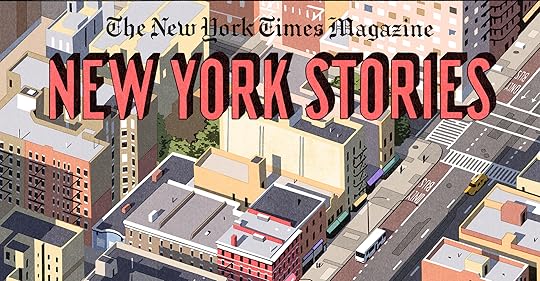
A review of the New York Stories issue by the New York Times Magazine (Read Here)
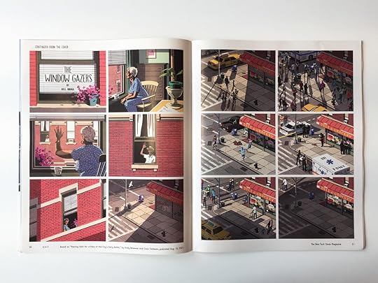
- The Window Gazers by Bill Bragg (5/5):
Original Article Excerpt: The sociologist and window-gazer extraordinaire Jane Jacobs, in her 1961 polemical valentine “The Death and Life of Great American Cities,” championed “the ballet of the good city sidewalk, ” an intricate dance which, she wrote, “never repeats itself from place to place, and in any one place is always replete with new improvisations.”
The story revolves around two elderly folks in the Bronx. Even though the comic has no words (a silent movie of sorts), its meaning especially after reading the article it was based on is exquisite. It prompts the feeling of serenity and solidarity one finds when looking out of a window onto the streets whose mood varies depending on the time of day. From being crowded, bustling and exuberant it can turn quiet and mellow. From the fights and squabbles that break out or the accidents which shatter the resolute peace, there are those moments of love and friendship which speak volumes. The art with fixed lines and solid faded colours adds to the cardboard cut-out re imagining of a realistic tale, one that would delight one's grandkids in the future.
- The Amiable Child by Robert G. Fresson (4/5)
Biblical Quotation from the Book of Job on the tomb: “Man that is born of woman is of a few days, and full of trouble. He cometh forth like a flower and is cut down: he fleeth also as a shadow, and continueth not.”
This comic chooses more rustic, earthy tones of yellows and browns to shed light on the life and death of a small boy- St.Claire who's tomb lays near the bigger, more recognised Grant tomb in NY's Riverside Park. The story weaves itself after the late 18th century to the present day highlighting the different attitudes towards the memorial.
- Twin Flames by Tillie Walden (4.5/5)
Tillie Walden does a fantastic job in portraying the article about a man who spent a fortune of $700,000 on deceptive romantic advice from a Manhattan fortuneteller. The colour palate is dominated by pinks, reds, purples, burgundy and orange hinting at the lost case for love. I loved the fairy tale-esque adaptation of the article, complete with the black evil blobs symbolising possible demons and a dramatic shift in tone, with evil and suspense lurking in the corner. It makes the reader very aware of the possible dangers that is brooding, unbeknown to the man in the comic.
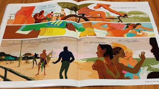
- Hot Fun by Wesley Allsbrook (3.5/5)
The art practically bounced off the page with its vibrancy and animation. However, the only fault (and half star deduction) is that the comic requires you to read the article to actually make sense of the seemingly random quotes that are thrown around otherwise the panels appear to be incoherent. The sense of community and relaxing, beachy vibes though, are very well conveyed.
- Missing by Bianca Bagnarelli (4/5)
Loved the muted colour scheme (blues,greys, blacks) which were peppered with striking orange-reds and yellow-greens. The comic followed the tale of how everyone came together to find a missing dog- "Bailey" and was interesting in the ordinary, relatable and cosy tone it took within its square 'homey' panels.
- Terror and Mystery by Sammy Harkham (4/5)
"Nudged aside by a city's larger loss"
The line above still rings within me. The story follows the sad and mysterious case of the last man killed on September 11 2001, a man who will likely remain forgotten after the bleak, terrifying and dramatic events that shook history, America and the world during the day.
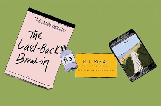
- The Laid- Back Break-in by K.L.Ricks (5/5)
Highly entertaining! A true modern retelling of Goldilocks and the 3 bears. It's better to go in blind and then later gain context from the article.
- The Viewfinder- by Tom Gauld (3/5) - The Birdmen of Queens- by Andrew Rae (5/5) Superb informative story telling with lush artwork - Enemies Amongst Us- by Francesco Francavilla (5/5) Incredible use of blues, blacks and yellows to hype the suspense and add to the thrill - Fake Notes- by David Mazzucchelli (4/5)