
SOS: Serious Overload of Series discussion
This, That or the Other
>
Editions - which is prettier?
 I prefer the UK one on this one.
As to which cover, I'm probably an equal opportunity reader/buyer. I love the US editions of Mercy and Guild Hunter & go out of my way to buy those. And on others, like Rivers of London much prefer the UK cover.
 US yes
 UK no
UK no US yes
 UK no
UK no US no
US no
 UK yes
 There are loads of US/UK differences. I'm with Sandra on the Mercy and Guild Hunter books, although sometimes I prefer ours like with this:
 US
US
 UK
UKHowever these US covers are way better:
 US
US
 UK
UK US
US
 UK
UK US
US
 UK
UK US
US
 UK
UK US
US
 UK
UKAnd this I can't decide on:
 US
US
 UK
UK
 This is probably a stupid question Sandra, but are there Australian editions?
US on the left, UK on the right (I think they're all right, I'm basing them on which ones I've read lol):
 v
v

 v
v

 v
v

 v
v
 v
v
 (Aus) <-- I found one - it's so pretty!
 v
v

 v
v
 v
v
 I don't know which edition is for which country...but this is one that has been bothering me. Actually, looking at my "no" cover in a large size, it's not too bad, but I hate the mini-pic version.
 no
no
 yes
There are occasionally Australian editions. The only one I can think of off the top of my head is this:
yes
There are occasionally Australian editions. The only one I can think of off the top of my head is this: US
US
 UK
UK
 AUS
@Nairabell: Agreed, although I think the 'Rachel Morgan' series look quite good as a set in the UK:
AUS
@Nairabell: Agreed, although I think the 'Rachel Morgan' series look quite good as a set in the UK:


Plus there is a new edition to the BDB, I don't know which country (I think maybe the UK since they're in the library) but they look better:


@Judithe: Yeah, although neither of them are spectacular - why are YA so good and PNR completely rubbish?
@Josie - the Rachel Morgans do look good as a series (I just liked the US ones more), but they've now changed the UK covers so the newest looks like this: 
Those are the new UK BDB covers. I have the US covers up to LEn with LAv and LM in those which aren't as bad as the old ones.
Oh - and YA do always seem to have way better covers than PNR, which is probably why I read more YA now.
Aw man, as much as I like the new version, it's going to mess up the set! Oh well, luckily I haven't bought any of that series since I like matching. The kindle cover of Serpent's Kiss kind of annoyed me, simply because it's not matching the previous ones (even though it's actually quite nice): 
 ... okay I can't find the third one which made this pointless but I'm sure most people know what it looks like...
And I can't resist buying books with lovely covers either! It's fairly superficial but true. I know
 is not for me but just look at that cover! It makes me want to read it so bad!
= Pretty!!!
is not for me but just look at that cover! It makes me want to read it so bad!
= Pretty!!!I've given up on matching book covers. My Morganville Vampires all match, but only because they were on a 3 for £5 offer. My Tomorrow books don't even vaguely match, but they're out of print and had to be ordered from all over.
I actually know someone who rebuys all her series books whenever the covers change but I can't afford to do that, especially with some series that are 20+ books.
Wow! Yeah, maybe when (okay, if) I'm rich and I have a beautiful library in my house, I'll think about doing that but at the moment I can barely afford to buy the books once lol!
Josie wrote: "Wow! Yeah, maybe when (okay, if) I'm rich and I have a beautiful library in my house, I'll think about doing that but at the moment I can barely afford to buy the books once lol!"That's exactly what I thought when she told me. No way can I justify replacing books like that, and I rarely ever pay full price because it really stretches my budget.
Yep, we do get our own covers occasionally, but otherwise we get both US & UK covers here in the shops.But I buy mostly from BD which does offer both styles of covers usually, so I pick my fav or if I'm not fussed I buy the cheapest :D
And I'd never seen those covers for Elder Races Josie. I think I prefer mine :)

 US
US
 UK
UKLove both!
Also audiobook cover differences:
 PB
PB
 AB
ABDon't like the audiobook version - **blows raspberry**
Lisa Kay, I know lots of people hate the US version of A Hunger Like No Other, but personally I've always liked it. Peeps get weird cause she's the vamp, but he's a wolf and they bite too. LOLAgree about the audiobooks.
 I'm lovin' this chat! I like seeing all the different cover art for different countries. I have posted several for my faves on my blog, if anyone's interested. (Kate Daniels and Mercy Thompson; about time for me to find another one to highlight) I had fun checking out the UK (sometimes AU) covers when I lived in Australia. Some of them are so much nicer than the US version. Sometimes the US PB release is better than the HC, IMO. Wow - lots of acros there, Steph! LOL!
The Halo covers are both beautiful.
They all look cool, Steph!I found an interesting article about the agent who sold the rights of 'Unearthly', Why "World Rights, One Cover" Is Not The Best Idea
(I have to say, I have a fondness for the Australian cover :P)
Thanks, Josie. That was a very interesting article. Thanks for sharing :)
Thanks! I would've liked to know how and why they work in the intended markets, for instance, why wouldn't this,
, work for North America, what is the market looking for that this ,
, caters to? Are some more subtle than others, the colour schemes?
Ya got me, girl. I was thinking the same. Guess that's why they make the big bucks. ;)
I prefer the AU cover for Unearthly as well. Much nicer!
Josie wrote: "Lol, I want specifics!":) If you find them, fill us in too.
 It is interesting that the NA version, shows her face and it more apparant how slender she is. But perhaps that is just my jaded perception. I am going to read the article. :)
 I much prefer the AU version of Unearthly. I'm not a blue person AT ALL, and I almost passed this one up just because of the all blue cover.....it's pretty, but to me blue is a depressing color.
I'm definitely a blue girlie, but think that cover is horrible and you're right, depressing ;)
Yeah, I thought the US one was the worst tbh.
I much prefer the AU version of Unearthly. I'm not a blue person AT ALL, and I almost passed this one up just because of the all blue cover.....it's pretty, but to me blue is a depressing color.
I'm definitely a blue girlie, but think that cover is horrible and you're right, depressing ;)
Yeah, I thought the US one was the worst tbh.I wonder if it even works - say if they did some kind of survey asking people from US, UK and Aus which one they prefer. It'd be interesting to see the results.
I suppose it would depend/vary on the genre and the ages asked.
I found a related article, although I have to warn everyone that there are generalizations. I'm sure not every American likes "almost garish" covers lol.
British and American cover art
Oh and here is Maria V. Snyder's Cover Art Gallery. Apart from the Russian and German editions, they're all absolutely lovely!
Very nice. Thanks for those, Josie. I am drawn to cover art for all sorts of reasons. Sometimes it's the font (Yes, I'm a nerd), sometimes it's the picture, other times it's the author and I don't care what the cover looks like. I have the AU versions of MVS' Study trilogy.
Those ones are so nice! I also really like the Insider UK covers for some reason - very striking.Lol, considering how popular certain books/series are, you would've thought they'd have really amazing cover art. Although saying that, I understand how it's important to have a good cover to attract readers, particularly if it's a debut or a YA book, but once an author's established and has a strong fan base, it probably wouldn't matter even if the book is coverless :P
I'd definitely read my faves with an ugly cover or no cover. :)
I was out and about today so I checked which Unearthly was in the shops and we've got the AU cover of course. LOL
and very pretty it is in RL.
 Currently trying to find
 but all I can find is
 Patrick wrote: "Currently trying to find but all I can find is "
Have you tried book depository?
Sandra wrote: "Lisa Kay, I know lots of people hate the US version of A Hunger Like No Other, but personally I've always liked it. Peeps get weird cause she's the vamp, but he's a wolf and they bite too. LOL"Don't know why I didn't answer you, Sandra. 'Cause I remember reading your response. Yeah, I saw people say that too (about him looking like the vamp b/c he is biting her) and I totally didn't get it... for the reason you stated. And it is a beautiful cover; love the colors.
Patrick wrote: "Currently trying to find but all I can find is "Interesting Patrick, the one you're trying to find is the only one here in the shops; I've got the other one direct from Book Dep. but that was some time ago.
No worries Lisa Kay ;)

 (US) vs
  (France) vs
 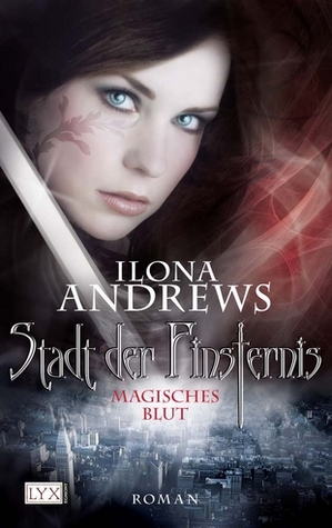 (Dutch/German?) vs
 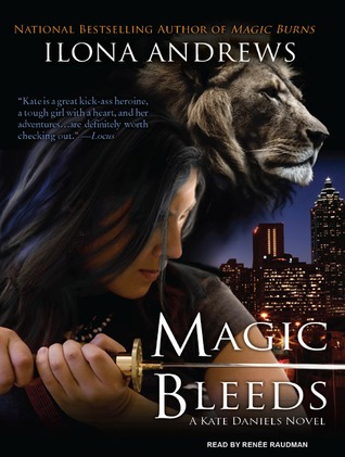 (audiobook)
I am thinking either of the French or Dutch/German covers is better than the US edition. I like the audiobook cover better too. Cept for the blue hair. Kate doesn't have blue hair.
Maybe she had her hair temporarily streaked – or put in a blue extension, Lady Jaye. LOL! I like this one the best, I think: . However, the lion on the audiobook is great!

 US
US  UK
UKSometimes the books have different titles too. I like both versions it is just strange because I am not used to the UK ones. I don't like when they change covers in the middle of a series. I also don't like movie covers and TV show covers. I like the original artwork better.
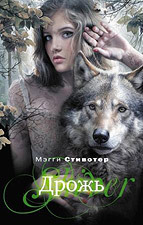
Shiver by Maggie Stiefvater has some of the most beautiful international covers I have ever seen. I like the US more than the UK one but I think both are pretty. My favorite however is probably the Russian one.
You can see all of them on her website here:
http://maggiestiefvater.com/shiver/fo...
The Japanese cover is awesome, JenReads (it felt welt writing "...awesome, AwesomeVegan!) :DFor Harry Potter i think I prefer the UK cover. I am more used to those I think.
And just to confuse the matter - we have kid and adult covers for Harry Potter in the UK.Kid:
Adult:

 Awesomevegan (AKA JenReads) wrote: "My favorite however is probably the Russian one."
Mine too
Russian Cover
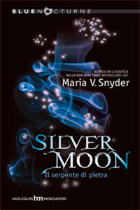
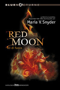
 For Maria V. Snyder's covers I really like Italian Covers for the Study Series. I havn't ready any of her books yet but i'm going too.
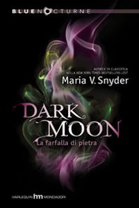
I really don't know why I like them. I am just drawn to them.
Sorry if they are too big still trying to get the hang of the HTML
Ok For the fever series do you like the hardback or paperback? -Hardback
 -Paperback
 -HB
-HB -PB
-PB -HB
-HB -PB
-PB -HB
-HB -PB
❥☪LIZZ NEILL☪❥ wrote: "Ok For the fever series do you like the hardback or paperback?"
-PB
❥☪LIZZ NEILL☪❥ wrote: "Ok For the fever series do you like the hardback or paperback?"I kinda prefer the paperbacks. I like the ripped effect. That's a good thing because I just got Darkfever from the library to try, and if I like it I'll be picking up the paperbacks :)
Nairabell wrote: "❥☪LIZZ NEILL☪❥ wrote: "Ok For the fever series do you like the hardback or paperback?"I kinda prefer the paperbacks. I like the ripped effect. That's a good thing because I just got Darkfever fro..."
You are going to like that series. The only one I got in hardback was Shadowfever and i'm bad cause I still need to read the last 2
Rachel Vincent has a facebook and in her photos she has photos of her different covers

SOS: Serious Overload of Series
Books mentioned in this topic
Fire Study (other topics)Magic Study (other topics)
Poison Study (other topics)
Shadowfever (other topics)
Dreamfever (other topics)
More...

(US)
I personally think they're both lovely. But this did get me thinking. In general, do you prefer the US editions to the UK ones or the other way around? Do you go out of your way to get the prettier one? I know I'm guilty of that last one...
I also wonder why some books have different covers whilst others stay the same. How on earth do publishers choose/decide that the original cover is not suitable for a market?