

What do you think?

Phaidon Colour Library
Cézanne. Phaidon Colour Library
This series acts as an introduction to key artists and movements in art history. Each title contains 48 full-page colour plates, accompanied by extensive notes, and numerous comparative illustrations in colour or black and white, a concise introduction, select bibliography and detailed source information for the images. Monographs on individual artists also feature a brief chronology.
- GenresArt
128 pages, Paperback
First published August 1, 1992
About the author
Catherine Dean
3 books1 followerCatherine Dean trained at the Courtauld Institute of Art. She was Editor of the Art Book Review Quarterly and is the author of Cézanne (1991), Manet, and Klimt in the Phaidon Colour Library series.
Ratings & Reviews
Friends & Following
Create a free account to discover what your friends think of this book!
Community Reviews
Displaying 1 - 4 of 4 reviews

June 6, 2010
(A nice collection, with some intelligent commentary. The introduction, though brief, is useful, and contains interesting comments on technique and on subject matter. The commentary accompanying each picture is much too brief; hence the missing star. The reproductions a fine, though not quite as bright or sharp as they could be. My original comments, posted when I began the book, are below.)
Though I've really only just begun it, this seems to be a fabulous book -- and so I wanted to get a couple of impressions down. It is informative, detailed, not as vague and portentious as Schapiro.
Dean, for example, begins by noticing how Cézanne developed a hatching brushstroke during the 1870's -- though earlier (under the influence of Pissarro) he had painted in a more impressionistic style. This stroke is sometimes said to be 'constructive', since the objects are built-up out of these vertical or diagonal hatches. You can see it (and see it developing) in these two pictures:
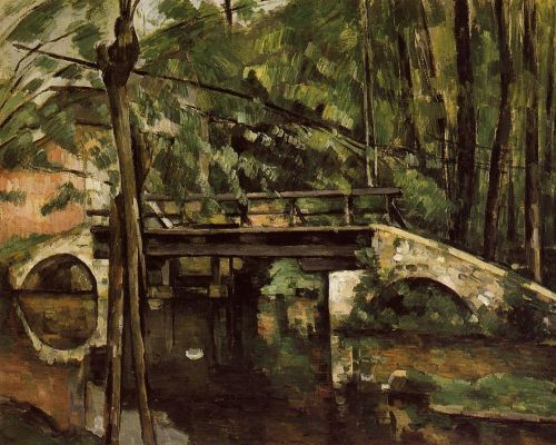
The Bridge at Maincy, near Melun. 1879-1880. Oil on canvas. Musée d'Orsay, Paris
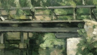
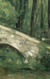
[image error]
Mountains seen from l'Estaque, 1886-1890. Oil on paper. National Museum of Wales, Cardiff. The museum, however, gives the title as The François Zola Dam, 1877-78 (http://www.museumwales.ac.uk/en/art/o...)
This last picture was the one that Gauguin purchased and much admired. According to Dean, you can see that 'flattening' tendency associated with Cézanne (and with much modern art that followed). This is associated with Cézanne's exploration of the relationship between the painting as a representation of the physical world and the painting as itself a concrete, two-dimensional object in its own right. This flattening is obtained through several devices: 1.) Cézanne ignored 'aerial perspective', whereby distant objects are painted in a lighter shade; by using the same intensity fore and aft, it 'flattens' out the picture. 2.) in the second picture (above), the warm ochres and oranges that pull the picture forwards are thoroughly mixed with the greens and blues that have a recessive effect. 3) Finally, there is that tendency, often noticeable in Cézanne, of tilting the objects upward towards the viewer. I'm not sure how to explain this, but I think I understand what she means.
One last point -- Schapiro and Dean both point out that Monet and the Impressionists, with their delicate hues, thus highlight the 'momentariness' or 'transitoriness' of the landscapes and of the natural world they paint -- while Cézanne, with the 'solidity' of his themes and handling, stresses rather the 'permanence' of the world around him.
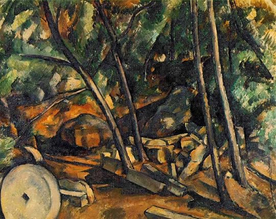
Woods with Millstones. 1898-1900. Oil on canvas. Private collection
In doing so, I would add, he stresses, ex contrario, the 'momentariness' of the artist -- that is, his own mortality.
It is this extra dimension of reflective depth that makes Cézanne so close to us.
Though I've really only just begun it, this seems to be a fabulous book -- and so I wanted to get a couple of impressions down. It is informative, detailed, not as vague and portentious as Schapiro.
Dean, for example, begins by noticing how Cézanne developed a hatching brushstroke during the 1870's -- though earlier (under the influence of Pissarro) he had painted in a more impressionistic style. This stroke is sometimes said to be 'constructive', since the objects are built-up out of these vertical or diagonal hatches. You can see it (and see it developing) in these two pictures:
The Bridge at Maincy, near Melun. 1879-1880. Oil on canvas. Musée d'Orsay, Paris
[image error]
Mountains seen from l'Estaque, 1886-1890. Oil on paper. National Museum of Wales, Cardiff. The museum, however, gives the title as The François Zola Dam, 1877-78 (http://www.museumwales.ac.uk/en/art/o...)
This last picture was the one that Gauguin purchased and much admired. According to Dean, you can see that 'flattening' tendency associated with Cézanne (and with much modern art that followed). This is associated with Cézanne's exploration of the relationship between the painting as a representation of the physical world and the painting as itself a concrete, two-dimensional object in its own right. This flattening is obtained through several devices: 1.) Cézanne ignored 'aerial perspective', whereby distant objects are painted in a lighter shade; by using the same intensity fore and aft, it 'flattens' out the picture. 2.) in the second picture (above), the warm ochres and oranges that pull the picture forwards are thoroughly mixed with the greens and blues that have a recessive effect. 3) Finally, there is that tendency, often noticeable in Cézanne, of tilting the objects upward towards the viewer. I'm not sure how to explain this, but I think I understand what she means.
One last point -- Schapiro and Dean both point out that Monet and the Impressionists, with their delicate hues, thus highlight the 'momentariness' or 'transitoriness' of the landscapes and of the natural world they paint -- while Cézanne, with the 'solidity' of his themes and handling, stresses rather the 'permanence' of the world around him.
Woods with Millstones. 1898-1900. Oil on canvas. Private collection
In doing so, I would add, he stresses, ex contrario, the 'momentariness' of the artist -- that is, his own mortality.
It is this extra dimension of reflective depth that makes Cézanne so close to us.
August 21, 2019
48 colour plates, mostly of a good size. Could have been brighter. Many other images but those are black and white and some of those cover two pages so harder to see. Good commentaries.

September 15, 2024
I think I’d like to be a French painter

August 6, 2010
Interesting book on Cezanne.
Displaying 1 - 4 of 4 reviews