
Hmmm
I can't decide if I like the participant badge design for this year's National Novel Writing Month:
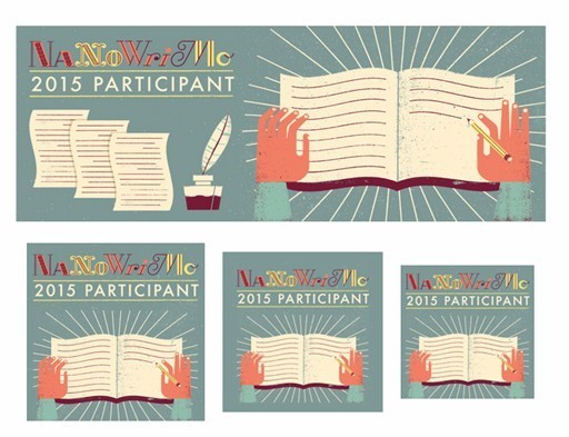
So it's not as awful as that one year when they went with the Gameboy-style design. I like the colors, but the graphics make me think more of writing journals than novels. The hodge-podge font is hard to read, and the design is on the clunky side (and before anyone asks, I was not the model for the crooked hands. Mine aren't that crooked.) On the other hand it's not as awful as that one year when they went with the Gameboy-style design.
What do you think? Let us know in comments.


No comments have been added yet.
S.L. Viehl's Blog

- S.L. Viehl's profile
- 224 followers
S.L. Viehl isn't a Goodreads Author
(yet),
but they
do have a blog,
so here are some recent posts imported from
their feed.

