
Wallpaper in the Gilded Age, Part I: Introduction
Wallpaper in the Gilded Age:
A Nine-Part Series Based on Ventfort Hall
by Robert M. Kelly
 1. "leather" paperI. introduction to six types of historic wallpaper found at Ventfort Hall
II. 1893: historical context
III. 1893: social context
IV. architectural changes 1850-1910
V. wallpaper's commercial context in the Gilded Age
VI. Wharton's wallpaper complex
VII. revisiting six wallpaper types found at Ventfort Hall
VIII. conclusion
IX. addendum: Cottage Industry: L. C. Peter's Notebook
*** author's note: These blog posts started as a written version of a lecture about six wallpapers found at Ventfort Hall. The six wallpapers are covered in Part I.
I went on. When I came up for breath I had a series of nine parts. I enjoyed exploring the nooks and crannies of related areas such as the architecture and social history of the Berkshire County region, and hope you will, too. Many will wonder in the course of this nook and cranny-ing what the heck happened to those original six wallpapers. Let me assure you: the wallpapers SHALL RETURN in Part VII.
During this work I was introduced by Nini Gilder to the amazing nineteenth-century daybook left behind by L. C. Peters, an accomplished carpenter and fix-it man for the Lenox colony. I decided that his story, (Cottage Industry) belonged here as well. It appears as Part IX.
That said, forward into 1893!
I. introduction to six types of historic wallpaper found at Ventfort Hall
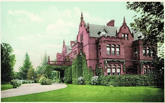 2. period colorized postcard
Ventfort Hall, a Jacobean-revival pile in Lenox, Berkshire County, Massachusetts, was narrowly saved from the wrecking ball around twenty years ago. Volunteers instituted a preservation program which has breathed new life into the 1893 structure. The educational programs of Ventfort Hall explore not only the Hall's history but also the culture of the late Gilded Age during which it was constructed.
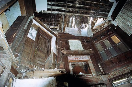 3. Ventfort Hall in disarray: the view from the basement looking up through the collapsed floor to the dining room.
Six seemingly first-generation wallpapers from the house are of prime importance: a leather paper, a block printed floral, a “stenciled look,” a Lincrusta-type, an Anaglypta-type, and a varnished tile.
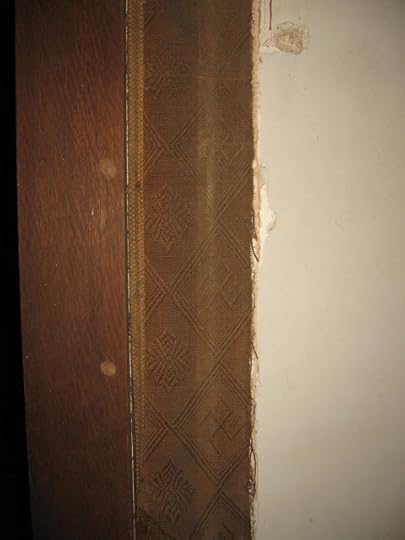 4. fabric remnant on 2nd floor
Though not adddressed here, fabric was also important at Ventfort Hall. A batten system to which sewn fabric was tacked extended throughout a second-floor hallway in the private quarters and more fabric was hung in the Salon.
When I was asked to give a lecture about Ventfort Hall's wallpaper I gladly accepted. For starters, wallpaper history is literally made up of fragments, and any opportunity to connect the fragments must be taken. Wallpaper was so prolific in the nineteenth century that we’ve resorted to stereotyping it, perhaps in self-defense.
Few eras are stereotyped more firmly than the last decade of the century, when bilious green and red gilt scrolls, like some invasive species from hell, grew wild on ceilings, friezes, sidewalls, and adjoining surfaces. Or did they? In fact, the colors were often pastels, the scrolls COULD be reform influenced, and many wallpapers of the time were painstakingly colored and nicely matched to their surroundings—a claim that cannot be made for every era. Much that has been written about 1890s decoration treats it as a way station, as a time when decoration was either stuck in a rut or desperately trying to advance out of one. The pages of The Decorator and Furnisher, the major trade magazine of the time, are vivid testimony that this picture is unfair and inaccurate. To be sure, the writers of the magazine were salesmen. Yet, within their sales vocabulary one can discern a genuine pride in American manufacturing that does not seem misplaced when rare samples of 1890s wallpaper are closely examined.
Other than these concerns, case studies are an excellent way to illuminate a moment in time. The moment here is June, 1893, when the George Hale Morgan family moved into their newly constructed home in Lenox. George's wife, Julia Morgan, brought the Morgan name (and Morgan money) into the marriage — she was the sister of J. P. Morgan. But, as impressive as the house and family are, the wallpaper story associated with them is no less important. It leads us far beyond the Hall—to Chicago, to Europe, and to the White House. It turns out that 1893 was a significant year for architecture, design, and decoration. It was, I believe, a hinge year. Broadly speaking, 1893 witnessed the last stand of the picturesque and a resurgence of classicism. The first suggestion of complexity came when my colleague Bo Sullivan sent several gigabytes of information gleaned from the pages of The Decorator and Furnisher, the New York City trade magazine which ran from 1882 to 1897.
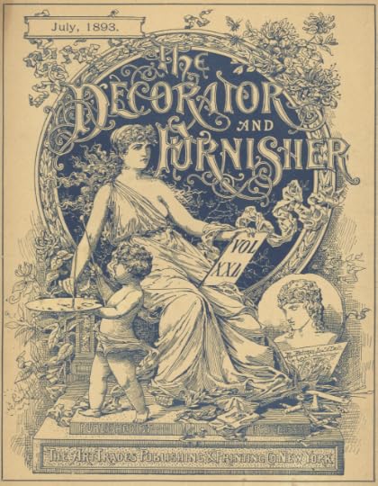 5. The Decorator and Furnisher magazine
The magazine's style was not quite what I expected. The early 90s are known for grandiosity, but the depth of it displayed in the magazine was surprising. Some historians have proposed that by the early 90s a shift toward the cleaner styles of classicism had occurred and that this forward-looking change was visible in the buildings and plan of the Columbian Exposition in Chicago. These buildings are discussed below. While there is some truth to the claims, upper-class style in 1893, on the evidence of the contemporaneous commercial press, seems, in my opinion, to have been looking not forward, but backward. Back past the short 120-year span of the United States. Back to Europe and to post-medieval if not medieval times. Back to shields, heraldry, mottos, nationalism, and the “colors of woven tapestry” as one writer put it. To some extent, this conservative outlook dovetailed with the design of American wallpapers in the late-nineteenth century, which were often florid, in the sense of flower-based. But, the high-style decoration encountered in the pages of The Decorator and Furnisher went further. It was florid in the sense of exceptionally ornate. This extended to the house style of the magazine.
Although a shift to pared-down styles was certainly in the wind, this de-cluttering is hardly in evidence in much of the documentation from 1893. This makes the somewhat retrograde wallpaper choices of the Morgans more understandable. Yet, it left unanswered the questions that we always have about wallpaper, namely: how popular were these choices?; how expensive were the wallpapers?; how exclusive were they?; were they domestically produced? how did the style of the wallpapers relate to the style of the house? This series of posts aims to answer some of these questions.
Ventfort Hall was build by Rotch & Tilden, a Boston firm, and housed George Hale Morgan and his wife, the former Sarah Spencer Morgan, a distant cousin of George. The house was the most expensive building project yet in an area known for expensive building projects.[1]
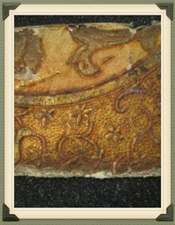
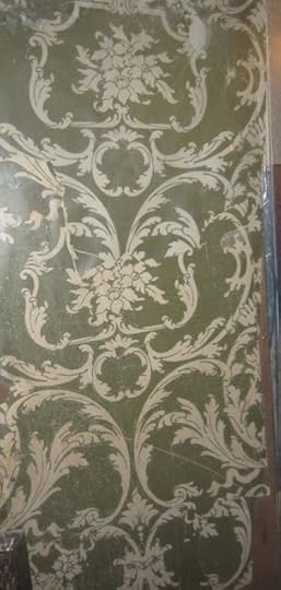
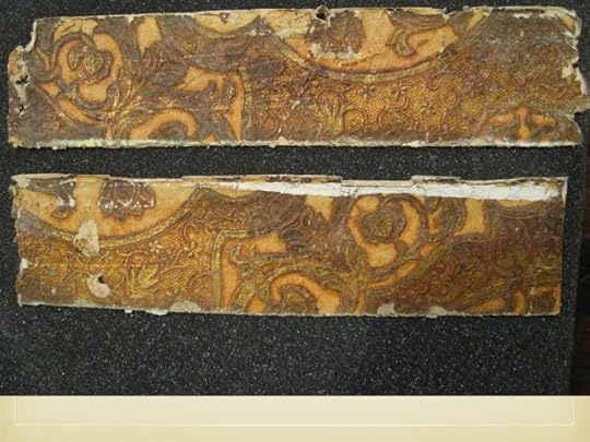 6. "leather" paper in Long Hall
The first samples to consider are the so-called leather papers. These oblong scraps were found beneath the cornice moldings in the first-floor hallway. Leather papers were highly processed. They were created by embossing and finishing paper laminates to approximate the effect of gilt leather. There seems to have been a shift from multiple layers to single layers as machine embossing improved. Leather papers were often promoted in the pages of The Decorator and Furnisher. During a review of the offerings of Warren, Fuller & Company, a writer stated: "We must not forget to mention the leather papers. The most striking one is the Heraldic shield pattern. Unusual care has been taken in producing this high relief effect. These are well named, as they retain the character color and texture of stamped leather. Architects and others will be gratified in finding so close a resemblance."[2] This direct appeal to architects is telling, for it would have been Arthur Rotch or George Tilden who chose, or, have had a hand in choosing, the interior finishes. Both were trained for this creative role at the Beaux Arts school in Paris.
 7. block printed floral in 1894
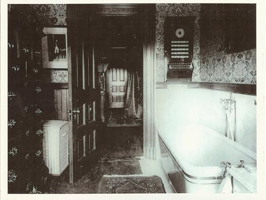
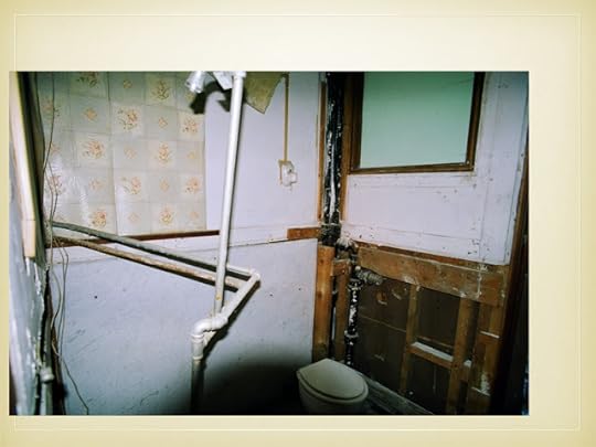
This block printed floral was found in a bathroom thought to be Sarah's. Even though the design and colors are elaborate, the wallpaper conforms to English reform design principles. The flowers are not naturalistic but instead symmetrical, two-dimensional flowers. The strange object on the bathroom wall was apparently part of the burglar alarm system.
 8. recent photo of block printed floral remnant found behind alarm
 9. "stenciled look"
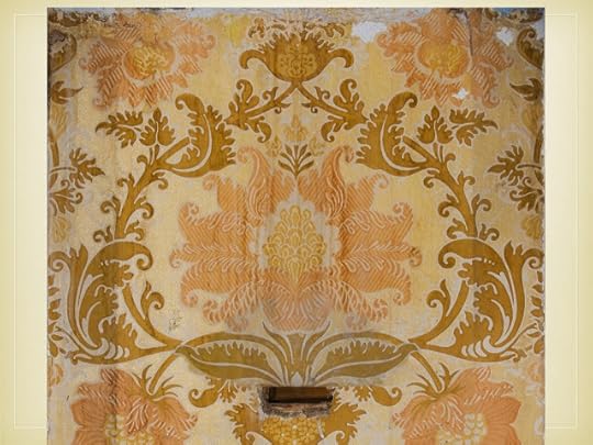
The next pattern has been dubbed a “stenciled look.” The two colors are simply rendered in a post-medieval style, but the vertical repeat is very long—55". This wallpaper was almost certainly created with block prints, and therefore expensive. This looming pattern decorated the wide third-floor hallways outside of the guest rooms. Incidentally, the pattern as rendered here is askew, due to the preserved strip of wallpaper twisting in mid-air.
 10. Anaglypta-type in service hall
 11. Lincrusta-type, service hall
Neither of the manufacturers of the service-hall papers are known. Both the Anaglypta-type (above the dado) and the Lincrusta-type (below the dado) were hung throughout the three floors of the hallway, mute witnesses to the hustle and bustle of household chores. With its spear and shaft motifs the Lincrusta-type presents a somewhat military aspect, albeit the beaded molding and rigid fluting hint at a Classic Revival effect. Both Lincrusta (from 1877) and Anaglypta (from 1887) were English patented products, though there was an American licensee for Lincrusta—Beck—who ran a Connecticut factory.
“Lincrusta-Walton” is often encountered in advertising of the period. Lincrusta was developed by Frederick Walton, inventor of linoleum, while Anaglypta was invented and patented by Thomas Palmer, an employee of Walton. The distinction between the types is that Lincrusta is solid, being made from linseed oil, cork, and other materials which were forced under pressure and great heat into molds. Anaglypta, on the other hand, was hollow, and made from pulp. Thus Anaglypta was cheaper and often used overhead. With a few coats of paint, the Anaglypta types could stand up to regular wear and tear.
 12. varnished tile
The final paper under consideration is a varnished tile wallpaper which still hangs in a third-floor bathroom. The offerings of Nevius and Haviland were reviewed in 1893 by The Decorator and Furnisher [3]: "That branch of their sanitary grade known as tile patterns contain some new and rarely beautiful designs. There are tile effects with Empire patterns and blue and white, green and white, soft red and white, and other combination, all washable and sanitary, and suitable for halls, kitchens and bathrooms. These goods are artistic, durable and cheap...."
The hygienic aspect of sanitary papers was hugely important to a late-Victorian audience. The company's pitch for varnished tile papers combines this virtue with others: varnished tile wallpaper was artistic, rarely beautiful, durable, and yet, for all that...cheap!—suggesting that low cost was a high value for producers and consumers alike. The varnished tile paper at Ventfort Hall, with its several colors, is a step up from the description in the magazine, but not by much. As we shall see, varnished tiles, like most wallpapers, came in a variety of grades, some of which found their way into other large estates in the Berkshire hills during the Gilded Age.
=====
footnotes:
[1] Gilder and Jackson, Houses of the Berkshires, 1870-1930: The Architecture of Leisure, 2011, p. 132. Some of the wealth which created Ventfort Hall was inherited by Sarah from her father, Junius Spencer Morgan, who was killed in a freak carriage accident in 1890. The Ventfort Hall complex included six greenhouses on 26 acres. The house had 15 bedrooms, 13 bathrooms, 17 fireplaces, billiard room, bowling alley, elevator, burglar alarms, and central heating.
For more about Ventfort Hall:
http://gildedage.org/history/
Before and after photos are at John Foreman's blog site:
http://bigoldhouses.blogspot.com/2012/02/hairbreadth-escape.html
[2] The Decorator and Furnisher, V. 23, N. 4 (July, 1893) p. 147.
[3] The Decorator and Furnisher, V. 23, N. 6 (September, 1893) p. 223.
=====
captions:
1 - 4. © 2015 Ventfort Hall Association, Inc.
5. cover, The Decorator and Furnisher magazine, courtesy Bolling & Company Archive.
6 - 8. © 2015 Ventfort Hall Association, Inc.
9. © WallpaperScholar.Com
10 - 12. © 2015 Ventfort Hall Association, Inc.
A Nine-Part Series Based on Ventfort Hall
by Robert M. Kelly
 1. "leather" paperI. introduction to six types of historic wallpaper found at Ventfort Hall
II. 1893: historical context
III. 1893: social context
IV. architectural changes 1850-1910
V. wallpaper's commercial context in the Gilded Age
VI. Wharton's wallpaper complex
VII. revisiting six wallpaper types found at Ventfort Hall
VIII. conclusion
IX. addendum: Cottage Industry: L. C. Peter's Notebook
*** author's note: These blog posts started as a written version of a lecture about six wallpapers found at Ventfort Hall. The six wallpapers are covered in Part I.
I went on. When I came up for breath I had a series of nine parts. I enjoyed exploring the nooks and crannies of related areas such as the architecture and social history of the Berkshire County region, and hope you will, too. Many will wonder in the course of this nook and cranny-ing what the heck happened to those original six wallpapers. Let me assure you: the wallpapers SHALL RETURN in Part VII.
During this work I was introduced by Nini Gilder to the amazing nineteenth-century daybook left behind by L. C. Peters, an accomplished carpenter and fix-it man for the Lenox colony. I decided that his story, (Cottage Industry) belonged here as well. It appears as Part IX.
That said, forward into 1893!
I. introduction to six types of historic wallpaper found at Ventfort Hall
 2. period colorized postcard
Ventfort Hall, a Jacobean-revival pile in Lenox, Berkshire County, Massachusetts, was narrowly saved from the wrecking ball around twenty years ago. Volunteers instituted a preservation program which has breathed new life into the 1893 structure. The educational programs of Ventfort Hall explore not only the Hall's history but also the culture of the late Gilded Age during which it was constructed.
 3. Ventfort Hall in disarray: the view from the basement looking up through the collapsed floor to the dining room.
Six seemingly first-generation wallpapers from the house are of prime importance: a leather paper, a block printed floral, a “stenciled look,” a Lincrusta-type, an Anaglypta-type, and a varnished tile.
 4. fabric remnant on 2nd floor
Though not adddressed here, fabric was also important at Ventfort Hall. A batten system to which sewn fabric was tacked extended throughout a second-floor hallway in the private quarters and more fabric was hung in the Salon.
When I was asked to give a lecture about Ventfort Hall's wallpaper I gladly accepted. For starters, wallpaper history is literally made up of fragments, and any opportunity to connect the fragments must be taken. Wallpaper was so prolific in the nineteenth century that we’ve resorted to stereotyping it, perhaps in self-defense.
Few eras are stereotyped more firmly than the last decade of the century, when bilious green and red gilt scrolls, like some invasive species from hell, grew wild on ceilings, friezes, sidewalls, and adjoining surfaces. Or did they? In fact, the colors were often pastels, the scrolls COULD be reform influenced, and many wallpapers of the time were painstakingly colored and nicely matched to their surroundings—a claim that cannot be made for every era. Much that has been written about 1890s decoration treats it as a way station, as a time when decoration was either stuck in a rut or desperately trying to advance out of one. The pages of The Decorator and Furnisher, the major trade magazine of the time, are vivid testimony that this picture is unfair and inaccurate. To be sure, the writers of the magazine were salesmen. Yet, within their sales vocabulary one can discern a genuine pride in American manufacturing that does not seem misplaced when rare samples of 1890s wallpaper are closely examined.
Other than these concerns, case studies are an excellent way to illuminate a moment in time. The moment here is June, 1893, when the George Hale Morgan family moved into their newly constructed home in Lenox. George's wife, Julia Morgan, brought the Morgan name (and Morgan money) into the marriage — she was the sister of J. P. Morgan. But, as impressive as the house and family are, the wallpaper story associated with them is no less important. It leads us far beyond the Hall—to Chicago, to Europe, and to the White House. It turns out that 1893 was a significant year for architecture, design, and decoration. It was, I believe, a hinge year. Broadly speaking, 1893 witnessed the last stand of the picturesque and a resurgence of classicism. The first suggestion of complexity came when my colleague Bo Sullivan sent several gigabytes of information gleaned from the pages of The Decorator and Furnisher, the New York City trade magazine which ran from 1882 to 1897.
 5. The Decorator and Furnisher magazine
The magazine's style was not quite what I expected. The early 90s are known for grandiosity, but the depth of it displayed in the magazine was surprising. Some historians have proposed that by the early 90s a shift toward the cleaner styles of classicism had occurred and that this forward-looking change was visible in the buildings and plan of the Columbian Exposition in Chicago. These buildings are discussed below. While there is some truth to the claims, upper-class style in 1893, on the evidence of the contemporaneous commercial press, seems, in my opinion, to have been looking not forward, but backward. Back past the short 120-year span of the United States. Back to Europe and to post-medieval if not medieval times. Back to shields, heraldry, mottos, nationalism, and the “colors of woven tapestry” as one writer put it. To some extent, this conservative outlook dovetailed with the design of American wallpapers in the late-nineteenth century, which were often florid, in the sense of flower-based. But, the high-style decoration encountered in the pages of The Decorator and Furnisher went further. It was florid in the sense of exceptionally ornate. This extended to the house style of the magazine.
Although a shift to pared-down styles was certainly in the wind, this de-cluttering is hardly in evidence in much of the documentation from 1893. This makes the somewhat retrograde wallpaper choices of the Morgans more understandable. Yet, it left unanswered the questions that we always have about wallpaper, namely: how popular were these choices?; how expensive were the wallpapers?; how exclusive were they?; were they domestically produced? how did the style of the wallpapers relate to the style of the house? This series of posts aims to answer some of these questions.
Ventfort Hall was build by Rotch & Tilden, a Boston firm, and housed George Hale Morgan and his wife, the former Sarah Spencer Morgan, a distant cousin of George. The house was the most expensive building project yet in an area known for expensive building projects.[1]
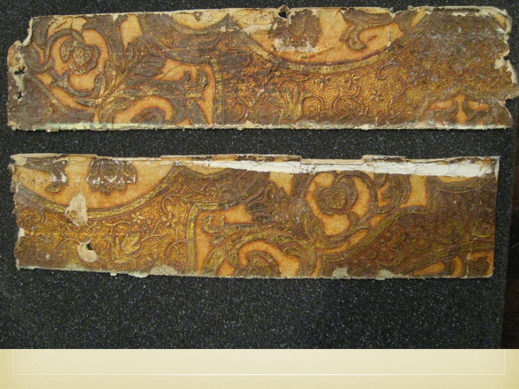 6. "leather" paper in Long Hall
The first samples to consider are the so-called leather papers. These oblong scraps were found beneath the cornice moldings in the first-floor hallway. Leather papers were highly processed. They were created by embossing and finishing paper laminates to approximate the effect of gilt leather. There seems to have been a shift from multiple layers to single layers as machine embossing improved. Leather papers were often promoted in the pages of The Decorator and Furnisher. During a review of the offerings of Warren, Fuller & Company, a writer stated: "We must not forget to mention the leather papers. The most striking one is the Heraldic shield pattern. Unusual care has been taken in producing this high relief effect. These are well named, as they retain the character color and texture of stamped leather. Architects and others will be gratified in finding so close a resemblance."[2] This direct appeal to architects is telling, for it would have been Arthur Rotch or George Tilden who chose, or, have had a hand in choosing, the interior finishes. Both were trained for this creative role at the Beaux Arts school in Paris.
 7. block printed floral in 1894
This block printed floral was found in a bathroom thought to be Sarah's. Even though the design and colors are elaborate, the wallpaper conforms to English reform design principles. The flowers are not naturalistic but instead symmetrical, two-dimensional flowers. The strange object on the bathroom wall was apparently part of the burglar alarm system.
 8. recent photo of block printed floral remnant found behind alarm
 9. "stenciled look"
The next pattern has been dubbed a “stenciled look.” The two colors are simply rendered in a post-medieval style, but the vertical repeat is very long—55". This wallpaper was almost certainly created with block prints, and therefore expensive. This looming pattern decorated the wide third-floor hallways outside of the guest rooms. Incidentally, the pattern as rendered here is askew, due to the preserved strip of wallpaper twisting in mid-air.
 10. Anaglypta-type in service hall
 11. Lincrusta-type, service hall
Neither of the manufacturers of the service-hall papers are known. Both the Anaglypta-type (above the dado) and the Lincrusta-type (below the dado) were hung throughout the three floors of the hallway, mute witnesses to the hustle and bustle of household chores. With its spear and shaft motifs the Lincrusta-type presents a somewhat military aspect, albeit the beaded molding and rigid fluting hint at a Classic Revival effect. Both Lincrusta (from 1877) and Anaglypta (from 1887) were English patented products, though there was an American licensee for Lincrusta—Beck—who ran a Connecticut factory.
“Lincrusta-Walton” is often encountered in advertising of the period. Lincrusta was developed by Frederick Walton, inventor of linoleum, while Anaglypta was invented and patented by Thomas Palmer, an employee of Walton. The distinction between the types is that Lincrusta is solid, being made from linseed oil, cork, and other materials which were forced under pressure and great heat into molds. Anaglypta, on the other hand, was hollow, and made from pulp. Thus Anaglypta was cheaper and often used overhead. With a few coats of paint, the Anaglypta types could stand up to regular wear and tear.
 12. varnished tile
The final paper under consideration is a varnished tile wallpaper which still hangs in a third-floor bathroom. The offerings of Nevius and Haviland were reviewed in 1893 by The Decorator and Furnisher [3]: "That branch of their sanitary grade known as tile patterns contain some new and rarely beautiful designs. There are tile effects with Empire patterns and blue and white, green and white, soft red and white, and other combination, all washable and sanitary, and suitable for halls, kitchens and bathrooms. These goods are artistic, durable and cheap...."
The hygienic aspect of sanitary papers was hugely important to a late-Victorian audience. The company's pitch for varnished tile papers combines this virtue with others: varnished tile wallpaper was artistic, rarely beautiful, durable, and yet, for all that...cheap!—suggesting that low cost was a high value for producers and consumers alike. The varnished tile paper at Ventfort Hall, with its several colors, is a step up from the description in the magazine, but not by much. As we shall see, varnished tiles, like most wallpapers, came in a variety of grades, some of which found their way into other large estates in the Berkshire hills during the Gilded Age.
=====
footnotes:
[1] Gilder and Jackson, Houses of the Berkshires, 1870-1930: The Architecture of Leisure, 2011, p. 132. Some of the wealth which created Ventfort Hall was inherited by Sarah from her father, Junius Spencer Morgan, who was killed in a freak carriage accident in 1890. The Ventfort Hall complex included six greenhouses on 26 acres. The house had 15 bedrooms, 13 bathrooms, 17 fireplaces, billiard room, bowling alley, elevator, burglar alarms, and central heating.
For more about Ventfort Hall:
http://gildedage.org/history/
Before and after photos are at John Foreman's blog site:
http://bigoldhouses.blogspot.com/2012/02/hairbreadth-escape.html
[2] The Decorator and Furnisher, V. 23, N. 4 (July, 1893) p. 147.
[3] The Decorator and Furnisher, V. 23, N. 6 (September, 1893) p. 223.
=====
captions:
1 - 4. © 2015 Ventfort Hall Association, Inc.
5. cover, The Decorator and Furnisher magazine, courtesy Bolling & Company Archive.
6 - 8. © 2015 Ventfort Hall Association, Inc.
9. © WallpaperScholar.Com
10 - 12. © 2015 Ventfort Hall Association, Inc.


No comments have been added yet.


