Layout Thoughts: Men's Health April 2015
About the blur: I'm only writing about these pages based on details in layout. I don't want to accidentally infringe on anyone's copyright, hence the "content" itself is blurred whenever there's a paragraph or more. If you are the content owner and want me to take these down, I completely understand.
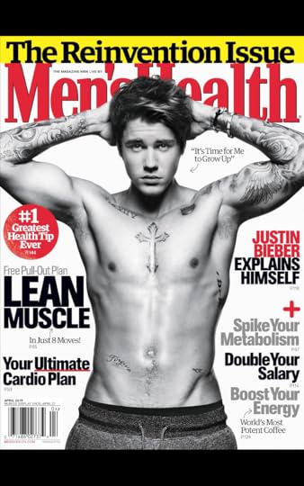
I'm fascinated with the layout of Men's Health and other periodicals like it. They may be loud and gauche and not exactly "timeless," but the design isn't meant to act like a coffee table book in a white minimalist fantasy. If design is how it works, then Men's Health is going for a very specific kind of functionality. It absolutely has to be a pain in the ass to design Men's Health every month, so they must make it the way they do for a reason. The cover is hyperbolic in every inch, every word not only selected for maximum impact, so is the colour and formatting. Spike, boost, ultimate, most, greatest, grow, reinvent. It doesn't matter if you're Justin freakin' Bieber, you're not good enough. Men's Health has received lots of flack for its utterly lazy cover design in recent years, (and they've deserved it), but this cover isn't supposed to be attractive. It's supposed to make you feel like you need it in order to improve.
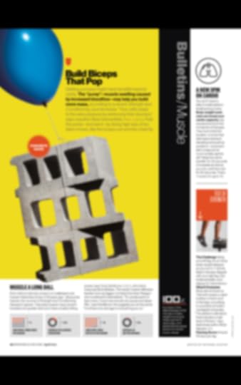
I'd love to see the Men's Health stock object library. I'd love to talk to the designer who thought an image of cinderblocks floating away would convey "biceps that pop" or that someone would want biceps that "pop" or that you can somehow get "biceps" that pop without also doing all the other things. It bothers me that Men's Health segments itself into such tiny chunks. Look at how the text is laid out on this page: each section is walled off, but takes only a few seconds to complete. I can't concentrate when I read it. I don't think it's meant to be read like other magazines. I feel like there's good data-based reasons they design it like this, but they're not good as in wholesome.
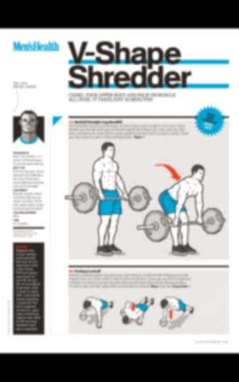
But if the point of the magazine is functionality, education, and assistance, their animated workout sections are fine. They're attractive, even! I like the arrows, and the colour scheme, and the light Wii-Fit gray in the background of the images.
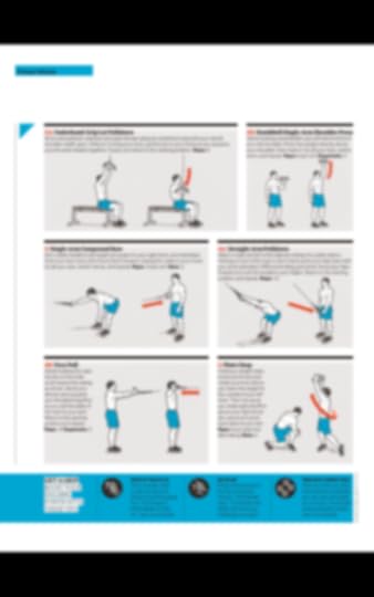
These kinds of pages are helpful, though, and I wish they'd do this more often. Sometimes, it's just better to explain an exercise visually, simply, and with bright orange motion arrows. It's all well and good to show good looking people being more healthy than you'll ever be, but this Wii-fIt-looking guy here? I can get there. Just gotta follow the orange motion arrows.
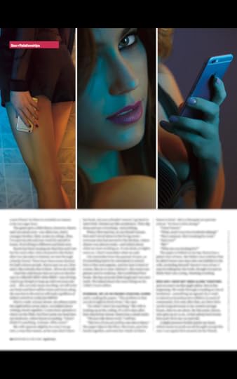
It wouldn't be Men's Health if there weren't a good amount of Playboy-lite material. It's often in between Esquire and Maxim for tastlessness, and the layouts of these pages tend to be the laziest in the whole book. It's not bad here but obvious, formulaic, and without any of the zeal that a great sexy ("sexy") ["""sexy"""] article should carry.
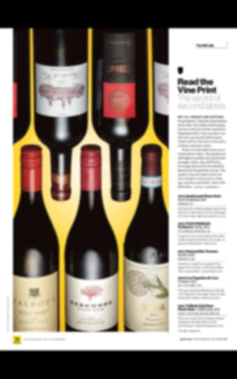
How do we fit five wine bottles in four inches of space? In a way that'll make you have to flip the magazine around to see two, that's how. Perhaps I'm just incredibly lucky to have the LCBO's "Food & Drink" in my proximity, but this is just about the most basic way to layout a wine list. Good background colour selection, though.
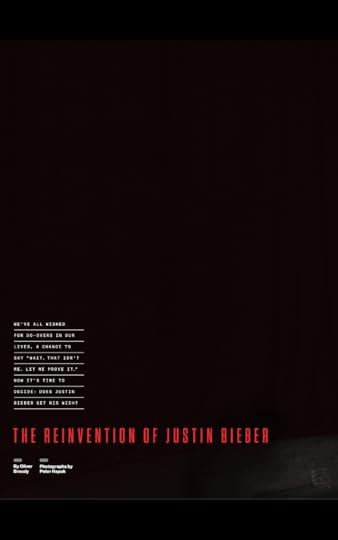
"Cover" pages in Men's Health often show flair. With Bieber, they went decidedly low-key. In magazines full of loud content like these, introduction pages like this almost have to act as white space, where the eye can finally relax for a second before the excess can continue.
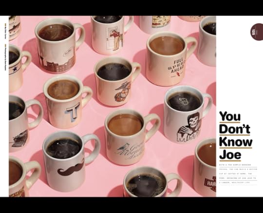
Speaking of excess, here's a million coffee cups, arranged isometrically. It's fun. I like this kind of thing. But just because you're talking about coffee doesn't mean it's okay to underline things in brown. Cripes.
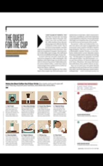
The little flat designs are adorable here. This piece on coffee was why I even opened up the magazine, and the touches of animation and grid layout is good enough to be in a better publication.
All in all, there isn't a lot of inspiring layout in regards to Men's Health. What I do see are a lot of work just getting the content all to fit, and allowing for flourishes of colour and space only when they can absolutely get away with it. It's a strange magazine in that it knows what it wants to be--truckloads of information that may or may not actually help you--and looking good might come in fourth on the priority list. Still, every now and then while flipping through I see things I wish I'd thought of.